Edward Scott
Research Lead, US

Ed is the team lead for UX research at Baymard and has been with Baymard since 2016. Ed oversees all UX research areas at Baymard. His specializations within ecommerce UX are Mobile, Checkout, Product Finding, Product Page, and Accounts and Self-Service. Ed has a PhD in technical communication and information design.
Edward Scott is a Research Specialist in:
- Mobile UX
- Cart & Checkout UX
- Search UX
- Product Lists & Filtering UX
- Homepage & Category Navigation UX
- Product Page UX
- Accounts and Self-Service UX
- Form UX
- Mobile App UX
99 Articles by Edward Scott

Ecommerce Homepage UX: Can Users Infer the Breadth of Your Product Catalog?
April 10, 2025 (Updated)
10 UX Requirements to Follow for a User-Friendly Homepage Carousel Design
April 3, 2025 (Updated)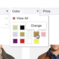
Horizontal Filtering Toolbars: 2 Reasons to Be Cautious
March 13, 2025 (Updated)Popular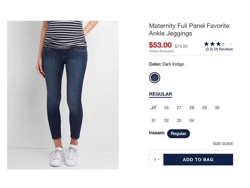
Product Page UX 2025: 15 Pitfalls and Best Practices
January 14, 2025 (Updated)Popular
2024 E-Commerce Product Finding: Expanded and Updated Research Findings
September 17, 2024
Always Copy the Active Autocomplete Suggestion to the Search Field (58% Don’t)
August 27, 2024
Checkout Optimization: 5 Ways to Minimize Form Fields in Checkout
June 26, 2024 Popular
B2B Electronics Sites: 2 High-Level Takeaways from 2,500+ Hours Testing
May 8, 2024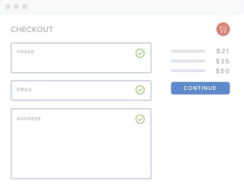
2024 E-Commerce Checkout: Expanded and Updated Checkout Research Findings
March 13, 2024
Usability Testing of Inline Form Validation: 31% Don’t Have It, 4% Get It Wrong
January 9, 2024 Popular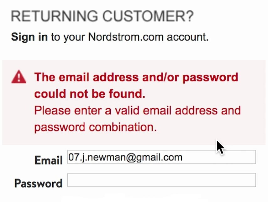
Improve Validation Errors with Adaptive Messages (98% Don’t)
December 14, 2023 Popular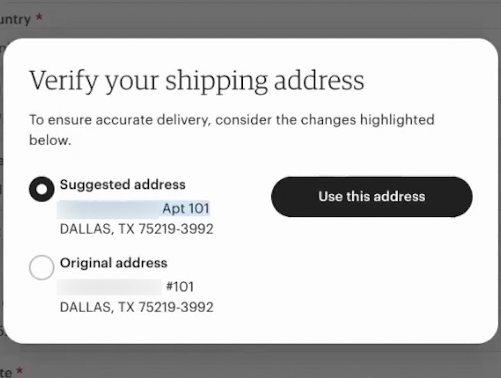
Have an Address Validator (47% Don’t)
November 28, 2023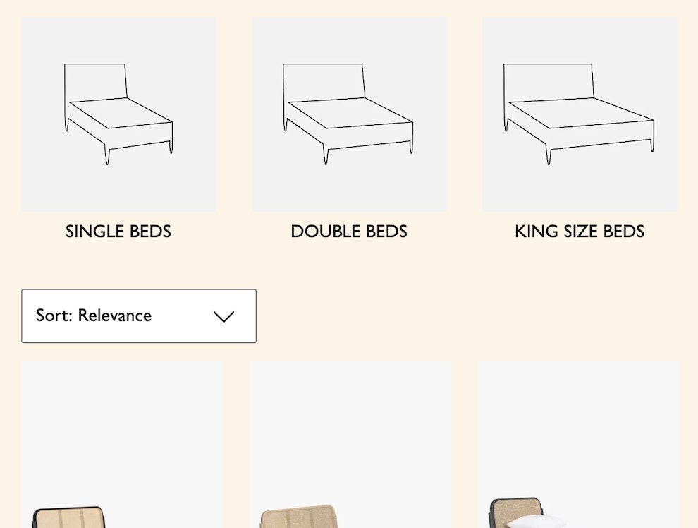
Consider Promoting Important Filters (61% Don’t)
November 21, 2023
Generalizability of UX E-Commerce Research
November 14, 2023
Form Field Usability: Avoid Extensive Multicolumn Layouts (16% Make This Form Usability Mistake)
October 31, 2023 Popular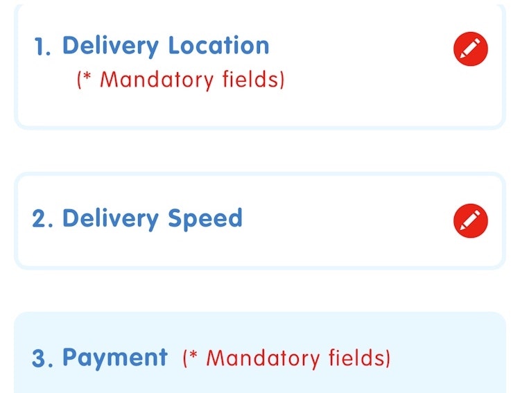
Always Collapse Completed Accordion Checkout Steps into Summaries
September 27, 2023 Popular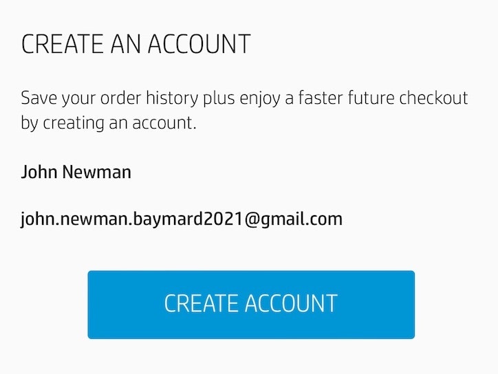
Save Account Creation for the Confirmation Step (42% Don’t)
September 19, 2023 Popular
Grocery UX: Dynamically Update the “Add to Cart” Button to a Quantity Selector after Item Added
September 12, 2023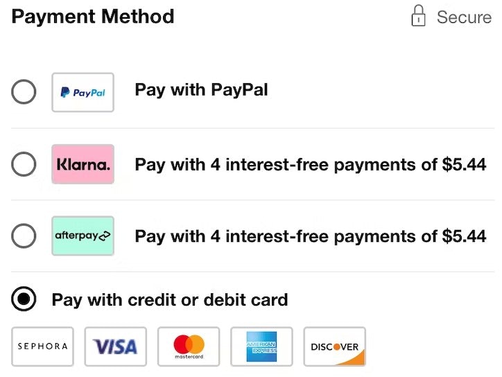
Payment Method UX: Designing Payment Selection
September 5, 2023 Popular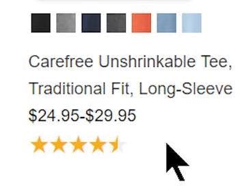
Always Show the Number of User Ratings in List Items (5% Don’t)
August 29, 2023
Make All Color Swatches Available in Mobile List Items for Visually Driven Product Types (57% Don’t)
August 8, 2023 Popular
Avoid “Quick Views” for Spec-Driven Product Types (21% Don’t)
August 1, 2023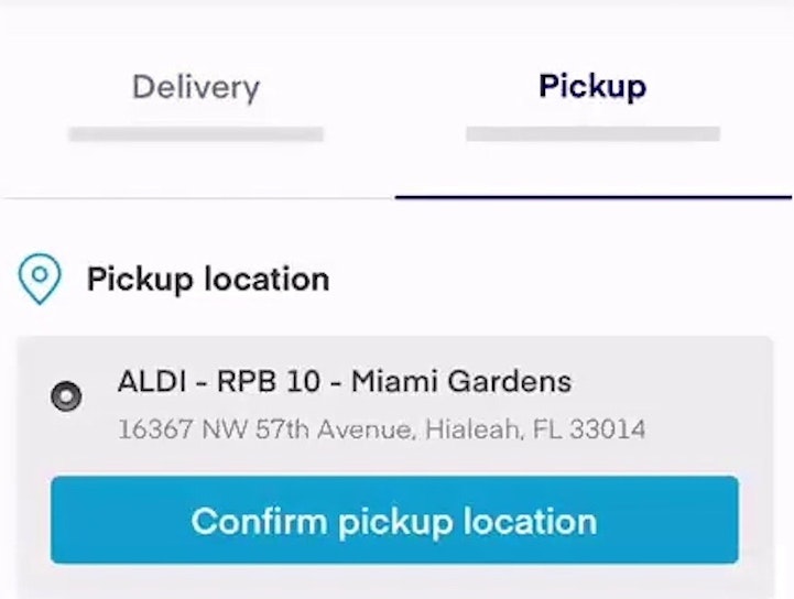
Include All Order-Fulfillment Options in the Fulfillment-Selector Interface (50% Don’t)
July 6, 2023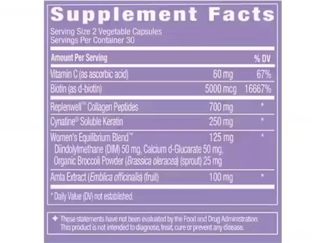
Always Provide a “Supplement Facts Label” Image in the Main Image Gallery of Vitamins & Supplements Sites
May 16, 2023
3 High-Level Takeaways from 1,800+ Hours Testing Vitamins & Supplements Sites
May 2, 2023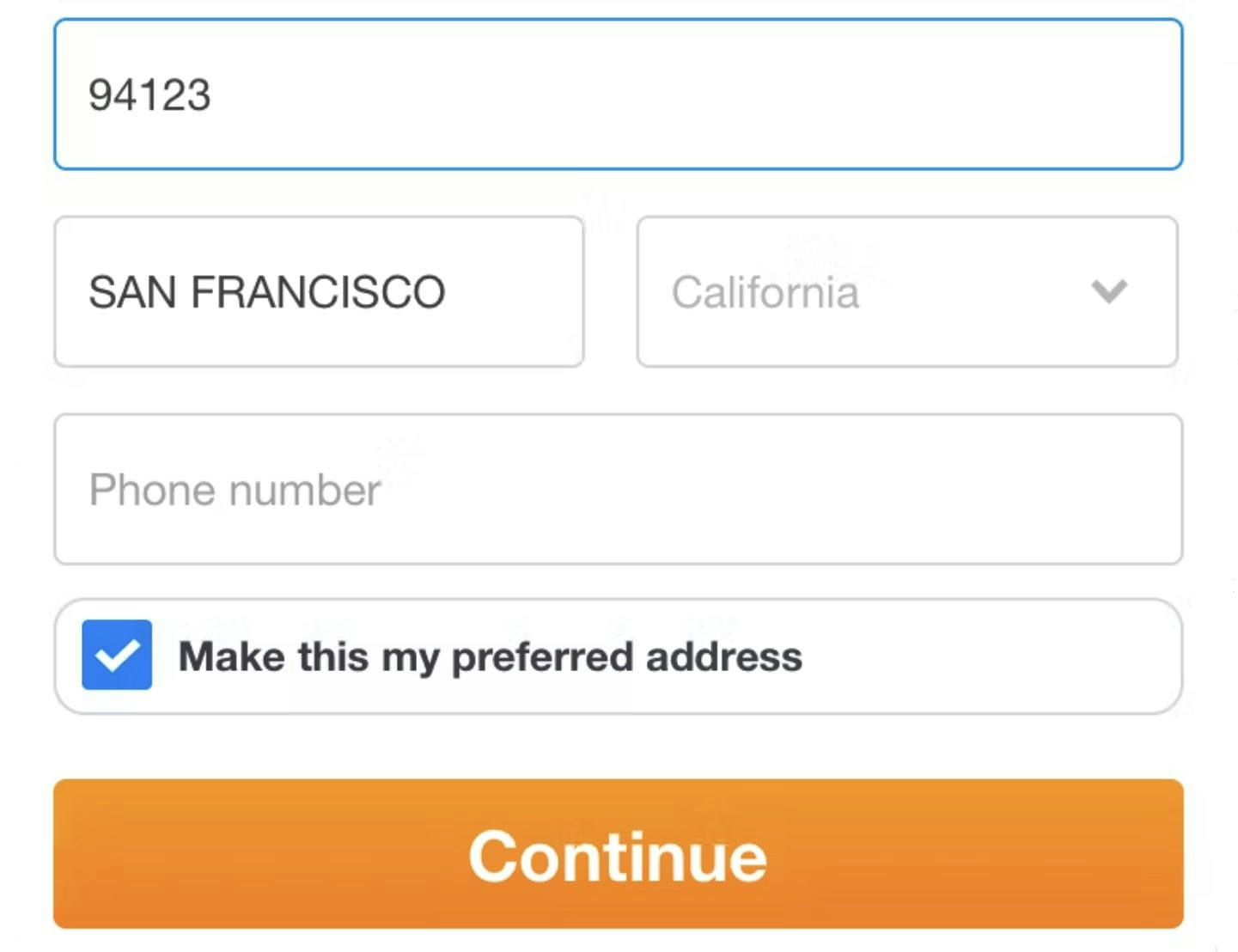
Checkout Usability: Autodetect “City” and “State” Inputs Based on the User’s Postal Code (28% of Mobile Sites Don’t)
April 11, 2023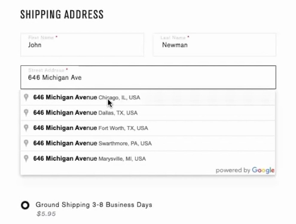
Provide a “Fully Automatic Address Lookup” Feature (55% Don’t)
March 24, 2023
Always Have a Map on the “Tour Details” Page Indicating the Departure or Meeting Point for the Tour
March 21, 2023
Consider Providing “Intermediary Category Pages” (13% Don’t)
March 7, 2023
Always Link to Third-Party Sources of Reviews, Aggregate Ratings, Awards, and Endorsements on Tours and Experiences Sites
February 22, 2023
3 High-Level Takeaways from 1,700 Hours Testing Travel Tours and Experience Booking Sites
February 7, 2023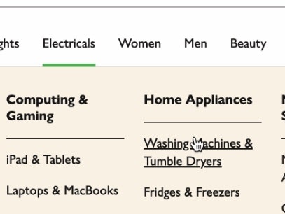
Provide a Hover Delay of 300–500 MS for Hover-Based Drop-Down Menus (60% Don’t)
January 31, 2023 Popular
Make Product Categories the Top-Level Navigation Items on Mobile Sites (33% Don’t)
January 24, 2023 Popular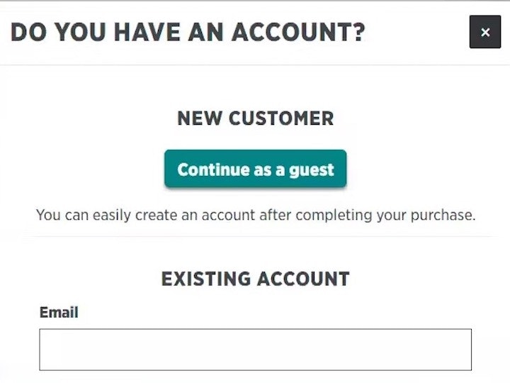
Make “Guest Checkout” the Most Prominent Option (47% Don’t)
January 17, 2023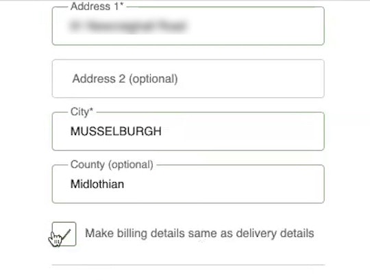
Use “Shipping Address” as “Billing Address” by Default (16% of Mobile Sites Have Implementation Issues)
January 10, 2023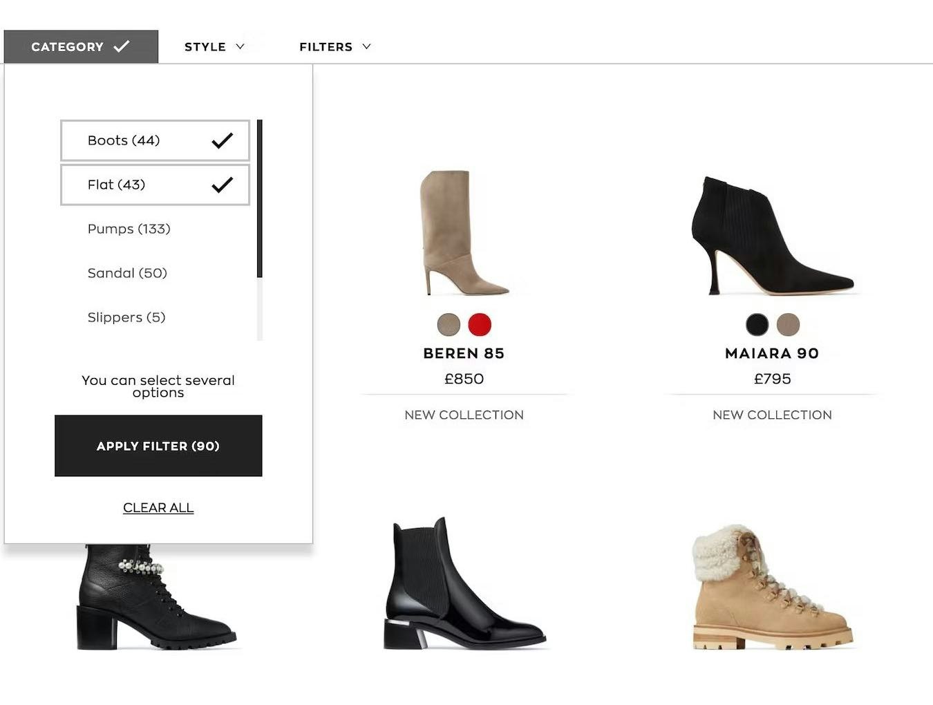
Overcategorization of the Product Catalog Can Lead to Abandonment (Yet 75% Get It Wrong)
January 3, 2023 Popular
Allow Users to Choose the Frequency of Newsletter Emails (80% Don’t)
December 13, 2022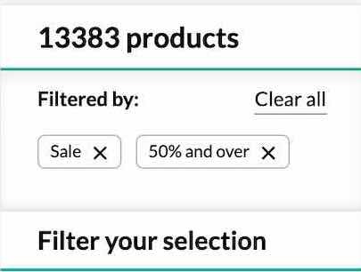
Consider Having a “Sales” or “Deals” Filter-Based Category (32% Don’t or Have Implementation Issues)
December 7, 2022
Avoid Unnecessarily Complex Password-Creation Requirements (82% Don’t)
November 29, 2022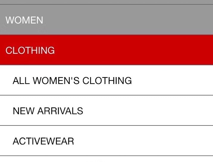
Have a “View All” Option in the Main Navigation at Each Level of the Mobile Product Catalog (Only 24% Get It Right)
November 16, 2022
Mobile Apps: New UX Benchmark with Over 3,700 Performance Scores and 2,800+ Best Practice Examples
November 9, 2022
E-Commerce Accessibility: Specifying UI Elements Using “Roles”
November 1, 2022
European Sites: Updated UX Benchmark with over 4,950 Performance Scores and 4,100+ Best Practice Examples
October 25, 2022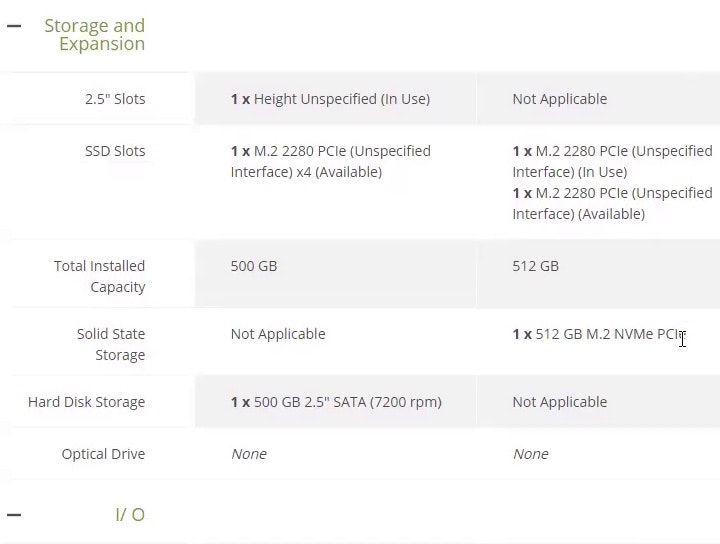
4 Ways to Optimize the Comparison Feature for Scanning
October 19, 2022 Popular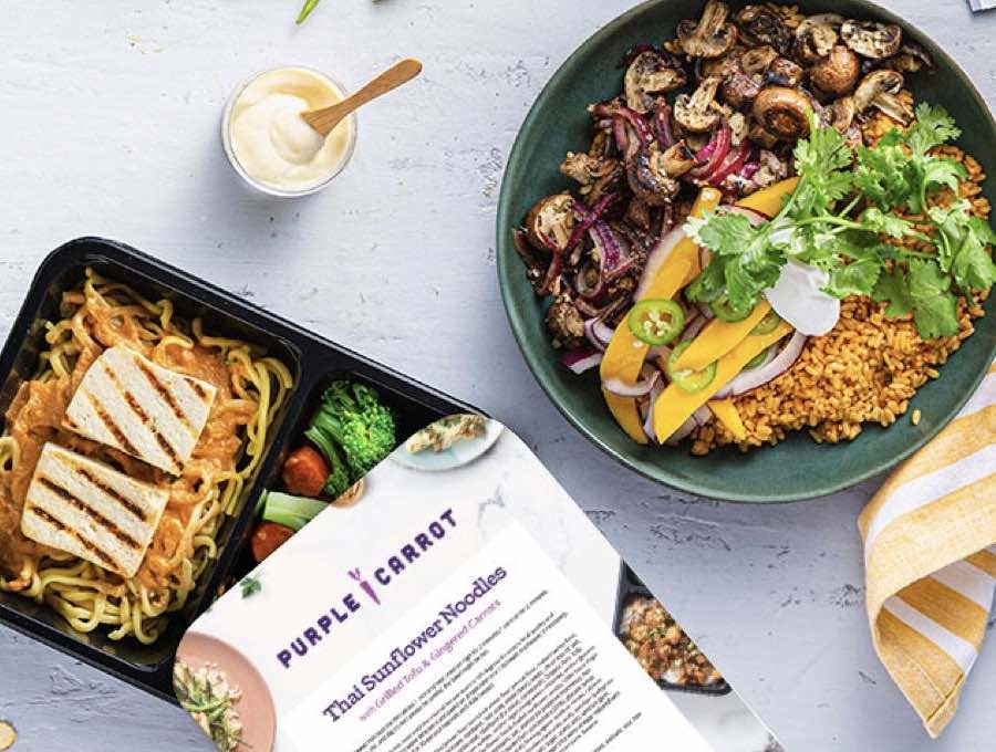
Meal Kit Sites: New UX Benchmark with over 3,300 Performance Scores and 2,200 Best Practice Examples
October 11, 2022
Form Usability: Getting ‘Address Line 2’ Right
October 4, 2022 Popular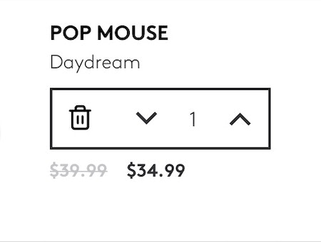
Use Buttons or Buttons Plus an Open Text Field for Updating Cart Quantity (61% Don’t)
September 20, 2022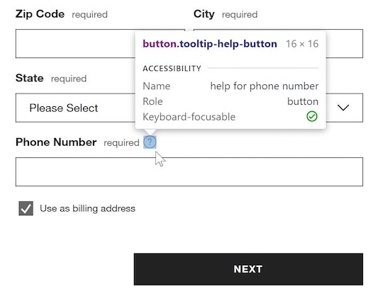
E-Commerce Accessibility: Specifying UI Elements Using “Names”
August 30, 2022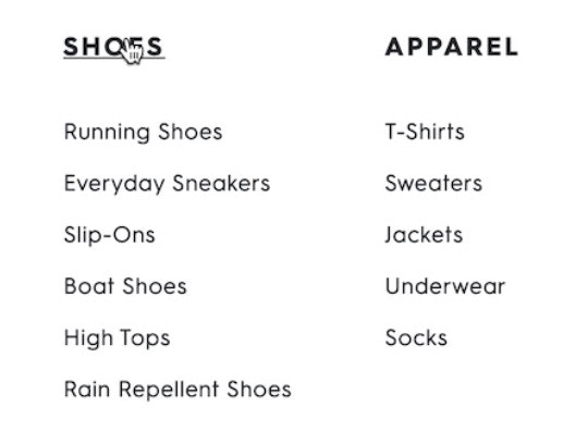
DTC UX: Avoid Intermediary Category Pages
August 23, 2022
Make the Travel Accommodations “Booking” Search Feature the Primary Content on the Homepage (25% Don’t)
August 16, 2022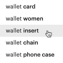
9 UX Best Practice Design Patterns for Autocomplete Suggestions (Only 19% Get Everything Right)
August 2, 2022 Popular
Accounts & Self-Service UX: Consider Having an “Icon-Based” Dashboard (81% Don’t)
July 21, 2022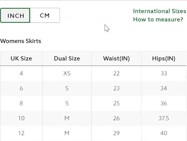
83% of Apparel Sites Don’t Provide Sufficient Sizing Information — 10 Best Practices on Sizing
July 6, 2022
35% of SaaS Sites Fail to Make the Service’s UI Sufficiently Prominent to Prospects
June 23, 2022
Consumables Subscription Service Sites: New UX Benchmark with over 3,000 Performance Scores and 2,300 Best Practice Examples
June 14, 2022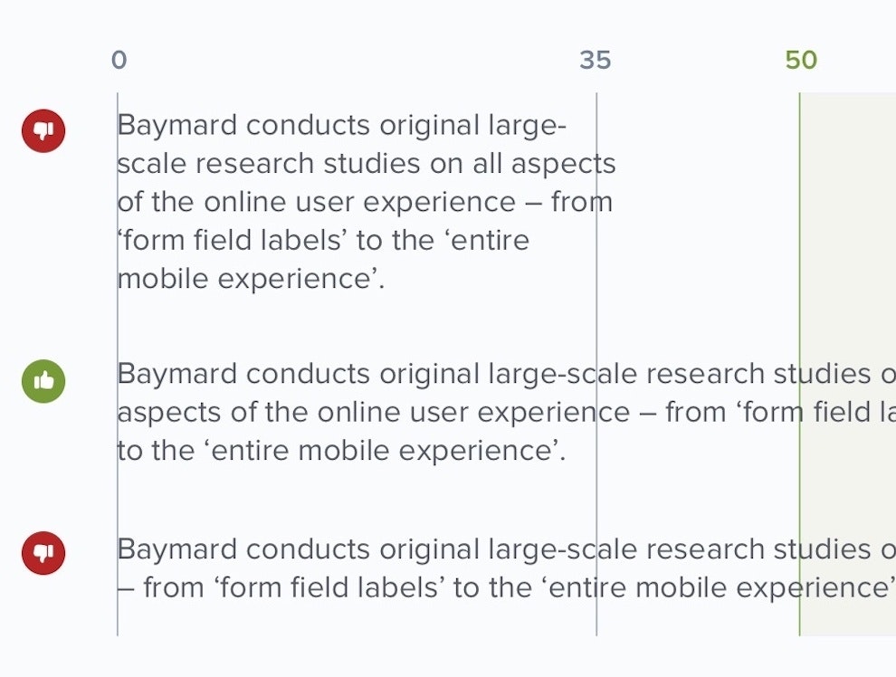
Readability: The Optimal Line Length
May 10, 2022 Popular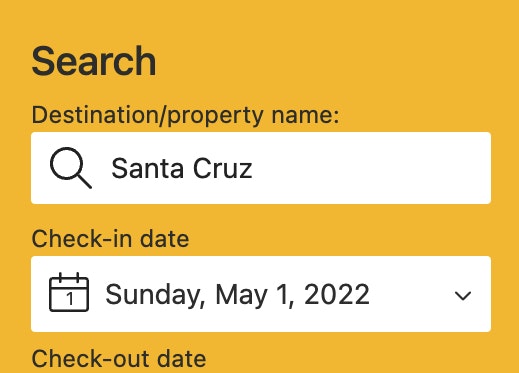
Baymard Update: New UX Benchmark for Travel Accommodations Websites (OTAs, Hotels, Vacation Rentals)
April 22, 2022
Consumables Subscription Services Site UX: Avoid This Major CTA Pitfall
April 19, 2022
3 UX Best Practices for Consumables Subscription Services Websites — Based on 1,200+ Hours of UX Testing
April 12, 2022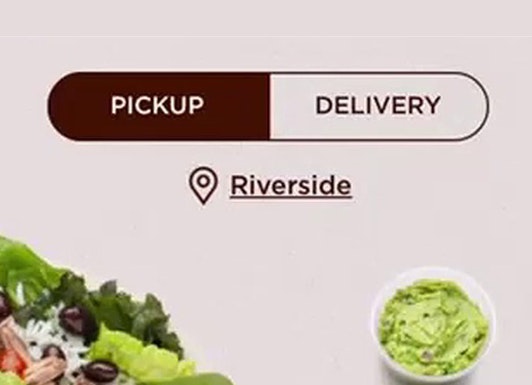
3 High-Level UX Takeaways from 1100+ Hours of Testing Leading Food Delivery and Takeout Sites
March 29, 2022
3 High-Level UX Takeaways from 950+ Hours of Testing Leading Meal Kits Sites
March 1, 2022
Travel Accommodations UX: 3 High-Level UX Takeaways from 992 Hours of Testing Leading Travel Accommodations Sites
February 1, 2022
Online Grocery UX: 5 High-Level UX Takeaways from 1,100 Hours of Testing Leading Grocery Websites
January 11, 2022
Offer Relevant Autocomplete Suggestions for Closely Misspelled Search Terms and Queries (69% Don’t)
August 31, 2021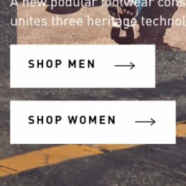
Always Provide the Full Scope for Links on Mobile Homepages (58% Don’t)
August 3, 2021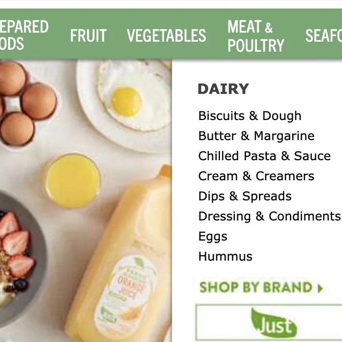
12 Common UX Pitfalls ‘Online Grocery’ E-Commerce Sites Suffer From
July 20, 2021
15 Common UX Pitfalls Luxury Retail E-Commerce Sites Suffer From
June 8, 2021
New Research Study on Direct-to-Consumer UX
May 25, 2021
New Research Study on “Digital Subscriptions” (SaaS) UX
May 11, 2021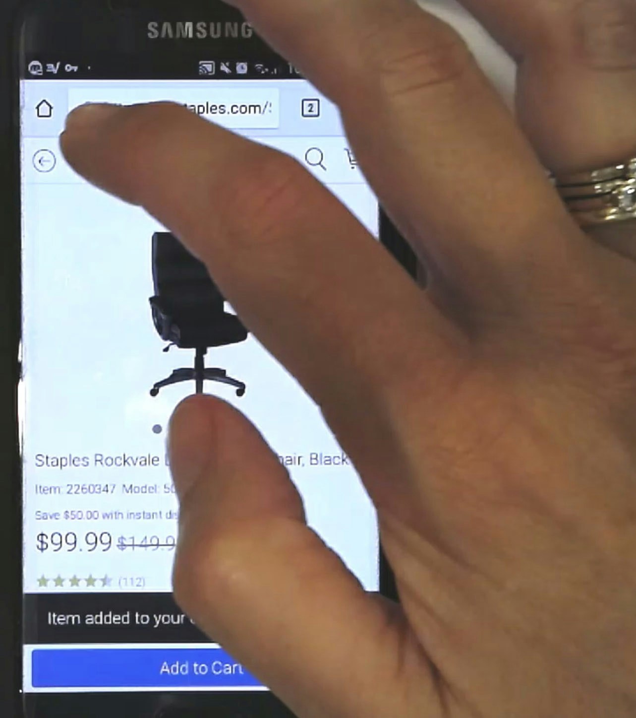
Understanding Mobile E-Commerce UX: 5 Overarching Issues
January 26, 2021 Popular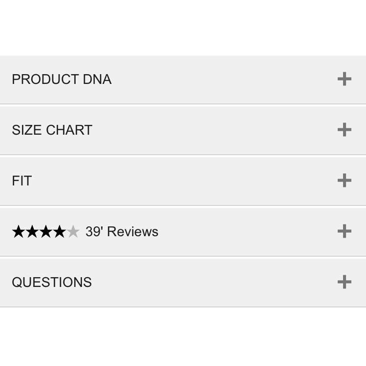
Mobile UX: Avoid Using Subpages within the Product Details Page (26% Don’t)
November 2, 2020 Popular
6 Important Aspects of Well-Performing Mobile Product Page Breadcrumbs
September 21, 2020 Popular
Allow Users to Upload Images with Their Review (34% of Sites Don’t)
August 4, 2020
Six ‘COVID-19’ Related E-Commerce UX Improvements to Make
May 5, 2020 Popular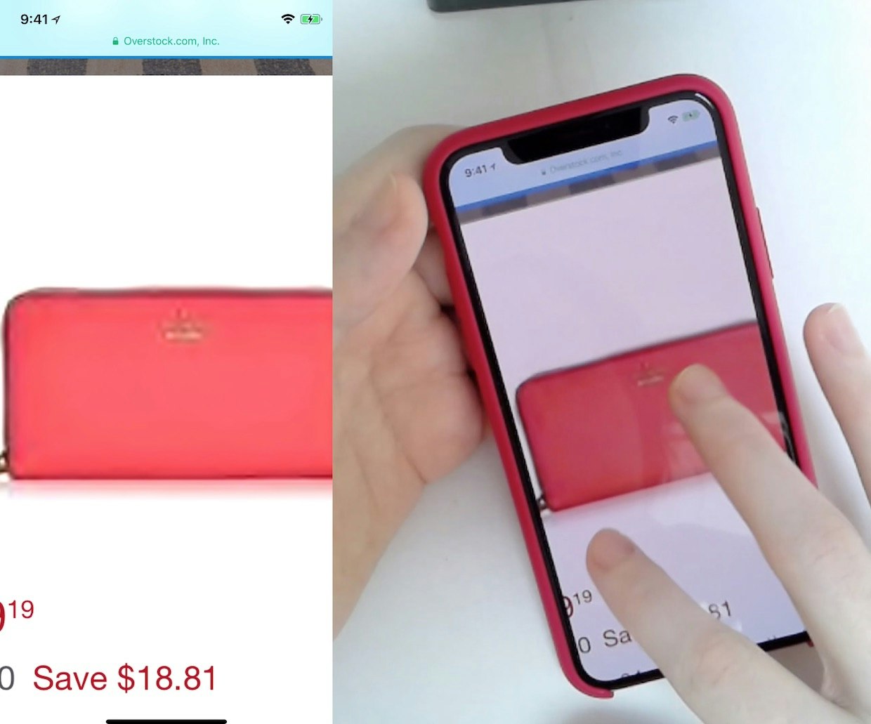
25% of E-Commerce Sites Don’t Have Product Images with Sufficient Resolution or Level of Zoom
April 2, 2020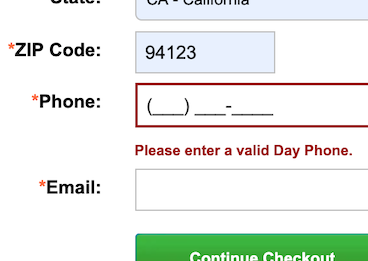
Phone Number UX: Always Explain Why the ‘Phone Field’ Is Required
March 16, 2020 Popular
Filter List Design: Have Filters for All Displayed List Item Info (38% Don’t)
September 17, 2019
Mobile E-Commerce UX: Deemphasize ‘Install App’ Ads or Avoid Them Entirely
August 20, 2019 Popular
5 ‘Order Review’ UX Implementations That Make Office Depot Best-in-Class
July 15, 2019 Popular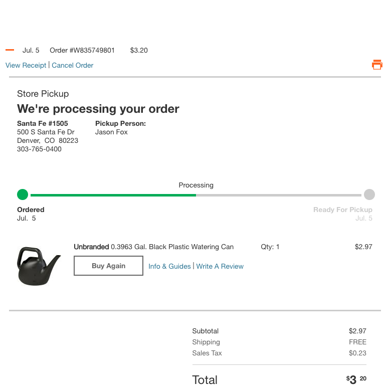
Self-Service UX: Integrate All Order Tracking Info and Events Within the E-Commerce Site Itself (56% Don’t)
April 2, 2019 Popular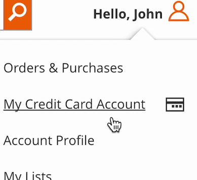
Self-Service UX: Distinguish Primary from Secondary Paths in the ‘My Account’ Drop-Down (71% Don’t)
March 20, 2019 Popular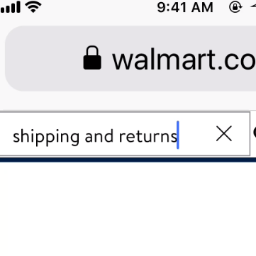
E-Commerce Search Needs to Support Users’ Non-Product Search Queries (15% Don’t)
March 5, 2019
PDP UX: Provide an ‘Included Accessories’ Image and Clarify That Optional Accessories Are Extra (44% Don’t)
February 19, 2019
Product Page UX: Include Descriptive Text or Graphics for Some Product Images (52% Don’t)
November 28, 2018
PDP UX: Core Product Content Is Overlooked in ‘Horizontal Tabs’ Layouts (Yet 28% of Sites Have This Layout)
October 17, 2018 Popular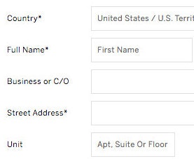
E-Commerce Checkouts Need to Mark Both Required Fields and Optional Fields Explicitly (Only 14% Do So)
October 2, 2018 Popular
Self-Service UX: Promote In-Store Returns Alongside Mailed Return Options
August 21, 2018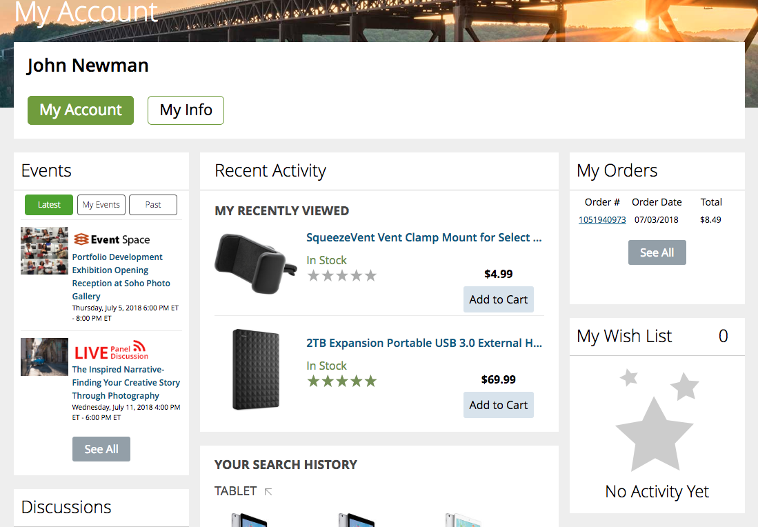
Dashboard Design: Dashboard Cards Must Be Highly Consistent and Appropriately Styled
August 8, 2018 Popular
New Research Findings on ‘Accounts & Self-Service’ UX
July 9, 2018
Mobile Web: Scale Product Images Proportionally in Mobile Landscape Mode (52% of Sites Don’t)
May 22, 2018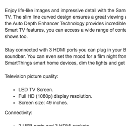
Structuring Product Page Descriptions by ‘Highlights’ Increases User Engagement (Yet 78% of Sites Don’t)
April 24, 2018 Popular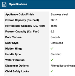
Product Spec Sheets: 4 Ways to Make Spec Sheets More Scannable for Users (50% of Sites Get It Wrong)
March 27, 2018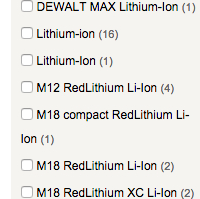
E-Commerce UX: Post-Process Vendor-Supplied Product Data (52% Don’t)
March 6, 2018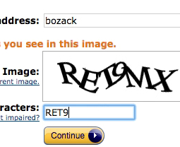
CAPTCHAs Have an 8% Failure Rate, and 29% if Case Sensitive
January 18, 2018
Consider Using Localized Input Masks for ‘Phone’ and Other Restricted Inputs (64% Aren’t Taking Advantage of Input Masking)
November 28, 2017 Popular
7 Product Page UX Implementations that Make REI Best-in-Class
October 18, 2017 Popular
Product Pages: ‘Free Shipping’ Should Not Only Be in a Site-Wide Banner (32% Get It Wrong)
August 22, 2017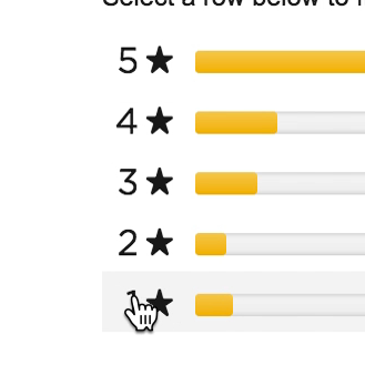
Ratings Design UX Research: 5 Requirements for the ‘Ratings Distribution Summary’ (65% of Sites Get it Wrong)
August 8, 2017 Popular
Allow Users to Purchase Temporarily ‘Out of Stock’ Products by Increasing the Delivery Time (68% Don’t)
July 18, 2017 Popular
