“Install App” ads — which ask mobile website users to install the site’s application on their mobile device — are quite common on mobile e-commerce sites, with 53% of sites during testing displaying one.
Indeed, it’s entirely understandable that e-commerce sites that have apps would want to promote them while users are on their website.
Yet our newest round of large-scale mobile e-commerce usability testing reveals severe and disruptive issues caused by these “Install App” ads. These include:
- “Install App” blocking the view for critical site content (e.g., blocking an “Add to Cart” button),
- “Install App” appearing multiple times even after users have dismissed it, or
- “Install App” narrowing the viewport when users choose to ignore it, leaving them with a reduced view of the main page content.
These issues make it clear that having an ad for “Install App” has a high cost in terms of causing an often severe negative impact on users’ product-browsing and -purchasing experience on the mobile website. During our testing “Install App” banners were the direct and sole cause of several abandonments of some of the world’s largest e-commerce websites.
In this article, we’ll discuss the test findings from our latest mobile usability study related to “Install App” ads. In particular, we’ll discuss:
- Severe usability issues caused by “Install App” ads
- 3 ways issues caused by “Install App” ads can be minimized
- Carefully weigh the benefits vs. drawbacks to showing ‘Install App’ ads
Observed Issues Caused by ‘Install App’
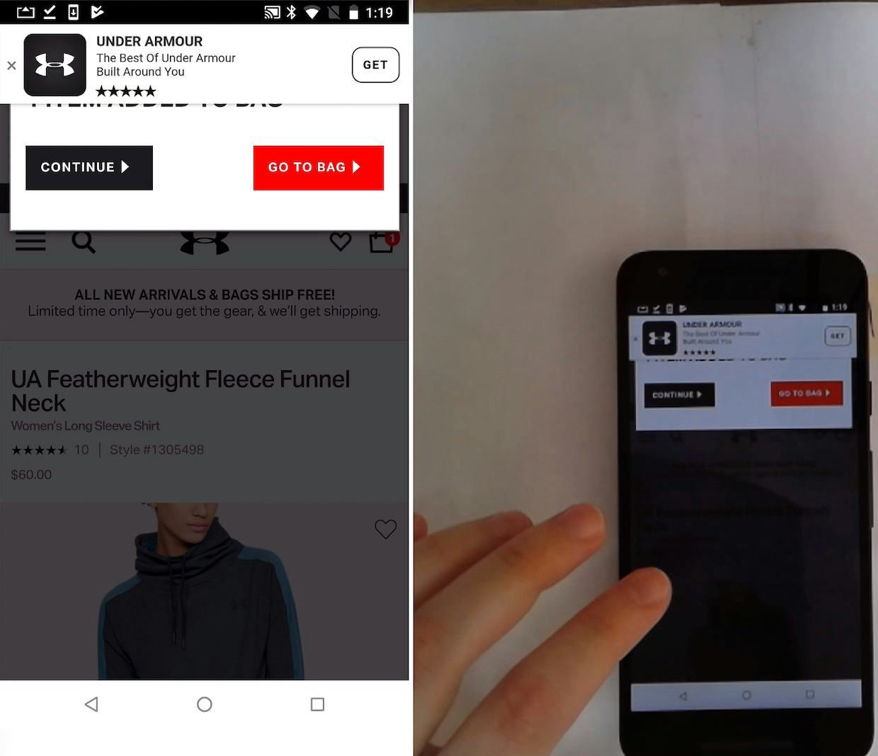
In testing, the most severe outcome of having the “Install App” ad displayed was when it covered critical site elements — for example, the “Add to Cart” button. As one user said, “‘Add to Basket’ was underneath the little flash pop-up thing. Yeah, that’s stupid [laughs]. That annoyed me.”
With the “Install App” ad displayed, some users won’t be able to add products to their cart without first dismissing the ad — which testing revealed not all users will think to do. Consequently, in some cases the “Install App” ad will be a direct cause of abandonments.
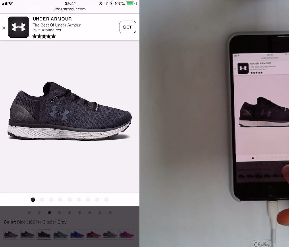
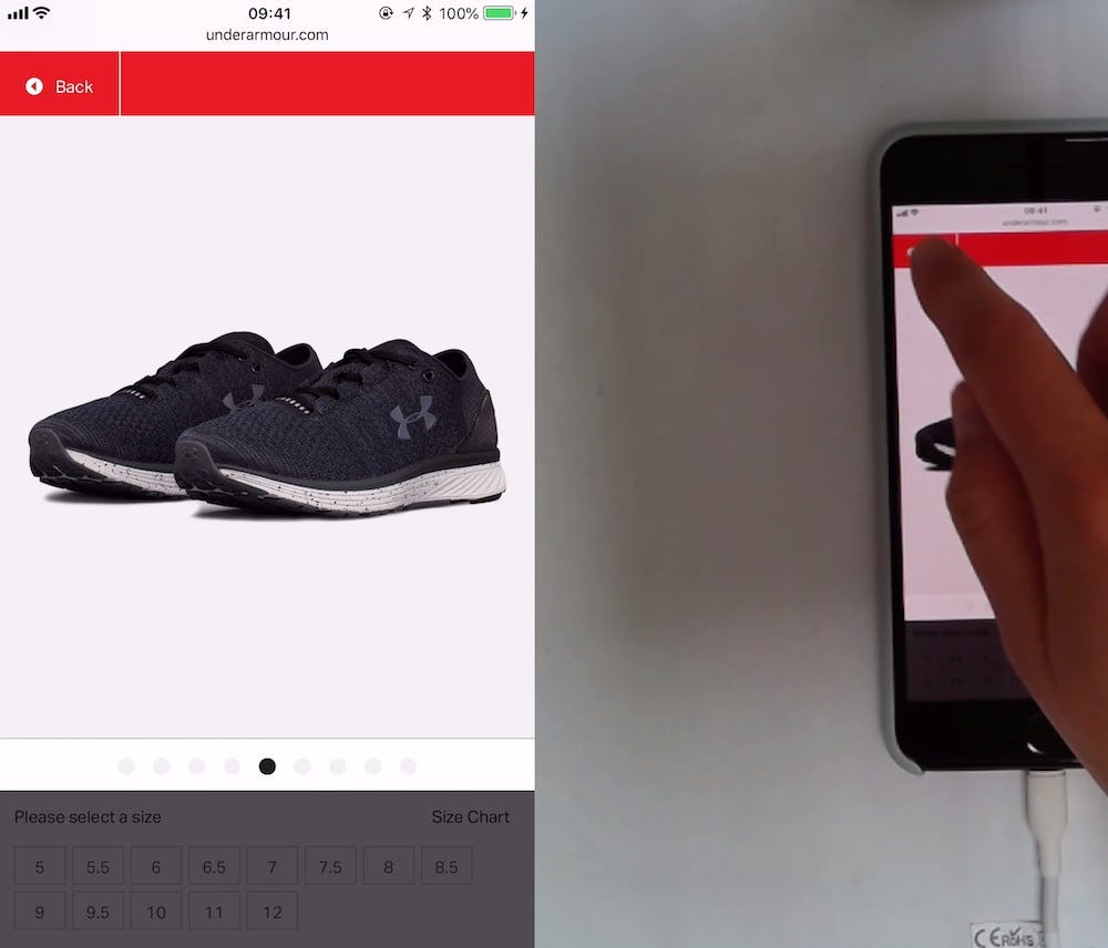
“I don’t know how to get out of this…Oh there”. A user at Under Armour was viewing images of shoes in an image gallery overlay. When she was finished she wanted to return to the product page but couldn’t figure out how to exit the overlay. She first tried tapping the page behind the overlay but nothing happened (first image). Stumped, she wasn’t sure what to do, before she finally noticed and closed the “Install App” ad, which revealed a “Back” link to exit the overlay (second image).
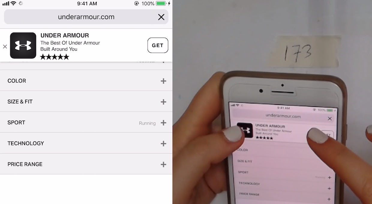
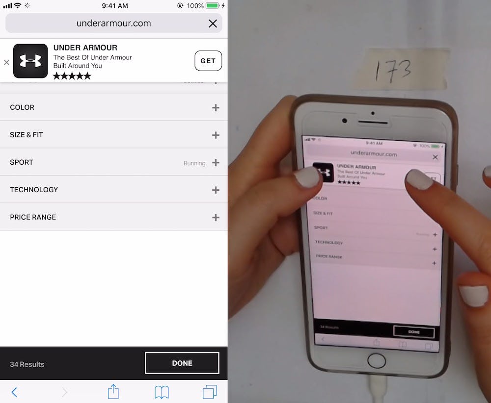
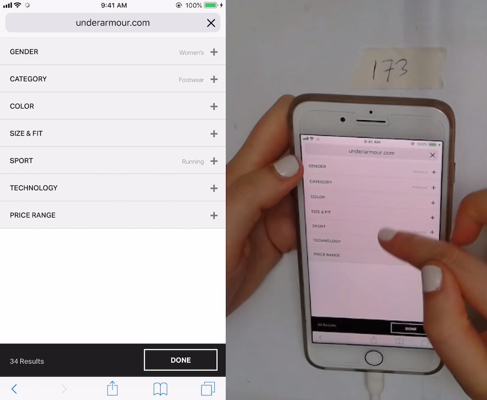
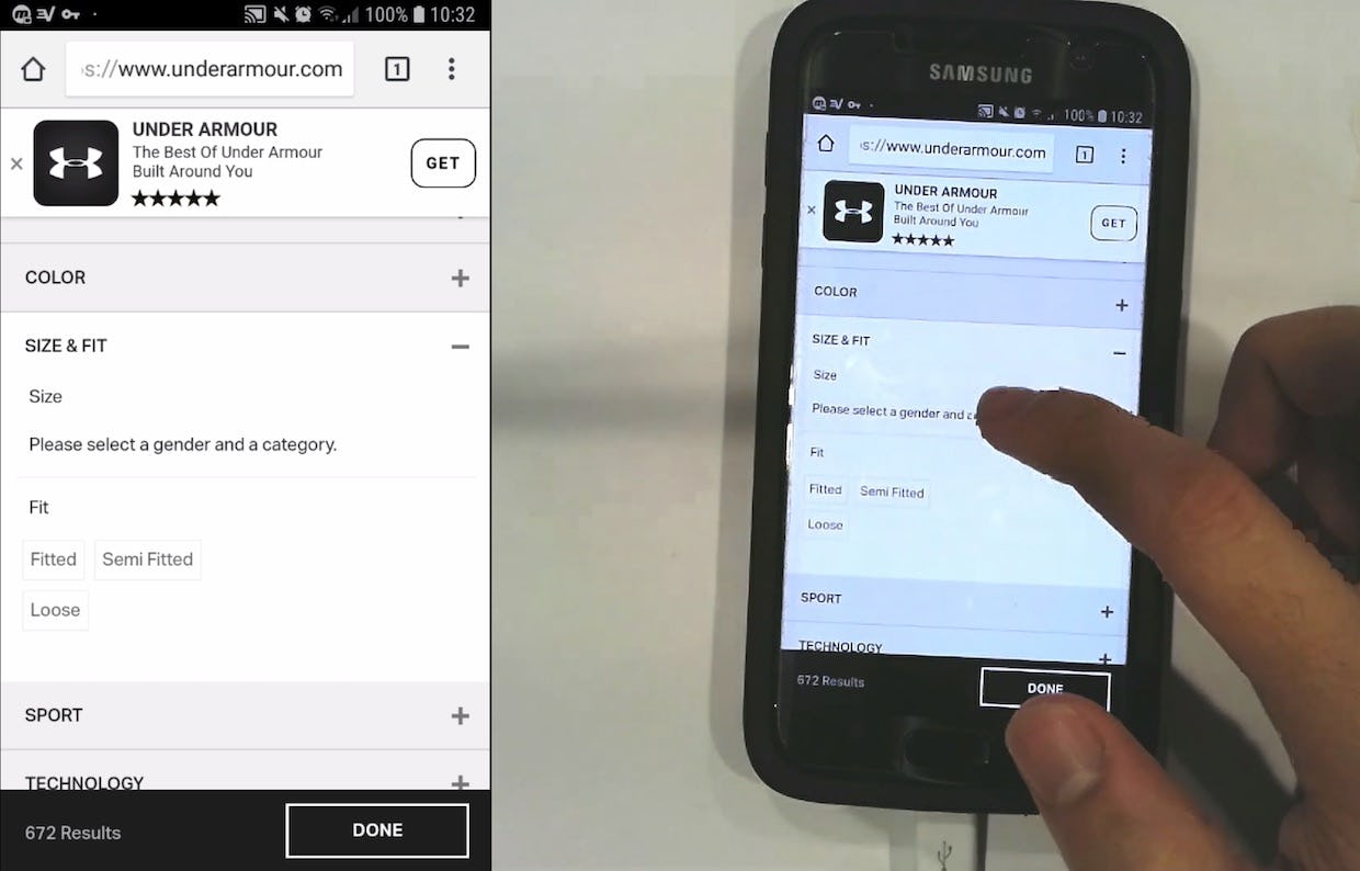
At Under Armour, the “Install App” ad blocks critical product filters (“Gender” and “Category”; first image) until another user dismisses the ad (second image).
“Is there a way I can find it for “Men” and not “Youth”? None of them are clickable. It doesn’t seem like I’ve got size options. There should be something underneath “Size” that I can click…I don’t know what to do.” A different user at Under Armour never thinks to dismiss the “Install App” ad — consequently, he never discovers the filters for “Gender” and “Category”, which were required selections in order to see “Size” filters. He ended up with an overly broad product list that was difficult to navigate.
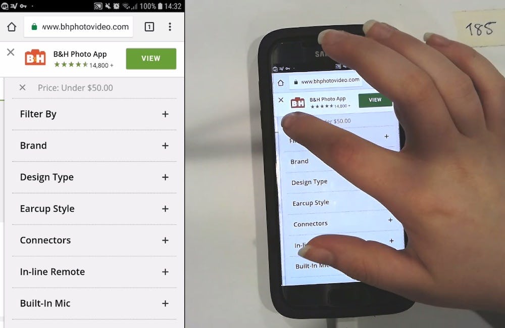
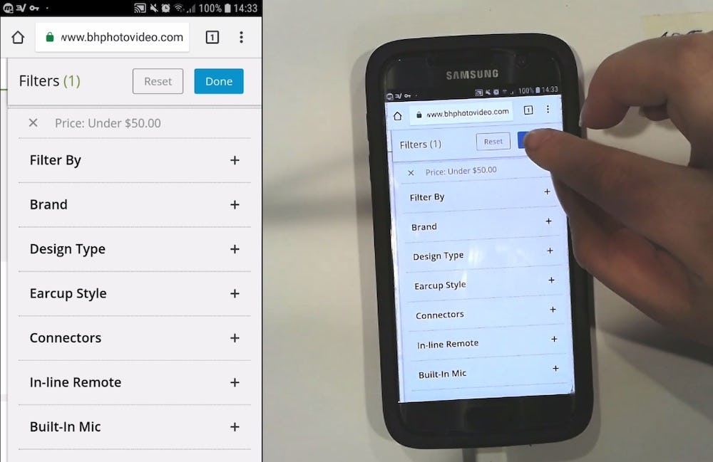
At B&H Photo, the “Install App” ad covers the “Done” button to apply filters. This user initially exited the filter interface and was confused when his filter changes weren’t applied. He reentered the filter interface, dismissed the app ad, then noticed the “Done” button to apply his filtering choices.
Covering the “Add to Cart” button is obviously a severe issue, but other instances of the “Install App” ad covering crucial content were uncovered as well during testing. For example, the “Install App” ad covering buttons or links needed to exit interfaces or apply selections (such as filters).
These instances, while less severe than when the “Install App” ad covers the “Add to Cart” button, are also quite disruptive for users, as they begin to feel lost and no longer in control of the interface.
Furthermore, some users will never think to dismiss the ad and, consequently, will never find whatever the ad is covering (e.g., crucial filter types). Other users may go back-and-forth between different interfaces as they try to figure out why their selections aren’t being applied (e.g., when the “Install App” ad is covering the “Done” button in filtering interfaces), before finally thinking to dismiss the ad.
Indeed, the “Install App” ad is, for many users, an example of “banner blindness”, where despite its prominence it is ignored. Users missing banner ads for promoted products is one thing, but missing crucial site elements and features because an “Install App” ad is covering them is a much more harmful case of banner blindness.
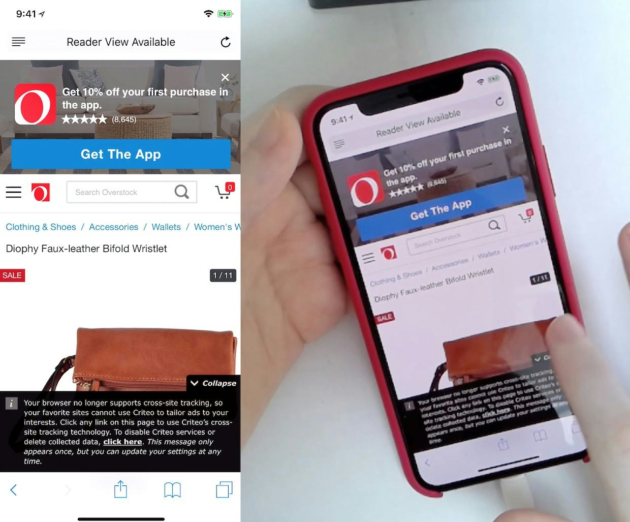
At Overstock a custom “Install App” ad, combined with a tracking privacy notice, severely limits the actual page content a user is able to see (despite using a tall iPhone XS). Even when “Install App” ads aren’t covering crucial site content they limit a user’s viewport — and therefore hinder the product-browsing experience.
In addition to covering site content, “Install App” ads were also observed in testing to severely limit users’ ability to view main page content.
On mobile, screen real estate is already at a premium, and small viewports are simply a fact of life.
However, making the effective viewport even smaller by showing an “Install App” ad — which, again, not all users will actually dismiss right away — makes it even more difficult to browse and evaluate products. This is especially true when the app ads are combined with privacy notices and other nonproduct-related content, which combined may reduce a user’s ability to see actual page content by 50% or more.
Additionally, it’s worth noting that issues were caused in testing both by the native “Smart App Banners” and custom-designed “Install App” banners.
Now, an obvious solution to the issues caused by the “Install App” ad is not to display one at all to users. In fact, 47% of sites during testing didn’t show an “Install App” ad when users were browsing the sites.
If opting not to display the “Install App” ad at all on the site due to potential usability issues, consider other, less-distracting ways the app can be promoted to users. For example, displaying the ad only on the order confirmation page (after users have placed an order) or including links in marketing emails and newsletters.
Adopting a more subtle approach may allow sites to straddle the line between disrupting users and promoting their app: ensuring that users are allowed to browse free of issues caused by the “Install App” ad while satisfying business interests to promote the app to users.
Three Ways to Minimize Issues Caused by ‘Install App’
While we advise great caution before using “Install App” ads, if it’s deemed that the business case is sufficient for disrupting website users with “Install App” ads then consider the following 3 implementation details, which we observed can greatly impact the cost / benefit ratio.
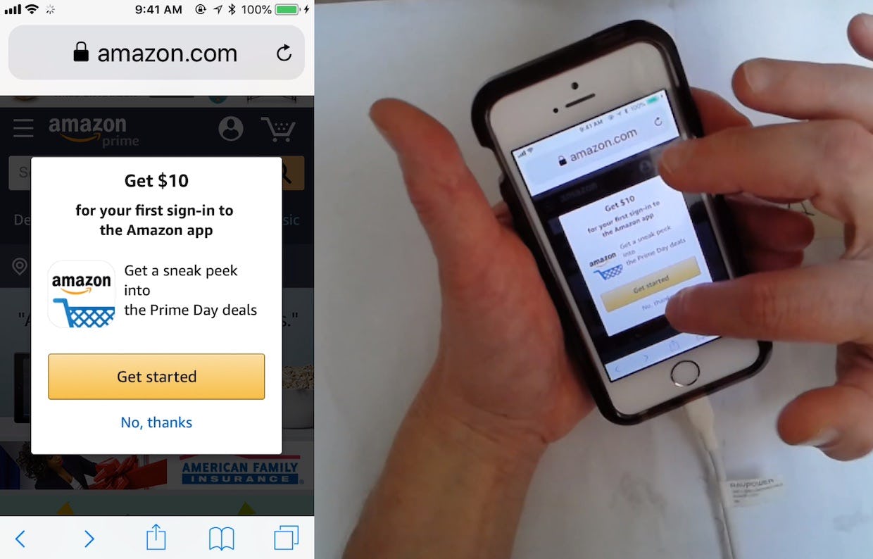
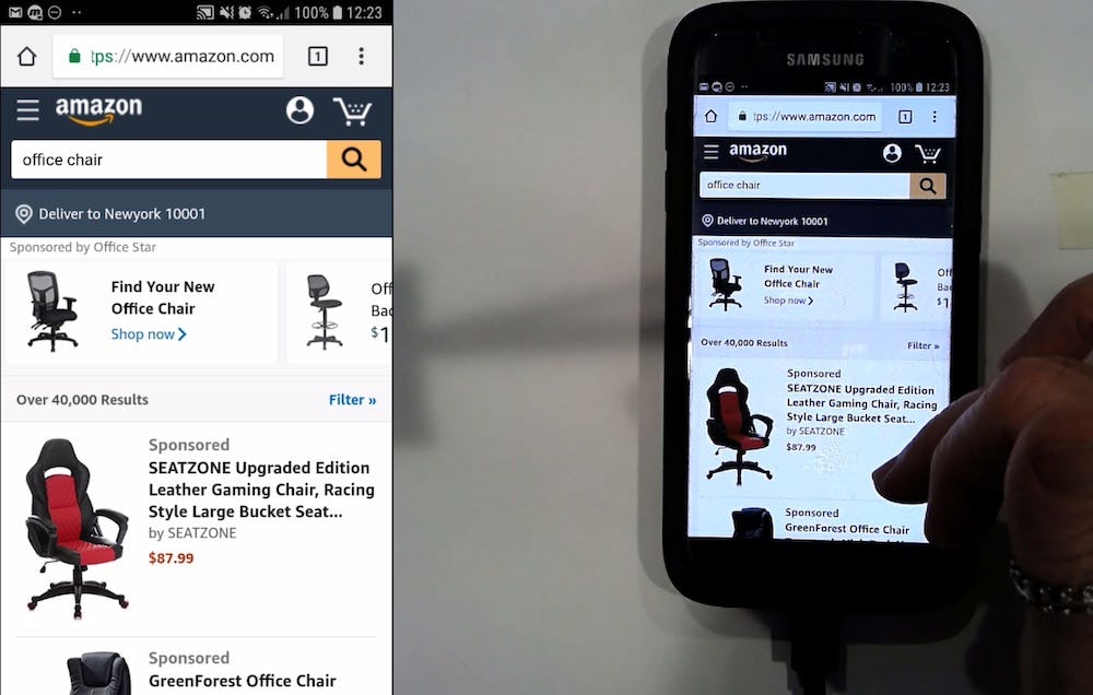
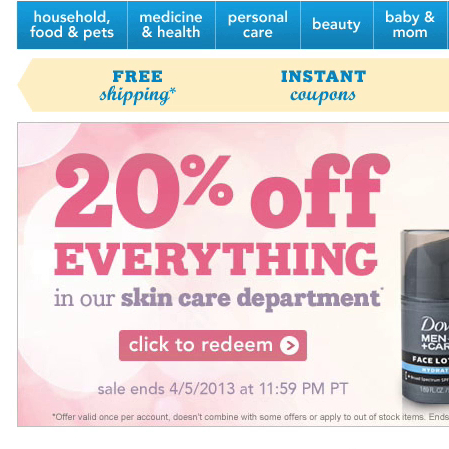
1) Incentivize users to install the app. While showing an overlay immediately on page load is disruptive, at least Amazon offers users an incentive to download their app.
1) Incentivize users to install the app. If the business case is strong enough to accept losing some mobile website users due to the “Install App” ad, then consider at least incentivizing users to download the app from the site. Offering users “10% off your first order” or “Get $10 to use after installing the app” may get more users to actually install the app on their device, and therefore may offset to some extent the users lost due to usability issues caused by the “Install App” ad on the website.
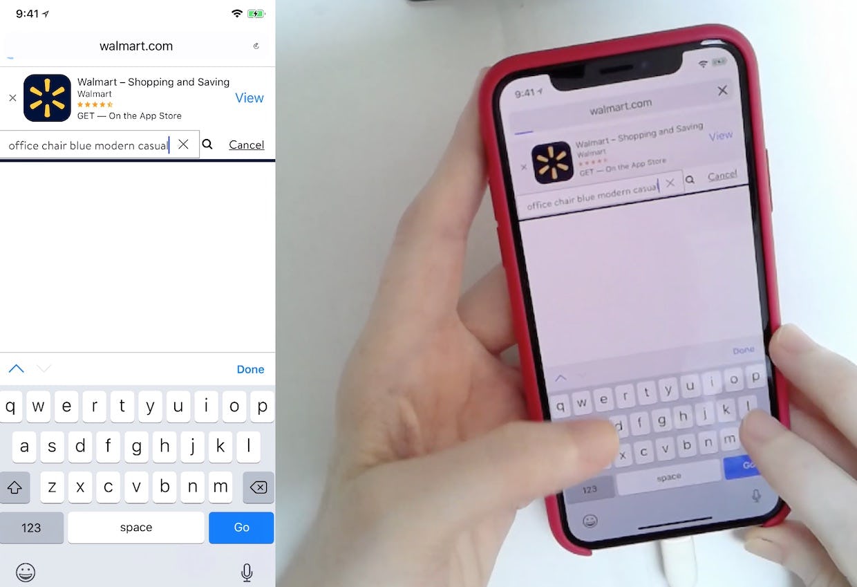
2) Don’t permanently display the ad. At Walmart an “Install App” ad persists despite this user having been on Walmart for several minutes. This is disruptive to the product-browsing experience. Additionally, it’s likely that few users will decide to download an app when they’re already minutes into their browsing on the mobile website.
2) Don’t permanently display the ad. If an “Install App” ad must be displayed, it should be removed once users have navigated to a new page on the site or have been on the same page for a certain amount of time. Once users have been on the site awhile, or have navigated to new pages, the benefit of showing the “Install App” ad decreases, while the potential to distract users is constant or increases.
As mentioned above, “Install App” ads were observed during testing to suffer from banner blindness, where some users simply ignored them. For these users, the end result will be that they’ll have a much more limited view of the main site content for the duration of their time on the site, if the ad is permanently displayed. Furthermore, these users will potentially never see some critical site elements that are hidden by the “Install App” ad.
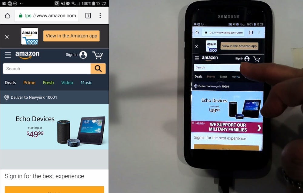
3) Show the ad only on certain pages. At Amazon, the “Install App” ad was automatically removed once this user moved from the homepage (first image) to viewing search results (second image) — greatly reducing how potentially distracting the ad is to users.
3) Show the ad only on certain pages. Showing the ad only on certain pages — for example, only on the homepage — also will limit the damage to users’ browsing experience by removing the ad from potentially problematic areas (e.g., product lists, product pages, or search results).
Additionally, limiting where the ad is shown will allow potential issues that the ad may be causing to be better monitored (e.g., overlaying important site elements or content). Conversely, displaying the ad universally throughout the site makes it nearly impossible to control adverse effects that are caused by the ad.
Carefully Weigh the Benefits vs. Drawbacks to Showing ‘Install App’ Ads
The “Install App” ad partially covers the “Added to Cart” overlay for another user at Under Armour.
Sites that choose to display “Install App” ads are clearly hoping users will download the app and then use it on their mobile device to make purchases, rather than going to the mobile website. The reasoning likely is that users using the app are likely to be more frequent and loyal customers.
However, as illustrated above, displaying an “Install App” ad to users isn’t a “freebie” and, depending on the implementation, will either directly or indirectly lead to mobile website abandonments (e.g., if users are unable to find the “Add to Cart” button or if it’s more difficult to find products using filters).
Sites should weigh these costs carefully against the benefit of having a minority of users actually install the app on their device, and then also use it instead of the website.
If “Install App” ads must be displayed to users, then be sure to minimize the disruption for users, by:
1) users are incentivized to download the app,
2) ads are temporary, and
3) ads are only displayed on a select few pages
This article presents the research findings from just 1 of the 650+ UX guidelines in Baymard – get full access to learn how to create a “State of the Art” ecommerce user experience.

