B2B Ecommerce UX Research
What are the top 40 UX improvements for your Business-to-Business (B2B) site? How does your UX performance compare to leading sites within your B2B industry?
Empower your digital team with instant access to B2B-specific UX insights. Improve ROI on your UX projects and increase confidence in UX decisions with access to 150,000+ hours of UX research that covers every question and UI Component for your B2B ecommerce site.
At Baymard Institute, we have a whole research topic devoted to online shopping UX and usability, specifically Business-to-Business sites selling products through a B2B ecommerce website.
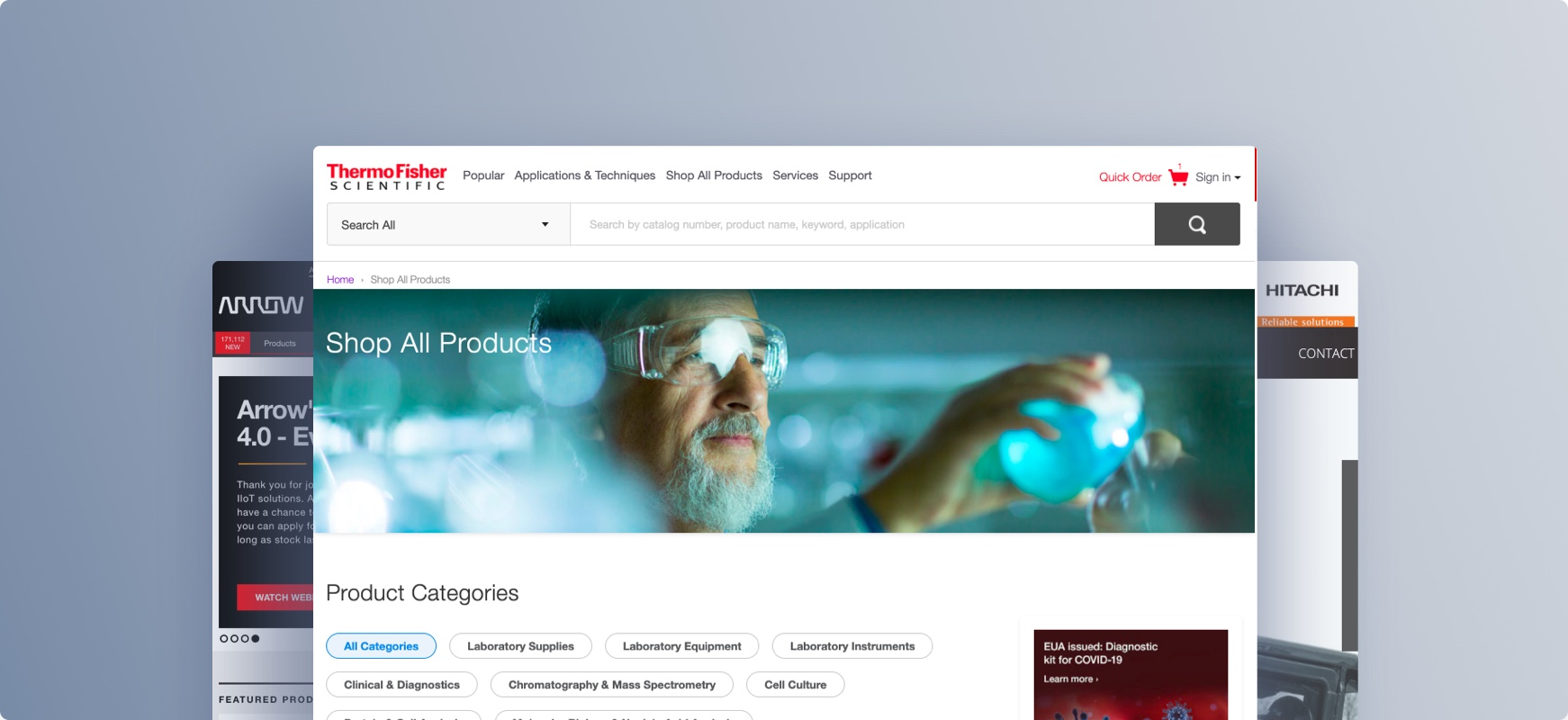
Our research includes large-scale usability testing of more than 25 B2B sites across industries such as B2B Electronic Components, Machinery, Office, Pharma, Life Sciences, and Construction such as Arrow, Thermo Fischer, Staples, Grainger, and more (see all B2B sites tested and benchmarked).
Note we have dedicated research studies for B2B Electronic Components & Machinery and B2B Medical & Pharma.
Baymard’s UX research is used by 29,000+ UX professionals in organizations like:


“I’m reviewing the report this morning and I am delighted. The recommendations are detailed and our resulting actions are clear. I’m excited to share this with the rest of the team!”
Leverage Large-Scale Research for Better Decision-Making
Empower your team with a vast library of large-scale research insights to inform and support your design decisions, advance your projects, and transform opinion-based discussions into evidence-driven outcomes.

Business-to-Business
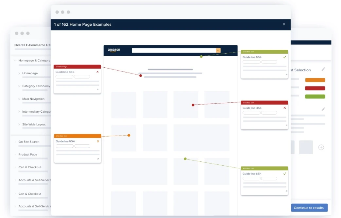
Baymard’s UX research provides you with 270+ UX guidelines for B2B ecommerce sites, along with 9,000+ UX performance scores and 4,600+ best practice examples from B2B ecommerce sites.
The research includes large-scale usability testing and UX benchmarking of B2B sites such as: B2B Electronic Components & Machinery: Analog Devices, Microchip Technology, Microchip Direct, STMicroelectronics, eStore, TDK Corporation, TE Connectivity, CoreStaff, Farnell/Newark/element 14, Future Electronics, RS Components, DigiKey, Avnet, Mouser, TTI, Schneider Electric, Norgren, Maxon, MSC Direct, Hitachi, Arrow, Bossard, and Fastenal. B2B Medical & Pharma: McKesson, Medline, Henry Schein, Sigma Aldrich, Waters, Abcam, Allegro Medical, Bound Tree Medical, Thermo Fisher, and Cole Parmer. Construction: Northern Tool and Grainger. Office: Staples and Office Depot.How Does Your UX Performance Stack Up Against Industry Leaders and Your Direct Competitors?
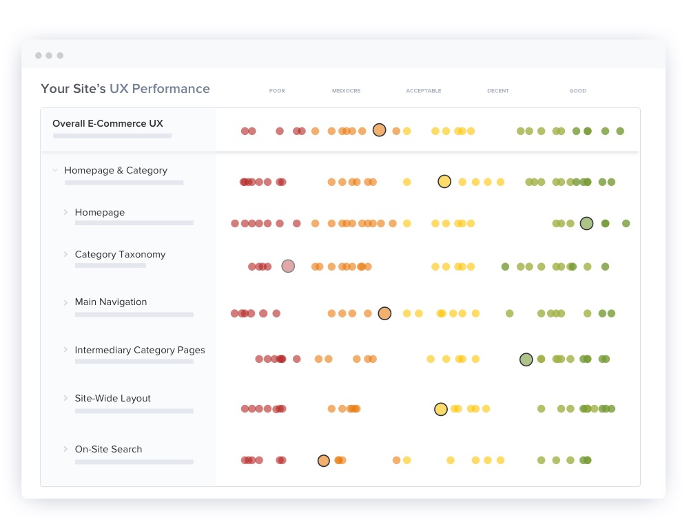
Baymard has benchmarked the online shopping experience of 27 leading US and European B2B sites across 270+ UX guidelines for B2B.
With a B2B UX Audit, Baymard will perform a confidential UX benchmark of your site across the same parameters. This enables your organization to compare your site’s UX performance to leading brands and competitors within your B2B industry. Along with documenting if and how your site’s UX falls behind the competition or falls short of users' expectations.
B2B Test Methodology
This UX research on B2B ecommerce UX is part of Baymard Institute’s full 150,000+ hours of large-scale research catalog, which is based on:
Usability Testing
25 rounds of qualitative usability testing with 4,400+ test participant/site sessions following the "Think Aloud" protocol, mainly as in-person 1:1 moderated lab usability testing.
Manual Benchmarking
54 rounds of benchmarking the world’s 256 top-grossing ecommerce sites across 650+ UX guidelines (175,000+ implementation examples and 275,000+ UX performance scores).
In-Lab Eye-Tracking Testing
Eye-tracking was also used for select testing. The eye-tracking test study included 32 participants using a Tobii eye-tracker, with a moderator present in the lab during the test sessions (for task and technical questions only).
Quantitative studies
12 studies with a total of 20,240 participants
Baymard’s research methodology is described in detail here.
What Our Clients Say
Baymard’s research is used by 29,000+ brands, agencies, researchers, and UX designers, across 80+ countries, and includes 71% of all Fortune 500 ecommerce companies.

“I’m reviewing the report this morning and I am delighted. The recommendations are detailed and our resulting actions are clear. I’m excited to share this with the rest of the team!”

“The Baymard E-commerce Usability reports have proven to be a valuable resource for UX teams within our organisation both at group and operating company level. The reports contain precise, actionable insights and recommendations which are backed up by extensive research and data. The severity and frequency ratings have helped our development teams to prioritise which areas to improve first. The most recent improvements we’ve recommended from the Ecommerce Search report have been extremely well received by senior stakeholders and have already been fed into the backlog.”

“Thank you very much for your time and the presentation. It was super useful, comprehensive and most importantly very concrete, so that we know exactly what to do next. We will definitely recommend you to other divisions within Bosch.”

“Baymard recently did a UX audit of our new e-commerce Website. We were very pleased with the results. The report and live review of the findings validated our approach to user experience, and also, we learned a lot about best practices for e-commerce UX. We believe Baymard’s work will help us increase revenue and user satisfaction.”

“Baymard’s training provides the proper language and sound evidence to understand what it means to create a truly usable interface in the ecommerce business.”

“Our UX Auditor was very engaged and responsive throughout the entire 2-week audit process. Delivered quicker than expected. We feel confident that the insights will be constructive.”

“Exceptional audit with actionable points and excellent examples. ”

“Intelligent, consumer-focused insights that are clear and actionable. The team in the room really loved the way the Baymard Institute highlighted the optimizations in the various user experience elements (copy, layout, design, calls-to-action…), from the perspective of consumer struggles. Baymard’s Usability research really complements our other existing research tools.”

“Baymard has been a great resource in helping us improve the customer experience. We are continually applying these best practices to our sites.”

“I just wanted to take a minute to thank you for the amazing work on this audit. You should know that this has been very well received internally and there’s a lot of excitement around adopting the ideas you have shared.”

“A great presentation, and the results were very eye-opening. It’s really helpful.”

“Thank you for the UX audit presentation, it was FANTASTIC. People here are quite pleased and amazed by the amount of work that was put into this.”

“My team loves Baymard Premium and it has become a valuable tool for us. We consult with a number of large brands and manage their eComm (both DTC and eRetail) and your data is amazing, it gives us all the testing data without having to run the tests ourselves. Our clients appreciate us having the depth of knowledge Baymard provides, we’ve used Baymard data multiple times to defend our recommendations and to inform our designs.”

“I wanted to begin by saying how incredibly impressed I have been with the degree/depth of content shared on UX/UI best practices for eCommerce experiences. This has by far been one of the most valuable workshops I have ever attended in my professional career.”

“The training was worth every penny and kudos to Christian and Lauryn for doing such a great job. My mind was definitely blown.”

“These reports are fabulous. The content is exactly what our team has been looking for, and so much more! Extremely helpful, thank you!”

“We implemented “E-Commerce Checkout Usability” guide for all our stores and saw doubling of checkout conversion rates. We will soon work on implementation of other usability guidelines. Thank you Christian and Jamie for your excellent work!”

“Some time ago we purchased the Ecommerce Homepage & Category report - the research and insights are extremely useful to us and help us a lot in our work!”

“Damn. The reports that the @Baymard folks do cost money, but they’re worth it.”

“I’m an avid user of your reports and recommendations. I have leveraged your articles and findings throughout my career in B2B, B2C, and hospitality.”

“This was indeed very helpful guidance and a very well-documented roadmap for us to fix, validate, organize, collectively understand and continually improve our ecommerce foundation.”

“I can confirm that the list was fully implemented. Every time we put up a change we either A/B test or we watch it very closely to determine that it’s doing better and not the opposite. So I can confirm that these fixes have improved our checkout. Thanks for everything.”

“I can not tell you how much help your benchmark studies have been for our company, e-commerce and UX teams. We have used and continue to use these reports for baseline benchmarks as we build test protocols or eye tracking scripts etc. in lab.”

“Excellent tool – looking forward to using it with our other sites and prototypes as they’re developed.”

“I really like the work Baymard Institute does around usability. Their articles often get my Ecom gears turning.”

“We’ve received some awesome feedback from our Merchant Success team as well as our merchants about all of the UX Audits we’ve had thus far with Baymard. Thank you so much to you and your team for all of your hard work. The pilot with Baymard has been going fantastic and I’m really excited with all that we’re learning! You have an amazing platform, team and super helpful data base for us to work with.”

“This #ecommerce checkout guide is worth every penny. Highly recommended. #cro ”

“Thank you very much for the 7 usability audits of our country-specific sites. The audits have provided us with specific and actionable advice, allowed us to prioritize development resources, and enabled us to compare UX performance between the 7 different country-specific sites, and against State of the Art implementations. The audit itself is done really professionally, and the recommendations contain actionable and insightful information.”

“Thank you. This was an excellent piece of work: professional, thorough, and actionable for the team. We’re very happy with the work Baymard has done for us.”

“Great UX report on shopping cart checkout forms/process we have used in a few audits recently. ”

“It is immensely valuable having a thorough, independent study to help validate my work and in particular, help facilitate buy-off from stakeholders. Baymard has quickly become one of my most trusted resources for the UX/UI field.”
“I am just thrilled by this study, it’s helped me in the construction of my online store checkout. All points in this study make incredible sense, and I cannot help but incorporate all of these suggestions. Incredible.”

“Thanks for everything. The audit was extremely useful, I think we have gained valuable insight.”

“I have found the M-Commerce and E-Commerce reports very useful, thank you!”

“The recommendations in our audit were awesome - well prioritized, actionable and helped us focus on what to optimize. This audit, along with the ecommerce database access, are my go-to resources for thorough, insightful information. Thank you!”

“Given the tricky science of conversion rate optimization, it is great to know that you are dealing with professionals whose advice is based on solid research. It was a pleasure collaborating with the Baymard team.”

“This is very, very useful! Let me check what we can do to improve the usability in the Smashing Shop.”
“Wow, this is great! Just reviewed it with the team. It’s a huge help and we’re excited to fix these issues.”

“The walkthrough today was great. The report was very, very well done and loaded with great opportunities for us to improve our business. I wanted to again express my appreciation for working with us on such a condensed time frame last month. You and your team have been amazing partners to us and we very much appreciate the work, expertise and partnership.”

“We like what we are reviewing from the audit - great analysis and feedback.”

“We have worked with a number of third party companies before on various projects/audits, and I can certainly say that working with Baymard was not only a pleasure; but you delivered on time; to the level of depth we wanted; addressing important issues; and answering all our questions; and you did all this for a great price. A big THANK YOU on behalf of N11.”

“Baymard’s real-user research is invaluable for ecommerce marketers. It leaves no stone unturned, and with the guideline checklists provided, you’ll be well equipped to optimize your mobile presence.”

“We found the audits extremely helpful and validated a number of changes we have been wanting to make or are in the process of making, so thank again for all the great insights.”

“The Baymard reports have proven to be an invaluable resource for us. Comprehensive, pragmatic and actionable. We have redesigned our checkout process and made changes to our category pages based on usability guidelines in the reports.”

“[Wanted to] say thanks, because we had a meeting yesterday everyone’s really excited about this. It’s really got everyone motivated and interested in what we’re going to tackle next so it’s been really invaluable, I think.”

“The Baymard Institute have some seriously good reports on ecommerce usability, design, and best practices”

“Worth every dollar. It’s well done, good looking and simply very useful.”

“I love the information that you guys provide and have bought a couple of reports. Love them.”

“Really good rundown on all these thing. I definitely think we got a lot of value out of it, and we’re excited to get it all in and do some A/B testing on this.”

“We implemented the majority of your checkout recommendations and a/b tested most of them, in every instance your recommendation provided the catalyst for us to make an improvement. Your approach and methodology has proven itself to be valuable. Now, when a new report comes out from your office we just buy it right away.”

“Baymard’s UX training week was invaluable. Christian presented the company’s vast research in an organized and digestible format that encouraged actionable takeaways. I can’t wait to share these learnings with my colleagues!”

“You guys help us, our clients (and our clients’ users), in delivering a better user experience through your research. I really appreciate it.”
“I wanted to write you a note to tell you how much I’ve gotten out of the Usability Benchmark I bought this Summer. We often get asked to for help with checkout usability and I often refer people your way. Keep up the great work!”

“This is without a doubt the most important eCommerce training I’ve ever done. Knowing the right approach for converting the average user puts us massively ahead of the competition.”

“Love Baymard’s Checkout Usability Report. A must read for E-Comm UX teams.”

“The Baymard team has been a delight to work with on the JohnLewis digital platform audit. They responded to the brief very well, have been very accessible for ongoing clarification and queries and Rebecca was excellent in the recent team share, articulately presenting findings in an engaging walk-through with the wider team which will really support driving engagement and a robust response. Many thanks for all the effort and focus folks.”

“If you are a User Experience Designer and have not read this report on check out form usability, than you should #UX”

“Here at Boxed we’re a small team who are BIG fans of your research. Your services have been immensely helpful to us as a small UX/UI team, and we are so excited to have a new version of our own product page going into development later this month.”

“I just wanted to reach out to you personally and commend you for hosting a terrific course. It’s quite seldom I find myself learning quite as much and gaining so many new perspectives in such a short period of time. So please keep up the good work and keep on inspiring other fellow UX practitioners!”

“designing a checkout experience? This is one of the coolest resource I’ve seen”

“I’m very impressed! Not about our site’s performance, quite the opposite, but about your work. Very detailed and packed with great and tangible advice. This was exactly what I dreamt about, but sometimes you just have to be careful dreaming.”

“We implemented this [1 of the 15 audit suggestions] and since then we’ve had a 20% increase in warranties added and a pretty healthy average order increase because of that. That was a great suggestion, it hit our bottom line immediately.”

“I often refer to myself as ‘the worst type of user’ because I have adapted to standard/bad UX practices when browsing eCommerce sites. I have found Baymard Institute is an incredible resource for getting some insight into user behaviour for making websites foolproof.”

“after benchmarking checkouts for a couple of hours last week… this resource is magical ”

“Truly a great learning experience about almost every aspect of eCommerce and the steps you need to take to improve the shopping experience for your users. Everyone working with eCommerce should attend this course. Absolutely worth the investment!”
“I really enjoy what you guys do. I bought your guide over a year ago to help a large website I consult to improve their checkout.”

“We implemented these guidelines on a client’s website and our e-commerce conversion rate increased 18.7% across the board. Most importantly our mobile conversions increased from 0.89% to 1.9% – we doubled our mobile revenue.”
“I wanted to pass on some praise to the Baymard team. I’m doing some desk research at the moment into best practices for navigation, search and filtering, and I’ve been using a lot of Baymard reports. Even though we’re not in the e-comm business, the insights you provide have been invaluable and inspirational to my project. It’s really really great work. I’ve previously grazed the content before out of interest, but now that I’m actually putting it into practice, I’m really feeling the value of this work. Thanks for making it available so that the whole community can benefit.”

“I just wanted to let you know that I think your site is the best thousand bucks I’ve ever spent. I wish I found you years ago.”

“Christian Holst and his team have done it again. Rock-solid research backed up by numbers that can’t be argued with. We’ve been using Baymard’s research for many years now and consistently find value in it in the form of highly applicable guidelines. The cost of the annual subscription has paid for itself many times over. Thank you for that, Christian.”

“Baymard has helped so much: UX was a brand new role at my company when I was hired. I was researching, planning, and designing UX & UI for 5 different products, all by myself. After showing real-world, bottom-line results from a UX centered approach to our products, we have expanded our UX team and greatly improved our UX-to-product process. Baymard’s research database was a critical component to my (and my company’s) success. Thank you!”
“We have recently tested some of your recommendations for the Avast checkout and got some great wins!”

