Research Topic
Cart & Checkout Usability Research
70% of all e-commerce visitors abandon their shopping cart. Why?
At Baymard we’ve tracked the global average cart abandonment rate for 14 years, and it currently sits at 70.19%.
After e-commerce sites have invested vast resources in “first in mind” strategies, Pay Per Click campaigns, beautifully crafted homepage imagery, faceted search logic, etc., it seems almost unbearable that 70% of users – after having added items to their cart – then choose to abandon their purchase.
Why is it that this many orders are abandoned? And what exactly can online retailers do to improve this sad state of affairs? That’s exactly what we wanted to find out.
At Baymard Institute, we started researching checkout usability more than 14 years ago when we founded the institute and did our first round of large-scale checkout usability testing. Ever since, we’ve tested and re-tested checkout usability, running large-scale qualitative research studies testing the checkout flows of the world’s leading e-commerce sites, as well as conducting checkout UX audits for more than 150 leading e-commerce sites.
During all 14 years of usability testing we have consistently found the design and flow of the checkout to frequently be the sole cause for users abandoning their purchase during the checkout flow. Either because users become so infuriated that they leave in anger, or because they don’t know how to complete one or more fields, and thus have no other option but to leave.
This page provides you an overview of the results from those years of testing checkout flows with real end-users. All of this research is available as part of Baymard Premium.
The Current Checkout UX Performance
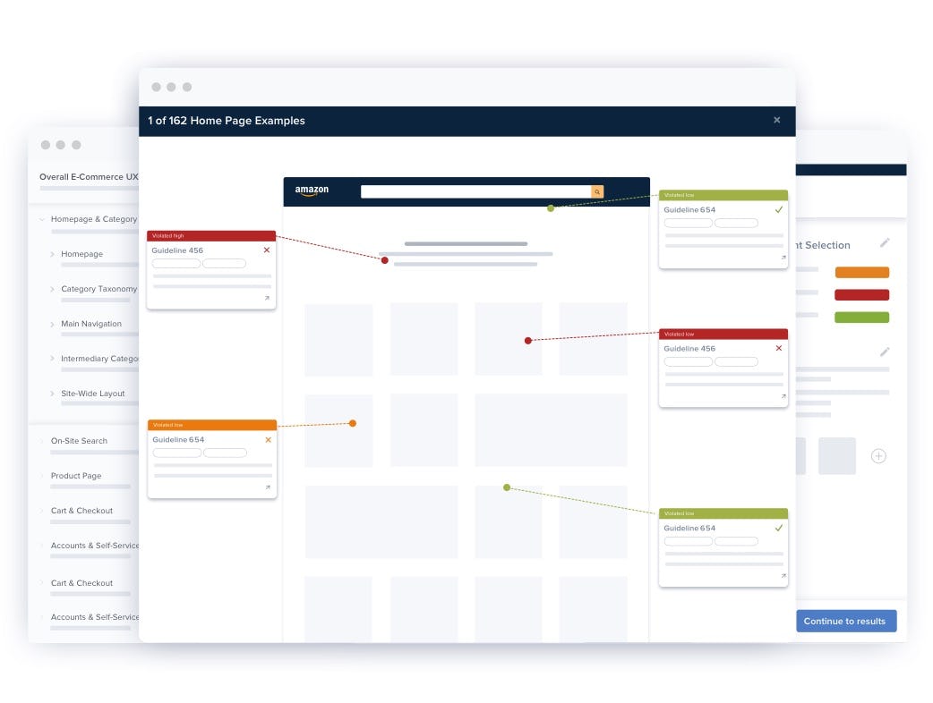
To accompany the checkout usability test sessions we’ve also benchmarked the checkout flows of 280 top-grossing US and EU e-commerce sites across our 110+ Cart & Checkout guidelines, each on a 7-point weighted scale. This has resulted in a benchmark database with 30,000+ checkout elements manually reviewed and scored, along with 26,000+ best and worst practice examples from leading e-commerce sites (all categorized and performance verified).
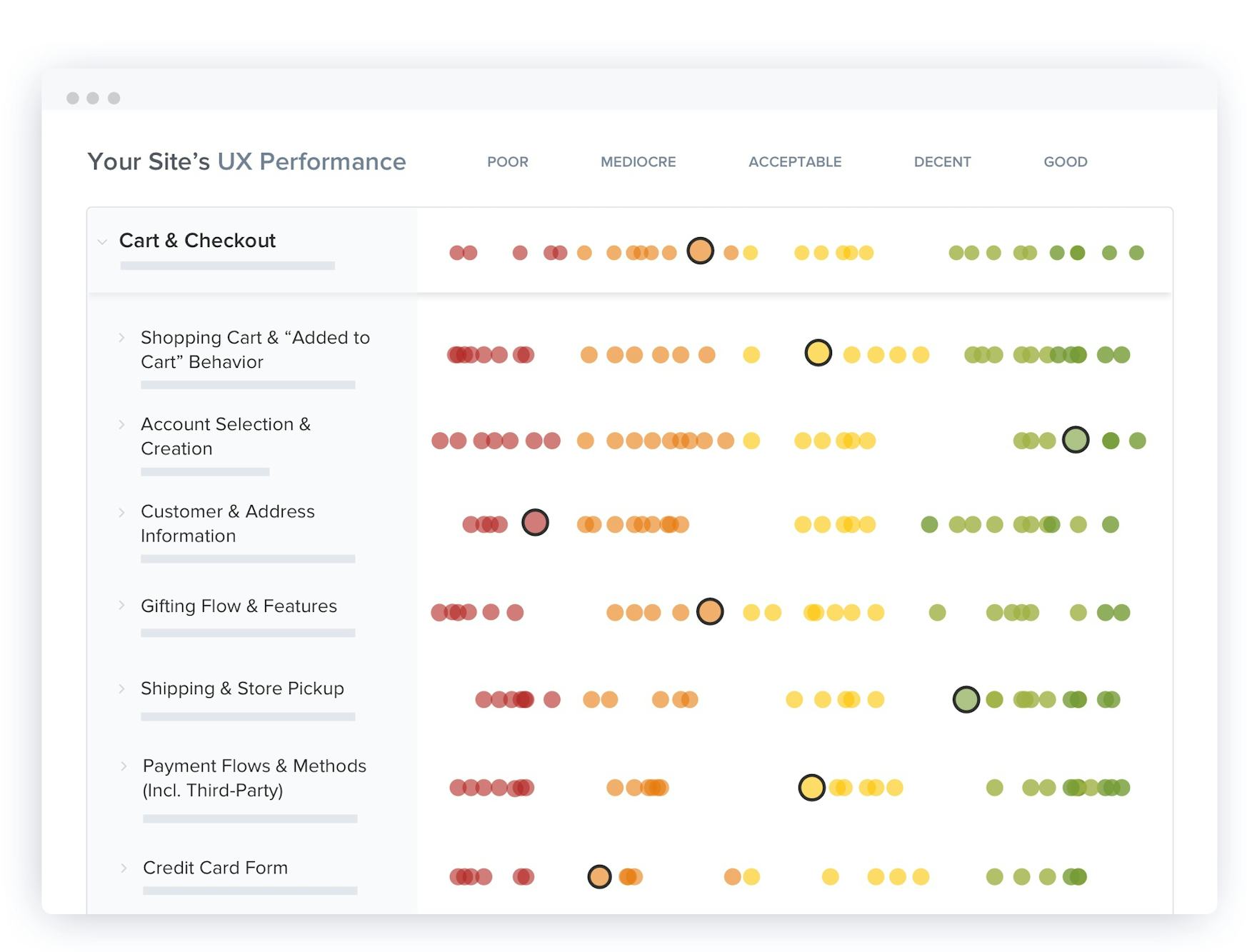
The UX performance scores from our most recent Cart & Checkout UX benchmark update are plotted in the interactive scatterplot above.
When looking at the general state of Cart & Checkout usability, 65% of sites have a performance of “mediocre” or worse, 35% of sites feature a “decent” or better checkout flow, and only 2% are “good”. What’s more, none were able to reach a “perfect” or “state-of-the-art” experience. Thus there is great room for improvement.
The average site has 32 unique improvements to perform in their checkout flow, to gain the 35% increase in conversion rate our combined usability test sessions show that the average large-scale e-commerce site can potentially improve through better Checkout UX. However, the nuances and diversities behind the overall mediocre performance are manyfold.
This is a subset of the full benchmark which includes 280 e-commerce sites.
View our full UX benchmark
7,500+ Categorized Checkout Step Design Examples
FREE RESEARCH CONTENT
Explore checkout design patterns across 7,500+ checkout step examples, all annotated and organized into 16 different checkout page types. This is a great way to get inspiration for your own checkout flow, and to get a feel for emerging trends in checkout design.

Account Selection
843 Examples

Customer Info & Address
973 Examples

Delivery & Shipping Methods
802 Examples
68 Research Articles on Checkout Usability
FREE RESEARCH CONTENT
We’ve released a small subset of the Premium research finding on checkout usability and form field usability for free in these 68 articles:
3 Checkout Resource Pages
FREE RESEARCH CONTENT
Beyond the extensive set or articles, benchmark database, and Premium research we have on checkout UX, we’ve also gathered three resources that are related to checkout UX that you may want to explore:
Country selector
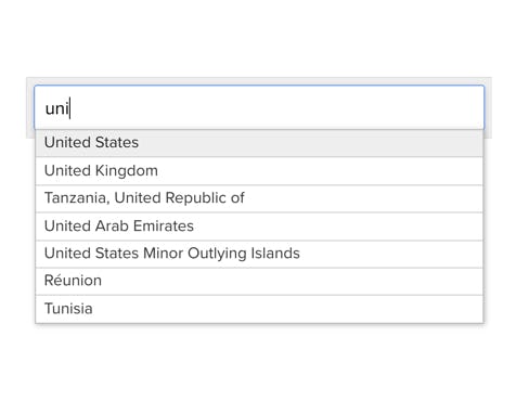
A free auto-complete plugin for country selection.
Abandonment stats
A reference list of 49 cart abandonment statistics along with a reasons for checkout abandonments survey (lower on the page).
Card number patterns
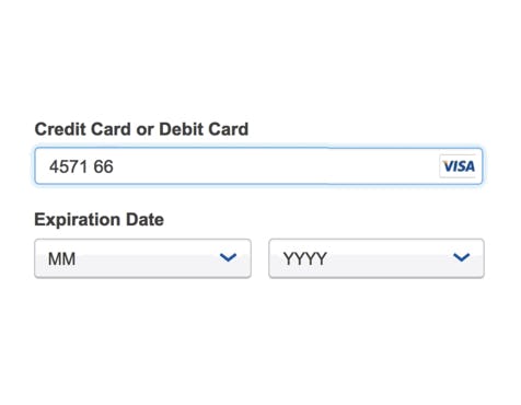
A reference table of numerous different credit card patterns, outlining the IIN-range and spacing-schema.
17 Research Reports on Checkout UX
PAID RESEARCH CONTENT
All 110+ checkout research findings are available as part of Baymard Premium, and are divided into the following 17 topics (611 pages of research findings in total):
Cart & Checkout Topics
Checkout Types
Checkout Types
The UX benefits and inherent usability pitfalls of a multistep checkout flow, accordion checkouts, and one-step checkouts.
Cart & Checkout Topics
Shopping Cart & “Added to Cart” Behavior
Shopping Cart & “Added to Cart” Behavior
The shopping cart page, incl. cart design, quantity and save features, the page response when users add products to the cart on the product page (drop-down cart, etc.).
Cart & Checkout Topics
Account Selection & Creation
Account Selection & Creation
Checkout flows for signed in users, users creating an account, or checking out as a guest, incl. account-selection designs and communication,‘Delayed Account Creation’, social media accounts, password rules.
Cart & Checkout Topics
Customer & Address Information
Customer & Address Information
How to handle the form fields for all personal user data, incl. privacy concerns, shipping addresses, billing addresses, international addresses, phone fields, address auto-detection techniques, etc.
Cart & Checkout Topics
Gifting Flow & Features
Gifting Flow & Features
How the checkout flow and fields need to change when users gift-mark items, where and how users should be able to gift-mark items, and how the actual gifting features needs to be presented to avoid issues.
Cart & Checkout Topics
Shipping & Store Pickup
Shipping & Store Pickup
Shipping and store pickup, incl. the shipping method UI, shipping descriptions, order cut-off times, ‘Free Shipping’ tiers, how omni-channel sites best integrate ‘Store Pickup’ and ‘Store Availability’, and more.
Cart & Checkout Topics
Payment Flow & Methods (Incl. Third-Party)
Payment Flow & Methods (Incl. Third-Party)
The payment methods interface, how to integrate and display an array of different third-party payment methods, the gift card redemption flow, and more.
Cart & Checkout Topics
Credit Card Form
Credit Card Form
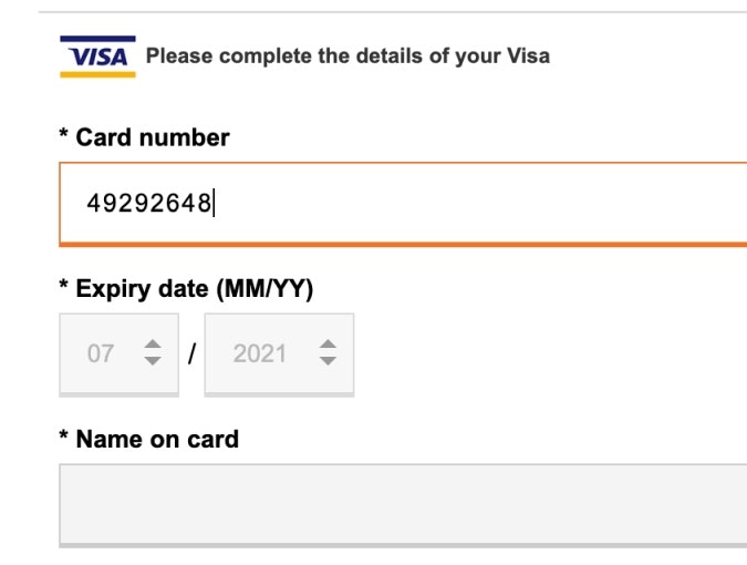
How to cause as few abandonments as possible, incl. the credit card field design, card validation logic and formatting, expiration date, security code, and cardholder name inputs, field sequence, card icons, and card type selection.
Cart & Checkout Topics
Order Review
Order Review
How to properly design the final ‘Review’ step before a user completes an order, including ‘Place Order’ button placement, and necessary review data, along with the editing flow for those users who need to change data.
Cart & Checkout Topics
Order Confirmation & E-Mail
Order Confirmation & E-Mail
The implementation of post-purchase confirmations, incl. the information and actions needed on the order confirmation page and order confirmation email.
Cart & Checkout Topics
Form & Page Design
Form & Page Design
How to design and position the cart link in the site wide header and primary button throughout the checkout, minimizing form intimidation, avoiding multi-column layouts, using ‘Enclosed Checkout’ designs, etc.
Cart & Checkout Topics
User Interactions & Distractions
User Interactions & Distractions
How to implement load indicators, when to provide feedback on user actions, where to avoid ‘Apply’ buttons, embedding content from third-parties, and much more on interactive components.
Cart & Checkout Topics
Cross-Sells
Cross-Sells
How to thoughtfully incorporate cross-sells into a checkout flow, including the use of active vs. passive cross-selling, adapting cross-sells to user context, and pitfalls of specific placements and wording.
Cart & Checkout Topics
Validation Errors & Data Persistence
Validation Errors & Data Persistence
Error recovery and address validation experiences, incl. how to improve users’ ability to locate, understand, and resolve errors, and more.
Cart & Checkout Topics
Field Labels & Microcopy
Field Labels & Microcopy
How to mark optional and required fields, appropriate label positions, inline labels, optimizing microcopy and descriptions, and marking of optional and required fields.
Cart & Checkout Topics
Field Design & Features
Field Design & Features
The proper selection and assembly of form elements, inputs, and selections, incl. choosing the right type of interface, field masking and character restrictions, and more.
Cart & Checkout Topics
Default Values & Autocompletion
Default Values & Autocompletion
Intelligent form features such as making inferred selections, prefilling form fields, browser auto-fills, and personalization of the checkout flow — smart form field features that improve checkout UX substantially.
Subscribe to Baymard Premium to access all of our Cart & Checkout Usability research
Get full access to all our Cart & Checkout UX research reports, benchmarks, and page designs previewed here, along with our complete 650+ guidelines for Homepage & Category Navigation, Search, Product Listing, Product Details Page, Accounts & Self-Service, and Mobile E-Commerce. Utilize our 150,000+ hours of UX research to improve your Cart & Checkout user experience and to document your UX decisions.
Test Methodology
This research on Checkout UX is part of Baymard Institute’s full 150,000+ hours of large scale research catalog, which is based on:
- Usability Testing: 25 rounds of qualitative usability testing with 4,400+ test participant/site sessions following the "Think Aloud" protocol (in-person 1:1 moderated lab usability testing).
- Manual benchmarking: 54 rounds of benchmarking the world’s 280 leading e-commerce sites across all 650+ UX guidelines (175,000+ implementation examples and 275,000+ UX performance scores).
- In-lab eye-tracking testing.
- Quantitative studies: 12 studies with a total of 20,240 participants.
Baymard’s research methodology is described in detail here.
UX Audit Service
GET YOUR CHECKOUT PROCESS REVIEWED
What are the 20 most important changes you can make to your checkout process?
We will put together a 40-page report of the 20 most important usability improvements you can make to your checkout process.
What Our Clients Are Saying

“Baymard produces some of the most relevant and actionable user experience research available. They really understand the needs of UX and Product Management professionals, and their deep experience in the eCommerce field allows them to offer sophisticated, nuanced insights.”

“Baymard has been a great resource in helping us improve the customer experience. We are continually applying these best practices to our sites.”

“I can not tell you how much help your benchmark studies have been for our company, e-commerce and UX teams. We have used and continue to use these reports for baseline benchmarks as we build test protocols or eye tracking scripts etc. in lab.”

“Thanks again for the great work on our checkout project. Our whole group found it incredibly insightful. We’re applying the suggestions you provided to our new checkout design which launches at the end of the month! One of my colleagues was also interested in your group’s competitive expertise with regard to responsive web and native apps.”

“Thank you. This was an excellent piece of work: professional, thorough, and actionable for the team. We’re very happy with the work Baymard has done for us.”

“Thank you very much for the 7 usability audits of our country-specific sites. The audits have provided us with specific and actionable advice, allowed us to prioritize development resources, and enabled us to compare UX performance between the 7 different country-specific sites, and against State of the Art implementations. The audit itself is done really professionally, and the recommendations contain actionable and insightful information.”

“Intelligent, consumer-focused insights that are clear and actionable. The team in the room really loved the way the Baymard Institute highlighted the optimizations in the various user experience elements (copy, layout, design, calls-to-action…), from the perspective of consumer struggles. Baymard’s Usability research really complements our other existing research tools.”

“Thank you, this was really insightful!”

“We’ve received some awesome feedback from our Merchant Success team as well as our merchants about all of the UX Audits we’ve had thus far with Baymard. Thank you so much to you and your team for all of your hard work. The pilot with Baymard has been going fantastic and I’m really excited with all that we’re learning! You have an amazing platform, team and super helpful data base for us to work with.”

“Having Baymard is like having access to a magical UX super power. I can't believe how helpful and easy to use it is, given the vast array of tools and information they provide!”

“Baymard's audit services give us a detailed view of usability improvements across our entire site. This is so much more comprehensive than running individual usability studies.”

“Clear, concise, actionable, data-driven insights!”

“I was able to bring these designed solutions home with me and kickoff multiple optimization projects that I am confident will affect the site in a positive way, both in usability and conversion.”

“I just wanted to take a minute to thank you for the amazing work on this audit. You should know that this has been very well received internally and there’s a lot of excitement around adopting the ideas you have shared.”

“Very thorough and professional UX review of our website, based on an extensive amount of previous UX research insights within the industry, and specifically targeted to our needs. We received both critical and, most importantly, constructive feedback, along with actionable, prioritized suggestions and best-practice examples. This will allow us to address the areas of improvement and significantly help ameliorate the experience users have on our website, which in turn is expected to drive conversion rates and reduce the number of customer service requests. We can highly recommend Baymard's UX audit.”

“Damn. The reports that the @Baymard folks do cost money, but they’re worth it.”

“This has been fantastic: really good recommendations, really comprehensive.”

“I can confirm that the list was fully implemented. Every time we put up a change we either A/B test or we watch it very closely to determine that it’s doing better and not the opposite. So I can confirm that these fixes have improved our checkout. Thanks for everything.”

“Excellent tool – looking forward to using it with our other sites and prototypes as they’re developed.”

“We found the audits extremely helpful and validated a number of changes we have been wanting to make or are in the process of making, so thank again for all the great insights.”

“This was indeed very helpful guidance and a very well-documented roadmap for us to fix, validate, organize, collectively understand and continually improve our ecommerce foundation.”

“It is immensely valuable having a thorough, independent study to help validate my work and in particular, help facilitate buy-off from stakeholders. Baymard has quickly become one of my most trusted resources for the UX/UI field.”

“I found the UX audit a very comprehensive evaluation, with clear reports and actionable recommendations. Baymard's commitment to excellence in user experience shines through its thorough approach!”

“Thanks for everything. The audit was extremely useful, I think we have gained valuable insight.”

“This was…mind-blowing. We’ve been having conversations on the side as you’ve been presenting the audit findings. There’s so much to do!”

“These reports are fabulous. The content is exactly what our team has been looking for, and so much more! Extremely helpful, thank you!”

“I have found the M-Commerce and E-Commerce reports very useful, thank you!”

“I’m an avid user of your reports and recommendations. I have leveraged your articles and findings throughout my career in B2B, B2C, and hospitality.”

“The Baymard team has been a delight to work with on the JohnLewis digital platform audit. They responded to the brief very well, have been very accessible for ongoing clarification and queries and Rebecca was excellent in the recent team share, articulately presenting findings in an engaging walk-through with the wider team which will really support driving engagement and a robust response. Many thanks for all the effort and focus folks.”

“The Baymard reports have proven to be an invaluable resource for us. Comprehensive, pragmatic and actionable. We have redesigned our checkout process and made changes to our category pages based on usability guidelines in the reports.”

“Thanks for this audit and your good work. This was exactly what I was aiming for. Also thanks for the very, very professional presentation, and answering all our countless questions. Very good work.”

“I just wanted to let you know that I think your site is the best thousand bucks I’ve ever spent. I wish I found you years ago.”

“First off, thank you. This was the most engrossed I’ve ever been in a 2-hour meeting. This [audit presentation] was incredibly insightful and very helpful. Many, many thanks.”

“We are very excited to finally proceed with the UX improvements, and I truly believe your audit report will be super helpful to put us ahead of the wave. If you ever need a reference, please do not hesitate to share my contact.”

“Baymard has helped so much: UX was a brand new role at my company when I was hired. I was researching, planning, and designing UX & UI for 5 different products, all by myself. After showing real-world, bottom-line results from a UX centered approach to our products, we have expanded our UX team and greatly improved our UX-to-product process. Baymard’s research database was a critical component to my (and my company’s) success. Thank you!”

“Wanted to thank you again for the checkout audit and walking us through the process. It was super helpful and we can’t wait to apply the changes to our checkout for a better user experience.”

“The recommendations in our audit were awesome - well prioritized, actionable and helped us focus on what to optimize. This audit, along with the ecommerce database access, are my go-to resources for thorough, insightful information. Thank you!”

“This is awesome so far. Everyone wants to know what's going on – you just got everyone's attention here. Everything that you've called out is definitely eye-opening for us over here.”

“Some time ago we purchased the Ecommerce Homepage & Category report - the research and insights are extremely useful to us and help us a lot in our work!”

“Given the tricky science of conversion rate optimization, it is great to know that you are dealing with professionals whose advice is based on solid research. It was a pleasure collaborating with the Baymard team.”

“Within a very short time Baymard Institute provided 15 clear, useful improvement suggestions for our checkout process. We intend to implement all of them. It’s easy to find companies that offer website improvement suggestions. But, most companies don’t do their homework and don’t provide specific examples of how best to make the improvements. With Baymard Institute, the checkout process suggestions they made were intuitive, specific, and actionable. I highly recommend their audit service.”

“This UX audit has been very helpful, not just for our design and product teams, but even for the UX research team, because we can reference back to the audit, either in the design of a user research session or when we analyze findings. Thank you very much; this has been incredibly valuable.”

“The Baymard UX audit has been a revelation for our organisation and will likely become a vital tool in our process moving forward.”

“Working with Baymard for our UX audit was an exceptional experience from start to finish. Their attention to detail, depth of analysis, and clear communication throughout the process truly exceeded our expectations. The insights they provided were not only actionable but profoundly insightful. I highly recommend Baymard for their expertise, professionalism, and commitment to elevating user experiences.”

“The audit opened our eyes once again, as we are often blind to our own operations. The comparison with competitors' best practices was particularly helpful.”


