Research Topic
Product Lists UX
How do users scan, filter and browse your search results and category pages?
Without the right tools, finding just the right product can be an almost impossible task for the user. E-commerce product lists and their filtering and sorting tools determine how easy or difficult it is for the user to browse the site’s product catalog.
This is why we at the Baymard Institute have conducted an extensive large-scale usability study of how users scan, evaluate, filter and sort products within a product listing page.
A group of users age 21-56 were recruited to test 19 leading e-commerce sites across 8 different verticals. Despite testing multi-million dollar sites, more than 700 usability issues related to product lists, filtering and sorting, arose during testing. All these issues have been analyzed and distilled into 83 concise guidelines on product list usability.
From this research study we’ve uncovered exactly what users expect as they interact with product lists on e-commerce sites, what typically goes wrong in the process, why it goes wrong, and what changes e-commerce sites can make to avoid these issues. In short: how to design a high-performing product list experience for your users.
After all, if users can’t easily browse your product lists, they can’t easily find what they are looking for – and if they can’t find it, they can’t buy it.
This page provides you an overview of our research specific to Product Listings & Product Filtering UX. All of this research is available as part of Baymard Premium.
The Current Product Listings & Product Filtering UX Performance
The product list effectively dictates product presentation and provides the pathway from category pages and search results to the all-important product page.
During Baymard’s Product Listings & Filtering study, sites with mediocre product list usability saw abandonment rates of 67-90%, whereas sites with just a slightly optimized toolset saw only 17-33% abandonments for users trying to find the exact same types of product. This translates into as much as a 4-fold increase in leads.
From testing it’s clear that a unity of product list design, filtering and sorting is required – the chain is no stronger than its weakest link:
- With the right filters and a clear filtering interface users are able to narrow down a product list with thousands of generic products to only a few items relevant to their unique needs and interests.
- Solid sorting features enable users to order products by the attributes they care about – something that can dramatically speed up the user’s product exploration and selection process.
- A balanced product list design provides users with a better overview of the products available and help them make a more informed evaluation of which items to engage with (and which they can safely skip).
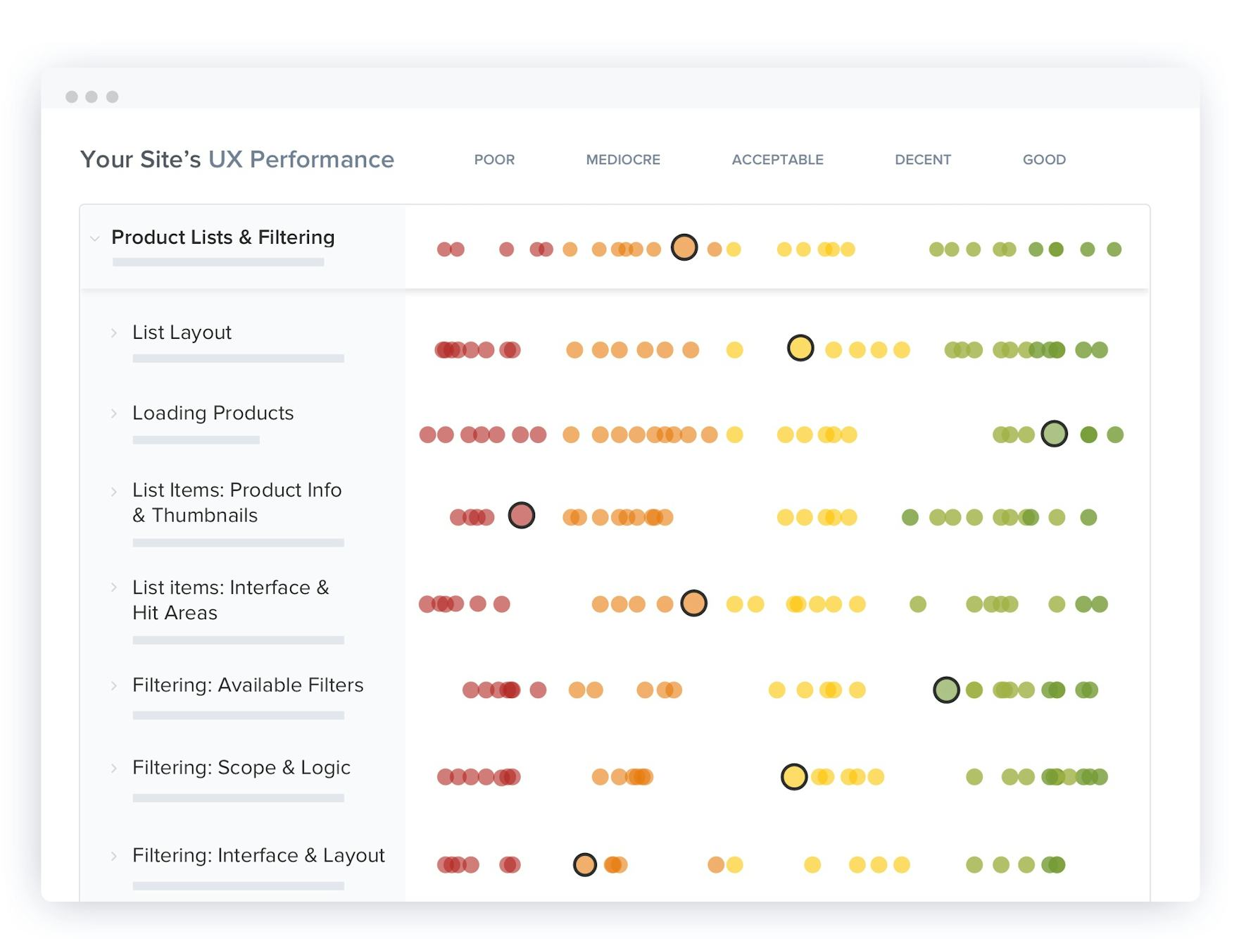
At Baymard we’ve subsequently benchmarked the 280 top grossing US and European e-commerce sites across our 70 most important (weighted) Product Listing guidelines; adding to our existing e-commerce benchmark leading to a massive database of 11,000+ UX performance scores and 9,000+ best- and worst- practice examples of Product List UX.
The UX performance scores from our most recent Product List & Filtering UX benchmark update are plotted in the interactive scatterplot above.
Analyzing this dataset we’ve found the average site to perform mediocre at best, and 36% of sites to have such severe design and feature flaws that it was downright harmful to their users’ ability to find and select products. Product list usability is generally characterized by being both overlooked and poorly understood. On average each site will need to make 35 design changes to achieve optimal product list usability, revealing widespread mediocrity. There’s a clear lack of knowledge about and attention paid to the design and features of product lists. Perhaps most critically, many sites have adopted a fundamentally flawed “one size fits all” approach which greatly impedes the user’s product finding ability.
This is a sub-set of the full benchmark which includes 280 e-commerce sites.
View our full UX benchmark
3,200+ Categorized E-Commerce Product Listing UX Examples
FREE RESEARCH CONTENT
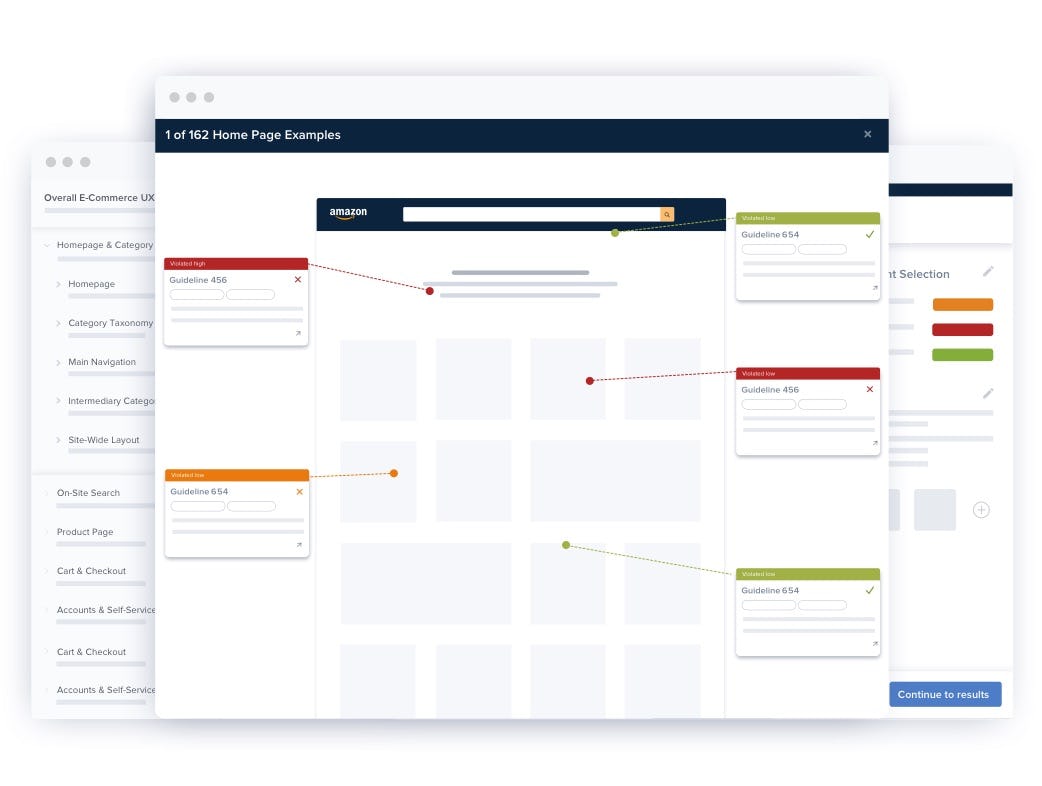
Explore design patterns across 3,200+ page examples of Product Listing, Filtering and Sorting designs and features, all annotated and organized into 7 different page types. This is a great way to get inspiration for your own Product List & Filtering design, and to get a feel for emerging trends in e-commerce.
50 Articles on Product Listings & Product Filtering UX
FREE RESEARCH CONTENT
We’ve released a small subset of the Premium research finding on Product Listings & Filtering UX for free in these 50 articles:

Desktop UX Trends: 10 Common Pitfalls & Best Practices
March 6, 2025
Always Provide 3 or More Product Thumbnails in Product Lists and Search Results
November 5, 2024 Popular
Mobile App UX Trends: The Current State of Mobile App UX (10 Common Pitfalls & Best Practices)
October 24, 2024 Popular
Furniture & Home Decor UX: Always Include Contents and Quantities in the List Item for Sets and Bundles
October 8, 2024
10 Research Reports on Product Listings & Filtering UX
PAID RESEARCH CONTENT
All 83 Product Listings & Filtering research findings are available as part of Baymard Premium, and are divided into the following 10 reports:
Product Lists & Filtering Topics
List Layout
List Layout
How to create a list layout that bolsters product browsing experiences, with guidelines on the design and features of the overall product list layout, including grid and list layouts.
Product Lists & Filtering Topics
Loading Products
Loading Products
How to load items in a product list, including guidelines on how new items should be loaded, how many items should be displayed by default, how to approach novel navigation methods, and more.
Product Lists & Filtering Topics
List Items: Product Info & Thumbnails
List Items: Product Info & Thumbnails
Information to include in List Items, formatting and displaying information, displaying product variations as one or multiple List Items, what product thumbnails to display, and more.
Product Lists & Filtering Topics
List Items: Interface & Hit Areas
List Items: Interface & Hit Areas
Presenting and arranging information in List Items, including showcasing product features, List Item hover effects, and more.
Product Lists & Filtering Topics
List Items: Personalization
List Items: Personalization
How sites can personalize List Items to suit each unique user by inferring user interests through filtering and sorting observations, context-aware product thumbnails, and contextual compatibility notices.
Product Lists & Filtering Topics
Filtering: Available Filters
Filtering: Available Filters
Which filtering types users need to narrow down product lists, incl. thematic filters, considerations for accessory products, user-defined ranges for all numeric filtering values, and more.
Product Lists & Filtering Topics
Filtering: Scope & Logic
Filtering: Scope & Logic
Common pitfalls and optimizations such as avoiding filter attributes as category scopes, explaining industry-specific filters, and allowing users to combine multiple filter values of the same filter type.
Product Lists & Filtering Topics
Filtering: Interface & Layout
Filtering: Interface & Layout
Layout and interface styling and the discoverability of filters, incl. how to visually nest sidebar categories, when to truncate filters, and considering a horizontal unified sorting and filtering tool.
Product Lists & Filtering Topics
Sorting
Sorting
How to provide innovative and forward-thinking product selection with guidelines on the default sort type, avoiding most alphabetical sorting, sorting interface and scope, as well as the sort types needed.
Product Lists & Filtering Topics
Comparison Tool
Comparison Tool
When a comparison tool is appropriate and how both its selection process and comparison page should be designed, when to have a comparison feature, and how to design the compare link and comparison view.
Subscribe to Baymard Premium to access all of our Product Lists & Filtering UX research
Get full access to all our Product Lists & Filtering UX research reports, benchmarks, and page designs previewed here, along with our complete 650+ guidelines for Homepage & Category Navigation, Search, Product Details Page, Checkout, Accounts & Self-Service, and Mobile E-Commerce. Utilize our 150,000+ hours of UX research to improve your Product Lists & Filtering user experience and to document your UX decisions.
Test Methodology
This research on Product Listings & Filtering UX is part of Baymard Institute’s full 150,000+ hours of large scale research catalog, which is based on:
- Usability Testing: 25 rounds of qualitative usability testing with 4,400+ test participant/site sessions following the "Think Aloud" protocol (in-person 1:1 moderated lab usability testing).
- Manual benchmarking: 54 rounds of benchmarking the world’s 280 leading e-commerce sites across all 650+ UX guidelines (175,000+ implementation examples and 275,000+ UX performance scores).
- In-lab eye-tracking testing.
- Quantitative studies: 12 studies with a total of 20,240 participants.
Baymard’s research methodology is described in detail here.
UX Audit Service
GET YOUR PRODUCT LIST EXPERIENCE REVIEWED
What are the 15 most important changes you can make to your e-commerce filtering and sorting implementation?
We will put together a detailed 40-page report of the 15 most important usability improvements you can make to your e-commerce product list design.
What Our Clients Are Saying

“Baymard produces some of the most relevant and actionable user experience research available. They really understand the needs of UX and Product Management professionals, and their deep experience in the eCommerce field allows them to offer sophisticated, nuanced insights.”

“Baymard has been a great resource in helping us improve the customer experience. We are continually applying these best practices to our sites.”

“I can not tell you how much help your benchmark studies have been for our company, e-commerce and UX teams. We have used and continue to use these reports for baseline benchmarks as we build test protocols or eye tracking scripts etc. in lab.”

“Thanks again for the great work on our checkout project. Our whole group found it incredibly insightful. We’re applying the suggestions you provided to our new checkout design which launches at the end of the month! One of my colleagues was also interested in your group’s competitive expertise with regard to responsive web and native apps.”

“Thank you. This was an excellent piece of work: professional, thorough, and actionable for the team. We’re very happy with the work Baymard has done for us.”

“Thank you very much for the 7 usability audits of our country-specific sites. The audits have provided us with specific and actionable advice, allowed us to prioritize development resources, and enabled us to compare UX performance between the 7 different country-specific sites, and against State of the Art implementations. The audit itself is done really professionally, and the recommendations contain actionable and insightful information.”

“Intelligent, consumer-focused insights that are clear and actionable. The team in the room really loved the way the Baymard Institute highlighted the optimizations in the various user experience elements (copy, layout, design, calls-to-action…), from the perspective of consumer struggles. Baymard’s Usability research really complements our other existing research tools.”

“Thank you, this was really insightful!”

“We’ve received some awesome feedback from our Merchant Success team as well as our merchants about all of the UX Audits we’ve had thus far with Baymard. Thank you so much to you and your team for all of your hard work. The pilot with Baymard has been going fantastic and I’m really excited with all that we’re learning! You have an amazing platform, team and super helpful data base for us to work with.”

“Having Baymard is like having access to a magical UX super power. I can't believe how helpful and easy to use it is, given the vast array of tools and information they provide!”

“Baymard's audit services give us a detailed view of usability improvements across our entire site. This is so much more comprehensive than running individual usability studies.”

“Clear, concise, actionable, data-driven insights!”

“I was able to bring these designed solutions home with me and kickoff multiple optimization projects that I am confident will affect the site in a positive way, both in usability and conversion.”

“I just wanted to take a minute to thank you for the amazing work on this audit. You should know that this has been very well received internally and there’s a lot of excitement around adopting the ideas you have shared.”

“Very thorough and professional UX review of our website, based on an extensive amount of previous UX research insights within the industry, and specifically targeted to our needs. We received both critical and, most importantly, constructive feedback, along with actionable, prioritized suggestions and best-practice examples. This will allow us to address the areas of improvement and significantly help ameliorate the experience users have on our website, which in turn is expected to drive conversion rates and reduce the number of customer service requests. We can highly recommend Baymard's UX audit.”

“Damn. The reports that the @Baymard folks do cost money, but they’re worth it.”

“This has been fantastic: really good recommendations, really comprehensive.”

“I can confirm that the list was fully implemented. Every time we put up a change we either A/B test or we watch it very closely to determine that it’s doing better and not the opposite. So I can confirm that these fixes have improved our checkout. Thanks for everything.”

“Excellent tool – looking forward to using it with our other sites and prototypes as they’re developed.”

“We found the audits extremely helpful and validated a number of changes we have been wanting to make or are in the process of making, so thank again for all the great insights.”

“This was indeed very helpful guidance and a very well-documented roadmap for us to fix, validate, organize, collectively understand and continually improve our ecommerce foundation.”

“It is immensely valuable having a thorough, independent study to help validate my work and in particular, help facilitate buy-off from stakeholders. Baymard has quickly become one of my most trusted resources for the UX/UI field.”

“I found the UX audit a very comprehensive evaluation, with clear reports and actionable recommendations. Baymard's commitment to excellence in user experience shines through its thorough approach!”

“Thanks for everything. The audit was extremely useful, I think we have gained valuable insight.”

“This was…mind-blowing. We’ve been having conversations on the side as you’ve been presenting the audit findings. There’s so much to do!”

“These reports are fabulous. The content is exactly what our team has been looking for, and so much more! Extremely helpful, thank you!”

“I have found the M-Commerce and E-Commerce reports very useful, thank you!”

“I’m an avid user of your reports and recommendations. I have leveraged your articles and findings throughout my career in B2B, B2C, and hospitality.”

“The Baymard team has been a delight to work with on the JohnLewis digital platform audit. They responded to the brief very well, have been very accessible for ongoing clarification and queries and Rebecca was excellent in the recent team share, articulately presenting findings in an engaging walk-through with the wider team which will really support driving engagement and a robust response. Many thanks for all the effort and focus folks.”

“The Baymard reports have proven to be an invaluable resource for us. Comprehensive, pragmatic and actionable. We have redesigned our checkout process and made changes to our category pages based on usability guidelines in the reports.”

“Thanks for this audit and your good work. This was exactly what I was aiming for. Also thanks for the very, very professional presentation, and answering all our countless questions. Very good work.”

“I just wanted to let you know that I think your site is the best thousand bucks I’ve ever spent. I wish I found you years ago.”

“First off, thank you. This was the most engrossed I’ve ever been in a 2-hour meeting. This [audit presentation] was incredibly insightful and very helpful. Many, many thanks.”

“We are very excited to finally proceed with the UX improvements, and I truly believe your audit report will be super helpful to put us ahead of the wave. If you ever need a reference, please do not hesitate to share my contact.”

“Baymard has helped so much: UX was a brand new role at my company when I was hired. I was researching, planning, and designing UX & UI for 5 different products, all by myself. After showing real-world, bottom-line results from a UX centered approach to our products, we have expanded our UX team and greatly improved our UX-to-product process. Baymard’s research database was a critical component to my (and my company’s) success. Thank you!”

“Wanted to thank you again for the checkout audit and walking us through the process. It was super helpful and we can’t wait to apply the changes to our checkout for a better user experience.”

“The recommendations in our audit were awesome - well prioritized, actionable and helped us focus on what to optimize. This audit, along with the ecommerce database access, are my go-to resources for thorough, insightful information. Thank you!”

“This is awesome so far. Everyone wants to know what's going on – you just got everyone's attention here. Everything that you've called out is definitely eye-opening for us over here.”

“Some time ago we purchased the Ecommerce Homepage & Category report - the research and insights are extremely useful to us and help us a lot in our work!”

“Given the tricky science of conversion rate optimization, it is great to know that you are dealing with professionals whose advice is based on solid research. It was a pleasure collaborating with the Baymard team.”

“Within a very short time Baymard Institute provided 15 clear, useful improvement suggestions for our checkout process. We intend to implement all of them. It’s easy to find companies that offer website improvement suggestions. But, most companies don’t do their homework and don’t provide specific examples of how best to make the improvements. With Baymard Institute, the checkout process suggestions they made were intuitive, specific, and actionable. I highly recommend their audit service.”

“This UX audit has been very helpful, not just for our design and product teams, but even for the UX research team, because we can reference back to the audit, either in the design of a user research session or when we analyze findings. Thank you very much; this has been incredibly valuable.”

“The Baymard UX audit has been a revelation for our organisation and will likely become a vital tool in our process moving forward.”

“Working with Baymard for our UX audit was an exceptional experience from start to finish. Their attention to detail, depth of analysis, and clear communication throughout the process truly exceeded our expectations. The insights they provided were not only actionable but profoundly insightful. I highly recommend Baymard for their expertise, professionalism, and commitment to elevating user experiences.”

“The audit opened our eyes once again, as we are often blind to our own operations. The comparison with competitors' best practices was particularly helpful.”


