
Key Takeaways
- Users need as much visual information as possible for products in product lists and search results
- 1 or 2 images are often not enough to communicate sufficient visual information
- Provide access to at least 3 thumbnails, including the default thumbnail, for each list item in product lists or search results
In Baymard’s large-scale UX testing of Furniture & Home Decor and Apparel & Accessories, the number of thumbnails was shown to be a crucial factor in determining whether users could evaluate an item while in the product list.
Indeed, during testing when only 1 or 2 thumbnails were provided for a product, some participants did not have sufficient information to make an accurate assessment of its suitability — leading some to dismiss suitable items.
By providing access to more thumbnails in the product list, sites can maximize the visual information available to users so they can navigate without having to leave the product list or search results.
However, testing showed that most sites neglected to provide additional thumbnails, thereby causing some participants to go to product pages to see more images.
This article will discuss our latest Premium research findings on how many product thumbnails to provide for visually-driven products:
- Why 2 thumbnails don’t offer sufficient visual information
- How providing access to 3+ thumbnails helps users evaluate product list items
- How signaling the availability of more thumbnails affects users’ ability to discover them
Why 2 Thumbnails Don’t Offer Sufficient Visual Information


“Here, you’re not able to scroll through different pictures. It looks like they just have two options: with the model and then just the shorts.” A participant browsing for shorts at Nicce (first image) was disappointed that only 1 additional thumbnail was provided for each item, on hover (second image). He resorted to opening the product pages of several shorts in different tabs in order to see more images (third image): “So maybe I’ll open the item, I could get more views. Well it’s a little bit of an inconvenience…[when arriving at the product page] yeah, clearly more pictures now!”


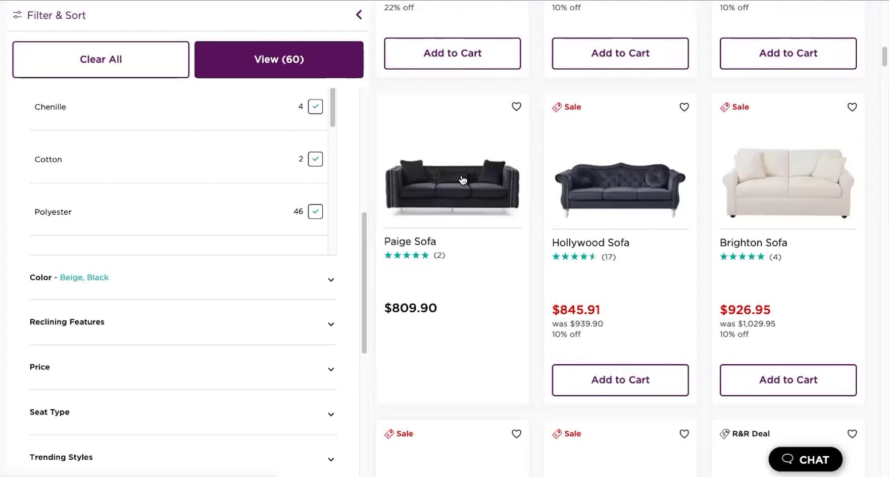
“Ooh, this one’s pretty! They have a lot of colors. I’m swiping to the right to see if it will show me other pictures, and it doesn’t! I like when…you don’t have to click into it to see the different pictures.” At Pottery Barn, a participant interested in a sofa was taken aback that additional thumbnails weren’t offered (first image) — and was forced to go to the product page to view more images (second image): “But they do have a lot once we’re in here.”

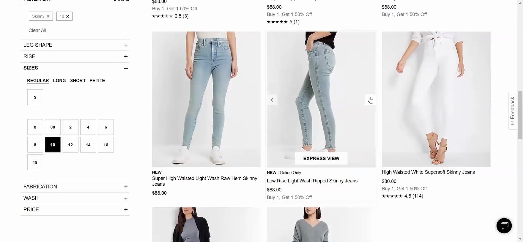
“‘Ultra stretch high-rise skinny fit jeans’, I like the sound of that!” A participant at UNIQLO paused on the item listing for a pair of jeans that caught her attention — but without any additional thumbnails offered to explore the item further, she resumed browsing without ever returning to that item.
The primary purpose of product lists is for users to quickly and accurately determine which products to investigate further and which to discard.
Thumbnails are heavily relied on when users scan lists, and multiple rounds of testing revealed that 2 images were often not enough for most users to get sufficient visual information about the product.


“I like the middle one in the bottom row, but I probably would click on it to see if that’s a slab or if that’s a leaf.” This participant at Ashley Furniture couldn’t tell from the default thumbnail (first image) nor the “Lifestyle” thumbnail on hover (second image) whether the tabletop was one solid piece or extendable, so she had to click through to the product page to find additional images.
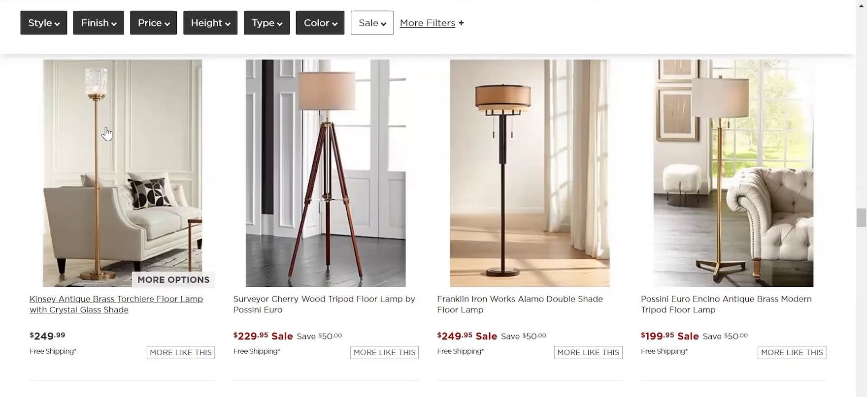

“I’m just going to open this one to see the photos. I’m wanting to get a better image of the top”, this participant at Lamps Plus explained as she clicked on a list item where the only available thumbnail lacked detail of the shade (first image). Once she found a “Feature Callout” image in the product page image gallery, she realized the texture of the shade didn’t meet her expectations: “I thought it was a little different, I didn’t think it had the [texture] to it. So that’s not something I would want to buy. So I’m going to go back and keep looking” (second image). A few minutes later, the exact same thing happened with a different lamp: “I’m going to look at this one too…[clicks through to product page]…And the same thing. So I see that it’s the same glass [texture], which I’m not a huge fan of that design, so I’m going to keep looking.”
“I like the pictures here. [But] I like how IKEA had them in a room too.” This participant at Raymour & Flanigan was only able to see the couches in the product list as “Cut Out” thumbnails, even though she liked to see “Lifestyle” images in the product list too. Since no additional thumbnails were provided, she wasn’t sure whether extra images were available or not, even on the product page: “Out of curiosity, I would probably open one in a tab and see if they have more pictures showing it in a room.”
Indeed, additional images often contain information that cannot be communicated any other way, especially for visually driven products or products with multiple features or complex configurations.
For example, users shopping for a couch may want to see a “Cut Out” image to understand its overall look, an “In Scale” image to assess its size, a “Feature Callout” image to understand storage or sleeper features, and a “Lifestyle” image to gauge its style in relation to other decor.
When sites offer only 1 or 2 thumbnails in the product list, users are almost guaranteed to need to click or tap through to the product page to see all product attributes that are best assessed visually.
Indeed, while 2 thumbnails might have been sufficient in the past (our previous recommendation was to show 1 additional thumbnail on hover), testing showed that some users now want and expect the product list to offer the richer functionality of a product page — and wanting more images is part of this phenomenon.
This is supported by our other research on the navigation from product list to product page (and back) (see Return Users to the Same Place in the Product List When Returning from the Product Page
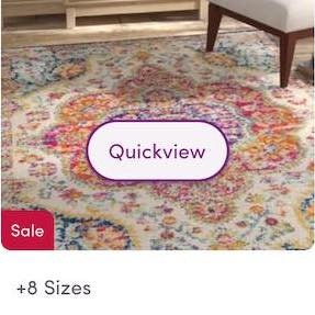
and Provide “Quick Views” for Visually Driven Products).
How Providing Access to 3+ Thumbnails Helps Users Evaluate Product List Items


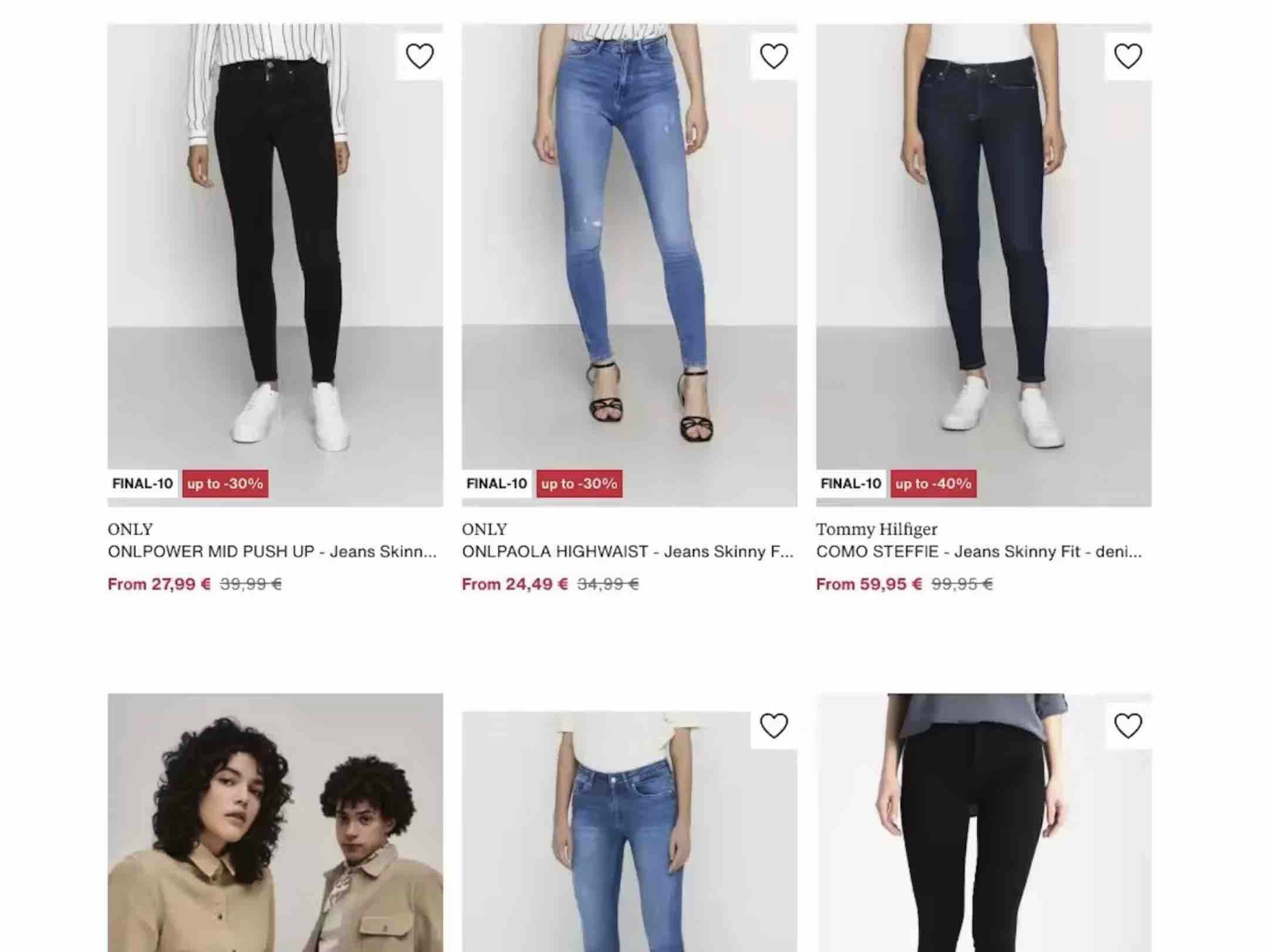
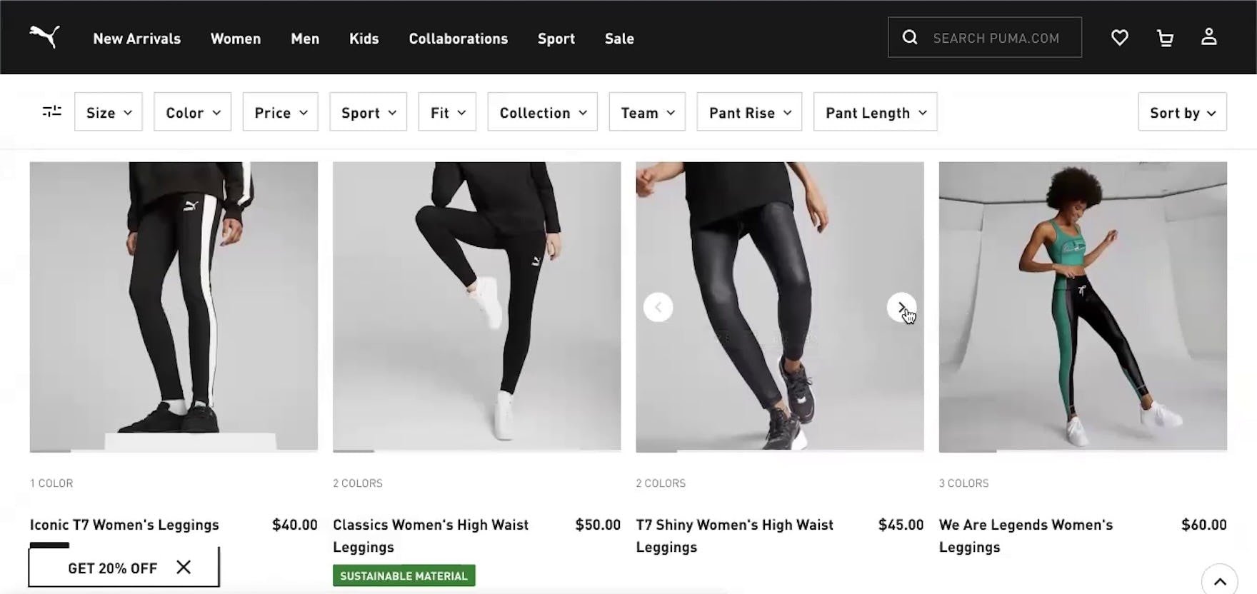
“I like how you don’t have to click into the different items to look at different pictures. They just have a scroll here that’s really useful…Sometimes on the main picture it’s hard to tell…it’s really nice that they have different viewpoints and zoomed in as well,” enthused a participant at Puma perusing running shorts. After noticing carousel arrows appear when he hovered over the thumbnails, he immediately began clicking them for other items, using the extra views to help him better evaluate the shorts (first through third images).


“I like how it has the different views that you can see, like right in this aspect right here. That makes it super convenient!” exclaimed a participant at Express while clicking through a thumbnail carousel for a pair of jeans (first to third images). Confident after viewing multiple thumbnails of the jeans she was interested in, she opened its product page and immediately added the jeans to her cart: “I do like those. So I click it! And then add it in.”


At CarMax, users could hover over a thumbnail and a carousel arrow would appear, signaling that additional images were available (first image). Users could carousel through additional images using the back and forward arrows to see additional views of the car (second image).
To maximize the visual information available to users scanning list items, access to additional thumbnails should always be provided in the product list and search results.
Importantly, 1 additional thumbnail won’t be enough for most users — 2 additional thumbnails should be considered a minimum, while 3+ will provide users with even more information.
However, apparel and accessories products, where both specific features and aesthetics count, will need a wide variety of image types and may need as many as 5–15 thumbnails to cater to users’ different needs for performing a full visual inspection and evaluation of the product.
Therefore, on both desktop and mobile sites provide 2+ thumbnails, so that users can navigate without having to leave the product list.
While default thumbnails should clearly convey what the product is and what it’s used for, be adequately sized, and depict the number of products included in multipack items, additional thumbnails serve a different role; they add context, detail, and additional visual information for products without cluttering list items.
Even though thumbnails are smaller than full-size product images available on the product details page, during testing most participants were happy to have all the visual information they could in the product list for products of interest — and used the additional thumbnails to either make a final decision about a product right then and there or as a reason to go to the product page to view the product in more detail.
How Signaling the Availability of More Thumbnails Affects Users’ Ability to Discover Them


“Oh, I like the shiny ones! I’m going to click through and look.” A pair of leggings at Puma caught this participant’s eye (first image). Using the carousel arrows that appeared on hover she viewed 5 secondary thumbnails for the leggings, including one image that showed the logo detail (“They have a little Puma logo, that doesn’t bother me too much”; second image) and another with a close-up of the fabric (“It kind of looks almost sheer in the back, but I think that’s just the shine”; third image). She then viewed other leggings in the product listings, eventually returning to this pair and quickly adding them to her cart: “I think I’ll go back to the shiny ones. I think those were my favorite so far…I’ll add those to the cart.”

At Kate Spade, users could swipe the default thumbnail to view 5 additional views of totes in the product listings.
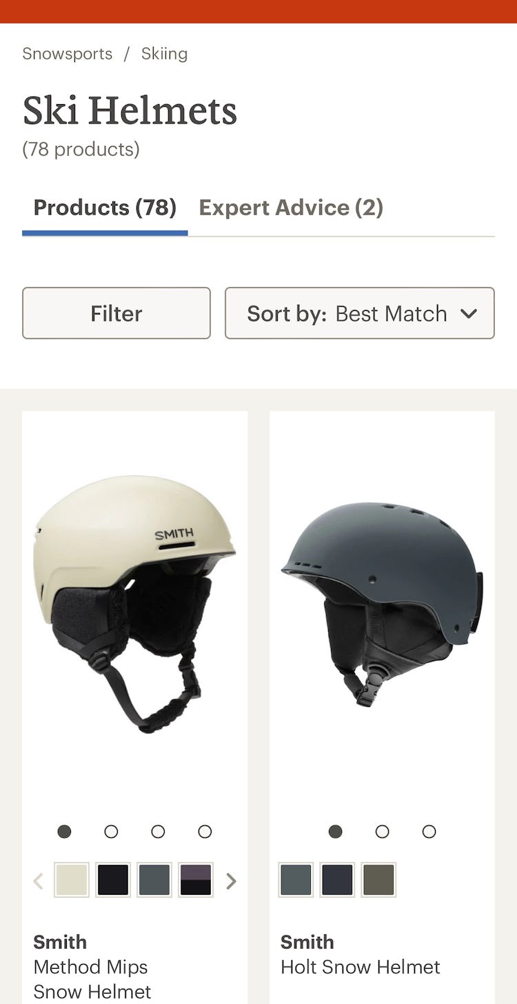
Similarly, users at REI could access more thumbnails of ski helmets by swiping the thumbnail image or tapping on the very large and visible carousel dots.
On desktop, providing permanent arrows or carousel dots or displaying such indicators on hover both performed well for participants.
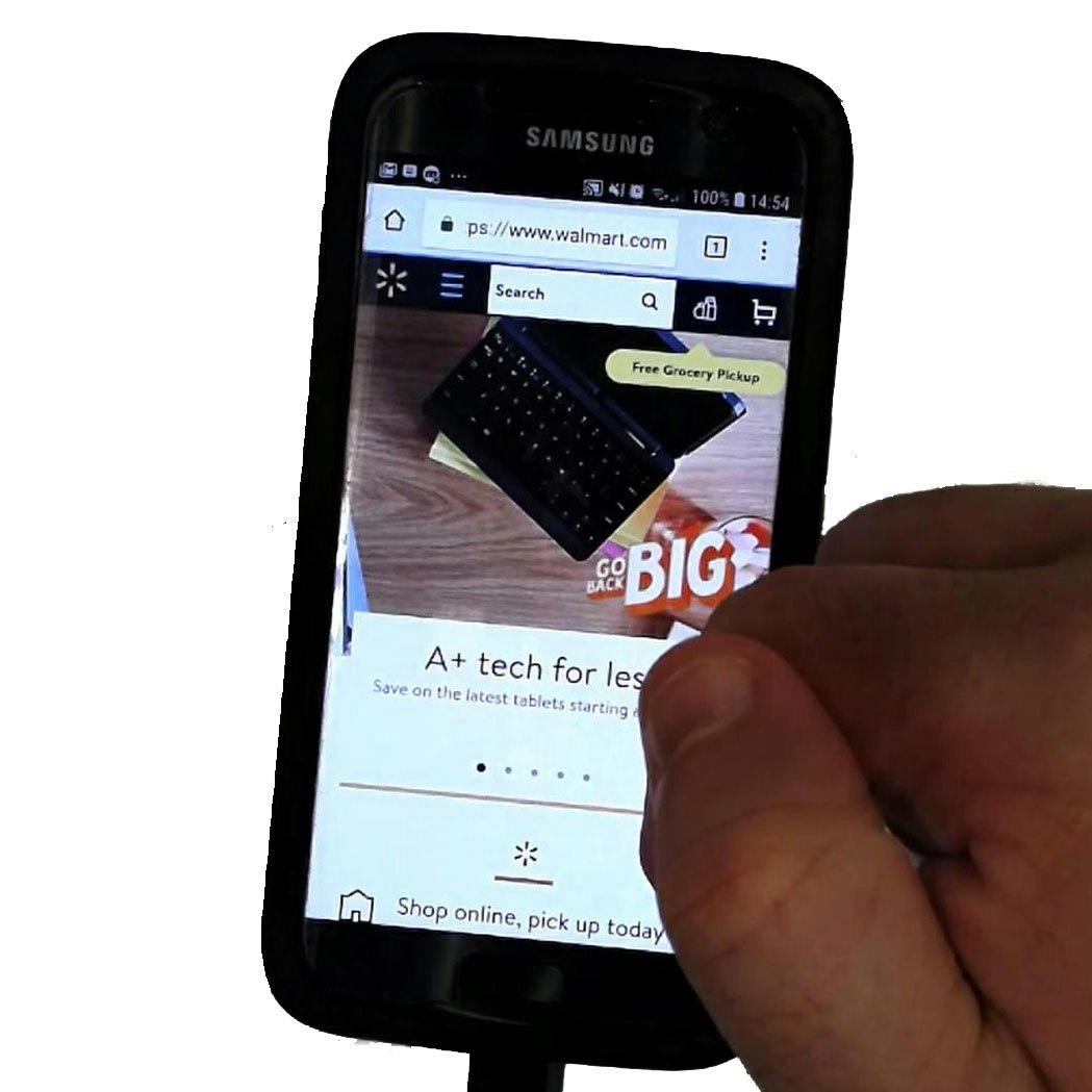
However, on mobile, carousel indicators visible by default are essential to signal their availability.
On either platform, the availability of additional thumbnails should always be visually communicated to users.
An overly subtle approach, where there’s no indication given at all of additional thumbnails, should be avoided.
Finally, some sites included autoplaying videos in their additional thumbnails, which in testing was received well by participants, particularly for industries like Apparel & Accessories where certain details are easier to glean using video (such as how a skirt moves when the wearer is walking).
Provide Users with Sufficient Thumbnails to Communicate Relevant Visual Information

“If I were interested in it size-wise, I would hover over it. See this one doesn’t come to life”, a participant at Serena & Lily complained when hovering didn’t trigger any access to additional thumbnails.
By offering at least 3 thumbnails for items in product lists (and as many as 5–15 thumbnails for apparel and accessories products), sites can maximize the visual information users need to fully inspect a product visually.
However, many sites with visually driven products don’t provide a sufficient number of thumbnails, and thereby provide insufficient visual information for users to adequately evaluate products.
This increases the likelihood that users overlook or discard suitable products or are forced to proceed to the product page to see more images.
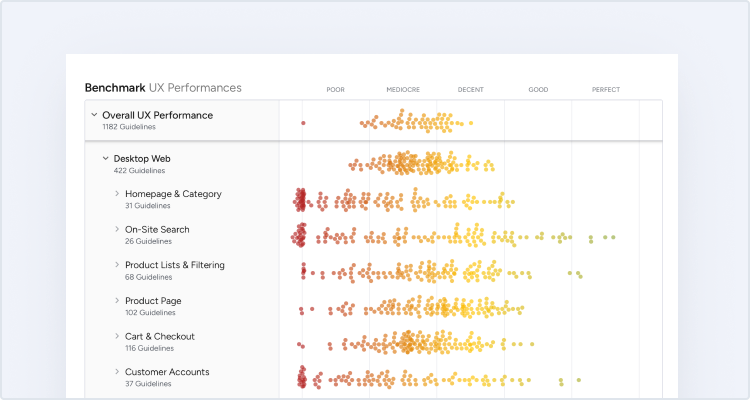
This article presents the research findings from just a few of the 650+ UX guidelines in Baymard – get full access to learn how to create a “State of the Art” ecommerce user experience.
If you want to know how your desktop site, mobile site, or app performs and compares, then learn more about getting Baymard to conduct a UX Audit of your site.