Key Takeaways
- Our UX benchmark of 130+ large e-commerce websites shows that 44% of sites perform “mediocre” or “poor” for “Product Lists and Filtering”
- As a result, users often abandon product lists without finding suitable products — solely due to resolvable UX issues
- This article details 15 best practices for improving your Product List and Filtering UX
As Baymard’s large-scale testing has revealed, finding just the right product can be almost impossible without the right tools.
E-commerce product lists and their filtering and sorting tools determine how easy or difficult it is for the user to browse the site’s product catalog.
Yet almost half of e-commerce sites perform “mediocre” or worse when it comes to product list usability.
As a result, many users will struggle to use the list effectively to find suitable products.
Baymard’s latest 2024 Product Lists and Filtering e-commerce UX benchmark adds to our previous Product Lists and Filtering benchmarks, and now contains the following:
- 11,000+ Product Lists and Filtering UX parameters that have been manually reviewed and scored by Baymard’s team of UX researchers
- 9,000+ best practice (and worst practice) examples from 130+ leading e-commerce sites in the US and Europe (performance verified)
In this article, we’ll share a portion of our large-scale Premium research UX dataset, which provides an overview of the current e-commerce UX landscape for Product Lists and Filtering and outlines 15 best practices applicable to most e-commerce sites.
The Current State of E-Commerce Product List and Filtering UX
Product lists are key to enabling users to find suitable products, as they help users explore and narrow down what can be lists of 100s to 1,000s of products.
Without a high-performing product list, users will skip over products that may have suited them.
As a result, some will — as we’ve observed many participants do during our large-scale testing — abandon the site, thinking they won’t find products that match their needs.
Despite the importance of the product list, our 2024 e-commerce UX benchmark reveals that many sites still perform at a mediocre” or “poor level.
For this analysis, we’ve summarized the 11,000+ UX performance scores for this theme, and plotted the benchmarked sites’ Product List and Filtering user experience across these topics in the scatterplot above.
Each dot, then, represents the summarized UX score of one site across the guidelines within that respective topic of the Product List and Filtering user experience.
Despite the importance of Product Lists and Filtering for users’ ultimate ability to find a suitable product, our 2024 UX benchmark shows that 44% of sites have a “mediocre” or worse performance.
This figure paints a relatively negative picture of the theme performance as a whole; that said, the performance trend is heading in the right direction and has improved since our previous benchmark in 2021.
Next, we’ll discuss the results from our research in more detail by sharing 15 Product Lists and Filtering best practices across 5 of our Product Lists and Filtering topics, beginning with Product List Layout.
Each topic will highlight common trouble spots, and we’ll provide examples of sites that get it wrong along with best practice examples from our large-scale testing and benchmarking.
4 Product List Layout Best Practices
The layout of product lists can prove challenging to users, especially as many are noisy and overwhelming by default.
It’s vital that sites help users quickly evaluate the scope of the product list and come to an accurate conclusion — is the list overly broad, too narrow, or, as Goldilocks would have it, just right?
When product lists are designed poorly, users have difficulty finding relevant products, and as observed in testing, this can lead to site abandonment.
More specifically, sites can hamper product-finding when
- loading too many or too few items at once,
- the loading schema makes it harder rather than easier to shop,
- items with variations display as separate items in the list,
- or the total number of products in the list is unavailable.
With 53% of sites hovering between “decent” and “good” performance, it’s apparent that many companies have yet to fully seize the missed opportunities available to them.
The following 4 best practices work together to produce a list layout that is more manageable for users to evaluate.
1) Load the Optimal Number of Items in the Product List (78% Don’t)
During large-scale usability testing, we’ve found that when sites load too many products into the default product list, some users feel overwhelmed by the number of items they must consider.
On the other hand, when too few products are loaded (sometimes in a bid to relieve performance issues), some users will fail to grasp the full range of products available.
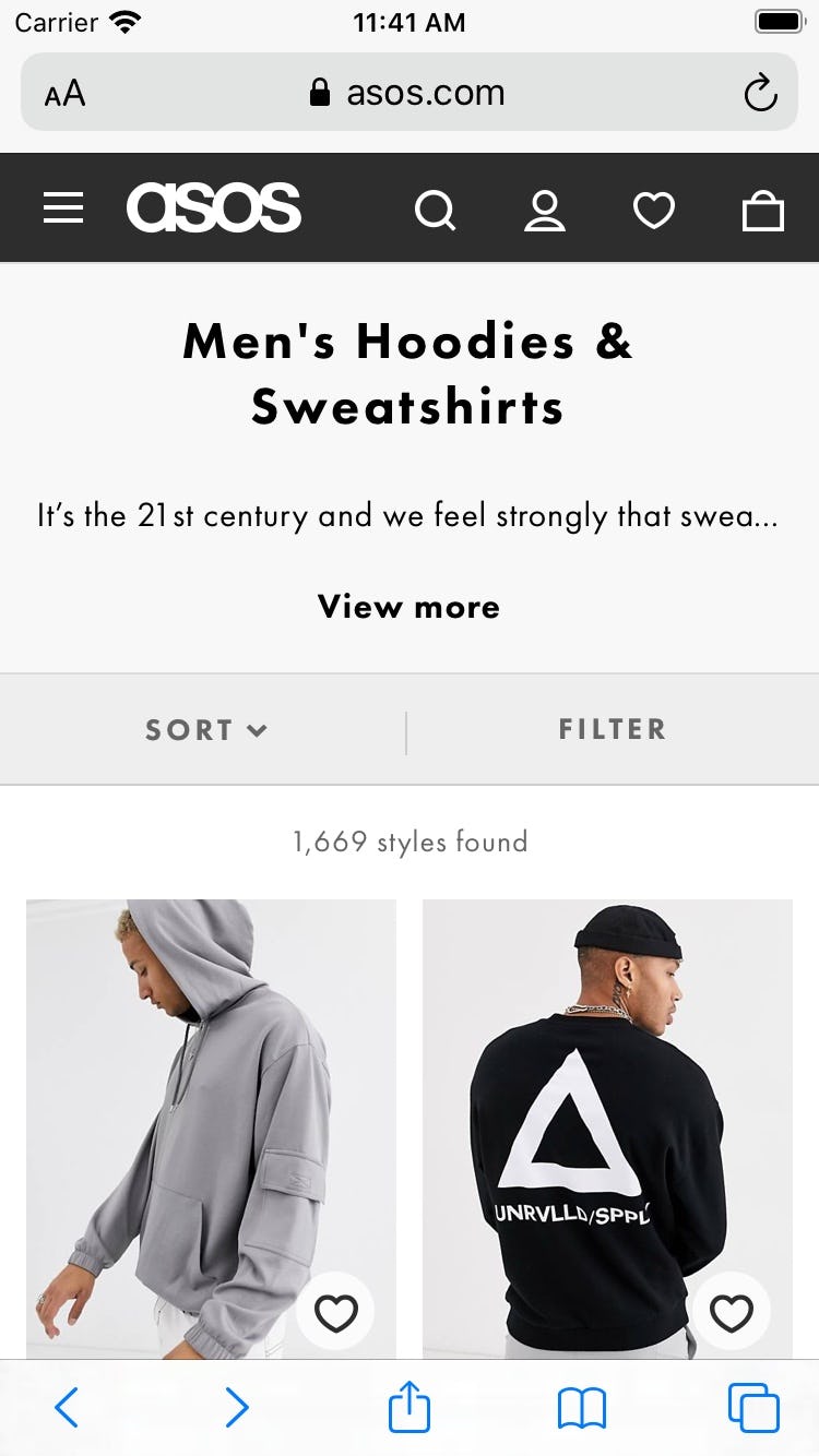
The 72 items in this product list at ASOS take up 18 viewports on a mobile device, but only 8 to 10 on a typical desktop monitor. To view all items on a page necessitates far more scrolling effort from users on mobile.
During testing, this even led some participants to abandon sites with relevant products, giving up when either too many products were presented or they underestimated the site’s product selection when too few were displayed.
To determine the optimal strategy, sites should consider the user’s current context and whether they want to encourage scanning a large number of products more superficially or inspecting fewer in depth.
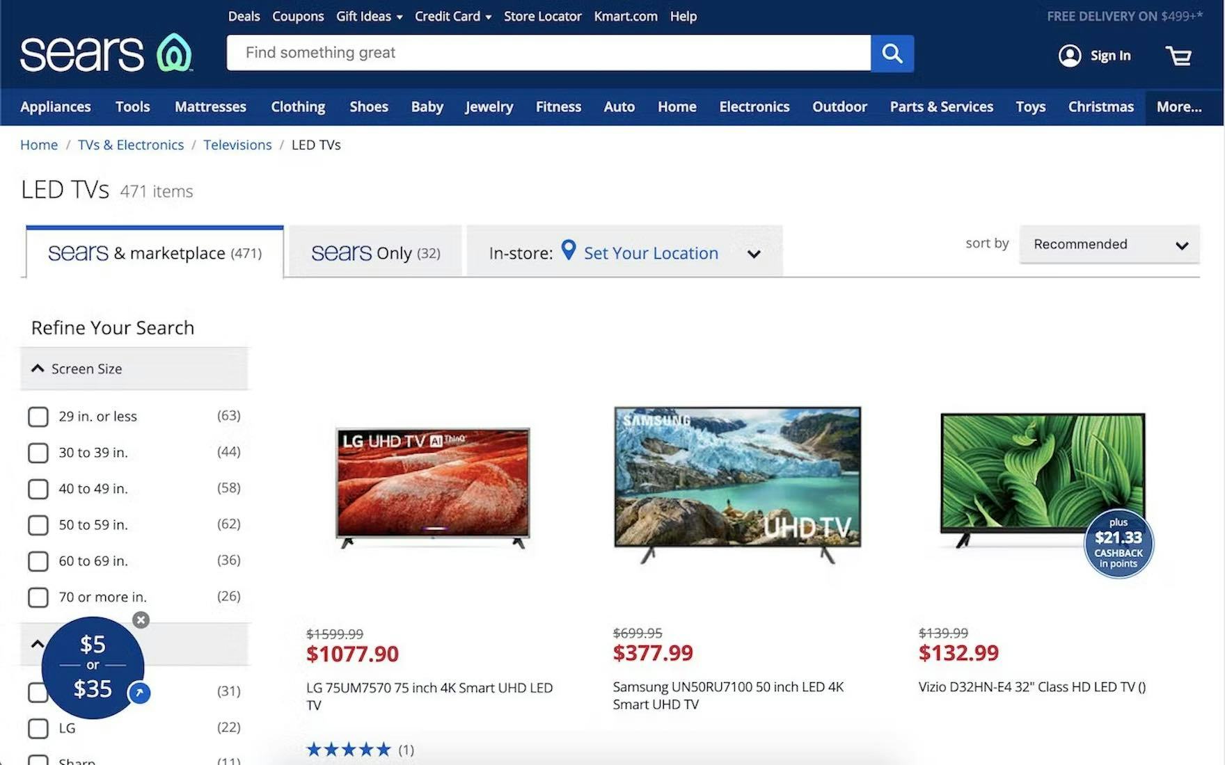
Sears presents the user with 50 spec-driven items (televisions) at a time.
The optimal range of products to load depends on the type of product — whether it’s spec driven or visually driven — as well as whether it’s a mobile or desktop device:
- For spec-driven products on desktop sites, our testing indicates that a range of 50–100 items is optimal
- For visually driven products on desktop sites, our testing indicates that a range of 100–150 items is optimal
- On mobile sites, for both types of products, 15–30 products is the optimal range
Providing users with the right number of products to consider in the product list helps them effectively estimate the scope of the list and efficiently determine the next best step.
2) Consider Using “Load More” to Show Additional Items (54% Don’t)
“Load More’’ is 1 of 3 types of loading schema for product lists and search results.
The other two — “Endless Scrolling” and “Pagination” — proved less successful during large-scale testing in providing users with the best product list experience.
“Endless Scrolling” was generally unhelpful to most users, while “Pagination” performed decently, but only if implemented carefully.
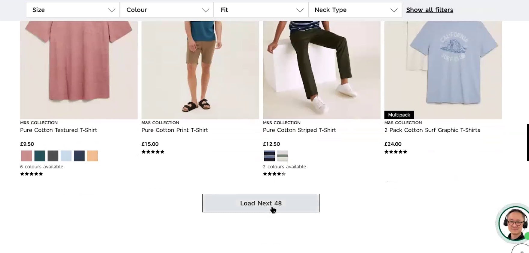
“I guess it’ll load the next 48”, said this participant at Marks & Spencer during large-scale European testing. Then, when the next 48 items loaded, she said, “Okay, so they all loaded on the same page and it didn’t take me to a new page. That’s pretty good, I like that.” When both previously viewed and new items are on the same page, users don’t have to visit multiple pages to compare items from each set.
The “Load More” implementation offers 3 main benefits that help users as they continue to peruse the product list:
- Users can compare all items viewed thus far on one page
- The page footer with helpful links remains easy to access
- There’s a natural stopping point that encourages users to consider next steps
Neither “Endless Scrolling” nor “Pagination” can match the benefits provided by “Load More”.
Moreover, “Load More” performs best for mobile users, as there’s just one button that controls the loading of more products, which offers a much larger tap target than pagination links along with a considerably simpler interface.
Despite the benefits, 54% of sites don’t use “Load More”, providing their users with a suboptimal product list loading experience.
3) Combine Variations of a Product Into One List Item (43% Don’t)
Certain products have variations that users need to be aware of when browsing product lists.
Examples of variations include the colors of clothing and consumer electronics items and the exterior finishes of home appliances like refrigerators.
There are 2 ways to display these product variations in product lists:
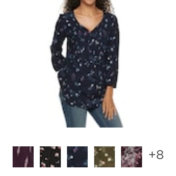
- Combine variations into a single list item, with the variations often indicated using swatches below the thumbnails.
- Display variations as individual list items, with each variation — for example, shirts in different colors — showing up separately in the list.
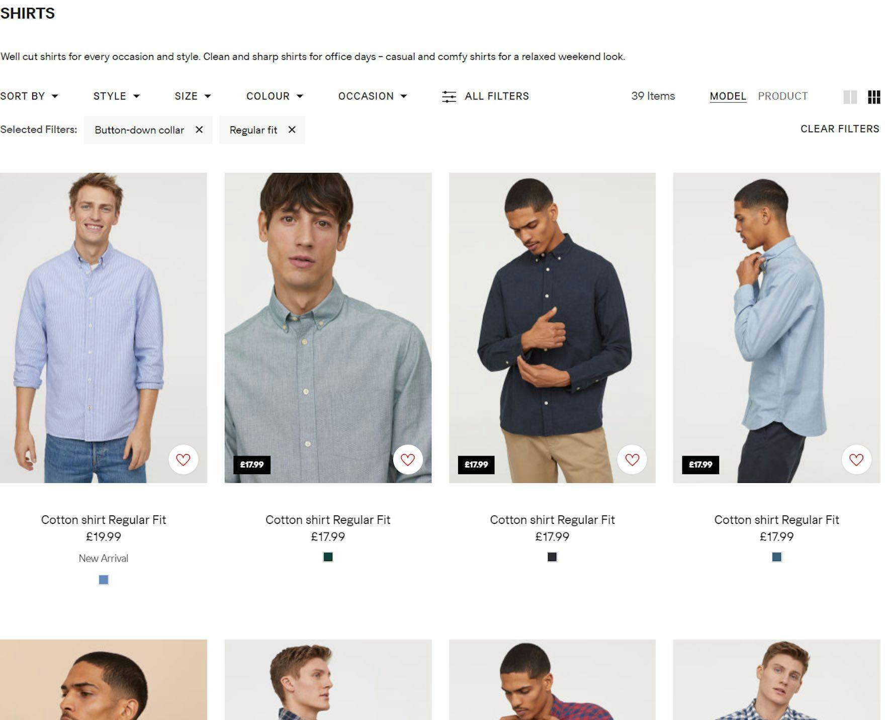
At H&M, color variations of shirts are shown separately. Users thus have a larger and more cluttered list to browse and it is difficult to figure out how many distinct products exist.
During multiple rounds of testing, it became evident that 2 major usability issues emerge when product variations display as separate list items:
- Product lists can become overly cluttered with product variations, overwhelming users and making it harder for them to get an overview of the actual range of products.
- When variations are spread throughout the product list, many users struggle to find a particular variation of a product, such as an item in a specific color.
Therefore, it’s important to combine product variations into a single list item to help users accurately estimate the range of the products and quickly find suitable variations.
4) Always Show the Total Number of Items in the List (27% Don’t)
When a site fails to display the total number of items in a product list or does not display it clearly, users will have trouble judging its scope.
Without information on the relevance and quantity of items, it becomes harder to determine the next steps: Am I ready to browse, narrow, expand, or view an entirely different list?
Users searching for products at Backcountry (first image) and The Entertainer (second image) will have no idea how many results were returned. Thus, they’ll have to spend time scrolling the list to get an idea of its extent before deciding whether to adjust the search terms, filter the results, or simply work with what they have.
Furthermore, we observed in testing that mobile participants experienced even more friction when the total number of items in the product list was unclear.
With fewer items visible at once, mobile participants had to scroll far more than their desktop counterparts to get a sense of the scope of the list, which drove inefficiencies in their shopping.
At Crutchfield, the total number of items for the product list displays at the top of the list but also at the bottom, helping users decide whether to refine or change the list before browsing more items.
Showing the total number of items in the list helps users determine whether a product list is manageable.
If the number of items in the list doesn’t match expectations for a given product category, users can quickly narrow down or widen the scope before spending time reviewing individual items.
During testing, we observed 3 details that help optimize the visibility of this number:
- repeat the number of items at the bottom of the list
- differentiate the number of results from pagination links, if used
- ensure the text size of the total number of items is sufficiently large.
4 Product List Item Info Best Practices
The purpose of displaying items in a product list is to allow users to easily and accurately determine which products to investigate further — essentially whether it’s worth the time to open a list item’s product page or skip it.
While that may seem like a fairly basic goal, it is by no means easy to achieve — testing reveals that sites must carefully implement the information for each list item (among other details) to ensure the product list meets this objective.
In the end, similar to many other Product List UX considerations, it requires a balancing act: ensure users have enough detail to decide whether they should visit the product page while also retaining scannability and surfacing an overview of the overall list.
Product List Info is one of the worst-performing topics in the Product Lists & Filtering theme, with the average site performing “poorly,” bordering on “mediocre,” and 65% of sites rated “mediocre” or worse.
While improving these areas can be time-consuming and costly, most sites stand to gain tremendously by addressing these inadequacies.
Below are 4 best practices that apply to the information surfaced for list items.
5) Always Provide These 5 Essential Pieces of List Item Info (85% Get One or More Wrong)
Many users select and reject products based on the information displayed about those items in the product list.
Yet during testing, we observed that participants were unable to adequately assess the listed products when the items lacked essential information.
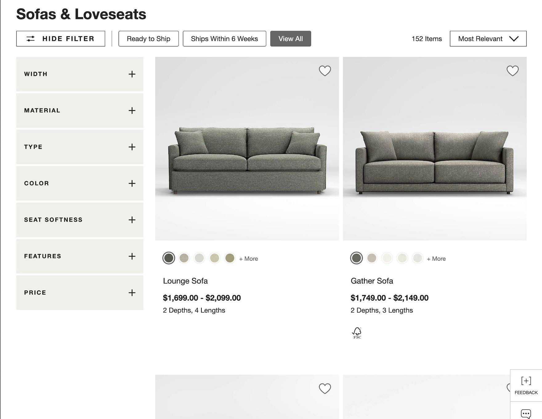
Crate & Barrel fails to include the review averages for these sofas. If users are interested in comparing sofas against this data point, they are forced to visit the product page for each sofa of interest.
When essential information is missing from a list item, users are forced to go to the product page, then back to the product list, and then back to a different product page—a back-and-forth exercise that quickly tests users’ patience.
Therefore, it’s critical to always include the essential details in the product list.
In particular, we’ve identified 5 pieces of information that most product list items should include:
- Price
- Product title or type
- Thumbnail
- Ratings
- Product variations
Yet 85% of sites fail to include one or more of these details — leaving users without access to necessary product information.
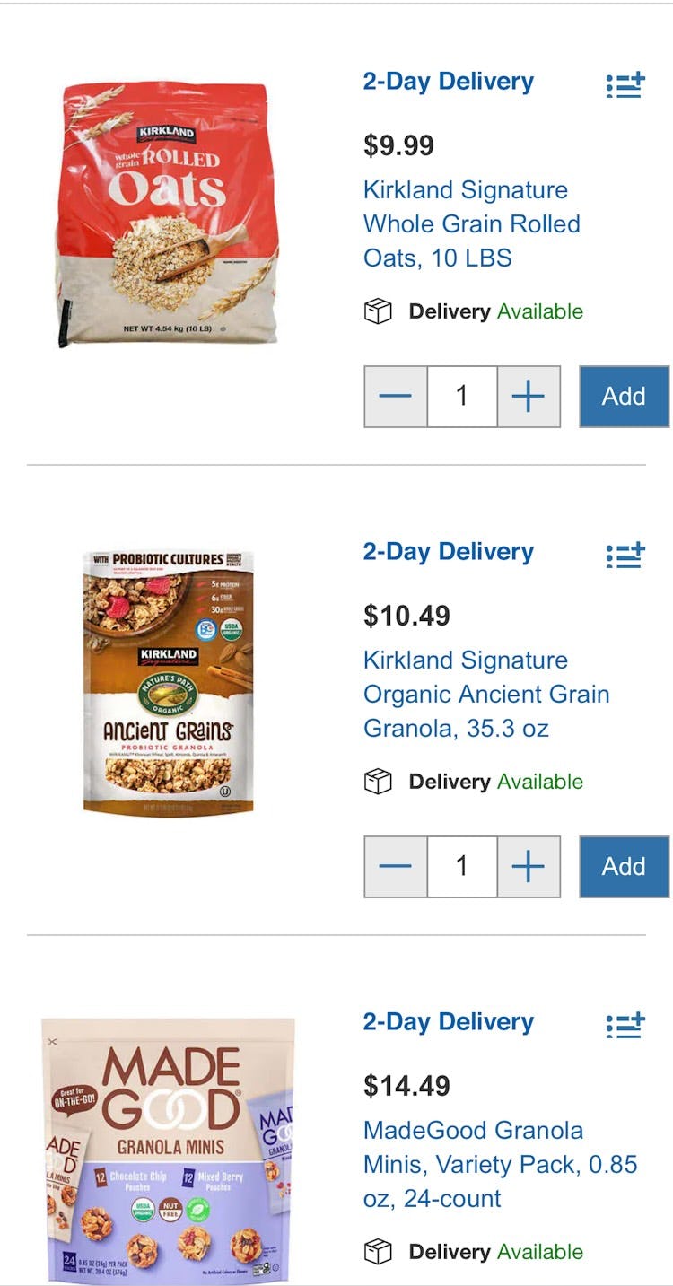
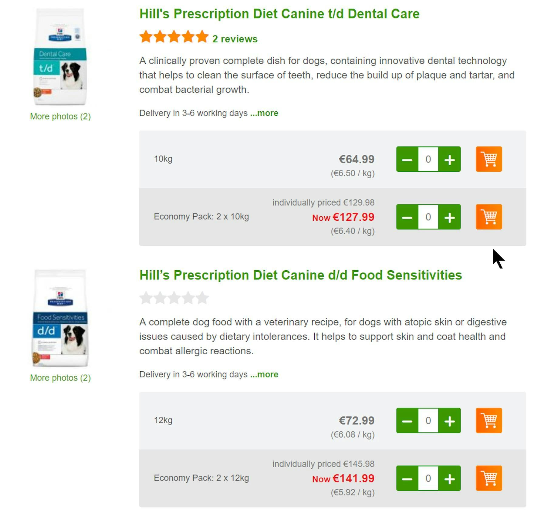
6) Display “Price per Unit” for Products with Varying Volumes or Quantities (89% Don’t)
When users compare the products available to them, price is often a critical factor that can significantly influence their buying decision.
Yet sometimes highly similar products are sold in different volumes or quantities together in the same list, making it hard to compare one item to another.
These products actually have two price points that are important to the user: the total product price and the unit price.
If sites only display the total price, users aren’t provided with the information they need to make an informed purchase decision.
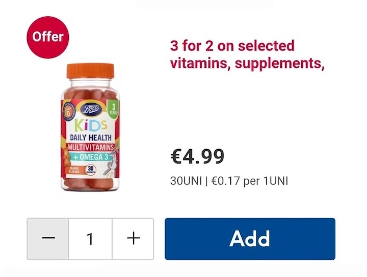
By providing unit costs, Zooplus makes it easier for users to select between product types and pack sizes. Users don’t have to calculate unit prices so the comparison process is easier and quicker.
Therefore, when offering similar products of different quantities and volumes, we recommend displaying both the total price and the unit price — yet a shockingly high 89% of sites fail to do so.
7) Provide Category-Specific Information for List Items (35% Don’t Include Enough)
Some product categories contain items with one or more attributes that are so important to convey that those details should be included directly in the list item overview.
“And it doesn’t have battery times. So unfortunately I will be skipping that.” If a critical feature is not included in the list item, such as battery time for a portable speaker on Otto (Germany) noted during large-scale European testing, users could easily dismiss products rather than visiting product pages for the missing detail.
Essentially, these attributes operate the same way as the 5 essential attributes just mentioned: they help users make informed decisions about which products to open and which to skip.
These attributes will naturally vary greatly across categories and must be chosen uniquely for the product types within each of them.
“Yes, good battery life.” On the other hand, another test participant found the same key attribute at Argos (UK), making this product worth considering.
While the specific attributes to include will vary, some category-specific attributes to consider include compatibility information (e.g., “Works with your Honda Fit”) , physical dimensions (e.g., length/width/height, capacity), appropriateness for audience or occasion (e.g., “Popular for Valentine’s Day” ), essential technical details (e.g., “IPX” for water resistance), and so on.
In the end, the goal is to identify the key category-specific attributes for a given product type and ensure they’re included in the product list.
8) Include and Display Product Attributes Consistently Across List Items (59% Don’t)
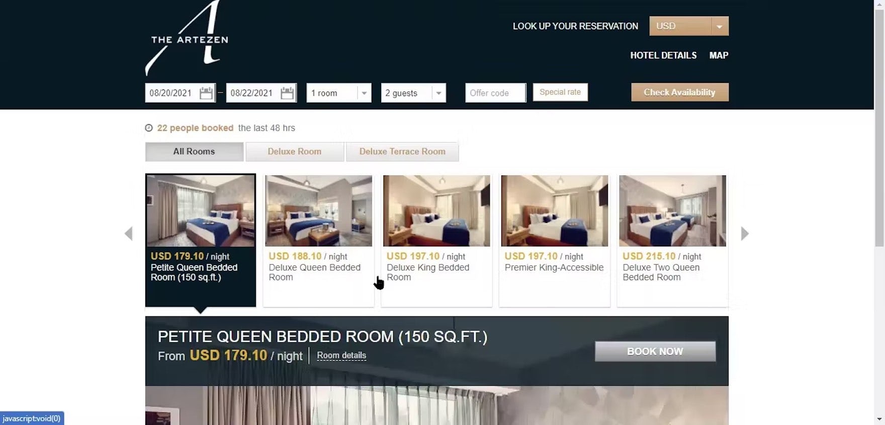
“It’s interesting that it’s ‘150 square feet’ for the ‘Petite Queen’, but all the other variations don’t tell me the number of square feet. That’s kind of what I would have liked to know.” During large-scale Travel Accommodations testing, this participant shopping for hotel rooms at a boutique hotel, The Artezen, was unable to compare rooms she was considering because square footage was only provided for one of the rooms.
During testing, whenever a site included different product attributes across the list items in a product list, or presented those attributes inconsistently, the participants would find it difficult to evaluate, compare, and choose between those products.
For example, if an electronics site only includes “Battery time” for some of the laptops in a product list, users would have a difficult time comparing those items with any items that didn’t include that same detail.
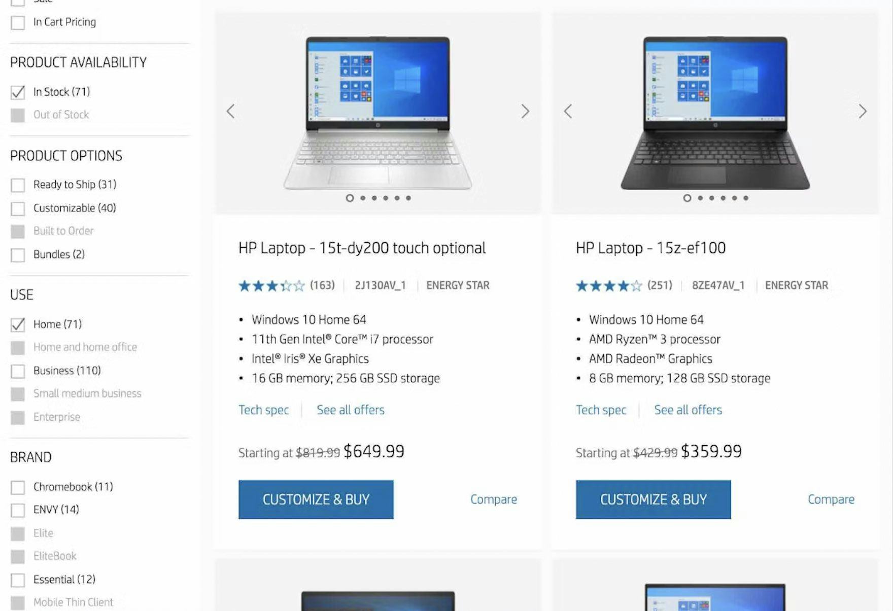
At HP, information in list items is included and presented consistently, e.g., operating system, processor, graphics card, and memory information. Users can effectively compare laptops and decide which to explore further.
Therefore, in addition to providing the right information, it’s important to provide information consistently across list items.
Doing so helps the product list function more effectively as a way for users to compare products.
2 Product List Item Features Best Practices
Certain features and interactive elements within a product list exist to help users compare and assess items quickly and effectively.
While users can often simply scan list items and quickly decide what is suitable and what isn’t, during testing, participants were frequently observed to need further help when evaluating products against one another.
List Item Features is one of the worst-performing topics in Product Lists & Filtering, with the average site performing “poorly” and 77% of sites rated “mediocre” or worse.
When trying to compare products, users often encounter 2 key challenges:
- no way to directly compare spec-driven products on a single page, and
- hard-to-scan data due to layout or formatting issues in a comparison table.
This section describes 2 best practices that help users quickly compare multiple products without having to remember pertinent information from each item’s product page.
9) Always Provide Comparison Features for Spec-Driven Products (48% Don’t)
At Kohl’s, there’s no comparison feature. Users must rely on the product list and product page to compare items, which is typically inefficient and challenging for users.
Enabling users to compare products easily and efficiently is one of the primary purposes of product lists.
While scanning the information in a product list is sufficient for some products, spec-driven product types often have multiple differentiating attributes that are too numerous to display within the list item.
Furthermore, switching between the product list and product page can be challenging for users, as it forces them to memorize or take notes on a variety of different specifications.
At B&H Photo, a comparison features allow users to compare up to four spec-driven products, which will help them view critical attributes of these camera bags across multiple products in one view.
After selecting camera bags to compare, users at B&H Photo can review the dimensions and weight for each in one place, which significantly decreases the cognitive load and time associated with the task.
Therefore, sites with many spec-driven product types should provide comparison features to optimize the interface for users needing to compare products.
Note, however, that our large-scale testing found that comparison features were unhelpful for mobile users due to the device’s smaller interface.
10) Optimize Comparison Features for Scannability (78% Don’t)
Simply providing a comparison feature isn’t enough — the feature must be easy to scan to be truly useful.
Without careful design, comparison tables can be hard to read and can unintentionally slow down users’ purchasing decisions.
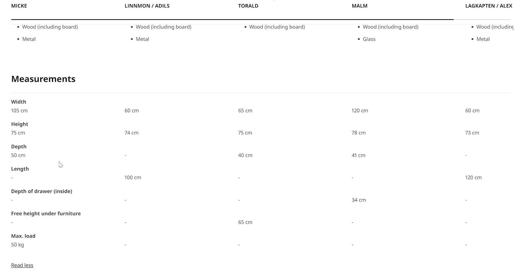
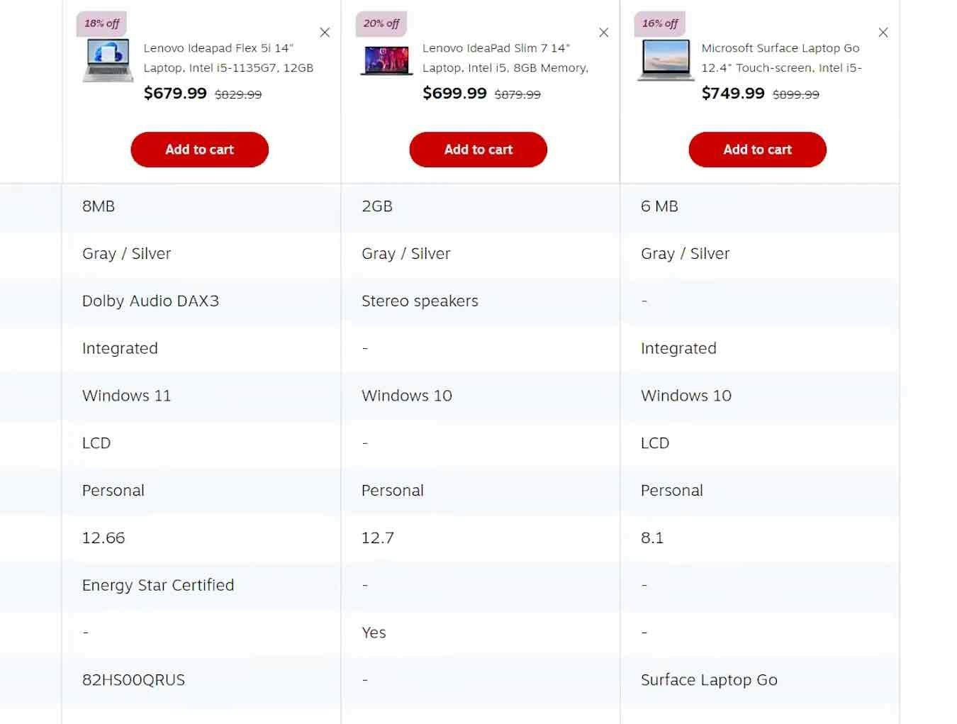
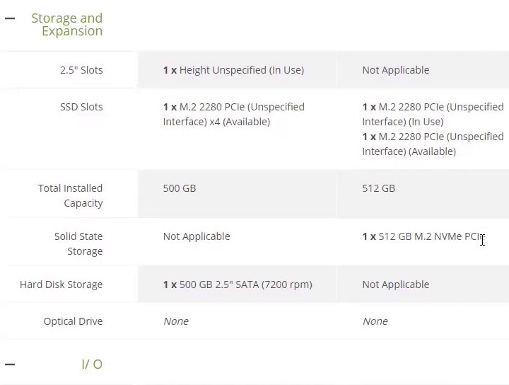
The rows in IKEA’s comparison table lack horizontal styling, increasing users’ scanning efforts. Further, the lack of data in some cells makes it slightly harder for users to follow the line across — for example, the “Length” row — because of the absence of any design element to guide the eye.
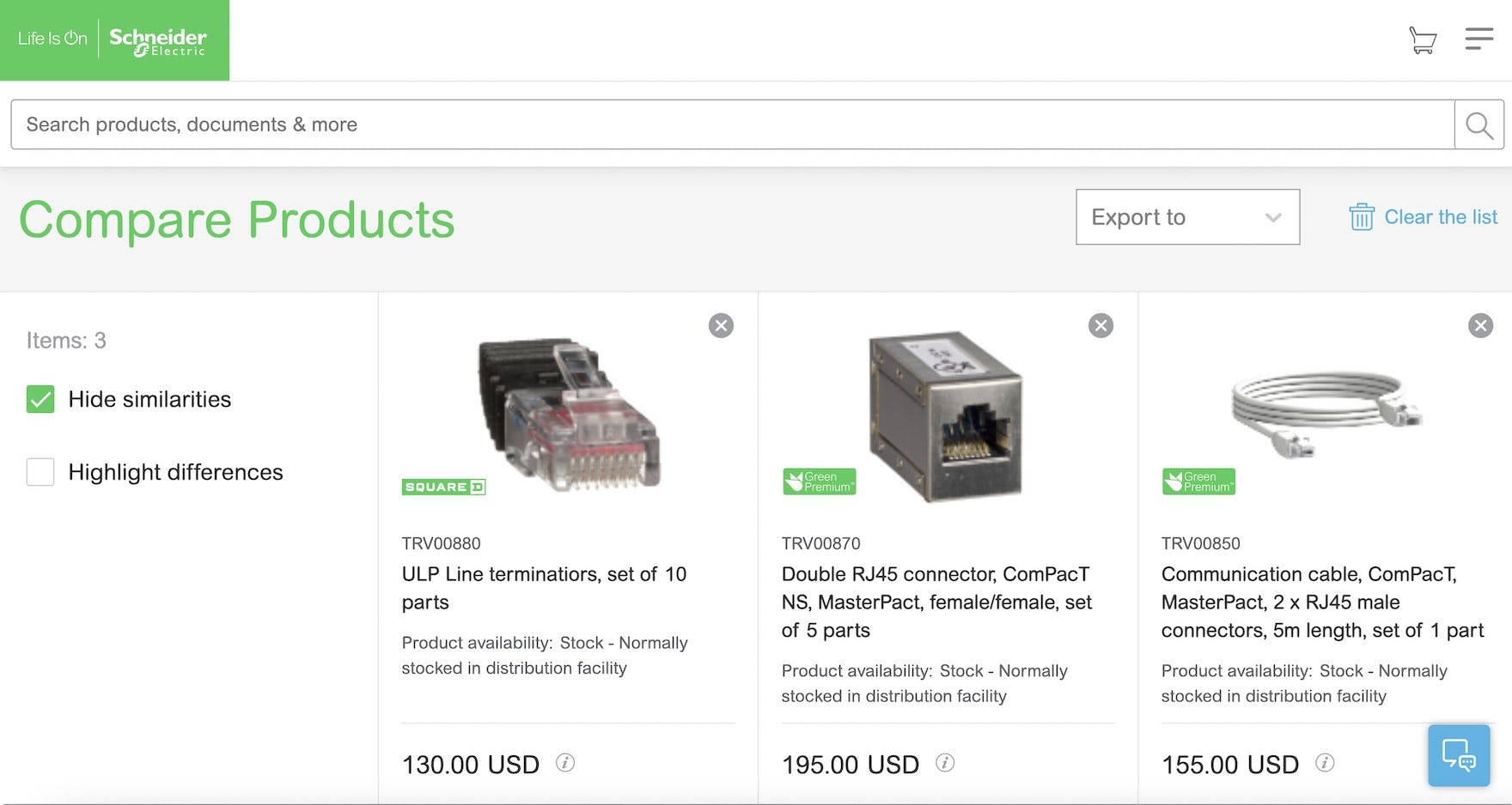
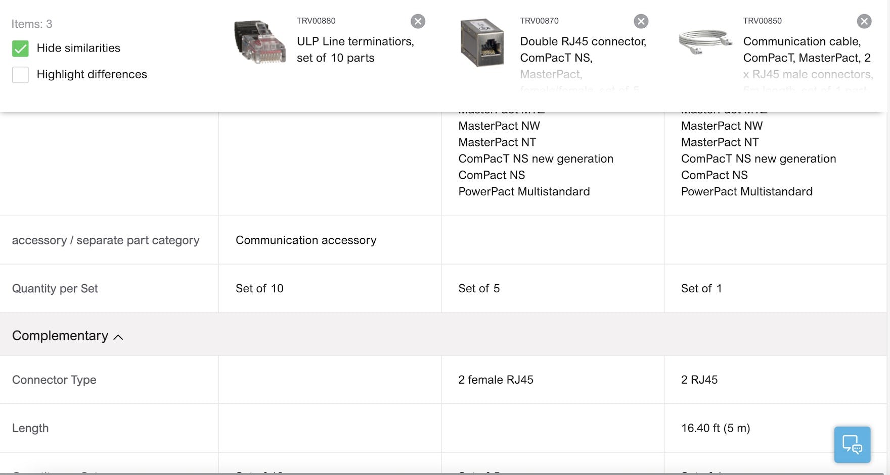
At Schneider Electric, the comparison feature allows users to “Hide similarities”, attributes are grouped by category, column headings are persisted as users scroll down, and horizontal lines help define rows. For B2B electronic components and machinery sites, comparison features are likely highly used and relied on, making them even more important to get right to ensure the feature performs well.
In particular, our large-scale testing revealed 4 key design details for comparison features that are important to implement to enhance scannability:
- Remove identical attributes
- Group attributes by category
- Persist column headings during scrolling
- Use horizontal styling to define rows
A high-performing comparison feature is more likely to be useful, which means more users are likely to find a suitable product.
3 Product List Filtering Best Practices
Filtering empowers users to take a large generic product list and narrow it down to a manageable set of products uniquely tailored to their needs and interests.
In some ways, it’s the e-commerce equivalent of walking into a physical store and asking the salesperson for a “women’s black leather jacket in size medium”.
To be successful, sites must provide the essential filters that cross product categories and offer additional filters for attributes that are unique within a product category.
Furthermore, to use them effectively, users must be able to understand the meaning of each filter type and option, either through a clear text label or a helpful thumbnail image.
Filtering is a large topic, and our filtering guidelines are placed in 3 separate subtopics: “Available Filters”, “Scope and Logic”, and “Interface and Layout”.
- For “Filtering: Available Filters”, our benchmark reveals a decline in average performance over the past two years with 57% of sites rated “mediocre” or worse performance and 32% of sites rated “poor”.
- For “Filtering: Scope and Logic,” our benchmark reveals that sites perform better in general, with 69% performing “decent” or better and 17% rated “perfect”.
- For “Filtering: Interface and Layout”, our benchmark reveals an interesting split in performance, with 49% of sites rated “mediocre” or worse and 37% rated “perfect”.
Below we’ll discuss 3 filtering implementations that many sites get wrong.
11) Always Provide These 5 Essential Filter Types (55% Don’t)
Effective product finding relies on users’ ability to filter e-commerce product lists according to their purchasing preferences.
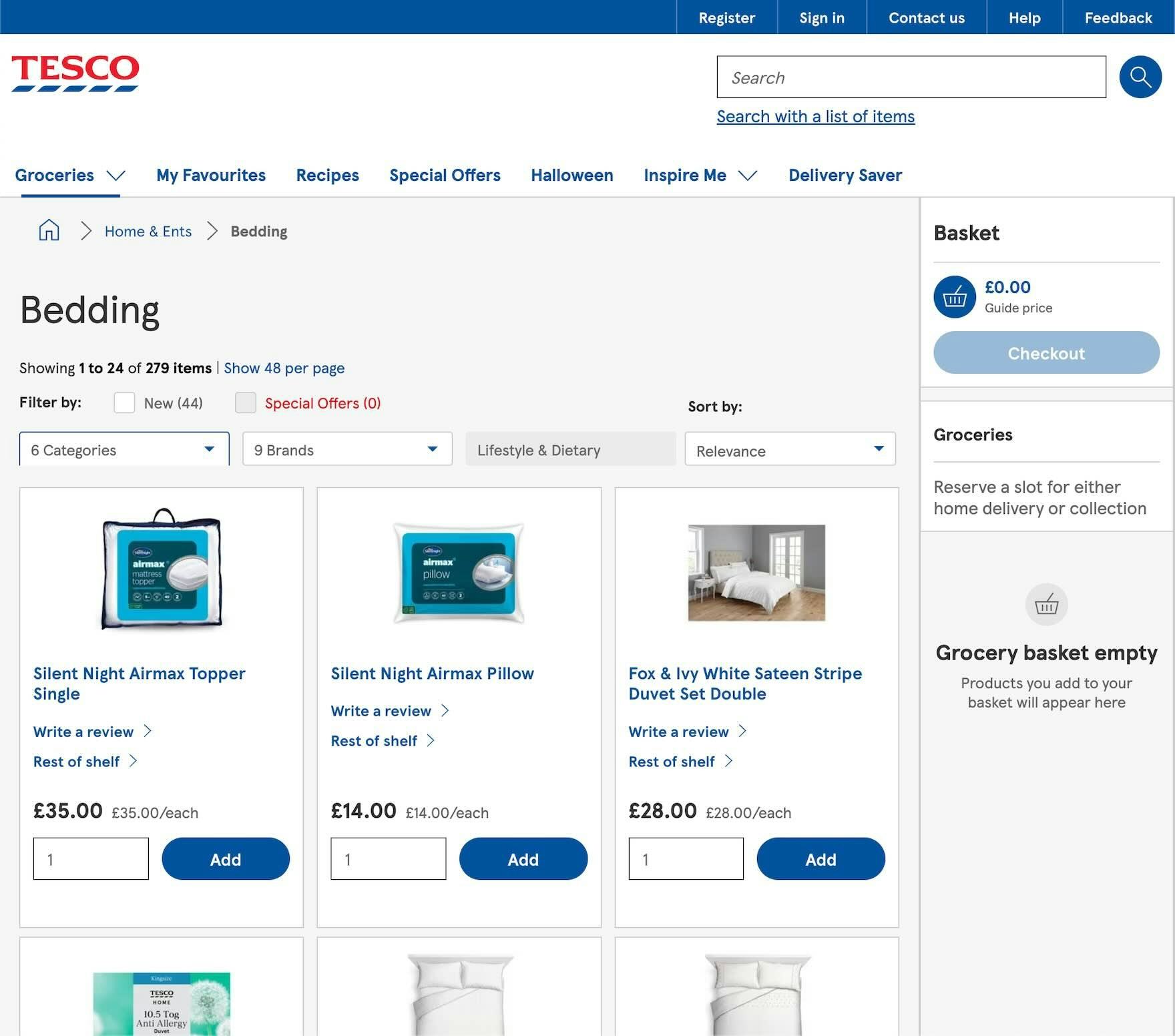
Users shopping the “Bedding” category at Tesco are unable to filter by price, user ratings, size, or color. Instead, they must wade through a list of 279 items without the ability to narrow the scope using these essential factors.
When users can’t adequately filter product lists, they often can’t properly tailor the list to only items of interest, and they may be unable to find products that actually exist on the site.
Indeed, the absence of one or more of these key filter types could easily result in users leaving the site to look elsewhere for the products they want.
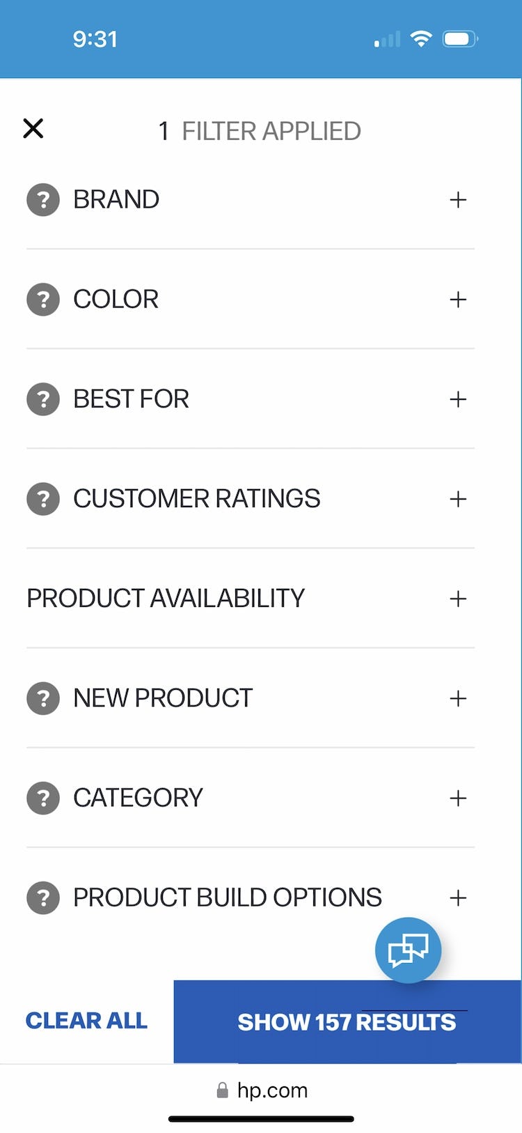
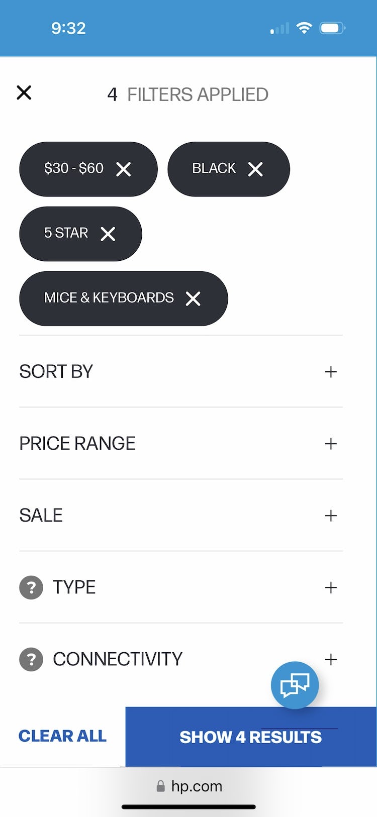
Users searching for “Mice & Keyboards” on HP can quickly filter the product list of 157 items using essential filters such as price, user ratings, color, along with numerous other category specific filters. Users can thus skip any lengthy scrolling tasks and narrow the list quickly to just relevant items.
Large-scale testing revealed 5 filter types in particular that should always be provided if applicable, as they are commonly used and critical helping many users find suitable products:
- Price
- User ratings average
- Color
- Size
- Brand
Providing these 5 essential filters will allow the vast majority of users to filter product lists to a subset that better matches their items of interest.
12) Always Explain Industry-Specific Filters (62% Don’t)
As just described, filters are key to helping users narrow the product list to a more suitable set of items.
Indeed, filters can often be the deciding factor in whether a user is able to find a desirable product.
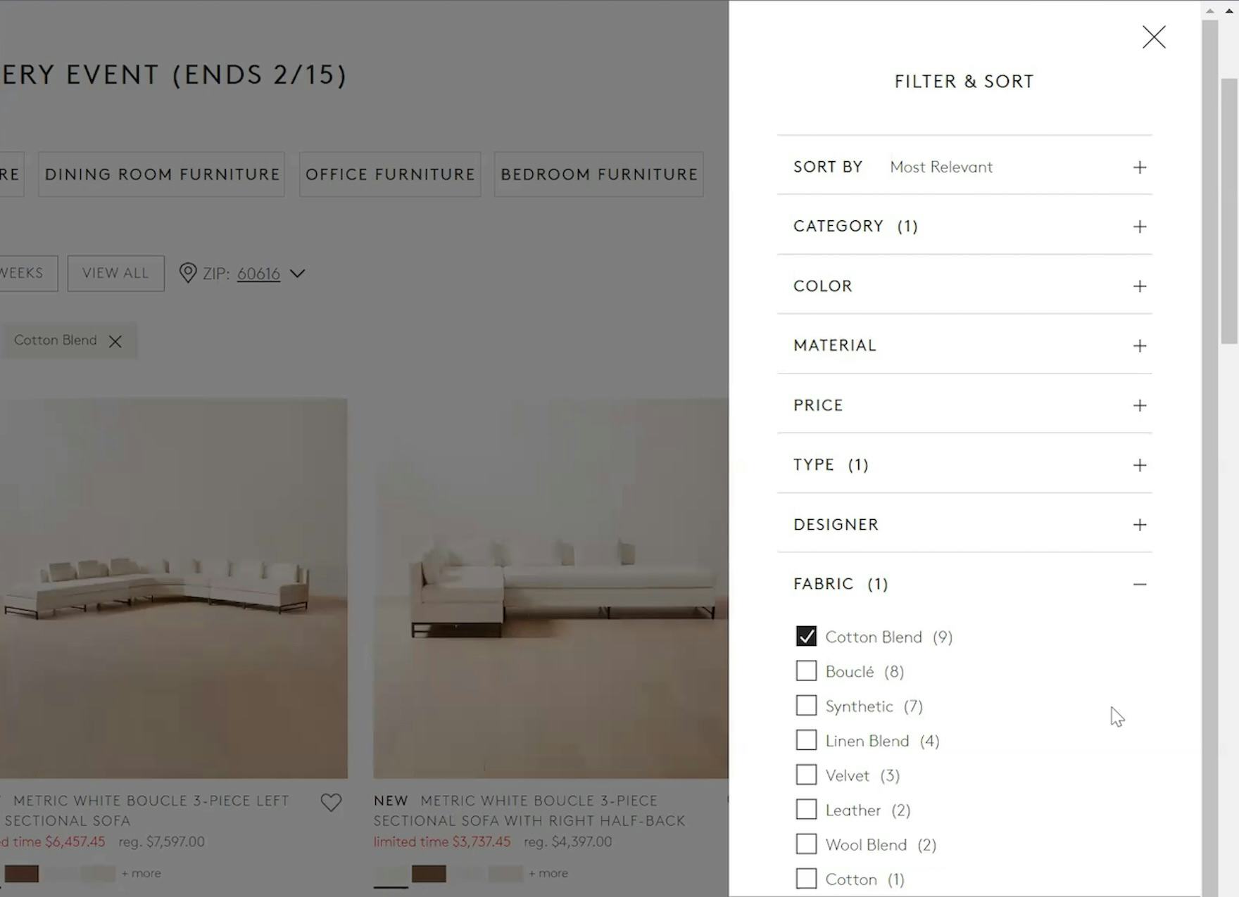
“Now it’s throwing me off…I know ‘Linen’ and ‘Wool’ are different, but then what’s the difference between ‘Cotton Blend’, ‘Cotton’, and ‘Linen Blend’? Ugh…Like, what is this B-O-U-C-L-É? Now you want me to Google this to figure out what that even is?… Should I get something [when] I don’t know what it is?” When users don’t understand filter names, they’re likely to avoid them, like this participant at CB2. If users go offsite to learn the unknown term, there’s a risk they won’t return.
However, if users don’t fully understand the filter types and options, it can be as damaging as not having these filters in the first place, and as observed in testing, led users to delay purchasing decisions.
Ideally, then, filter labels should entirely avoid using industry jargon.
Yet sometimes industry jargon can’t be avoided, such as when it is relevant or critical for “users in the know”.
Grainger provides a tappable Help icon so that users who are unfamiliar with industry terms can view their definitions and reduce the chances of accidentally making a poor selection or not applying an otherwise helpful filtering option.
In this case, such filters should be explained so that users who are unfamiliar with the terminology can learn about those product attributes and whether they are relevant to the task at hand.
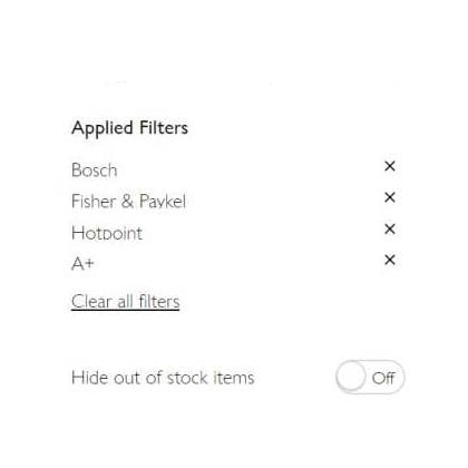
13) Display Applied Filters in an Overview (29% Don’t)
When users filter product lists, almost all sites confirm their choices at the location where the filters were applied — for example, by showing a selected checkbox for a filter option on a desktop site.
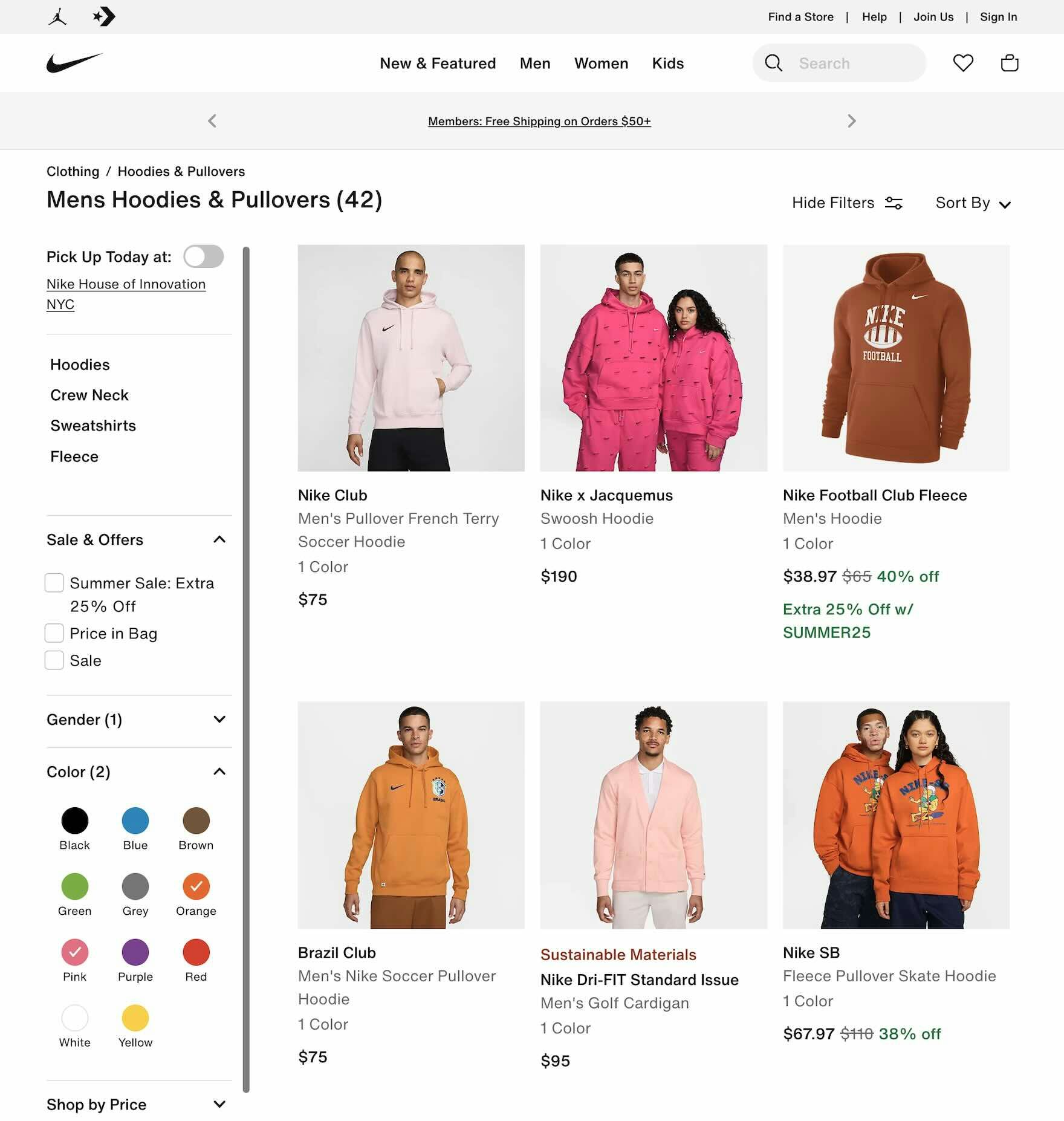
On desktop, the absence of an applied filters overview can slow users down when they need to check which filter options they have selected. If multiple filter options are applied and are out of view because they are spread across more than one viewport — as can be the case with a tall sidebar such as here at Nike — it will take longer to find all of the applied filters than if an overview were present.
However, during both desktop and mobile large-scale UX testing, many sites failed to provide an overview of applied filters.
Without this overview, users encounter 2 main issues:
- No easy way to confirm which filters are applied
- Removing the applied filters is often cumbersome
Some users can even become disoriented by the results of their filtering operations because they lack the overall context of the product list, which cannot be easily seen at a glance.
Therefore, the selected filters should be displayed in an overview.
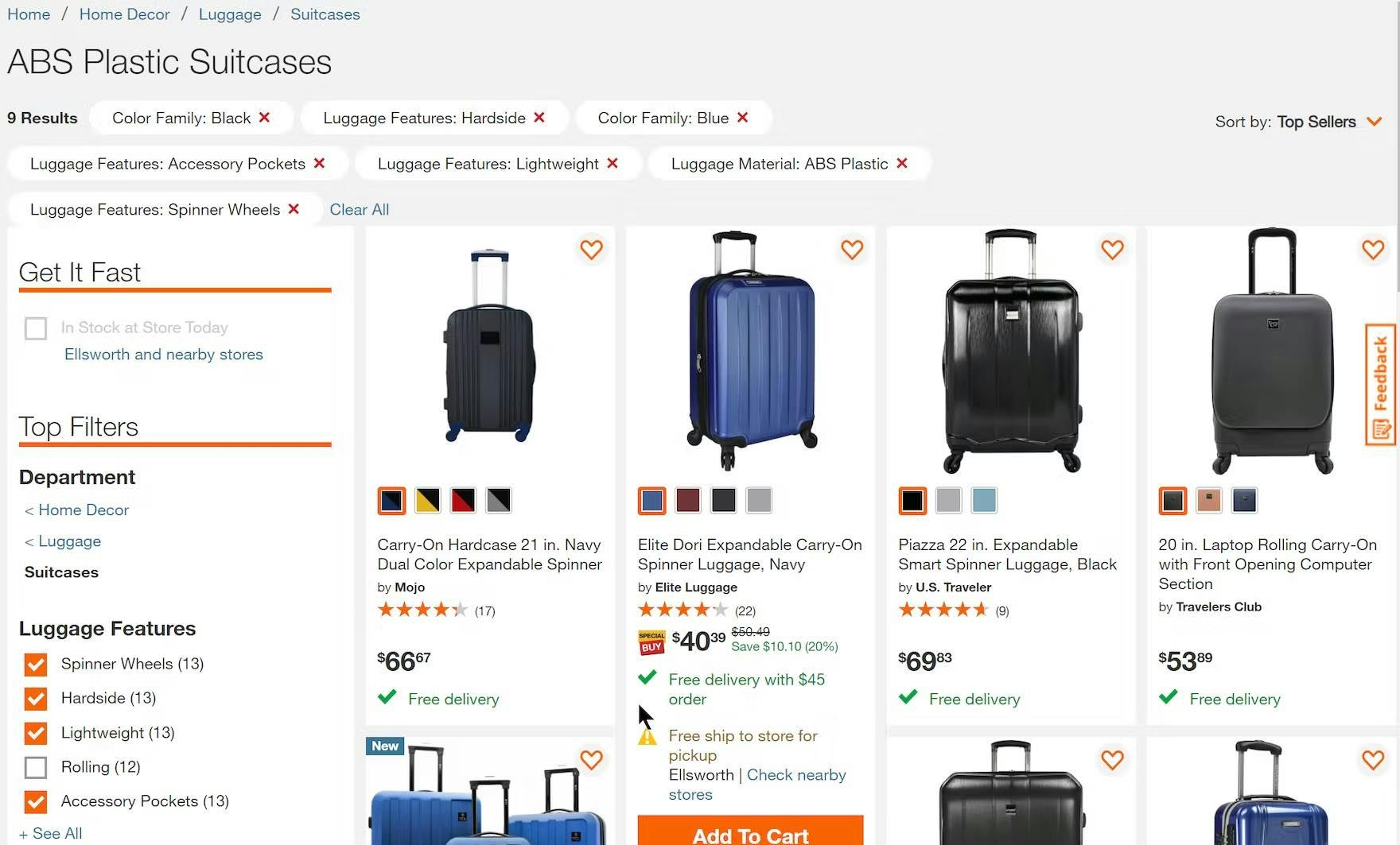
Applied filter options on Home Depot are large and very obvious. The red “Xs” within the applied filters also help to draw attention, and the “Clear All” link allows for their easy removal. Users will find it easy to confirm what filters are applied, remove those that are not needed, and keep apprised of the context of the list.
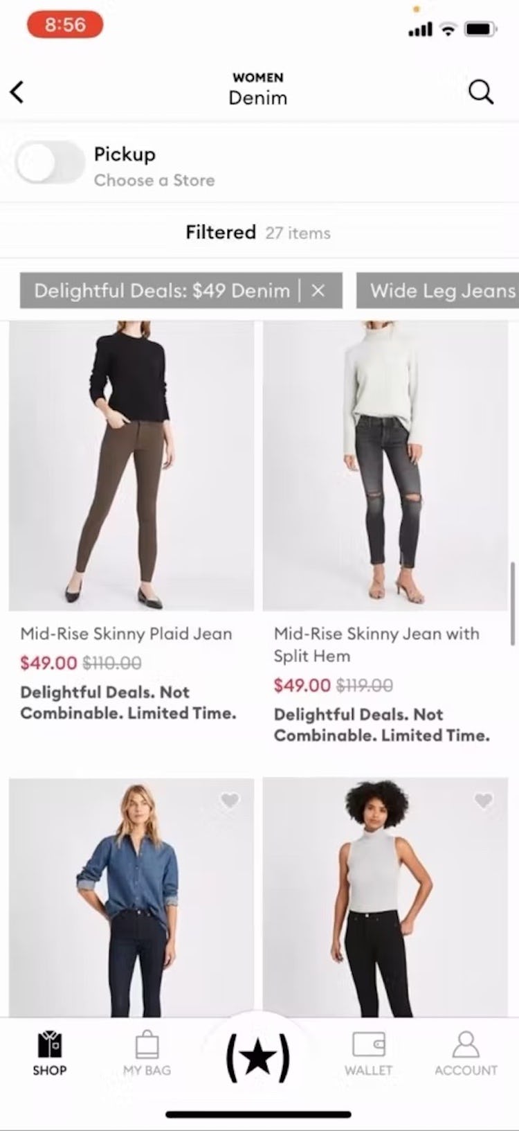
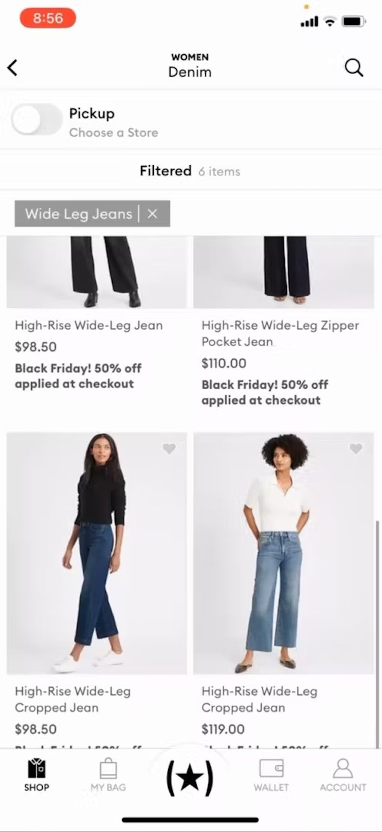
“I’m going to get rid of that [filter]…okay.” The use of horizontally scrolling applied filters in the Banana Republic app made it very easy for this participant to remove one. In this case, the width of the two filters made it easy to see that there was more than one applied.
Depending on the platform — desktop or mobile — there are several different solutions that have been verified to perform well for users during testing:
- On desktop, filters can be displayed in an overview above the product list, above the filtering sidebar, or below a horizontal filtering toolbar.
- On mobile, filters can be displayed in a horizontally scrolling or stacked list at the top of the product list.
2 Product List Sorting Best Practices
Many users confuse sorting and filtering features and don’t realize that sorting only changes the order of the items listed.
Sorting receives far less attention than filtering as a feature and sites may, therefore, not realize the important role it plays in users’ shopping.
During testing, sorting proved critical to helping participants find and select products; for example, when price mattered but they didn’t have a specific range in mind.
Aside from conflating sorting and filtering, 2 key struggles for users are
- overlooking the sort control (i.e., discoverability), and
- the lack of meaningful or helpful sorting options.
“Sorting” saw the best overall performance across the 8 Product List and Filtering topics, with 60% of sites rated “decent” or better; still, 58% of sites lacked critical sorting options and 83% did not sort user ratings according to best practice.
With little sign of innovation for sorting types, most sites have something to gain by addressing inadequacies with this task.
To follow are 2 key best practices that apply to sorting list items.
14) Always Provide These 4 Essential Sorting Types (58% Don’t)
Sorting allows users to rearrange products in the list so that those of most interest are at the top.
During our large-scale usability testing, we observed 4 essential sorting types to be commonly sought out by users:
- Price
- User Rating
- Best Selling
- Newest
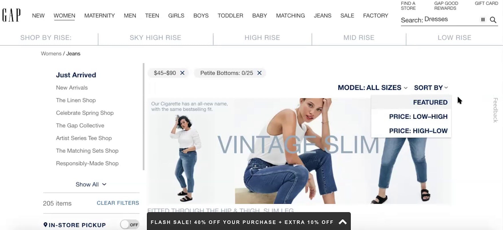
“I’m going to sort — so again, this is another one where I wish they had more of a ‘Highest Rated’ or ‘Bestseller’ [sort option].” This participant at GAP was dismayed to be unable to choose a sort option that reflected other people’s opinions and buying preferences.
However, our latest benchmark shows that 58% of desktop and 60% of mobile sites don’t offer all four of these sorting types.
Failing to provide all four of these basic sorting types means that some users will be unable to rank products by the criteria that matter to them.
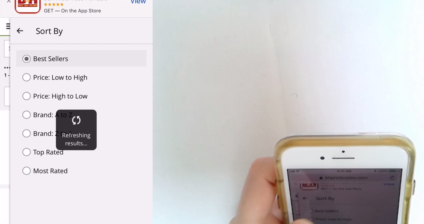
“Maybe “Best Sellers””, ’cause I don’t really know what I’m doing.” This participant at B&H Photo, unfamiliar with the wireless speakers he was browsing, opted for “Best Sellers” as a way to view the most popular products.
On the other hand, sites that make sorting discoverable and that carry the expected sorting types will help users shop more efficiently and effectively.
Therefore, providing each of these four sorting options is crucial to helping users float relevant items to the top of the list.
15) Sort “User Ratings” Using Both Ratings Average and Number of Ratings (83% Don’t)
Sorting by “User Ratings” (also frequently labeled as “Top Rated” or “Customer Ratings”) continues to be one of the most popular ways of ordering a product list.
During testing, participants often used this type of sorting to quickly identify the highest-quality products.
However, when sorting by “User Ratings” did not order the list as expected, taking into consideration both the ratings average and the number of ratings, participants began to mistrust the rating logic.
“This one only has a single rating, so that isn’t trustworthy at all”, noted a participant after realizing several of the 5-star products ordered first when sorting by “Customer Rating” only had 1–2 ratings. She and all of the other participants who used this sort type at REI found this few number of ratings inadequate and instead favored the products with a 4–4.5 star average based on 5 or more ratings.
Some sites will position an item with a 5-star average based on one rating ahead of an item with a 4.8-star average from 18 ratings.
When the sort logic only considers the ratings average, this rank order is technically correct, as the first product has a higher average rating.
However, nearly all users will find the first product to be a less trustworthy choice and are far more likely to explore the product with 18 ratings.
Sites like Overstock (first image) and Wayfair (second image) both have a sorting logic for “User Ratings” that take both the rating average and number of ratings into account when determining the display sequence. Notice how products with lower averages but more ratings are placed above 5-star-rated products with fewer ratings.
Therefore, to better match user expectations and intent when sorting by “User Ratings,” improve the sorting logic, take into account the number of ratings and not solely the average score.
Improving E-Commerce Product List and Filtering UX
This high-level analysis of the current state of Product Lists and Filtering UX focuses on only 5 of the 8 Product Lists and Filtering topics included in our e-commerce UX benchmark analysis.
We recommend reviewing the 3 other topics as well to gain a comprehensive understanding of the current state of Product Lists and Filtering UX and identify additional site-specific issues not covered here.
As our benchmark has revealed, many sites clearly have room to improve the Product List and Filtering UX, as 44% of sites have “mediocre” or worse performance.
Adhering to these 15 best practices is a great first step toward improving users’ Product List and Filtering experiences:
- Load the optimal number of items in the product list (78% don’t)
- Consider using “Load More” to show additional items (54% don’t)
- Combine variations of a product into one list item (43% don’t)
- Always show the total number of items in the list (27% don’t)
- Always provide 5 essential pieces of list item info (85% don’t)
- Display “price per unit” for products with varying volumes or quantities (89% don’t)
- Provide category-specific information for list items (35% don’t)
- Include and display product attributes consistently across list items (59% don’t)
- Always provide comparison features for spec-driven products (48% don’t)
- Optimize comparison features for scannability (78% don’t)
- Always provide 5 essential filter types (55% don’t)
- Always explain industry-specific filters (62% don’t)
- Display applied filters in an overview (29% don’t)
- Always provide 4 essential sorting types (58% don’t)
- Sort “User Ratings” using both ratings average and number of ratings (83% don’t)
This article presents the research findings from just a few of the 650+ UX guidelines in Baymard – get full access to learn how to create a “State of the Art” ecommerce user experience.
If you want to know how your website performs and compares, then learn more about getting Baymard to conduct a UX Audit of your site.

