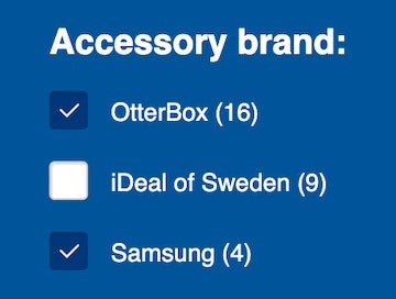
When users apply filters to product lists, almost all sites confirm the choices where the filter was originally chosen — for example, by adding a tick mark to a filter option checkbox on a desktop site.
However, during both desktop and mobile large-scale UX testing, the lack of an overview of applied filters caused issues such as slowing down the process of tailoring the product list and in some cases causing disorientation.
In fact, 32% of sites in our benchmark of 60 top e-commerce sites don’t display an overview, a slight decrease from 40% in our 2015 benchmark.
This article discusses the 3 issues that occured during large-scale UX testing with not having “Applied Filters Overviews”, outlines 3 solutions for desktop and 2 for mobile, and discusses 2 implementation considerations.
Observed desktop and mobile issues:
- No obvious and immediate confirmation that filters have been applied:
- Not having a quick way to remove filters
- Not having a context for the product list
Observed solutions for desktop:
- Overview above the product list
- Overview above the filtering sidebar
- Overview below a horizontal filtering sidebar
- Overview in a horizontally scrolling list
- Overview in a stacked list
- Avoid only indicating the number of applied filters
- Showing the filter type
Observed Desktop and Mobile Issues
Without an overview of applied filters, users are faced with 3 issues:
- No obvious and immediate confirmation that filters have been applied.
- Not having a quick way to remove filters.
- Not having a context for the product list.
Issue 1: No Obvious and Immediate Confirmation that Filters Have Been Applied
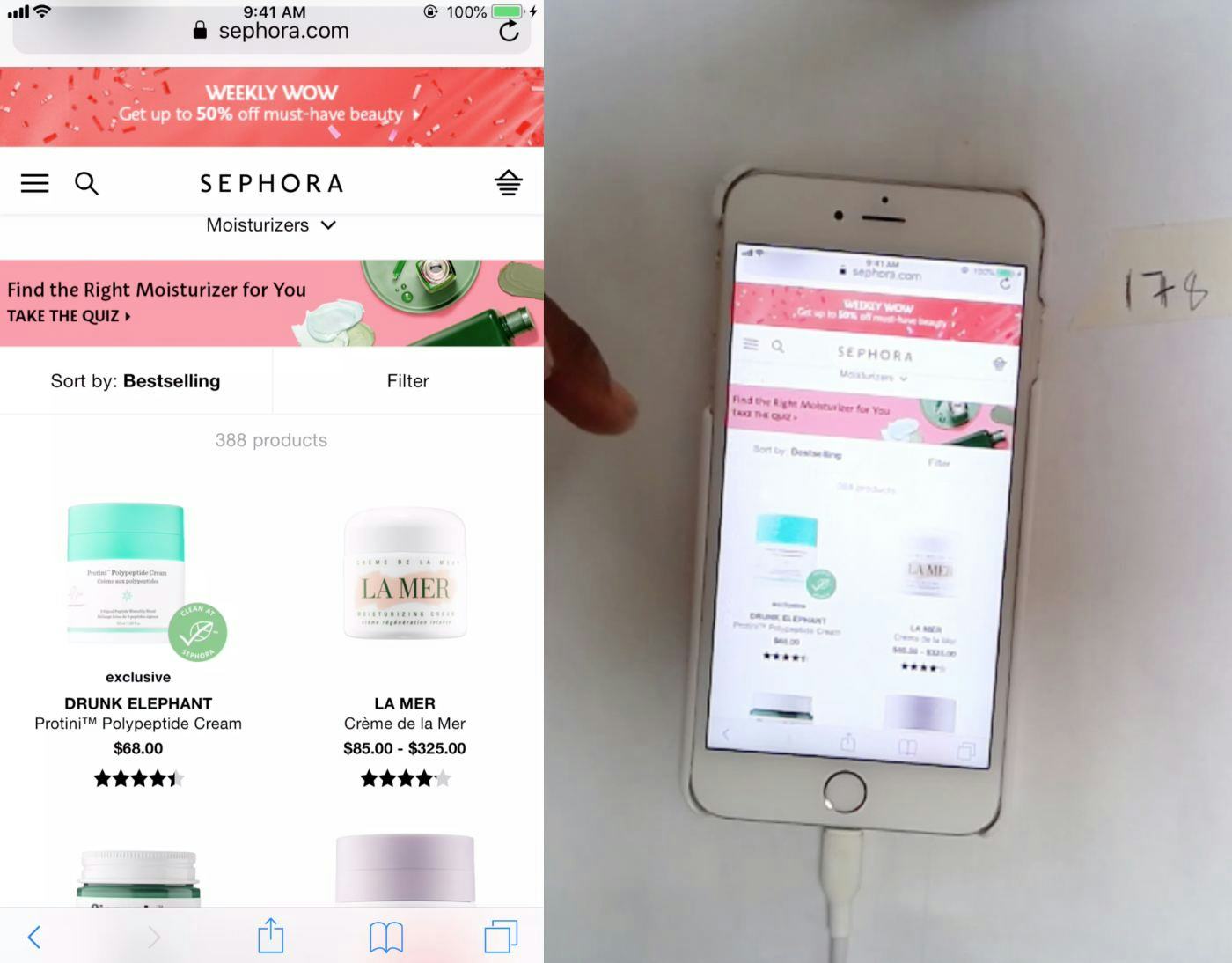
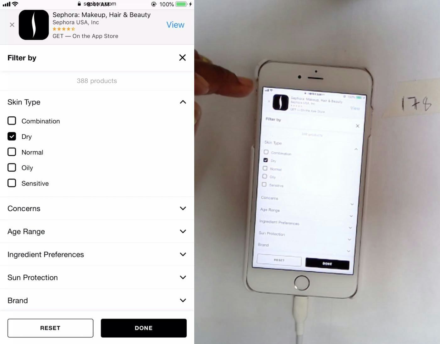
This user on Sephora wasn’t sure that the filtered selection was what she had expected (first image). Because there was no immediate confirmation of her actions on the product list, she had to open the filtering interface to check which filters she had applied (second image). On mobile sites, this process is a time-consuming diversion.
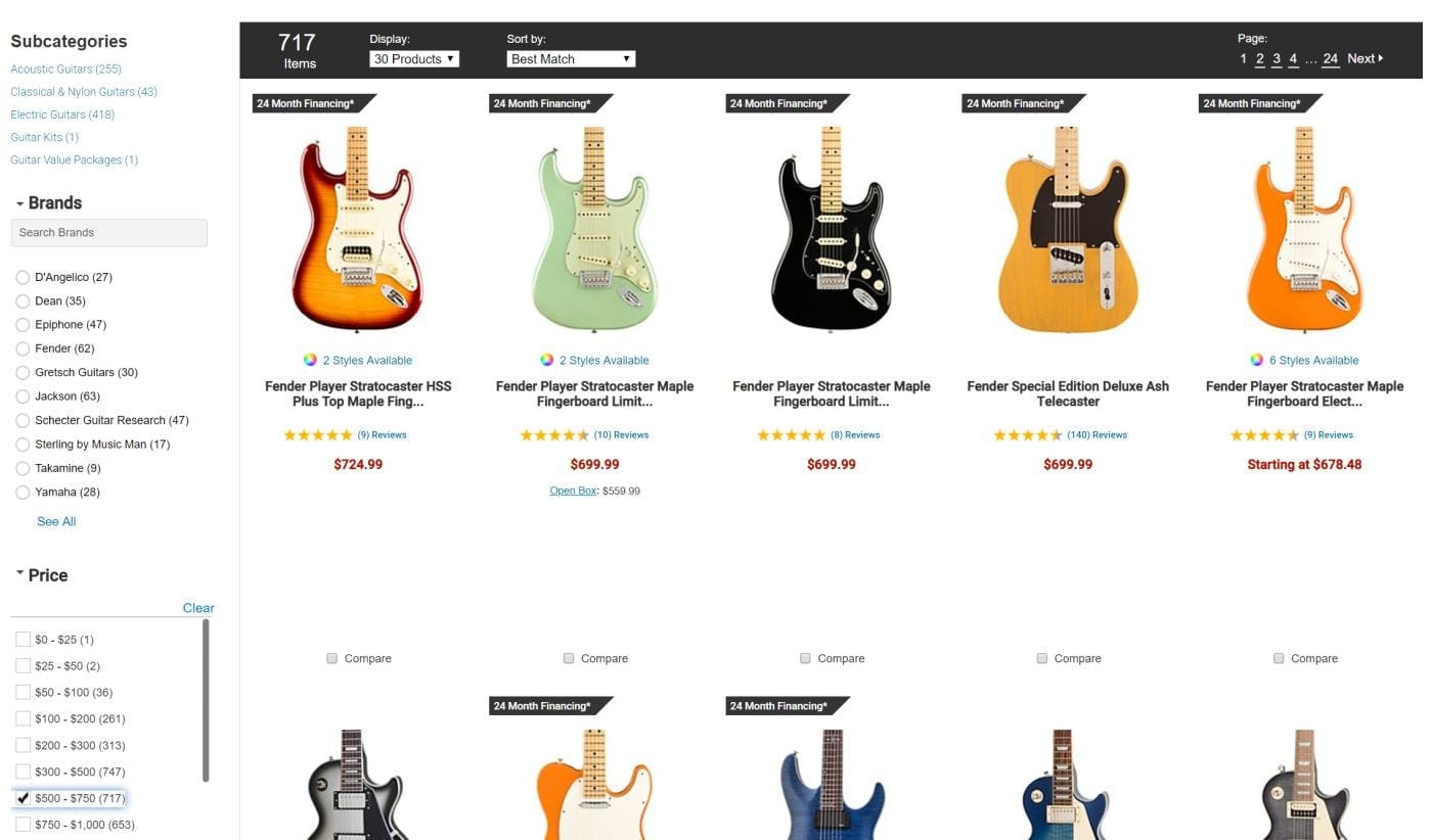
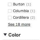
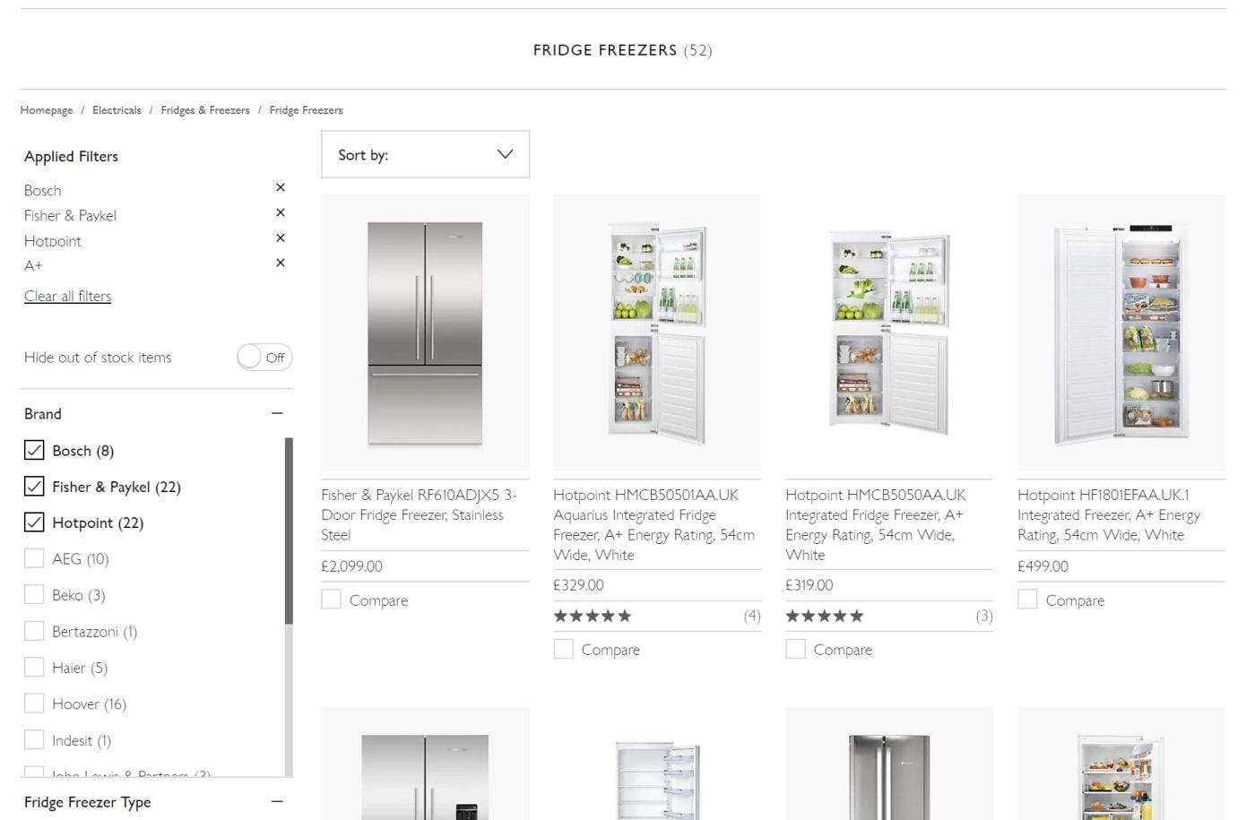
On desktop, the absence of an applied filters overview can slow users down when they need to check which filter options they have selected. If multiple filter options are applied and are spread across more than one viewport — as can be the case with a tall sidebar such as here on Musician’s Friend, with many filter types and options — it will take longer to find all of the applied filters than if an overview were present.
Without an applied filters overview, desktop users will need to look to the filtering sidebar to confirm which filter options have been applied.
If the chosen filter options are towards the top of the sidebar, users will have little trouble, unless an inline scrolling interface is used and some filter options are hidden. But if there are multiple filters selected and they are spread throughout a tall sidebar, users would have to scroll through a few viewports to get an overview of the choices they have made.
Furthermore, users don’t always consciously choose all filters that are currently applied. For example, if users clicked a promoted filter on a home furnishing site’s homepage for “Armchairs under $300”, 3 filters could be automatically applied to the product list they arrive on. (And applying filters, rather than sending users to a sub-subcategory, is the right approach.)
If those applied filters aren’t shown in an overview, users may misinterpret the range and type of products the site offers, as the filters that are narrowing the scope of the list aren’t immediately obvious.
On mobile, confirming which filters have been applied can be even more troublesome for users than on desktop because users have to open the filtering interface to do so. During testing, users opened the filtering interface to confirm their filter selections because they had no visual confirmation in the product list after applying filters.
Issue 2: Not Having a Quick Way to Remove Filters
If there is no overview of applied filters, removing filters that have already been applied becomes more difficult. Users on desktop will be faced with having to scroll through the sidebar to find and deselect filter options that they no longer need.
Mobile users will have to reopen the filtering interface to remove filter choices. And if they need to remove more than one filter, the process would be quite troublesome on sites where the filter interface is closed after one filter is deselected.
For example, if filter option choices are auto-applied, users would have to make 2 trips to the filter interface to remove 2 filters — as well as having to scroll through the filter interface to locate those options.
The end result of this is that users will find applying and deselecting filters more labor intensive, and thus many will be dissuaded from trying to get a perfectly fine-tuned product list.
Issue 3: Not Having a Context for the Product List
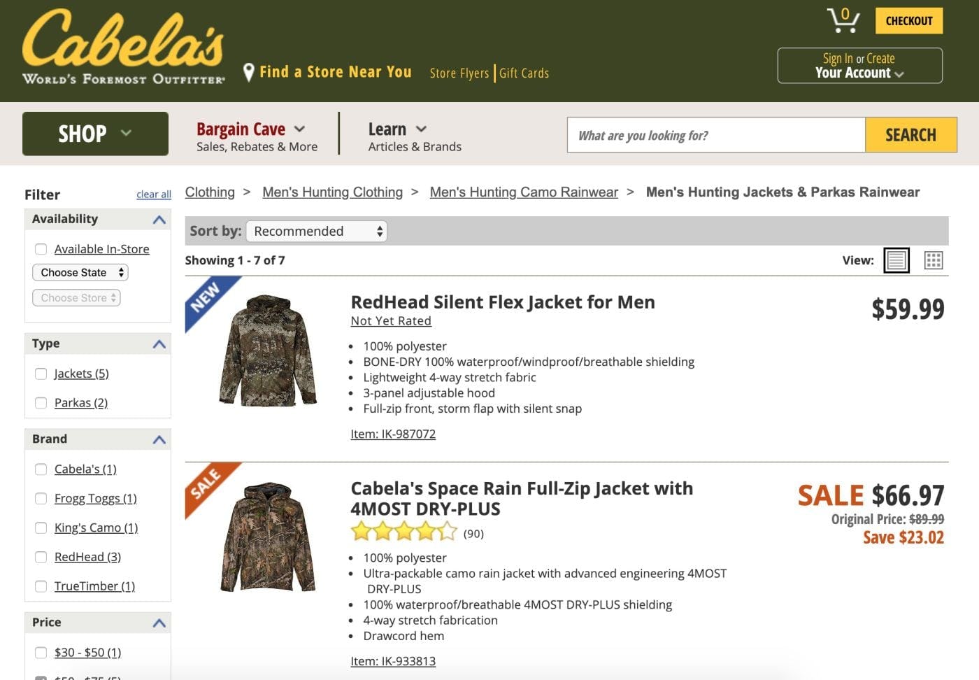
This product list on Cabela’s has 4 filters applied. With none of the applied filters visible in the sidebar in this viewport, users will have no visible indication of what filters are defining the scope of the product list without scrolling. The absence of an overview of applied filters can be a particular issue for users who are exploring multiple product pages and coming back to the filtered list. If the context of the list isn’t always clear, users could lose track of how the filtered products relate to the broader catalog.
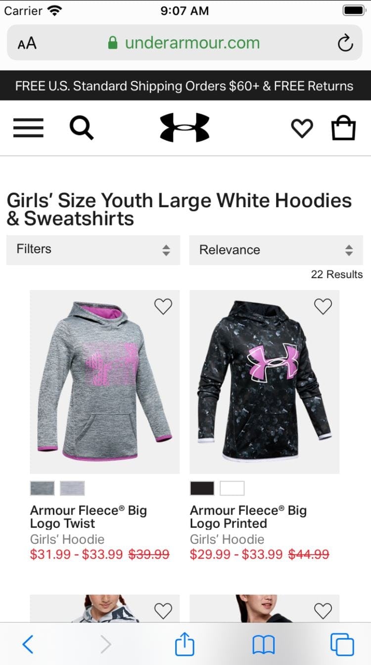
On Under Armour’s mobile site, although the page heading hints at some filters being applied, there are in fact 4 color filters chosen, not just “White”, making the heading misleading. The lack of an overview of applied filters means that users could easily lose track of what the parameters of the list are, especially if they are pogo-sticking between the product list and product pages.
In many ways, an overview of applied filters is just as important as a page title or breadcrumbs that inform users of where they are and what type of product list they are viewing — they provide a summary of their current scope and product list criteria.
Testing showed this kind of product list context to be essential as users who overlooked even a single applied filter were likely to misinterpret both the type and range of products the site carried.
Users often spend time exploring filtered product lists, scrolling up-and-down to assess products, and visiting product pages. After focusing on product features for awhile, they could easily forget what filters are active.
And without an overview of what filters are scoping the product list, they could form a mistaken impression of the extent of the product catalog.
For example, a product list with 5 filters applied might contain only a dozen products. If none were suitable, and users forgot which filters they had applied 3 minutes previously, they could mistakenly assume that the site didn’t have what they needed, while the removal of one filter could expand the selection to include a suitable product.
On desktop, such an issue would be most likely to occur when some of the applied filters are a few viewports down from the top of the page and thus more likely to be forgotten.
On mobile, the issue would be even more likely to occur because the applied filters would be hidden away in the filtering interface, making it easier for the context of the list to be forgotten.
(An issue observed in previous rounds of testing, whereby sites removed the filter option from its original position when it was chosen, was not observed in the latest test sessions. 97% of our benchmark sites leave the chosen filter option in its original position — as they should — indicating this is no longer an issue for the vast majority of sites.)
Observed Desktop Solutions for Showing Applied Filters
On desktop, there are 3 commonly observed ways to show an overview of applied filters. Although testing was inconclusive about which implementation was most effective, what matters is that the overview is easy to see and is not lost among other page elements.
The three design patterns are the following:
- Overview above the product list
- Overview above the filtering sidebar
- Overview below a horizontal filtering toolbar
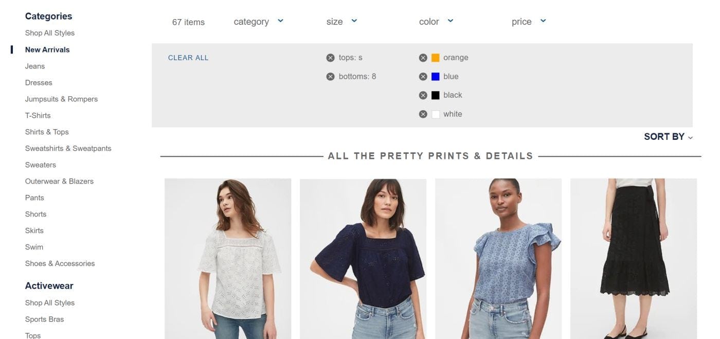
Desktop Solution 1: Overview Above the Product List
Applied filter options are displayed in an overview above the product list on Macy’s. Users had no issues identifying or deselecting applied filters, despite their relatively small size.
On B&H Photo, there is a “Clear All” link alongside the applied filters, making it easy for users to reset them. Although the applied filters are quite small, the lack of clutter around the page header would ensure that they are noticed by most users.
Applied filter options on Home Depot are large and very obvious. The red “Xs” within the applied filters help to draw attention, and the “Clear All” link allows for their easy removal. Users will find it easy to confirm what filters are applied, remove those that are not needed, and keep apprised of the context of the list. Note, however, that as more filters are applied another row is added, pushing the product list further down the page.
With the applied filters overview above the product list, there is typically plenty of horizontal space to devote to them. The applied filter option text can be relatively large, there’s space for a descriptive header to bring attention to the filters, and each filter can have large hit areas for easy deselection.
When more filters are added to the overview than will fit on one row, many sites simply add another row to accommodate them.
However, these extra rows can push the product list down the viewport — potentially obscuring part or all of the first row of products in the list. One way around this issue would be to truncate the second and subsequent rows, as shown in the H&M example below.
Desktop Solution 2: Overview Above the Filtering Sidebar
John Lewis places the “Applied Filter Overview” above the filtering sidebar rather than above the product list. Testing showed this positioning to be no less effective than having the overview of applied filters above the product list. In this implementation, the applied filters are on separate lines, and the addition of each filter pushes the filtering interface further down the page.
The applied filters above the sidebar on Curry’s PC World are very prominent, with a large font size and a background color that helps draw attention. Note how each line in the overview contains multiple filters, reducing the vertical space occupied by the overview and pushing down the filtering interface less than if each applied filter was on a separate line.
Placing applied filters above the filtering sidebar means that all filtering features are in the same area of the page. This location is prominent and most users will quickly find the applied filters if they need to review or remove them.
This placement has associated drawbacks, however. Since filtering sidebars are generally fixed width, when many filters are applied they are often stacked vertically. Depending on the width of the sidebar and the number of applied filters, stacking the filters could push the filtering interface downwards, so that fewer filter types and options are visible in the first viewport.
Desktop Solution 3: Overview Below a Horizontal Filtering Sidebar
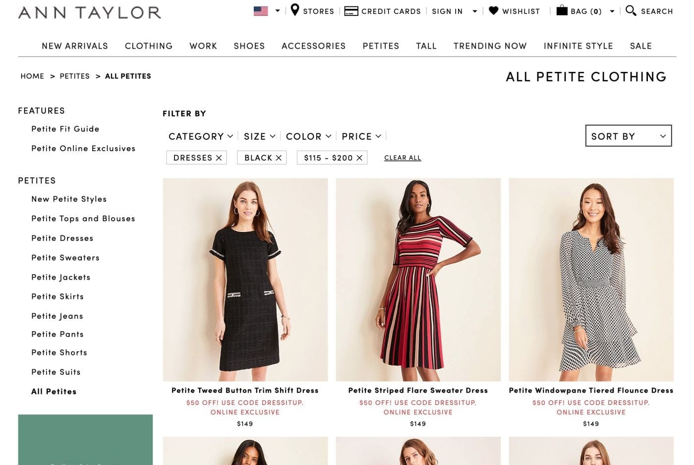
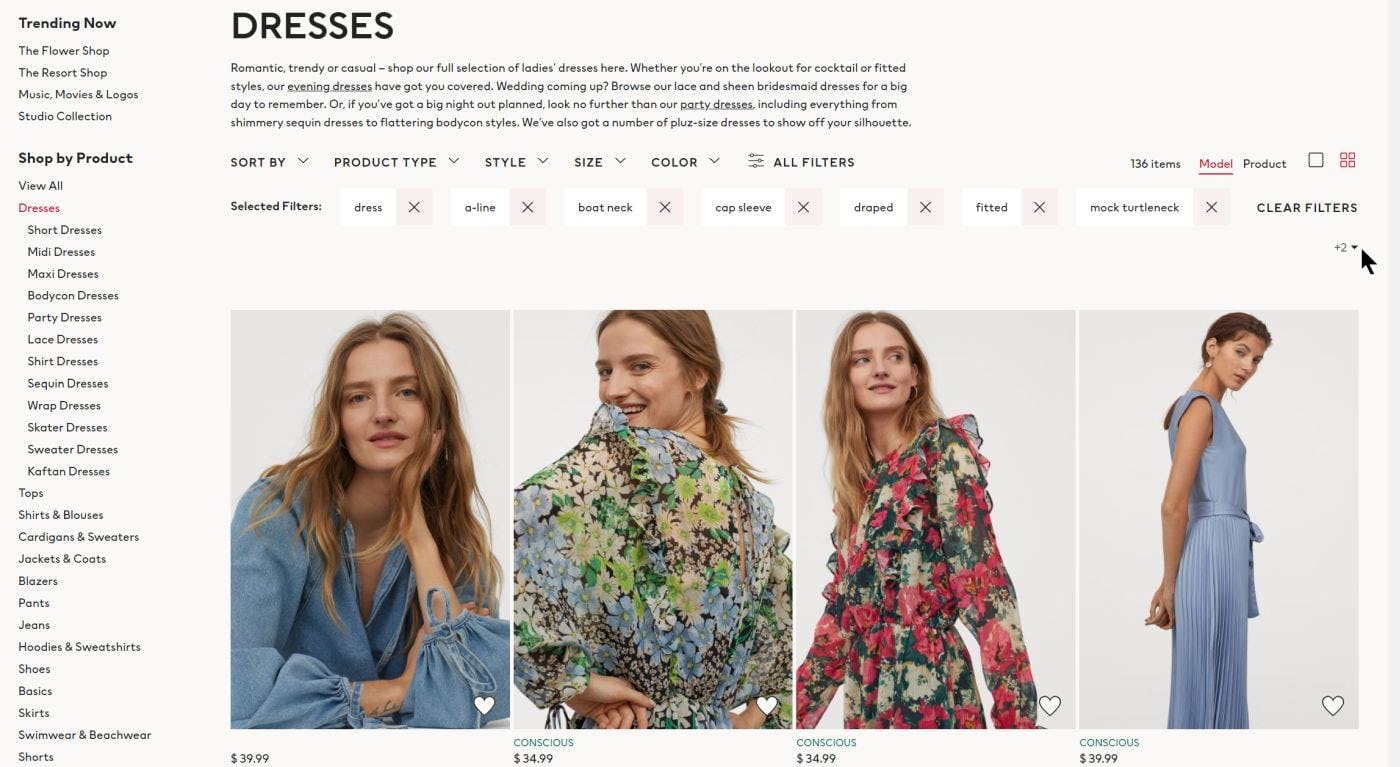
Ann Taylor uses a horizontal filtering toolbar (first image), common on apparel sites, and applied filters are placed just below it. This implementation of filtering has the advantage of concentrating all filtering features in one area of the page for easy access (the items in the left sidebar are subcategories). H&M’s applied filters (second image) have large “delete” buttons, and the applied filters are even more prominent than the filtering toolbar. To avoid any possible doubt about what the applied filters are, the heading “Selected Filters” is placed just to the left of the toolbar. Note that when there are more applied filters than will fit on one line, a link appears below and to the right of the toolbar indicating the number of hidden applied filters and enabling users to view all applied filters when clicked. Although it may be less prominent than it should be, this truncation indicator means that the product list below won’t be pushed out of the viewport as more filters are applied.
On GAP, applied filters are displayed vertically stacked below the filtering toolbar. This has the effect of pushing down the product list and, in this example, the list item info of the first 4 products is not visible without scrolling. Each added filter option for a specific filter type pushes the product list down further, unlike the H&M example, where 4–5 filter options are needed to affect the product list. This implementation takes up a lot more of the page compared with the more common horizontal layout of applied filters, but on the other hand the applied filters are very hard to overlook.
Horizontal filtering bars, often found on apparel sites, are an alternative to filtering sidebars on desktop and can be used successfully on sites that have only a few filter types.
Applied filters work well with horizontal filtering toolbars because all filtering features can be concentrated in one place above the product list, allowing users to apply and deselect filters in a single area of the page.
When more filters are applied than will fit in one row, some sites add more rows to accommodate the extra filters, thereby pushing the product list down (as with the “Above the product list” implementation). This would cause users to have to scroll down in order to assess the top row of items for suitability.
Although not all users will add enough filters to warrant a second row in the overview, one way to resolve this issue would be to truncate the second and subsequent rows. Users could click on the truncation indicator to reveal the hidden rows if they need to.
While most sites with horizontal filtering toolbars align applied filters horizontally, some sites vertically stack the applied filters.
With vertically stacked applied filters, each added filter would push down the product list, while with horizontally arranged filters this would happen less often as an extra 4–8 filters would need to be applied to add a row to the applied filters overview”.
Observed Mobile Solutions
On mobile, because of the size of the viewport, only a few applied filters will fit in a single line. If users choose more filters than will fit on one line, sites with applied filters overviews have the choice of displaying the filters either as a horizontally scrolling list or in vertically stacked rows.
Whichever is chosen — testing showed either can work well for users — getting the implementation details right is key to making sure that users see all filters without a negative impact on the user experience.
Mobile Solution 1: Overview in a Horizontally Scrolling List
One approach to displaying multiple applied filters on mobile is to use a horizontal scrolling list.
While this design can work well — as it takes advantage of the natural aptitude mobile users have for horizontally scrolling content — care must be taken to ensure that users know that some applied filters can only be seen if the list is scrolled.
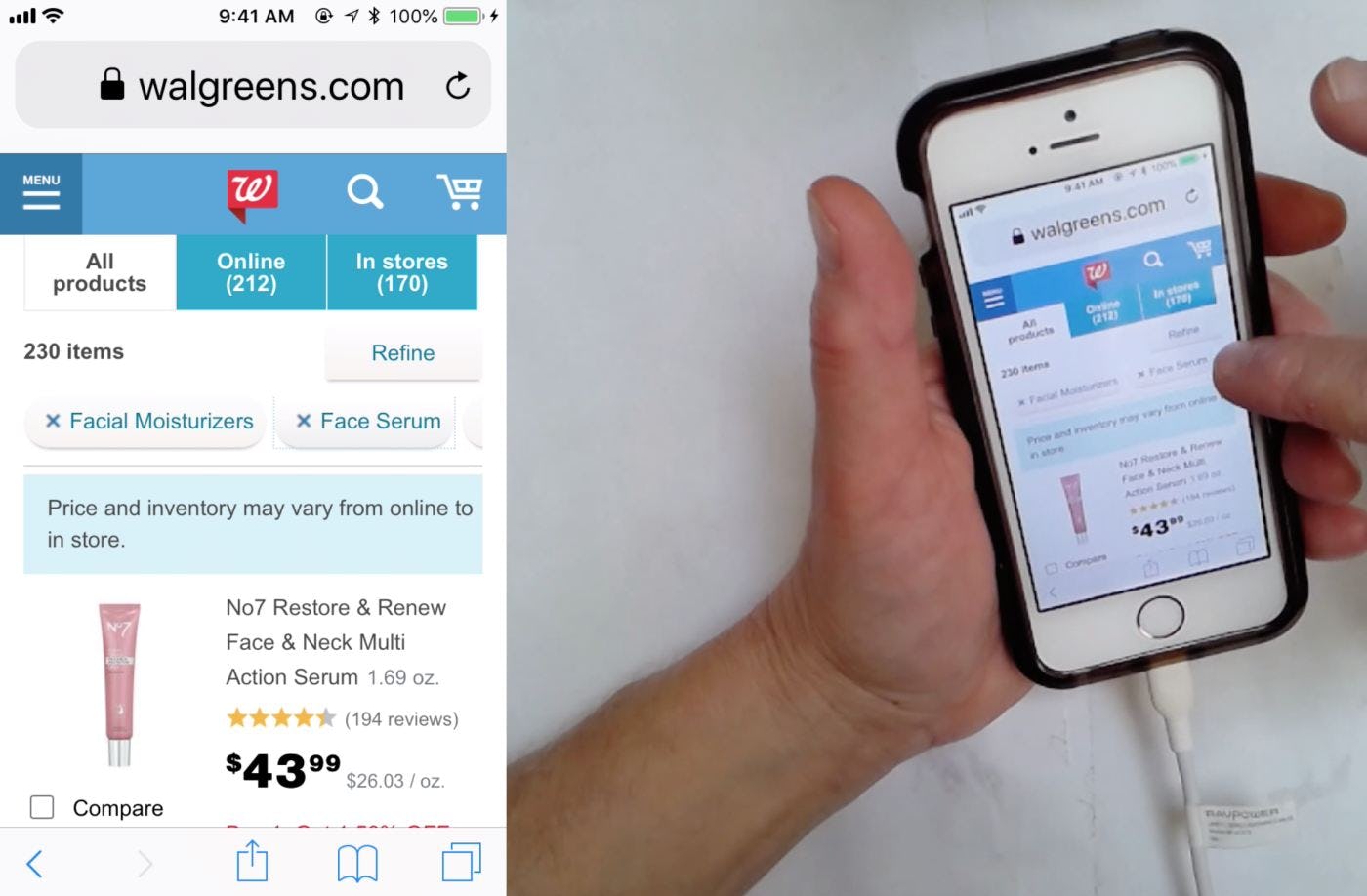
“But it’s only showing…are they all added? I guess so, I can’t see the other two…I’m just going to have faith.” This user wasn’t sure whether filters she had chosen on Walgreens were applied, as only 2 were fully visible, with others hidden in a horizontally scrolling list. A small piece of the third filter was just visible but not enough to prompt the user to scroll — if more of it were visible she would have been more likely to have done so.
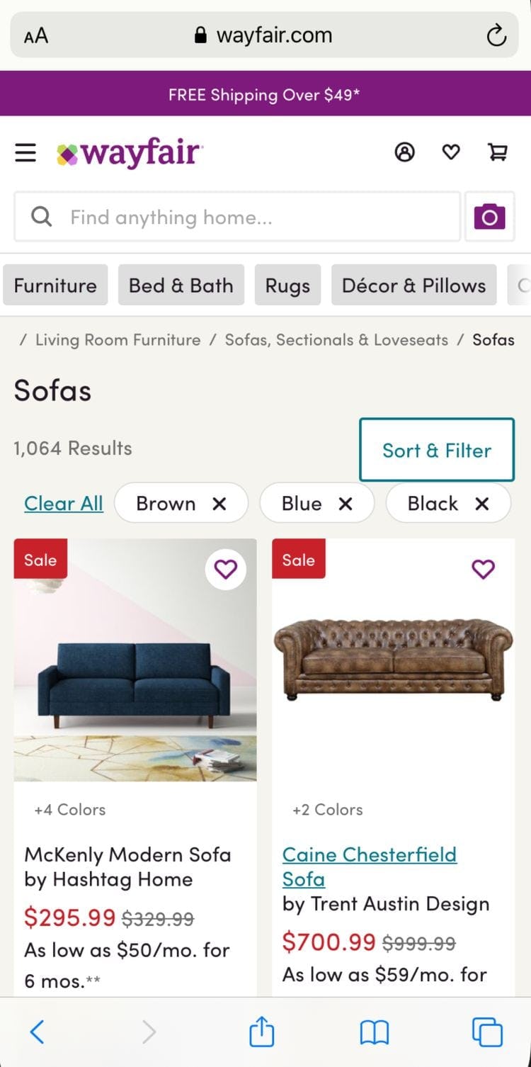
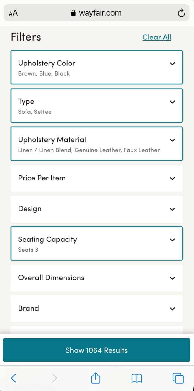
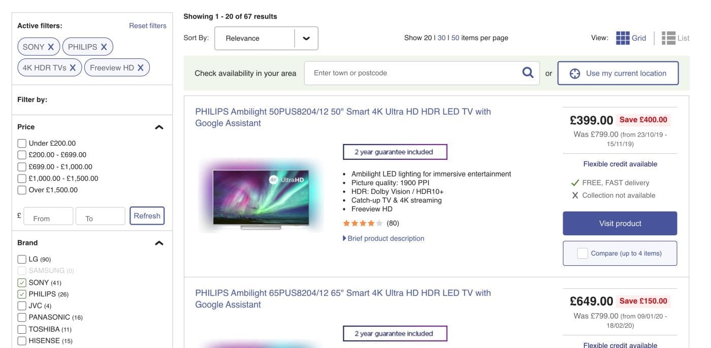
When users apply multiple filters on Wayfair’s mobile site, they are displayed in a scrolling horizontal list (first image). Note however that it’s impossible to tell that there are 9 filters applied (as shown in the filtering interface, second image) since there is no indication that filters options beyond “Brown”, “Blue”, and “Black” have been selected.
Truncation of the rightmost applied filter can work well, but only if users notice the truncation. For example, if only a small slice of the last visible filter is shown, then it is likely to be overlooked. But if half or more of the applied filter is shown, it will be clear that more are visible if users scroll to the right.
Another way to encourage users to scroll to see more applied filters is by fading the edge of the right-most filter (see the Macy’s example in the next section), an indication that more are available to the right.
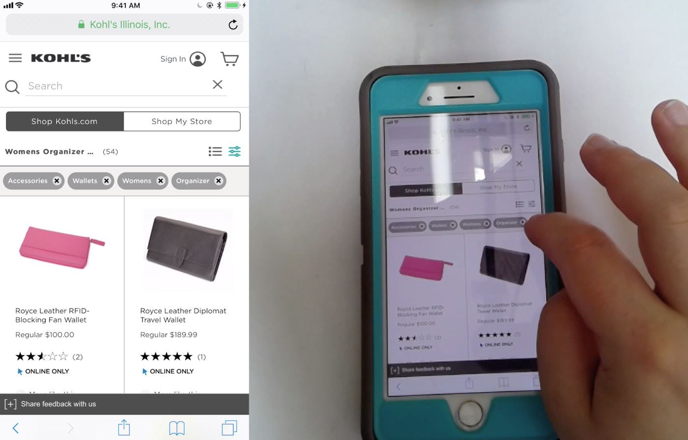
“I might close the ‘Organizer’ one.” The applied filters overview on Kohl’s mobile site makes it very easy for users to deselect filters without having to open the filtering interface. In this example, the subject was able to view all 4 applied filters without needing to scroll horizontally as she would have had to do if there were 5 or more. Since few users are likely to apply many more than 5–10 filters, a design that allows space for up to 4 filters to be shown (even if one is only partially but clearly visible) will suffice for many users.
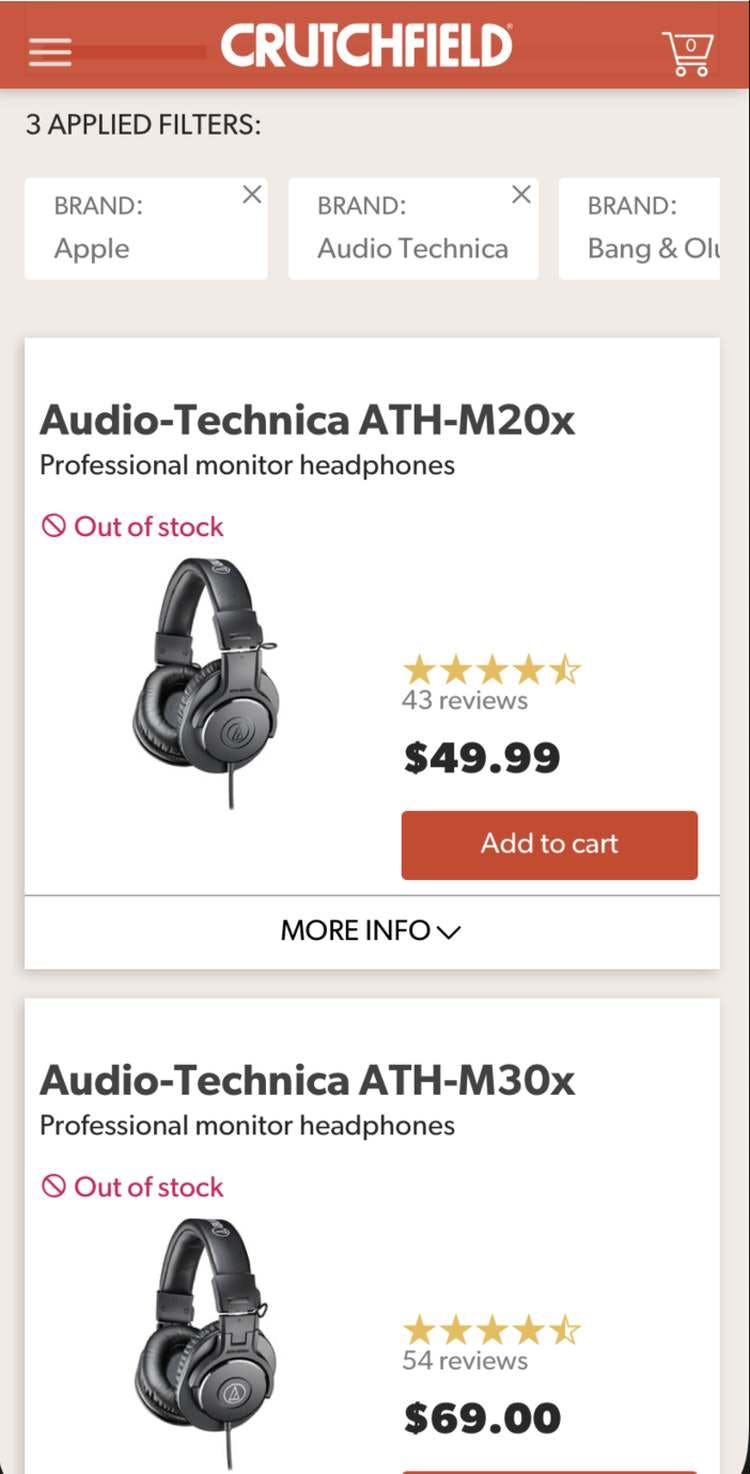
On Crutchfield, the addition of the heading “3 Applied Filters:” not only clarifies to users how many filters are active, but also indicates that the fourth filter can be viewed by scrolling. In addition, the truncation of the third applied filter is a clear indication to users that they need to scroll horizontally to view more filters
A third way to signal to users that more filters can be seen in horizontally scrolling lists is to state the number of filters that have been applied in text just above the list.
For example, a text header “3 Applied Filters” would indicate clearly that the applied filters visible by default are not the only ones. This knowledge would in turn prompt users to scroll the horizontal list to see the full set of applied filters.
Yet we also observe users frequently skip over text, so this should only be used in conjunction with some of the other implementations described above.
Combining the three ways of indicating to users that there are more applied filters that can be revealed by scrolling — truncation (with at least 50% visible) and fading of the rightmost filter, and a heading that states the total number of applied filters — is the ideal way of presenting an applied filters overview on mobile.
Mobile Solution 2: Overview in a Stacked List
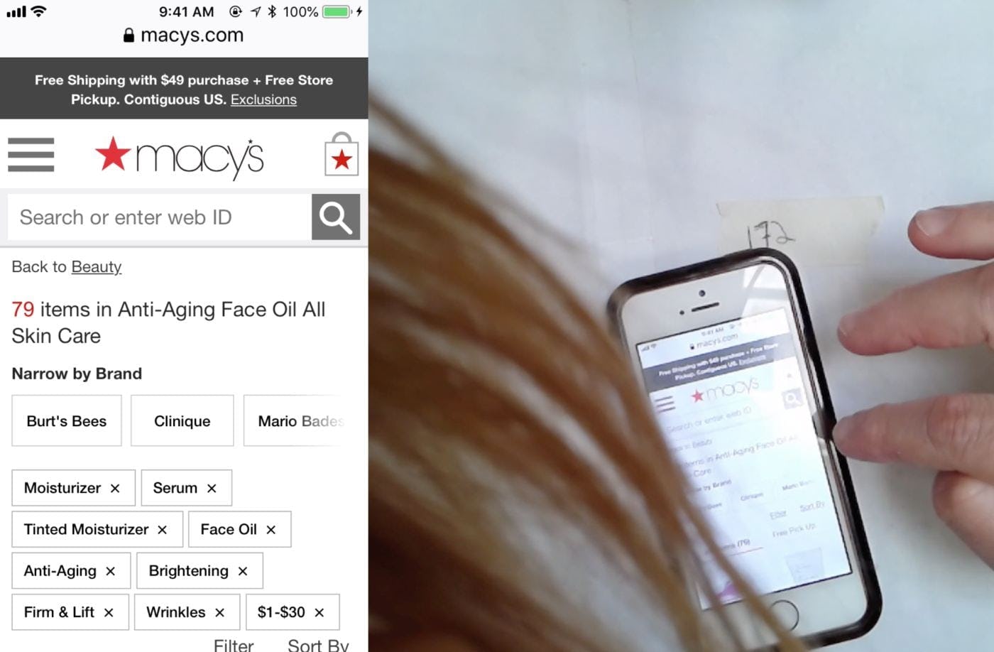
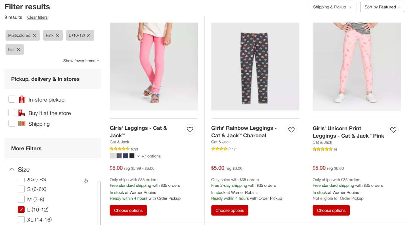
Macy’s approach to displaying multiple applied filters in an overview on mobile is to stack them in rows. Users will be in no doubt about what filters are applied, but note how the first item in the product list is pushed out of the viewport. Note also how the third brand filter “Mario Bade…” is faded to indicate that more filters are available with horizontal scrolling. This method of fading could also be used with a horizontally scrolling list of applied filters to indicate that more filters have been applied than just those that are visible.
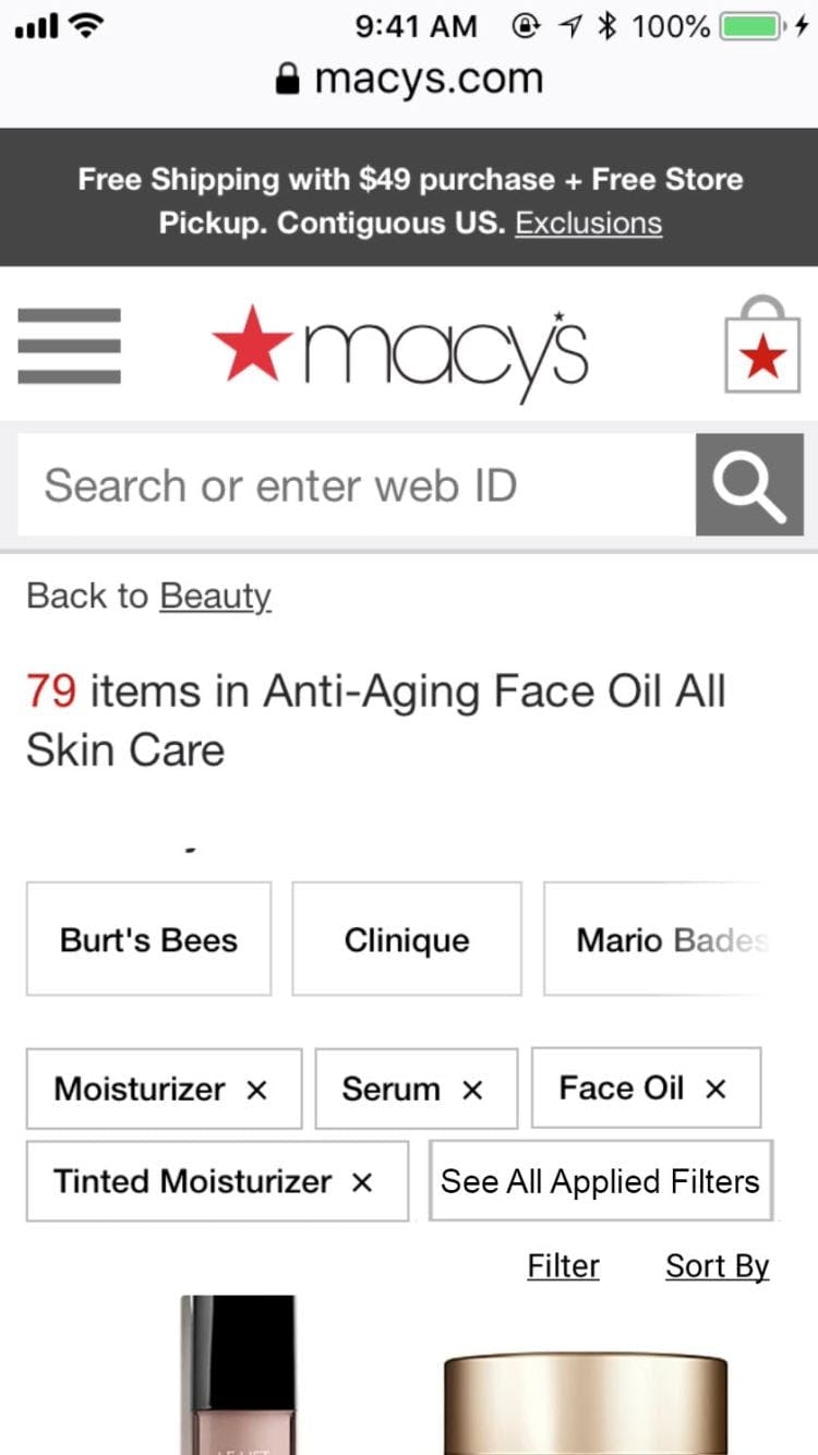
Another way to accommodate multiple rows of applied filters, as shown in this mockup of Macy’s, would be to show a “See All Applied Filters” button at the end of the second row. If tapped, this button would expand the full list of applied filters to occupy as many rows as needed. This method would allow users that are not too concerned about which filters are applied to browse the product list without the top of the page being too cluttered, without losing sight of the fact there are more than 4 filter options active.
Another approach to displaying applied filters on mobile is to simply spread the filters over as many rows as are needed to show them all. The advantage of this method is that users would be able to see all applied filters without having to scroll horizontally.
But there is a danger that the rows of filters, combined with other elements at the top of the product list, like the search bar, promoted filters, and the sorting and filtering buttons, could push the list items out of the viewport. Although not observed during testing, some users may feel disoriented when the first list item is out of the viewport, and having to scroll to see list items may be troublesome.
A variation of this design would be to show 1 or 2 rows of applied filters and truncate any further rows. Tapping a “See All Applied Filters” button would reveal the hidden rows.
Not all users need to see all of the applied filters, and vertical truncation of the list would avoid needless clutter at the top of the product list without obscuring the fact that there are more filters applied. This method would also lessen the amount by which the product list is pushed down the page.
Additional Considerations for Applied Filters Overviews on Desktop and Mobile
Avoid Only Indicating the Number of Applied Filters
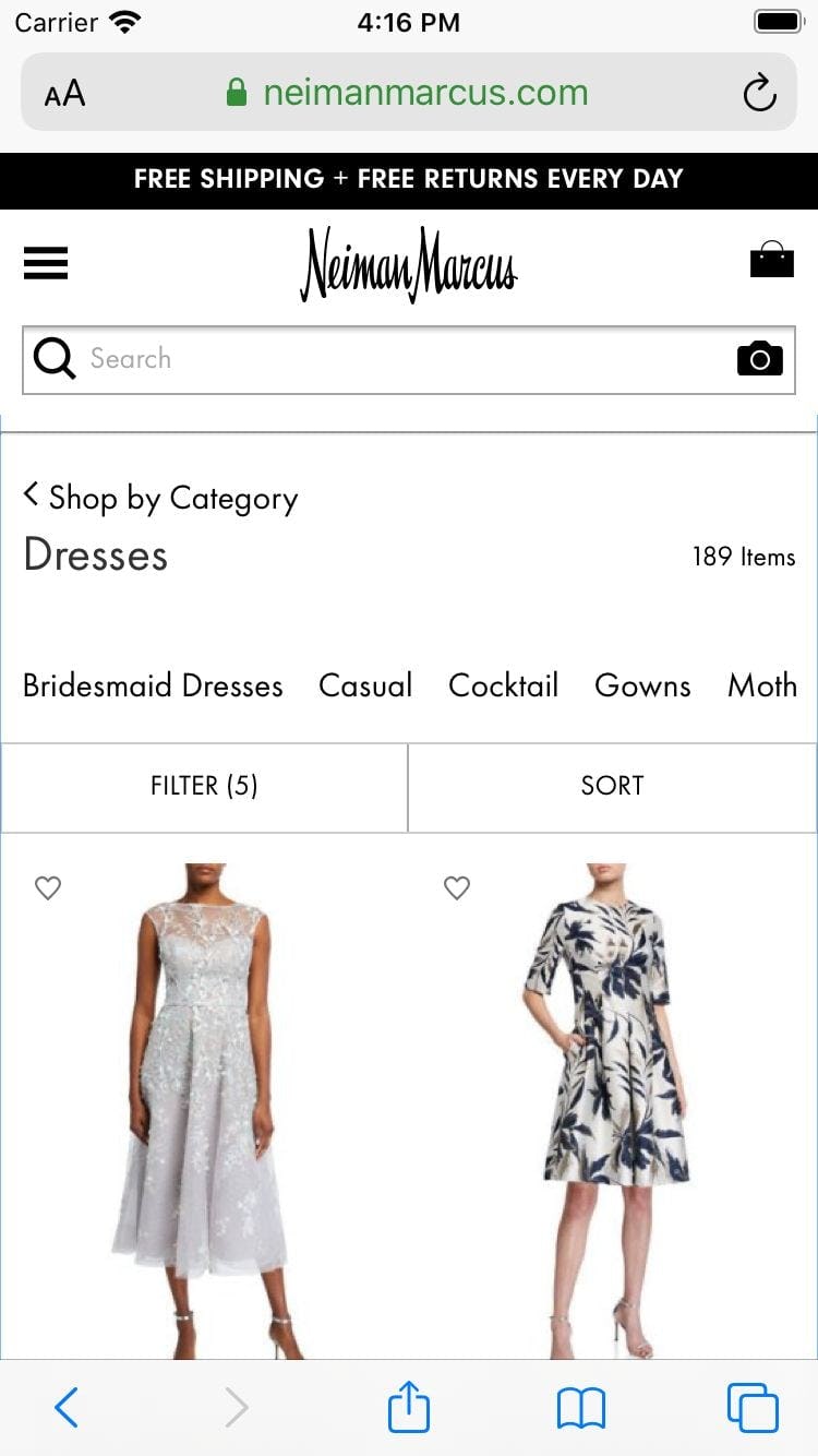
Although Neiman Marcus shows the number of applied filters (“Filter (5)”) users would need to open the filtering interface to see what filter options are selected and to remove any that were not needed.
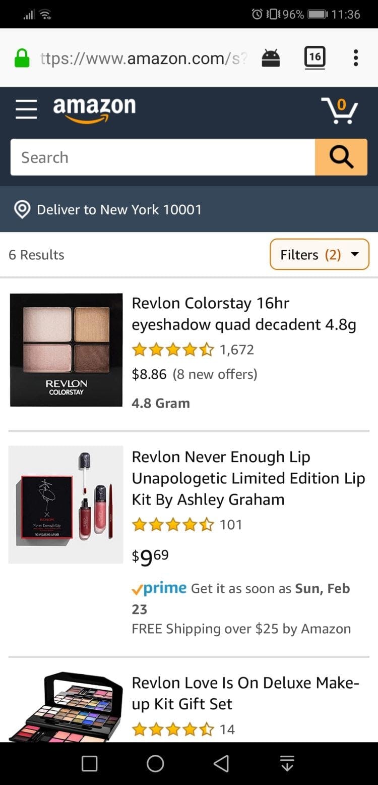
Amazon also shows only the number of applied filters (“Filters (2)”), displaying no information about the chosen filter options.
One design implementation that didn’t perform well during testing was when sites only indicated the number of applied filters, without actually displaying those filters.
When sites just show the number of filters that have been applied but not the filter options selected, there’s no applied filters overview.
This means that, as discussed in the issues section above, users will have to open the filtering interface on mobile to confirm what filters are applied and to remove any that are no longer needed. In addition, users have no visual reminder of the context of the product list.
Showing the Filter Type
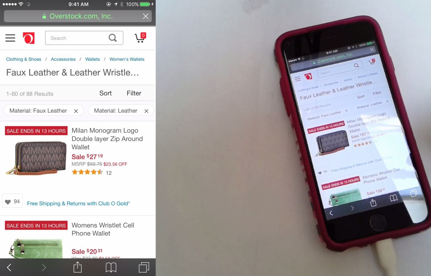
On Overstock’s mobile site, filter types are included with filter options in the applied filters overview (e.g, “Material: Faux Leather”). Note how the addition of the filter type makes each item in the overview wider, so fewer applied filters are visible without scrolling.
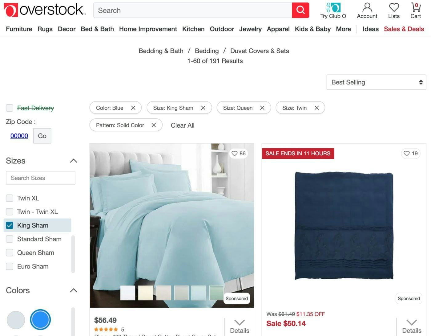
On Overstock’s desktop site, since there is plenty of space to accommodate applied filters, adding the filter type has minimal negative impact. Note how the applied filters are shown on different rows rather than truncated.
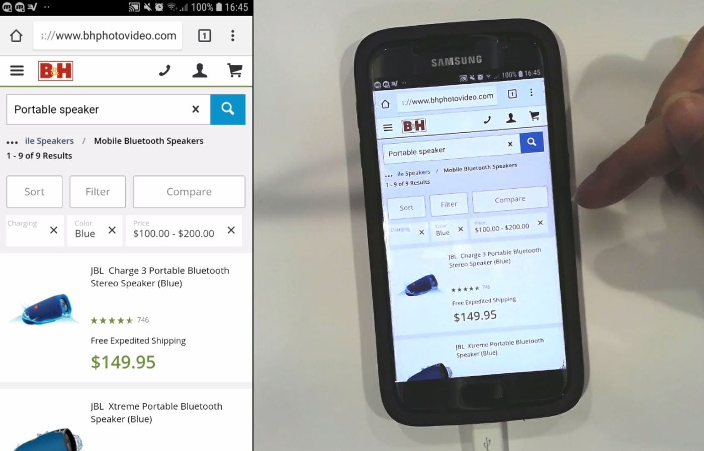
B&H Photo includes filter types (e.g., ”Color”) above the filter options using small gray type. This method allows users to focus on the options, and doesn’t increase the width of the individual applied filters, meaning that more will be visible without scrolling. For added clarity, the filter option under the type “Charging” should be added, for example “Yes” or “No”, so that users are reassured that the absence of an option is not a site error.
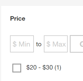
Some sites display the filter type in addition to the selected filter option in the overview; for example, “Color: Blue” or “Price: $100.00 to $200.00”. Including the filter type alongside the option increases the size of the applied filter in the overview, which can lead to either more space being taken up by the overview or more filters being hidden by default on mobile devices.
Sometimes, however, the filter option only makes sense with the added context of the filter type. For example, a filter option “90cm” could refer to either the width or the height of a product, while “Width: 90cm” in an “Applied Filter Overview” is unambiguous.
Other filter types won’t necessarily need to be stated in the applied filters overview — for example, color options like “Red” or material options like “Leather” are unlikely to need any further clarification.
Therefore, sites should consider whether or not to include the filter type with the filter option in an applied filters overview.
However, displaying filter types for some options and not for others would not only pose a technical challenge for the site, but also could make it harder for users to understand the structure of the overview. A mixture of differently structured applied filters, some with types and others without, would look inconsistent and could be hard to interpret.
Thus, sites have to decide whether adding filter types in “Applied Filter Overviews” would benefit the majority of users, taking into account the types of products offered.
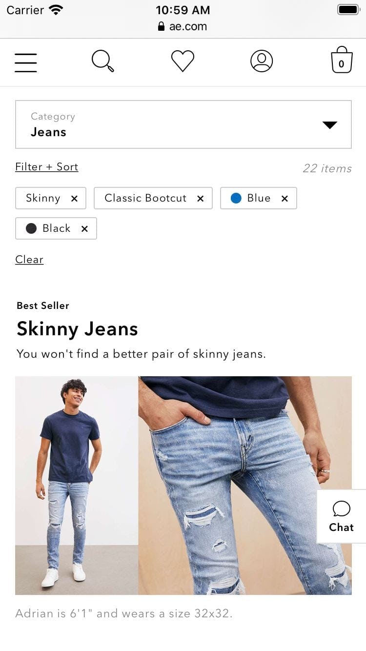
On apparel sites like American Eagle, showing filter types in applied filters overviews is often unnecessary. Filter options like “Skinny” and “Blue” will make sense to users without the associated filter types “Fit” and “Color”. Note also how the absence of filter types means that the applied filters are comparatively narrow, with 3 fitting comfortably on each line.
Apparel sites, for example, with fewer filter types that are largely self-explanatory (e.g., “Color”, “Size”, “Fit”, and “Price”), might choose to omit filter types from “Applied Filter Overviews”.
On the other hand, Home & Hardware sites that offer products for which the filter type would be needed (e.g., “Width” and “Height” for appliances, or “Power Input” and “Power Output” for tools) might need to include the filter types.
As a rule of thumb, spec-heavy sites should include the filter type along with the filter option.
Visually driven sites can most likely only provide the applied filter option.
Sites that sell a mix of the two can choose to simply always show the filter type, or adjust what’s shown dynamically based on the product list being viewed, or the predominant types of products displayed (spec heavy or visually driven) in search results.
If the filter type is necessary for users to interpret the filter option correctly, consider placing it above the option rather than alongside it, so that the combination is as narrow as possible. Also, the filter type should appear secondary to the option by use of appropriate styling (as seen in the B&H example above).
Most users scanning the list of applied filters will be focused on the options, and should not be distracted by the filter types that are there only to remove doubt about the meaning of the filter option.
Display Applied Filters in an Overview
The applied filters on Target are summarized in an overview above the filtering sidebar, making it easy for users get quick confirmation that filters have been applied, to remove filters that are no longer needed, and understand the context of the product list.
Without an overview of applied filters, users are faced with 3 issues:
- There is no obvious and immediate confirmation that filters have been applied
- There’s no quick way to remove filters
- There’s no context for the product list
On desktop, applied filters can be placed above the product list, above the filtering sidebar, or below a horizontal filtering toolbar.
On mobile, applied filters can be placed in a horizontally scrolling list above the product list, with clear truncation of nonvisible, applied filters. Alternatively, applied filters can be stacked in rows above the product list.
For both desktop and mobile, avoid simply displaying the number of applied filters, and consider showing the filter type in addition to the filter options.
With 68% of our desktop benchmark sites providing an overview of applied filters, many users will come to rely on seeing these overviews and benefitting from them. To avoid being at a competitive disadvantage, sites should therefore always display applied filters in an overview.
This article presents the research findings from just 1 of the 650+ UX guidelines in Baymard – get full access to learn how to create a “State of the Art” ecommerce user experience.