Key Takeaways
- Users in product lists are apprehensive about visiting product pages because doing so can slow product finding substantially
- The back-and-forth between product lists and product pages can be even more troublesome on mobile
- “Quick Views” can help users by keeping them on product lists of visually driven items
- This observation applies only for visually driven products; it was observed in our testing that for spec-driven products, “Quick Views” are not recommended
When assessing items in product lists, users rely heavily on both thumbnails and list item info.
If features or attributes that are most important to them are not clearly shown in list items, users will typically need to visit product pages if they want to find out more.
However, our large-scale testing of product lists during our Premium UX research reveals that many participants expressed a fear that the back-and-forth between product lists and product pages would be troublesome and time-consuming.
As a result, many users will hesitate to visit multiple product pages and could therefore miss out on suitable items and spend too much time working out which items could be dismissed.
On the other hand, “Quick Views” can help assuage users’ anxiety by keeping them anchored in the product list — yet our e-commerce UX benchmark shows that only 50% of sites with visually driven products offer them.
However, during testing it was observed that “Quick Views”, while helpful for visually driven products, are far less so on spec-driven product types (see our separate article “Avoid Quick Views for Spec-Driven Product Types”).
Note: our advice regarding “Quick Views” for visually driven products has changed in the light of recent research; see section 5 for more details.
In this article, we’ll discuss the following:
- Why users are apprehensive about visiting multiple product pages
- Why visiting multiple product pages is more troublesome on mobile
- How “Quick Views” can reduce visits to product pages
- How to optimize “Quick Views”
- How “Quick Views” & user engagement have improved since we first tested them
- Why “Quick Views” are not suitable for spec-driven sites
- Conclusion: Speed up product finding for visually driven items
1) Why Users Are Apprehensive about Visiting Multiple Product Pages
Throughout multiple rounds of testing, we have observed some users experiencing anxiety when considering visiting product pages.
First, users are concerned about not being brought back to the same point in product lists or search results when returning from product pages.
Even if a site does return users to the same place in product lists, users who are new to a site or who haven’t visited in a while will not know if the site will return them to the same place in the product list after visiting a product page — hence users are hesitant to “take a risk” and visit a product page.
Second, many users during product exploration experience performance issues in the form of slow-loading site pages.
Thus, even if a site returns users to the appropriate spot in the product list when returning from the product page, a subgroup of users will be hesitant to click to go to a product page, at least until they’re certain they want to invest the potential time to wait for a product page to load.
Third, users often experience UI quirks or other technical issues that cumulatively degrade their trust in the site’s performance — and thus increasing the perceived risk of initiating any unnecessary page loads for fear of running into some UI issue.
Hence, many users desire to remain in the product list or search results — while also needing more textual or visual information than is possible to provide for list items.
2) Why Visiting Multiple Product Pages Is More Troublesome on Mobile
Moving back-and-forth between product lists and product pages is more troublesome for mobile UX for two reasons.
Firstly, on sites that don’t return users to the same place in the product list as they had been before visiting the product page, it is harder on mobile to scroll down through potentially many items to refind the correct spot.
Secondly, it was clear during testing that many mobile sites had significant speed issues and some pages were extremely slow to load.
As a result, journeys back-and-forth between the product list and product pages could take quite awhile, especially if the list contained a lot of items.
And if users are not returned to the right place in the list, extra time will be needed to scroll to that location.
Furthermore, while desktop users can avoid having to reload product pages by opening product pages in new browser tabs without closing the product list, and returning to the first tab once finished on the product pages, this is more difficult on mobile — in fact none of the users in our most recent mobile testing sessions opened new tabs in this way.
3) How “Quick Views” Can Reduce Visits to Product Pages
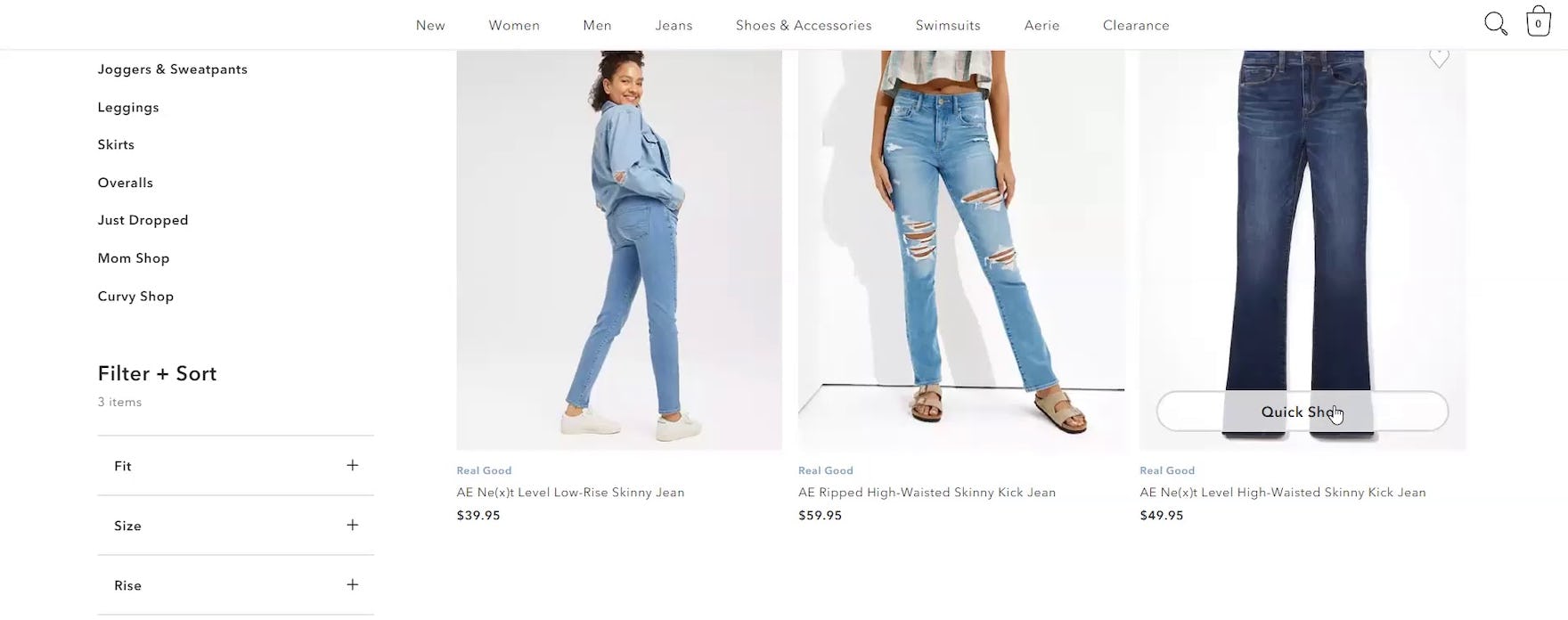
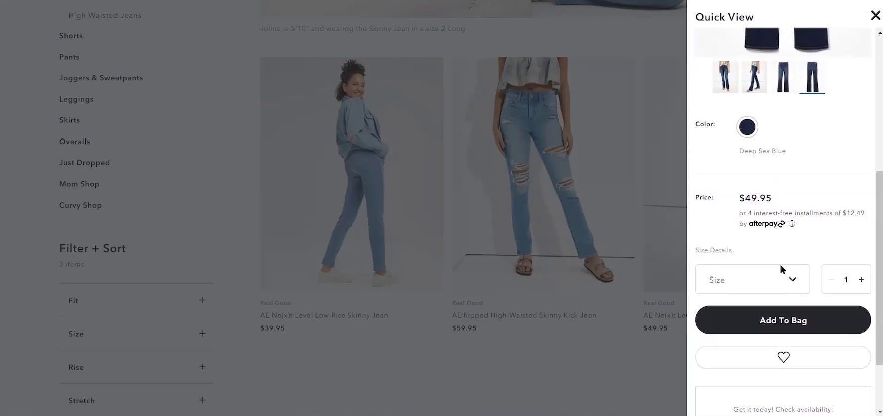
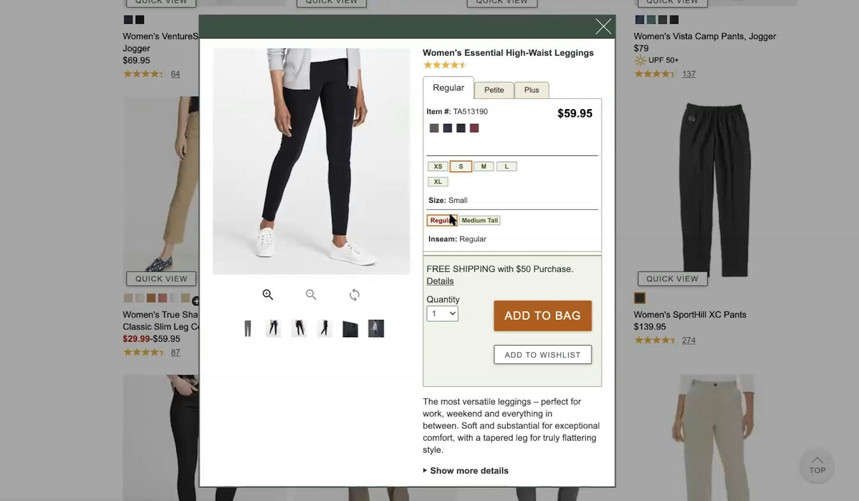
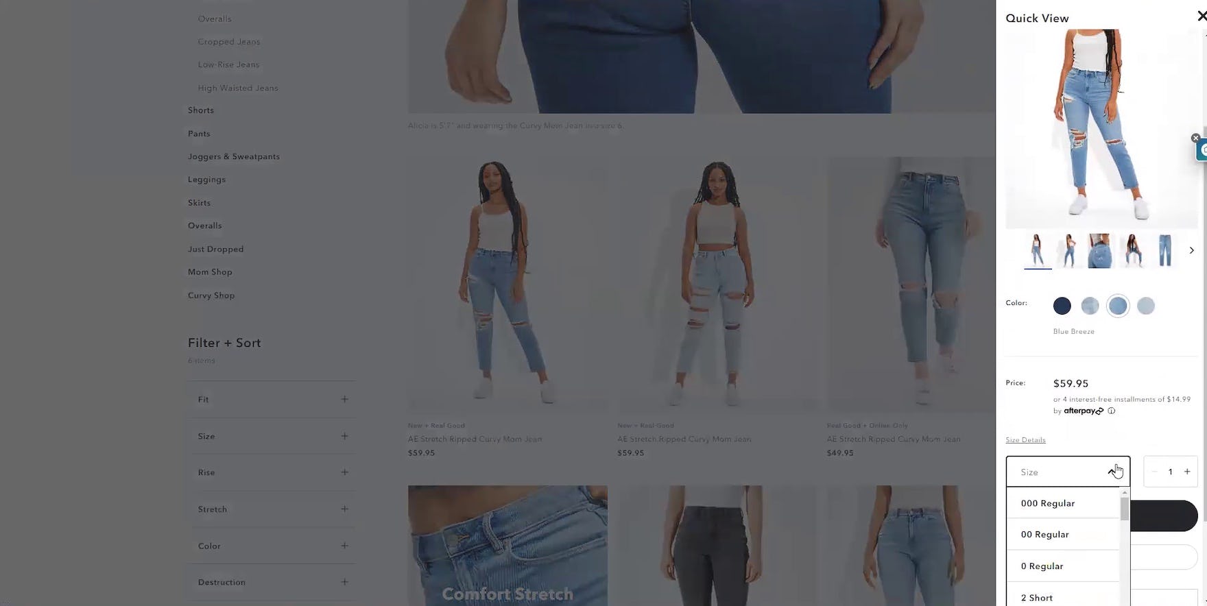
“So I like the “Quick Shop” option because I stay on that same page without moving to a different page. And so this way once I’m done choosing my size, I can just pick right up where I left off as opposed to having to go back to a different page.” This participant could not only avoid visiting the product page, but also was able to choose a size without leaving the product list. “Quick Views” can save users a lot of time when they contain key attributes such as this one on American Eagle.
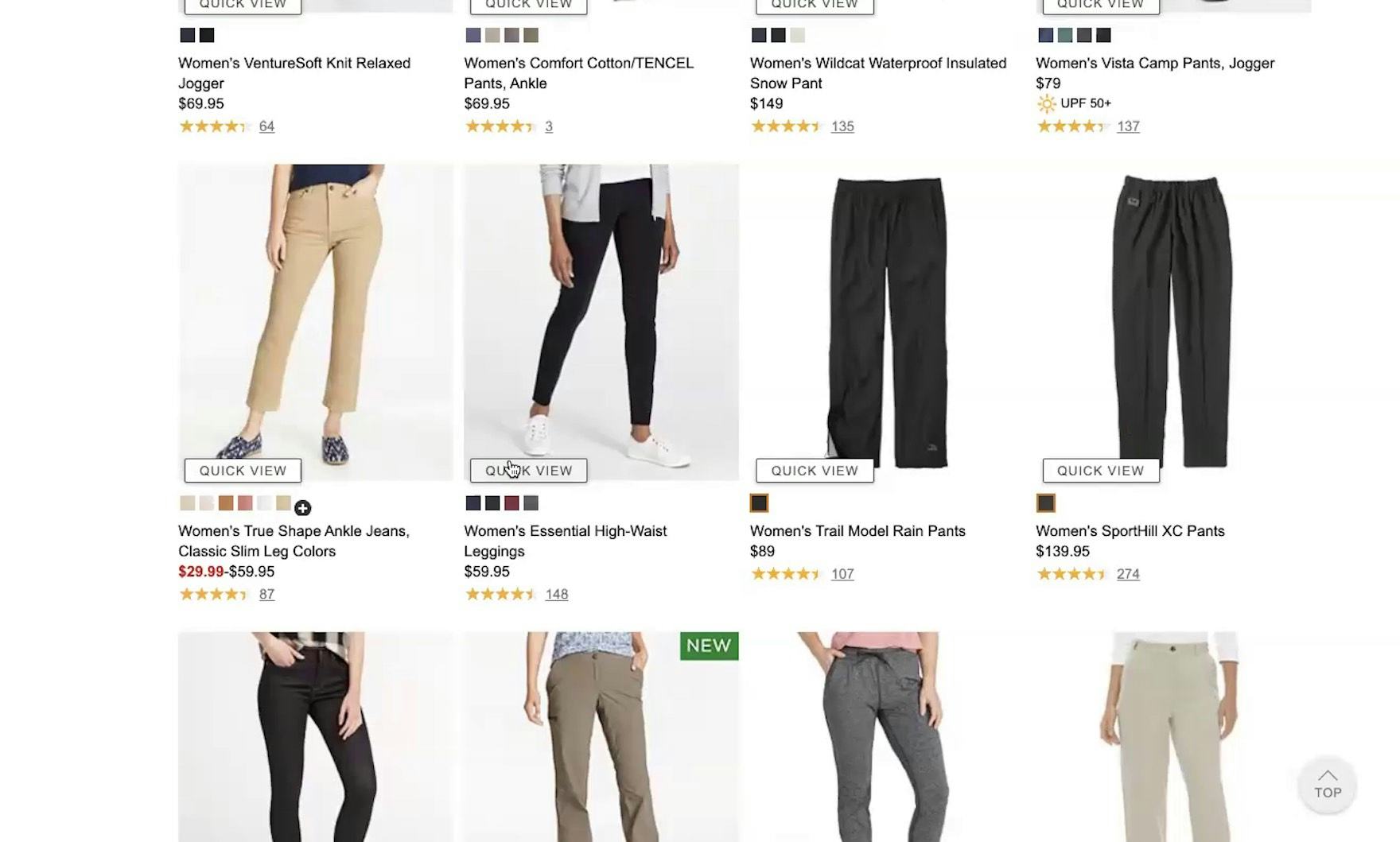
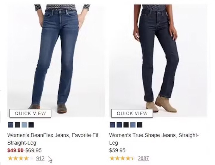
“And you see more pictures — then I don’t have to go to the next page to see more pictures.” The availability of mini image galleries in “Quick Views”, like this one on L.L. Bean, was a major positive during testing. Being able to view more than 2 thumbnails without leaving the product list can save a lot of time compared to having to visit multiple product pages.
“I was gonna see the ‘Quick View’…that’s what I like to do…because then you don’t have to go back, you can just close this little tab. It is enough information for me to decide if I want to look further.”
On sites where users need only to check on 3–5 attributes to judge a product’s suitability, provide “Quick Views” to allow them to assess the most important product features without the need for visiting product pages.
For example, during testing on visually driven sites like apparel sites it was observed that being able to view price, size availability, and 2–3 images in “Quick Views” speeded up the initial assessment of items.
As one test user commented; “If there was another picture so I could just see everything here without having to click…maybe a “Quick View” or something, because I’ve seen that before…then I can either scroll through all your photos if there’s more than one.”.
Plus, being able to access “Quick Views” minimizes delays that are due to slower site responses during the transition to and from product pages.
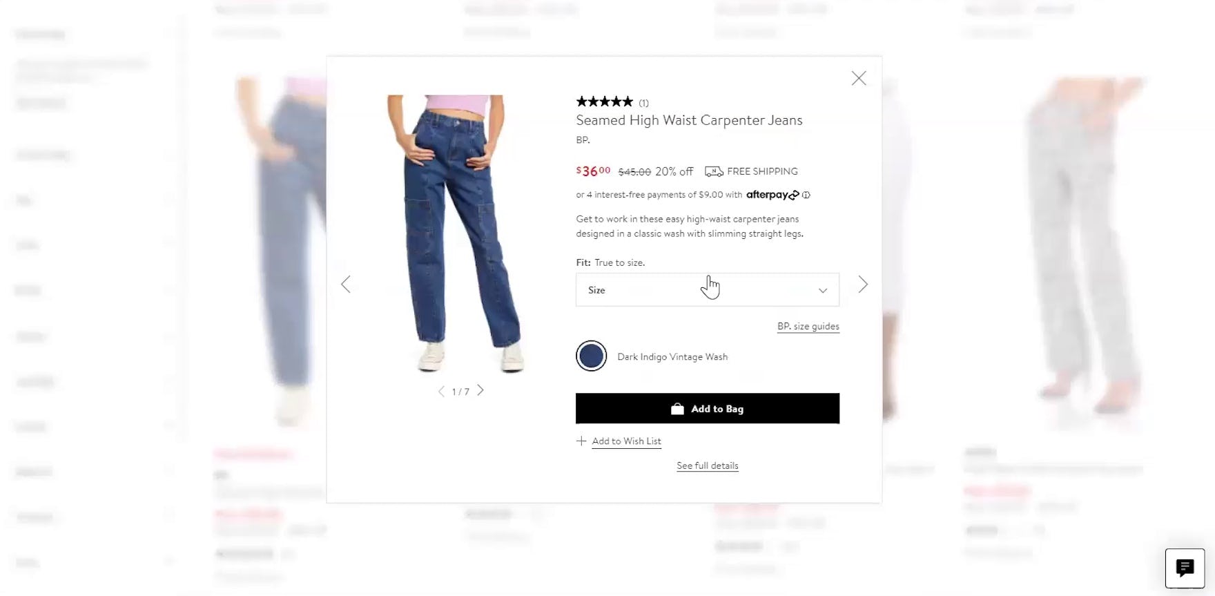
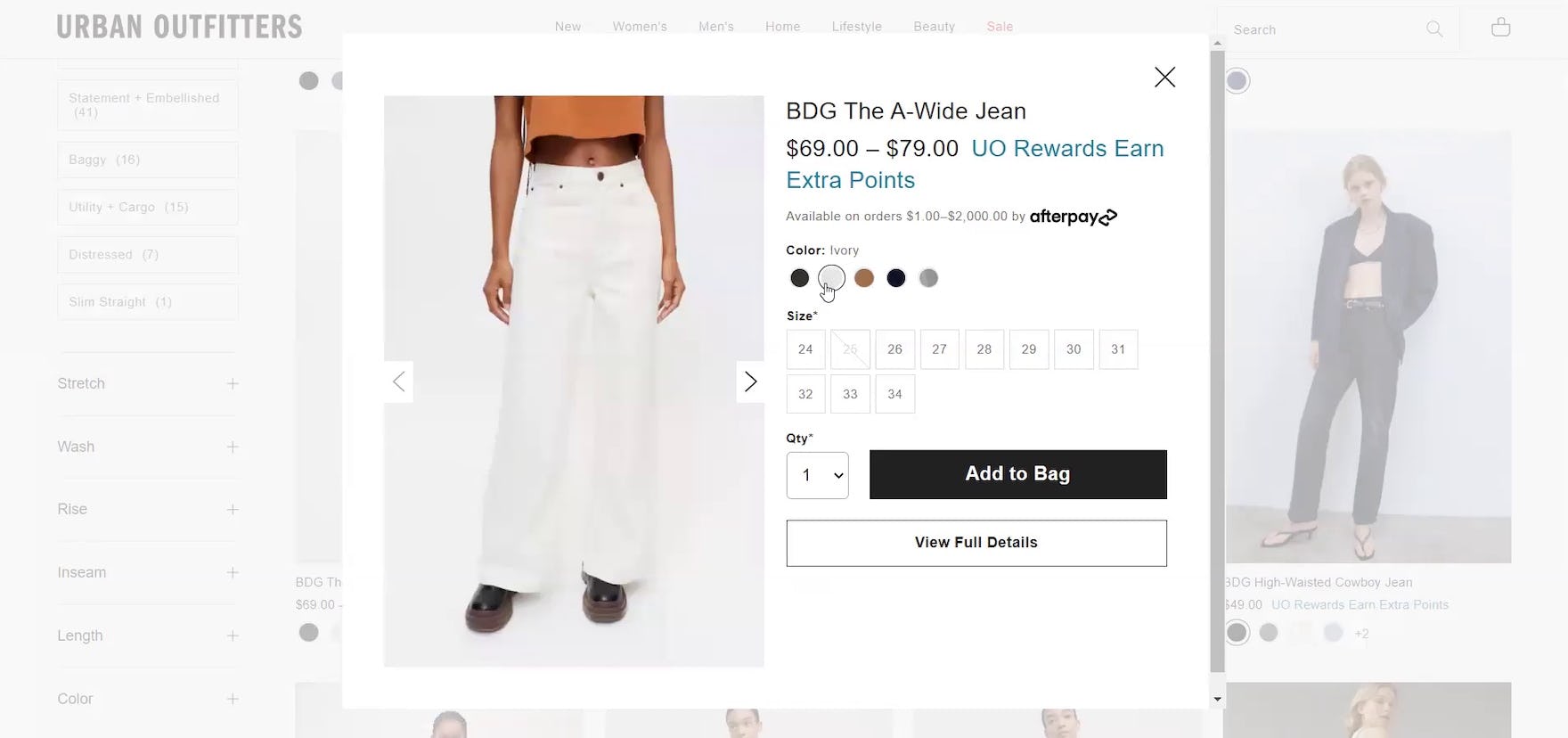
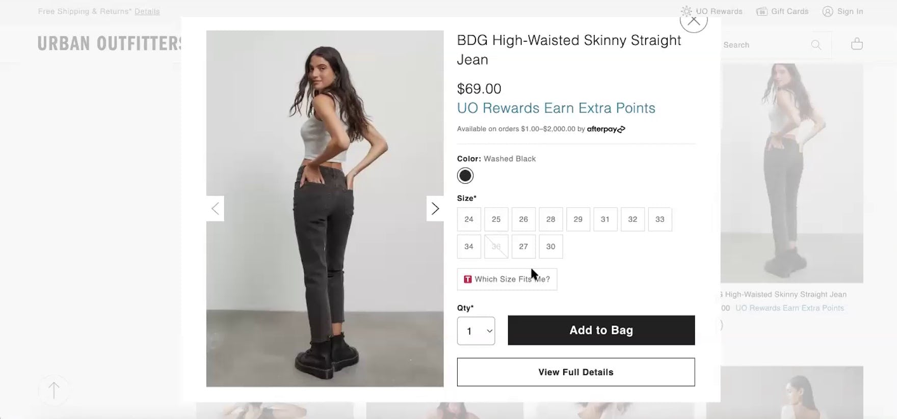
“So we’ll hit the “Quick Shop” view. Ivory…like that color a lot. Okay, so I’m looking at the different color options like the black…the ivory as well with the brown-tinted denim and rinse denim. So overall I like the tinted denim and brown and black.” Being able to see available sizes and preview different color variations, in addition to being able to add items to the cart, makes this “Quick View” on Urban Outfitters a great timesaver.
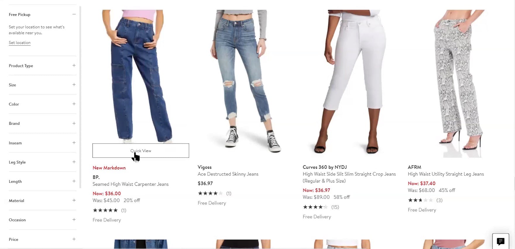
“I actually do use the “Quick View” pretty often. You can see all of the different pictures very easily. They’ll tell you it’s true to size. I pick my size…then I can add it to my bag and look at the full details later when I narrow it down. So I like their “Quick View”.” Having size availability, a mini image gallery, and an “Add to Bag” button available on Nordstrom allows users to explore many key attributes and save items for comparison without leaving the product list.
Furthermore, during testing on apparel sites many participants added items to shopping carts for comparison purposes, usually after they had narrowed down their choices to 2 or 3 items.
Having an “Add to Cart” button in a “Quick View” is an easy way for users to save items for comparison (and is a better solution than having “Add to Cart” buttons in list items).
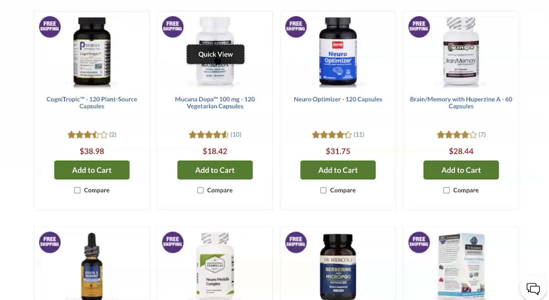
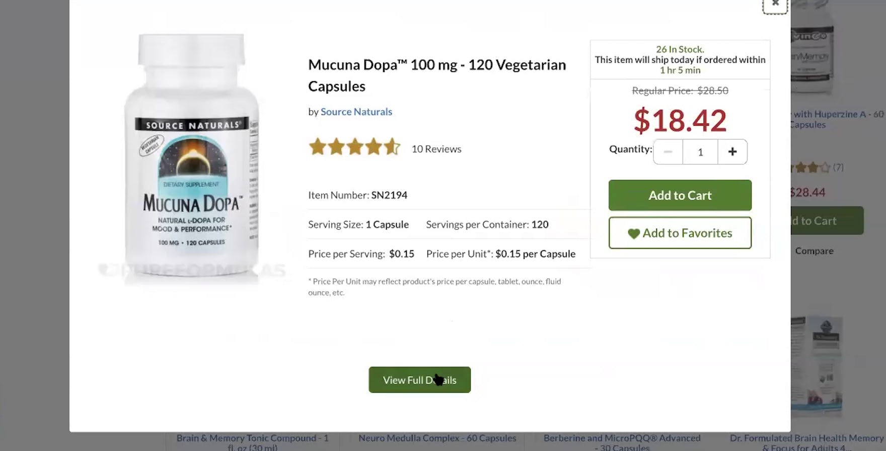
“Let’s see what’s in that. Okay, I want to look at the full details.” “Quick Views” can also be helpful in industries that are not visually driven but have relatively few key attributes, such as here on Pure Formulas — as this participant found before proceeding to the product page.
Additionally, testing revealed that “Quick Views” are not only helpful on apparel sites or other visually driven product sites.
In fact, any sites with products that have relatively few key attributes can benefit from “Quick Views”, especially those that offer products that are often repurchased.
For example, in the Vitamin & Supplements industry, a basic overview of ingredients can be shown in list items, with a fuller list appearing in “Quick Views”, and the comprehensive list appearing on the product page.
Other functionality can also be added to “Quick Views” like “Add to Favorites” and of course “Add to Cart” so that the whole process of product finding is simplified.
4) Optimizing “Quick Views”
During testing, 2 details were found to optimize the implementation of “Quick Views”:
- Support “Back” button expectations
- On mobile, make it obvious that the “Quick View” isn’t the product page
1) Support “Back” Button Expectations
If users are looking at a “Quick View” overlay, most will assume that clicking the browser “Back” button will take them back to the current product list.
In other words, clicking “Back” while viewing the “Quick View” should exit the “Quick View”.
Therefore, although sites usually provide a way to close the “Quick View”, for example by clicking an “X” at the top-right corner of the overlay, clicking the “Back” button should achieve the same result.
2) On Mobile, Make It Obvious that the “Quick View” Isn’t the Product Page
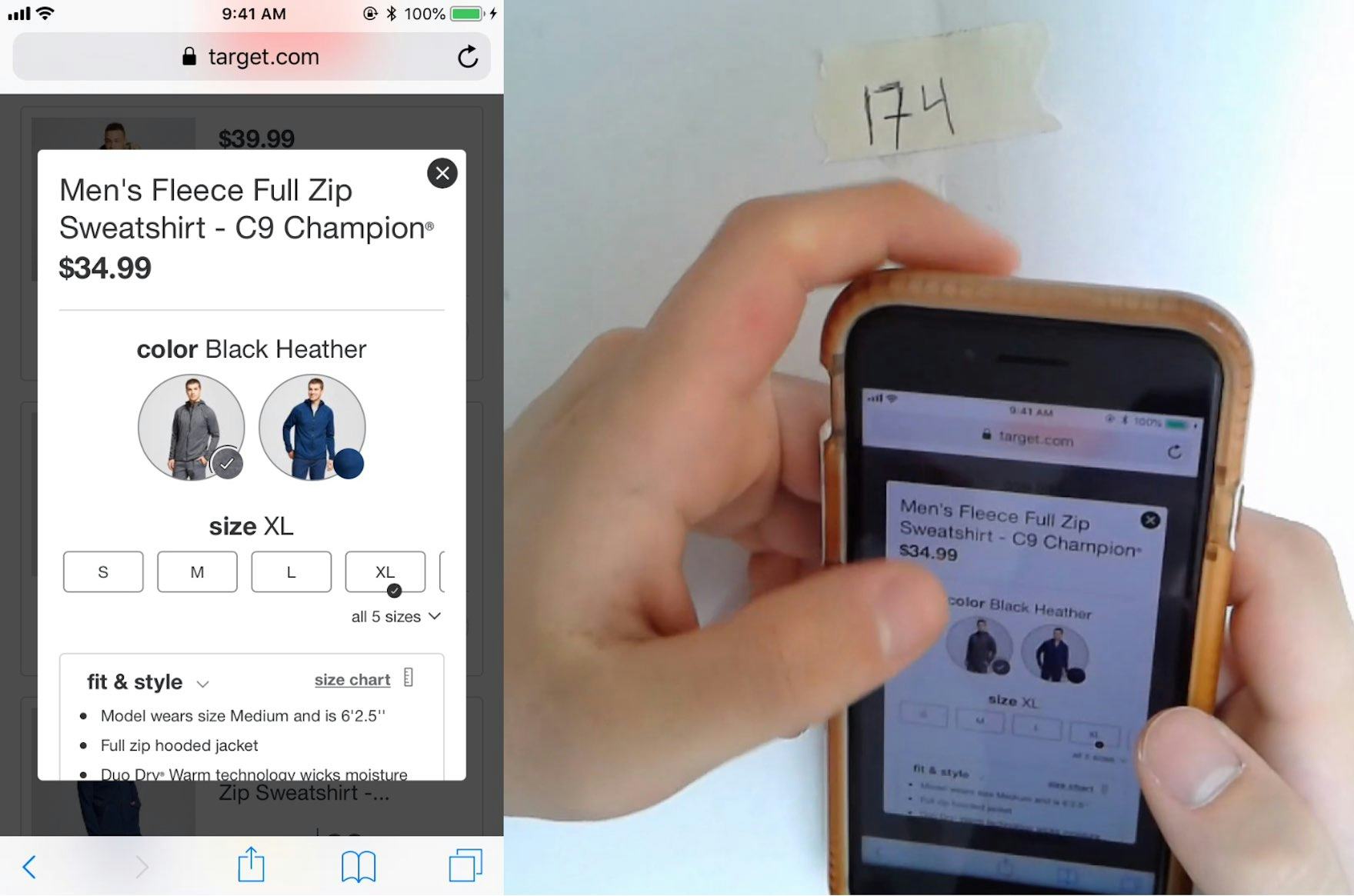
Target also doesn’t make the link to the product page easily accessible from the “Quick View”. However, there is sufficient space surrounding the “Quick View” to allow users to easily see the product list — reinforcing that they’re not viewing the product details page, while also allowing them to exit the “Quick View” by tapping on the product list.
To ensure mobile users don’t mistake the “Quick View” for the product page, the product list should be visible behind the “Quick View”.
During mobile testing, some subjects mistook the “Quick View” for the product page (an issue not observed during recent desktop testing).
When users are presented with a “Quick View” that contains a decent amount of product information, product variations, multiple large product images, and even an “Add to Cart” button, some users will — quite understandably — perceive the “Quick View” to be the site’s product page.
If users mistake the “Quick View” for the site’s product page they miss out on the product information and features only available on the product page, and may as a consequence discard perfectly suitable products simply because they cannot find the information they are looking for.
The product list can be dimmed while users are in a “Quick View” (allowing users to focus on the “Quick View”), and sufficient space should be left around the “Quick View” to leave room for the product list to be clearly seen and easily tapped when users want to exit the “Quick View”.
Additionally, a link to the product page must be provided in the “Quick View”, and it should be very prominent — in particular, visible without scrolling and in a prominent font so that it’s highly visible.
5) How “Quick Views” & User Engagement Have Improved Since We First Tested Them
At Baymard our 2014-2015 large-scale usability testing revealed Quick Views to perform poorly. So we’ve previously advised to generally avoid “Quick Views” on desktop sites. However, our advice has changed in the light of our latest 2022 research findings.
Two of the negative behaviors associated with “Quick Views’’ — that users overlooked links to product pages in “Quick Views”, thereby assuming that the “Quick Views” were in fact the product pages; and that users accidentally clicked on “Quick View” buttons when intending to click through to product pages — have not been re-observed in our recent 2022 desktop testing.
These issues were prevalent when “Quick Views” were new to e-commerce sites (back in 2014) but, given that we no longer observe them, we now recommend that “Quick Views” can complement well-designed list items in the contexts described in this guideline.
That said, while “Quick Views” were observed to be appreciated and used by many participants during testing, they shouldn’t be a solution for poor listing design.
Indeed, to enable users to assess the scope of product lists and make initial judgements of suitability without having to open “Quick Views”, list items should always contain essential product information, thumbnails should be adequately sized and display sufficient visual information, and secondary thumbnails should appear on hover.
“Quick Views” can be a useful complement to a well-designed list item — not a substitute for one.
6) Why “Quick Views” Are Not Suitable for Spec-Driven Products
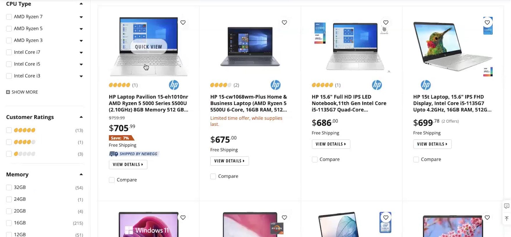
Although Newegg offers a “Quick View”, the lack of detail in list item info — caused in part by the grid design of the product list — makes it very difficult for users to even form a basic impression of products, forcing them into the “Quick Views” just to get a basic overview of each item.
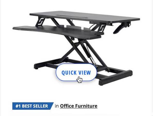
While “Quick Views” were observed to be helpful to users on visually driven sites such as apparel, furniture, and other sites selling products with few key attributes, during testing we observed that users considering spec-driven product types found “Quick Views” much less useful.
Spec-driven products generally have far more features and attributes than visually driven products and even the extra space afforded by “Quick Views” is unlikely to accommodate all features of interest to every single user.
Instead, to allow users on spec-driven sites to easily assess and compare all specs across multiple products, after first optimizing list items, sites selling spec-driven products should provide comparison features.
7) Conclusion: Speed Up Product Finding for Visually Driven Items
Two types of “Quick View” were observed in desktop testing — the more common centered overlay as seen on Urban Outfitters (first image) and a right-sided scrolling sidebar on American Eagle. While both worked equally well, there is a potential for users with small viewports to overlook information and features in the second type because they may need to scroll to access them. Therefore, if adding “Quick Views” consider using a centered overlay.
Having to travel back and forth between product lists and product pages can slow down the process of product finding, especially on mobile.
In fact, users have specific concerns about:
- Not being brought back to the same point in product lists or search results when returning from product pages (which is a bigger issue on mobile)
- Performance issues in the form of slow-loading site pages (also a bigger issue on mobile)
- UI quirks or other technical issues that increase the perceived risk of initiating any unnecessary page loads for fear of running into some UI issue
“Quick Views” can speed up this process on visually driven sites by allowing users to stay on product lists while assessing products with relatively few features, such as apparel, and only visiting product pages to do a “deep dive” on the finer details.
Indeed, well-implemented “Quick Views” proved extremely popular during our Premium UX research.
However, 2 implementation details are needed to ensure that “Quick Views” are optimized:
- Support “Back” button expectations
- On mobile, make it obvious that the “Quick View” isn’t the product page
For visually driven products, therefore, providing “Quick Views” should be considered to reduce both the number of trips to the product page and the apprehension of users about how troublesome they might be.
This article presents the research findings from just a few of the 650+ UX guidelines in Baymard – get full access to learn how to create a “State of the Art” ecommerce user experience.

