Key Takeaways
- List item information is critical in helping users select products that are relevant to them
- 50% of e-commerce sites in our benchmark failed to display adequate list item attributes, leading users to dismiss perfectly relevant products or even abandon a site
- Carefully chosen Universal Attributes and Category-Specific Attributes enable users to make informed decisions about which products to open and which to skip
Users select and reject products based on the list item information in product listings — it is therefore crucial to include this information so that users can efficiently assess products.
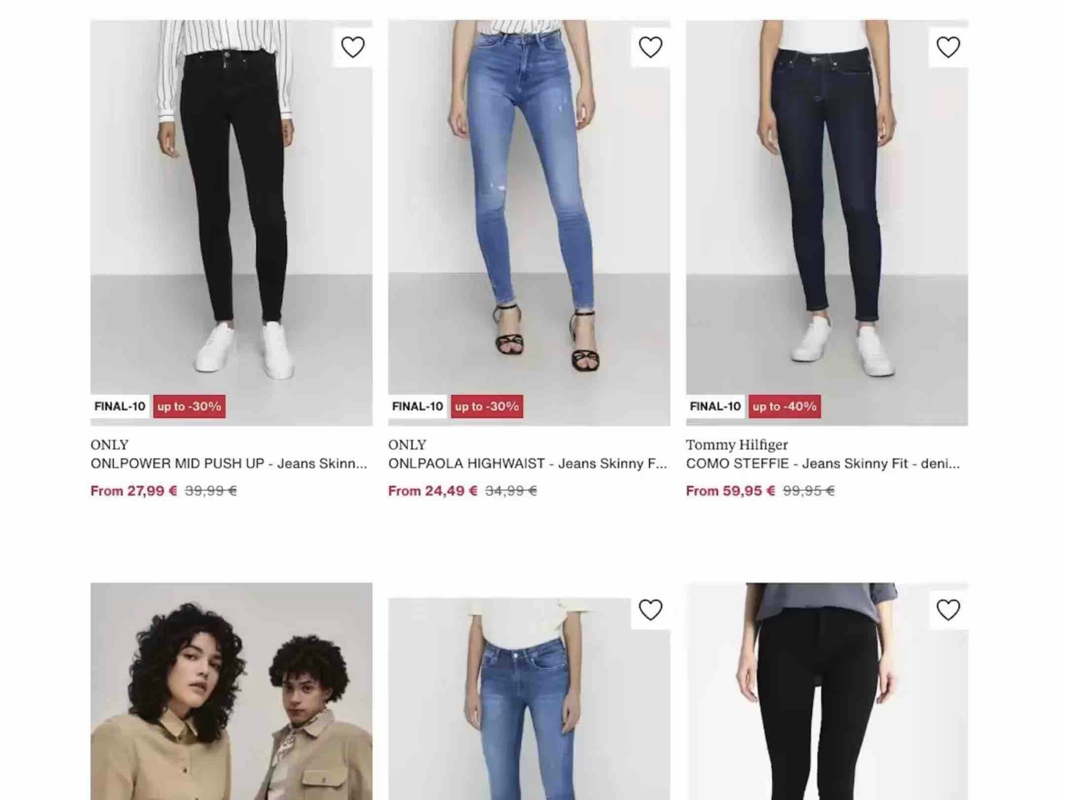
In Baymard’s large-scale UX testing of Product Lists & Filtering, we’ve observed that missing list item attributes caused participants to miss out on relevant products — either because participants had to guess if the product was a match, or because they were forced to click to the product page of each item to glean its essential attributes.
This back and forth process often led users to abandon the site.
On the other hand, a list item that provides both Essential and Category-Specific Product Attributes helps users accurately evaluate which items are relevant to them — and which they can skip — while also enabling users to compare products.
However, our e-commerce UX benchmark shows that 50% of sites don’t display the right balance of important content in product listings.
As a result, users are more likely to be unable to find suitable products to explore in the product list.
In this article, we’ll discuss test results from our Premium research findings on how to evaluate and select list item attributes for your Product Listings Page:
- Why including 5 essential product attributes is critical for nearly all sites
- How including category-specific attributes is important for spec-driven products
- Give users the info they need to evaluate products in the product list
Provide 5 Essential Product Attributes (35% Don’t)
Our large-scale testing revealed that there are 5 product attributes that are so essential to users scanning list items that they will actively avoid clicking on products without them:
- Price
- Product title or type
- Thumbnail
- User ratings average and the number of ratings
- Product variations
1) Price
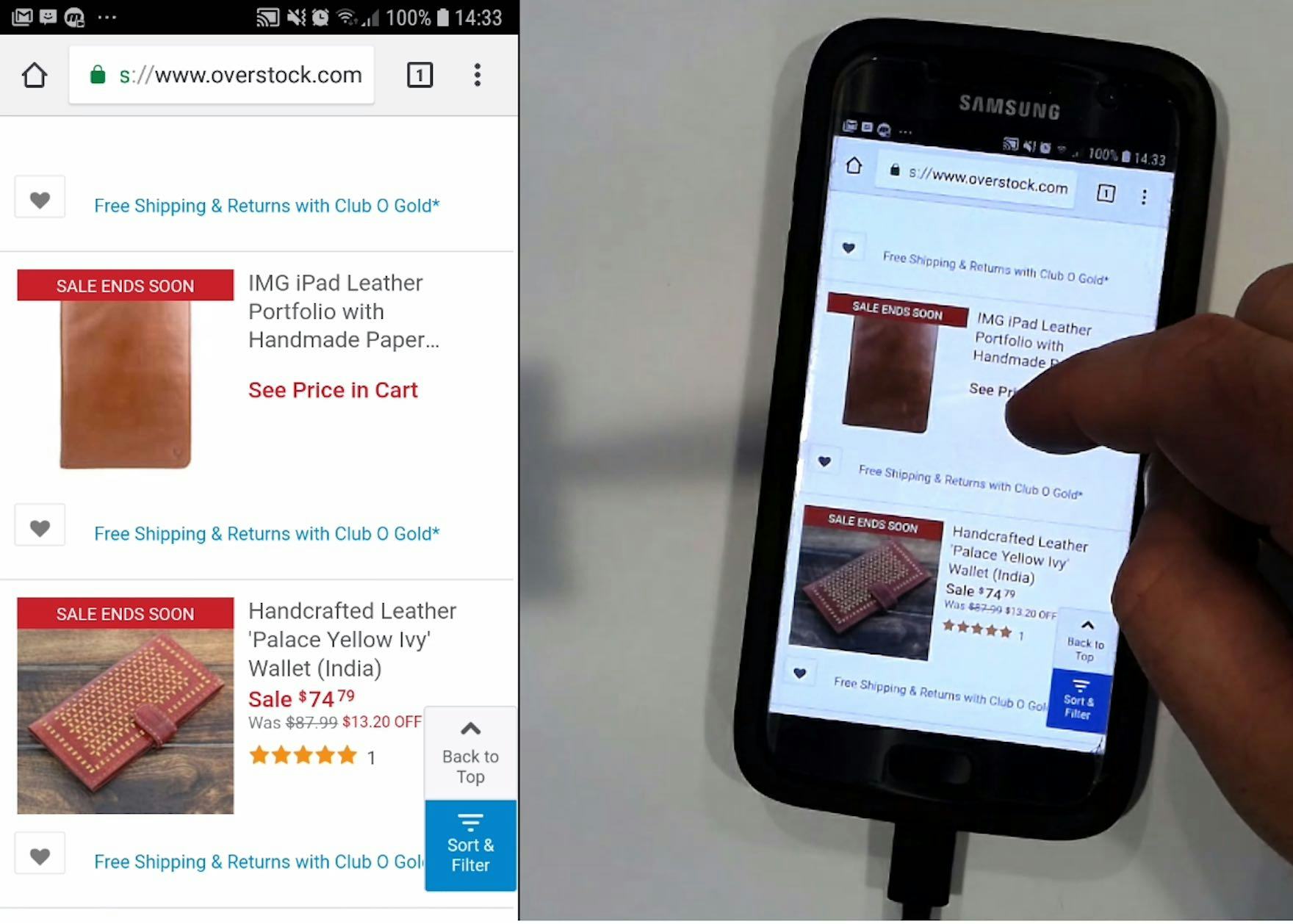
“‘See price in cart.’ I don’t necessarily understand why you’d have that on a wallet.” Most users won’t understand why prices are not shown in list items, and some will discard these products in favor of those with visible prices, as seen here with a participant trying to buy a wallet at Overstock.
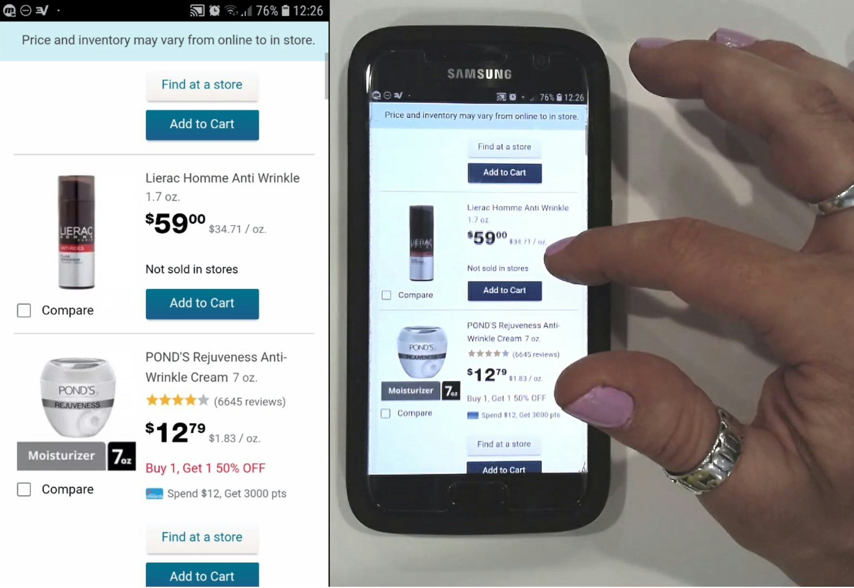
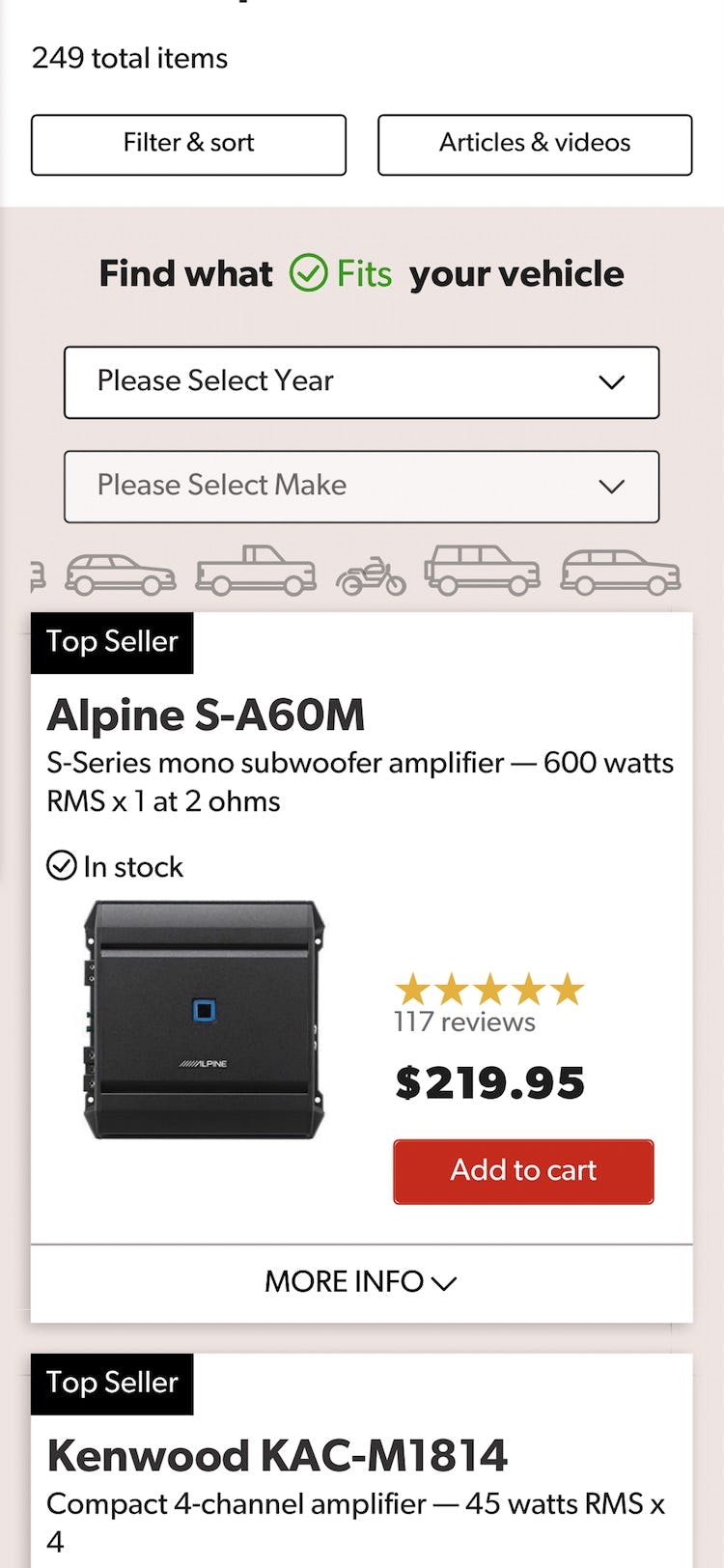
“Price is nice and big.” Prices on Walgreens’ mobile site are very prominent. Notice also how the price per unit (in this case per oz.) is shown (see Display “Price Per Unit” For Multiquantity Items) but does not interfere with the price.
The price of each product is obviously essential to users, both in terms of evaluating each product on its own and for comparing product prices to one another.
It is therefore vital that the price be permanently visible at all times (which nearly all sites get right).
2) Product Title or Type
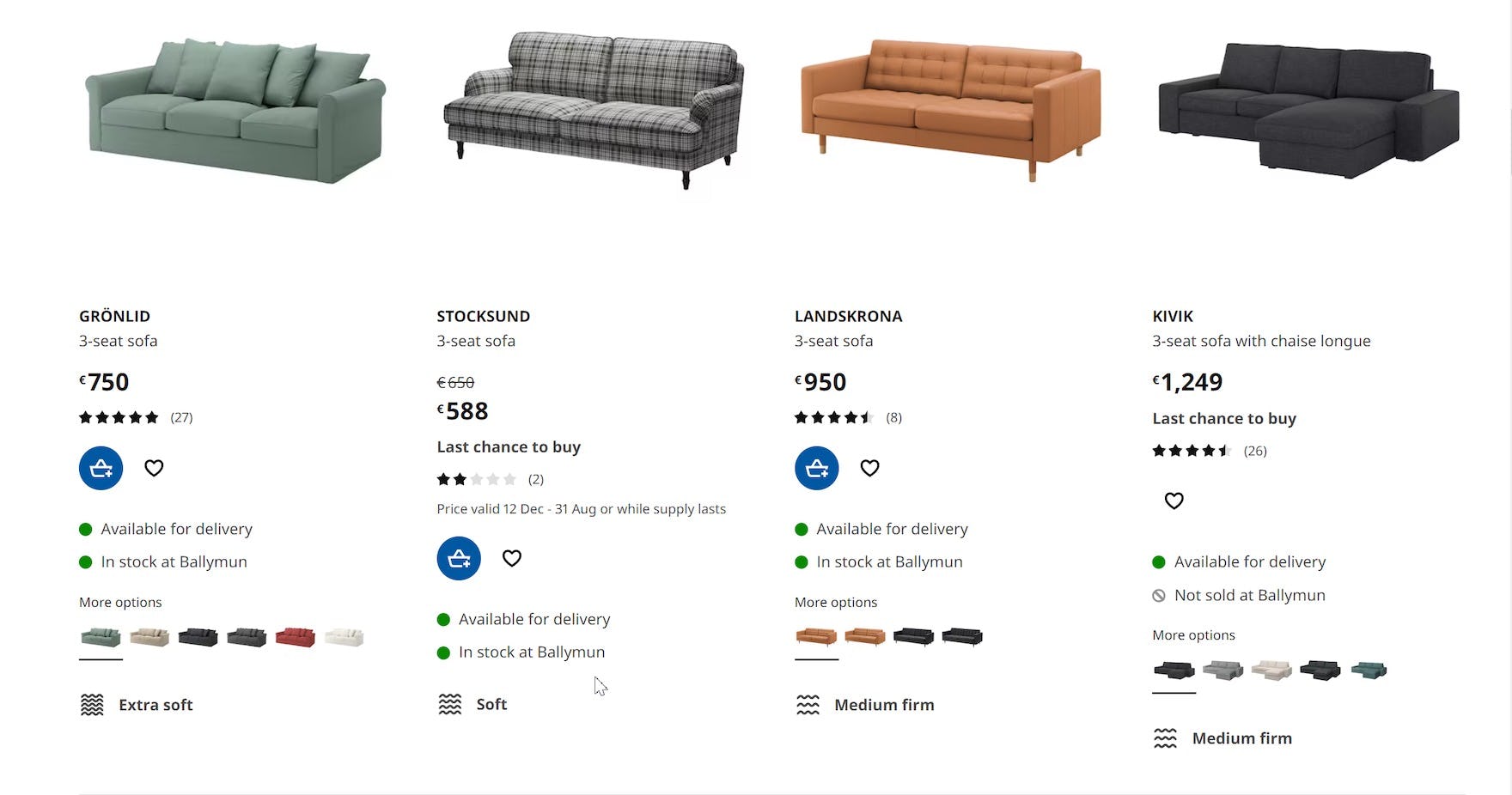
IKEA includes both product title and type, as the names alone would be of little value to the user. A title such as “STOCKSUND” or “KIVIK” is only meaningful to the user as a unique identifier of a product series. However, including product types like “3-seat sofa” makes it perfectly clear what the items are.
“‘Retinol treatment’— I could see that, since retinol is good for age.” The clear product titles on Maya Chia helped this participant decide which serum might address her primary skin concern of signs of aging.
Test participants were also observed to rely on the product title or product type when scanning list items — for example, when the thumbnail was difficult to decipher at first glance.
While descriptive product names can generally stand on their own as the product title, there are a few industries (such as Houseware & Furnishings) where the product type may actually make more sense to the user than the product title — especially if the titles are nondescriptive in nature.
In those cases, product type may be displayed instead of or in combination with the product title.
For large or mixed-product catalogs, it might be too resource intensive to manually determine if each product title is descriptive or not, in which case it is recommended to include both product title and product type.
Additionally, having feature-rich product titles gives users more information about the items than just a simple product name.
Highlighting a product’s features in its title also lets users compare product list items to each other more easily — product features in titles serve as crucial product data that users can rely on to facilitate their comparisons.
However, the downside is that the more feature-rich product titles are, the longer they will be.
As a result, it will be important to make the most important information within the product titles stand out visually (e.g., by using a larger and bolder font for the primary information in the title).
Furthermore, testing revealed that product titles should not extend to more than 3–4 lines on mobile devices: beyond that, titles were perceived as descriptions.
3) Product Thumbnails
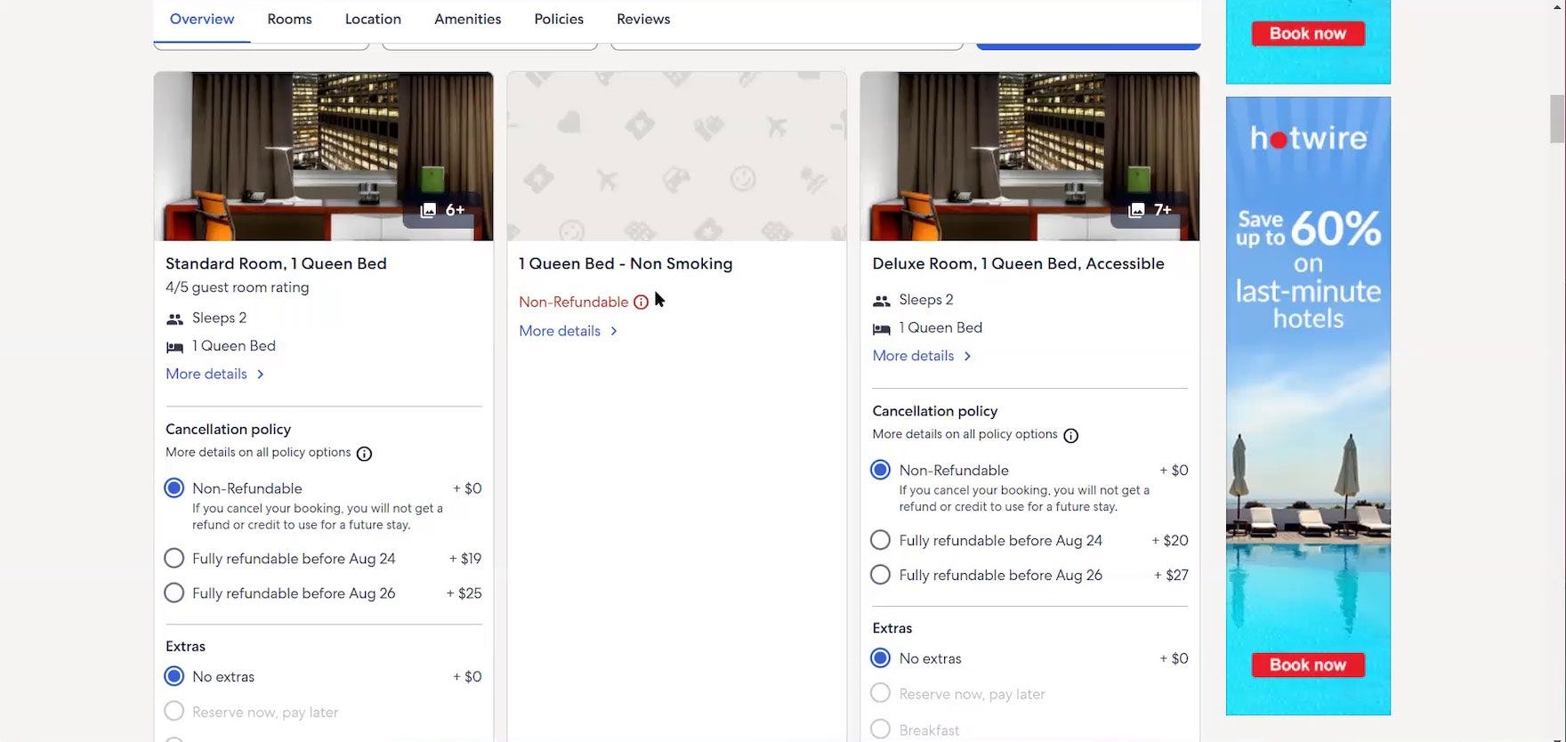
“So that’s a little — they don’t have a picture or anything — different”, laughed a participant shopping for hotel rooms at Expedia as she skipped past a nonrefundable room with no thumbnail. During large-scale Travel Accommodations testing, thumbnail images were essential to participants’ success in identifying suitable properties and rooms to book.
Thumbnails proved to be one of the most essential attributes for test participants, who would devote a disproportionately large amount of attention to them.
List items without thumbnails were often completely ignored, as most of the participants perceived these products as “incomplete”.
Therefore thumbnails should always be included in product list items.
(For more on thumbnails in product lists, see Product Lists: Display Extra Product Info and Images on Hover.)
4) User Ratings Average and the Number of Ratings
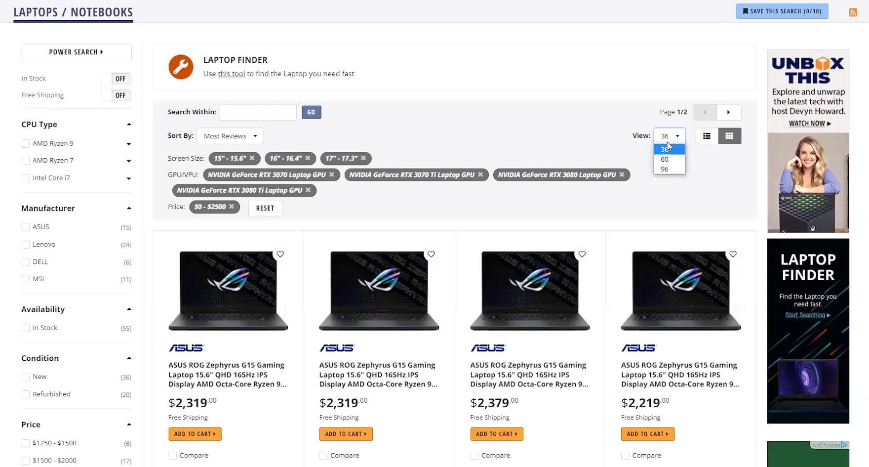
“The only downside is that on Newegg, a lot of them don’t have reviews. So I couldn’t just rely on this. I’d have to look at what content creators are saying about certain computers. Get their take.” The absence of user ratings averages on Newegg’s product list — which were available on the product details page — tempted this test participant to go off-site for opinions on items of interest. When users go to other sites to read reviews, there is a risk that they’ll never return.
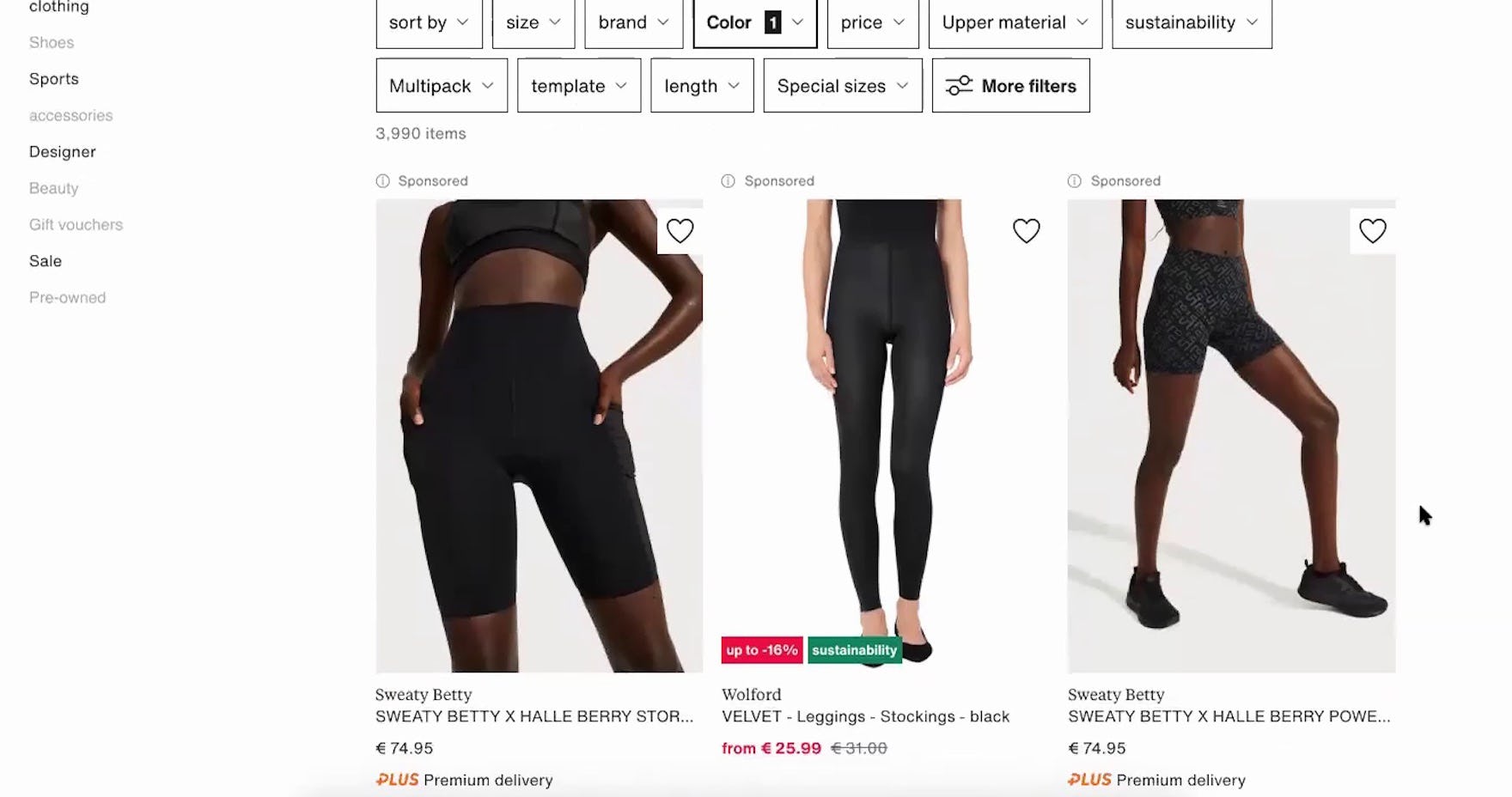
“Yeah, I think it’s a shame I cannot see any stars, or how they’re rated by other customers. If it has really good reviews, I’m willing to pay a little bit more.” When user ratings aren’t included in list items, such as here on Zalando, a subset of users will be dissuaded from exploring the product further.
For most industries and site types, user ratings averages and the number of ratings will also be vital attributes to include in the list item, as also discussed in Allow Sorting by “Price”, “User Rating”, “Best-Selling”, and “Newest”.
Indeed, during testing, participants relied extensively on user ratings to help them choose which products they wanted to explore further.
Additionally, besides the ratings average it is essential to also include the number of ratings that the average is based on and of course to allow users to submit ratings and reviews of products in the first place.
However, note that small or direct-to-consumer sites don’t have as much need to offer site-provided reviews.
5) Product Variations
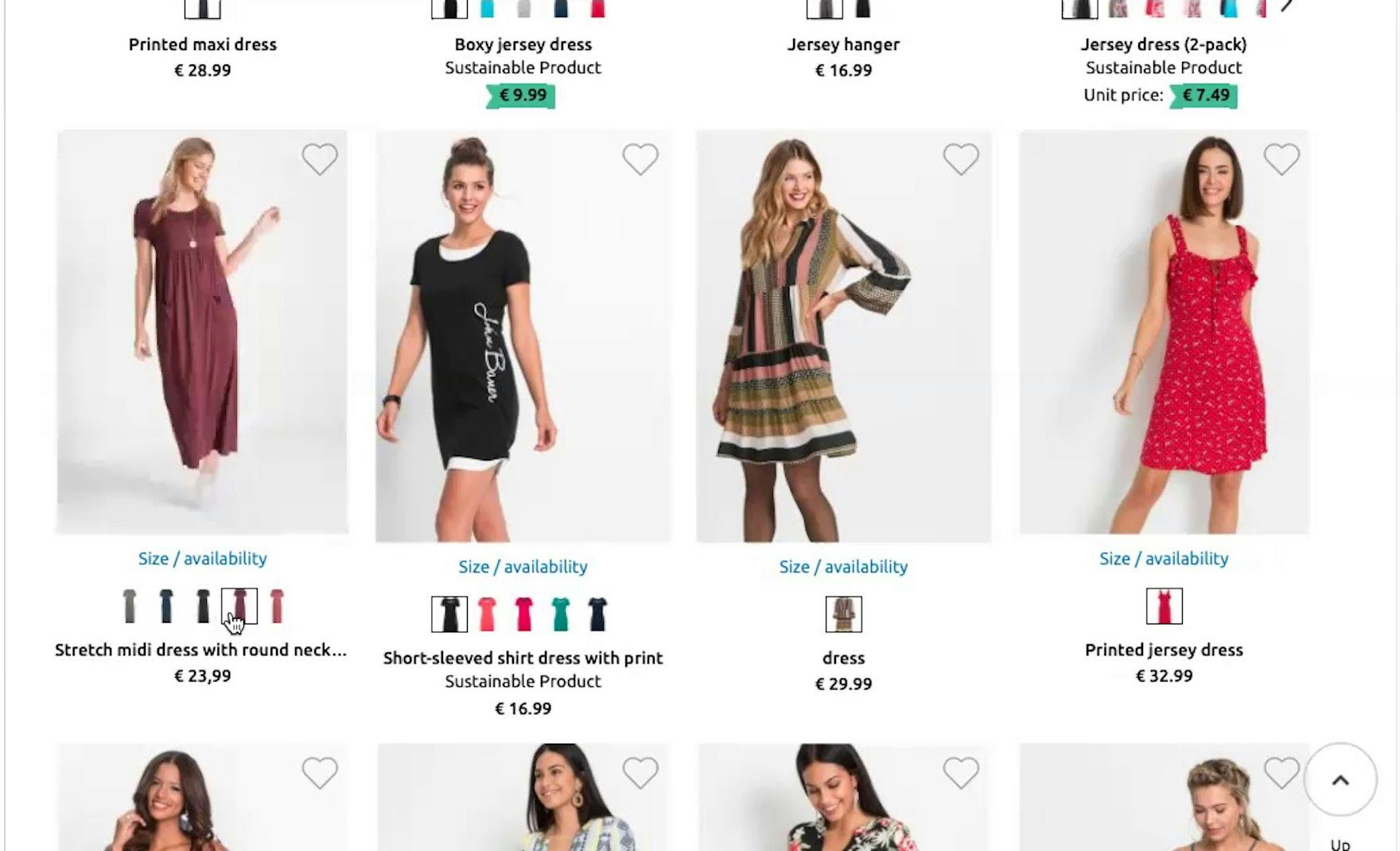
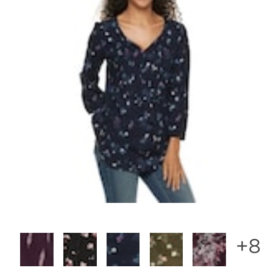
“Okay, it’s good that they have all the color variants shown right below the dress. So if I like some dress and if I know that there are variations I can just go on that and see them without opening it — that saves time.” Providing color variations in list items can save a lot of time, as this test participant on the German site Bonprix confirmed during large-scale European testing.
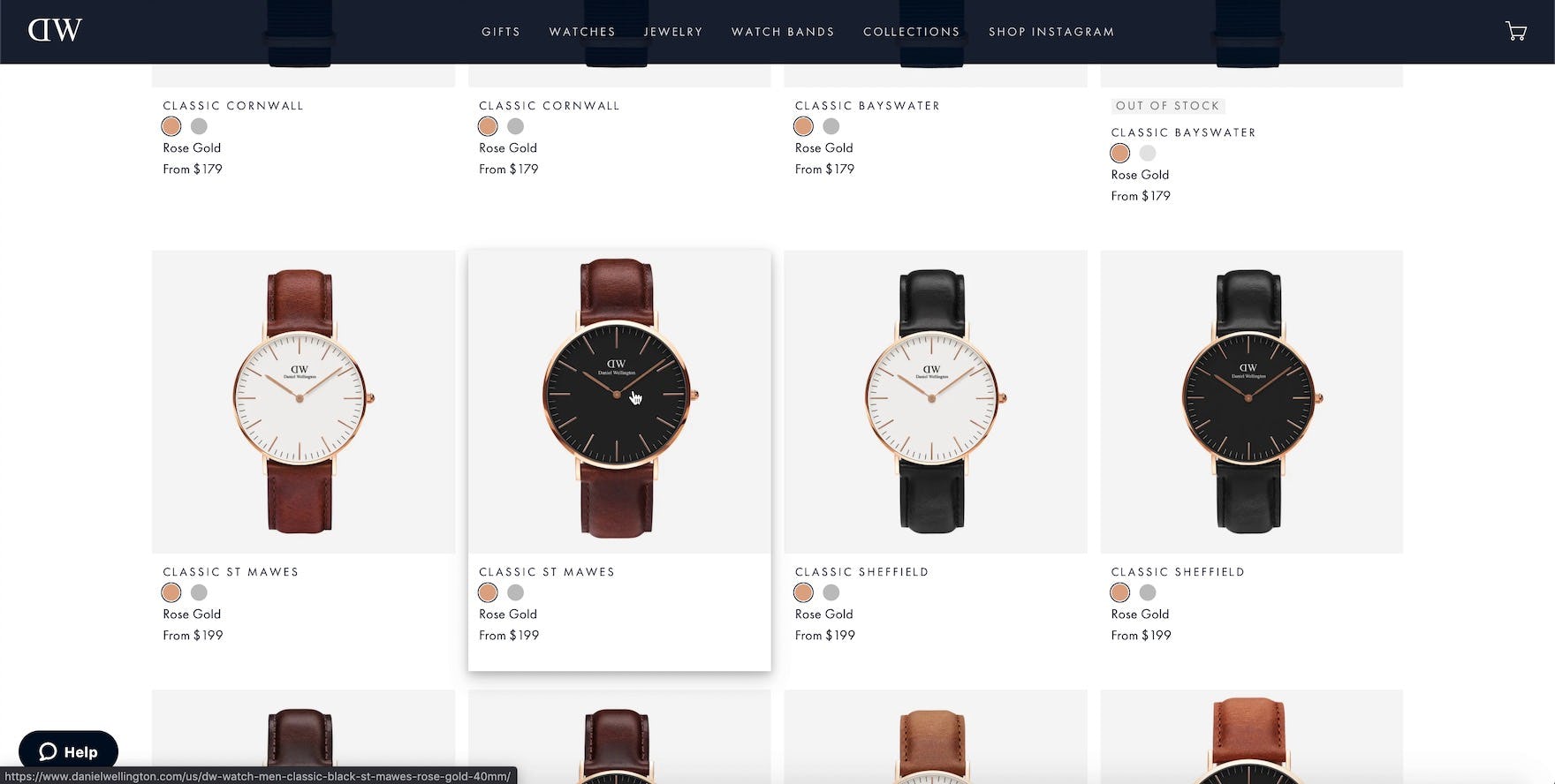
On Daniel Wellington, color variations for watch straps help streamline the evaluation process in the product list.
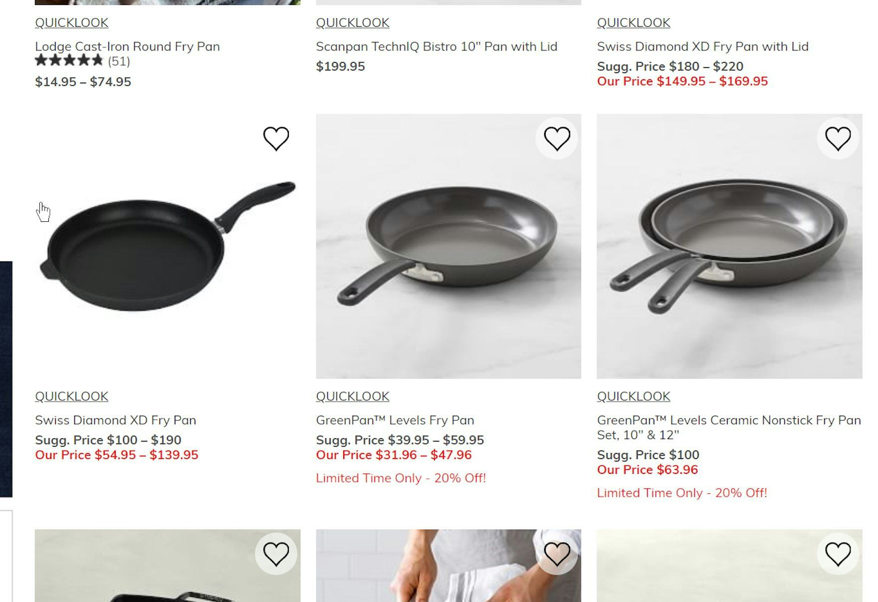
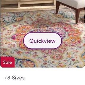
Without an indication that some of these pans exist in multiple sizes, users on Williams Sonoma will have to visit each product page to learn about the available variations. While the user can infer that multiple variations exist based on the listed price range, it’s needlessly cumbersome to have to infer this for each product in a list with dozens or even hundreds of results. Moreover, neither does a price range indicate what the product variation is (e.g., do the pans vary in size, material, color, etc.?).
Certain products have variations, such as color (e.g., colors of clothing and consumer electronics items, and exterior finishes of home appliances like refrigerators), that users need to be aware of when browsing product lists, because they offer choices that increase the user’s likelihood of finding a suitable item.
Variations such as different colors, sizes, and materials are therefore another essential attribute to include in the list item (also see Combine Variations of Products into One List Item).
During testing, when list items did not include variations, participants often rejected products that actually matched what they were looking for, as they judged the product on the default variation featured, without ever realizing that multiple (and highly relevant) product variations were available on the product page.
However, not all product variations should be displayed.
For example, the different size variations for a desk would typically need to be indicated in the list item, whereas it’s far less relevant for a shoe list item to indicate that multiple sizes exist, as users will assume so due to the nature of the product.
Provide Category-Specific Product Attributes for Spec-Driven Products (15% Don’t)
Beyond the 5 essential attributes, many industries will have a few attributes that are so important to the products in that category that they should be included in list item info in order for users to make an informed decision about which products to explore further and which to skip.
What follows are a few examples of different category-specific attributes to use as a source of inspiration when trying to determine which product attributes may be uniquely essential for a given category, and thus should be displayed in list items:
- Technical specs
- Dimensions and capacities
- Attributes conveying appropriateness
- Attributes conveying suitability in a given context
1) Technical Specs
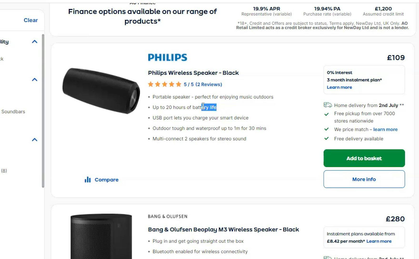
“Yes, good battery life.” This test participant found a key category-specific attribute on Argos (UK) that made this product worth considering without her having to visit the product page.
For some spec-heavy product types, certain specs are critical to the comparison and assessment process — for example, during testing with participants looking for laptops, screen size and hard disk capacity were of key importance.
Another common decision factor is compatibility with other products (such as when users are looking for laptop chargers) — and if those attributes aren’t included in list items, users will inevitably have to visit multiple product pages to find more information, slowing the product-finding process.
2) Dimensions and Capacities
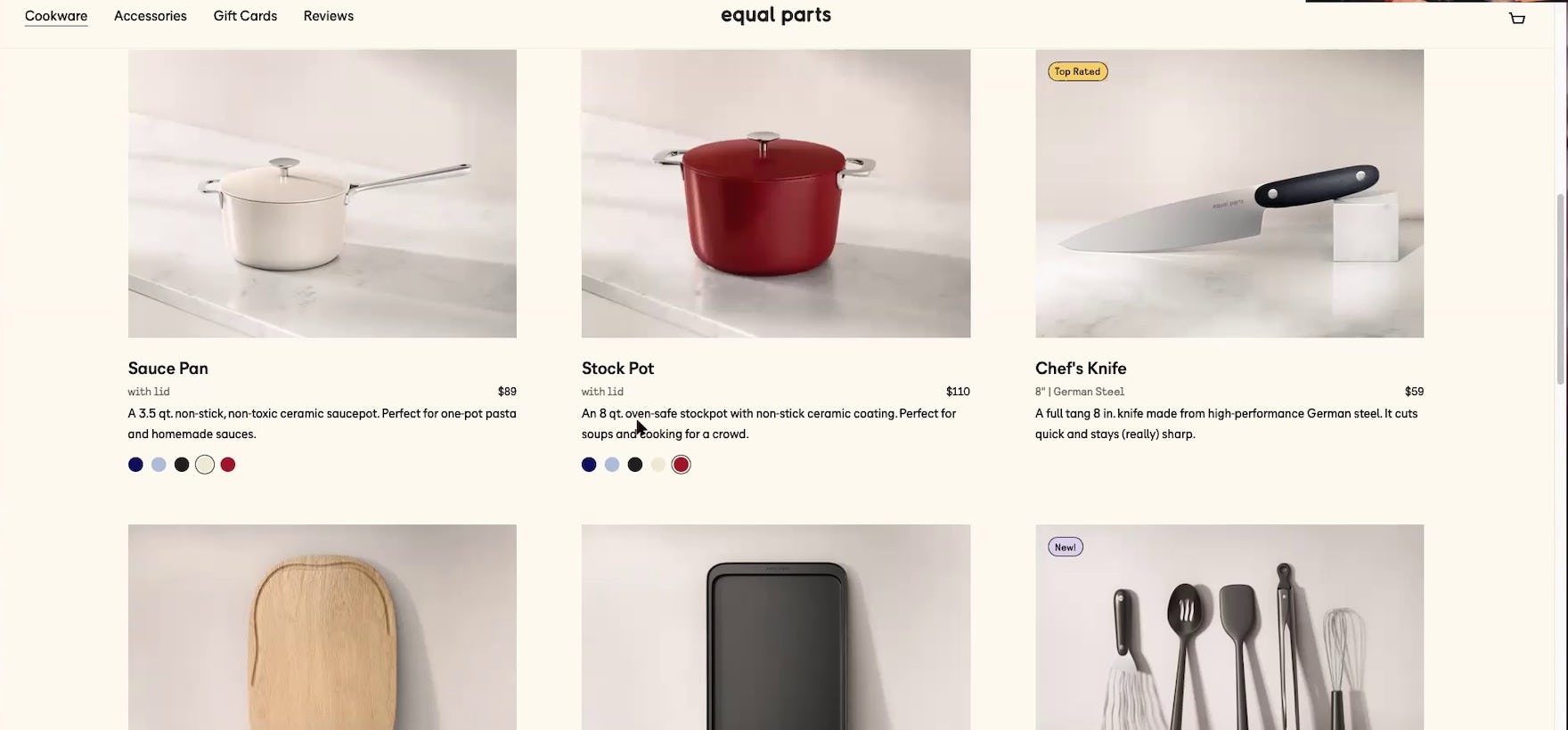
“The stockpot is 8 quarts.” This participant on Equal Parts easily referenced the product’s capacity, provided directly within the product list. Providing key category-specific attributes can help users determine if products will suit their needs.
Dimensions are a key piece of information, as in the case of a receptacle or bag that contains, carries, stores, or otherwise holds another item, which will often need to have its inner dimensions listed so users can determine whether their item will fit within it.
Likewise, any product that has to fit within a specific room or space, such as a refrigerator, a bed, or a sofa, should have the key dimensions listed.
Similarly, capacity — such as how much liquid a stock pot can contain — can be a key attribute for products like kitchen equipment.
3) Attributes Conveying Appropriateness
Attributes conveying appropriateness for audience or occasion can be important in industries where the user making the purchase typically isn’t the end user.
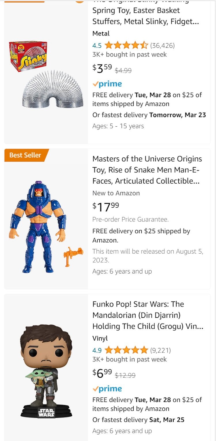
In fact, such attributes can almost function as an integrated help guide, directing the user to products that will be suitable for their recipient or occasion, such as the suitable age range for toys or the type of jewelry to gift by recipient.
4) Attributes Conveying Suitability in a Given Context
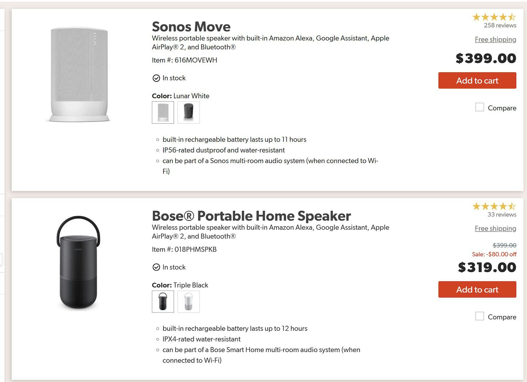
List items in the “Portable Bluetooth Speakers” category on Crutchfield include the level of water resistance, such as “IPX4-rated water-resistant”. For products designed to be used outdoors, this attribute is important, and users can judge suitability right from the product list.
Another typical example of category-specific attributes are those for any product that must work in a special context and under certain conditions (such as safety gear, outdoors products, underwater equipment, and any other type of product that has to perform in a special context).
Without these attributes available in list items, users will be unable to fully judge product suitability.
Give Users the Info They Need to Evaluate Products in the Product List
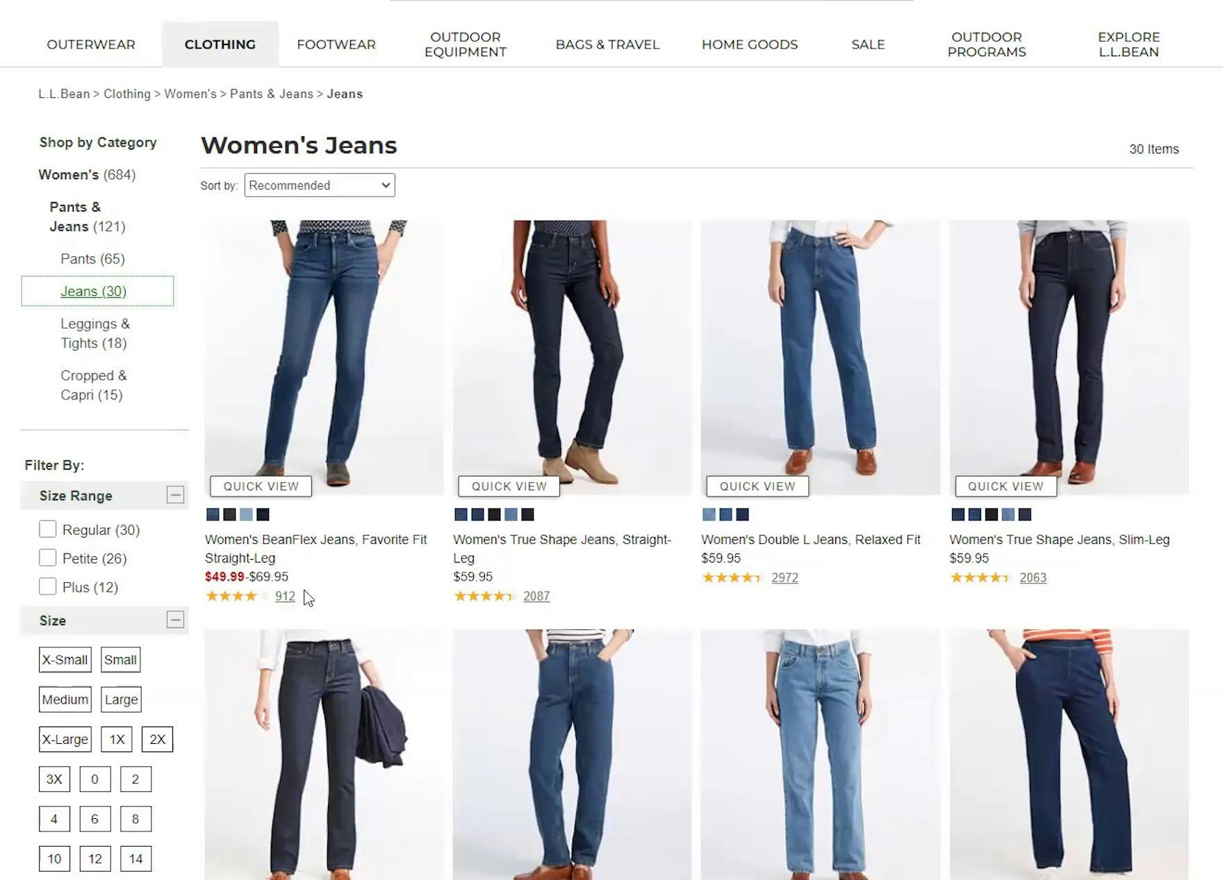
“And I do like that their reviews [ratings] are on this front page. I like that, because it makes it easier.” When both user rating averages and the number of ratings are shown in list items, as seen here at L.L. Bean, users don’t need to visit multiple product pages to see how each item rates.
By including all universal product attributes (price, thumbnail, product title or type, variations, and user ratings) along with any pertinent category-specific attributes in each list item, the user is provided with optimal conditions for evaluating each item in the product list and selecting which products to explore further (e.g., which product pages to open).
Universal attributes must be included because they are essential to any product, and users therefore can’t accurately determine the relevancy of an item without them.
Category-specific attributes are a smart way to provide 1–3 extra pieces of product information that are uniquely relevant to that product’s vertical and thus uniquely helpful to the user in determining whether the item is of relevance to them or not.
Achieving an optimal balance for the list item information results in a high signal-to-noise ratio in the product list, which is critical to the user’s ability to find the products they are looking for, as a good ratio enables users to easily ascertain which products to pursue and which are safe to ignore.
Yet — a whopping 50% of e-commerce sites fail on one or more of these parameters, forcing their users into an excessive back-and-forth pogo-sticking exercise — often creating so much friction in their users’ product-exploration process that it ends up being the direct cause for site abandonments.
This article presents the research findings from just a few of the 650+ UX guidelines in Baymard – get full access to learn how to create a “State of the Art” ecommerce user experience.
If you want to know how your website performs and compares, then learn more about getting Baymard to conduct a UX Audit of your site.

