Baymard’s UX Research Roadmap & Changelog
What’s new in Baymard Premium and what’s coming
Baymard currently has conducted 150,000+ hours of large-scale e-commerce UX research. Every year we add another 37,000+ hours of new UX research to Baymard Premium. All of these research findings are available only in the Premium research catalog.
This ‘Roadmap & Changelog’-page describes what’s new in Premium and what new research is coming.
Tip: If you want to get four emails per year summarizing what new research Baymard has just published — then sign up to our Quarterly Newsletter.
Upcoming Research (2025 Q1 & Q2)
Each year we conduct 37,000+ hours of new UX research for Baymard Premium.
Here’s the roadmap for Baymard’s upcoming UX research:
- New UX research study on ‘Product Page’.
- New UX research study on ‘Accounts & Self-Service’.
- New UX research study on ‘Health & Beauty’ sites.
- New UX research study on ‘Telco’ websites.
- New UX research study on ‘Insurance’ websites.
- New UX research study on ‘Loyalty’ programs.
- New UX industry benchmarks for: Flight Booking & Airlines, Online Learning, Merchandise & Print-to-Order, DTC/Small Catalog, Pet Food & Care, Footwear, Eyewear, Jewellery & Watches, Video Games, and Educational Reading & Books.
Major UX Research Studies Added
Below are some of the most prominent research releases and features we’ve added to Baymard Premium:
Feature Update: UX-Query - Get Instant Answers to Any UX Question
After a year of testing, our AI-powered UX search assistant, UX-Query, is officially now out of Beta!
Just type in your UX question and get insights in seconds (every answer is 100% verified and backed by our Baymard research). The feature is a great way to:
- Validate your design decisions
- Get research-backed answers instantly in meetings
- Save time on internal testing and desktop research
Sign up to Baymard and try UX-Query completely free
Baymard’s New Free Plan — Get Instant Access to Premium UX Research
We are excited to announce the launch of our brand-new Free Plan, giving you unprecedented access to Baymard’s industry-leading UX research platform, completely free.
Whether you’re looking to solve key usability challenges, streamline your design process, or see how your UX stacks up against top-performing brands, our Free Plan gives you instant access to a host of insights and features.
Here’s what’s included:
- 50 UX Best Practice Guidelines covering a range of fundamental design patterns and component types.
- AI-Powered UX Assistant — get instant answers to any UX question, every answer based on Baymard’s 150,000+ hours of research.
- Thousands of annotated UX Design Examples — explore real-world UX examples annotated with detailed UX insights by our research team.
Digital Subscriptions & SaaS UX Benchmark with 1,600+ Examples
We’ve released a new UX benchmark of 10 sites in our SaaS & Digital Subscriptions UX benchmark collection. The 10 digital subscriptions and SaaS sales sites are benchmarked across 230+ research-based UX parameters relevant to Digital Subscriptions Services and SaaS.
This provides you with:
-
1,600+ new worst and best practice UX implementation examples from digital subscriptions and SaaS desktop and mobile websites – these are already embedded in the 170+ Digital Subscriptions & SaaS relevant UX guidelines
-
2,300+ UX performance scores from the 10 sites – view them and the updated case-study dataset in the Digital Subscriptions & SaaS UX Benchmark
-
10 in-depth Digital Subscriptions & SaaS UX case studies from: Evernote, Xero, Microsoft Teams, Basecamp, Canva, Firebase, Avast, McAfee, Norton, and Adobe
We also offer an industry-specific Digital Subscriptions & SaaS UX Audit option.
Online Grocery UX Benchmark with 2,700+ Examples
We’ve released a new UX benchmark of 5 grocery sites and apps in our “Online Grocery” benchmark collection. The 5 sites and apps are benchmarked across 700+ research-based UX parameters relevant for grocery websites and apps.
This provides you with:
-
2,700+ new worst- and best-practice UX implementation examples from grocery desktop and mobile websites and apps – these are already embedded in the 390+ Online Grocery relevant UX guidelines.
-
3,500+ UX performance scores from the 5 sites and apps – view them and the updated case-study dataset in the Online Grocery UX Benchmark.
-
5 in-depth Online Grocery UX case studies from: Albertsons, Stop & Shop, Ocado, FreshDirect, and Sainsbury’s.
We also offer an industry-specific Online Grocery UX Audit option.
Furniture & Home Decor UX Benchmark with 1,400+ Examples
We’ve released a new UX benchmark of 5 ‘Furniture & Home Decor’ sites. The 5 sites are benchmarked across 500+ research-based UX parameters relevant to furniture and home decor websites.
This provides you with:
-
1,400+ new worst and best practice UX implementation examples from furniture and home decor desktop and mobile websites – these are already embedded in the 500+ Furniture & Home Decor relevant UX guidelines
-
2,800+ UX performance scores from the 5 sites – view them and the updated case-study dataset in the Furniture & Home Decor UX Benchmark
-
5 in-depth Furniture & Home Decor UX case studies from: Castlery, Jysk, Lumens, Modloft, and Perigold
We also offer an industry-specific Furniture & Home Decor UX audit option.
Apparel & Accessories UX Benchmark with 6,000+ Examples
We’re releasing a new UX benchmark of 14 sites in our Apparel & Accessories benchmark collection. The 14 sites are benchmarked across 500+ research-based UX parameters relevant to apparel and accessories websites.
This provides you with:
-
6,000+ new worst and best practice UX implementation examples from apparel desktop and mobile websites – these are already embedded in the 500+ Apparel & Accessories relevant UX guidelines
-
7,000+ UX performance scores from the 14 sites – view them and the updated case-study dataset in the Apparel & Accessories UX Benchmark
-
14 in-depth Apparel & Accessories UX case studies from: Debenhams, Everlane, Neiman Marcus, Foot Locker, Gilt, Nordstrom, JCPenney, Victoria’s Secret, L.L.Bean, Anine Bing, E. Breuninger, reserved, Ellos, and La Redoute
We also offer an industry-specific Apparel & Accessories UX Audit option.
Releases & Features 2024
New Baymard Figma Plugin
We’re excited to announce that we’ve just launched the new Baymard plugin for Figma! With our brand-new free plugin, you can instantly add UX Best Practice Cards to any Figma or FigJam project, helping you to inspire confidence in your designs with a click.
The cards cover a broad range of use cases and component types, making them highly versatile for various design projects.
Whether you are justifying the placement of a button or explaining the structure of a product page, Baymard’s evidence cards make it easier to communicate your design choices with stakeholders.
Head over to the Figma store to install
New Research Study on Furniture & Home Decor
We’ve released our new large-scale UX research study on Furniture and Home Decor sites.
Our research team has spent over 2,500 hours usability testing and researching Furniture & Home Decor sites, and this study is based on more than 275 participant/site test sessions.
The study included 16 U.S.-based retailer websites: Article, Ashley Furniture, Bed Bath & Beyond, Bob’s Discount Furniture, Burke Decor, CB2, IKEA, Joybird, Lamps Plus, Parachute, Pottery Barn, Raymour & Flanigan, Room & Board, Serena & Lily, The Company Store, and Wayfair.
Test sites were selected across multiple criteria. Study sites ranged from large furniture stores to small boutique decor shops, and included both omnichannel brands (e.g., Pottery Barn) and online-only retailers (e.g., Article). Sites carried a variety of product types ranging from furniture (e.g., CB2) to decor (e.g., Lamps Plus) to bedding (e.g., The Company Store).
The study encompassed multibrand (e.g., Wayfair) and single-brand sites (e.g., Joybird), nationwide (e.g., IKEA) and regional (e.g., Raymour & Flanigan) retailers, and represented a cross-section of price points from discount (e.g., Bob’s Discount Furniture) to high-end (e.g., Room & Board) brands.
During testing participants encountered 1,900+ medium-to-severe usability issues.
These issues have been distilled into 500+ UX guidelines relevant for furniture and home decor websites.
Explore our new Furniture & Home Decor UX research study available today.
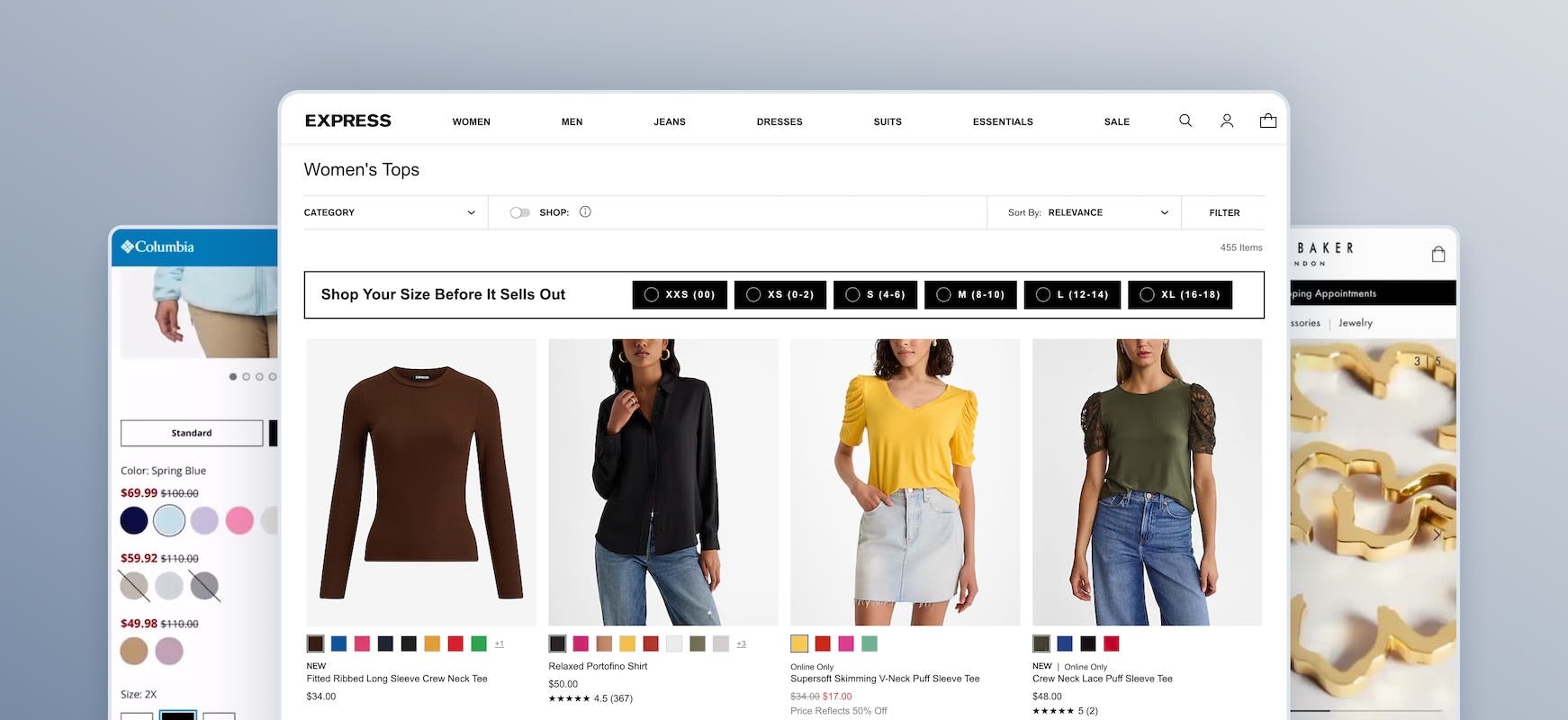
New Research Study on Apparel & Accessories
We’ve released our new large-scale UX research study on Apparel & Accessories sites.
Our research team has spent over 1,765 hours usability testing and researching Apparel & Accessories sites, and this study is based on more than 370 participant/site test sessions.
The study included 18 U.S.- and Europe-based retailer websites: Express, Francesca’s, Gerry Weber, Levi’s, Madewell, UNIQLO, adidas, Columbia Sportswear, Nicce, Nike, Puma, All Saints, Catbird, Ted Baker, Pandora, Cole Haan, DSW, and Hush Puppies.
Test sites were selected across multiple criteria. Study sites ranged from large apparel stores to small boutique shops, all of which were omnichannel brands. Sites carried a variety of product types ranging from apparel (e.g., Express) and sportswear (e.g., adidas) to jewelry (e.g., Pandora) and shoes (e.g., Hush Puppies).
The study encompassed mostly single-brand sites (e.g., Nicce) and represented a cross-section of price points from discount (e.g., DSW) to mid-range (e.g., Puma) brands.
During testing, participants encountered 1,720+ medium-to-severe usability issues.
These issues have been distilled into 500+ UX guidelines relevant for apparel and accessories websites.
> Explore our new Apparel & Accessories UX research study available today.
New ‘Product Finding’ Research Study
Our research team has just spent 5,550+ hours usability testing and researching Product Finding features, layouts, content, and designs — leading to our revised and expanded Search, Homepage and Category, and Product Lists and Filtering research studies.
This Product Finding study focused on a mix of mass merchant and smaller sites, for a total of 12 sites: Staples, HP, Office Depot, Best Buy, B&H Photo, Newegg, GAP, H&M, AEO, Nordstrom, L.L. Bean, and Urban Outfitters.
During Baymard’s testing the users encountered 1,000+ medium-to-severe Product Finding usability issues.
These issues have subsequently been analyzed and distilled into 160+ Product Finding UX guidelines.
> Explore our updated Search, Homepage and Category, and Product Lists and Filtering UX research studies
Furniture & Home Decor UX Benchmark with 5,400+ Examples
We’ve released a new UX benchmark of 10 ‘Furniture & Home Decor’ sites. The 10 sites are benchmarked across 540+ research-based UX parameters relevant to furniture and home decor websites.
This provides you with:
-
5,400+ new worst and best practice UX implementation examples from furniture and home decor desktop and mobile websites – these are already embedded in the 500+ Furniture & Home Decor relevant UX guidelines
-
5,000+ UX performance scores from the 10 sites – view them and the updated case-study dataset in the Furniture & Home Decor UX Benchmark
-
10 in-depth Furniture & Home Decor UX case studies from: West Elm, Home24, Crate & Barrel, Living Spaces, CB2, Williams Sonoma, Dunelm, IKEA, Wayfair, and McGee & Co.
We also offer an industry-specific Furniture & Home Decor UX audit option.
Apparel & Accessories UX Benchmark with 4,700+ Examples
We’re releasing a new UX benchmark of 10 sites in our Apparel & Accessories benchmark collection. The 10 apparel sites are benchmarked across 500+ research-based UX parameters relevant to apparel and accessories websites.
This provides you with:
-
4,700+ new worst and best practice UX implementation examples from apparel desktop and mobile websites – these are already embedded in the 500+ Apparel & Accessories relevant UX guidelines
-
5,500+ UX performance scores from the 10 sites – view them and the updated case-study dataset in the Apparel & Accessories UX Benchmark
-
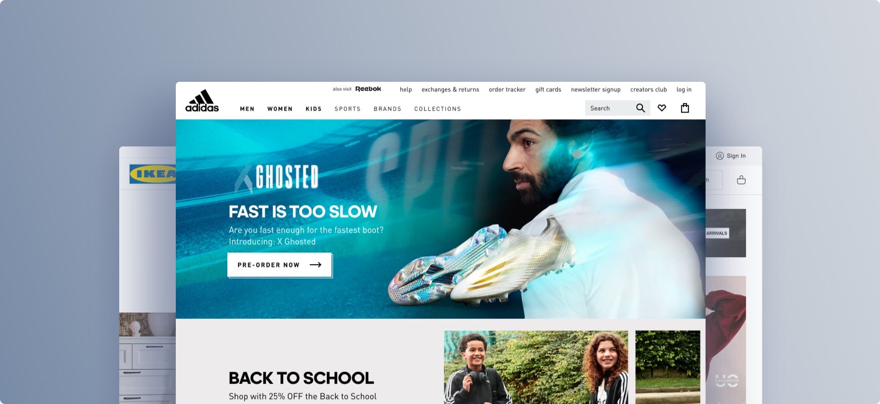
10 in-depth Apparel & Accessories UX case studies from: Macy’s, Nike, ASOS, Adidas, Zalando, H&M, American Eagle, Urban Outfitters, Marks & Spencer, and GAP
We also offer an industry-specific Apparel & Accessories UX Audit option.
Digital Subscriptions & SaaS UX Benchmark with 2,300+ Examples
We’re releasing a new UX benchmark of 10 sites in our SaaS & Digital Subscriptions benchmark collection. The 10 digital subscriptions and SaaS sales sites are benchmarked across 240+ research-based UX parameters relevant to digital subscriptions and SaaS websites.
This provides you with:
-
1,600+ new worst and best practice UX implementation examples from digital subscriptions and SaaS desktop and mobile websites – these are already embedded in the 170+ Digital Subscriptions & SaaS relevant UX guidelines
-
2,300+ UX performance scores from the 10 sites – view them and the updated case-study dataset in the Digital Subscriptions & SaaS UX Benchmark
-
10 in-depth Digital Subscriptions & SaaS UX case studies from: Slack, Zoom, Zendesk, Box, Shopify, Apple Music, Dropbox, HBO Max, Grammarly, and Netflix
We also offer an industry-specific Digital Subscriptions & SaaS UX Audit option.
B2B Electronic Components & Machinery UX Benchmark with 1,700+ Examples
We’re releasing a new UX benchmark of 5 sites in our B2B Electronic Components & Machinery benchmark collection. The 5 components & machinery sites are benchmarked across 430+ research-based UX parameters relevant to B2B electronic components & machinery websites.
This provides you with:
-
1,700+ new worst and best practice UX implementation examples from electronic components & machinery desktop and mobile websites – these are already embedded in the 280+ B2B Electronic Components & Machinery relevant UX guidelines
-
2,000+ UX performance scores from the 5 sites – view them and the updated case-study dataset in the B2B Electronic Components & Machinery UX Benchmark
-
5 in-depth Electronic Components & Machinery UX case studies from: DigiKey, Mouser, Arrow, Avnet, and TTI
We also offer an industry-specific B2B Components & Machinery UX Audit option.
Travel Accommodations UX Benchmark with 1,500+ Examples
We’re releasing a new UX benchmark of 5 sites in our Travel Accommodations benchmark collection. The 5 travel accommodations sites are manually benchmarked across 390+ research-based UX parameters relevant to accommodations websites.
This provides you with:
-
1,500+ new worst and best practice UX implementation examples from travel accommodations desktop and mobile websites – these are already embedded in the 310+ Travel Accommodations relevant UX guidelines
-
1,900+ UX performance scores from the 5 sites – view them and the updated case study dataset in the Travel Accommodations UX Benchmark
-
5 in-depth Travel Accommodations UX case studies from: Airbnb, Best Western, Booking.com, Hyatt, and Prince Akatoki London
We also offer an industry-specific Travel Accommodations UX Audit option.
Food Delivery & Takeout Mobile & App UX Benchmark with 2,000+ Examples
We’re releasing a new UX benchmark of 8 food delivery and takeout mobile apps and mobile websites. The 8 mobile apps and mobile websites are benchmarked across 400+ research-based UX parameters relevant for Food Delivery & Takeout.
This provides you with:
-
2,000+ new Food Delivery & Takeout worst and best practice UX implementation examples across mobile apps and mobile web. The examples are already embedded in the 320+ Food Delivery & Takeout relevant UX guidelines.
-
3,000+ UX performance scores from the 8 food delivery and takeout sites and apps – view them and the updated case study dataset in the Food Delivery & Takeout UX benchmark.
-
8 in-depth UX case studies from: DoorDash, KFC, Burger King, McDonalds, Domino’s, Uber Eats, Just Eat, and Deliveroo.
We also offer an industry-specific Food Delivery & Takeout UX audit option.
New Research Study on B2B Electronic Components & Machinery
Our research team has spent over 2,500 hours usability testing and researching Business-to-Business (B2B) Electronic Components & Machinery sites, and this study is based on more than 168 participant/site test sessions.
The research focused on U.S. and global manufacturer and distributor websites offering electronic components and machinery:
Manufacturer sites: Analog Devices, Microchip Technology, Microchip Direct, STMicroelectronics, STMicroelectronics eStore, TDK Corporation, and TE Connectivity
Distributor sites: Arrow Electronics, CoreStaff, Digi-Key Electronics, Farnell/Newark/element 14, Future Electronics, Mouser Electronics, RS Components, Ltd., and TTI, Inc.
Throughout the test sessions participants repeatedly ran into difficulties with the layout, content types, or features on the test sites.
Indeed, during testing, the participants encountered 1,100+ medium-to-severe usability issues, that we’ve distilled into 275+ UX guidelines relevant for B2B electronic components & machinery websites.
> Explore our new B2B Electronic Components & Machinery UX research available today
Another 5 New Mass Merchant UX Case Studies with 3,000+ Examples Added to Our Mass Merchant Benchmark
We’re releasing a new UX benchmark of another 5 sites in our Mass Merchant benchmark collection. The 5 Mass Merchant sites are manually benchmarked across 600+ research-based UX parameters relevant to Mass Merchant websites.
This provides you with:
-
3,000+ new worst and best practice UX implementation examples from Mass Merchant desktop and mobile websites – these are already embedded in the 500+ Mass Merchant relevant UX guidelines.
-
3,000+ UX performance scores from the 5 sites – view them and the updated case study dataset in the Mass Merchant UX Benchmark.
-
5 in-depth Mass Merchant UX case studies from: Sears, Etsy, Argos, Kohl’s, and Tesco.
We also offer an industry-specific Mass Merchant & Department Store UX Audit option.
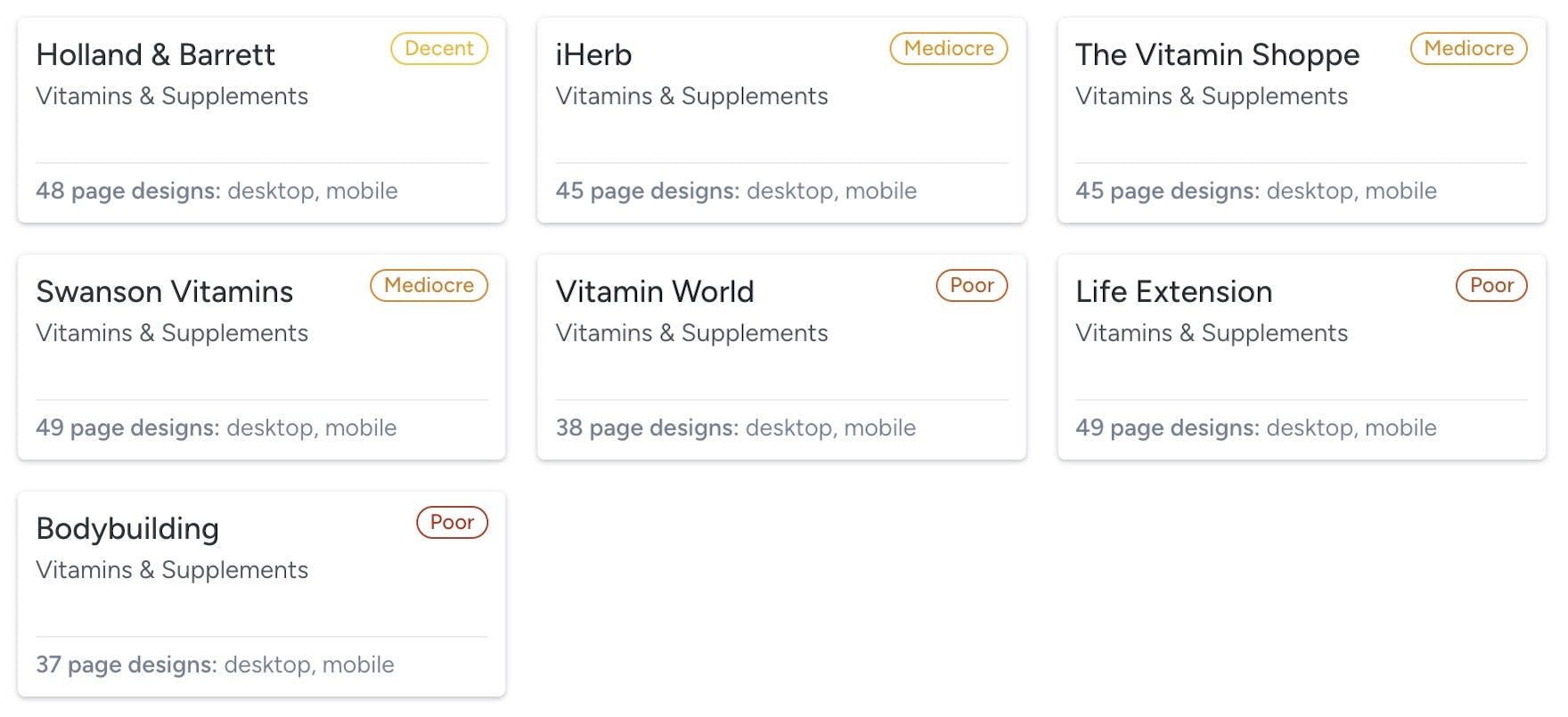
Vitamins & Supplements UX Benchmark with 2,500+ Examples
We’re releasing a new UX benchmark of 7 Vitamins & Supplements sites. The 7 sites are benchmarked across 500+ research-based UX parameters relevant for Vitamins & Supplements websites.
This provides you with:
-
2,500+ new worst and best practice UX implementation examples from Vitamins & Supplements desktop and mobile websites – these are already embedded in the 450+ Vitamins & Supplements relevant UX guidelines
-
3,500+ UX performance scores from the 7 sites – view them and the updated case-study dataset in the Vitamins & Supplements UX Benchmark
-
7 in-depth Vitamins & Supplements UX case studies from: Holland & Barrett, iHerb, The Vitamin Shoppe, Swanson Vitamins, Vitamin World, Life Extension, and Bodybuilding
We also offer an industry-specific Vitamins & Supplements UX audit option.
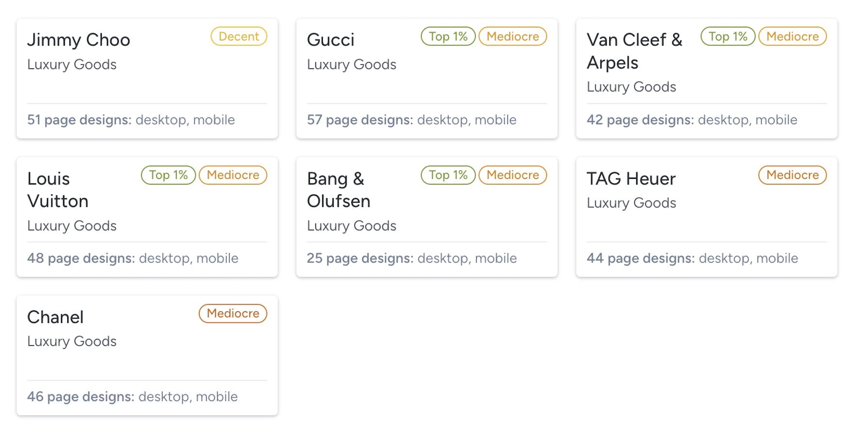
Luxury Goods UX Benchmark with 2,500+ Examples
We’re releasing a new UX benchmark of 7 Luxury Goods sites. The 7 sites are benchmarked across 500+ research-based UX parameters relevant for Luxury websites.
This provides you with:
-
2,500+ new worst and best practice UX implementation examples from Luxury Goods desktop and mobile websites – these are already embedded in the 400+ Luxury Goods relevant UX guidelines
-
3,500+ UX performance scores from the 7 sites – view them and the updated case-study dataset in the Luxury Goods UX Benchmark
-
7 in-depth Luxury Goods UX case studies from: Jimmy Choo, Gucci, Van Cleef & Arpels, Louis Vuitton, Bang & Olufsen, TAG Heuer, and Chanel
We also offer an industry-specific Luxury Goods UX audit option.
5 New Mass Merchant UX Case Studies with 3,000+ Examples Added to Our Mass Merchant Benchmark
We’re releasing a new UX benchmark of 5 sites in our Mass Merchant benchmark collection. The 5 Mass Merchant sites are manually benchmarked across 600+ research-based UX parameters relevant to Mass Merchant websites.
This provides you with:
-
3,000+ new worst and best practice UX implementation examples from Mass Merchant desktop and mobile websites – these are already embedded in the 500+ Mass Merchant relevant UX guidelines.
-
3,000+ UX performance scores from the 5 sites – view them and the updated case study dataset in the Mass Merchant UX Benchmark.
-
5 in-depth Mass Merchant UX case studies from: Walmart, Amazon, John Lewis, Target, and Costco.
We also offer an industry-specific Mass Merchant & Department Store UX Audit option.
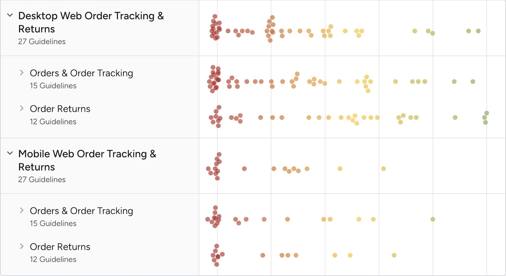
New 2024 Order Tracking & Returns UX Benchmark with 850+ Examples
We’re releasing a 2024 update of our Order Tracking & Returns UX benchmark, with 20 large desktop and mobile e-commerce sites manually rated across our 27 Order Tracking & Returns UX guidelines.
This provides you with:
-
850+ new worst and best practice Order Tracking & Returns UX implementation examples already embedded in the 27 UX guidelines
-
950+ new Order Tracking & Returns UX performance scores from the 20 sites – view them and the updated case-study dataset in the UX Benchmark tool
-
160+ new full-page design examples of order tracking and returns pages from leading e-commerce sites in the Page Design tool
New Guideline Tagging Feature
You can now tag and create notes on guideline pages within Baymard Premium’s research catalog. Tagging allows you and your team to more easily collaborate within Baymard Premium:
- Organize, find, and collaborate - Sort and categorize Baymard’s research for each of your projects, for instant retrieval and easy sharing.
- Attach notes - Contextualize your taggings and provide links to relevant sources (e.g. Figma or Jira).
- Team-wide sharing - Tags are visible to your entire team so you can collaborate and benefit from each other’s work.
Have a look at any guideline page, or head over to the tag management page to see and manage existing tags.
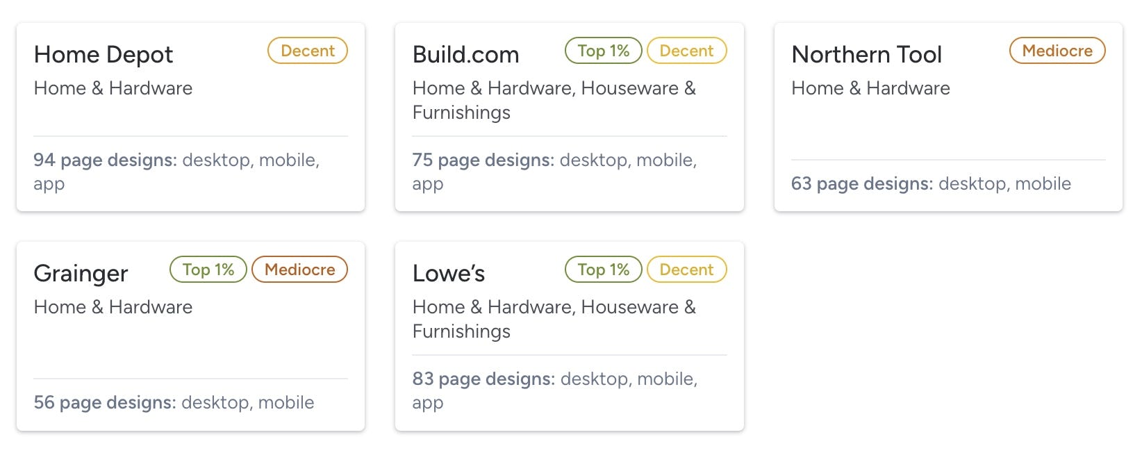
5 New Home & Hardware UX Case Studies with 2,000+ Examples Added to Our Home & Hardware Benchmark
We’re releasing a new UX benchmark of 5 sites in our Home & Hardware benchmark collection. The 5 Home & Hardware sites are manually benchmarked across 500+ research-based UX parameters relevant for Home Improvement & Hardware websites.
This provides you with:
-
2,000+ new worst and best practice UX implementation examples from Home & Hardware desktop and mobile websites – these are already embedded in the 500+ Home & Hardware relevant UX guidelines.
-
2,500+ UX performance scores from the 5 sites – view them and the updated case-study dataset in the Home & Hardware UX Benchmark.
-
5 in-depth Home & Hardware UX case studies from: Home Depot, Build.com, Northern Tool, Grainger, and Lowe’s.
We also offer an industry-specific Home & Hardware UX Audit option.
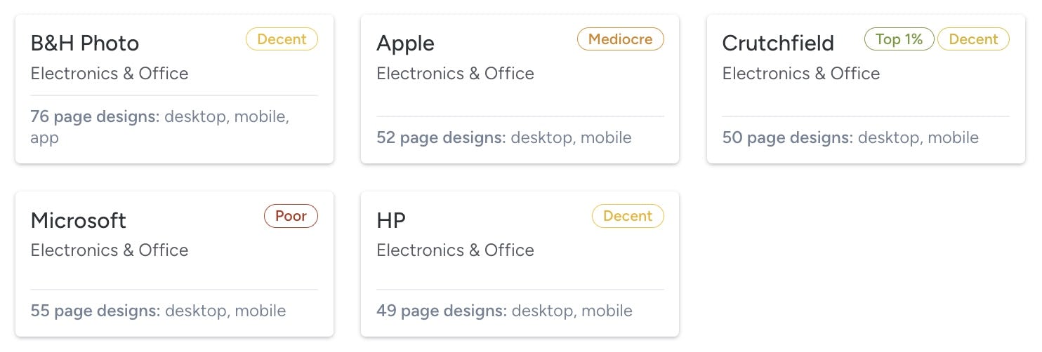
5 New Electronics UX Case Studies with 2,500+ Examples Added to Our Electronics & Office Benchmark
We’re releasing a new UX benchmark of 5 Electronics sites in our Electronics & Office benchmark collection. The 5 Electronics sites are manually benchmarked across 600+ research-based UX parameters relevant for Electronics and Office websites.
This provides you with:
-
2,500+ new worst and best practice UX implementation examples from Electronics desktop and mobile websites – these are already embedded in the 500+ Electronics & Office relevant UX guidelines.
-
3,000+ UX performance scores from the 5 sites – view them and the updated case-study dataset in the Electronics & Office UX Benchmark.
-
5 in-depth Electronics UX case studies from: B&H Photo, Crutchfield, Microsoft, HP, and Apple.
We also offer an industry-specific Electronics & Office UX Audit option.
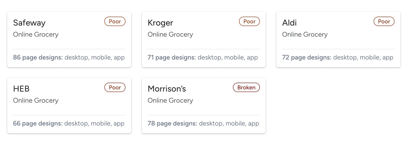
5 New Online Grocery UX Case Studies with 2,900+ Examples Added to Our Online Grocery Benchmark
We’re releasing a new UX benchmark of 5 Online Grocery sites and apps adding to our Online Grocery benchmark collection. The 5 Online Grocery sites and apps are benchmarked across 700+ research-based UX parameters relevant for grocery websites and apps.
This provides you with:
-
2,900+ new worst- and best-practice UX implementation examples from Online Grocery desktop and mobile websites and apps – these are already embedded in the 400+ Online Grocery relevant UX guidelines.
-
3,500+ UX performance scores from the 5 sites and apps – view them and the updated case-study dataset in the Online Grocery UX Benchmark.
-
5 in-depth Online Grocery UX case studies from: Safeway, Kroger, Aldi, HEB and Morrison’s.
We also offer an industry-specific Online Grocery UX audit option.
Releases & Features 2023-2019
Top 1% E-Commerce UX Awards - 2023 Winners
As 2023 comes to a close, at Baymard we’re awarding the companies with the top 1% UX performance across 18 industries, as well as the top 1% for theme and platform (e.g. top 1% checkout UX performance, top 1% mobile e-commerce UX performance, etc.).
The winners are selected from among the 234 top-grossing US and European e-commerce sites in our UX database. The award is based on more than 215,000 weighted UX performance scores in the database. Each of the 234 websites has been manually benchmarked using 500-680 weighted UX guidelines — a process that has required more than 10,000 hours of UX auditing work.
You can explore the case studies for each of the winning sites in the UX benchmark.
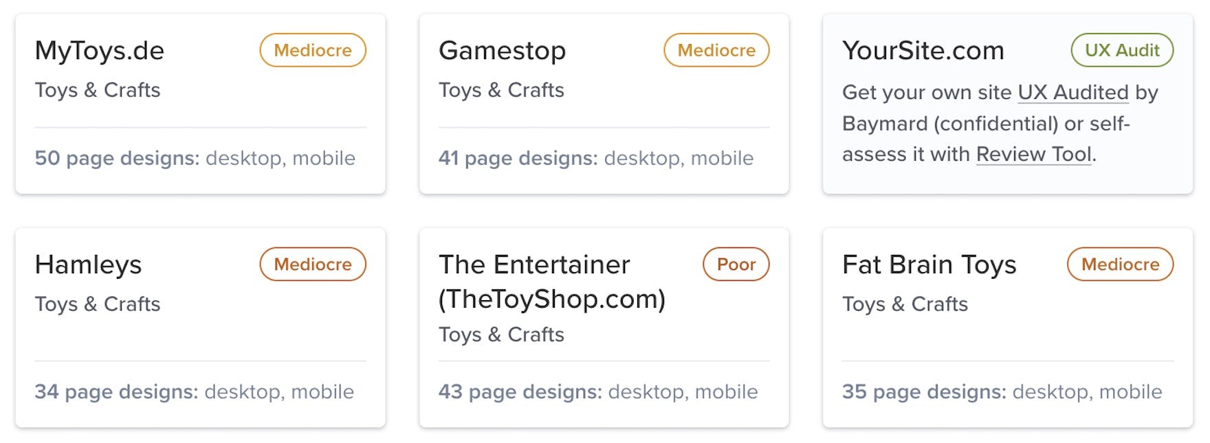
5 New Toys UX Case Studies with 2,200+ Examples Added to Our Toys & Crafts Benchmark
We’re releasing a new UX benchmark of 5 Toys sites adding to our Toys & Crafts benchmark collection. The 5 Toys sites are benchmarked across our 500+ UX guidelines most relevant for Toys & Crafts websites.
This provides you with:
-
2,200+ new worst- and best-practice UX implementation examples from Toys desktop and mobile websites – these are already embedded in the 500+ Toys & Crafts relevant UX guidelines.
-
2,600+ UX performance scores from the 5 sites – view them and the updated case-study dataset in the Toys & Crafts UX Benchmark.
-
5 in-depth Toys UX case studies from: MyToys.de, Fat Brain Toys, Hamleys, The Entertainer (TheToyShop.com), and Gamestop.
We’ve now also opened our industry-specific Toys & Crafts UX audit option.
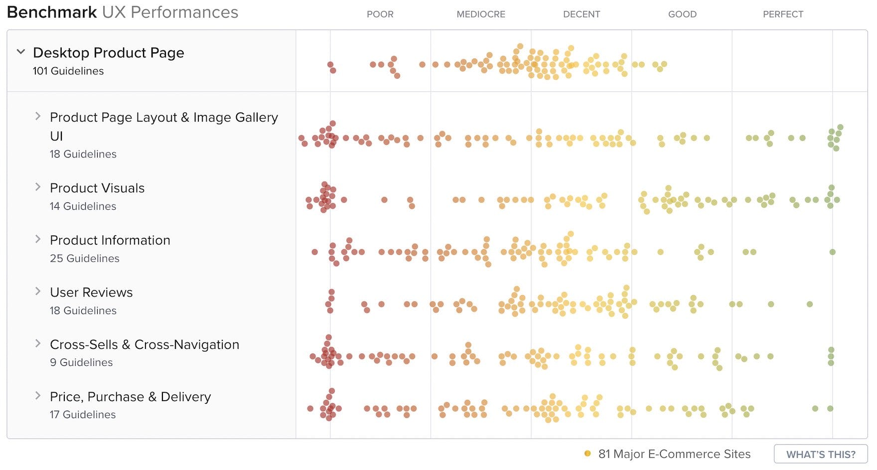
New 2023 Product Page UX Benchmark with 2,000+ Examples
We’re releasing a 2023 update for our Product Page UX benchmark, with 30 large e-commerce sites rated across 101 of our Product Page UX guidelines.
This provides you with:
-
2,000+ new worst and best practice Product Page UX implementation examples already embedded in the 101 UX guidelines.
-
3,000+ new Product Page UX performance scores from the 30 sites – view them and the updated case-study dataset in the UX Benchmark tool.
-
140+ new page design examples of product pages, image gallery overlays, video and 3060-views, user review sections, and spec sheets from leading e-commerce sites in the Page Design tool.
New 2023 Quantitative Research on 14 Different Topics
New quantitative 2023 research, providing you with the newest stats on user preferences and behavior across 14 topics, like:
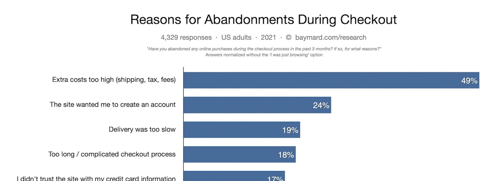
- why users abandon during the checkout flow,
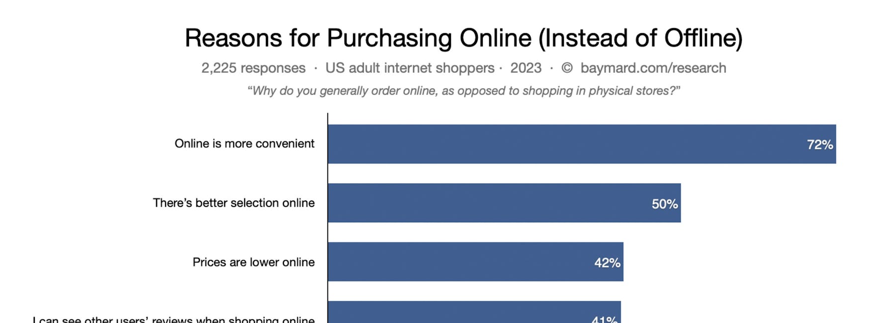
- why users shop online instead of in physical stores (see Product Page intro),
- what information types which will make users abandon the checkout (#731),
- how much more users rely on customer review averages if they have a higher number of votes (#517),
- how users actually “save” products they aren’t yet ready to purchase (#798),
- frequency of order returns (here),
- why users unsubscribe from newsletters (here), and
- how often users get new credit cards (#919), and more.
Travel Tours & Experience Booking UX Benchmark with 1,500+ Examples
We’re releasing a new UX benchmark of 7 Travel Tours & Experience Booking sites. The 7 sites are benchmarked across 340+ research-based UX parameters relevant for Travel Tours & Experience Booking websites.
This provides you with:
-
1,500+ new worst and best practice UX implementation examples from Travel Tours & Experience Booking desktop and mobile websites – these are already embedded in the 280+ Travel Tours & Experience Booking relevant UX guidelines
-
2,500+ UX performance scores from the 7 sites – view them and the updated case-study dataset in the Travel Tours & Experience Booking UX Benchmark
-
7 in-depth Travel Tours & Experience Booking UX case studies from: Much Better Adventures, Sea Saffron, Take Walks, Ziptrek Ecotours, Extranomical Tours, Sea Paradise, and Wild Rover Tours
We’ve now also opened our industry-specific Travel Tours & Experience Booking audit option.
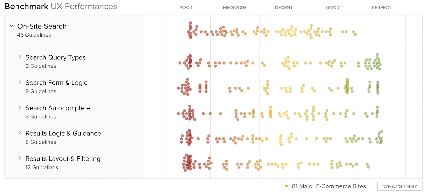
New 2023 On-Site Search UX Benchmark with 1,400+ Examples
We’re releasing a 2023 update for our On-Site Search UX benchmark, with 30 large e-commerce sites rated across 46 of our On-Site Search UX guidelines.
This provides you with:
-
1,400+ new worst- and best-practice Search UX implementation examples already embedded in the 46 UX guidelines.
-
1,000+ new Search UX performance scores from the 30 sites – view them and the updated case-study dataset in the UX Benchmark tool.
-
100+ new design examples of search fields, autocompletes, search results pages, and no results pages from leading e-commerce sites in the Page Design tool.
3 New Health & Beauty UX Case Studies with 1,200+ Examples Added to Our Health & Beauty Benchmark
We’re releasing a new UX benchmark of 3 Health & Beauty sites adding to our Health & Beauty benchmark collection. The 3 Health & Beauty sites are benchmarked across 500+ research-based UX parameters relevant for Health & Beauty websites.
This provides you with:
-
1,200+ new worst- and best-practice UX implementation examples from Health & Beauty desktop and mobile websites – these are already embedded in the 500+ Health & Beauty relevant UX guidelines.
-
1,500+ UX performance scores from the 3 sites – view them and the updated case-study dataset in the Health & Beauty UX Benchmark.
-
3 in-depth Health & Beauty UX case studies from: Lyko, Kicks, and Blivakker.
We’ve now also opened our industry-specific Health & Beauty UX audit option.
5 New Sports UX Case Studies with 2,200+ Examples Added to Our Sports Gear & Equipment Benchmark
We’re releasing a new UX benchmark of 5 Sports sites adding to our Sports Gear & Equipment benchmark collection. The 5 Sports sites are benchmarked across our 500+ UX guidelines most relevant for Sports Gear & Equipment websites.
This provides you with:
-
2,200+ new worst- and best-practice UX implementation examples from Sports desktop and mobile websites – these are already embedded in the 500+ Sports Gear & Equipment relevant UX guidelines.
-
2,600+ UX performance scores from the 5 sites – view them and the updated case-study dataset in the Sports Gear & Equipment UX Benchmark.
-
5 in-depth Sports UX case studies from: Hibbett, Backcountry, SportChek, Academy, and Evo.
We’ve now also opened our industry-specific Sports Gear & Equipment UX audit option.
Insurance UX Benchmark with 1,700+ Examples
We’re releasing a new UX benchmark of 7 Insurance sites. The 7 sites are benchmarked across 320+ research-based UX parameters most relevant for Insurance websites.
This provides you with:
-
1,200+ new worst and best practice UX implementation examples from Insurance desktop and mobile websites – these are already embedded in the 200+ Insurance relevant UX guidelines
-
1,700+ UX performance scores from the 7 sites – view them and the updated case-study dataset in the Insurance UX Benchmark
-
7 in-depth Insurance UX case studies from: AXA UK, Generali, State Farm, Liberty Mutual, Travelers, Allstate, and Progressive
We’ve now also opened our industry-specific Insurance UX audit option.
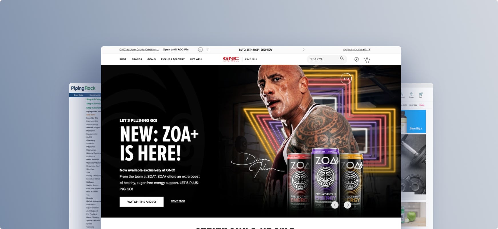
New Research Study on Vitamins & Supplements
Our research team has spent over 1,800+ hours usability testing and researching Vitamins and Supplements sites, and this study is based on more than 230 qualitative participant/site test sessions.
The research study focused on a total of 13 sites that distribute vitamin and supplement products to the US — with almost all test sites operating worldwide:
-
11 multibrand vitamins and supplements sites: eVitamins, GNC, iHerb, Lucky Vitamin, PipingRock, Pure Formulas, Puritan’s Pride, Swanson Vitamins, Vitacost, Vitamin Shoppe, and Vitamin World.
-
2 single-brand, or white-label, sites: Nature Made and Nature’s Sunshine.
During testing, the users encountered 1,000+ medium-to-severe usability issues. These issues have subsequently been analyzed and distilled into the 490+ UX guidelines found within our new Vitamins & Supplements research study.
> Explore our new Vitamins & Supplements UX research available today
New 2023 Mobile Apps UX Benchmark with 2,200+ Examples
We’re releasing a new UX benchmark of 9 native mobile e-commerce apps. The 9 apps are benchmarked across our 360+ UX guidelines most relevant for mobile apps.
This provides you with:
-
2,200+ new worst- and best-practice mobile apps UX implementation examples – these are already embedded in the 360+ UX guidelines relevant for mobile apps.
-
2,200+ UX performance scores from the 9 apps – view them and the updated case-study dataset in the Mobile Apps UX Benchmark.
-
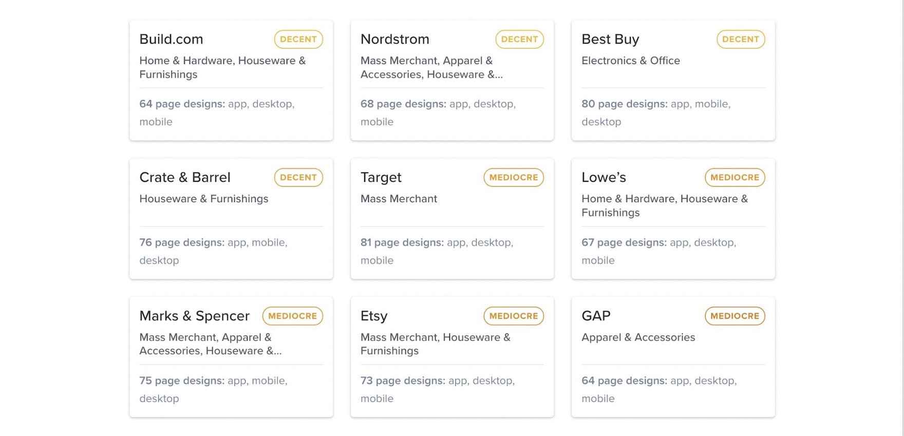
9 in-depth mobile app UX case studies from: GAP, Etsy, Nordstrom, Target, Crate & Barrel, Best Buy, Lowe’s, Build.com, and Marks & Spencer.
Automotive Parts & Specialty UX Benchmark with 4,000+ Examples
We’re releasing a new UX benchmark of 10 Automotive Parts & Specialty sites. The 10 sites are benchmarked across 500+ research-based UX parameters most relevant for Automotive Parts & Specialty websites.
This provides you with:
-
4,000+ new worst and best practice UX implementation examples from Automotive Parts & Specialty desktop and mobile websites – these are already embedded in the 250+ Automotive Parts & Specialty relevant UX guidelines
-
5,000+ UX performance scores from the 10 sites – view them and the updated case-study dataset in the Automotive Parts & Specialty UX Benchmark
-
10 in-depth Automotive Parts & Specialty UX case studies from: CarParts.com, RevZilla, Advance Auto Parts, TireRack.com, ECS Tuning, Inter Cars, Demon Tweeks, AutoDoc, J&P Cycles, and Pep Boys
We’ve now also opened our industry-specific Automotive Parts & Specialty UX audit option.
Internet Service Providers UX Benchmark with 1,600+ Examples
We’re releasing a new UX benchmark of 7 Internet Service Providers (ISP) sites. The 7 ISP sites are benchmarked across 350+ research-based UX parameters most relevant for ISP websites.
This provides you with:
-
1,600+ new worst and best practice UX implementation examples from ISP desktop and mobile websites – these are already embedded in the 200+ ISP relevant UX guidelines
-
2,200+ UX performance scores from the 7 sites – view them and the updated case-study dataset in the ISP UX Benchmark
-
7 in-depth ISP UX case studies from: AT&T, COX, Spectrum, CenturyLink, Telekom.de, Viasat, and BT
We’ve now also opened our industry-specific ISP UX audit option.
New 2023 Home & Hardware UX Benchmark with 2,300+ Examples
We’re releasing a new UX benchmark of 5 Home & Hardware sites. The 5 Home & Hardware sites are benchmarked across our 500+ UX guidelines most relevant for Home & Hardware websites.
This provides you with:
-
2,300+ new worst- and best-practice UX implementation examples from Home & Hardware desktop and mobile websites – these are already embedded in the 500+ Home & Hardware relevant UX guidelines.
-
2,700+ UX performance scores from the 5 sites – view them and the updated case-study dataset in the Home & Hardware UX Benchmark.
-
5 in-depth Home & Hardware UX case studies from: Menards, OBI, ACE Hardware, Leroy Merlin, and B&Q.
We’ve now also opened our industry-specific Home & Hardware UX audit option.
New 2023 Homepage & Category UX Benchmark with 2,500+ Examples
We’re releasing a 2023 update for our Homepage & Category UX benchmark, with 68 large e-commerce sites rated across our 40+ Homepage & Category UX guidelines.
This provides you with:
-
2,500+ new worst- and best-practice Homepage & Category UX implementation examples already embedded in the 40+ UX guidelines.
-
3,000+ new Homepage & Category UX performance scores from the 68 sites – view them and the updated case-study dataset in the UX Benchmark tool.
-
180+ new full-page design examples of homepages, main menus, and category pages from leading e-commerce sites in the Page Design tool.
New 2023 Mobile Customer Accounts UX Benchmark with 1,100+ Examples
We’re releasing a new Mobile Customer Accounts UX benchmark, with 68 large e-commerce sites rated across our 29 Mobile Customer Accounts UX guidelines.
This provides you with:
-
1,100+ new worst- and best-practice Mobile Customer Accounts UX implementation examples already embedded in the 29 UX guidelines.
-
1,600+ new Mobile Customer Accounts UX performance scores from the 68 sites – view them and the updated case-study dataset in the UX Benchmark tool.
-
180+ new full-page design examples of account dashboards and account management pages from leading e-commerce mobile sites in the Page Design tool.
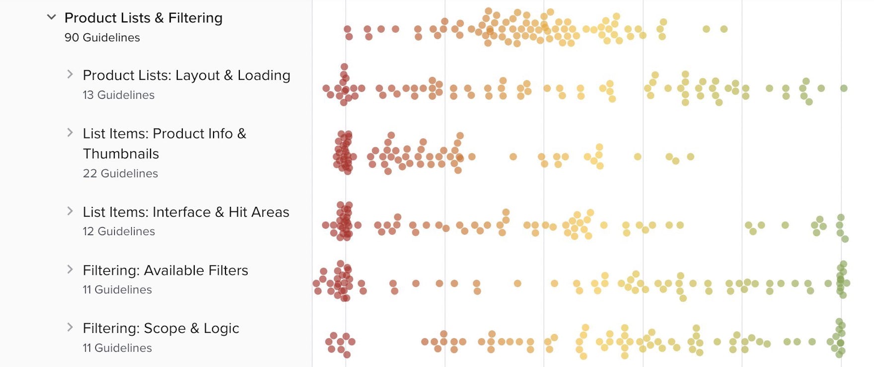
New 2023 Product Lists & Filtering UX Benchmark with 4,400+ Examples
We’re releasing a 2023 update for our Product Lists & Filtering UX benchmark, with 68 large e-commerce sites rated across 90 of our Product Listings UX guidelines.
This provides you with:
-
4,400+ new worst- and best-practice product lists and filtering UX implementation examples already embedded in the 90 UX guidelines.
-
6000+ new Product Lists & Filtering UX performance scores from the 68 sites – view them and the updated case-study dataset in the UX Benchmark tool.
-
140+ new full-page design examples of product lists from leading e-commerce sites in the Page Design tool.
New Research Study on Travel Tours & Experience Booking
Our research team has spent over 1700 hours usability testing and researching travel tours and experience booking sites, and this study is based on more than 300 participant/site test sessions.
The research study focused on small- and medium-sized sites offering a variety of tours and experiences including:
- Helicopter tours of New York City: HeliNY Sightseeing, New York Helicopter Tours, Zip Aviation
- River tours and lake cruises in Chicago: Shoreline Sightseeing, Tall Ship Windy, Wendella
- Guided tours and activities in Hawaii: Blue Hawaiian Activities, Roberts Hawaii, Volcano Tours
- Group walking tours in London: Fun London Tours, Golden Tours, London Top Sights
- Guided tours and adventures in Iceland: Arctic Adventures, Gray Line Iceland, Reykjavik Excursions
Throughout the test sessions participants repeatedly ran into difficulties with the layout, content types, or features on the test sites.
Indeed, during testing the participants encountered 1,200+ medium-to-severe usability issues.
> Explore our new Travel Tours & Experience Booking UX research available today
We’ve now also opened our industry-specific Travel Tours & Experience Booking UX audit option.
B2B Medical & Pharma UX Benchmark with 3,500+ Examples
We’re releasing a new UX benchmark of 10 B2B Medical & Pharma sites. The 10 Medical & Pharma sites are benchmarked across our 500 UX guidelines most relevant for B2B Medical & Pharma websites.
This provides you with:
-
3,500+ new worst- and best-practice UX implementation examples from Medical & Pharma desktop and mobile websites – these are already embedded in the 500 Medical & Pharma relevant UX guidelines.
-
4,500+ UX performance scores from the 10 sites – view them and the updated case-study dataset in the B2B Medical & Pharma sites UX Benchmark.
-
10 in-depth Medical & Pharma UX case studies from: Allegro Medical, Waters, Mckesson, Cole-Parmer, AbCam, Medline, Bound Tree Medical, Henry Schein, Thermo Fisher, and Sigma Aldrich.
We’ve now also opened our industry-specific B2B Medical & Pharma UX audit option.
New 2022 Mobile Apps UX Benchmark with 2,800+ Examples
We’re releasing a new UX benchmark of 11 native mobile e-commerce apps. The 11 apps are benchmarked across our 340+ UX guidelines most relevant for mobile apps.
This provides you with:
-
2,800+ new worst- and best-practice mobile apps UX implementation examples – these are already embedded in the 340+ UX guidelines relevant for mobile apps.
-
3,700+ UX performance scores from the 11 apps – view them and the updated case-study dataset in the Mobile Apps UX Benchmark.
-
11 in-depth mobile app UX case studies from: Macy’s, Nike, Ikea, H&M, Walmart, Staples, ASOS, Amazon, Home Depot, Sephora, and Wayfair.
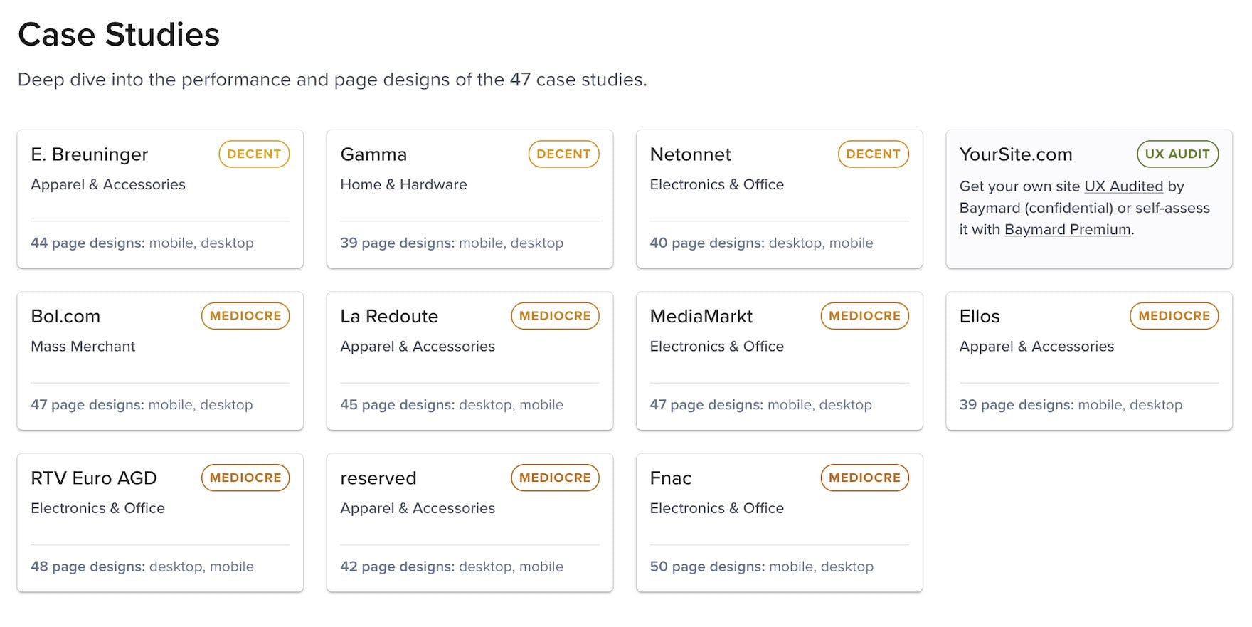
10 New 2022 UX Case Studies Added To Our European Benchmark (From Germany, Netherlands, Poland, France, and Sweden)
We’re expanding our European UX benchmark database significantly with in-depth UX case studies of 10 new European sites that we’ve manually benchmarked across 475+ guidelines. This provides you with 4,100+ new best practice examples and 4,950 performance scores from these sites and markets:
-
2 new German case studies from: Breuninger and MediaMarkt.
- 2 new Dutch case studies from: Bol.com and Gamma.
-
2 new Polish case studies from: RTV Euro AGD and Reserved.
- 2 new French case studies from: Fnac and La Redoute.
This also expands the number of European sites in our benchmark to 47.
B2B Electronic Components & Machinery UX Benchmark with 3,600+ Examples
We’re releasing a new UX benchmark of 10 B2B Electronic Components & Machinery sites. The 10 Components & Machinery sites are benchmarked across our 400+ UX guidelines most relevant for B2B Electronic Components & Machinery websites.
This provides you with:
-
3,600+ new worst- and best-practice UX implementation examples from Components & Machinery desktop and mobile websites – these are already embedded in the 400+ Electronic Components & Machinery relevant UX guidelines.
-
4,800+ UX performance scores from the 10 sites – view them and the updated case-study dataset in the B2B Electronic Components & Machinery UX Benchmark.
-
10 in-depth Electronic Components & Machinery UX case studies from: DigiKey, MSC Direct, Norgren, Mouser, Avnet, Schneider Electric, TTI, Bossard, Fastenal, and Maxon.
We’ve now also opened our industry-specific B2B Components & Machinery UX audit option.
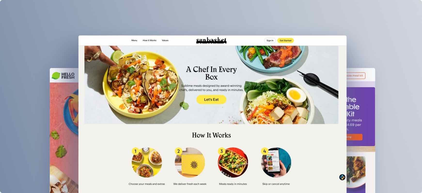
Meal Kit UX Benchmark with 2,200+ new Examples
We’re releasing a new UX benchmark of 8 Meal Kit Subscription sites. The 8 Meal Kit sites are benchmarked across our 400+ UX guidelines most relevant for Meal Kit websites.
This provides you with:
-
2,200+ new worst- and best-practice UX implementation examples from Meal Kit desktop and mobile websites – these are already embedded in the 400+ Meal Kit relevant UX guidelines.
-
3,300+ UX performance scores from the 8 sites – view them and the updated case-study dataset in the Meal Kit UX Benchmark.
-
8 in-depth Meal Kit UX case studies from: Gousto, HelloFresh, Blue Apron, Green Chef, Purple Carrot, Marley Spoon, Sunbasket, and Abel&Cole.
We’ve now also opened our industry-specific Meal Kit UX audit option.
Travel (OTA, Hotel, & Vacation Rentals) UX Benchmark with 3,000 Examples
We’re releasing a new UX benchmark of 10 Online Travel Agency, Hotel, and Vacation Property Rental sites. The 10 travel accommodations sites are benchmarked across our 400+ UX guidelines most relevant for travel accommodations websites.
This provides you with:
-
3,000+ new Accommodations worst- and best-practice UX implementation examples from OTA, hotel, and property rental desktop and mobile websites – these are already embedded in the 400+ travel accommodations relevant UX guidelines.
-
4,500+ UX performance scores from the 10 accommodations sites – view them and the updated case-study dataset in the accommodations UX Benchmark.
-
10 in-depth UX case studies from: OTA websites: Booking.com, Expedia, Trip.com. Chain Hotel websites: Hyatt, Best Western, Shangri-La Hotels. Vacation Home Rental: Airbnb, Kid & Coe. Boutique Hotels: Prince Akatoki London, and EsmeHotel.com.
We’ve now also opened our industry-specific Travel Accommodations UX audit option.
Online Food Delivery Mobile & App UX Benchmark with 2,000 Examples
We’re releasing a new UX benchmark of 8 Online Food Delivery mobile apps and mobile websites. The 8 online food delivery mobile apps and mobile websites are benchmarked across our 400+ UX guidelines most relevant for online food delivery.
This provides you with:
-
2,000+ new Online Food Delivery worst- and best-practice UX implementation examples across mobile apps and mobile web. The examples are already embedded in the 400+ food delivery relevant UX guidelines.
-
3,000+ UX performance scores from the 8 online food delivery sites – view them and the updated case-study dataset in the Food Delivery UX benchmark.
-
8 in-depth UX case studies from: DoorDash, KFC, Burger King, McDonalds, Domino’s, Uber Eats, Just Eat, & Deliveroo.
We’ve now also opened our industry-specific Food Delivery UX audit option.
New 2022 ‘Mobile E-Commerce’ Benchmark with 12,000+ Mobile Examples
We’re releasing a 2022 update for our ‘Mobile E-Commerce’ UX benchmark, with 50 large e-commerce sites rated across 340+ mobile UX guidelines.
This provides you with:
- 12,000+ new worst- and best-practice mobile UX examples – embedded into the 340+ UX guidelines
- 15,000+ new Mobile UX performance scores – view them and the updated case-study dataset in the Benchmark tool.
- You can see the 800+ new full-page mobile design examples from leading e-commerce sites in the Page Design tool.
New 2022 Quantitative Research on 14 Different Topics
New quantitative 2022 research, providing you with the newest stats on user preferences and behavior across 14 topics, like:
- why users abandon during the checkout flow,
- why users shop online instead of in physical stores (see Product Page intro),
- mobile app install rates, utilization rates, and top 5 installed apps (see #930),
- what information types which will make users abandon the checkout (#731),
- which SSL and trust badges that give users the best sense of trust in a checkout flow (#587),
- how much more users rely on customer review averages if they have a higher number of votes (#517),
- how users actually “save” products they aren’t yet ready to purchase (#798),
- frequency of order returns (here),
- why users unsubscribe from newsletters (here), and
- how often users get new credit cards (#919), and more.
New 2022 Niche Direct-To-Consumer Benchmark with 3,500+ DTC Examples
We’re releasing a new UX benchmark of 10 smaller/niche Direct-To-Consumer brands. This is in addition to the already 26, mostly larger brand, DTC e-commerce websites in our DTC benchmark.
This provides you with:
- 3,500+ new DTC worst- and best-practice UX implementation examples from smaller and niche DTC e-commerce websites – these are already embedded in the 400+ DTC relevant UX guidelines.
- 4,800+ UX performance scores from the 10 DTC sites – view them and the updated case-study dataset in the Benchmark tool.
- 10 in-depth UX case studies from niche DTC sites: AwayTravel, AnineBing, BackdropHome, Everlane, FitBit, OurPlace, GoPro, Harrys, SmileTwice, and SnoweHome.
New 2022 ‘B2C and B2B SaaS’ Benchmark with 3,300+ Software Examples
We’re releasing a new UX benchmark specific to Digital Software Subscriptions and SaaS, benchmarking 20 SaaS websites (both B2C and B2B software) across our 250+ UX guidelines most relevant for SaaS sales websites.
This provides you with:
- 3,300+ new SaaS worst- and best-practice UX implementation examples from leading SaaS sites – already embedded in the 250+ SaaS relevant UX guidelines.
- 5,000+ UX performance scores from the 20 SaaS sites – view them and the updated case-study dataset in the Benchmark tool.
- in-depth UX case studies from 10 B2B SaaS sites: Zoom, Slack, Basecamp, Google Firebase, Xero, ZenDesk, Box, Shopify, Adobe, Microsoft Teams and 10 B2C SaaS sites: Netflix, HBO Max, Apple Music, Dropbox, Norton, McAfee, Avast, Grammarly, Evernote, and Code Academy.
New 2022 ‘Customer Accounts’ Benchmark with 2,000+ Examples
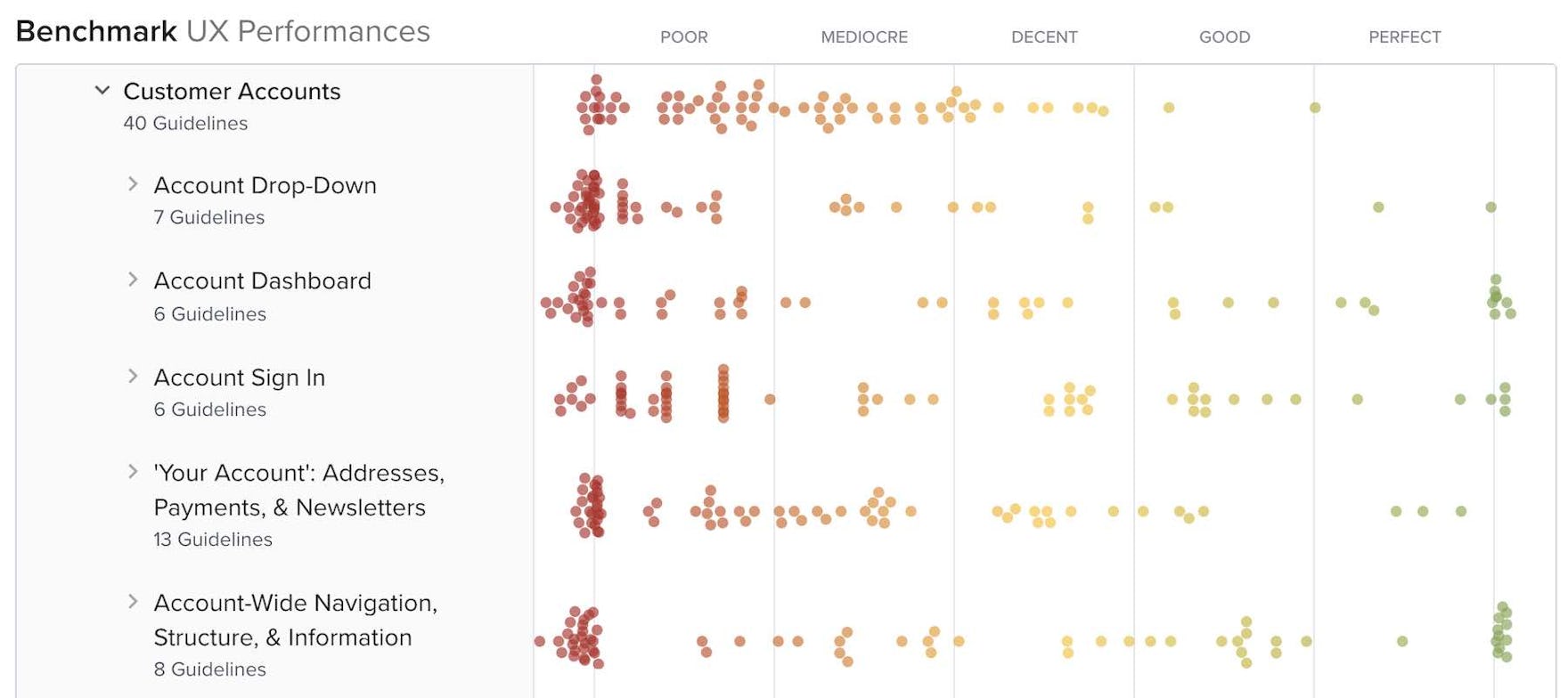
We’re releasing a new UX benchmark of 55 large e-commerce sites rated across 40 different UX guidelines relating to the Customer Accounts section, e.g. “my account” drop-down, account dashboard, order history, address book, stored cards, etc).
This provides you with:
- 2,000+ new worst- and best-practice Customer Accounts UX examples – embedded into the 40 UX guidelines
- 2,000+ new Customer Accounts UX performance scores – view them and the updated case-study dataset in the Benchmark tool.
- You can see the 280+ new full-page design examples of all the account pages & features from leading e-commerce sites in the Page Design tool.
New Research Study on ‘Travel Accommodation’ Sites
Our research team has spent over 900 hours usability testing and researching travel accommodations websites, and this study is based on more than 317 participant/site test sessions.
The research focused on Online Travel Agency (OTA) sites, large-brand hotel chains, boutique hotels, and whole property rental sites:
- Online Travel Agency (OTA) and large hotel sites: Booking.com, Expedia, IHG, Hilton, and Marriott.
- Small boutique hotel sites: The Artezen Hotel, NobleDEN Hotel, The Nolitan Hotel, Sixty LES Hotel, and The Sohotel.
- Whole property rental sites: Airbnb, Plum Guide, Sonder, TurnKey, and Vrbo.
Throughout the test sessions, users repeatedly ran into difficulties with the design or features on the travel sites as they were trying to find and book accommodation for their upcoming trip.
Indeed, during testing, the participants encountered 1,000+ medium-to-severe usability issues, that we’ve distilled into 364 UX guidelines relevant for accommodation websites.
> Explore our new Travel Accommodations UX research available today
‘New Research Study on ‘Takeout & Food Delivery’ Sites
Our research spent 500+ hours usability testing and researching mobile apps and mobile websites for takeout & food delivery.
This research is based on more than 90 test participant/site test sessions. Throughout the test sessions, users repeatedly abandoned food delivery sites due to issues with menu item information and images, customization options, pickup features, etc.
The tested food delivery mobile websites and mobile apps included:
- Individual restaurant chain apps: Starbucks, Chipotle, Domino’s, and Panera Bread.
- Aggregate 3rd-party restaurant delivery apps: Doordash and Uber Eats.
During testing of these, the participants encountered 600+ medium-to-severe usability issues while trying to find and place their takeout order. These usability issues have subsequently been analyzed and distilled into the 372 UX guidelines found within our food delivery UX research study.
> Explore our new Takeout & Food Delivery UX research available today
New Research Study on ‘Meal Kit’ Sites
Our research team has spent 950+ hours usability testing and researching Meal Kit Subscription websites (the public sale’s website).
Our Meal Kit UX research study is based on more than 128 participants/site test sessions following the “Think Aloud” protocol.
We tested 6 leading Meal Kit sites: Blue Apron, Dinnerly, Gobble, HelloFresh, Home Chef, and Sunbasket.
The participants encountered 1000+ medium-to-severe usability issues, which we’ve analyzed and distilled into the 543 guidelines relevant for meal kit sites.
> Explore our new Meal Kit website UX research available today
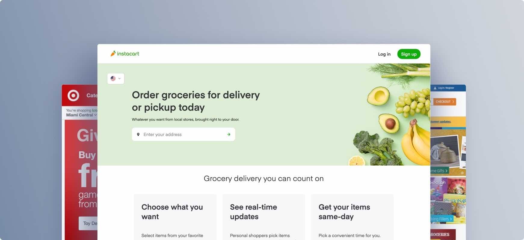
New Research Study on ‘Online Grocery’ Sites
Our research team has spent 550+ hours usability testing and researching mobile online grocery websites.
This research study specific to Online Grocery is based on more than 70 participant/site test sessions, and the tested grocery sites include:
- Individual grocery store websites: Amazon Whole Foods, Walmart, Target, and Aldi.
- Aggregate third-party grocery delivery services: Instacart and Shipt.
In some cases, parts of the user experience are overlapping between these different services, e.g., users browsing for groceries through Target.com, but delivery service is provided through Shipt.
Indeed, during testing, the participants encountered 700+ medium-to-severe usability issues. These issues have subsequently been analyzed and distilled into the 427 UX guidelines found within our grocery UX research study.
> Explore our new Online Grocery UX research available today.
New Research Study on ‘Consumables Subscription Services’ Sites
Our research team has spent 1,200+ hours testing and researching Consumable Subscription Services websites (grocery box subscriptions, product replenishment subscriptions, etc.)
Our new research study on Consumable Subscription Services is based on more than 100+ user/site test sessions. Test sites include:
- Grocery box subscriptions: Imperfect Foods and Hungryroot.
- Meat subscriptions: ButcherBox and Crowd Cow.
- Seafood subscriptions: Oceanbox and Sea to Table.
During testing, the participants encountered 1000+ medium-to-severe usability issues as they were exploring, and signing up for the Consumable Subscription Services. We’ve distilled these issues into 489 guidelines relevant for Consumable Subscription websites.
> Explore our new Consumables Subscription Services UX research available today.
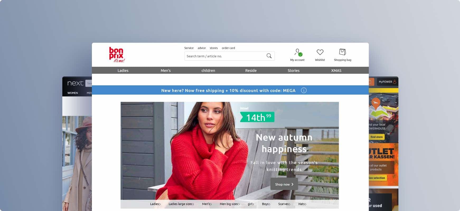
New Research Study on ‘European E-commerce Sites’
Our research team has spent 550+ hours usability testing and researching features, layouts, content, and designs on European e-commerce websites.
This research is based on more than 160 qualitative test participant/site usability test sessions. The 18 test sites were:
German Apparel sites: Esprit, Bonprix, Zalando.
German Technology sites: Otto, Notebooksbilliger, Cyberport.
Nordic Apparel sites: Boozt, Miinto, H&M.
Nordic Technology sites: Power, Elgiganten, Hi-Fi Klubben.
UK Apparel sites: Marks & Spencer, Next, Boohoo.
UK Technology sites: Argos, Currys, Appliances Online.
Despite testing a diverse set of sites, the participants encountered 1,000+ medium-to-severe usability issues during their shopping sessions.
But testing also revealed that European sites suffer from the same UX issues as those in the US: none of the 500+ guidelines in Premium was contradicted by the experiences of European test participants, nor did the European users on the European e-commerce sites experience any issues we haven’t previously observed in our 12 years of testing.
Once again showing that when it comes to things like core user behavior, UI interpretation, users’ content needs, web usability, then American and European users are very homogeneous.
Some local differences in features and options were observed, such as the larger range of third-party payment and delivery options in Germany and the Nordic countries - but the UX principles for designing 3rd party payment remain the same.
Based on this European testing, we’ve updated 150+ essential existing guidelines in Premium, adding 250+ test examples.
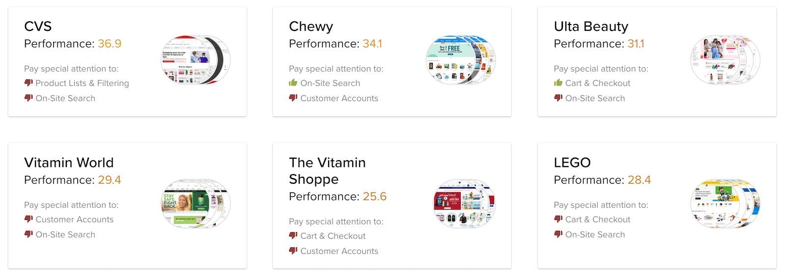
13 New 2021 UX Case Studies Added To: Health & Beauty, Vitamins, Sports, Pets, Toys, and Music
We’re expanding our UX benchmark database significantly with in-depth UX case studies of 13 new sites that we’ve manually benchmarked across 500+ guidelines.
This provides you with 4,500 new best practice examples and 6,500 performance scores within the industries Health & Beauty, Vitamins, Sports Equipment, Pets, Toys, and Musical Instruments:
- 5 new Health & Beauty & Vitamins case studies for Vitamin World, Vitamin Shoppe, Ulta, Shop Apotheke, and CVS.
- 2 new Sports case studies for Dick’s Sporting Goods and Sports Direct.
- 6 new Toys, Pets, and Music case studies for Zooplus, Chewy, Smyths Toys, LEGO, Guitar Center, and Thomann.
This also expands the number of European sites in our benchmark to 24.
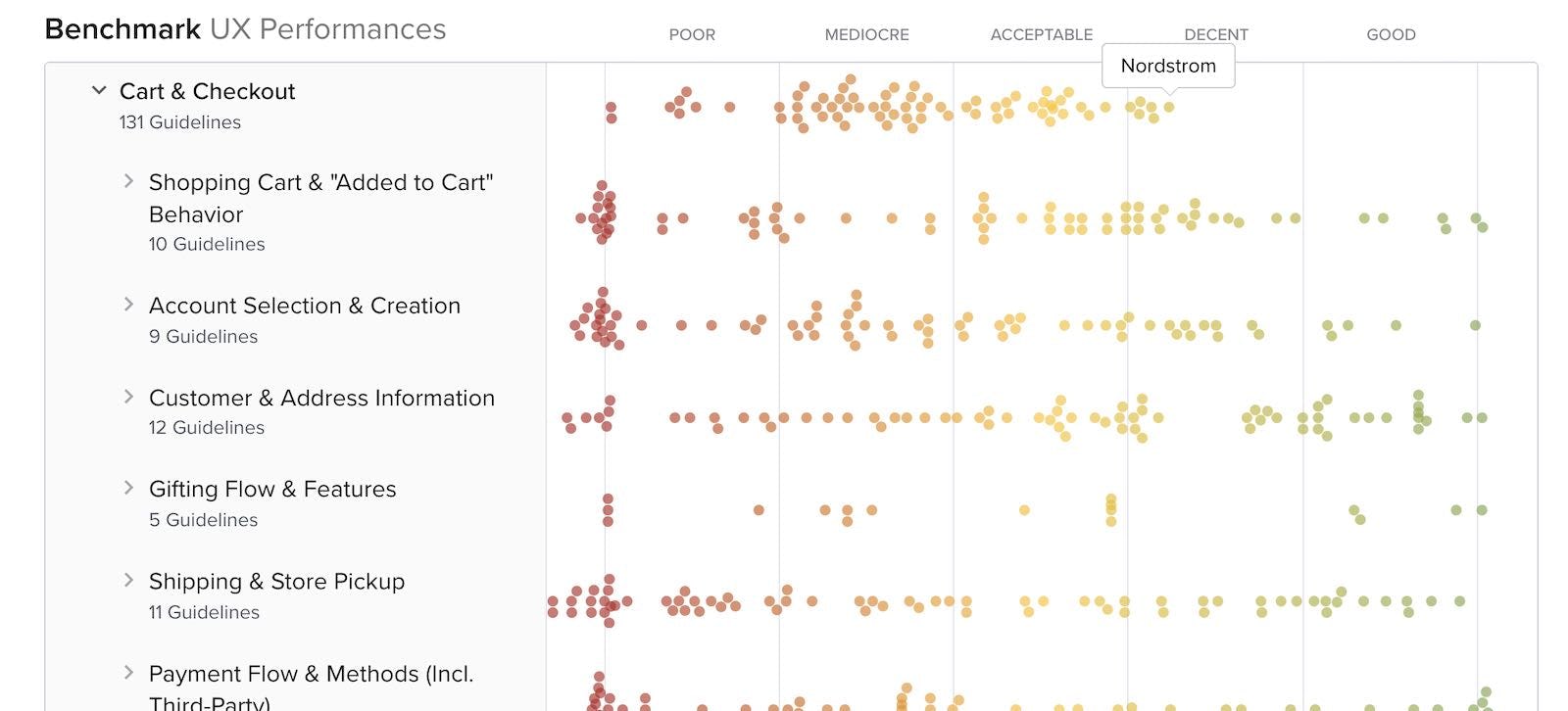
New 2021 ‘Cart & Checkout’ Benchmark with 8,000+ Checkout Examples
We’re releasing a 2021 update for our ‘Cart & Checkout’ UX benchmark, with 89 large e-commerce sites rated across 130 ‘Cart & Checkout’ UX guidelines.
This provides you with:
- 8,000+ new worst- and best-practice Cart & Checkout UX examples – embedded into the 130+ UX guidelines
- 10,000+ new Cart & Checkout UX performance scores – view them and the updated case-study dataset in the Checkout Benchmark.
- You can see the 600+ new full-page design examples of all cart and checkout steps from leading e-commerce sites in the Page Design tool, like Cart, Shipping Address, Shipping Methods, Address Validator, Payment, and Order Review checkout step designs.
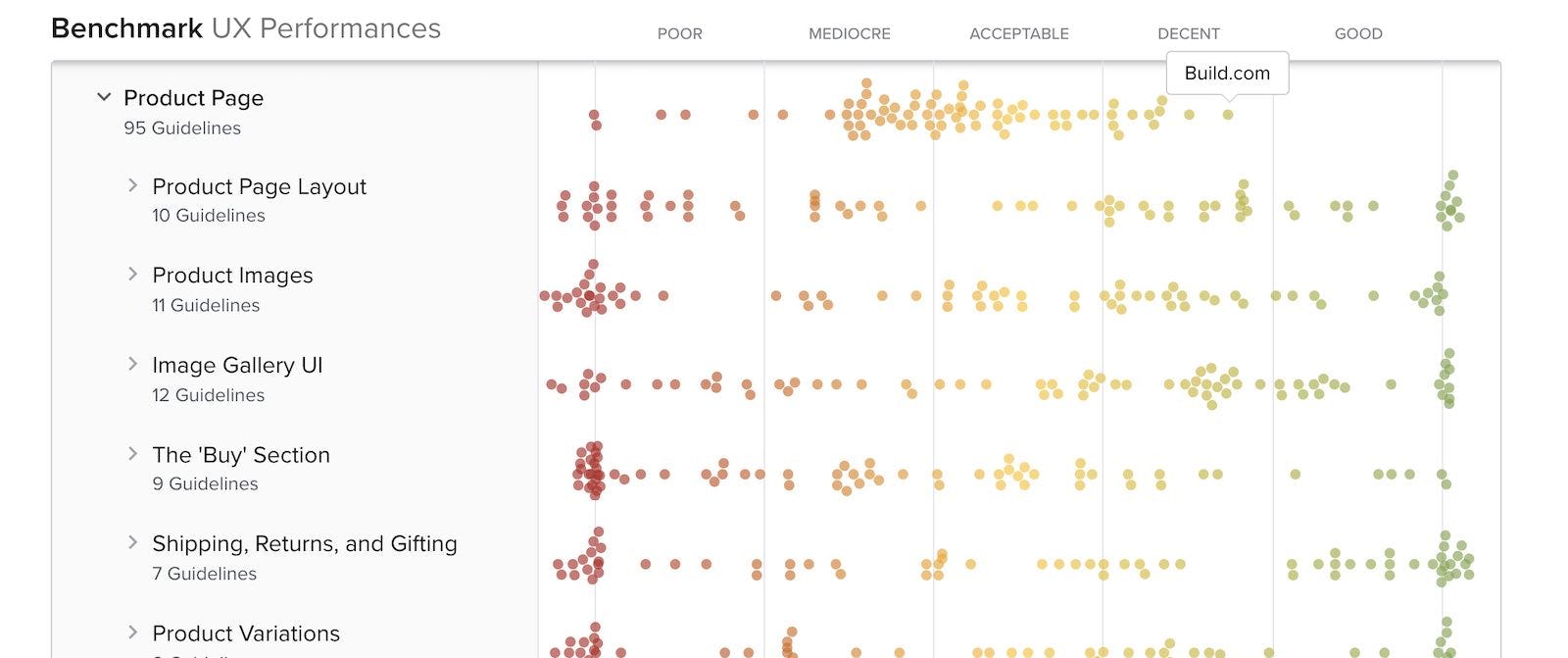
New 2021 ‘Product Details Page’ Benchmark with 5,000+ PDP Examples
We’re releasing a 2021 update for our ‘Product Details Page’ UX benchmark, with 90 large e-commerce sites rated across 95 PDP UX guidelines.
This provides you with:
- 5,000+ new worst- and best-practice Product Page UX examples – embedded into the 95+ UX guidelines
- 8,000+ new Product Page UX performance scores – view them and the updated case-study dataset in the Product Page Benchmark.
- You can see the 400+ new full-page design examples of Product Details Pages, image gallery UIs, user review UIs, and spec sheet UIs pages from leading e-commerce sites in the Page Design tool.
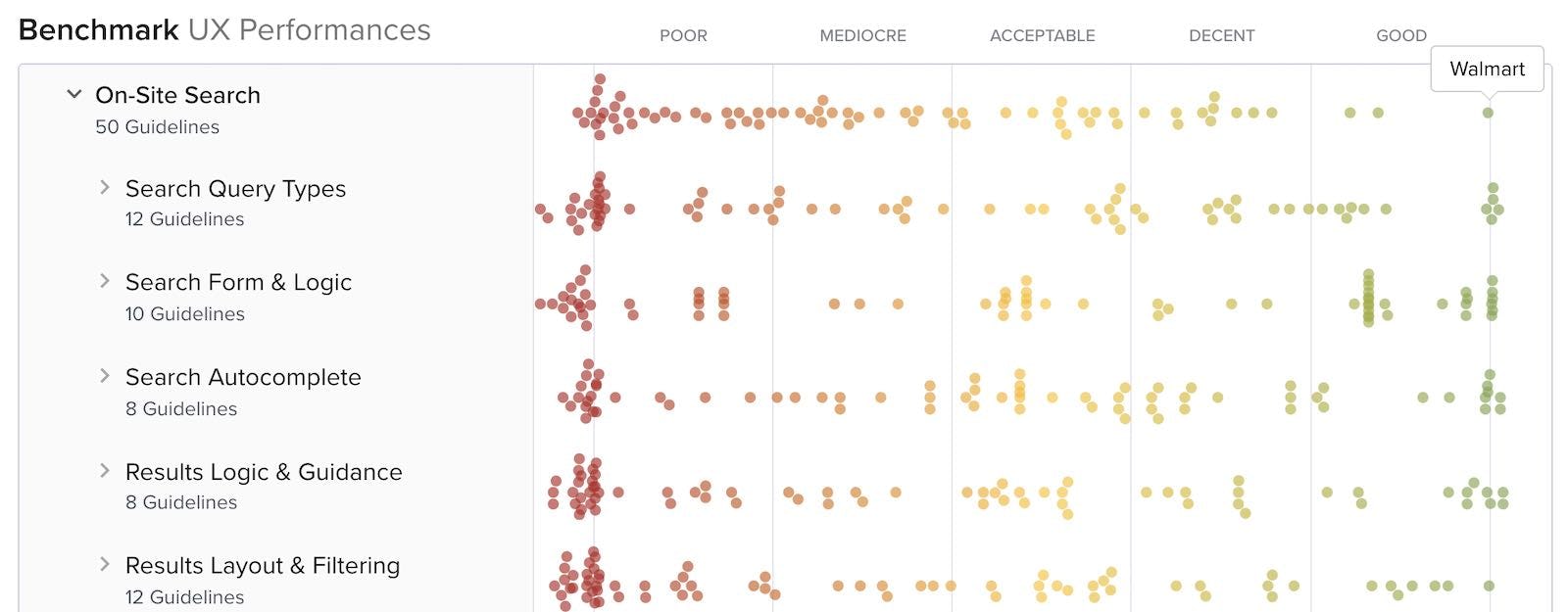
New 2021 ‘On-Site Search’ Benchmark with 2,500+ Search UI Examples
We’re releasing a 2021 update for our ‘On-Site Search’ UX benchmark, with 82 large e-commerce sites rated across 50 Search UX guidelines.
This provides you with:
- 2,500+ new worst- and best-practice Search UX examples – embedded into the 50 UX guidelines
- 3,500+ new Search UX performance scores – view them and the updated case-study dataset in the Search UX Benchmark.
- You can see the 300+ new full-page design examples of search fields, autocomplete UIs, search results, and no results pages from leading e-commerce sites in the Page Design tool.
New 2021 ‘Online Grocery’ Benchmark with 1,800+ Grocery Examples
We’re releasing a new UX benchmark specific to Online Grocery websites, benchmarking 5 grocery sites across 400+ research-based UX guidelines relevant for grocery sites.
**This provides you with: **
- in-depth UX case studies for the desktop and mobile websites of Albertsons, Peapod, FreshDirect, Ocado, and Sainsbury’s.
- 1,550+ new worst- and best-practice UX implementations specific to online grocery sites – already embedded in the 400+ grocery relevant UX guidelines.
- 1,930+ UX performance scores from the 5 grocery sites – view them and the updated case-study dataset in the Benchmark tool.
Get an overview of our UX research relevant for sites in the Online Grocery industry and see how the above 5 sites perform.
New 2021 ‘Telco’ Benchmark with 1,800+ Telco Examples
We’re releasing a new UX benchmark specific to the Telco industry, benchmarking 5 telco & ISP sites across 400+ research-based UX guidelines relevant for telco sites.
This provides you with:
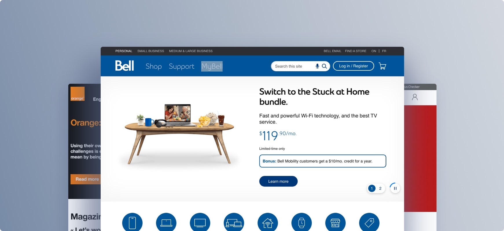
- in-depth UX case studies for the desktop and mobile websites of Bell, Orange, Verizon, Vodafone UK, and Xfinity.
- 1,625+ new worst- and best-practice UX implementations specific to telco sites – already embedded in the 400+ telco relevant UX guidelines.
- 2,400+ UX performance scores from the 5 telco sites – view them and the updated case-study dataset in the Benchmark tool.
Get an overview of our UX research relevant for sites in the Telco industry and see how the above 5 sites perform.
New 2021 ‘Luxury Goods’ Benchmark with 1,800+ Luxury Examples
We’re releasing a new UX benchmark specific to the Luxury Good industry, benchmarking 7 luxury goods sites across 360+ research-based UX guidelines relevant for luxury sites.
This provides you with:
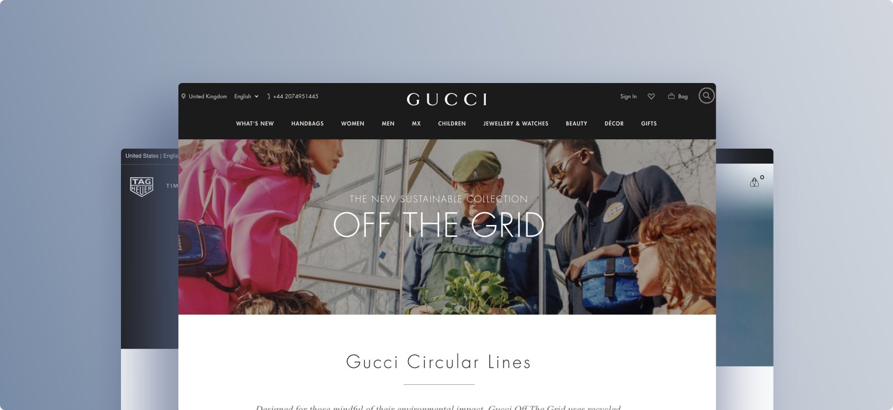
- in-depth UX case studies for the desktop and mobile websites of Bang & Olufsen, Chanel, Gucci, Jimmy Choo, Louis Vuitton, TAG Heuer, and Van Cleef & Arpels.
- 1,800+ new worst- and best-practice UX implementations specific to luxury sites – already embedded in the 360+ luxury relevant UX guidelines.
- 2,500+ UX performance scores from the 7 luxury sites – view them and the updated case-study dataset in the Benchmark tool.
Get an overview of our UX research relevant for sites in the Luxury Goods industry and see how the above 7 sites perform.
New 2021 UX Research Study on ‘Native Mobile Apps’
We’ve released our new UX study on ‘Native Mobile Apps’ .
At Baymard our research team has spent over 1,000 hours usability testing and researching Mobile Apps for e-commerce.
This mobile apps UX research is based on more than 200 qualitative subject/app usability test sessions following the “Think Aloud” protocol (1:1 remote moderated testing). Throughout the test sessions, the subjects had many issues with the layout, content, or features in mobile apps.
This study examines how to design a user-friendly shopping experience for mobile apps. It covers the entire mobile e-commerce experience, from homepage to completed order — investigating how to best align users’ behavior on mobile apps with the constant challenge of limited page context due to compact screen sizes.
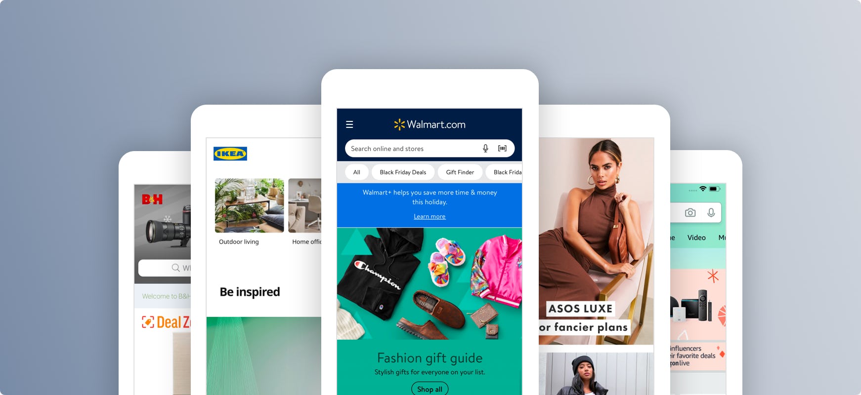
The test apps were chosen to reflect the apps provided by leading sites in the apparel (e.g., ASOS and Banana Republic), mass merchant (e.g., Amazon & Walmart), home & hardware (e.g., Home Depot and Lowe’s), and beauty (e.g., Sephora and Ulta) industries.
During testing the subjects encountered hundreds of medium-to-severe usability issues. These issues have subsequently been analyzed, and 342 UX guidelines, most of which also apply to Mobile Sites, make up the Mobile Apps UX research study.
Click here to see our new Mobile App UX research study.
New 2021 UX Research Study on ‘Direct To Consumer’ sites
We’ve released our new UX research study on ‘Direct To Consumer (DTC)’ sites. This research study focuses on brands that sell their products own their own site, directly to the end consumer.
Our DTC research includes testing of:
- DTC websites of larger brands, such as Adidas, American Apparel, Apple, H&M, IKEA, Levi’s, Urban Outfitters, Under Armour, Bose, JBL, KitchenAid, Cole Haan, Herschel, L’Occitane, Patagonia
- and smaller niche DTC brands, such as Allbirds, Caraway, Daniel Wellington, Equal Parts, Farer, Great Jones, Greats, Maya Chia, Mahalo Care, Milo, Mirror, mvmt, Monastery Made, Tempo, Tonal, Thousand Fell, etc.
Our research study focused in particular on DTC sites for smaller niche brands with fairly small product catalogs, although many of the findings will also be relevant for larger DTC sites and brands.
Click here to learn more about our new DTC UX research study
New 2021 Research Study on ‘E-Commerce Accessibility’
We’ve released our new study on E-Commerce Accessibility. This research study focuses on accessibility specifically from an e-commerce angle.
The study provides you with highly actionable accessibility guidelines specifically for the page types and UI elements found on e-commerce sites (WCAG 2.1 AA compliance).
300+ of the existing Baymard UX guidelines have also been updated with accessibility implementation nuances.
Click here to read more about our new E-Commerce Accessibility research study
New 2021 UX Research Study on ‘Digital Subscription’ Sites (SaaS)
We’ve released our new large-scale UX research study on Digital Subscription Services UX. The 190+ UX guidelines are relevant to Digital Service subscription sites in general but in particular showcase SaaS and B2B software sites, and cover topics such as ‘Features‘-pages and descriptions, ‘Case-study’ pages, ‘Industry’ pages, plan matrix design and features, ‘App Integrations’ pages, etc.
Click here to learn more about our new Digital Subscription Services research study.
Redesigned ‘Guidelines’ Research Catalog Page (a video intro)
We’ve just released a completely redesigned version of the ‘Guidelines’ Research Catalog pages. The redesign vastly improves the ‘Industry’ guideline collections, the theme and topics pages, along with the guideline pages themselves. Click the video below to see what has changed:
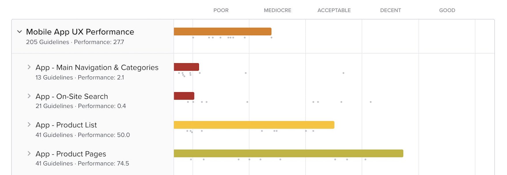
New 2021 ‘Native Mobile App’ UX Benchmark with 1,600+ App Examples
We’ve released a new UX benchmark of 10 native mobile e-commerce apps, assessing the 10 apps across 207 guidelines. This mobile app benchmark covers the entire e-commerce experience (incl. order tracking), with an average of 19.5 app screens reviewed for each of the 10x case studies.
This provides you with:
- “page designs” for mobile apps too, good for systematic inspiration for a particular page type. They can be found at the bottom of the ‘Page Designs’ section.
- 1,675 mobile app best- & worst practice examples, embedded at the bottom of each of the 207 assessed guidelines.
- along with 2,070 app-based UX performance ratings.
Explore 10 mobile app case-studies yourself: Nike, Amazon, Wayfair, Walmart, ASOS, IKEA, B&H Photo, Macy’s, Staples, and Sephora.
See our Mobile App UX research study
New 2021 Quantitative Research on 14 Different Topics
New quantitative 2021 research, providing you with the newest stats on user preferences and behavior across 14 topics, like:
- why users abandon during the checkout flow (see Checkout intro),
- why users shop online instead of in physical stores (see Product Page intro),
- mobile app install rates, utilization rates, and top 5 installed apps (see #930),
- what information types which will make users abandon the checkout (#731),
- which SSL and trust badges that give users the best sense of trust in a checkout flow (#587),
- how much more users rely on customer review averages if they have a higher number of votes (#517),
- how users actually “save” products they aren’t yet ready to purchase (#798),
- frequency of order returns (here),
- why users unsubscribe from newsletters (here), and
- how often users get new credit cards (#919), and more.
New B2B UX Benchmark with 1,090 Examples
2021 we’ve released a new ‘B2B’ UX benchmark. This provides you with:
- UX case-studies for B2B e-commerce sites like Cole-Parmer, Thermo Fisher, Arrow, Berlin Packaging, Hitachi, etc.,
- 1,090+ B2B UX examples for the 271 guidelines most relevant to B2B sites, and
- 1,300+ B2B UX performance scores.
New 2021 Homepage & Category UX benchmark with 3,100 Examples
We’re releasing a 2021 update for our Homepage & Category UX benchmark, with 58 large e-commerce sites rated across our 61 Homepage & Category UX guidelines.
This provides you with:
- 3,100+ new worst- and best-practice product Homepage & Category UX examples – already embedded in 61 UX guidelines
- 6,100+ new Homepage & Category UX performance scores – view them and the updated case-study dataset in the Benchmark tool.
- You can see the 199 new full-page design examples of homepages, main menus, and category pages from leading e-commerce sites in the Page Design tool.
All Benchmark Scorecards Show Year-Over-Year UX Performances
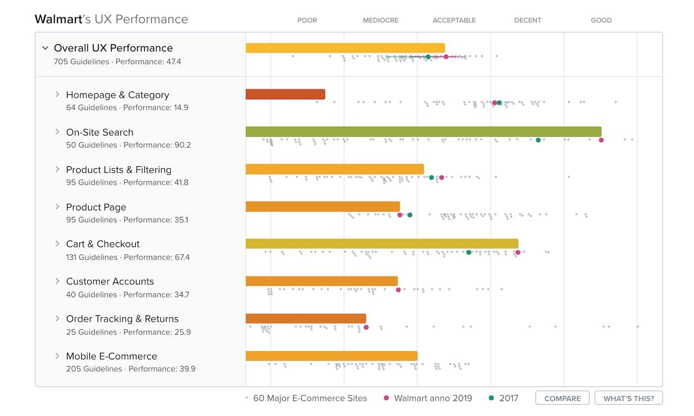
All benchmark UX performance scorecards now show historic Year-Over-Year performance comparisons, comparing the site’s current year (the bar chart) with the site’s past UX performances from our past benchmarks. In practice, this means that the benchmark case study pages will now, by default, show you 42,000+ past performance ratings on top of the current year’s performance ratings.
For those interested in the historic overall UX performance landscape within e-commerce, we’ve also made a page with historic versions of the benchmark scatterplot, from 2020 and then dating back to our first checkout UX benchmark performed in 2012.
All New Benchmarks Will Show ‘Implementation Breakdown’ and ‘UX Advice’
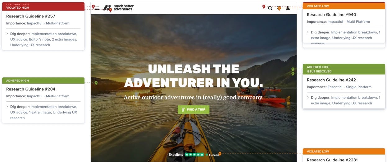
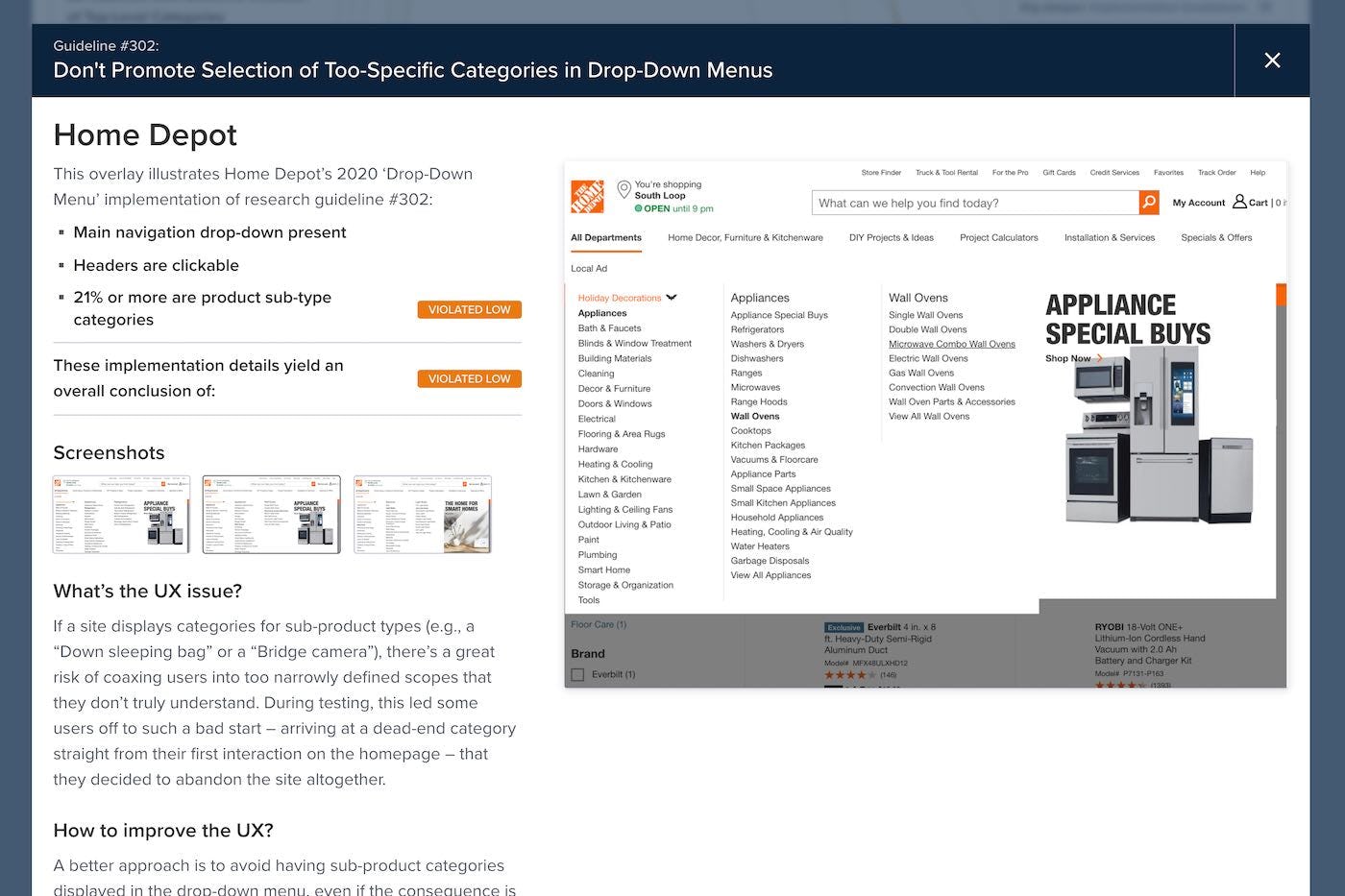
All new benchmarks will now feature a much more detailed view of the actual site implementation rated. This used to be information we only captured for internal documentation at Baymard, but we’ve now upgraded our benchmarking systems and process to show this to you. The new implementation overlay (seen above) will show you the actual assessment selections made for each of the 70,000+ UX performances ratings in the Benchmark tool, for the 40,000+ annotation pins in the Page Design tool, and for the 40,000+ Best- and Worst Practice examples found across the Guidelines.
For all new UX benchmarks we publish going forward, this new implementation overlay will provide you with:
- The actual implementation scenario breakdown for each of the guidelines (matching the assessment scenarios in the Review Tool).
- Feature more detailed implementation images than past benchmarks.
- Often display a “UX Advice” comment that further describes how the site’s implementation relates to the observed user behavior from our large-scale UX research (found in the guidelines) – i.e., explaining why the exact example is then good or bad for UX.
The bottom of the implementation overlay will also link to other relevant places in Premium. Notably, it will cross-link all Mobile and Desktop implementation examples with each other and cross-link to all past examples of that guideline from the currently viewed site.
The just-released ‘Product Lists & Filtering’, and the ‘Homepage & Category’ benchmarks already have this extra dataset available.
New 2020 Product Listings & Filtering UX benchmark with 1,500 Examples
We’re releasing a 2020 update for our Product Listings & Filtering UX benchmark, with 25 large e-commerce sites rated across our 95 Product Listings UX guidelines.
This provides you with:
- 1,500+ new worst- and best-practice product listings and filtering UX examples – already embedded in 95 UX guidelines
- 2,700+ new Product Listings & Filtering UX performance scores – view them and the updated case-study dataset in the Benchmark tool.
- You can see the 80+ new full-page design examples of product listings from leading e-commerce sites in the Page Design tool.
UX assessment tests embedded at the end of all 700+ guidelines
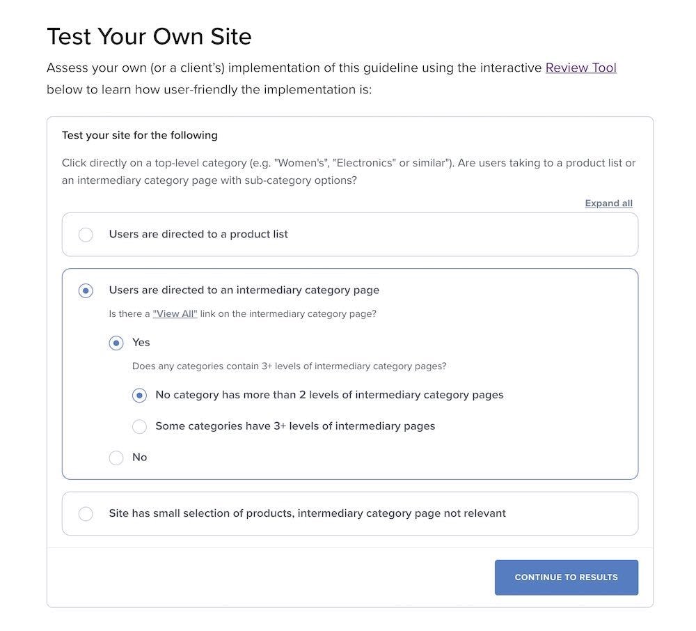
We’ve just released a new feature that embeds the Review Tool’s assessment interface at the end of all 700+ UX research guidelines:
This means that each UX guideline now ends with a simple interactive UX quiz you can take to see to what degree your website is suffering from the observed UX issues. The tool also provides tailored advice on how to improve your site UX based on the more than 7,000 UI scenarios options found in the Review Tool.
Note that this embedded test is just a “sandbox” – so your selections do not get saved. If you want to perform a full UX assessment (across 1 or all 700 guidelines) and get a UX performance scorecard, use the Review Tool instead.
New 2020 Mobile UX benchmark with 6,300 Examples
We’re releasing another round of Mobile E-Commerce UX benchmarking in 2020 (publishing one in February 2020 and another in June 2020), with 55 large e-commerce sites rated across up to 220 of our mobile UX guidelines (form the new mobile v2 research study).
This provides you with 6,300+ new worst- and best-practice Mobile UX examples (3,300 more than in the February release), and 8,700+ new Mobile UX performance scores (5,100 more than in the February release).
You can view the Mobile E-Commerce UX performance and case-study dataset in the Benchmark tool, and you can see the 800+ new mobile design examples from leading e-commerce sites in the Page Design tool.
The 6,300+ worst- and best-practice examples are already embedded in the 200+ mobile UX guidelines.
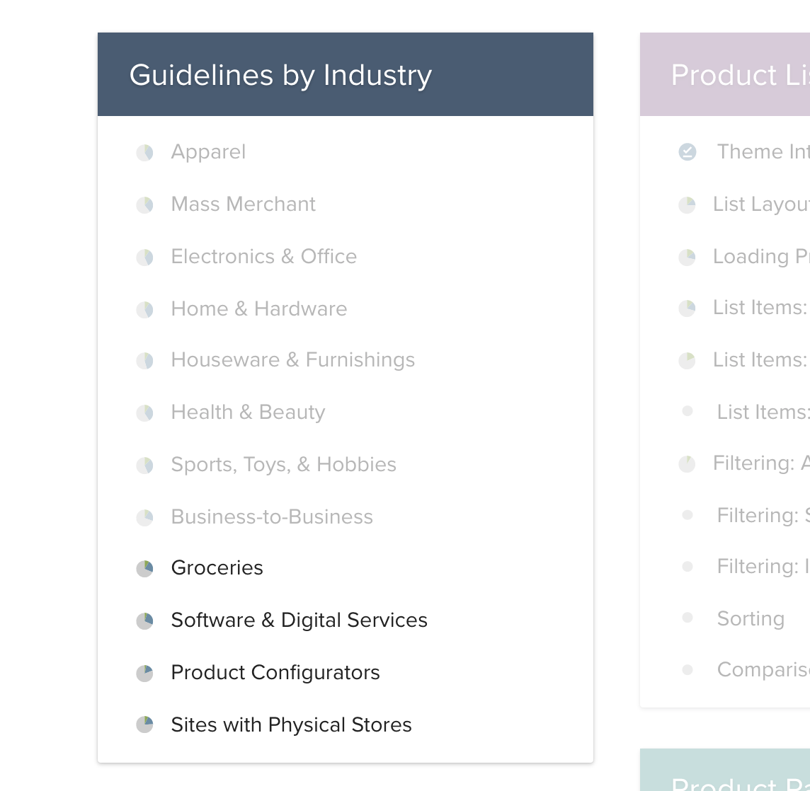
New ‘Industry Views’ for grocery-, digital-, configurator-, and ‘physical store’-sites
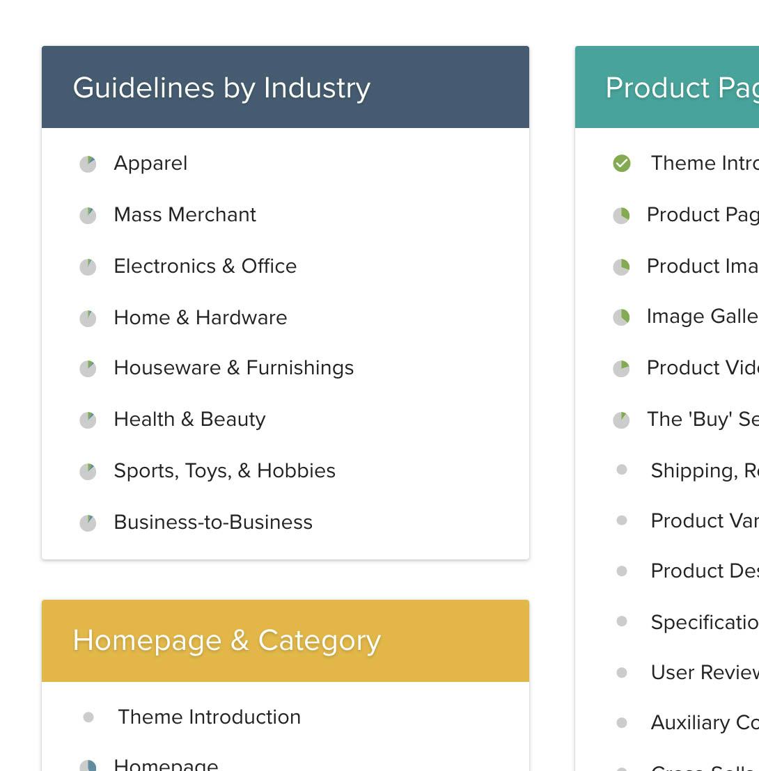
We’ve expanded the existing “Guidelines by Industry” feature with 4 new collections:
If you work on an e-commerce site within any of these industries, we recommend that you start examining the 50-150 guidelines listed within the corresponding industry view page before diving into the full 700+ guidelines available in Baymard Premium.
We’ve created these industry lists by analyzing the UX performance ratings from our UX our past audits and using our benchmark dataset, looking specifically for which of the 700+ guidelines that — within each industry — have the largest collective negative UX performance impact. In other words, guidelines that most sites within the industry violate despite the guideline having a relatively high UX impact seen during usability testing.
New ‘Review Tool’ with 7,000+ Scenarios Based on 9 Years of Auditing Experience
Most of Baymard’s developer and design teams have spent close to one full year building a completely new version of the Review Tool available in Baymard Premium.
The Review Tool allows you to self-assess your own site(s), competitor sites, prototypes, and client websites, against any of the 700+ guidelines available in Baymard Premium. This enables you to:
- Identify and document UX issues across all 700+ UX guidelines.
- Get detailed research-backed instructions for how to improve UX.
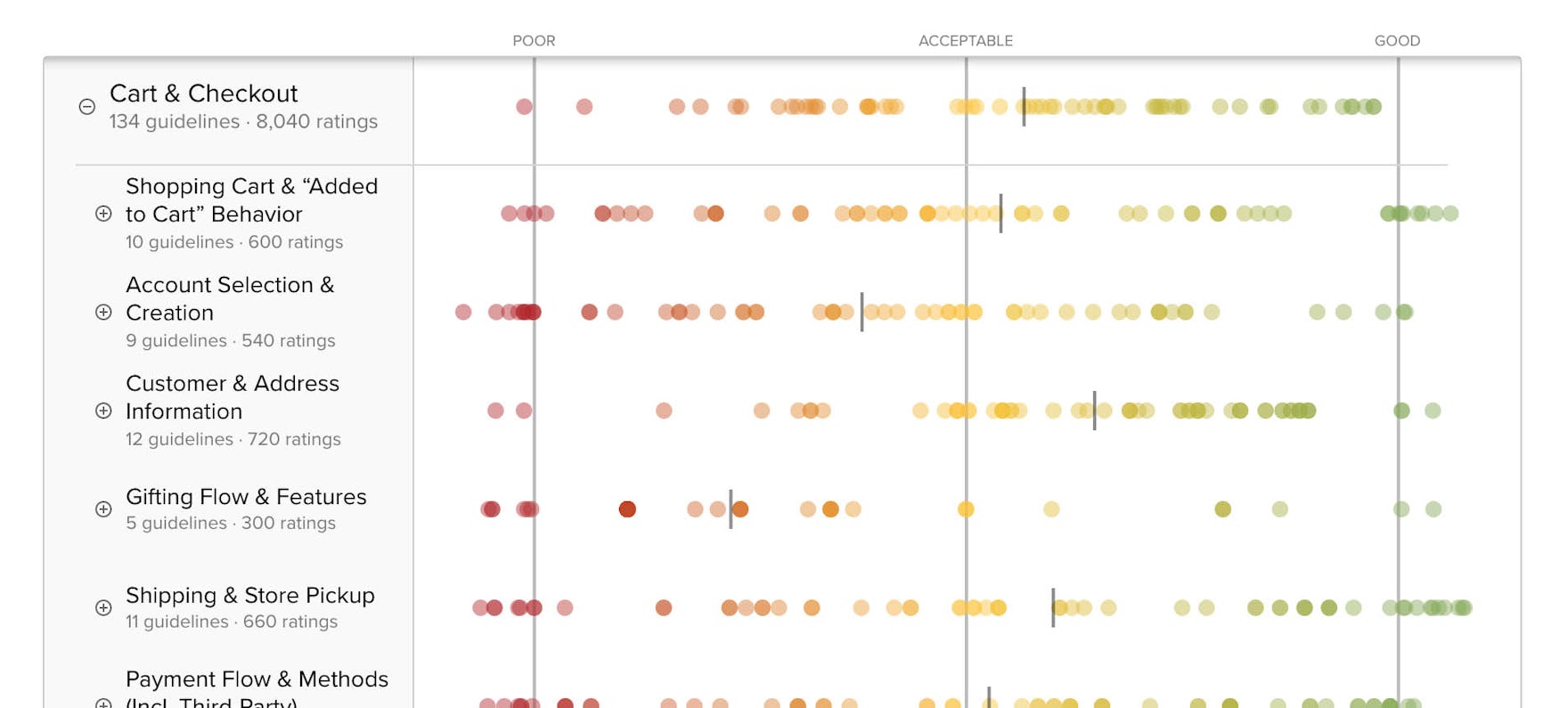
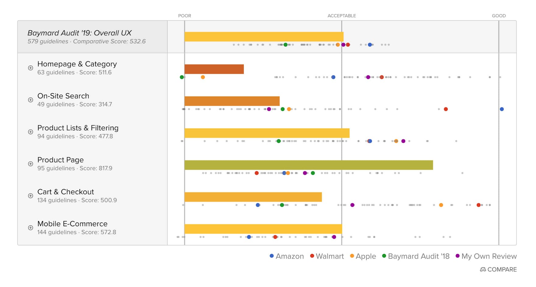
- Get a topic-level UX performance scorecard and compare it to any top 60 site.
This new Review Tool builds upon our audit team’s nine years of experience conducting highly detailed UX audits, and have more than 7,000 site implementation scenarios available (or “UI patterns” if you will), that are each traced back to specific findings among Baymard’s 54,000+ hours of UX research, to determine the UX performance output. This enables you to create highly accurate and highly repeatable heuristic evaluations at levels that are otherwise unseen in the UX industry.
Try the Review Tool, or start by watching the below video intro:
‘Guidelines by Type’: see all guidelines that are ‘Quick Wins’, ‘UX Basics’, etc.
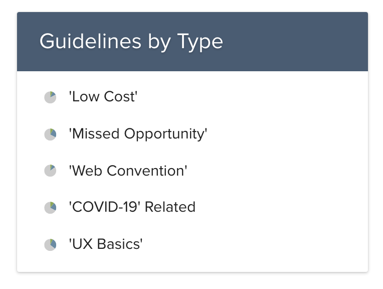
You now have a new way of navigating the 700+ research guidelines called “Guidelines by Type”.
This feature shows you different collections of guidelines that all have the same attribute.
The “Guidelines by Type” collections available are: Quick Wins, Missed Opportunity, Web Convention, ‘COVID-19’ Related, UX Basics. (More will be added later.)
The new guideline collections are good if you are interested in a particular type of guidelines, like “Low Cost/Quick Wins” or “UX Basics”.
New feature to see ‘Your Research Updates’
We’ve improved the “Mark as Read” feature in two ways:
- Both the Benchmark case studies and the Page Design collections now also have the “Mark as Read” feature, allowing you to say “I’ve read this content“. This helps you keep track of what you’ve read, and we’ll then also be able to inform you when there are research updates available to the content you’ve “Marked as Read”.
- We’ve now set up a centralized “Your Research Updates” page, that lists all the Baymard Premium research content you’ve clicked the “Mark as Read” button on, and that Baymard has subsequently updated with new research findings.
Tip: we strongly recommend that you use the “Mark as Read” button on all research content you’ve viewed – it’s the only way to keep track of your progress, to avoid duplicate reading, and to get notified about updates to the research you’ve read.
COVID-19 Relevant Guidelines
COVID-19 Relevant Guidelines we’ve assembled a list of the 58 existing Baymard UX guidelines that are the most relevant to consider in these COVID-19 times, covering user concerns such as like product availability, shipping, etc. - see it here
While Baymard haven’t done testing specifically during the COVID-19 crisis (as large-scale usability research simply takes too long to respond), the informational challenges users are facing right now. The list covers Baymard’s guidelines that relate to users’ general concerns over product availability, shipping speed, order returns, customer support, and similar.
New 2020 Mobile UX benchmark with 2,700 Examples
We’re releasing our new Mobile E-Commerce UX benchmark dataset. This provides you with 30 large e-commerce sites rated across the 120 new mobile UX guidelines (form the new mobile v2 research study), leading to 2,700+ new worst- and best-practice UX examples, and 3,600+ new UX performance scores.
You can view the Mobile E-Commerce UX performance and case-study dataset in the Benchmark tool and you can see the 400+ new mobile design examples from leading e-commerce sites in the Page Design tool.
The 2,700+ worst- and best-practice examples are already embedded in the 120 mobile UX guidelines.
New Mobile E-Commerce UX Study
We’re releasing our new large-scale Mobile E-Commerce UX study — the most comprehensive research study we’ve ever conducted. The mobile users encountered a massive 2,597 usability issues during testing, which we’ve distilled into 170+ new mobile e-commerce UX guidelines. These guidelines will reveal new mobile user behavior specific to e-commerce, where and how mobile websites need to deviate from desktop, which mobile design patterns consistenly cause issues and which perform well, and how to create a highly optimized mobile shopping experience. The new mobile guidelines also reveal which of the current approximately 500 “desktop” guidelines found in Baymard Premium that are actually “platform agnostic” and apply equally to both desktop and mobile sites.
Go see the theme overview page for the new extensive mobile UX study.
Note: The old mobile v1 guidelines are removed from the guideline navigation, but deep links to specific guidelines still work. The Review Tool will for newly created reviews use the new mobile v2 guidelines. Any reviews created before Feb 27 2020 will use the mobile v1 guidelines.
New 2020 Quantitative Research on 14 Different Topics
New quantitative 2020 research, providing you with the newest stats on user preferences and behavior across 14 topics, like: why users abandon during the checkout flow (see Checkout intro), why users shop online instead of in physical stores (see Product Page intro), mobile app install rates, utilization rates, and top 5 installed apps (see #930), what information types which will make users abandon the checkout (#731), which SSL and trust badges that give users the best sense of trust in a checkout flow (#587), how much more users rely on customer review averages if they have a higher number of votes (#517), and how users actually “save” products they aren’t yet ready to purchase (#798), frequency of order returns (here), why users unsubscribe from newsletters (here), how often users get new credit cards (#919), and more.
New UX performance graphs and improved Review Tool
After extensive development work, we’re excited to release a set of completely reworked UX performance graphs. The graph contains both improved UX scoring logic, improved visuals, and a new highly advanced prediction logic for unrated guidelines. The latter greatly improves how you can use the Review Tool right now, but also bring significant speed improvements to Baymard’s UX benchmarking going forward.
New prediction logic: the new UX performance graphs now include an advanced prediction logic for all unrated guidelines. This prediction logic uses the more than 57,000 UX performance ratings in Baymard’s benchmark database, to predict the score for unrated guidelines with a 95% accuracy. This means that the scorecards you create yourself in the Review Tool no longer need almost all guidelines rated before you get a UX scorecard - you can now rate just a small handful of guidelines to get a usable UX performance scorecard.
New UX scoring logic: the scoring logic itself is greatly improved, with better handling of guidelines that are not applicable to a site and with greatly improved “benchmark normalization” where all performance scores are adjusted on an ongoing basis depending on how the e-commerce industry as a whole evolves and depending how users’ expectations increase over time.
Improved Visuals: the graphs now include a sticky header and footer, there’s now gridlines to show the UX performance levels (“poor”, “mediocre” etc.), we’ve switched to a “swarm plot” instead of a “scatter plot” (meaning dots for sites with same performance will no longer collide).
New custom graph views for UX Audits: lastly, the UX performance graphs now support custom view structures. This greatly improves Baymard’s UX audit performance scorecards, where the audit scorecards can now be even more tailored to the specific client industry.
Normalized numbers: The UX performance score numbers are now also normalized on a 0-100 scale. This makes the performance numbers easier to interpret and makes them fully comparable across Theme, Topics, and scorecards. (Note the score range have two special cases: “-100 to 0” scores for “Broken” UX performances, and “101 to 200” for “State of The Art” performances).
New Product Page UX benchmark with 3,700 Examples
We’re releasing our new Product Page UX benchmark dataset. This provides you with 59 large e-commerce sites rated across the 95 Product Page UX guidelines, leading to 3,700+ new worst- and best-practice UX examples, and 5,600+ new UX performance scores.
You can view the Product Page UX performance and case-study dataset in the Benchmark tool and you can see the 265 new product page design examples from leading e-com sites at in the Page Design tool.
The 3,700+ worst- and best-practice examples are already embedded in the 95 product page UX guidelines. We recommend you start with the ‘Current State of Product Page UX’ analysis.
New Search UX benchmark
We’re releasing our new E-commerce Search UX benchmark dataset. This provides you with 59 large e-commerce sites rated across the 50 Search UX guidelines, leading to 1667 worst- and best-practice Search UX examples, and 2800+ new Search UX performance scores.
You can view the Search UX performance and case-study dataset in the Benchmark tool and you can see the 237 new search design examples from leading e-com sites at in the Page Design tool.
The 1600+ worst- and best-practice examples are already embedded in the 50 search UX guidelines. We recommend you start with the ‘Current State of E-Commerce Search UX’ analysis.)
New Late-2019 Quantitative Research on 9 Different Topics
Nine rounds of new quantitative research, providing you with new late-2019 stats on user preferences and behavior on things like: why users abandon their order during the checkout flow (see Checkout intro), why users shop online instead of in physical stores (see Product Page intro), mobile app install rates, utilization rates, and top 5 installed apps (see #930), what information types which will make users abandon the checkout (#731), which SSL and trust badges that give users the best sense of trust in a checkout flow (#587), how much more users rely on customer review averages if they have a higher number of votes (#517), and how users actually “save” products they aren’t yet ready to purchase (#798).
New Mobile Study (In Progress): 141 Mobile Guidelines Published So Far
The research team is currently conducting a new large-scale Mobile E-Commerce UX study — the most comprehensive research study we’ve ever conducted. The mobile users encountered a massive 2,597 usability issues during testing, revealing new mobile user behavior specific to e-commerce, where and how mobile websites need to deviate from desktop, and which of the current approximately 500 “desktop” guidelines found in Baymard Premium are actually “platform agnostic” and apply equally to both desktop and mobile sites.
Timeline:
- Currently 141 ‘mobile only’ and ‘platform agnostic’ guidelines have been written and published to the theme “Mobile E-Commerce Version 2”.
- The remaining 50-80 guidelines mobile guidelines will gradually be released as they are written during the next couple of months.
- November 2019 we’ve started a new round of Mobile UX benchmarking, initially of 20 sites, expected to be out Q1 2020.
- Early 2020 the old mobile v1 guidelines will be removed from the guideline navigation (deep links to specific guidelines still work), and Premium will switch fully to use the Mobile V2 guidelines (incl in the Review Tool).
‘Industry’ Feature: See the 50–150 Most Important Guidelines to Your Industry
You now have a new way of navigating the 700+ research guidelines called “Guidelines by Industry”.
This feature shows you the 50-150 most important guidelines to read first for a single industry (e.g. for apparel sites, mass merchant sites, etc.) and can be found next to the other research Themes in the Guideline tool.
The industry views available are: Apparel, Mass Merchant, Electronics & Office, Home & Hardware, Houseware & Furnishings, Health & Beauty, Sports, Toys, & Hobbies, and Business-to-Business. (More will be added later.)
If you work on an e-commerce site within any of these industries, we recommend that you start examining the 50-150 guidelines listed within the corresponding industry view page before diving into the full 700+ guidelines available in Baymard Premium.
We’ve created these industry lists by analyzing the 57,000+ UX performance ratings from our UX benchmark dataset, looking specifically for which of the 700+ guidelines that — within each industry — have the largest collective negative UX performance impact. In other words, guidelines that most sites within the industry violate despite the guideline having a relatively high UX impact seen during usability testing.
The industry view is meant as a starting point. Any given site within these industries should still pay attention to all the 700+ UX guidelines in Baymard Premium. To make that task more manageable, those 50-150 guidelines found within the “Guidelines by Industry” list will for most sites (within those respective industries) be the best starting point for improving their overall UX.
New Cart & Checkout UX Benchmark Added with 5,000+ New Examples
We’ve added a new Cart & Checkout benchmark with 59 sites benchmarked. This provides you with:
- 5,054 new worst- and best-practice checkout implementation examples. These examples are added to each of the relevant 134 checkout guidelines
- 7,906 new checkout UX performance ratings, added to the benchmark
- All benchmark case study pages have had their checkout UX walkthrough updated
- 427 new annotated checkout step design examples, added to the Page Design tool
A good starting point for getting an overview of the overarching insights from this new vast dataset would be to read the updated Cart & Checkout UX benchmark analysis.
‘Compare Mode’ Added to Scorecards
The UX performance charts now have two features to make performance comparison easier:
-
Select Sites for Comparison — All scorecards now have an actual “Compare” mode that enables you to load specific scorecards into your current bar chart for comparison. This allows you to make direct performance comparisons between: any Review Tool scorecards you’ve created yourself, any UX audit performance scorecards Baymard have conducted for you, and any of the 60 case studies from the Benchmarks. You can enter this comparison mode by clicking the “Compare” link found in lower right corner of each bar chart graph.
-
Superimposed Benchmark Performances — All bar charts now have the entire benchmark scatter plot superimposed as small grey dots below the bars. This means that in all UX performance bar charts you now get 39,500+ UX performance ratings (from the top 60 grossing e-commerce sites in the world) summarized right next to the site performance you’re currently viewing, providing much better context for the bar chart performance.
Search Tool Added to Premium
You can now search within Baymard Premium and Baymard.com.
You’ll find the new search tool in the upper right-hand corner of the main navigation, and it allows filtering by both Research Theme and Content Type.
‘Importance’ Added to All Guidelines
The beginning of all guidelines in Baymard Premium now lists an “Importance” sentence that describes overall importance of reading a guideline in three levels; “Detail”, “Impactful” and “Essential”. This makes it easier to immediately understand the relative importance of a guideline before reading it.
The importance is mostly based on how much of an impact we observe the underlying UX issue have on end-users. This part is the “Severity” and “Frequency” data from our large scale test sessions we’ve now combined into a single “Importance” sentence. Generally, all of the 74 research topics list the guidelines by their importance — so those guidelines found first within a topic are always more important to read than those at the end of the topic. (In some instances guideline sequence within topics deviate slightly from this if we deem that it vastly improves the reading experience of the whole topic.)
Select guidelines are also tagged as being a “Missed Opportunity”, “Web Convention”, and/or “Low Cost”:
- Missed Opportunity: Our benchmark reveals that many sites fail to address this UX issue, despite the issue also having a significant UX impact — making it a ‘missed opportunity’. Be sure to check your site doesn’t suffer from this issue as well.
- Web Convention: This guideline is a “Web Convention” as our benchmark reveals that almost all sites adhere to it — meaning that it’s also an experience users are highly accustomed to having. Be careful about breaking this user expectation.
- Low Cost: This guideline will often be relatively low cost to implement for the average e-commerce site (compared to other guidelines).
If a guideline meets any of these three requirements, the guideline Importance level is boosted beyond its “severity” and “frequency” test values — as we then deem it more important to read.
Account & Self-Service Benchmark Added With 2,000+ Examples
We’ve finished the Accounts & Self-Service benchmark with 42 sites benchmarked across the 65 Accounts & Self-Service guidelines.
This provides you with a total of 2,000+ implementation examples for the 65 guidelines, 2,700+ UX performance ratings in the benchmark, and 330 annotated page design examples available in the Page Design tool.
Compared to the other overall themes of e-commerce UX, Accounts & Self-Service is the overall theme with by far the fewest decently or well-performing sites, and the theme with the second highest amount of mediocre to poor performances (only surpassed by e-commerce Search UX).
We recommend that you read the “Accounts & Self-Service benchmark analysis” as it provides a good overview of the research and highlights commonly missed opportunities relating to the account management and the order tracking & returns experience.
‘Current State of the E-Commerce UX Landscape’ Analysis Added
We’ve added a high-level analysis of the “current state” of the e-commerce landscape as a whole (from a UX performance point of view), based on the 40,000+ current UX performance scores in our benchmark database, which cover 60 major e-commerce sites across multiple industries.
We strongly recommend this for those wanting the complete overview of the e-commerce UX industry and our overarching research findings, before diving into the specific themes, topics, and guidelines. For this reason, it’s also linked to from the top of the Guideline page and the Benchmark page.
Read our new ‘Current State of the E-Commerce UX Landscape’ analysis now.
Exam & Certification: Become a “Certified UX Professional by Baymard Institute”
All Premium users on the Medium and Large accounts can now in the Exam & Certification tool take a series of exams and — if passing all six exams — become a “Certified E-Commerce UX Professional by Baymard Institute”.
Certification also includes an (optional) profile page in Baymard Institute’s public list of “Certified E-Commerce UX Professionals” - certifying your high level of knowledge and expertise specifically within e-commerce User Experience to clients, partners, and current or future employees.


