Christian Holst
Research Director and Co-Founder, DK

Christian is the research director and co-founder of Baymard. Christian oversees all UX research activities at Baymard. His areas of specialization within ecommerce UX are: Checkout, Form Field, Search, Mobile web, and Product Listings. Christian is also an avid speaker at UX and CRO conferences.
Christian Holst is a Research Specialist in:
- Cart & Checkout UX
- Search UX
- Product Listings & Filtering UX
- Mobile UX
Conferences Christian Holst has spoken at:
- Conversion Boost, Denmark, 2021
- Dansk Industri, Denmark, 2021
- Amazon Merchant Summit, UK, 2019
- Facebook After the Click, NYC USA, 2019
- Amazon Merchant Summit, Germany, 2019
- GPEC SUMMIT, Romania, 2019
- Conversion Boost, Denmark, 2019
- Amazon Merchant Summit, Austria, 2018
- Smashing TV, Members-Only, 2018
- Amazon Merchant Summit, London UK, 2018
- Amazon Merchant Summit, London UK, 2017
- Umbraco Festival, Denmark, 2017
- Codegarden, Denmark, 2017
- Smashing Conference, USA, 2017
- Smashing Conference, Spain, 2016
- T-mobile Executive Conf., Austria, 2015
- Smashing Conference, Germany, 2015
- MobX, Berlin Germany, 2015
- UX Alive, Istanbul Turkey, 2015
- Checkout Optimization Lessons, VWO (web), 2014
- Mobile Commerce Usability, Denmark, 2014
- Mobile Commerce World, UBM, USA (web), 2013
- Marketing Camp, Denmark, 2013
- Online Travel Leaders Retreat, Abacus, China, 2013
- Smarter Web Strategies, Australia (web), 2012
95 Articles by Christian Holst

UX-Query - Get Instant Answers to Any UX Question
March 12, 2025
Baymard’s New Free Plan — Get Instant Access to Premium UX Research
February 11, 2025
Baymard Year In Review 2024
December 18, 2024
Top 1% E-Commerce UX Awards — 2024 WINNERS
December 10, 2024
The New Baymard Figma Plugin: Add UX Best Practice Cards to Any Figma Project
November 27, 2024 Popular
150,000+ Hours of Research Condensed Into Weekly Bitesized UX Videos: Find Us on YouTube
October 22, 2024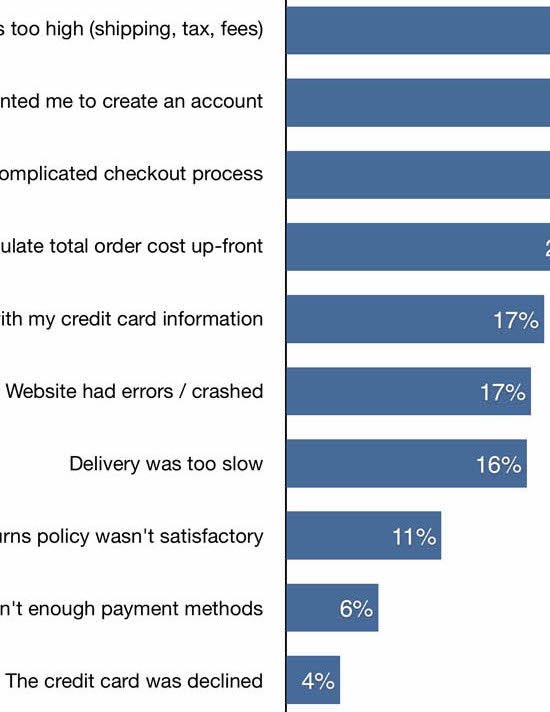
Reasons for Cart Abandonment – Why 70% of Users Abandon Their Cart (2025 data)
February 2, 2024 (Updated)Popular
Baymard: 2023 and 2024
December 20, 2023
Top 1% E-Commerce UX Awards — 2023 WINNERS
December 5, 2023 Popular
Testing ChatGPT-4 for ‘UX Audits’ Shows an 80% Error Rate & 14–26% Discoverability Rate
October 18, 2023 Popular
New Online UX Training Platform with 3 Different UX Degrees — All Based on Baymard’s Extensive UX Research
June 13, 2023
Baymard: 2022 and 2023
December 21, 2022
Baymard: 2021 and 2022
December 21, 2021
Baymard: 2020 and 2021
December 18, 2020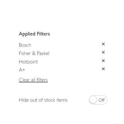
Display “Applied Filters” in an Overview (32% Aren’t Using the Best UX Practices for Filtering)
October 6, 2020 Popular
Baymard Update: 117 New ‘Mobile UX’ Guidelines and 9,000+ Mobile Examples Uncovered During 2020
September 1, 2020
4 Design Patterns That Violate “Back” Button UX Expectations – 59% of Sites Get It Wrong
July 20, 2020 Popular
Checkout Optimization: From 16 Form Fields to 8 Fields (keynote presentation)
June 21, 2019 Popular
The ‘Order Returns’ Experience is Critical for Customer Retention — Yet 54% of Sites Have a Returns Interface with Substantial UX Issues
June 3, 2019 Popular
Have Direct Links to ‘Return Policy’ and ‘Shipping Info’ in the Footer (20% don’t)
January 16, 2019
Order Cancellation Request: Have a ‘Cancellation Requested’ Order State
June 18, 2018
Remove Select Features When There’s Only One Option Left (14% Don’t)
December 12, 2017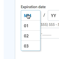
5 Common Usability Pitfalls of Custom Designed Drop-Downs (31% Have Drop-Down UI Issues)
November 14, 2017 Popular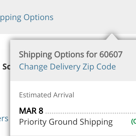
Product Pages Need to Show ‘Estimated Shipping Costs’ (Yet 43% of Sites Don’t)
June 20, 2017
Truncating Additional Images in the Gallery Causes 50-80% of Users to Overlook Them (30% Get it Wrong)
June 6, 2017 Popular
Product Page UX: All Products Need at Least One ‘In Scale’ Image (28% Get It Wrong)
May 30, 2017 Popular
7 Navigational Implementations that Make Kohl’s Best-in-Class
February 28, 2017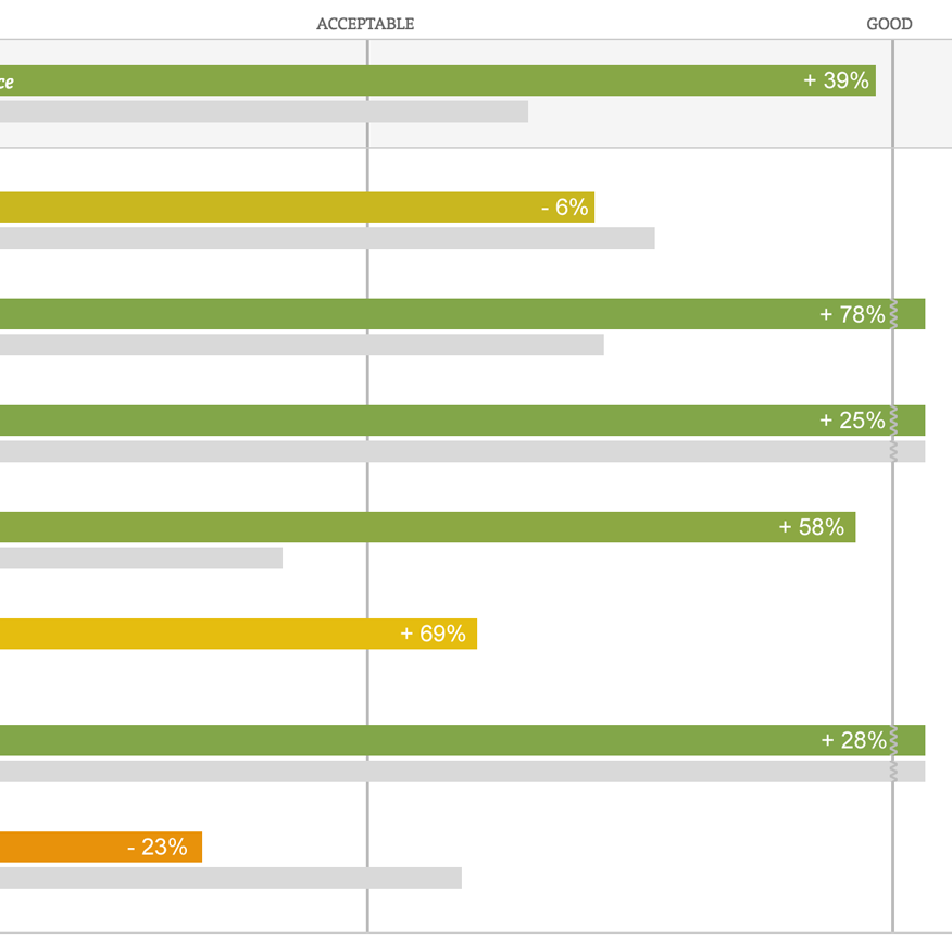
The Current State of Homepage & Category UX (Performance Is Up 39% Since 2013)
February 7, 2017
The ‘Credit Card Number’ Field Must Allow and Auto-Format Spaces (80% Don’t)
January 11, 2017 Popular
Hover UX: Use Synchronized Hover Effects & Unified Hit-Areas (76% Don’t)
August 16, 2016
External Article: 10 Requirements for Making Homepage Carousels Work for End-Users
July 6, 2016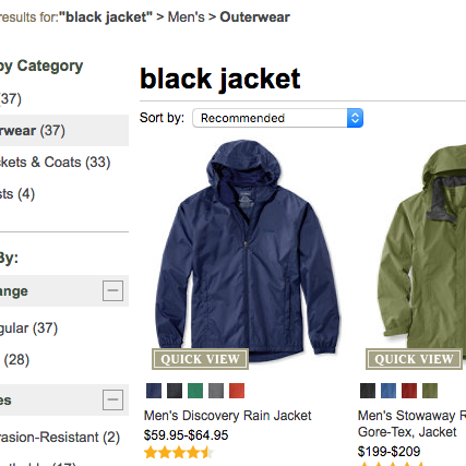
Product Thumbnails Should Dynamically Update to Match the Variation Searched For (54% Don’t)
May 24, 2016
Product List and Category Navigation: Highlight Items Already in the User’s Cart (96% Don’t)
April 19, 2016
UX Research: 7 Reasons B&H Photo’s Mobile Site is Best-in-Class
March 8, 2016
42% of Mobile Homepages Risk Setting Wrong Expectations for Their Users
February 17, 2016 Popular
Mobile Usability: Allow Users to ‘Search Within’ Their Current Category (94% Don’t)
February 2, 2016
Mobile Gestures: 40% of Sites Don’t Support Pinch or Tap Gestures for Product Images
January 12, 2016
‘Touch Keyboard’ Implementations Have Improved Just 9% Since 2013 (60% Still Get it Wrong)
December 15, 2015 Popular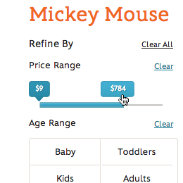
Improve Form Slider UX With These 5 Requirements for Slider Interfaces
September 15, 2015
7 Filtering Implementations That Make Macy’s Best-in-Class
July 1, 2015
E-Commerce Sites Need Multiple of These 5 ‘Search Scope’ Features
August 13, 2014
E-Commerce Sites Should Include Contextual Search Snippets (96% Get it Wrong)
July 15, 2014
6 Guidelines for Truncation Design
May 21, 2014 Popular
Avoid Inline Scroll Areas (26% Get it Wrong)
May 6, 2014 Popular
Sub-Sub-Category Links: a Vital Feature in E-Commerce Navigation (52% Get it Wrong)
February 18, 2014
Featured Products Should Also Link to Their Categories (43% Get it Wrong)
January 21, 2014
ROCI: Return On Click Investment
September 10, 2013
How to Recoup 30% of “Card Declined” Abandonments
August 13, 2013
The “Just Copy Amazon” Fallacy
July 2, 2013
Mobile Product Lists Need Very Distinct Hit Areas
May 21, 2013
How Should Your Mobile and Desktop Sites Differ?
May 7, 2013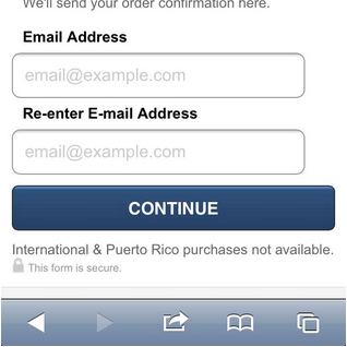
Field Label UX: Place Labels Above the Field
March 19, 2013 Popular
Which Site Seal do People Trust the Most? (2013/2016 Survey Results)
January 22, 2013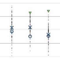
A Holistic View on the Current State of Checkout Usability
November 20, 2012
Accordion Style Checkouts – The Holy Grail of Checkout Usability?
September 18, 2012 Popular
Checkout Experience: Don’t Require Seemingly Unnecessary Information (61% Get it Wrong)
July 31, 2012
3 Types of False Simplicity
June 6, 2012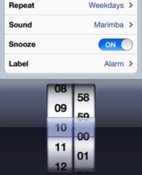
Designing With Metaphors & Skeuomorphs
May 8, 2012
UI: Proper Indicators for Hidden Elements
April 25, 2012
UX: 7 Types of Product Images
March 6, 2012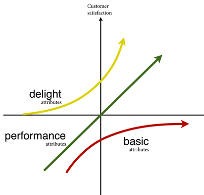
UX and the Kano model
February 7, 2012 Popular
Copywriting: How to Write Useful (Yet Intriguing) Headlines
January 10, 2012
16 Ways to Make Your Website Seem More Trustworthy
November 1, 2011
User Expectations Trump “Persuasive Design”
October 11, 2011
Google’s (for now) Novel Approach to “Must Read” Instructions
September 20, 2011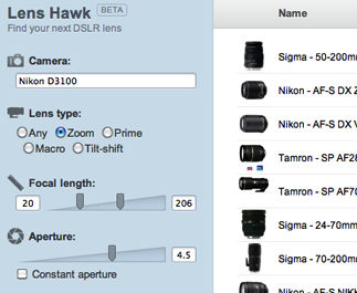
Case: 7 UX Considerations When Designing Lens Hawk
September 6, 2011
E-Commerce Without the Website
August 2, 2011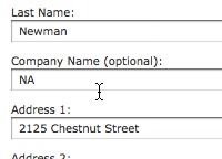
Observation: Users Will Go Far to Avoid Repeat Form Errors
July 12, 2011
Poor Copywriting – the UX Problem That Will Never Go Away?
June 7, 2011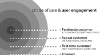
Circles of Care: Segmenting User Engagement
May 24, 2011
One Page Checkouts – the Holy Grail of Checkout Usability?
April 26, 2011 Popular
10 Ideas for Crafting a Better ‘About’ Page
April 14, 2011
Home Page Strategy: Category vs. Product
March 22, 2011
UX Lessons Learned from Buying Petfood
March 15, 2011
A/B Testing: Begin with a Problem and Hypothesis
February 16, 2011
9 Ways to Simplify ‘Sign In’
February 8, 2011
19 Ways to Simplify ‘Sign Up’
January 31, 2011 Popular
User Expectations: Create an Illusion of Space
January 7, 2011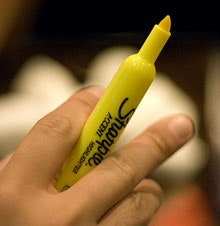
Scannability: How to Highlight Text on the Web
November 30, 2010
Redefining the Customer Experience with Augmented Reality
November 22, 2010
The Serial Position Effect in Web Design
October 23, 2010
3 Examples of Inline Help
September 24, 2010
The Conversion Rate Optimization Industry in 2015
June 6, 2010
Comparing Conversion Rates is Nonsense
May 9, 2010
Customers Perceive Only Parts of a Checkout-page as Being Secure
April 28, 2010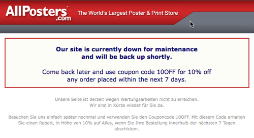
Handling Technical Glitches Without Losing Sales
April 10, 2010
Contextual Words like “Continue” are Usability Poison
March 15, 2010
Silverback: Screen Recording for Usability Studies
February 24, 2010
A Preparation Checklist for Conducting Web Usability Studies
January 26, 2010
Making a Slow Site Appear Fast
November 28, 2009
How to Lower Your Chargeback Rate
November 13, 2009
CAPTCHA Can Kill Your Conversion Rate
November 4, 2009
Subliminally Directing Visitor Attention Towards Your Page’s Goal
October 20, 2009
How I Increased Newsletter Sign-Up Rate 274%
October 4, 2009
Conversion Design: the Real Purpose of Web Design
September 29, 2009
