Cancelling an online order can often be a task that’s fraught with anxiety. Most users understand there’s a limited amount of time available to cancel an order, and are anxious to avoid having to go through the hassle of actually returning a product if the order can’t be cancelled.
Therefore, we observe that users are highly attuned to communications during and immediately after they’ve performed a cancellation request — they want to know if their cancellation request has been received, whether it’s being processed, and whether it’s been accepted or denied.
However, our large-scale Self-Service E-Commerce usability testing shows that many sites fail to recognize the “Cancellation Requested” order state. Without this state, users are left in an ambiguous transition between “Order Placed” and “Shipped”, where the order’s accurate state is unclear until the cancellation is processed.
In this article, we’ll discuss the test findings from our Accounts & Self-Service E-Commerce usability study related to cancellation order states.
Cancellation Requests and the Order Status Interface
Every e-commerce setup has its own set of logistical constraints when it comes to cancelling an order. For instance, some sites may be able to process a cancellation immediately after the user clicks the “Cancel” button, others will take up to an hour, and still others may take a full business day.
While long wait times will invariably have a negative impact on the user’s experience, we observed in testing that the interfaces and content associated with these experiences can also alleviate some of the friction and frustration.
Immediately after submitting a cancellation request, users are often presented with an interface that neglects to provide an accurate overview of the order’s current state, leading to the assumption that their request wasn’t received.
When processing an order cancellation, use of a “Cancellation Requested” order state, especially in the moments immediately after the request, may mitigate some of the ambiguity of the order’s current state.
First, a “Cancellation Requested” order state should be recognized across the entire e-commerce system. Many sites have a order state for “Order Received” and “Order Shipped”, but fail to have one for “Cancellation Requested”. This leaves users in doubt regarding the current status of their order after they’ve requested a cancellation — prompting some to reach out to customer service to clarify, or simply be in doubt regarding the status of the order.
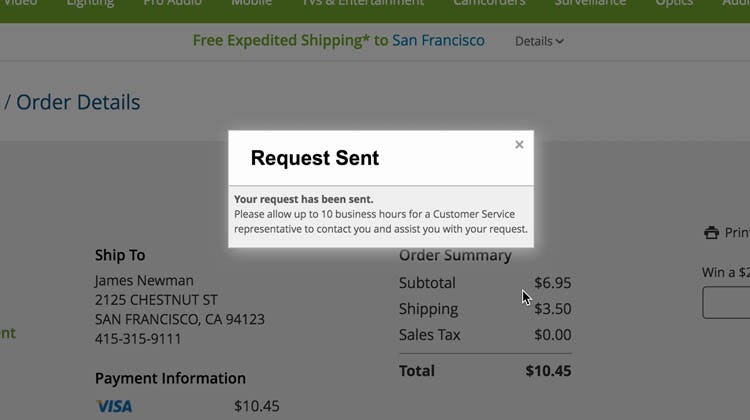
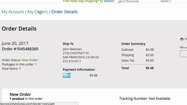
“I would like a verification, but since they said it would take 10 hours for something to get to me, I’m assuming that’s how long it’s going to take”. An overlay at B&H Photo provided this user with a timeline regarding how long it would take for customer service to contact her, but it’s unclear whether or not the cancellation would actually be accommodated (first image). Furthermore, when the user closed the cancellation overlay, the ‘Order Details’ page contained no record of the cancellation-request confirmation (second image).
Next, the precise wording of the the “Cancellation Requested” notification on the order status interface is crucial to users’ ability to manage the cancellation process unassisted. During testing, 42% of users trying to cancel an order were confused by ambiguous cancellation messaging after submitting their cancellation request — for instance, “We’ll do our best to cancel the order”. Many of these users were inclined to contact customer service for clarification.
Even if it’s undetermined whether the order can actually be cancelled at the moment of the cancellation request, more-specific messages are likely to be better received by users — at a minimum clarifying the expected wait time and next steps. For example, “You’ll receive an email in the next 1–2 hours detailing if the order has been cancelled”.
Furthermore, any cancellation-request confirmation should persist on the order status interface page. A permanently visible confirmation — as opposed to, for example, a temporary overlay — ensures that most users will see the confirmation, helping to alleviate their anxiety regarding the cancellation request.
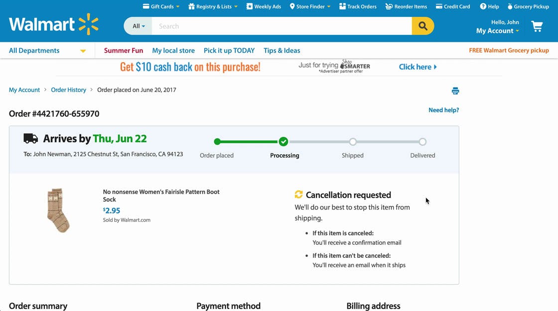
“Well, now it says ‘It cannot be canceled’…Then I’ll have to receive it and send it back — that’s annoying”. Many users misinterpreted Walmart’s cancellation message to mean that the request had been denied. In fact, in an effort to provide users with comprehensive information regarding the cancellation request, Walmart’s cancellation-requested message ended up confusing many users during testing. Furthermore, note the arrival date remains (“Arrives by Thu, Jun 22”), as well as the order status of “Processing”, making the current order status even more difficult to determine.
However, even if a site uses persistent and unambiguous cancellation messaging, that messaging can be undercut by contradictory text elsewhere on the interface. For example, after a user has requested a cancellation and seen the cancellation-request message, having outdated order statuses such as “Processing” and “Will arrive by” will understandably be confusing to users — which order status message is the “real” message?
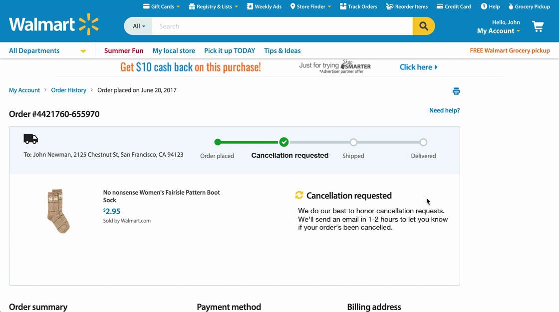
This mockup we’ve created illustrates how the order status interface could be updated after a cancellation request from a user. Note the lack of contradictory information and the brief note describing the next step.
These contradictory pieces of information are difficult, if not impossible, for users to correctly interpret, and therefore order statuses should be immediately updated to reflect the actual current status of the order (e.g., “Cancellation Requested”).
Cancellation Requests and Confirmation Emails
While having clear, permanent “Cancellation Requested” messaging is helpful, it’s not enough by itself. Indeed, after initiating an order cancellation during testing, 28% of users went directly from the site’s order status page to their email inbox to check for a cancellation confirmation. If the message is slow to arrive — or is never sent — users will feel like their request hasn’t been acknowledged — at which point they may again turn to customer support for assistance.
While it might not be logistically possible to cancel an order as soon as it’s requested, it is helpful to send a cancellation-request confirmation email immediately, using a “Cancellation Requested” order state if the cancellation can’t be confirmed immediately. This approach is especially useful for sites where it may take longer than an hour to process a cancellation, since it at least communicates to users that the cancellation request has been received.
Additionally, a secondary goal of this “Cancellation Requested” email is to provide an overview of possible outcomes, such as an accepted cancellation or a rejected cancellation, a timeline for when users should expect to be notified of the outcome, and ways users can get help with their request if they need it.
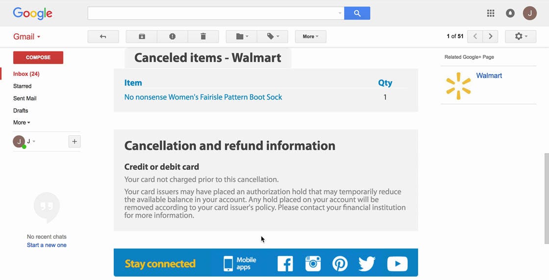
Walmart sent this user an email confirming that the cancellation request was successful, letting the user know the cancellation task was complete.
Once the cancellation has been processed, it’s also important to send users another confirmation email, indicating whether the cancellation request has been accepted or rejected, and providing other secondary information and paths to get help if needed.
Alleviate User Concern over Cancellation Requests
Clear messaging, whether on the order status page or through confirmation emails, is key to relieving users’ anxiety over the cancellation process. In the end, though, what users really care about is whether an order has been successfully cancelled, and, specifically, how payment is impacted.
If the payment method has not been charged for the initial order, this should be explicitly stated on the order status page and in the cancellation emails. If the user has already been charged, then information about the wait time and the process for receiving the refunded money should be explicitly mentioned.
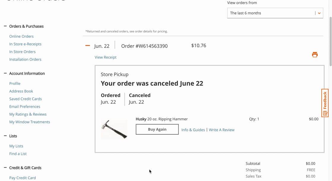
At Home Depot, the order status page is immediately updated after a user completes a cancellation request. Note the large font size for the message stating the order has been cancelled, and the indication that $0 were charged for the order.
Finally, it’s important to note that a “Cancellation Requested” status and a confirmation email are not needed for sites that can always process every single cancellation request within milliseconds after users click the “cancel” button. Users should still, of course, be informed of the successful (or unsuccessful) outcome of their cancellation request.
This article presents the research findings from just 1 of the 640+ UX guidelines in Baymard Premium – get full access to learn how to create a “State of the Art” Accounts & Self-Service user experience

