With the end of an unusual 2020 nearing, here’s an overview of:
- Baymard’s 10 most popular UX research articles in 2020,
- the new UX research and features we’ve added in 2020,
- the 8 new team members & our open UX Auditor position, and
- what new research we have planned for the first half of 2021.
10 Most Popular Articles in 2020
The most popular UX research articles we published in 2020 were:
- The Current State of Checkout UX – 18 Common Pitfalls
- Always Explain Why the ‘Phone’ Field Is Required – 58% of Sites Don’t
- Always Use Thumbnails to Represent Additional Product Images – 76% of Mobile Sites Don’t
- Product List UX: The Number of Products to Load by Default – 52% Get it Wrong
- Six ‘COVID-19’ Related E-Commerce UX Improvements to Make
- 6 Important Aspects of Well-Performing Mobile Product Page Breadcrumbs
- Use a Fake ‘Editing’ Flow When Users Try to Update Their Stored Credit Card – 84% of Sites Don’t
- 5 ‘Credit Card Form’ Implementations That Make ‘L.L. Bean’ Best-in-Class
- Mobile UX: Avoid Using Subpages within the Product Details Page – 26% Don’t
- 4 Design Patterns That Violate “Back” Button Expectations – 59% of Sites Get It Wrong
New UX Research & Features in 2020
During 2020 we’ve conducted and published 16,500 hours of new UX research, and on top of that deployed a number of site and tool improvements. The four most significant projects we completed during 2020 were:
199 New ‘Mobile UX’ Guidelines and 9,000+ Mobile Examples Uncovered During 2020
We published 199 new mobile UX guidelines based on extensive mobile usability testing. We subsequently conducted a new 2020 mobile UX benchmark providing you 9,000+ new mobile best- and worst-practice examples. This completes our mobile web UX research project (but 2021 Mobile App UX research is already underway).
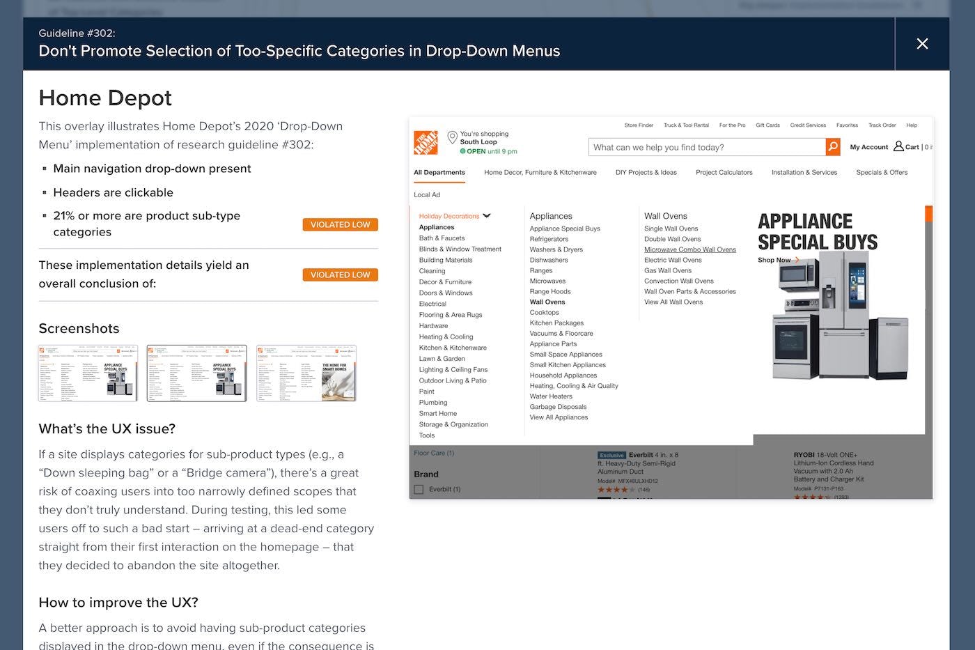
All New Benchmarks Show ‘Implementation Breakdown’ and ‘UX Advice’
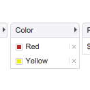
All new benchmarks published by Baymard will feature a much more detailed view of the actual site implementation assessed. The new implementation overlay (as seen above) will show you the actual assessment selections made for each of the 70,000+ UX performance ratings in the Benchmark tool, for the 40,000+ annotation pins in the Page Design tool, and for the 40,000+ Best- and Worst Practice examples found across the Guidelines.
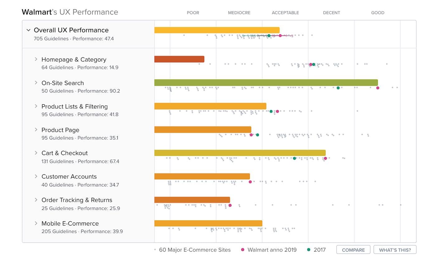
42,000 Historic UX Performance Scores Published
All benchmark UX performance scorecards now show historic Year-Over-Year performance comparisons, comparing the site’s current year (the bar chart) with the site’s past UX performances from our past benchmarks. In practice, this means that the benchmark case study pages will now, by default, show you 42,000+ extra UX performance ratings on top of the current year’s performance ratings.
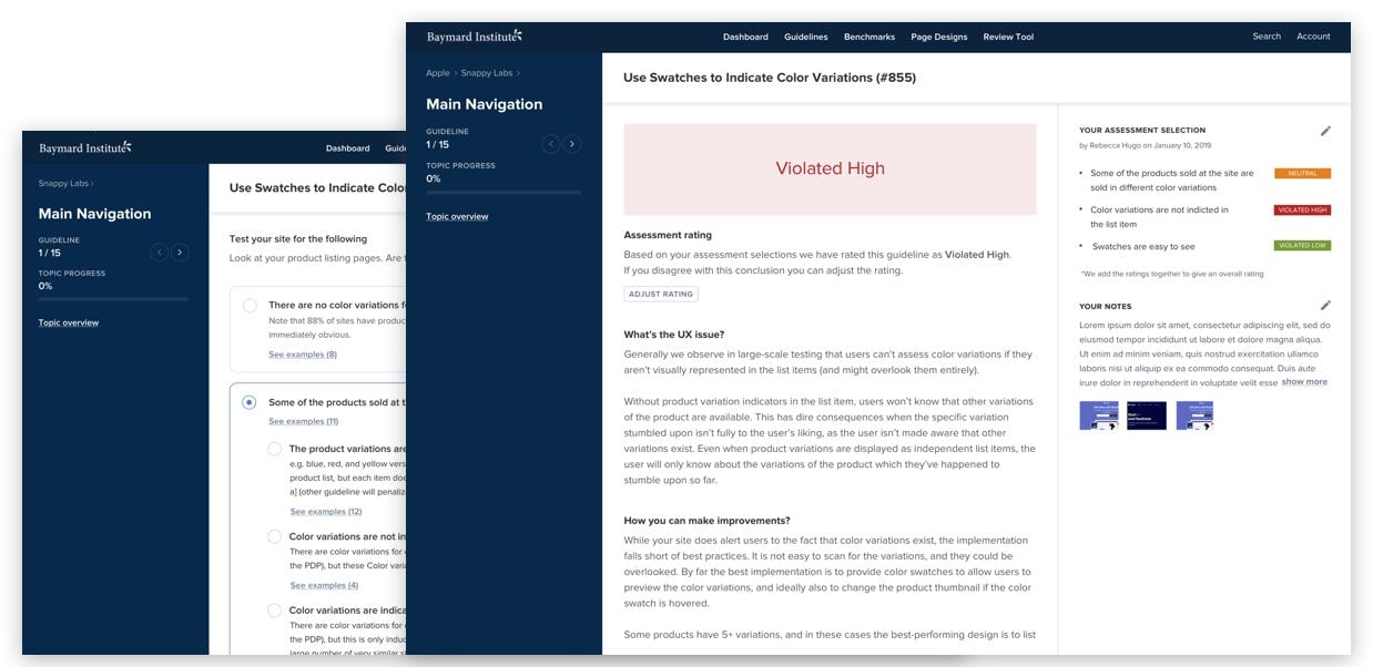
New ‘Review Tool’ with 7,000+ Scenarios Based on 9 Years of Auditing Experience
Most of Baymard’s development team have spent close to one full year building a completely new version of the Review Tool available in Baymard Premium.
The Review Tool allows you to self-assess your own, a competitor’s, or a prototype website, against any of the 800+ guidelines available in Baymard Premium. This allows you to get detailed research-backed instructions for how to improve UX, to document the site’s topic-level UX performance, and to compare it to any top 60 site’s e-commerce performance.
The tool is based on 7,000+ site implementation scenarios, that are each traced back to specific findings among Baymard’s 54,000+ hours of UX research. This enables you to create highly accurate and repeatable heuristic evaluations.
8 New Team Members & Our Open UX Auditor Position
In 2020 we welcomed 8 new team members to Baymard – and we are currently hiring one more UX Auditor in EMEA (deadline: Monday, 20 December 2020).
First Half of 2021
Looking ahead to 2021, we’re conducting 4 new UX research projects in parallel. Just this week the research team at Baymard wrapped up 800+ new user/site test sessions, which we’ll spend 2021 Q1 and Q2 analyzing and publishing:
- New ‘Mobile Apps’ UX research study: we’re conducting a new UX research study on ‘Mobile Apps’ to pinpoint the exact differences and similarities between mobile app and mobile web UX.
- New ‘Digital Service Subscriptions’ & ‘Physical Products Subscriptions’ UX research studies: we’re conducting a new UX research study on both digital service subscriptions (software as a service, both B2B and B2C), along with a smaller study of physical product subscriptions (e.g., meal kits).
- New ‘DTC/Single Brand sites with Small Product Catalog’ UX research study: we’re conducting a new UX research study on ‘Direct To Consumer’ / ‘Single Brand’ sites with a small product catalog (think sites like Fitbit, GoPro, etc.), within apparel, cookware, consumer electronics, and beauty. This study seeks to uncover both the unique UI challenges facing brands with a DTC website, along with navigational differences needed for sites that only have a very small product catalog (e.g., less than 25 products).
- New ‘E-Commerce Accessibility’ study: we’re creating an E-Commerce Accessibility study to provide the community both highly actionable accessibility guidelines specifically for the page types and UI elements found on e-commerce sites, and to update around 150 of the existing Baymard UX guidelines with accessibility implementation considerations (WCAG 2.1 AA compliance).
On top of this we will very soon release our new benchmarks on ‘B2B E-Commerce’, ‘Mobile Apps’, and updated benchmarks for ‘Homepage & Category’ and ‘Product Lists & Filtering’.
Tip: You can see a full breakdown of all changes on our Roadmap & Changelog page, or subscribe to our Quarterly Newsletter to get 4 emails per year summarizing what new UX research we’ve released.
We’re looking forward to 2021.
– Christian, Jamie, and the entire Baymard team


