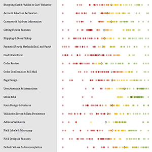
New UX Research in 2018: In 2018 we’ve launched our Account & Self-Service study (65 guidelines on topics such as the “Account” drop-down and dashboard, address books, stored payment methods, order tracking, order returns, and more), along with a new Search UX benchmark and a new Product Lists & Filtering benchmark. Additionally, the 10 top European e-commerce sites are also now benchmarked.
In 2018 we also consolidated all of our UX research efforts into the new Baymard Premium research catalog which now provides you with 32,000+ hours of UX research findings, all distilled into 642 design guidelines, 50,000+ UX performance scores, and 27,900 performance-verified best- and worst-practice implementation examples, and includes automatic access to all new research and more.
Team Expansion in 2018
We’ve also expanded the team significantly, so we’re now 14 full-time at Baymard. Most are UX researchers & auditors, but we now also have a few developers, and the majority of the team is US-based. For you this means that we’ll now conduct and release approximately 9,500 hours of new UX e-commerce research every year. On top of this our developer team adds another 4,700 dev hours worth of new features.
Christian Holst (DK)
Jamie Appleseed (NL)
Christian Vind (DK)
Edward Scott (US)
Lauryn Smith (US)
Mark Crowley (IE)
Juan Gomez (US)
Steffen Haferbier (DK)
Nancy McCrave (US)
Karolina Rukaite (DK)
Jan Jorgensen (US)
Rebecca Hugo (UK)
New Features Added in 2018
In 2018 we’ve added a series of new features, so you now have:
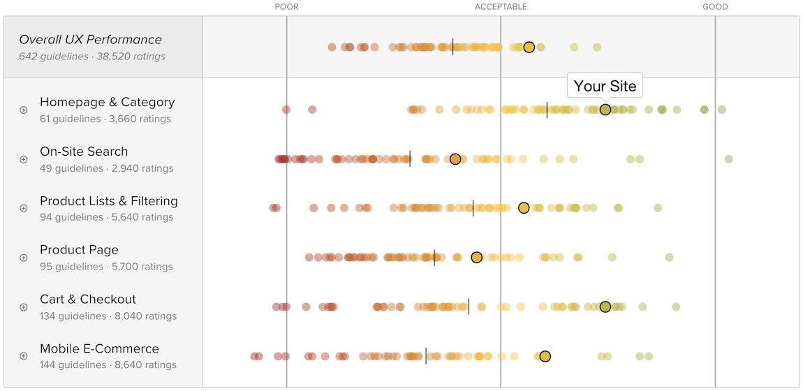
- An additional meta benchmark layer that summarizes the overall e-commerce performance of 60 major e-commerce sites. We no longer just show who has “the best Cart & Checkout experience” — we now also show who has “the best overall e-commerce UX” across all six benchmarked e-commerce themes.
- A new self-adjusting UX performance-scoring logic that better accounts for the changes that occur over time in both users’ expectations and the competitive landscape (see methodology).
- An improved Page Design tool.
- A “comparison mode” that allows you to compare any of the 60 sites in the benchmark database against another, or against any UX audit performance scorecard that Baymard’s researchers have created for you, or against any scorecard you have created yourself in the Review Tool. (Premium only)
- An exam & certification program for “Certified E-Commerce UX Professional by Baymard Institute”. This certification is only given to those who pass six difficult and detailed exams — this is our way of ensuring that those who are certified possess a high level of UX e-commerce research knowledge and know how to apply it in practice. So far 38 people are certified. (Premium only)
First Half of 2019
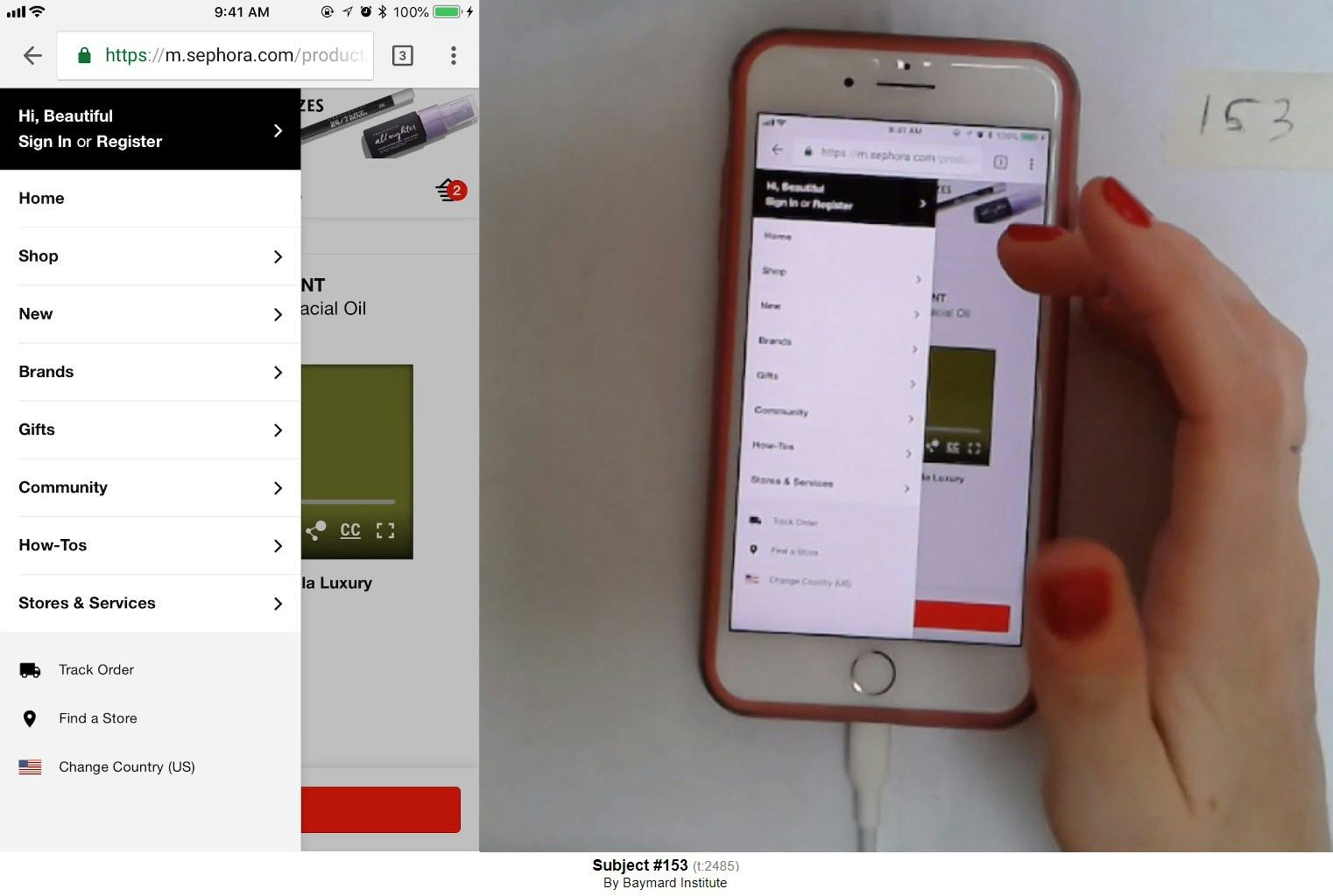
We are currently well into our new Mobile E-Commerce UX study, which will be the most comprehensive study we’ve ever conducted. During this round of large-scale usability testing of mobile e-commerce sites the mobile users encountered a massive 2,597 usability issues, which reveal:
- A host of new mobile user behavior specific to e-commerce
- Where mobile websites need to deviate from desktop (especially relevant for responsive sites)
- A series of new mobile design patterns that cause massive UX-performance issues.
While the wait was a bit longer than first anticipated, we’ve analyzed most of this massive dataset, and are about to release the first set of findings in January, after which new findings will gradually be released during the following months.
In 2019 we’ll also release a series of new UX benchmarks, including Accounts & Self Service (January 2019), Checkout, Mobile E-Commerce sites, Product Details Pages, and Homepage & Category Navigation — leading to even more implementation examples and UX-performance scores.
All the findings from the new Mobile UX research study and the new benchmarks will be made available automatically to all users on Baymard Premium.
10 Most Popular Articles in 2018
Lastly, here’s the list of 10 of the most popular articles this year:
- Form Field Usability: Avoid Multi-Column Layouts (13% Get It Wrong)
- PDP UX: Core Product Content Is Overlooked in ‘Horizontal Tabs’ Layouts (Yet 28% of Sites Have This Layout)
- Drop-Down Usability: When You Should (and Shouldn’t) Use Them
- Format the ‘Expiration Date’ Fields Exactly the Same as the Physical Credit Card (90% Get It Wrong)
- E-Commerce UX: Allow Users to Combine Multiple Filtering Values of the Same Type — an ‘OR’ logic (32% of Sites Don’t)
- E-Commerce Checkouts Need to Mark Both Required and Optional Fields Explicitly (Only 14% Do So)
- Offer ‘Delayed Account Creation’ at the Confirmation Step (38% Don’t)
- Self-Service UX: ‘Cards’ Dashboards Must Be Highly Consistent and Appropriately Styled
- Structuring Product Page Descriptions by ‘Highlights’ Increases User Engagement (Yet 78% of Sites Don’t)
- Allow Users to Purchase Temporarily ‘Out of Stock’ Products by Increasing the Delivery Time (68% Don’t)
We’d like to thank all our new and repeat customers for our research studies and for UX audits that we’ve served throughout 2018. Looking forward to a great 2019 with you!
– Christian, Jamie, and the entire Baymard team


