When I talk to people new to the world of A/B testing, I all too often hear something like:
“I saw this example of a site that changed the color of their ‘Buy’ button and got a YY% increase, but when I implemented the same it converted worse than my original!”
The problem with this “dive right in” approach of testing minor design changes without a clearly defined problem is that if the new version doesn’t increase conversions you’ve learned practically nothing, and if it does work, you aren’t really sure why.
Problem & Hypothesis
A better approach is to take one step back and instead do the following two things before diving into test variations for e-commerce conversion rate optimization:
- Determine the problem you are going to solve, such as a high bounce rate on your landing page or a high abandonment rate at step 2 during your checkout process. This gives you a clear idea of the problem your new designs should solve, as well as the criteria for success – did the bounce rate lower on your landing page?
- Articulate a hypothesis as to why you believe the problem occurs, such as “our customers leave because they don’t immediately understand the product’s features” or “our customers don’t trust the claims on our marketing site”.
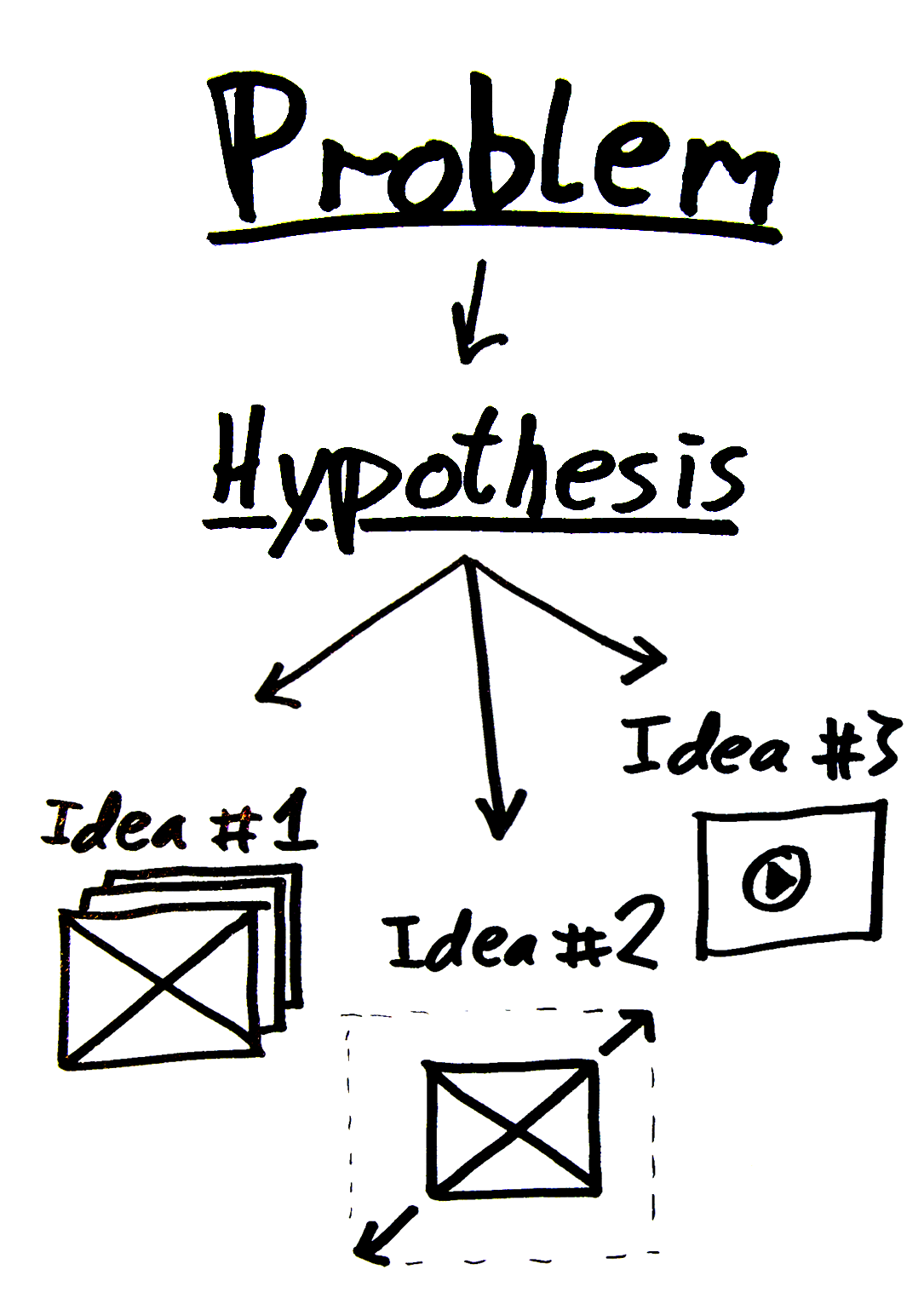
Start with a problem, then a hypothesis, and finally concrete test ideas.
Once you’ve 1) determined the problem and 2) articulated a hypothesis, you’re ready to brainstorm on actual split-test variations. With a clearly defined hypothesis you can easily come up with truly different variations, instead of testing yet another trivial tweak of the same old idea “change button color from green to red”.
Say your hypothesis is “our customers don’t trust the claims on our marketing site”. Then you might try out various solutions such as: placing a customer quote right below the headline, adding a video “proving” your claims, extending your return policy with 2 weeks, etc.
These are all substantial changes that are likely to make a real impact on the performance of the page. The result might be positive or negative, but in either case, you tested something substantial and came a step closer to learning something meaningful about your audience, instead of “they like ‘red’ buttons better than ‘green’ buttons”.


