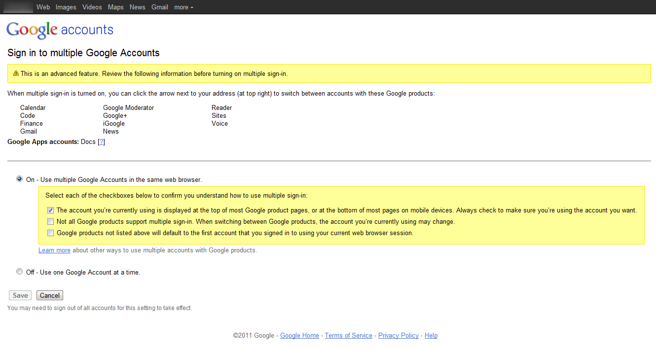
Google is making sure people understand the implications of using multiple Google accounts before enabling this feature.
Web users scan your text, skip paragraphs, click the button that looks like the ‘next’ button, decide whether to stay on your site (or not) within seconds, close anything that resembles a pop-up, and don’t read instructions.
This introduce an interesting dilemma when designing user interfaces for web applications: What do you do if you absolutely must pass on highly critical information to your users?
Here’s how Google do it when you activate “Sign In to Multiple Google Accounts”:
Google asks you to confirm each of these three implications of using ‘Sign In To Multiple Google Accounts’.
Instead of the widely used “I Accept / Understand” checkbox (typically seen for accepting Terms of Service when creating an account), Google takes it one step further by cutting the critical part of the message down to 3 separate ultra short descriptions, each of them with its own checkbox the user has to click before the “Save” button is enabled.
In more general terms this is just another pit stop in the never-ending spiral of attention slip. As this solution gains traction, it’s only a matter of time before some websites will start “abusing” the approach, using it for non-critical instructions and sales messages. After a while, users will grow accustomed to this configuration and will eventually afford it the same (extremely low) level of attention they afford “Accept terms” checkboxes nowadays.
For now, however, the approach is novel and well-designed.


