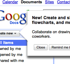
We’ve previously looked at how Google Chrome’s page translate feature had ambiguous copywriting that could leave first time users in doubt over whether Google would translate the page for them, or if the user himself could suggest a translation for it:
Does Google offer to translate the page? Or are they asking me to do the translation?
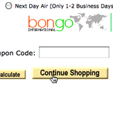
We’ve also reported how multiple e-commerce stores leave customers in doubt because of the use of contextual words like “Continue” and “Back” (when used as button text):
‘Continue’ is a contextual word which tends to confuse users – even when combined with additional explanation such as here.
The other day when Jamie connected his iPhone to the computer he got the following warning from iTunes:
Will clicking ‘Continue’ potentially cost me my purchases?
Does clicking ‘Continue’ mean the files will be transferred to the library or that the update will commence and the purchases potentially be lost? Simply writing “Update anyway” or “Transfer files” as button text would have resolved any doubt.
A Problem That Will Never Go Away?
Poor copywriting (from a UX writing perspective) can be almost impossible to spot if you know too much about the product/service/interaction. The moment you know the right way to interpret the text, you’re damned by The Curse of Knowledge, unable to see the ambiguity of your text because the meaning is inherent to you. This often leave the ones most likely to get the error fixed - programmers and UX designers - blindfolded.
This makes me wonder if poor copywriting is the UX problem that is the most difficult to get rid of? Or is it simply that most companies underestimate the impact copywriting has on the user experience?


