We first benchmarked touch keyboard implementations across 48 leading mobile e-commerce sites back in 2013 and now again in 2015, and sadly, touch keyboard implementations have only improved by a measly 9%.
This latest 2015 benchmark reveals that 54% of mobile sites fail to invoke optimized touch keyboards for either phone, ZIP code, or credit card form fields. And even among the sites that do invoke these special touch keyboards, 25% fail to do so consistently throughout their checkout flow.
Good touch keyboard usability of course goes beyond simply invoking the most appropriate touch keyboards available (e.g. a numeric keyboard for credit card field). During our large-scale mobile e-commerce usability study, we found that configuring auto-correction and auto-capitalization settings appropriately were important to mobile form field usability as well. The settings and combinations for these differ on a field-by-field basis, with auto-correction and -capitalization being neglected by 79% and 27% of mobile sites respectively.
In this article we’ll therefore dive into the 5 guidelines on user-friendly touch keyboard implementations from our mobile usability study which lay the foundation for a good mobile form filling experience. We’ll also look at stats from our 2013 and 2015 benchmark of touch keyboard implementations across 48 major mobile e-commerce sites to see how things have developed in the past two years. Finally, the article wraps everything up with our updated Touch Keyboard Cheat Sheet (free) which includes demos and ready-to-use code for some of the most common fields types used in a typical mobile checkout flow or mobile sign-up form.
Ok, enough intro. Let’s look at those 5 touch keyboard guidelines for user-friendly mobile form fields.
1) Disable Auto-Correct When the Dictionary is Weak (79% Don’t)
Poor auto-correction is frustrating when users actually notice it, and can be downright harmful when they don’t. Auto-correct often works very poorly for things like abbreviations, street names, e-mail addresses, person names, and similar words that are not in the dictionary.
During the usability tests, auto-correction on this type of information led to numerous interruptions in the subjects’ flow. (In fact, it proved so pervasive during testing that we have considered referring to the feature as ‘auto-incorrect’.) Even worse, these auto-corrections also resulted in a great deal of erroneous data being submitted as many subjects completed their purchase without noticing a “correction” had taken place.
Notice how Amazon’s mobile site hasn’t disabled auto-correct for the address field, causing valid entries to be overwritten by auto-correct.
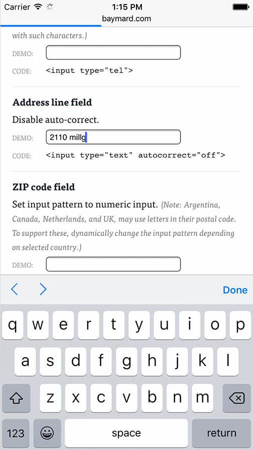
In comparison, notice how the keyboard doesn’t try to correct the user’s input in our ‘best practice’ example where auto-correct has been disabled for this field type.
During testing, the subjects were generally focused on what they were typing instead of what they had typed. In multiple instances, this led to valid addresses being auto-corrected into invalid ones, and thereafter submitted because the subject failed to notice an auto-correction had taken place. Issues like this can be downright harmful to the user experience since incorrect order information naturally leads to delivery issues, not to mention confused customers and angry calls to customer support.
Auto-correct can be disabled by adding an autocorrect attribute to the input tag and setting it to off, like this:
<input type="text" autocorrect="off" />
When benchmarking 48 leading US e-commerce sites back in 2013, just 8% disabled auto-correction for fields like Name, Address Line, and Email. Our most recent benchmark reveals that this has improved significantly, with 21% disabling auto-correct for these fields in 2015. However, that still leaves the vast majority of mobile sites risking invalid order data and certainly frustrating their customers with automatic “incorrections”.
See the Touch Keyboard Cheat Sheet for demos and code examples of the inputs that require disabling of auto-correction.
2) Show Optimized Keyboard Layouts (54% Don’t)
Unlike physical keyboards, touch keyboards can be optimized for each form field the user has to fill out. Our usability test sessions showed vastly better performance on sites that utilized these purpose-built touch keyboards, especially for numeric inputs. Yet an astonishing 54% of mobile sites fail to utilize all of the (relevant) mobile-optimized keyboards available to them!
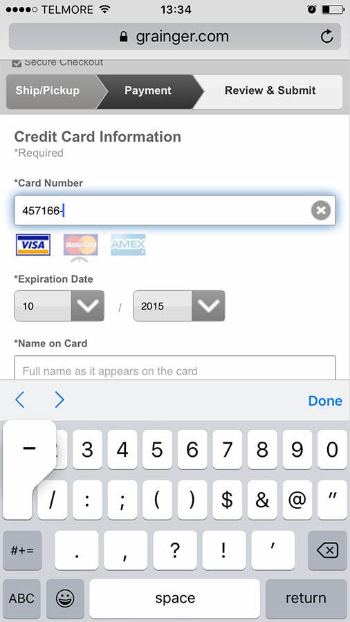
During usability testing, typos were much more common on sites that relied on the standard keyboard for numeric inputs, as seen on Grainger.
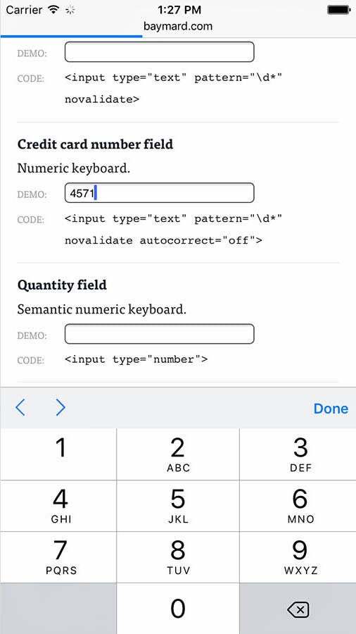
Compare this to the ‘best practice’ demo, where a numeric keyboard is invoked for the card number field, effectively increasing the hit area of each key by 521%.
On an iPhone 6S, the size and hitarea of the keys on the purpose-built numeric keyboard are 521% larger than on the traditional touch keyboard (257x109 vs 63x85 pts). Not only did the test subjects negatively comment on it when the purpose-built keyboards weren’t used at a site, we also recorded significantly more typos.
The decrease in typos on sites with numeric keyboards naturally led to fewer form validation errors, which in turn resulted in a better and more seamless shopping experience for the test subjects on those sites. Particularly long number sequences such as phone and credit card numbers benefitted from this keyboard optimization.
It’s of course crucial to provide formatting examples that users can actually type. Note how it’s impossible for the user to follow the phone formatting example at REI as the phone-optimized keyboard on iOS doesn’t allow entry of dashes or parentheses.
In general, there are three HTML attributes that will invoke the purpose-built keyboard layouts, namely the type, inputmode, and pattern, attributes. The exact attributes and values depend on the field. For instance, E-mail and Phone have special purpose-built keyboards, while other inputs such as Credit card number don’t and must instead make do with a more generic (but still optimized) implementation.
Because different fields require different attribute combinations (type, pattern, novalidate, auto-capitalize, etc.) we’ve created a Touch Keyboard Cheat Sheet with the recommended code combination for inputs such as credit card, phone, ZIP code, and quantity, to make your life a little easier. (The cheat sheet also notes things like which countries require an alphanumeric postal code deviation.)
When benchmarking the 48 major mobile sites across three fields (e-mail, phone, and credit card number), we found that support for purpose-built keyboards has only increased from 40% in 2013 to 46% in 2015. This meager improvement is fairly alarming given how easy it is to fix and just how big of an impact it can have on the user’s form filling experience for numeric inputs in particular.
3) Honor the ‘Next’ and ‘Previous’ Button Behavior
During testing, the subjects struggled with sites that failed to properly honor the “Next” and “Previous” button behavior. The expected behavior is very straightforward: when the user clicks the “Next” button they expect to be taken to the next logical field in the form without any other changes or form submissions.
The mobile checkout at Disney Store (2013 version) broke user expectations – as users tapped the ‘Next’ button the ‘State’ field was skipped and the ‘ZIP Code’ field got focused instead.
Most sites will get this right by default, and it’s mainly on form pages with dynamically injected fields, non-native fields, or altered tab-sequences where we’ve observed this to go wrong in practice. And we’re happy to say that support for correct ‘Next’ and ‘Previous’ button behavior has increased from 96% in 2013 (where Nike and Disney Store were observed to violate it), to 100% in 2015.
4) Configure Auto-Capitalization Appropriately (27% Don’t)
The default behavior on smartphones is to auto-capitalize the first letter in standard text fields, which is generally desirable. However, in some cases you will want to disable auto-capitalization since most users will actually want to enter lowercase values, or configure the field to auto-capitalize the first letter of every word because the input is going to be a name or place.
When usability testing mobile sites that – similar to Newegg – did not disable auto-capitalization in the email field, the subjects frequently went back and actively deleted the first capital letters as they feared e-mail delivery issues
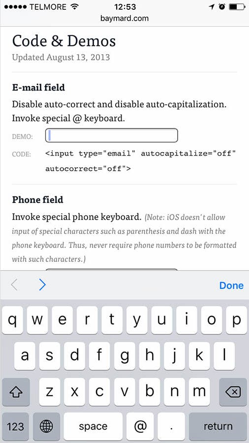
In comparison, notice how the ‘best practice’ demo doesn’t auto-capitalize the first letter as users focus the e-mail field, as auto-capitalization has been disabled.
During testing, multiple instances occurred where test subjects noticed a capitalized letter and made an active effort to delete the capital letter and replace it with its lowercase equivalent. The subjects explained that they were unsure if uppercase characters were allowed, or if email addresses in general were case sensitive. On sites that had disabled auto-capitalization in the email field, no subjects ever actively capitalized the first character. It is therefore recommended that auto-capitalization be disabled for email fields and other fields where appropriate (for example a website URL).
You can disable auto-capitalization behavior by adding an autocapitalize attribute to the input tag and setting its value to off, like this:
<input type="text" autocapitalize="off" />
Certain input types such as <input type="email"> will on recent versions of iOS and Android automatically disable auto-capitalization too. However, even for these fields we’d still recommend expliciting setting the ‘autocapitalize’ attribute since it doesn’t interfere with the behavior on those platforms and may be needed on other platforms that do not support these input types.
Another option for the autocapitalize attribute is to set its value to words. This will instruct the touch keyboard to automatically uppercase the first letter of each word the user types, which can be helpful for inputs such as names and places.
Turning off auto-capitalization for appropriate fields has improved somewhat with 60% of sites in 2013 to 73% 2015.
5) Invoke Touch Keyboards Consistently (25% Don’t)
While invoking an appropriate keyboard layout for different input fields is great (see section 2) Show optimized keyboard layouts above), be sure to do it consistently throughout your site as it can otherwise greatly confuse users.
While this advice may seem obvious, 25% of sites here in 2015 still fail to consistently invoke optimized keyboard layouts throughout their site. In 2013 it was an astonishing 52% of sites that only invoked numeric keyboards on some of their numeric fields.
Purpose-built keyboards should be invoked consistently for all inputs on the same page, unlike the above example from Urban Outfitters, where a numeric keyboard is invoked for the credit card number but not for the security code field even though both values are always supposed to be numeric.
What is perhaps even more surprising is just how confused some of the test subjects were by sites that had such inconsistent implementations. In some cases, the test subjects stopped in their tracks and began questioning their initial interpretation of the field altogether, thinking that maybe something else was required. When thinking about it, this is actually quite a reasonable logic.
Take the above Urban Outfitters example. By showing a numeric keyboard for the credit card number, the site lets the user know that this is a purely numeric input. When the site then two fields later in the form displays an alphanumeric keyboard for the (already difficult-to-understand) ‘Security Code’ input, it logically suggests that this will not be a purely numeric input, and the user naturally begins questioning their initial interpretation of the field.
9% Improvement in Touch Keyboard Implementations
If we dive a little deeper into the benchmark numbers and look at the overall quality of the touch keyboard implementations across the 48 major mobile e-commerce sites, we see that:
- In 2013, 98% of the mobile got one or more of these 5 touch keyboard guidelines wrong, and 69% got at least two wrong.
- In 2015, 85% of mobile sites now get one or more of these 5 touch keyboard guidelines wrong, and 60% get at least two wrong.
If we define getting only two of these guidelines wrong as “decent support” we get a modest 9% improvement in touch keyboard implementations over the past two years. If showing the correct keyboard type for Phone, Email, and Credit Card fields, is instead taken as the sign of basic support, the improvement is just 6%.
On a more positive note, the number of perfect touch keyboard implementations has increased greatly from 2% to 15%. In 2015, Office Depot, Target, Overstock, Kohl’s, 1-800-Flowers, Hayneedle, and Nike, adhered to all 5 touch keyboard usability guidelines.
To help improve these numbers, we’ve created a Touch Keyboard Cheat Sheet. The cheat sheet includes demos and code for common fields like Email, Phone, Addresses, Credit Card, Quantity, and Date, that outline the correct combination of keyboard type, inputmode, pattern, novalidate, autocorrect, autocapitalize, and autocomplete attributes. You can also see a detailed breakdown of the 2013 and 2015 benchmark compliance of the 48 sites on this page.
Whenever we begin to think “oh wow, mobile design is really maturing nowadays, we’re leaving the early days behind us”, it’s healthy to remind ourselves that 54% of the leading US e-commerce sites – all beyond the $50 million dollar mark in online sales – still don’t get something as basic as invoking the correct touch keyboard type right.
This article presents the research findings from just 1 of the 650+ UX guidelines in Baymard – get full access to learn how to create a “State of the Art” ecommerce user experience.


