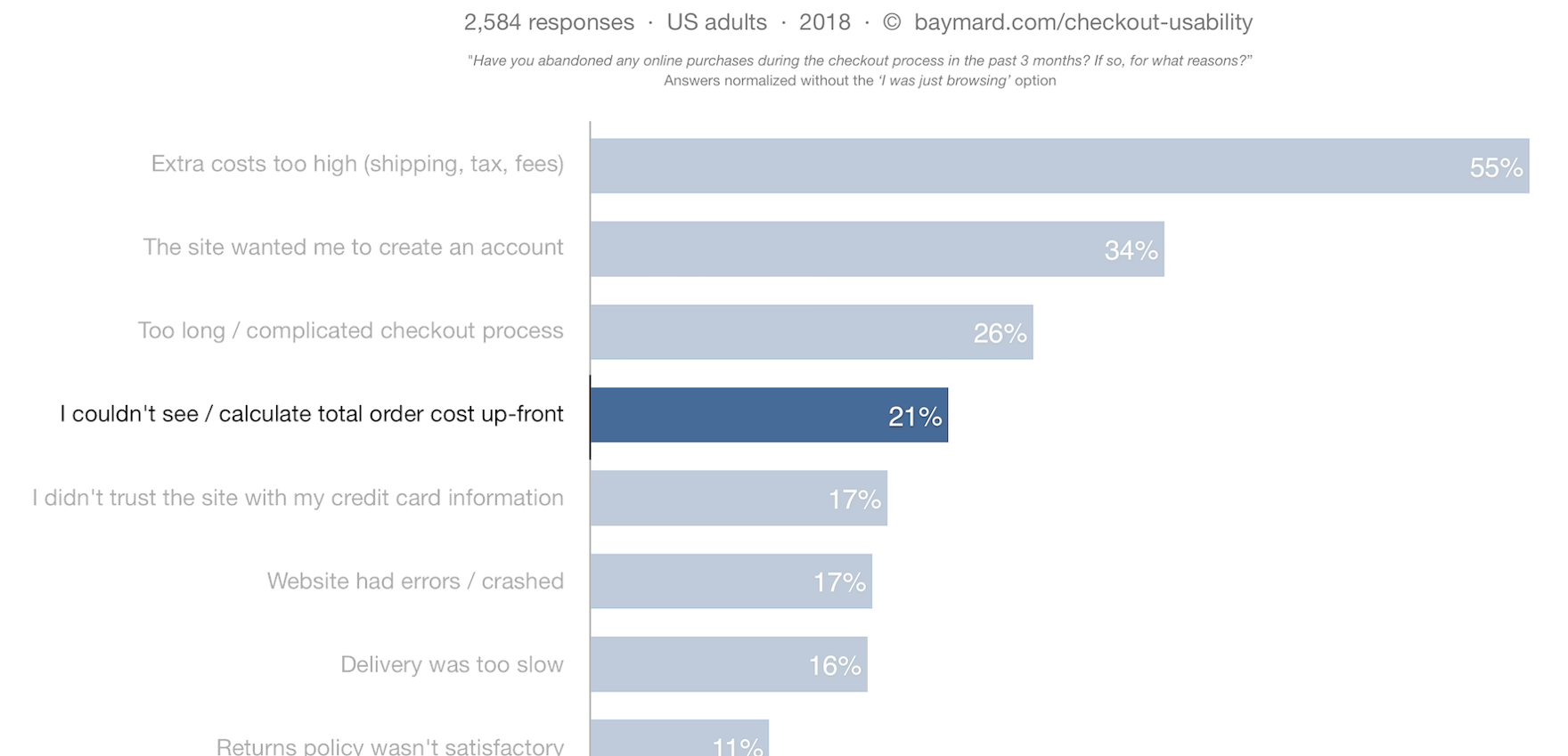
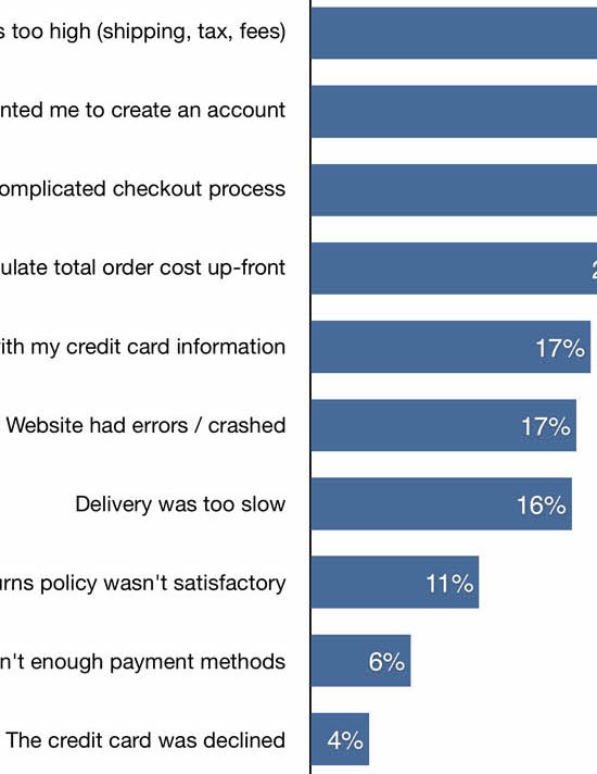
During our large-scale Checkout usability test study, we found that 21% of US online shoppers abandoned orders in the last quarter because they “weren’t able to see the total order cost upfront before initiating the checkout.” Additionally, a clear majority want to know their total order cost, before they begin filling out form fields to complete the checkout. However, users’ interest in shipping costs starts already at the product details page.
Our new Product Page study reveals that 64% of users looked for shipping costs on the product page, before deciding to add a product to the cart. For this majority of users, having an idea of the full order cost is crucial for being able to make a purchasing decision at the product page.
At the same time our Product Page UX benchmark reveals a large discrepency between user needs and site implementations, as 43% of e-commerce site do not display any kind of shipping costs or cost calculator at their product details pages.
In this article we’ll therefore cover some of our Product Page test findings that relate to showing shipping cost estimates directly at the PDP, including,
- Why users need a shipping cost estimate already on the product page
- How product price, Store Pickup, and Free Shipping tiers affect the importance of showing shipping costs
- Which design solutions were observed to perform well, along with how to handle technical challenges
The Importance of Estimating Shipping Costs on the PDP
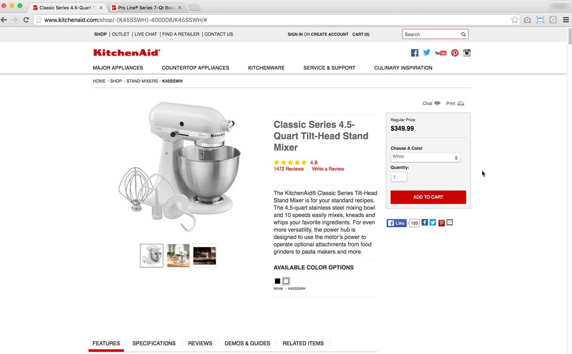
“Price now is important, but then shipping price is too. So if I’m paying $349 for it and buying it online, am I paying $50 more in shipping? And, I’d like to know that before I’m in the checkout,” one test subject complained at KitchenAid, wanting to factor the shipping cost into his purchasing decision. Across all tested sites and product types 64% of users looked for shipping costs at the product page.
64% of the test subjects looked for shipping costs on the product page, before deciding to add a product to the cart. If the shipping cost is missing from the product page, users will have to add the product(s) to the cart to even get an idea about what they will actually have to pay (assuming the site even provides it at the “Cart” step, which we’ve found that 16% of sites don’t).
In testing it was observed that this extra step of having to add the product to the cart quickly becomes tedious for users, especially if users want to compare several products or want to compare products across several sites. Unsurprisingly, we consistently observed during testing that the product pages with a shipping cost estimate somewhere on the page outperformed those that did not display any kind of estimate.
“I’ll just look at the shipping costs,” a subject said at Walmart, factoring in the shipping costs in his overall purchasing decision. Walmart place a IP geo-targeted shipping cost estimate near the “Buy” Section at all product pages. Shipping costs were shown to be more important to users when they constitute a greater percentage of the product price.
However, the importance of shipping costs to users will vary depending on the product they are considering purchasing. For lower-priced products, where shipping costs are likely to be a high percentage of the product price, shipping costs figure highly in users’ product-purchasing decisions, while for higher-priced products, where shipping costs will often be a lower percentage of the product price, shipping costs are less important.
For example, a user considering purchasing a DVD that costs $4.34 was observed to be more likely to hesitate if shipping costs $4.97 (greater than 100% of the product price), as opposed to a user considering purchasing a camera for $400 when shipping costs $10 (roughly 3% of the product price). Even though in the second example shipping is more expensive, users are likely to accept the $10 shipping charge with less hesitation than they would the $4.97 shipping charge, since shipping costs for the camera constitute a much smaller percentage of the product price than they do for the DVD.
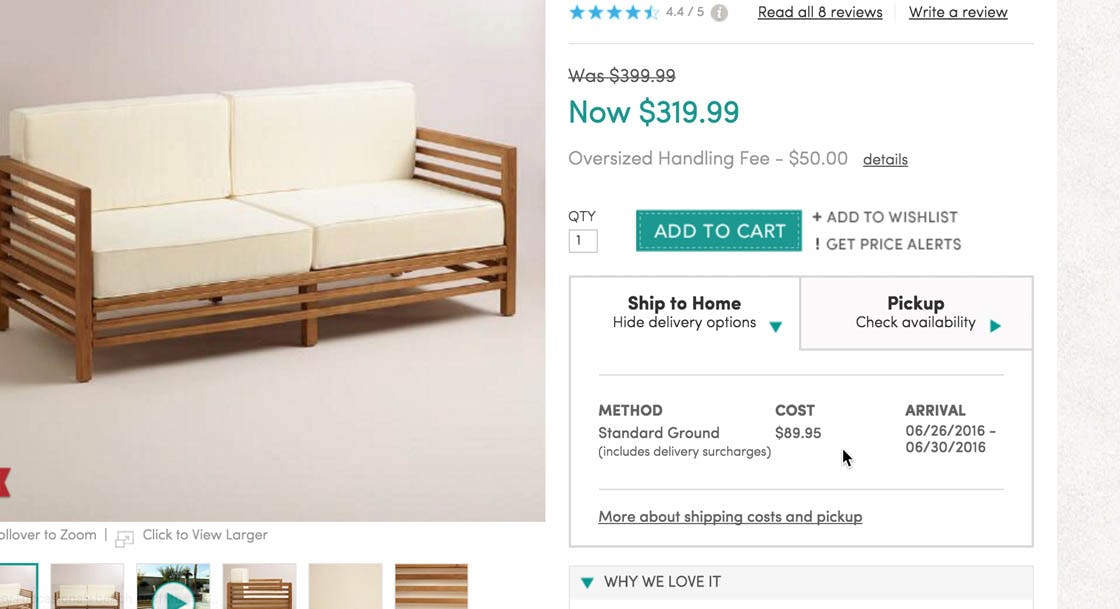
World Market adds a delivery surcharge to oversized products, making the shipping costs for this outdoor bench $89.95 — corresponding to 28% of the product price. Shipping costs become more important to users once additional “oversized” fees and handling costs are added.
Shipping costs for large or heavy products, though, can easily become very important to users if additional surcharges and handling fees are added. This is the case for products such as furniture and large appliances, when delivery and handling surcharges are sometimes added due to the product’s increased size or weight. These additional fees can greatly increase the total cost of shipping relative to the product price and make the cost of shipping much more relevant to users. As users cannot know upfront if your site is among the sites that charge an extra fee, most users will be extra concerned with verifying if potentially high shipping costs are added or not, whenever they land at any product page for either large or heavy products.
The exact same behavior is observed when testing with international users, where high shipping costs are expected, and the international shipping costs for the same items can fluctuate greatly from site to site.
Users Need Shipping Costs to Evaluate ‘Free Shipping’ Tiers and ‘Store Pickup’
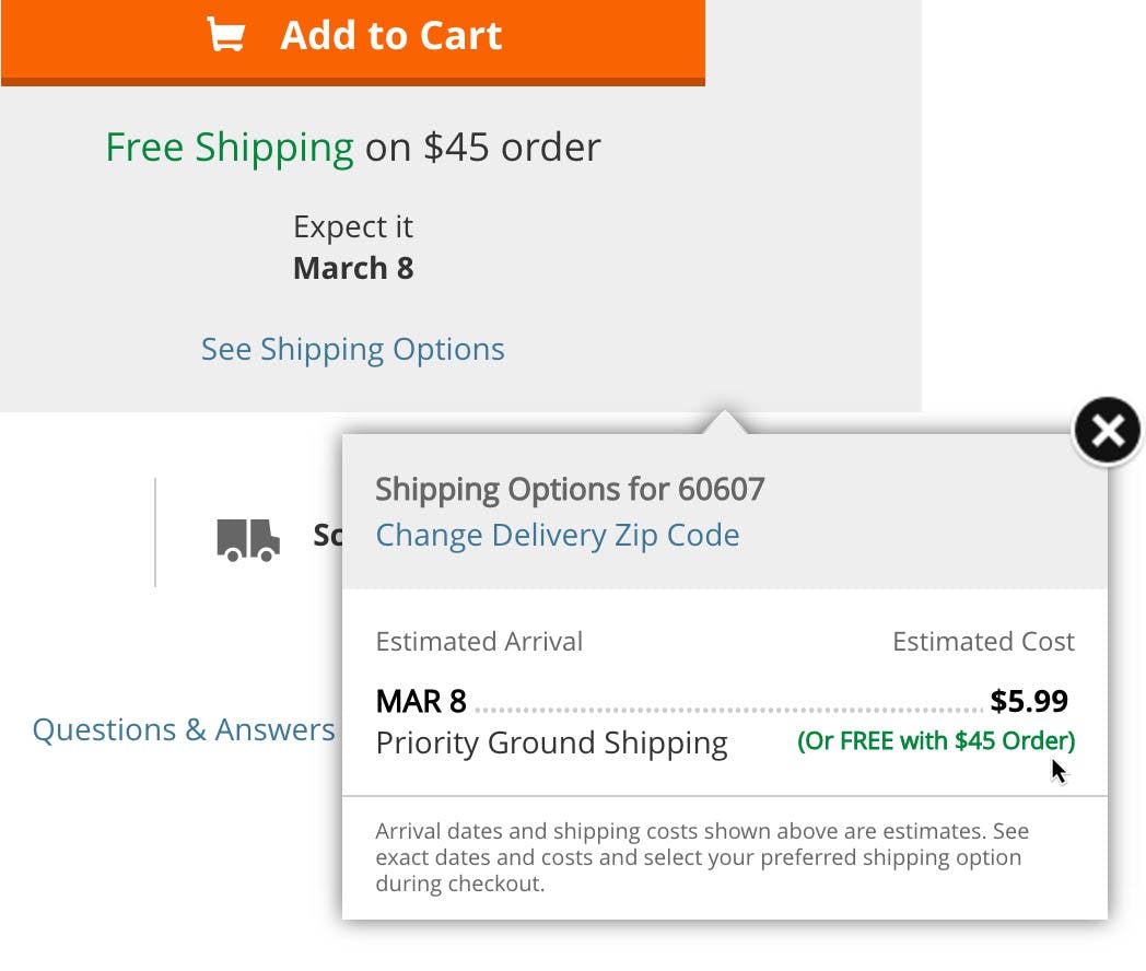
The shipping tooltip at Home Depot makes it clear both how much shipping is estimated to cost and what the threshold is for free shipping — testing clearly revealed that users need both pieces of information to evaluate if it’s worthwhile to reach the free shipping threshold.
Repeatedly, it was observed during testing that a shipping cost estimate isn’t just used for gauging the shipping cost and to get an idea of what the total order cost will be. Having an idea of the rough shipping costs is paramount for all users considering utilizing either any “Free Shipping” tiers or any omni-channel “Free Store Pickup” options.
Without knowing how much home delivery is going to cost, we observed it was impossible for users to evaluate if free store pickup is worth the hassle. Similarly, without knowing how much home delivery is going to cost, it’s difficult for users to decide whether it’s worthwhile to purchase other items; for example, whether it’s worth it to spend an extra $30 to qualify for free shipping.
Making such decisions on an informed basis is impossible without, at least, a shipping cost estimate. Presenting shipping costs alongside free shipping threshold information is an effective solution.
How to Estimate Shipping Costs on the Product Page
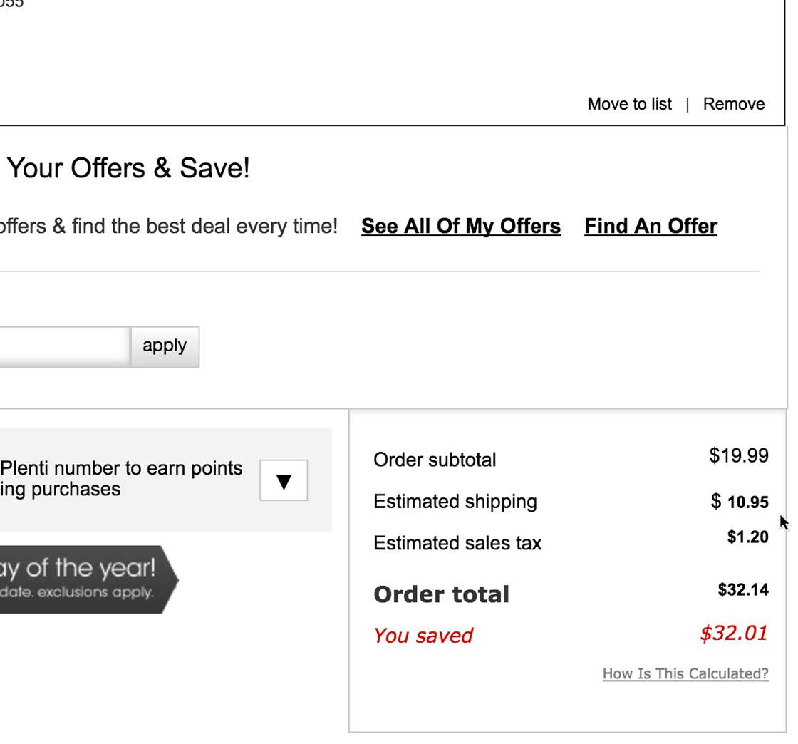
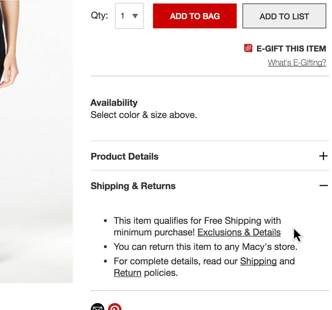
In the cart Macy’s uses IP geo-targeting to estimate a user’s shipping and tax costs — a good thing in itself (left). However, this estimate isn’t presented to users on the product page, despite having a section reading “Shipping” (right).
There are multiple ways to calculate the estimated shipping costs on the product page. In order of best-to-worst performing (UX wise), these include the following:
- If flat-rate shipping is used, simply display the lowest shipping cost available. (As users are mainly interested in knowing the lowest total order cost they can get away with.)
- Use IP geo-targeting to gauge the user’s location and, based on that, calculate a shipping cost estimate.
- Use a user’s prior shipping destination if they are signed in to an account.
- Show a price range of the lowest possible shipping fees — for example, “Standard Shipping: $5–$8 (depends on destination).” While not as good as an actual cost or a single number estimate, it will give users a rough cost estimate, allowing them to better evaluate if it’s worthwhile to proceed to get the accurate cost.
When using any of the above estimation techniques, it’s highly advisable to provide a tooltip or expanded labeling to clarify the conditions the estimate is based on — for example, “Estimated Shipping (for California): $5”. In our testing, this transparency is observed to help both those users where the location is accurate (confirming to the individual user that they do indeed qualify for the estimated $5 shipping), and users where the approximated location doesn’t match their intended shipping destination (by being upfront about the fact that the shipping cost might be different).
Additionally, making the estimated destination a link, which users can use to change their destination, will make the shipping estimate double as a shipping calculator tool.
Note, for sites where the shipping vendor requires that shipping costs be based on a live cost lookup for each order, it’s necessary to avoid those API calls for every single product page view. A shipping cost estimate can instead be provided by pre-querying all shipping regions and order weight threshold combinations on a periodic basis to serve as the individual user’s shipping estimate.
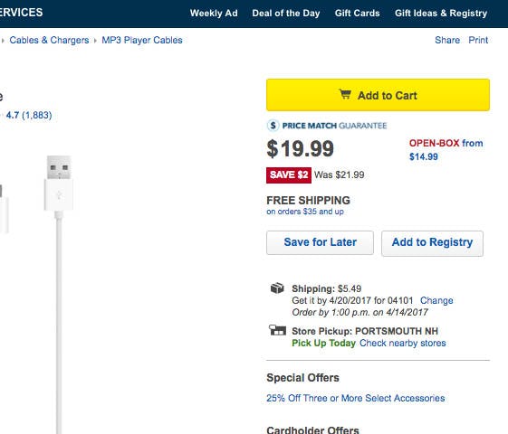
Best Buy places an IP geo-targeted shipping estimate right below their “Buy” Section, along with their store pickup option — providing a decent visual indication that allows users to asses the total product costs. (Note how both items have text links for altering the estimated location, effectively making it a shipping cost calculator with a smart default selection.)
Lastly, the design and prominence of the estimated shipping cost on the product page should reflect the overall importance of shipping costs to the particular site context. For example, sites that offer free shipping for all orders don’t really need a dedicated section, sites that have free shipping tiers will need to emphasize the shipping cost estimate but can get away with a tooltip for the exact details, and sites with large or heavy products may need an actual shipping section on the product page.
While the display prominence should generally match the importance, the visual prominence is to some extent an implementation detail. What is core is to have the shipping cost estimate somewhere on the product page, to allow your users to both understand the total product cost, and to evaluate the attractiveness of any free shipping tiers or store pickup — again, something that 43% of e-commerce sites currently don’t allow their users to do.
This article presents the research findings from just 1 of the 650+ UX guidelines in Baymard – get full access to learn how to create a “State of the Art” ecommerce user experience.

