49 Product Page UX Articles
These articles are based on observations and test findings from our usability research on product page designs and features.
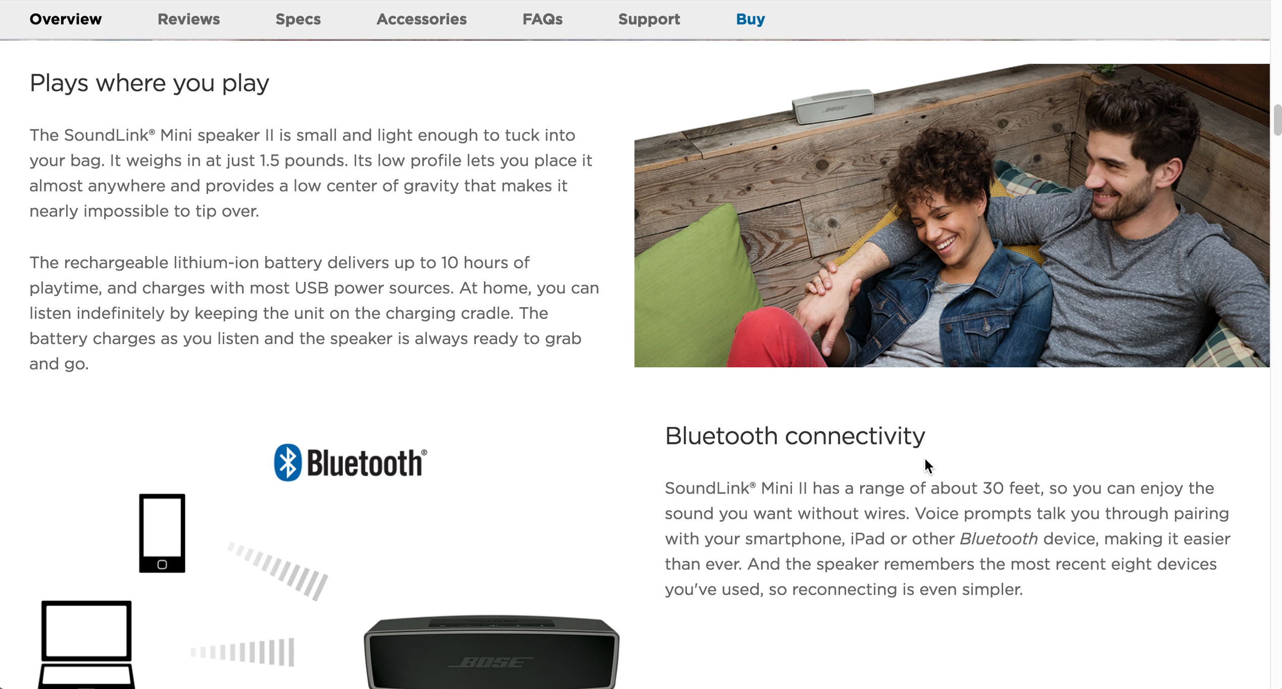
10% of E-Commerce Sites Have Product Descriptions That Are Insufficient for Users’ Needs
Detailed product descriptions are crucial for users’ deciding whether to purchase a product — yet 10% of sites provide inadequate descriptions, leading users to abandon. See our latest test findings on product page descriptions.
Featured
4 Ways to Improve the Post-Checkout UX
March 25, 2025
Desktop UX Trends: 10 Common Pitfalls & Best Practices
March 6, 2025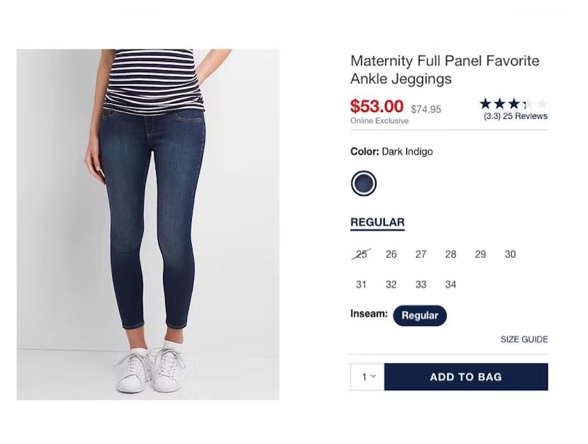
Product Page UX 2025: 15 Pitfalls and Best Practices
January 14, 2025 (Updated)Popular
E-Commerce Gifting UX: 4 Ways to Provide a Superior Gifting UI and Flow
December 3, 2024 (Updated)
10 UX Best Practices for E-Commerce Sales and Promotions
November 19, 2024
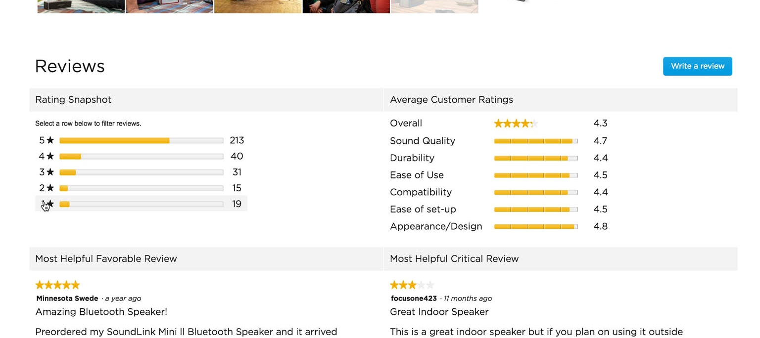
Ratings Design UX Research: 5 Requirements for the ‘Ratings Distribution Summary’ (65% of Sites Get it Wrong)
Users rely more on the ratings distribution summaries than individual reviews, yet 43% of sites don't have a distribution summary, and, of those sites that do, 39% aren't clickable.
Featured
Furniture & Home Decor UX: Always Provide a “Dimensions” Image
October 15, 2024
Always Integrate Social Media Visuals on the Product Page for Relevant Products (67% of Sites Don’t)
October 2, 2024
Apparel & Accessories Sites: Always Provide an Aggregate “Fit” Subscore in the Reviews (33% Don’t)
September 24, 2024
Always Allow Users to Navigate across User Reviews via Reviewer-Submitted Images
May 28, 2024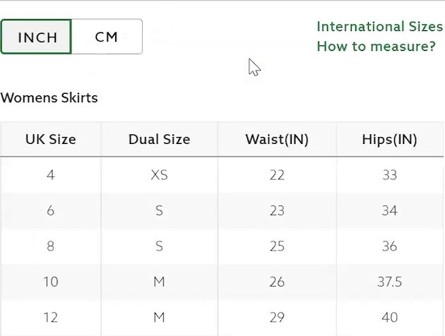
83% of Apparel Sites Don’t Provide Sufficient Sizing Information — 10 Best Practices on Sizing
July 6, 2022
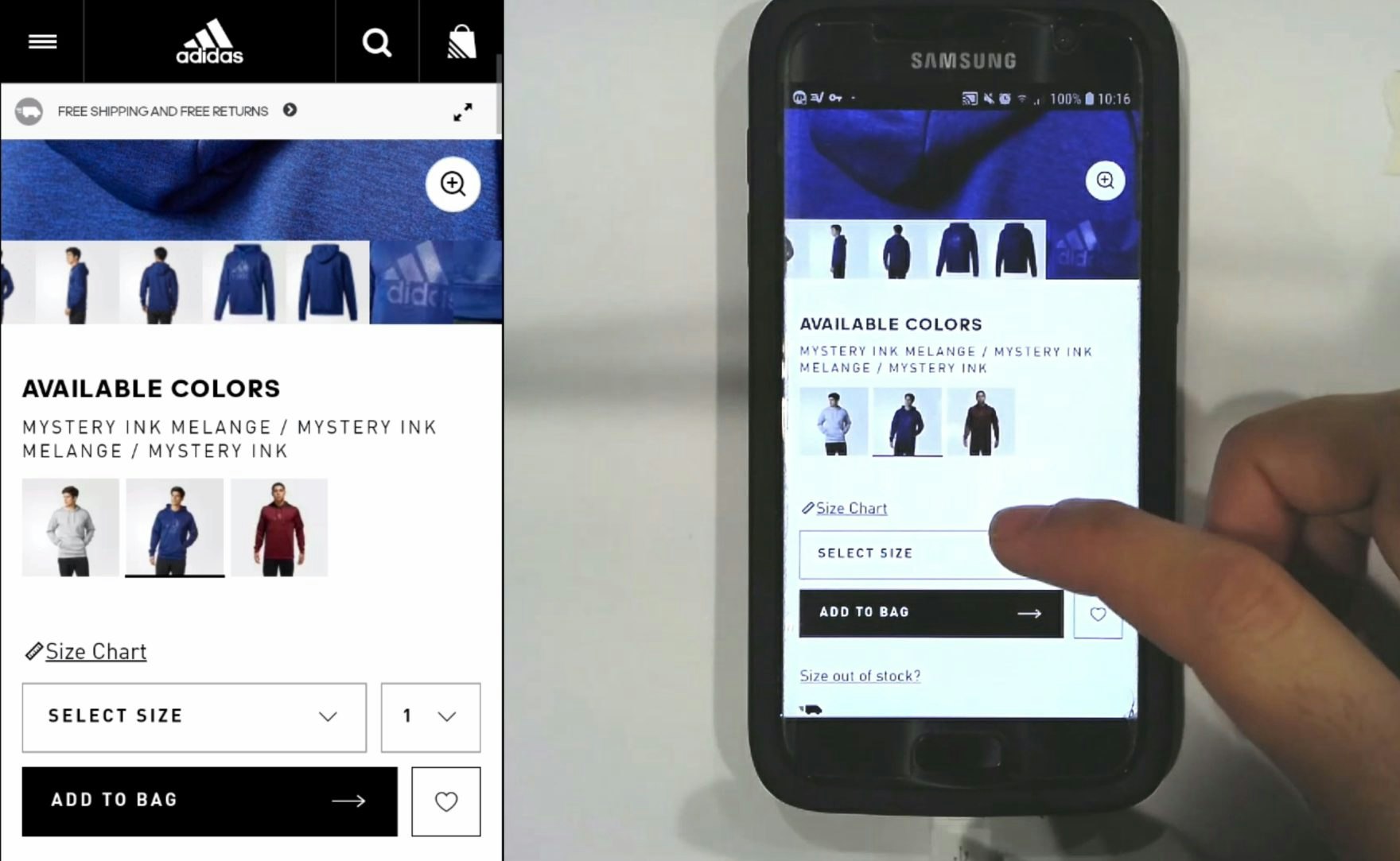
Always Use “Buttons” for Size Selection (28% of Desktop Sites Don’t)
Individual "buttons" are a common design for selecting sizes, but are they really better than drop-down menus? See our latest usability test findings on product page size selectors.
Featured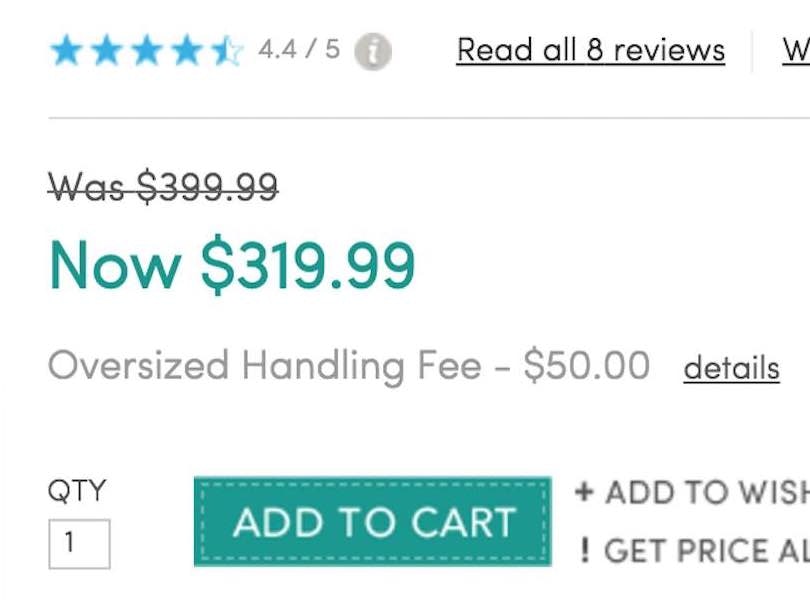
How to Display Price Discounts on the Product Page: Avoid These 4 Pitfalls (18%+ Have One or More)
May 25, 2022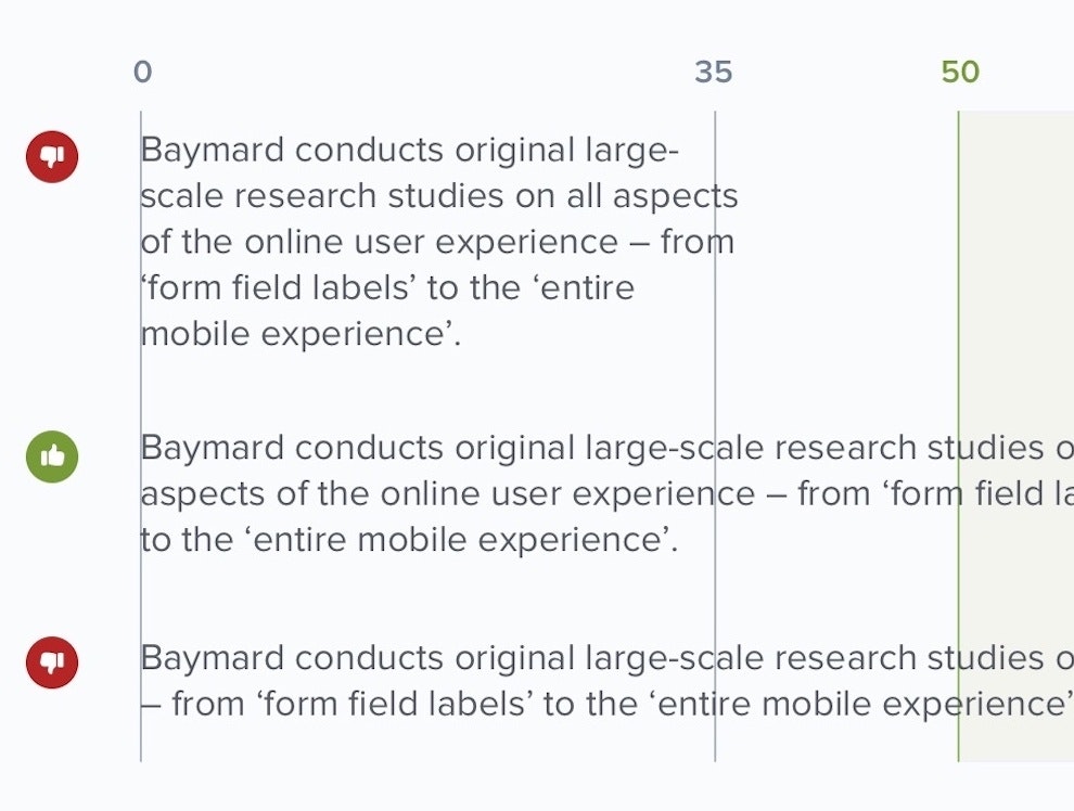
Readability: The Optimal Line Length
May 10, 2022 Popular
Direct-to-Consumer UX Benchmark: 5 Common DTC Pitfalls
February 22, 2022
DTC E-Commerce: User Reviews Are Much Less Important for DTC Sites
January 4, 2022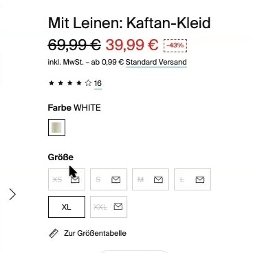
250+ New Examples Added from Large-Scale Testing on European Sites
November 9, 2021
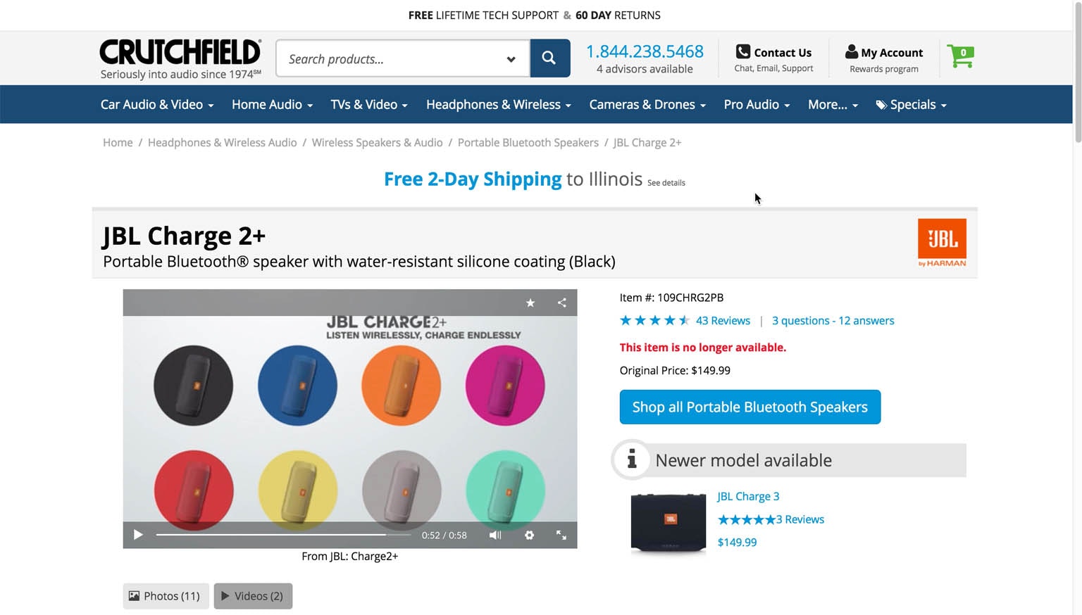
Product Pages: ‘Free Shipping’ Should Not Only Be in a Site-Wide Banner (32% Get It Wrong)
Our latest Product Page UX research reveal that 32% of sites display their “Free Shipping” offer using methods that are very prone to users overlooking it — see our full test findings.
Featured
Baymard Update: 13 New Case Studies and 3 New 2021 Benchmarks (Checkout, Product Page, and On-Site Search UX)
October 12, 2021
Direct-to-Consumer Research: 5 Effective Ways for DTC Sites to Tell Their ‘Brand’ & ‘Product’ Stories
June 22, 2021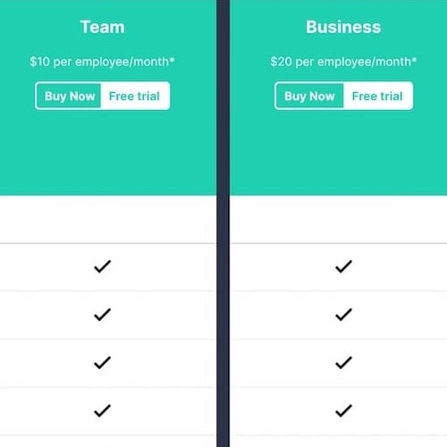
New Research Study on “Digital Subscriptions” (SaaS) UX
May 11, 2021
6 List Item Attributes to Include for Cross-Sell Recommendations (68% of Desktop Sites Are Missing One or More)
March 23, 2021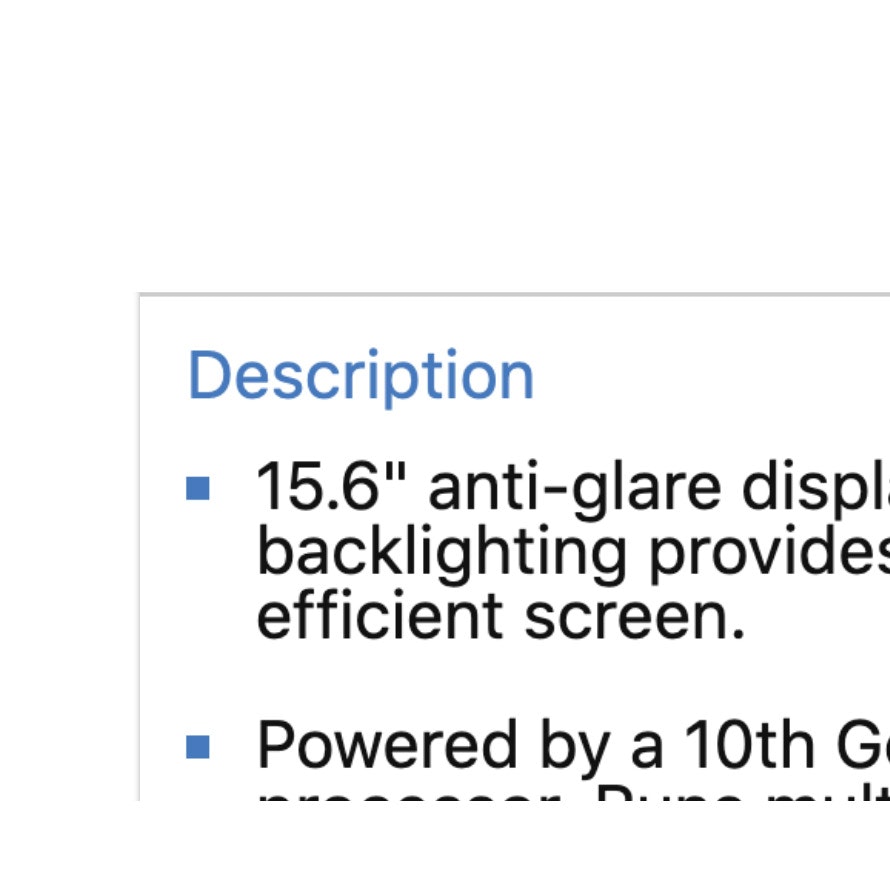
10% of E-Commerce Sites Have Product Descriptions That Are Insufficient for Users’ Needs
March 9, 2021
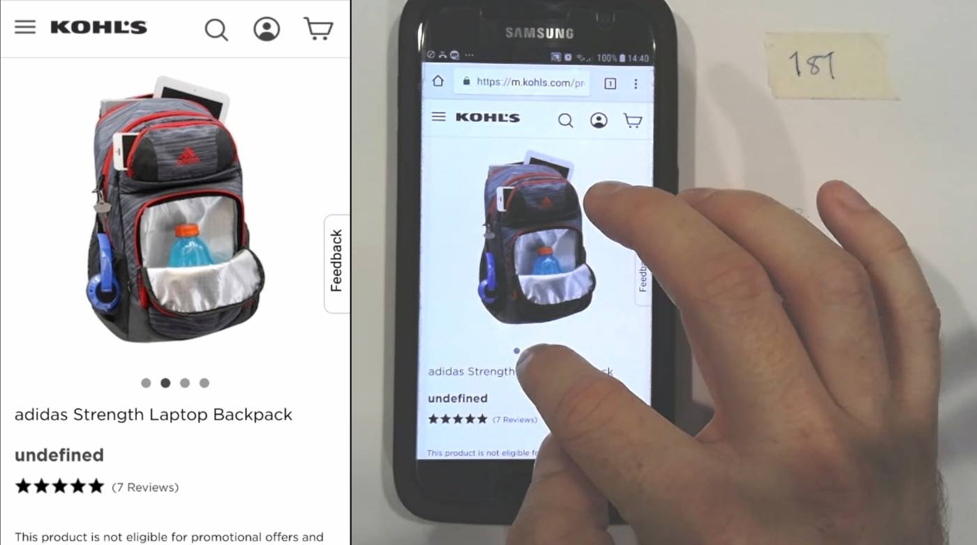
Always Use Thumbnails to Represent Additional Product Images (76% of Mobile Sites Don’t)
Product images are key in users’ decision-making. Why, then, are product page image thumbnails — ubiquitous on desktop — so rare on mobile? See our latest usability test findings on image gallery thumbnails:
Featured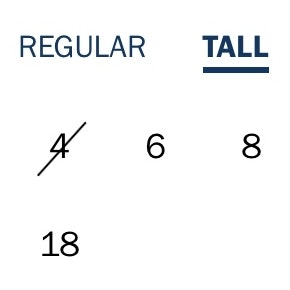
Always Use “Buttons” for Size Selection (28% of Desktop Sites Don’t)
February 9, 2021
Provide Images of Accessory, Apparel, and Cosmetic Products on a Human Model
December 1, 2020
Return Users to the Same Place in the Product List When Returning from the Product Page (13% Don’t)
November 17, 2020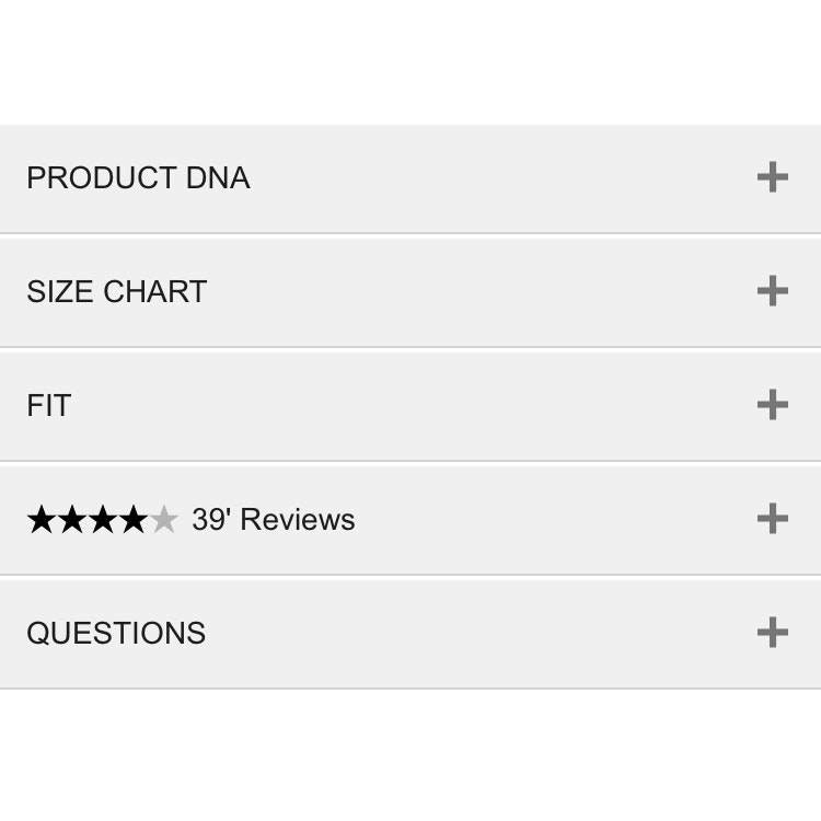
Mobile UX: Avoid Using Subpages within the Product Details Page (26% Don’t)
November 2, 2020 Popular
Always Use Thumbnails to Represent Additional Product Images (76% of Mobile Sites Don’t)
October 20, 2020 Popular
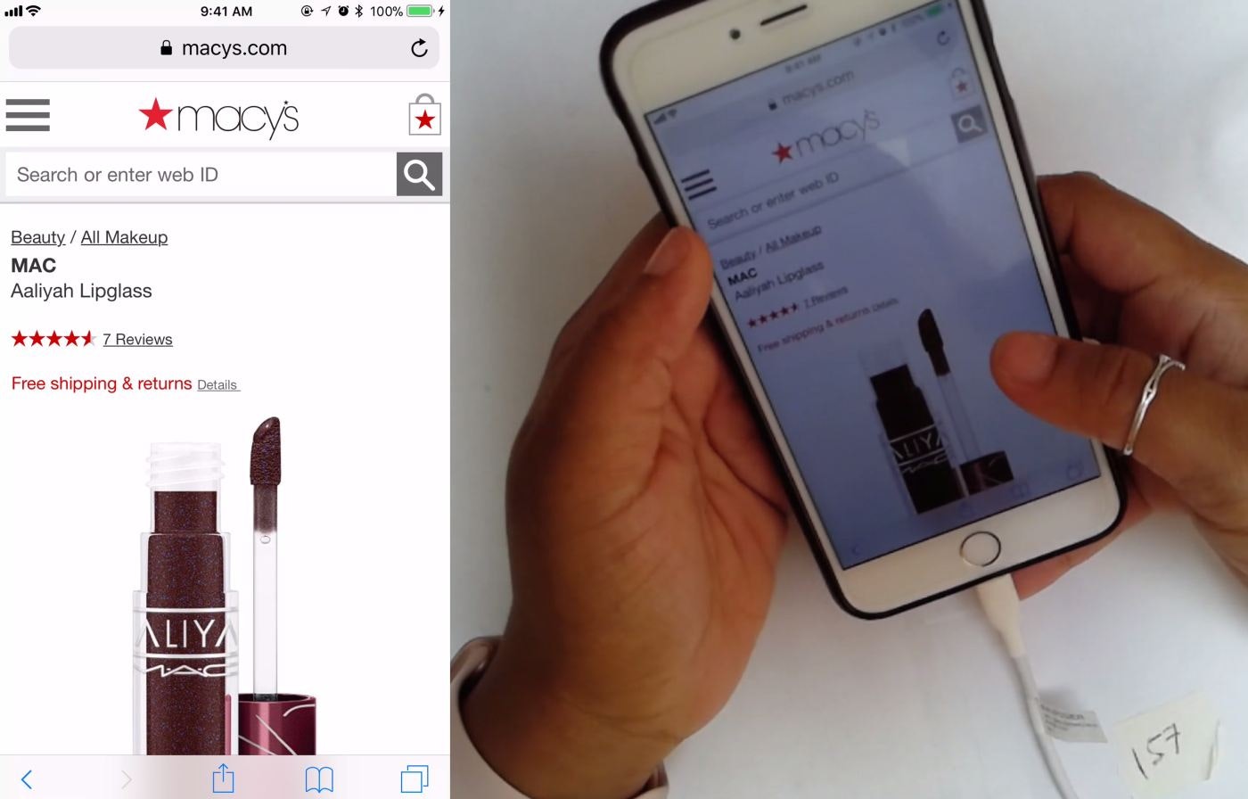
6 Important Aspects of Well-Performing Mobile Product Page Breadcrumbs
Mobile users rely on breadcrumbs to understand where they are and navigate the site hierarchy — yet 36% of e-commerce sites don’t provide full category paths, while others make it difficult to find breadcrumbs.
Featured
6 Important Aspects of Well-Performing Mobile Product Page Breadcrumbs
September 21, 2020 Popular
Inspirational Images Should Link to All Depicted Products (9% of Sites Don’t)
September 8, 2020
Allow Users to Upload Images with Their Review (34% of Sites Don’t)
August 4, 2020
4 Design Patterns That Violate “Back” Button UX Expectations – 59% of Sites Get It Wrong
July 20, 2020 Popular
25% of E-Commerce Sites Don’t Have Product Images with Sufficient Resolution or Level of Zoom
April 2, 2020
E-Commerce Sites Need to Respond to Some or All Negative User Reviews (87% of Sites Don’t)
August 6, 2019
UX Research on Product Page Videos: Where and How to Embed Them (35% Get it Wrong)
May 14, 2019
Product Page UX: Data Should Be Synchronized Across Product Variations (28% Don’t)
April 18, 2019
PDP UX: Provide an ‘Included Accessories’ Image and Clarify That Optional Accessories Are Extra (44% Don’t)
February 19, 2019
Product Page UX: Include Descriptive Text or Graphics for Some Product Images (52% Don’t)
November 28, 2018
PDP UX: Core Product Content Is Overlooked in ‘Horizontal Tabs’ Layouts (Yet 28% of Sites Have This Layout)
October 17, 2018 Popular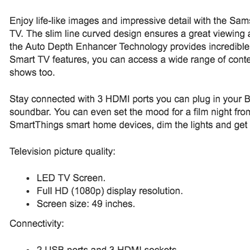
Structuring Product Page Descriptions by ‘Highlights’ Increases User Engagement (Yet 78% of Sites Don’t)
April 24, 2018 Popular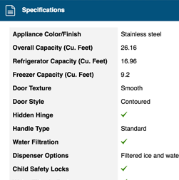
Product Spec Sheets: 4 Ways to Make Spec Sheets More Scannable for Users (50% of Sites Get It Wrong)
March 27, 2018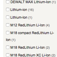
E-Commerce UX: Post-Process Vendor-Supplied Product Data (52% Don’t)
March 6, 2018
7 Product Page UX Implementations that Make REI Best-in-Class
October 18, 2017 Popular
Product Pages: ‘Free Shipping’ Should Not Only Be in a Site-Wide Banner (32% Get It Wrong)
August 22, 2017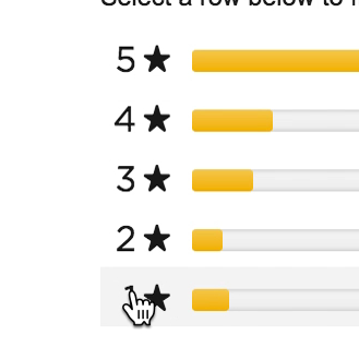
Ratings Design UX Research: 5 Requirements for the ‘Ratings Distribution Summary’ (65% of Sites Get it Wrong)
August 8, 2017 Popular
Allow Users to Purchase Temporarily ‘Out of Stock’ Products by Increasing the Delivery Time (68% Don’t)
July 18, 2017 Popular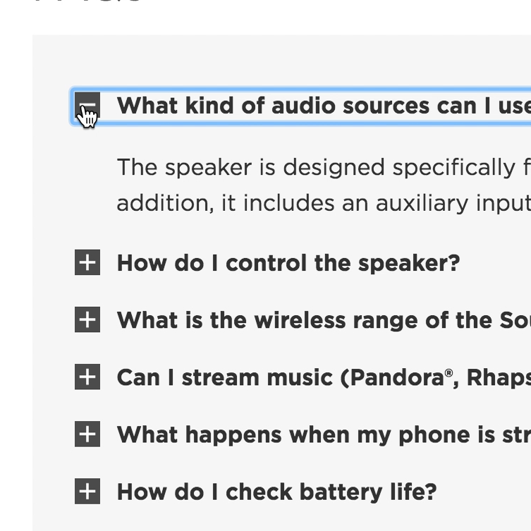
Product Page UX: Provide Both Site-Authored FAQs and Community-Driven Q&As (70% Get it Wrong)
July 4, 2017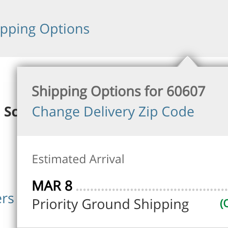
Product Pages Need to Show ‘Estimated Shipping Costs’ (Yet 43% of Sites Don’t)
June 20, 2017
Truncating Additional Images in the Gallery Causes 50-80% of Users to Overlook Them (30% Get it Wrong)
June 6, 2017 Popular
Product Page UX: All Products Need at Least One ‘In Scale’ Image (28% Get It Wrong)
May 30, 2017 Popular
Product Page Usability: 82% of Sites Have Severe UX Issues (New Research Study)
May 23, 2017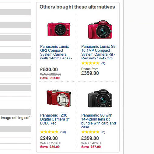
Product Page Usability: Recommend Both Alternative & Supplementary Products (Only 42% Get it Right)
November 25, 2014
Want to learn more about this topic?
Explore Other Research Content

257 top sites ranked by UX performance.

18,000+ annotated designs for systematic inspiration.

Code samples, demos, and key stats for usability.

