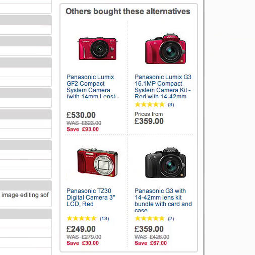
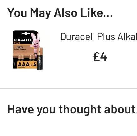
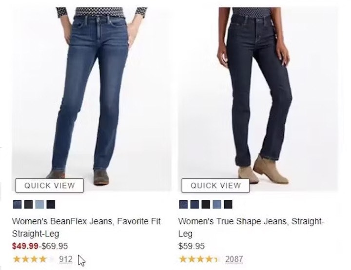
Providing cross-sell recommendations on the product details page streamlines the user’s shopping experience:
- Alternative cross-sells help users find the “right” product — recommending other viable options if the currently viewed product doesn’t match their criteria.
- Supplementary cross-sells save users time and effort by locating items that are compatible or complementary to a product of interest for them.
However, without adequate information for either type of cross-sell, it can be challenging for users to evaluate the suitability and compatibility of cross-sell recommendations.
Indeed, our large-scale desktop and mobile usability research studies consistently show that users are prone to ignore product suggestions that lack sufficient product details.
Yet, 68% of desktop sites in our product page benchmark fail to provide enough information for cross-sells offered on the product details page — leading to lost revenue, as users never find potentially relevant items.
In this article we’ll discuss:
- 4 essential product attributes needed for users to effectively evaluate the suitability and compatibility of cross-sell recommendations
- 2 additional product attributes to include if warranted
- Why it’s imperative to include the same level of detail on mobile
4 Essential Product Attributes to Include with All Cross-Sell Recommendations
Users can’t effectively compare alternative product recommendations to the currently viewed item, or assess supplementary items’ compatibility, if the information necessary to perform such evaluations is absent or incomplete.
This is particularly true when the missing information is fundamental to users’ ability to assess the suitability and compatibility of cross-sell suggestions.
Yet despite users’ need for this critical info, some of the largest e-commerce sites in our benchmark fail to include these 4 necessary attributes:
- High-quality thumbnail
- Fully visible product title
- Price
- User ratings average
1) High-Quality Thumbnail (8% of Visually Driven Sites Don’t Have Them)
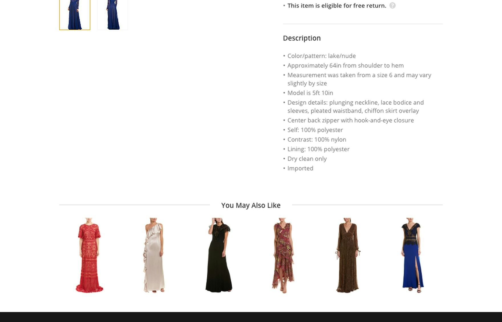
The tiny product thumbnails in the “You May Also Like” cross-sells section at Gilt make it difficult for users to adequately assess these dresses, risking users rejecting perfectly relevant alternative options.
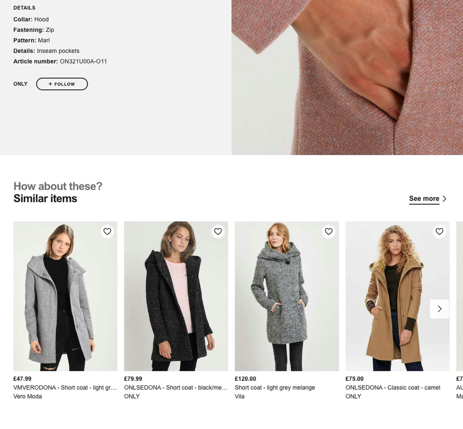
Zalando includes large high-quality thumbnails for alternative cross-sell recommendations to ensure users can visually assess the similarities and differences.
Product thumbnails proved to be one of the most essential attributes for users during our desktop and mobile usability research studies.
As observed during testing, thumbnails are an effective method of highlighting key product features, making it clear what is included in the price, and indicating the product type.
Cross-sell recommendations without thumbnails are often completely ignored, as most users perceive these suggestions as “incomplete” and thus less relevant.
Now, during testing, when a thumbnail was missing from a cross-sell, it was likely a result of a product data issue, rather than a case where no thumbnails were provided at all for cross-sells.
Yet having an adequately sized high-quality thumbnail is also a prerequisite for users being able to visually assess the suitability and compatibility of cross-sells.
If thumbnails are too small or of poor quality the cross-sell suggestion is likely to be overlooked by many users, just as if there was no thumbnail at all.
Therefore, adequately sized high-quality thumbnail images should always be included in cross-sell recommendations.
Moreover, on desktop, the visual information provided by a thumbnail can be taken a step further by presenting a secondary thumbnail on hover, which is an effective way to provide extra visual information without cluttering cross-sell sections.
Finally, while having adequately sized high-quality thumbnails is critical for visually driven products, they’re also vital for spec-driven products, as they help with product recognition and draw users’ attention to the cross-sells.
2) Fully Visible Product Title (55% Don’t Have One)
Hayneedle requires users to evaluate alternative product suggestions without a product title. Even on hover, no additional information is revealed. This places the burden on users to try to understand how the alternatives compare to the current product in order to determine if it’s worthwhile to explore them further.
Gilt also requires users to evaluate alternative product suggestions without a product title. While brand may be important, many users cannot make an informed navigation decision without the product title.
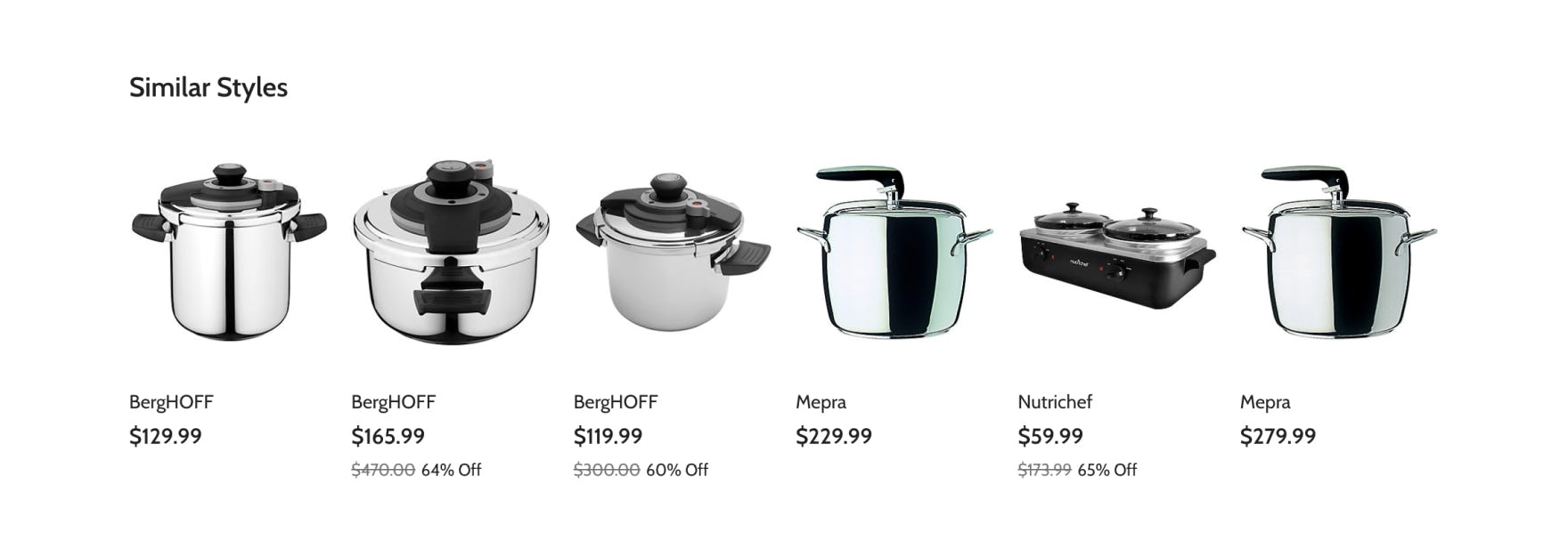
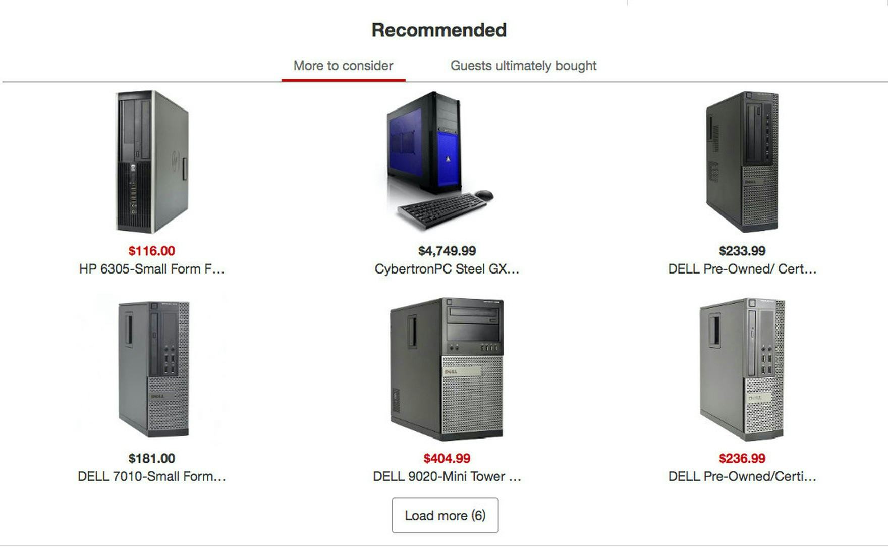
Truncated product titles increase users’ efforts to assess whether any of the alternative cross-sell recommendations at Target are a suitable replacement to current item. Requiring users to navigate to the product details page for each product recommendation simply to verify the product name undermines the value of cross-selling on the product details page.
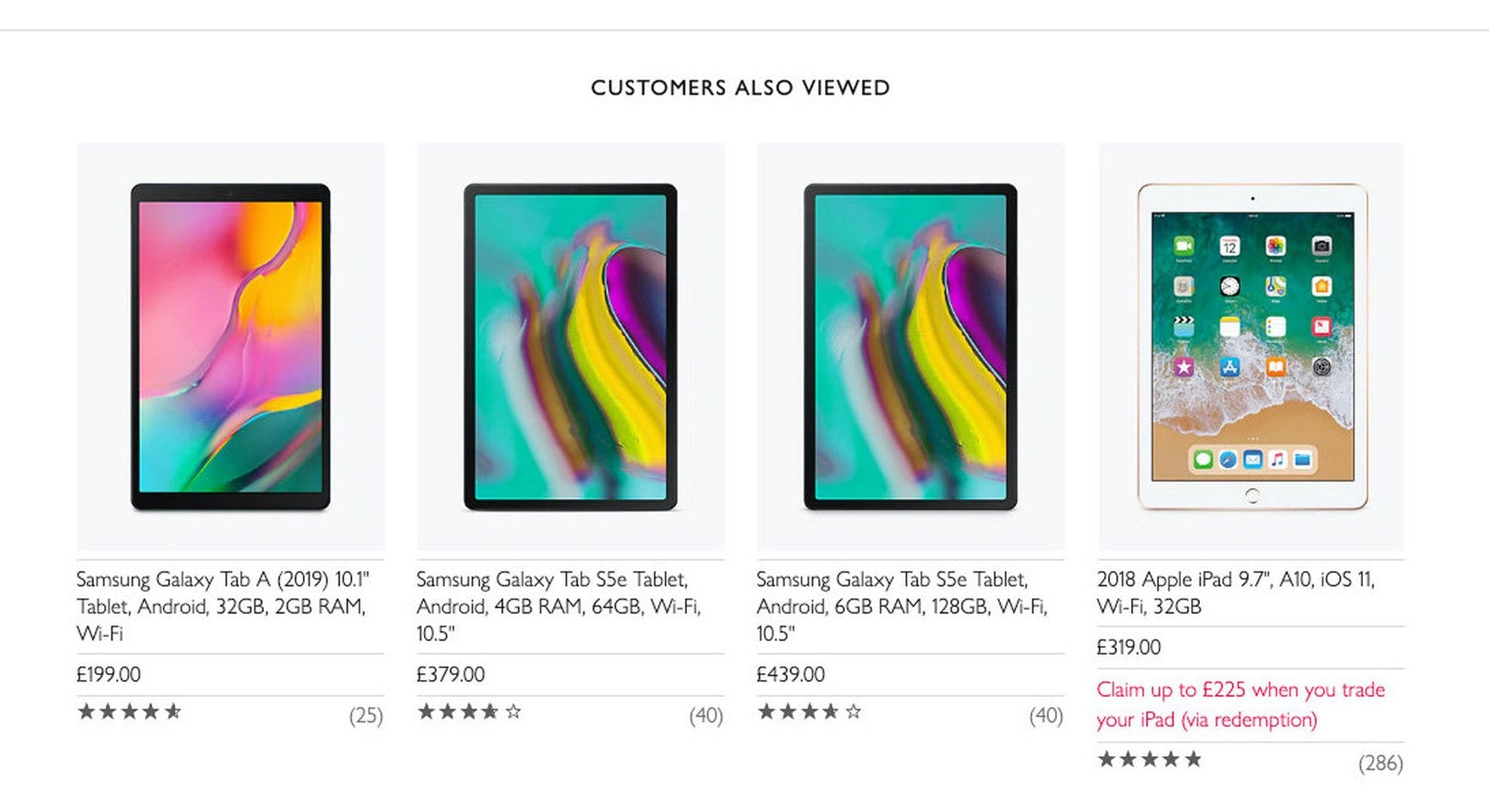
At John Lewis, cross-sell listings include a full, feature-rich product name, allowing users to easily evaluate and compare the product recommendations without being required to navigate to each item’s product detail page.
Product title or type is also critical for users when evaluating the relevance of cross-sell recommendations.
Without product titles users have to rely mainly on product imagery to judge the suitability of alternative items or compatibility of supplementary items, which can be challenging if the thumbnail is difficult to decipher due to size, quality, or context.
Now while most sites provide a product title, some will only provide a truncated product title — which can be just as harmful as providing no product title at all, as the important keywords users rely on may not be visible.
Very long product titles — typical for many spec-driven products — may be a consequence of vendor-supplied data, in which case post-processing may be necessary to ensure titles are a reasonable length.
Additionally, some sites hide the product title by default, then show it when users hover the cross-sell item.
However, requiring desktop users to hover over each cross-sell suggestion to view essential product information — such as the product title or type — unnecessarily increases their effort to evaluate and compare items.
In the end, including complete product titles, which are visible by default, in cross-sell listings allows users to compare the recommended items more easily.
3) Price (15% Don’t Provide It)
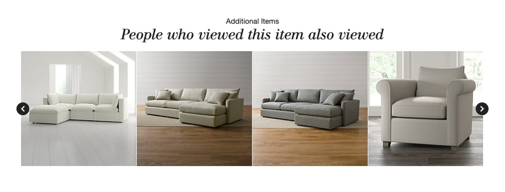
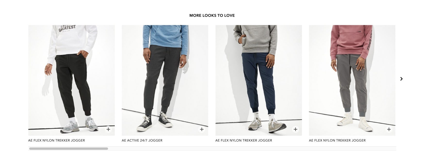
Without price, users are unable to easily determine if any of the alternative product recommendations at American Eagle are a suitable substitute for the currently viewed item.
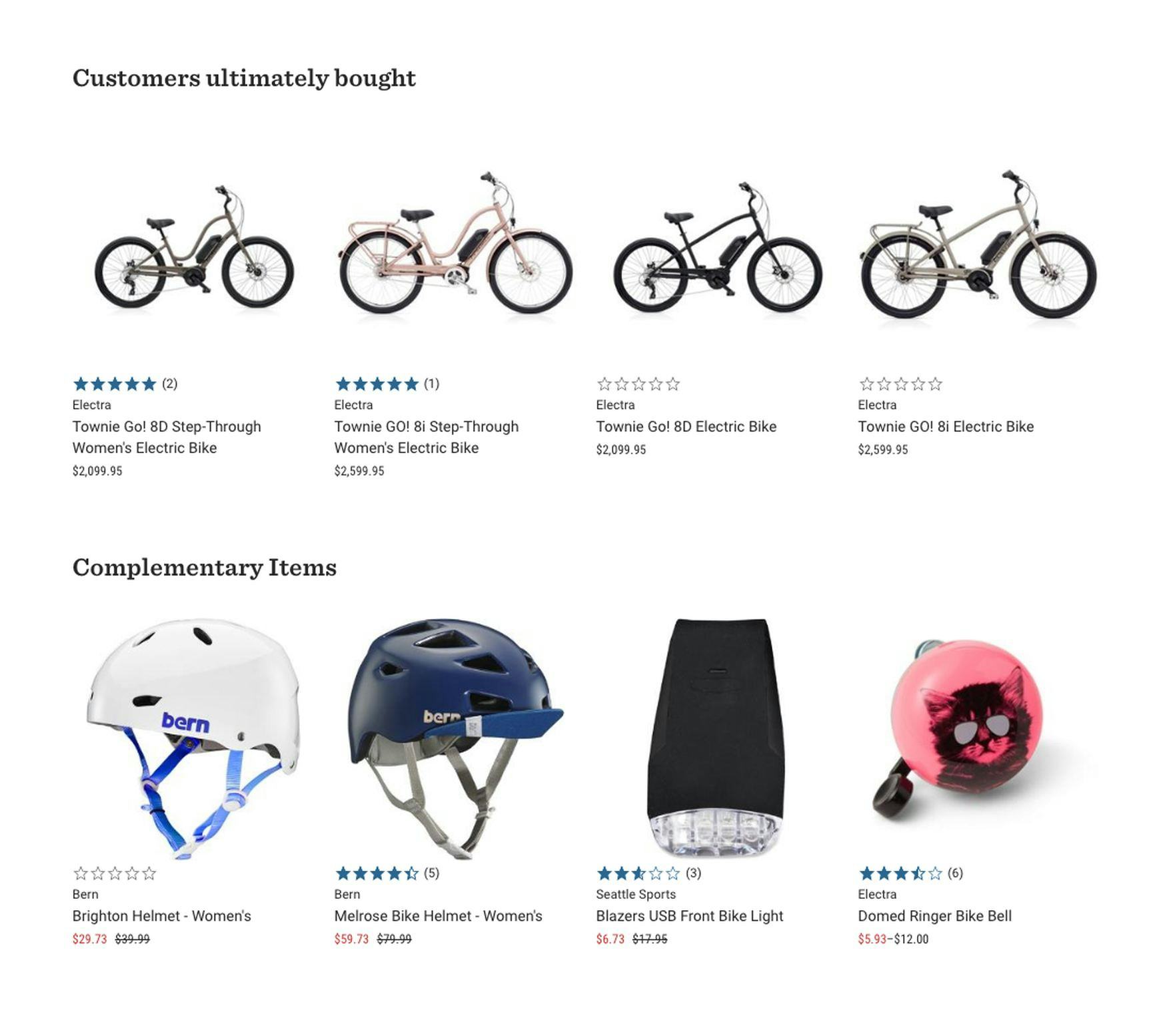
At REI, users can easily determine if any of the product recommendations in the “Customers Ultimately Bought” cross-sells section are within their price range, and therefore suitable alternatives to the current item. Likewise, they can easily calculate the extra cost of adding complementary items to their orders.
The price of each product suggestion is obviously essential to users when comparing suggested alternative items to the current item and to one another, as well as when considering supplementary items to add to a potential purchase.
For example, users shopping for a sofa or kitchen appliance will likely have a budget — they simply won’t consider items that are too expensive for their budget.
Conversely, users may suspect items that are too inexpensive won’t meet their needs either (e.g., because they’re “too cheap”).
When price isn’t displayed for cross-sells, users are required to navigate to the product details page for each product recommendation, simply to determine if it’s within their preferred price range.
This back and forth process impedes comparison, leading to fatigue and frustration.
Therefore, it is vital that the price is provided for both alternative and supplementary cross-sells.
4) User Ratings Average (50% Don’t)
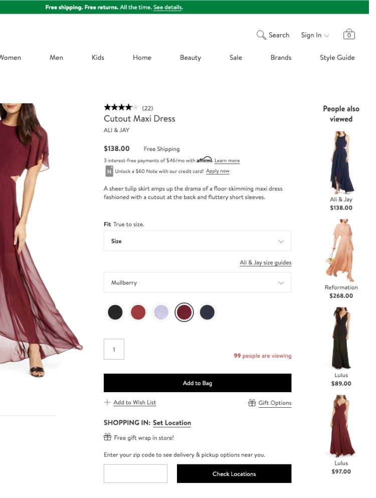
Without a user ratings average for the “People also viewed” cross-sell suggestions at Nordstrom, users are required to navigate to the product details page for each recommended dress to determine if it is rated higher by users than the current dress.
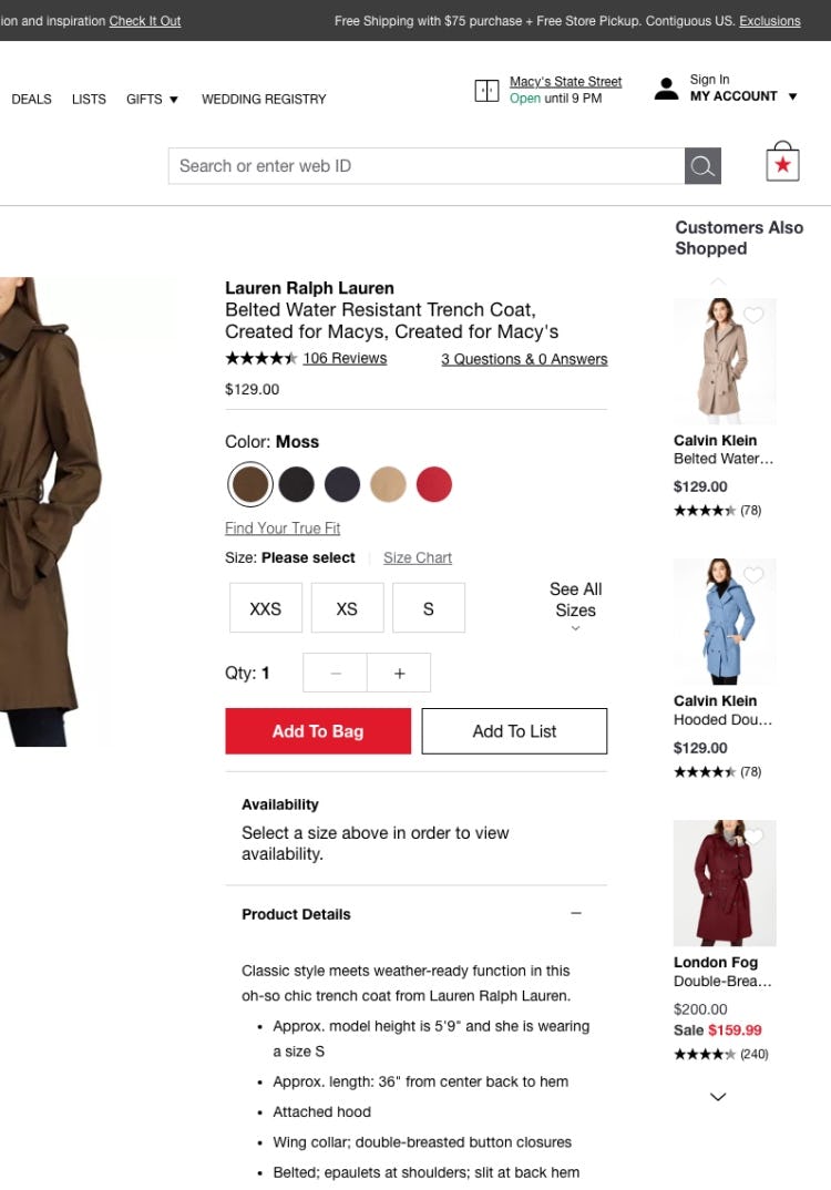
At Macy’s, users can easily factor the user ratings averages of the alternative product recommendations while comparing to the current item.
Users rely on user ratings averages to help them choose which cross-sell recommendations to consider — especially if the currently viewed item is rated low and alternative cross-sell suggestions are rated higher.
For example, during our large-scale product page testing, 95% of users relied on reviews to evaluate or learn more about products.
Product ratings essentially function as a type of social proof for users, letting them tap into the “wisdom of the crowd”, using good ratings as a proxy for “high quality” or “value for money.”
However, having ratings averages is not enough — testing shows that displaying the number of ratings is also critical.
This is understandable, since when users don’t know how many ratings an average is based on, they can’t tell if a perfectly rated product simply has a single 5-star rating, or if its rating average is actually based on hundreds of reviews.
In other words, if the number of ratings is not shown alongside the user ratings average, users will be unable to accurately judge how reliable the averages are, thereby lowering their overall confidence in the user ratings averages.
Furthermore, if users choose a cross-sell recommendation based on a high ratings average, only to find on the product page that it has a low rating count, they could lose interest in the product and feel that the trip to the product page was a waste of time.
2 Additional Product Attributes to Include if Warranted
To ensure users are able to assess the suitability of cross-sell recommendations, the minimum requirements to include are a high-quality product thumbnail, a fully visible title, price, and user ratings average.
However, providing additional information — particularly brand and product variations — has been observed to significantly enhance the evaluation.
5) Product Variations (54% Don’t)
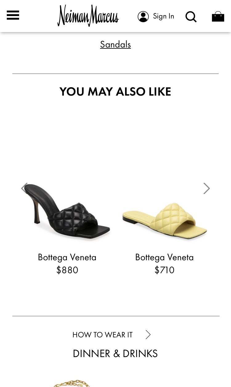
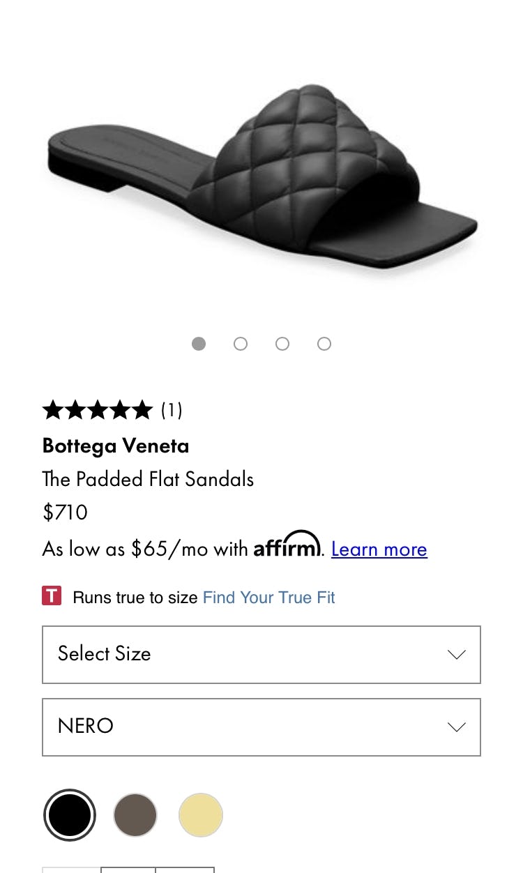
At Neiman Marcus, the absence of information about product variations in the “You May Also Like” cross-sells section (first image) risks users overlooking that alternative items may indeed be available in a more preferred color (second image), and rejecting them. Color variations can heavily influence users’ decisions to explore cross-sell recommendations, particularly for highly visual products.
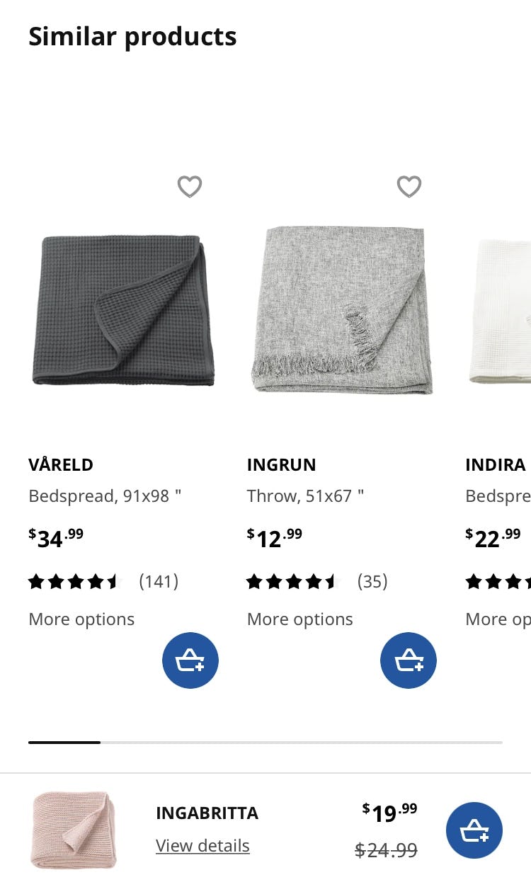
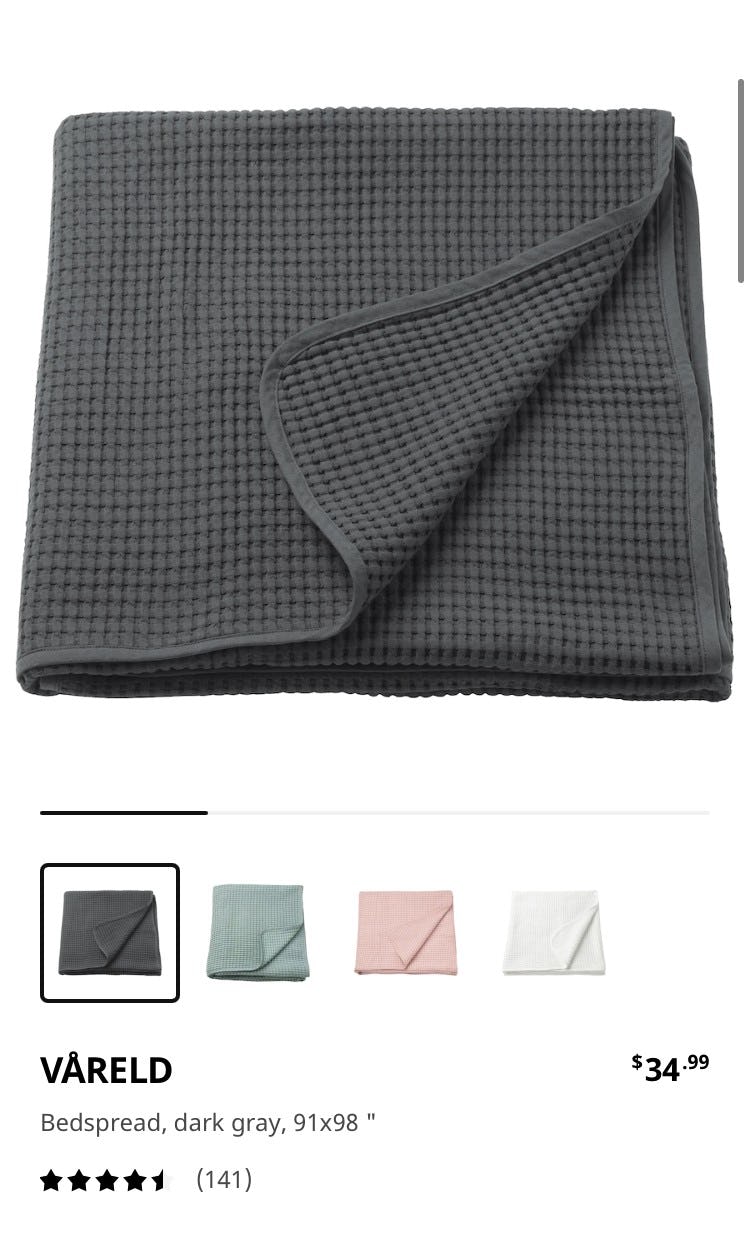
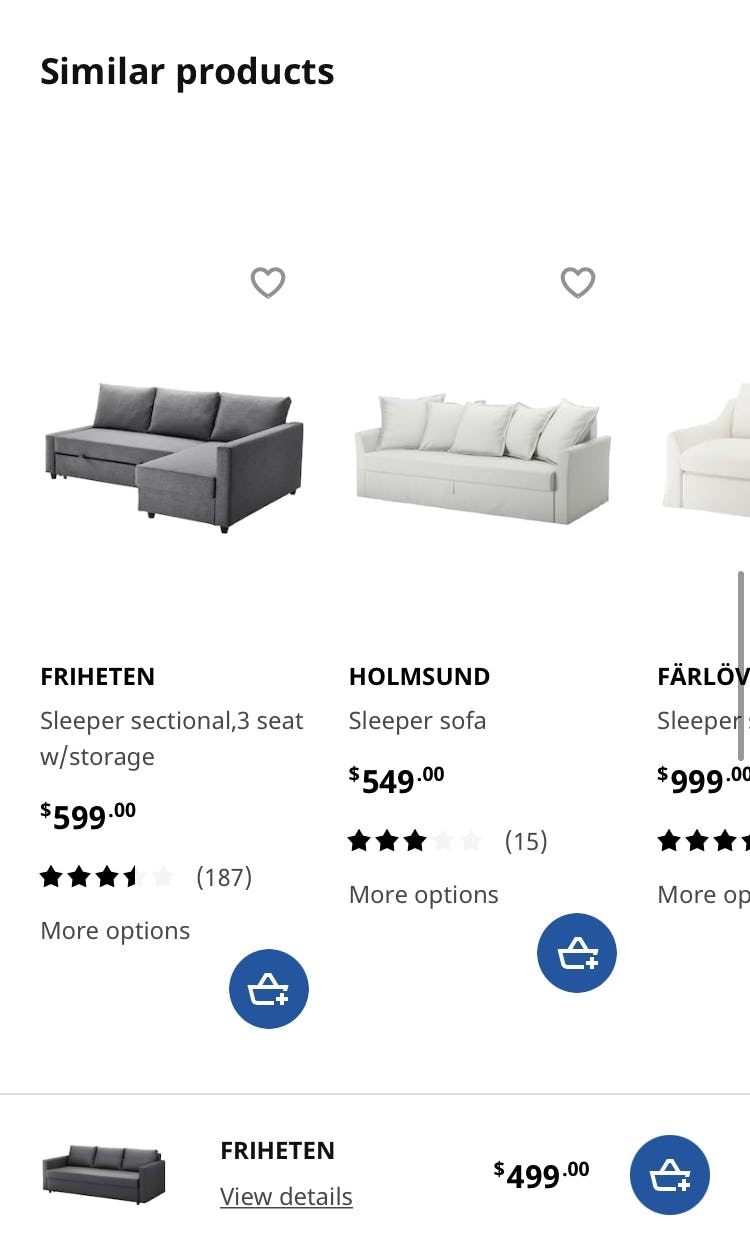
Product variations are available in the “Similar Products” cross-sells section at IKEA by clicking on the “More Options” text (first image). This serves to reassure a user who is interested in the first alternative, for example, but not necessarily the dark-gray color shown in the thumbnail image, that exploring the alternative product recommendation will be worth the tap (second image).
Without adequate information about available product variations such as different colors, users are more likely to reject product suggestions that actually match what they are looking for simply because they don’t see that other variations of the item are available.
For example, a user shopping for an orange dress may incorrectly presume alternative recommendations are not available in the preferred color if neither the thumbnail nor swatches indicate that it is.
Now, product variation information can be challenging to include in the squeezed space of the cross-sell list item.
However, thoughtful truncation — for example, showing 3 color swatches, along with text stating “+ 6 more” — gives users a chance of spotting an interesting variation, or at the very least alerts them to the fact that additional variations exist.
Alternatively, simply providing text stating “7 more colors available” may have to do for cross-sell designs that are especially tight on space.
Either way, users will be far less likely to conclude that the variation they’re seeing is the only one available — and thus less likely to simply reject the suggestion out of hand.
6) Brand (7% Don’t)
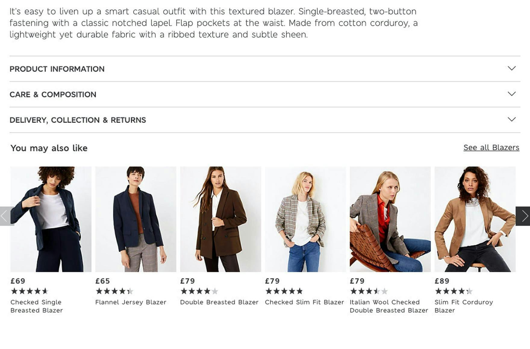
The absence of brand name in the “You May Also Like” and “Wear It With” cross-sells sections at Marks & Spencer means brand-conscious users will overlook product recommendations from their preferred brands that they’d otherwise potentially be interested in.
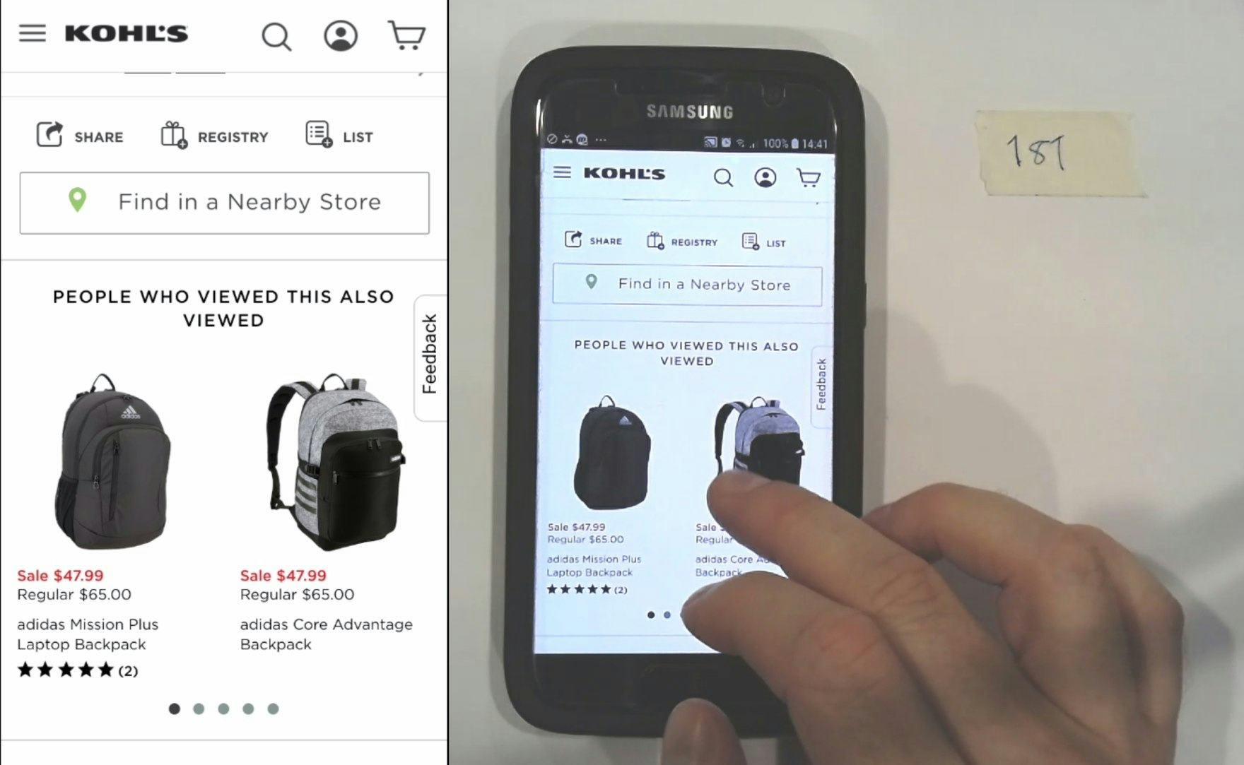
“I like that it’s giving me the brand and the style”, a user commented while browsing the cross-sell suggestions on the product details page for an Adidas laptop backpack at Kohl’s. Access to brand information about cross-sell suggestions enabled him to determine that none of the alternative suggestions would meet his needs.
Brand recognition is of prime importance across many industries, especially apparel, consumer electronics, and cosmetics.
Users often look for their favorite brands when seeking products across many industries, and in some cases they simply are not interested in products that aren’t part of their preferred brand.
If brands are not easily discernible in cross-sell listings, users may miss out on suitable alternative and complementary products that are recommended — simply because they can’t identify the brands easily.
Therefore, brand should be included for cross-sell listings on sites that have multiple brands as part of their product catalog.
Display Key Item Attributes Directly in the Cross-Sell Recommendations on Mobile
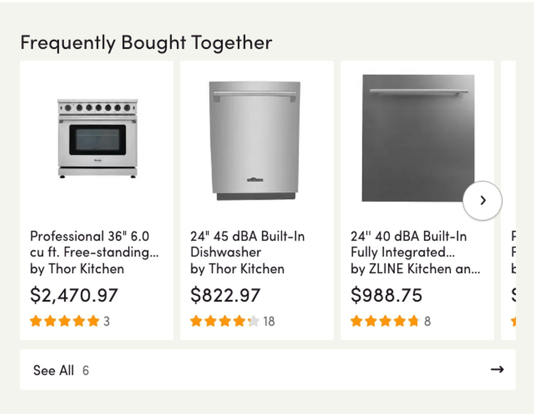
At Wayfair supplementary cross-sell listings include a thumbnail, product title, price, and user rating on desktop (first image). However, only a thumbnail and price are provided on mobile (second image). Without the same essential item attributes in the cross-sell sections on mobile, users are unable to effectively evaluate and compare them. Moreover, it creates an inconsistent cross-platform shopping experience.
During testing we observed that some sites are inclined to display less product information for cross-sells on mobile than on desktop.
However, despite the smaller mobile viewport, testing also revealed that it’s imperative to include the same level of detail.
After all, mobile users will need product titles, or user ratings averages, or other cross-sell information just as much as desktop users when they’re deciding if a cross-sell is worth consideration.
In fact, mobile users may need this information even more than desktop users, due to the unique challenges of shopping on mobile devices.
One challenge in particular worth highlighting is lag issues.
Because shopping on a mobile device tends to be a slower experience in general compared to shopping on a desktop device, the process of having to tap through to individual product pages simply to learn the price, for example, becomes even more tedious.
As such, some mobile users may dismiss items that could be a “perfect” match simply because they can’t be certain it’s worth the time and effort to explore them.
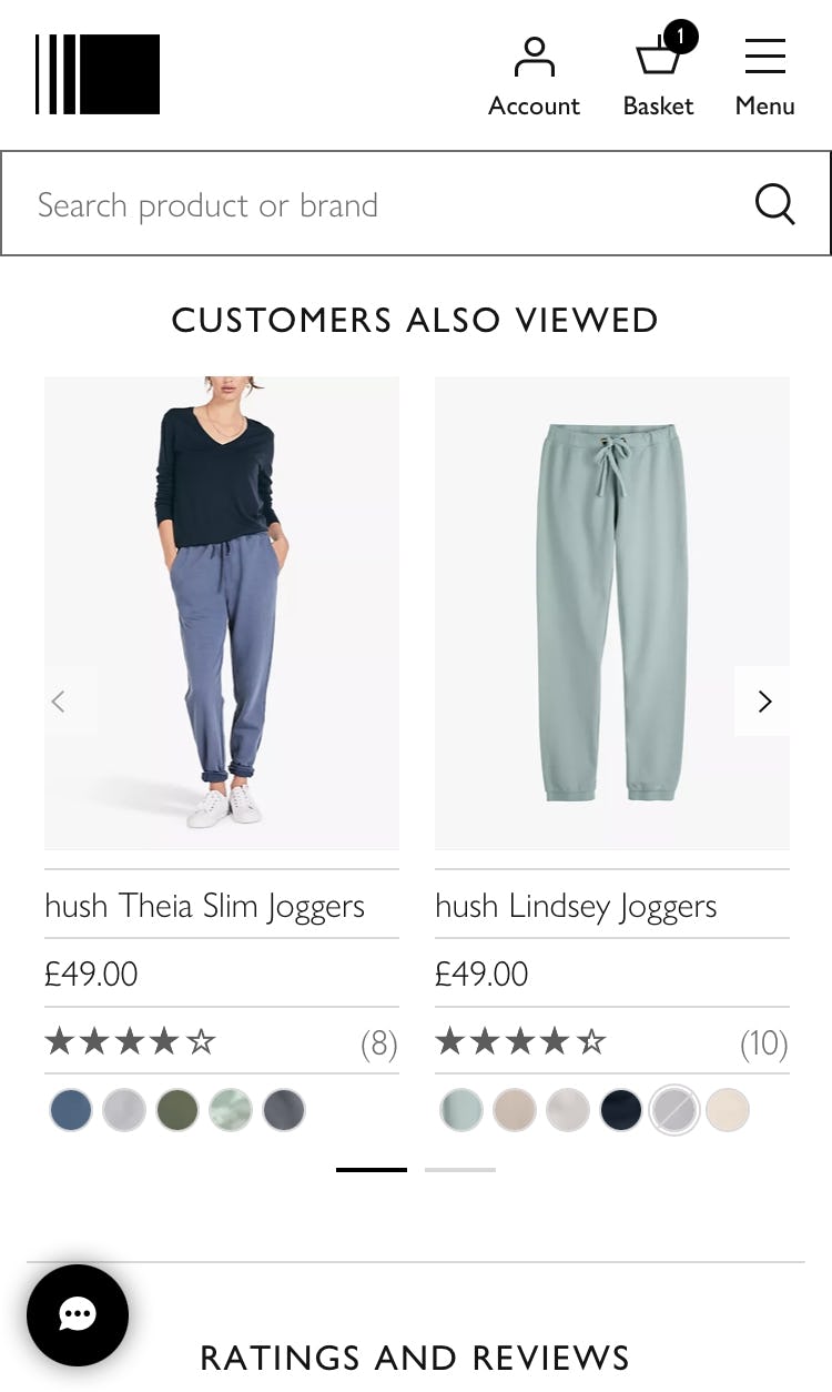
Mobile users can easily assess cross-sell listings at John Lewis (first image) and IKEA (second image) because they include essential product attributes (i.e., thumbnail, product name, price, and user rating) and additional attributes (e.g., brand, variations).
By including all essential product attributes (i.e., thumbnail, product name, price, and user rating) and additional attributes when warranted (i.e., brand, product variations), mobile users are provided with the information necessary to effectively evaluate and compare the items in the cross-sell sections.
Additionally, displaying key product details directly in the cross-sell sections on mobile provides a more consistent cross-platform browsing experience.
Help Users Assess the Suitability and Compatibility of Cross-Sell Recommendations
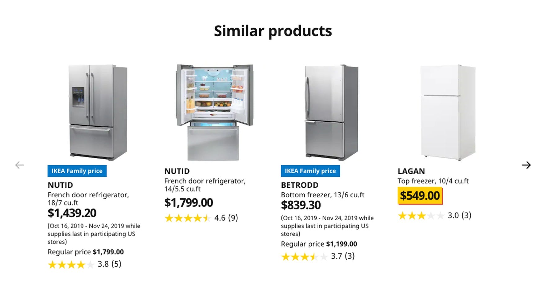
IKEA provides a high-quality product image, a fully visible feature-rich product title, price, and a user rating including the number of ratings with its alternative cross-sells. Most users will have everything they need to judge whether a cross-sell is worth exploring further.
Failing to include adequate product details with cross-sell recommendations undermines the primary purpose of cross-selling on the product details page — to provide users quick and easy access to relevant alternative and supplementary products.
Consequently, users will miss out on otherwise relevant products of potential interest.
Indeed, during testing, some users interested in a cross-sell, but provided with insufficient information, disregarded them entirely.
Yet, 68% of benchmark desktop sites are missing one or more of these essential item attributes in cross-sell listings:
1) High-quality thumbnail (8% of visually driven sites don’t)
2) Fully visible product title (55% don’t)
3) Price (15% don’t)
4) User ratings average (50% don’t)
Furthermore, 54% of desktop sites are missing these additional attributes proven to enhance the evaluation of product page cross-sells:
5) Product Variations (54% don’t)
6) Brand (7% don’t)
Indeed, it’s surprising that so many sites will put in the effort to provide cross-sells on the product page, yet fail to follow-through by providing users with everything they need to assess the suggestions.
In the end it’s a missed opportunity to provide users with direct access to suitable products, leading directly to lost sales as a result.
This article presents the research findings from just 1 of the 650+ UX guidelines in Baymard – get full access to learn how to create a “State of the Art” ecommerce user experience.

