Presenting cross-sells in the cart, or right after a product has been added to the cart, can enhance and streamline the user’s shopping experience.
Recommending products at this point in the purchase process can also increase the average order value by bringing additional items of interest to users’ attention.
However, the usefulness of cross-sells is directly linked to their relevance to the user’s cart contents.
Unsurprisingly, our large-scale checkout usability testing consistently shows that users are quick to dismiss recommended products and offers that are not obviously related or applicable to the product(s) they are purchasing.
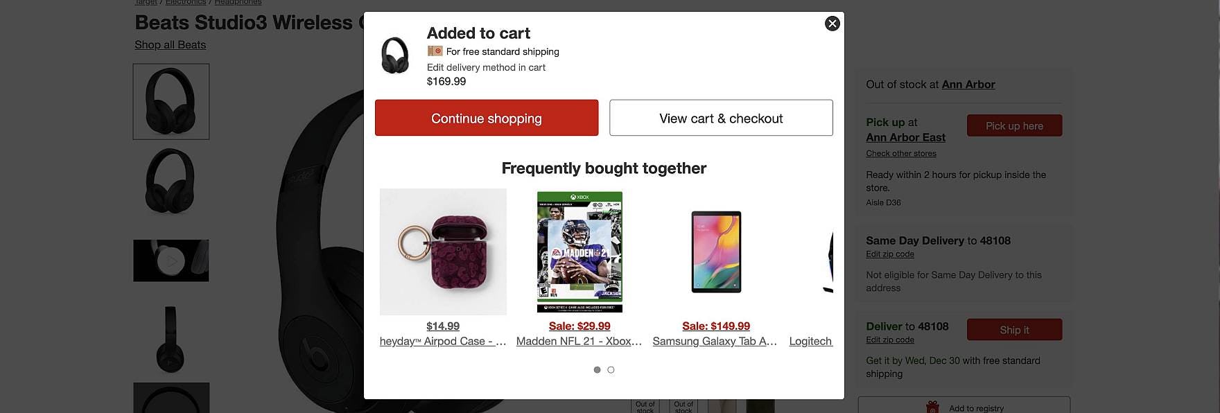
Yet, 52% of desktop sites we benchmarked present cross-sells in the cart, or in the “Added to Cart” confirmation, that are either completely irrelevant or based only on what other customers bought.
In this article we’ll discuss the test findings from our large-scale usability research studies on how irrelevant product recommendations and offers in the cart damage user engagement with cross-selling sitewide.
Moreover, we’ll also discuss 6 ways e-commerce sites can ensure cross-selling in the cart is meaningful and relevant for users:
- Avoid listing a fixed number of product suggestions
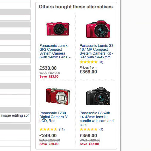
- Be cautious about listing alternative products
- Provide clear labels that define the context to the user
- Prioritize products of the same theme
- Give precedence to compatibility-dependent items
- Consider the user’s context when promoting special offers
Irrelevant Cross-Sells Erode Users’ Confidence Sitewide
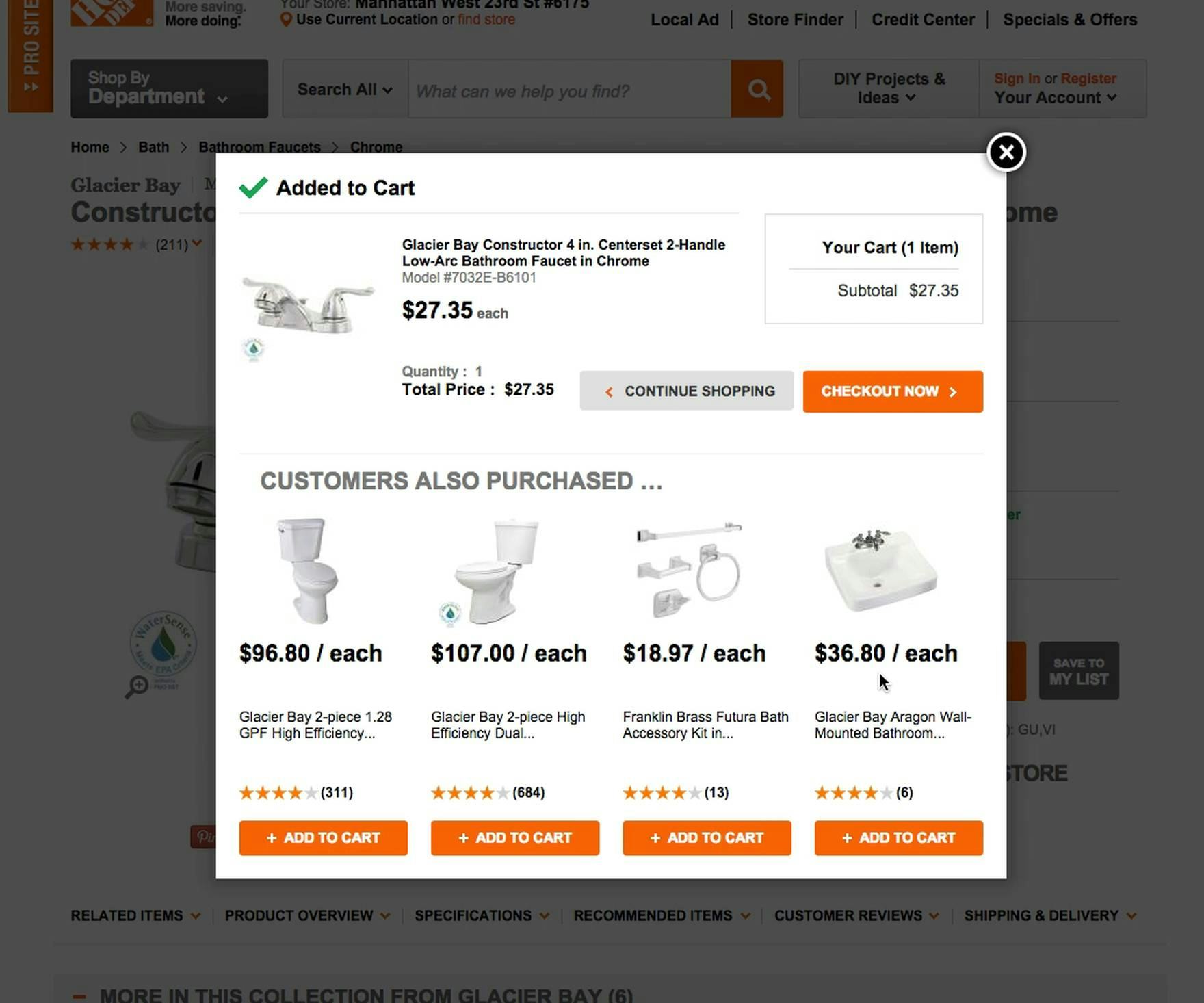
“These kind of things NEVER get me to buy anything extra. And not at all on sites like this, where I’m buying something practical, where something in my home has broken. It’s not like I’m thinking, ‘Wait, let me also get a new toilet’.” A user at Home Depot was annoyed by the suggested items after adding a bath faucet to his cart. A more appropriate list of suggested items would have been the fittings, connections, and sealant for a successful installation, none of which were recommended.
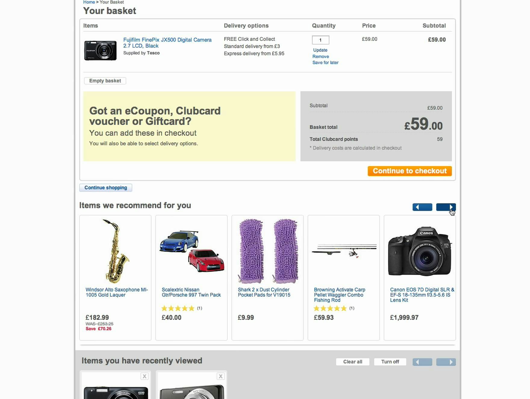
“No, not when I can see that the other products are not compatible, but otherwise I probably would.” A user at Tesco looking for a camera bag to supplement the camera she was purchasing lost all confidence that any of the bags would fit her camera upon seeing other items suggested that were not related at all to the item in her cart.
Users have come to expect and appreciate a highly personalized online shopping experience that is tailored to their preferences and needs at every step.
Therefore, recommending highly relevant items such as compatible accessories necessary to install or use the item(s) just added to the cart is considered by users to be “good service” instead of an attempt to sell them more products.
On the other hand, product recommendations and promotional offers that don’t have a clear relationship to the cart contents are typically seen as distracting or annoying, or simply ignored by users.
Indeed, suggesting products that are not obviously related to the cart contents, or to the item just added to the cart, can erode a user’s confidence in the site, and all of its recommendations — even relevant ones.
During our large-scale usability research studies, even 1 questionable recommendation was observed to cause users to lose faith in all of the product suggestions and subsequently ignore them all.
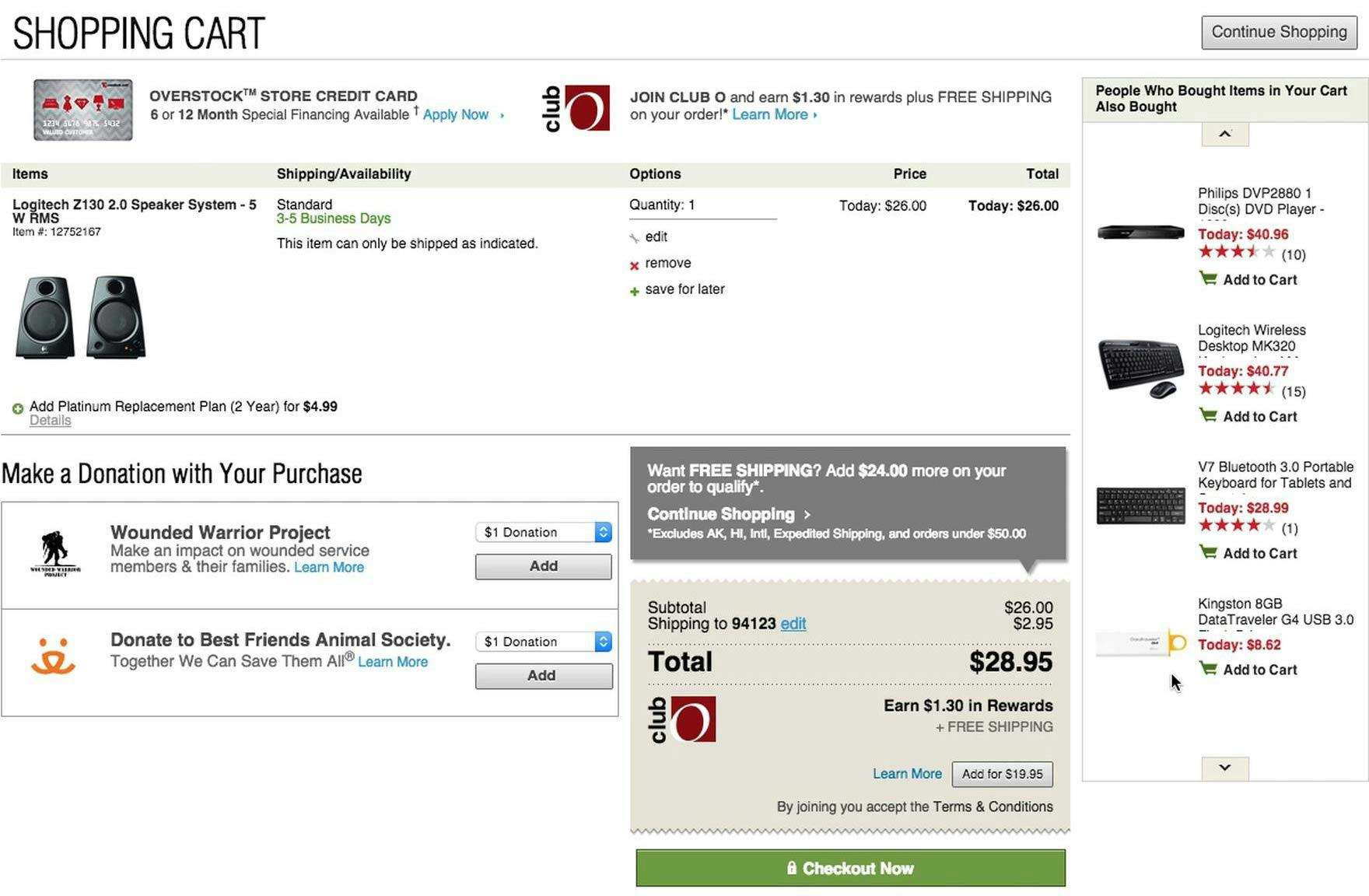
“I think this site is super annoying; there’s way too much info. Because I buy a speaker, I might also be interested in buying a USB stick? It’s difficult to see the connection.” A user at Overstock expressed irritation at the many cross-sell and promotional offers in the cart, including a store credit card, a “ClubO” membership, a sidebar of “Customers also bought” product suggestions containing unrelated items, 2 donation options, a free shipping offer, and a second “ClubO” offer.
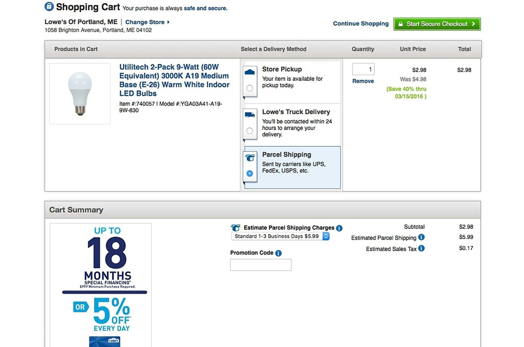
Lowe’s includes promotions where the relevance is highly doubtful, given the cart’s order size. For example, for most users, a promotion for 18 months of financing will be mainly noise when they’re about to place a $6 order.
Similarly, promotional offers such as discounts, credit cards, and financing options that, based on the cart contents or the item just added to the cart, would be illogical for users to opt in to waste users’ time and damage their overall perception of the site.
Once a user loses faith in the relevancy of the offers in the cart, they become just an unwanted distraction or clutter.
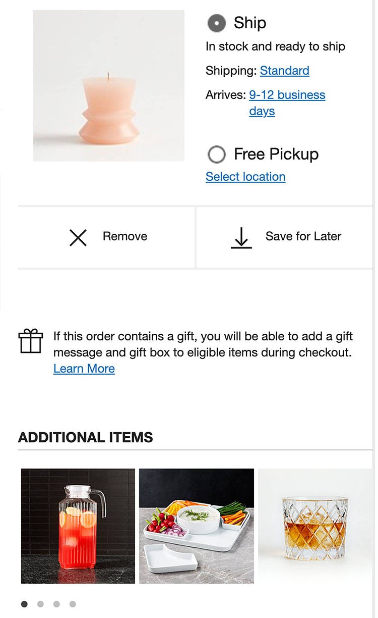
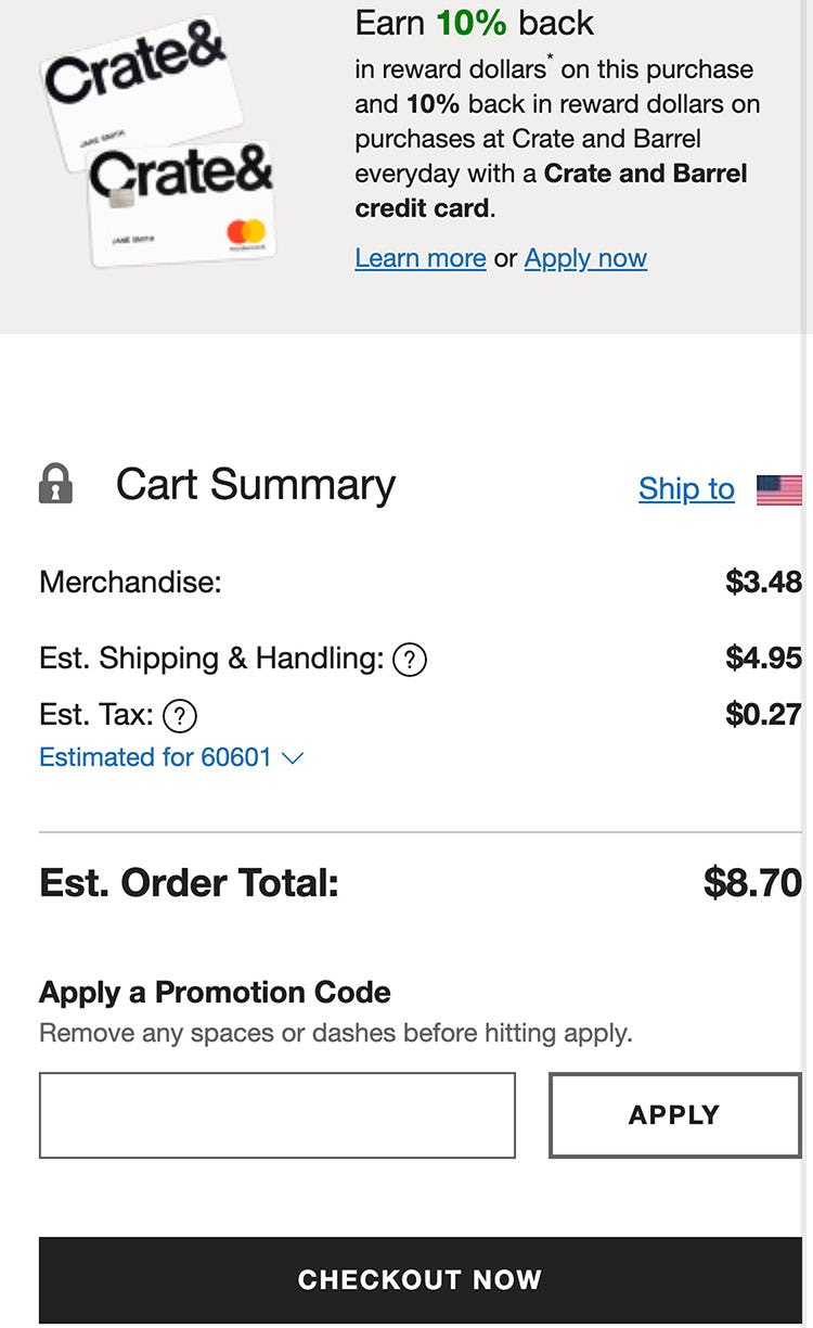
At Crate & Barrel irrelevant product recommendations (first image) and a credit card offer (second image) are presented in the primary cart area of the mobile site, creating unnecessary clutter, as well as undermining users’ primary goal in the cart to review the items in their order and acquire an estimated total.
On mobile, the smaller viewport was observed during testing to make it challenging for users to get an adequate overview of their cart, particularly if they had to contend with noise from product suggestions and promotional offers that were not relevant or applicable to their cart contents.
To avoid a cart being perceived as overwhelming or “pushy”, and to avoid distracting users from completing their checkout, both the relevance and placement of cross-sells and promotions presented in the cart must be carefully considered.
6 Ways to Improve the Relevance of Cross-Sells in the Cart
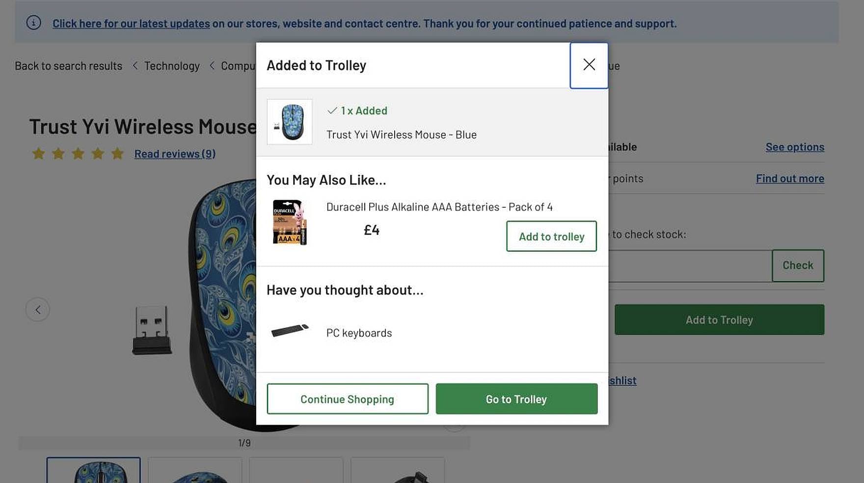
At Argos, the “Added to Cart” overlay recommends the batteries needed to operate the wireless mouse just added to the cart. An option to browse a related category — PC keyboards — is also presented.
Having a high relevance in the product suggestions and offers displayed in the cart or “Added to Cart” confirmation is paramount, as, at this point in the shopping process, the user isn’t in nearly the same degree of “product exploration” mindset as they are when considering product suggestions on a product details page.
On many sites, the behavioral data from other users is often the predominant or only factor considered for cross-sell relevance — an example being “Customers Also Purchased” or “Customers Who Viewed This Also Viewed This”.
While behavioral data can be a useful input for suggestion relevance, it’s clear from our usability research studies that it shouldn’t be the only factor, as there is an increased likelihood that at least some product suggestions will be perceived as irrelevant, and users largely ignored cross-sells they deemed irrelevant.
Using a combination of user-specific behavioral data (e.g., the specific user’s history, session history, purchase history, current items in cart, profile information) and general behavioral data (e.g., general shopper behavior, category relationships) would improve the level of product suggestion relevance.
Fortunately, most sites and third-party product recommendation engines get this right.
However, during our large-scale usability research studies, 6 additional implementation details proved vital for ensuring the relevance of product recommendations and promotions.
1) Avoid Listing a Fixed Amount of Product Suggestions
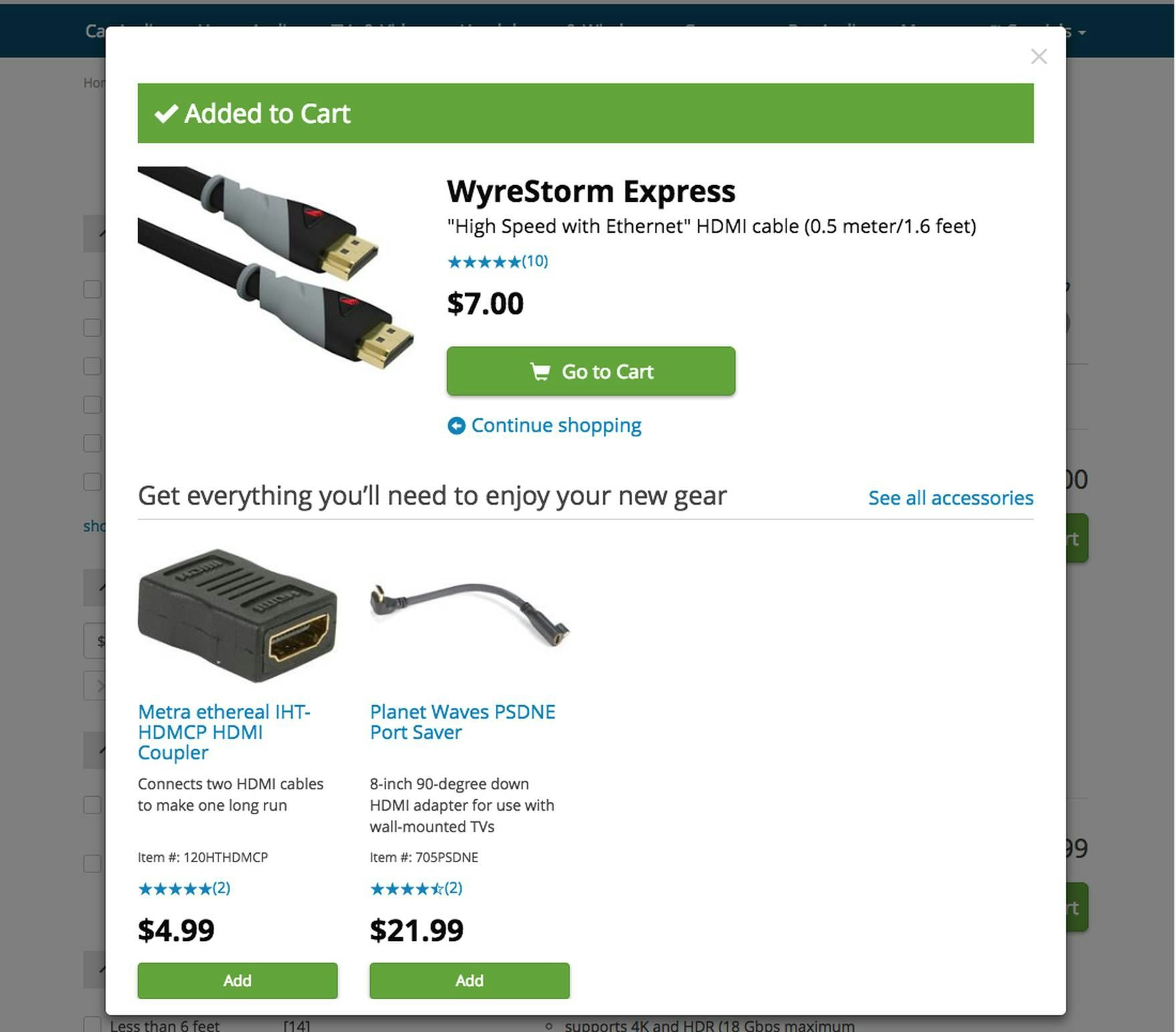
An “Added to Cart” overlay confirming an HDMI cable’s addition to the cart at Crutchfield displays a dynamic number of compatibility-dependent product recommendations, instead of a fixed number, which would likely include suggestions for products of lower relevance.
Most product recommendation sections always suggest the same number of items and are thus more likely to include irrelevant or only partially relevant items.
However, if there is only 1 truly suitable product that will complement a purchase, it will get more attention if it stands by itself — due to a better signal to noise ratio — rather than if it’s offered alongside 4 products of doubtful relevance, just because “5 suggestions” is the default defined in the suggestion logic.
The inclusion of 4 additional low-to-medium relevance product suggestions will cause a lowered confidence in the site’s ability to make product suggestions in general.
Therefore, the first step of improving the relevance of product suggestions is moving away from always suggesting a fixed number of items, and instead displaying a dynamic number of suggestions, depending mainly on how many “high relevance” items the logic can identify.
Recommending only the most relevant items boosts all product suggestions’ perceived credibility while simultaneously increasing users’ awareness of available compatible items.
2) Be Cautious about Listing Alternative Products
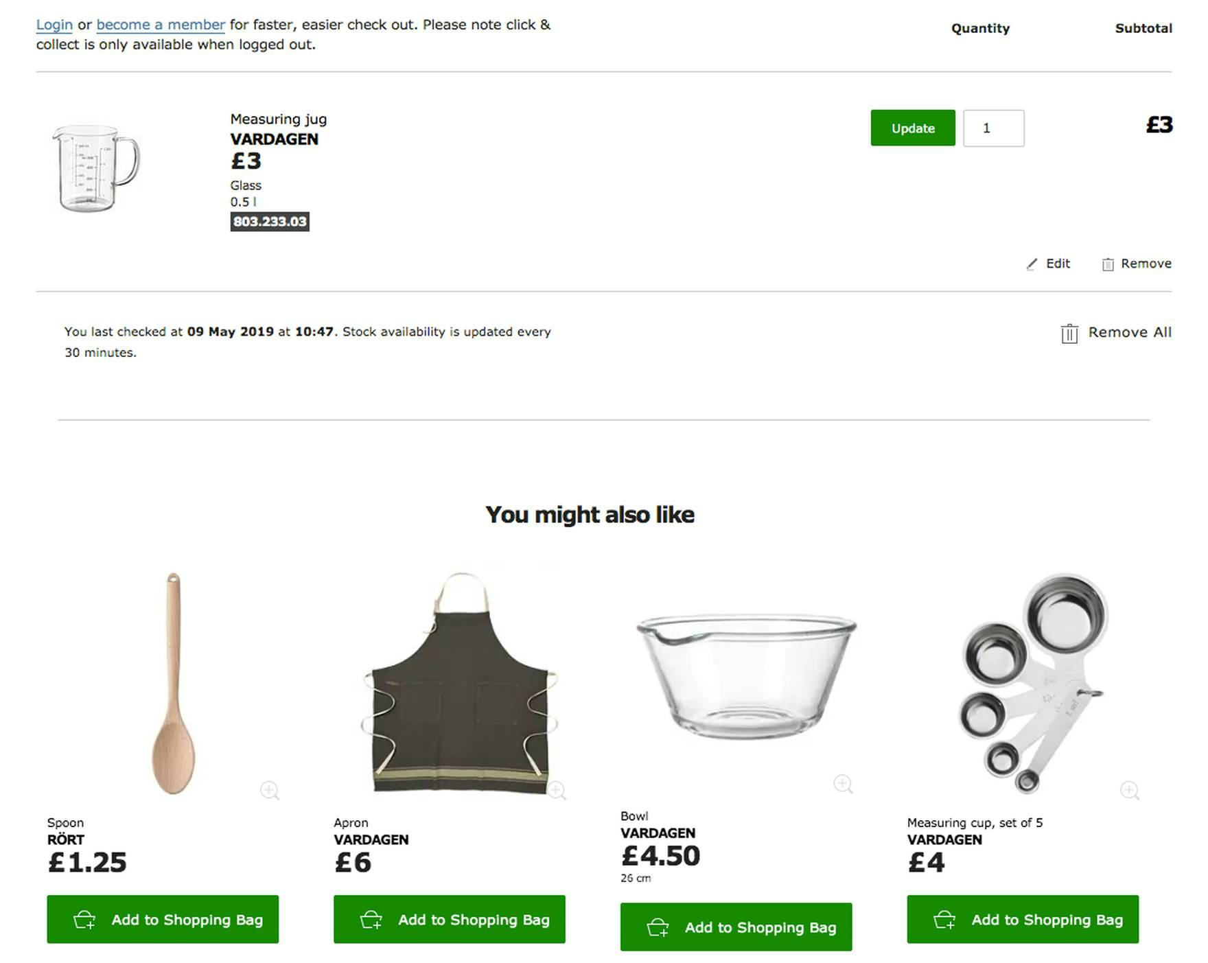
At IKEA, the “You Might Also Like” section presented at the bottom of the cart contains only other similarly priced kitchen tools that could conceivably be of interest to a user purchasing the measuring jug.
Users shouldn’t second-guess themselves while they are in the process of checking out.
Now, suggesting alternatives to a product can be helpful while a user is still shopping — for example, via a list of alternative product suggestions on the product details page.
However, suggesting alternative products is less helpful as users are about to check out.
At this point in the purchase process, suggesting alternative products may do more harm than good if a user ready to check out instead pursues an alternative product shown to them — potentially to never return to the checkout process.
Therefore, supplementary products that complement the item(s) in the cart should generally take precedence over alternative product suggestions.
Note though that there may be site-specific contexts that warrant alternative product suggestions, like product upgrades or newer versions of the same product.
3) Provide Clear Labels That Define the Context to the User
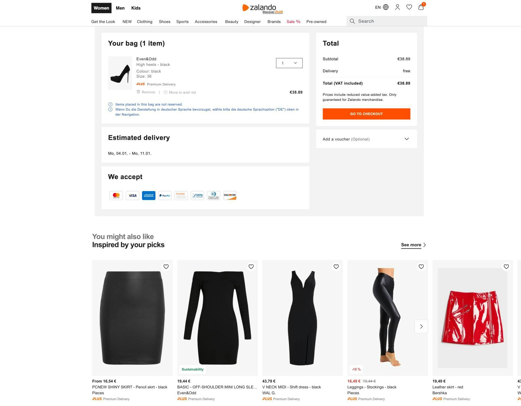
The “Inspired By Your Picks” label for cross-sells presented in the cart at Zalando helps users understand why the site is suggesting these particular items.
While not increasing the accuracy of the suggestions, clearly labeling the recommended products in the cart will increase the accuracy of the user’s interpretation of the suggestions.
If a user understands that a product is being suggested because of their previous browsing experience or purchase patterns, or based on what others who purchased the same item also bought, they are less likely to be dismissive when shown items that appear irrelevant to their current order.
Therefore, consider using labels like “Inspired by Your Browsing History” for recommendations based on previously viewed items, “Frequently Bought Together” for supplementary cross-sells based on other users’ purchasing patterns, “Complete the Look” for coordinating apparel, or “Other Products in this Collection” for other items of the same collection or series.
4) Prioritize Products of the Same Use Case or Theme
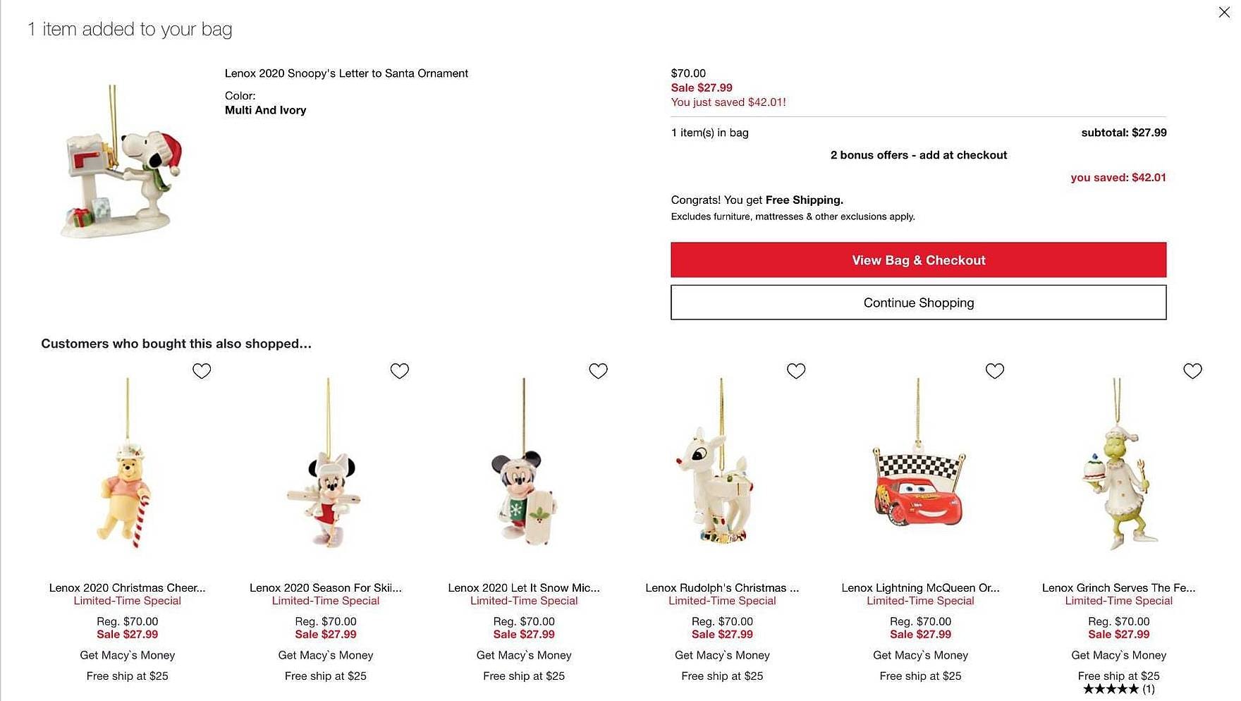
Product suggestions in the “Customers Who Bought This Also Shopped” section of the “Added to Cart” overlay at Macy’s are tailored to the item just added to the cart (other ornaments from the same brand’s collection).
One factor that can be useful to ensure high relevance in cross-sell suggestions is the “use case”.
To determine use cases sites can use existing product themes or styles — for example, “Back to School”, “Christmas Decor”, “Outdoor Entertaining”, “Country Kitchen”, or “Winter Essentials”.
Giving priority to products of the same theme can prevent seemingly unrelated items from being displayed.
If used as a predominant factor for relevance, consider dedicating the entire cross-sell section to use case–type products and labeling it appropriately — for example, for a winter jacket, having a cross-sell section for “More Winter Essentials”, so it’s clear to users that the suggestions are thematic.
5) Give Precedence to Compatibility-Dependent Items
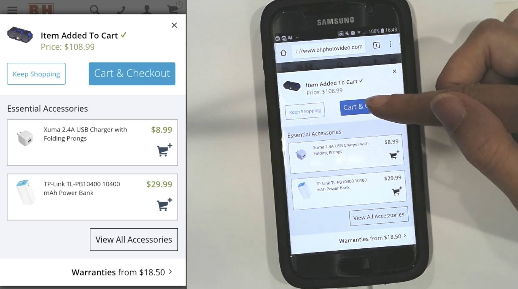
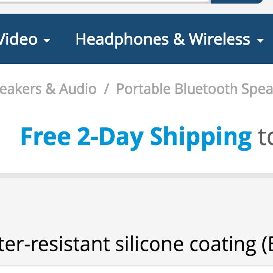
B&H Photo presents “Essential Accessories” in the “Added to Cart” overlay for a Bluetooth wireless speaker. Suggesting 100% compatible products helps ensure users can trust the site’s recommendations.
Suggestions for products that have a direct compatibility relationship, such as accessories or tools typically needed to make the product in the cart function as intended, will often be considered by users to be most relevant.
These can function as a helpful sales associate would, by, for example, suggesting a customer purchase a necessary cable along with their TV — customers (and users) will benefit from having everything they need to begin using their new product.
The most obvious examples include suggesting compatible batteries for a product that comes without them, installation parts and hardware, and accessories that are directly related.
For example, a toy that requires batteries to operate, a mobile phone with specific dimensions for a protective case, or a camera needing a particular memory card type are all examples of compatibility-dependent product suggestions.
Therefore, compatibility-dependent items should take precedence over other types of product suggestions, and compatibility should therefore be accounted for in the recommendation logic.
6) Consider the User’s Context When Promoting Special Offers
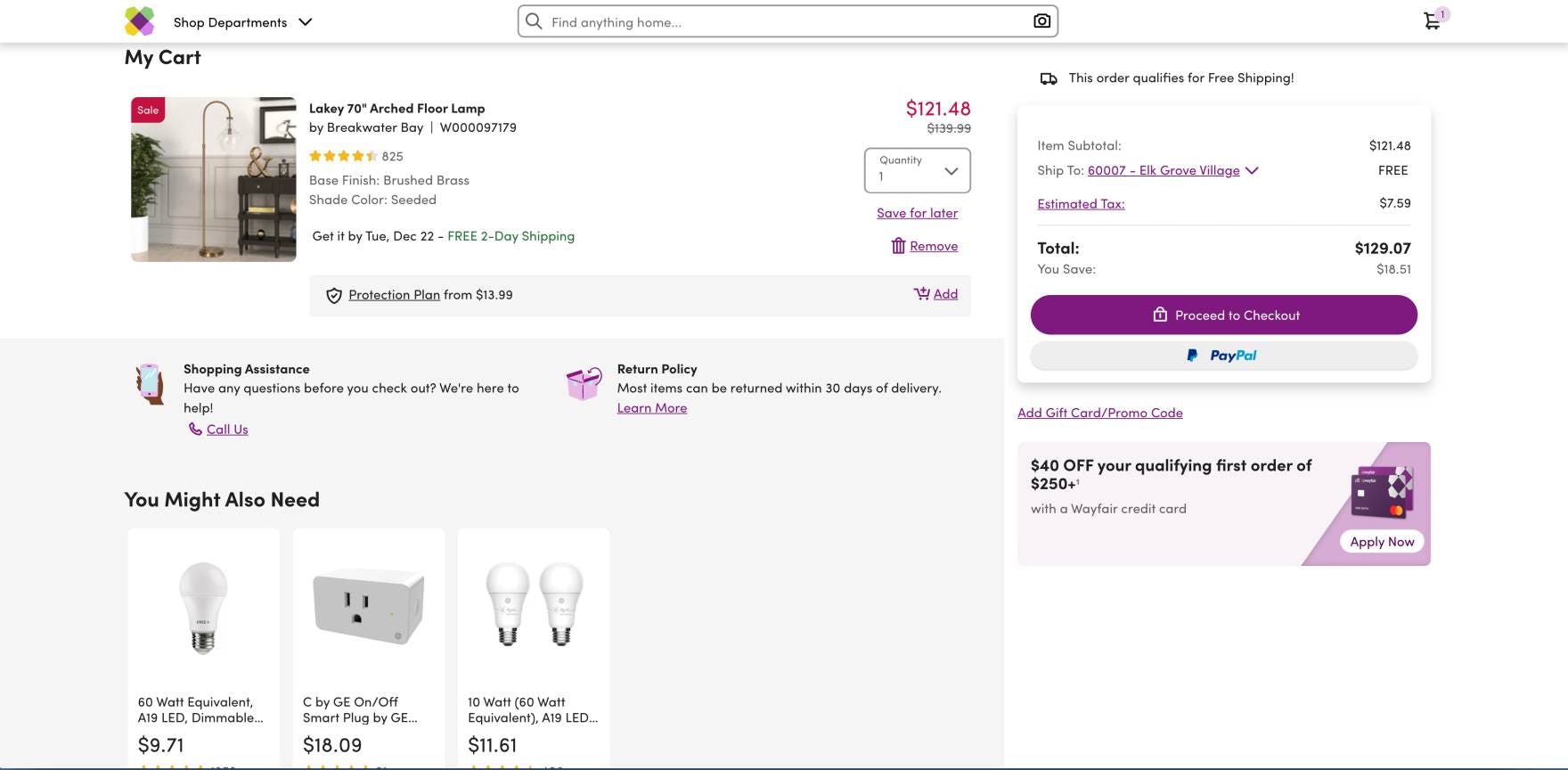
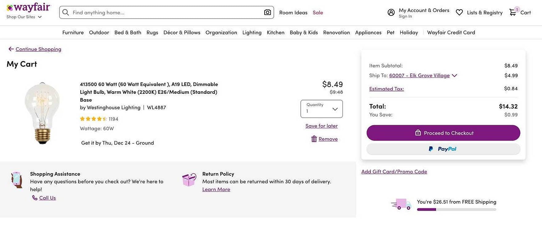
A promotional offer for the branded credit card is presented in the cart at Wayfair when it contains a higher-priced item such as a floor lamp (first image), yet not when it contains a lower-priced item such as a light bulb (second image).
Lastly, users are easily irritated by illogical and inapplicable promotional offers in the cart, leading to frustration and contributing to “banner blindness”.
Consider, for example, how likely are users to spend $60 extra to reach a free shipping threshold on a product that costs $4.99 and only $3 to ship? Or, who would apply for a credit card in order to save 10% on a $5 order?
Therefore, introduce low-level logic for when to present certain promotions like credit card offers and free shipping tiers — for example, by showing the offers only after users reach a meaningful order level.
Avoid Turning Cross-Sells into Another Instance of “Banner Blindness”
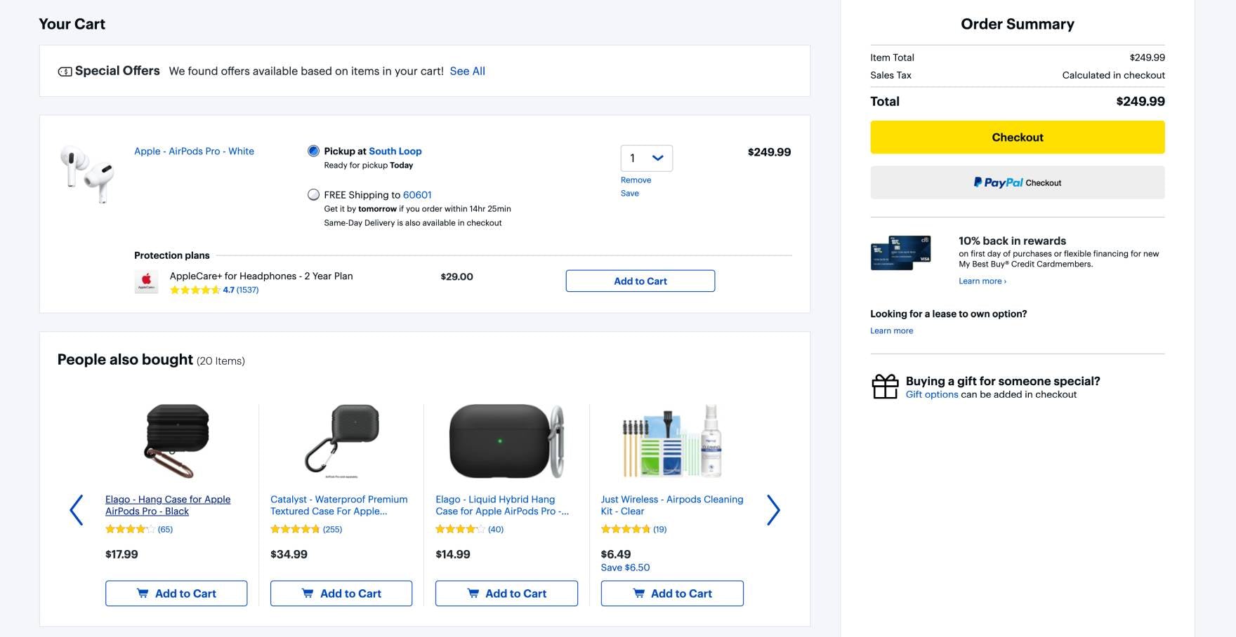
Best Buy recommends a variety of relevant accessories in the cart that others have purchased along with Apple Airpods Pro, including alternative cases and a cleaning kit.
Cross-selling in the cart is an ideal opportunity for e-commerce sites to streamline the shopping experience for users and boost sales at the same time.
However, our usability research consistently confirms that users are quickly turned off by irrelevant recommendations and offers in the cart — often ignoring cross-sells sitewide when even 1 questionable recommendation is presented.
On the other hand, recommendations and offers that are highly relevant to the items in the cart were observed to encourage user engagement, which can lead to increased order totals and an overall positive impression of the brand.
Therefore, it’s important to ensure the relevance of cross-sells by not just looking at behavioral data and defaulting to generic offers, but also by
- adjusting the number of displayed products based on their relevance score,
- giving precedence to supplementary items that complement items in the cart,
- using clear labels to provide context around why the items are considered relevant,
- prioritizing product recommendations of the same theme,
- accounting for product compatibility in the recommendation logic, and
- matching promotions to the user’s context.
By presenting only suitable recommendations and applicable offers in the cart, sites can provide the highly personalized shopping experience users expect while simultaneously increasing the average order value — a “win-win” for both users and sites.
This article presents the research findings from just 1 of the 650+ UX guidelines in Baymard – get full access to learn how to create a “State of the Art” ecommerce user experience.

