Key Takeaways
- Most sites benchmarked by Baymard obtain “mediocre” or worse performance scores in the area of Gifting Flow and Features
- Gifting options that are poor or unclear can cause users to abandon their purchases altogether
- This article offers 4 research-backed UX best practices to make it easy for users to buy gifts
Key Stats
- 60% of sites don’t explain available gifting features in detail
- 68% of sites don’t consider showing gifting options on the product page
- 68% of sites don’t allow users to designate gifts in the cart
- 81% of sites don’t dynamically adjust shipping field labels for gift-marked orders
Ideally, buying a thoughtful gift provides pleasure to the buyer, the receiver, and the seller (in a financial sense).
Unpleasurable is a buyer’s panicked realization that they have messed up the gift order by sending the gift to themselves, sending it to the recipient with a normal receipt, or failing to choose any gift options at all.
Gifting should be easy, but as gifting options vary widely from site to site, we observe in Baymard’s usability testing that users looking to place an order as a gift must carefully assess each site they visit for the availability and cost of gifting options.
Moreover, even when gift options are available, 60% of desktop sites in our e-commerce UX benchmark have trouble effectively communicating the details of available gifting options to users.
Based on our Premium research findings, this article describes 4 ways that sites can help users fully understand — and therefore feel comfortable using — available gifting options:
- Explain available gifting features in detail (60% don’t)
- Consider showing gifting options on the product page (68% don’t)
- Allow users to designate gifts in the cart (68% don’t)
- Dynamically adjust shipping field labels for gift-marked orders (81% don’t)
1) Explain Available Gifting Features in Detail (60% Don’t)
At Fitbit, users can select “This is a gift” at checkout but have no reassurance about what this option entails. Perhaps it means the package ships with a gift receipt, perhaps something else.
During testing, participants often drew false conclusions about gifting options — for example, what a particular gifting option included, or the specific details the recipient of the gift would see — which, in turn, led to a worse gifting and checkout experience overall.
While offering gifting options can provide a bespoke level of service, it also introduces an additional layer of complexity that can make users’ checkout experience more confusing.
As such, users are unable to accurately predict the consequences of clicking “This is a Gift” on some sites.
For example, possible gifting options on an e-commerce site can include, but are not limited to, the following:
- Custom gift messages (complimentary or for a fee)
- Gift wrapping and gift boxes
- Gifting-specific shipping options
- Price tag removal
- Gift receipts
As the exact names and definitions of each of these options are different on each site, user confusion is entirely understandable since they are being presented with so many different terms for what is essentially the same feature.
For example, one site will call it a “Gift Receipt”, whereas another will offer to “Hide prices on invoice”, and yet another will say that they “Don’t show price on package slip”.
“So ‘Send this order as a gift’, and that gives you a little information.” During testing at Walgreens, this participant used the tooltip to learn more about gifting options during checkout.
On the other hand, providing clearly detailed gifting options helps users quickly decide which gifting options they’d like to choose.
Therefore, every single gifting feature that users can opt into must be explained in detail — for example, providing
- a very clear and descriptive title with an additional inline description following it,
- a hover-activated tooltip on desktop, and
- some combination of expanding fields or overlays which only appear once gifting is selected.
Additionally, an important aspect of explaining gifting features is to state when two or more options are grouped together — for example, stating that a gift receipt is automatically included if a gift message is selected.
Otherwise, users might assume an option simply isn’t available.
Further complicating gifting for users is that some gifting services may be free — typically this includes a custom gift message and gift receipt — while other services are available for an additional charge, such as gift wrapping.
During testing, users’ expectations for which services were free were sometimes misaligned, leading some users to believe that adding a gift message would be a premium service.
Therefore, it is crucial that each of the gifting features is explicitly marked as free if there is no cost associated.
“‘Recipient email’ — I don’t know, is this optional? I’d prefer not to have them email the person…It seems like it’s going to be required.” This participant, ordering a gift from Hayneedle, hesitated to include a gift message, worrying that it would be emailed to the recipient rather than included with the gift.
At Disney Store, users sending a gift are required to include the recipient’s email address when sending the order as a gift, which some users may not wish to do.
Finally, participants in testing were surprised by gifting options that required them to provide the recipient’s email address for sending postorder notifications. Most participants preferred for recipients to not receive any site communications even when they were assured that the email would contain no pricing information.
As one participant put it, “I feel like it would lose that surprise aspect, to just get it in an email rather than when the item shows up at the doorstep.”
At Amazon, opting in to gift options reveals several additional optional features, including gift wrapping and the option to email the recipient a copy of the gift receipt after the gift has been delivered.
Likewise, users checking out at Zingerman’s can opt into send tracking information to the recipient but are not required to do so to include a gift message.
Instead, sending order communications to gift recipients should be optional, allowing users to designate their order as a gift without requiring them to “ruin the surprise.”
Alternatively, it can be made clear that emails to recipients will only be delivered after the gift has been delivered.
2) Consider Showing Gifting Options on the Product Page (68% Don’t)
Here Gamestop’s product page gives users options for shipping and coupons, but not gifting. Users have to wait until the product is in their cart before they learn how they can give it as a gift.
Target does not offer gifting options on their product page, but it will let users choose the product quantity, shipping speed, product insurance, and even to add it to their registry (next to the tantalizing image of a gift box).
Some especially thoughtful users will want to know what gifting options a site has to offer early on — while still in the product-search phase — to avoid wasting time finding a suitable gift only to be disappointed during the checkout process when gifting options are nonexistent, too expensive, or too complicated to understand.
During testing, we’ve observed some users begin considering gifting options as early as the product page (or even before they land on the site, if they know they’ll need to send the order as a gift).
If users are unclear about the gifting options being offered for a particular product, they may not be willing to add the product to the cart or investigate the site’s nonproduct content in order to learn whether orders can be placed as gifts and what gifting features are available.
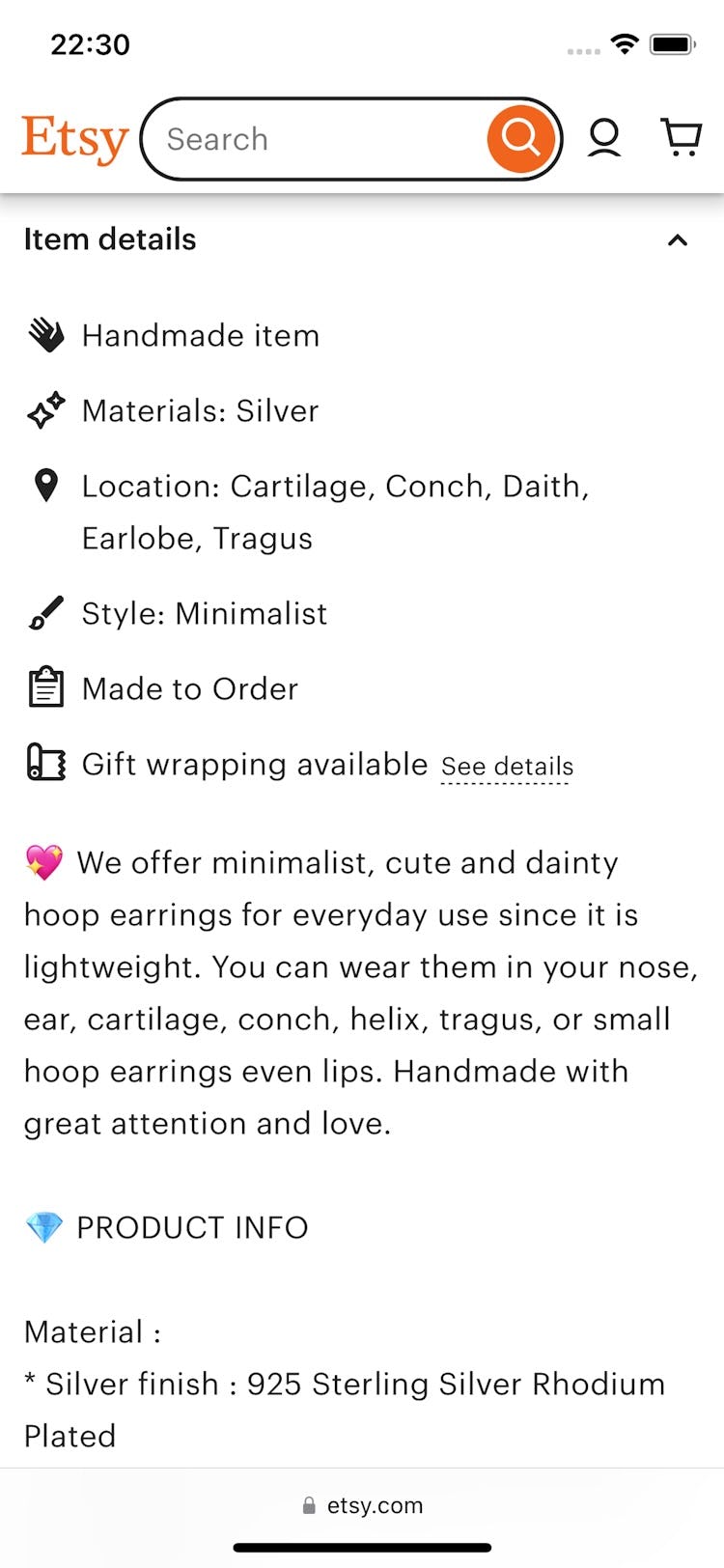
At Etsy, users can see the gifting options directly from the product page, before they decide to buy. Tapping the “See details” link provides a description of the options, including a picture of the gift box.
Indeed, users shopping for a gift will want to know if gifting options are available on a site — for example, if gift wrapping or custom messages are available — without having to go through multiple steps of the checkout process before potentially discovering the site doesn’t offer gifting, or the specific gifting options they are looking for.
If users are forced to add items and view them in their cart (or navigate the help section) in order to find details about available gifting options, some will falsely conclude that the site doesn’t offer gifting options and choose to abandon the site instead.
On the product page at Pen Heaven, users are offered the option to gift wrap their product, are shown the additional cost of gift wrapping, and are provided with a link to “More info” (first image). Additional information on available gift-delivery services — in this case, details about gift wrapping, custom gift messages, and removal of price tags and paperwork — is shown in an overlay (second image). Providing a link to more details about gift options allows users to easily answer their gifting questions.
However, advertising gifting options as early as the product page helps users keep their minds focused on finding the right gift — rather than prematurely worrying about whether gift options are offered during the checkout.
This information on the product page should clarify that gifting options are available, and provide additional details either directly on the product page or through a link to more information elsewhere.
To avoid cluttering the product details page when an abundance of gift options are available, clarifying information can be provided in a tooltip, overlay, or link rather than be fully described on the main product page.
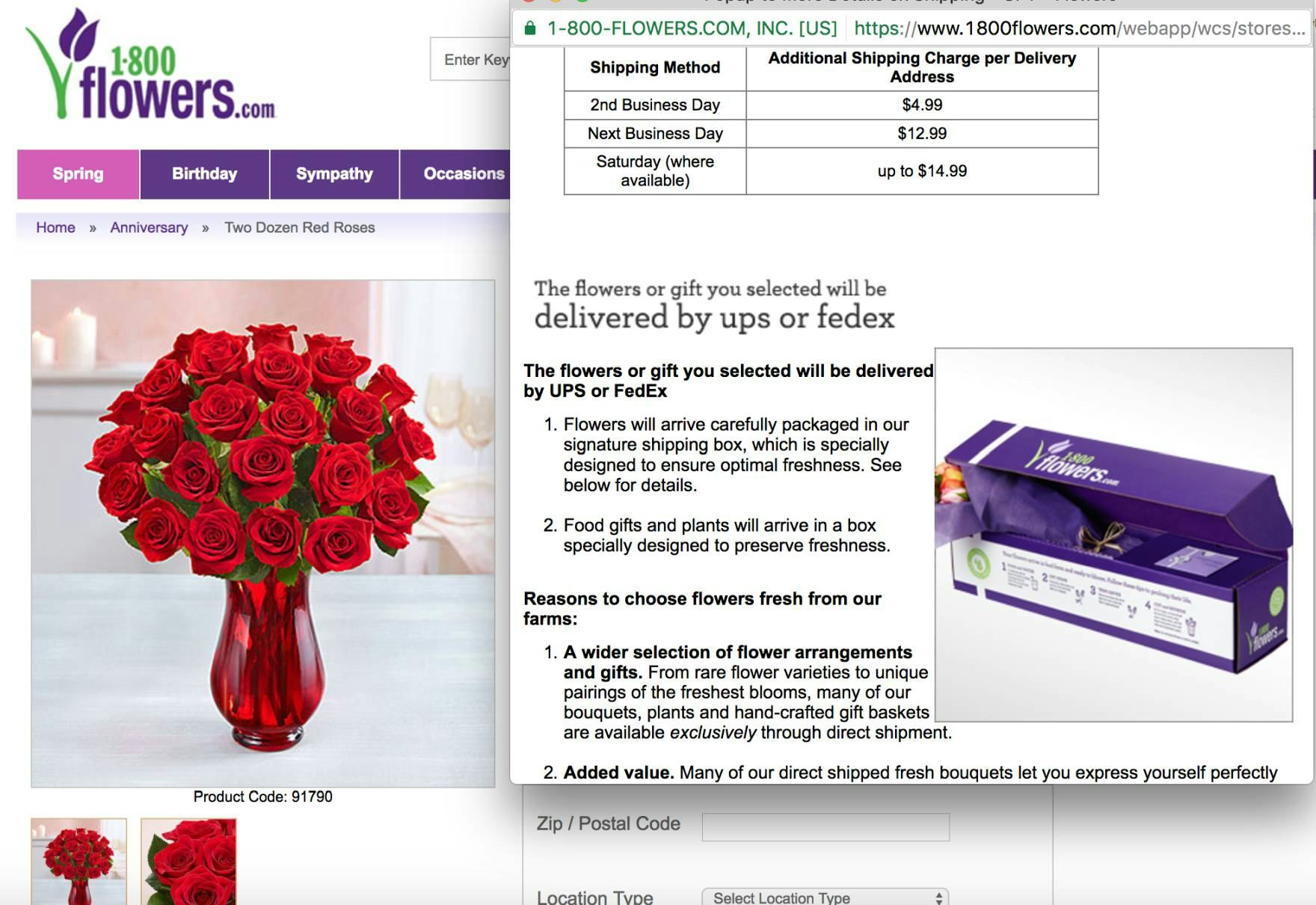
Gifting is a primary reason many users shop at 1-800flowers.com. Therefore, it makes sense to go into greater detail about the gifting options available on the product page. Allowing users to see what their gifts will look like upon final delivery — with gift boxes or custom gift messages — can put their minds at ease about their purchases.
For sites that ship most of their orders as gifts, providing more detailed gifting information as early as the product page offers a competitive advantage for those users who want to put extra care into their gift giving.
For example, offering detailed shipping information, pictures of gift boxes, and descriptions of how the gift will arrive all help considerate users to get a full picture of the gifting process — as compared to first adding a product to the cart in order to finally see the gift options.
3) Allow Users to Designate Gifts in the Cart (68% Don’t)
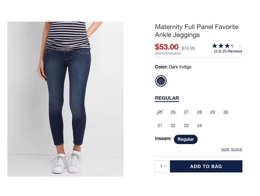
At Mejuri, no mention of gifting is offered in the cart, which may cause users intending to order a gift to hesitate to move forward.
At Sephora, users seeking to purchase a gift may not know that the site offers gift messaging or gift wrap, as none of these benefits are offered or mentioned in the cart.
Some users may face anxiety and unease if they cannot see gifting options when they view their shopping cart.
Other users, coming to the site with the sole purpose of purchasing a gift, may misinterpret the lack of gifting options in the cart as an indication that the site doesn’t offer gifting at all, and may consequently abandon.
Thus, sites that have any kind of gifting options should allow users to designate one or more products as gifts in the cart.
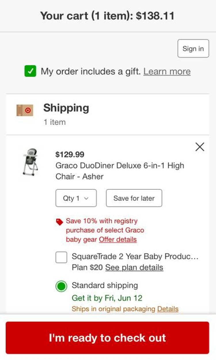
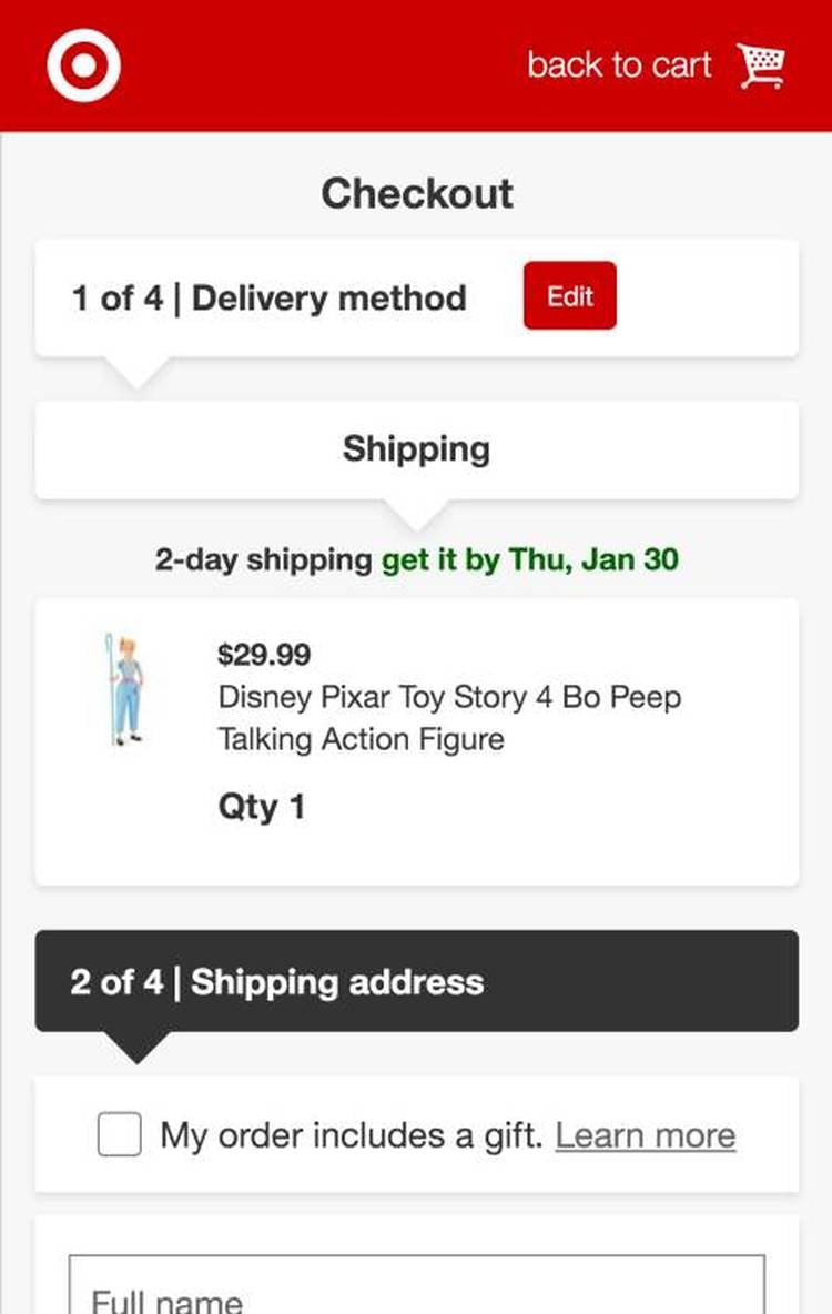
Target offers gifting options in both the cart (first image) and further in the checkout flow (second image), making it very easy for users to gift products.
“Let’s see if I can add a gift wrap or message.” This participant at Apple was excited to add gift wrapping to her order and immediately homed in on the option provided in the cart (first image), revealing an overlay with all available options and their associated costs (second image).
However, if users in the “Added to Cart” interface have the option to bypass the cart step, then the cart step cannot be the only place where items or orders can be designated as a gift.
Instead, it must be possible to designate an order as a gift further in the checkout flow as well.
By allowing users to designate gifting in the cart, sites can consequently customize the checkout flow to better suit the user’s gifting context.
In particular, the gift-recipient address and the phone number can be clarified.
If gifting is not technically possible in the cart, then consider having a small description in the cart step telling users when the gifting process will be available, and what type of gifting options exist.
4) Dynamically Adjust Shipping Field Labels for Gift-Marked Orders (81% Don’t)
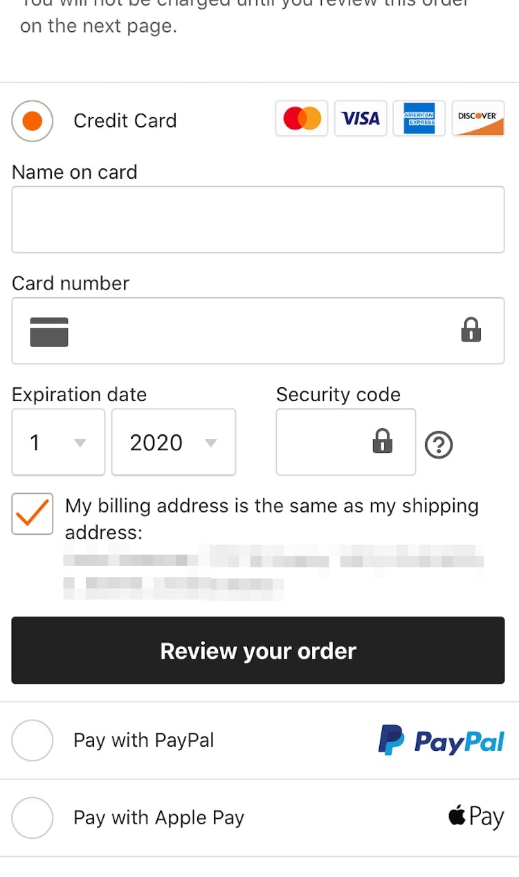
On Etsy, despite an order being marked as a gift in the cart (first image), “Billing = Shipping” is selected by default at the payment step (second image). Users looking to send this order as a gift would have to be very diligent in setting the shipping address as the recipient’s and the billing address as their own — something in practice many users are likely to overlook.
When a user selects the option to gift an item, and arrives at checkout, they have 2 options:
- Send the gift directly to the recipient
- Send the gift to themselves (in order to give it to the recipient directly)
However, during testing, presenting gifting users with the same billing and shipping address selectors normally used for nongifting users was observed to be problematic — as users conflated their own billing or shipping address with the address of the intended gift recipient.
This added layer of complexity to the shipping process was observed to be the direct cause for orders placed with incorrect order data, and even site abandonments.
At Primary, returning and signed in users who add gift options in the cart (first image) still have their saved default shipping address displayed during checkout (second image), making it more difficult for users to input or select the recipient’s address.
If a user has already indicated that “the order is a gift”, then the billing address should no longer be defaulted to equal the shipping address — to reduce confusion and prevent users from inadvertently sending an item to themselves.
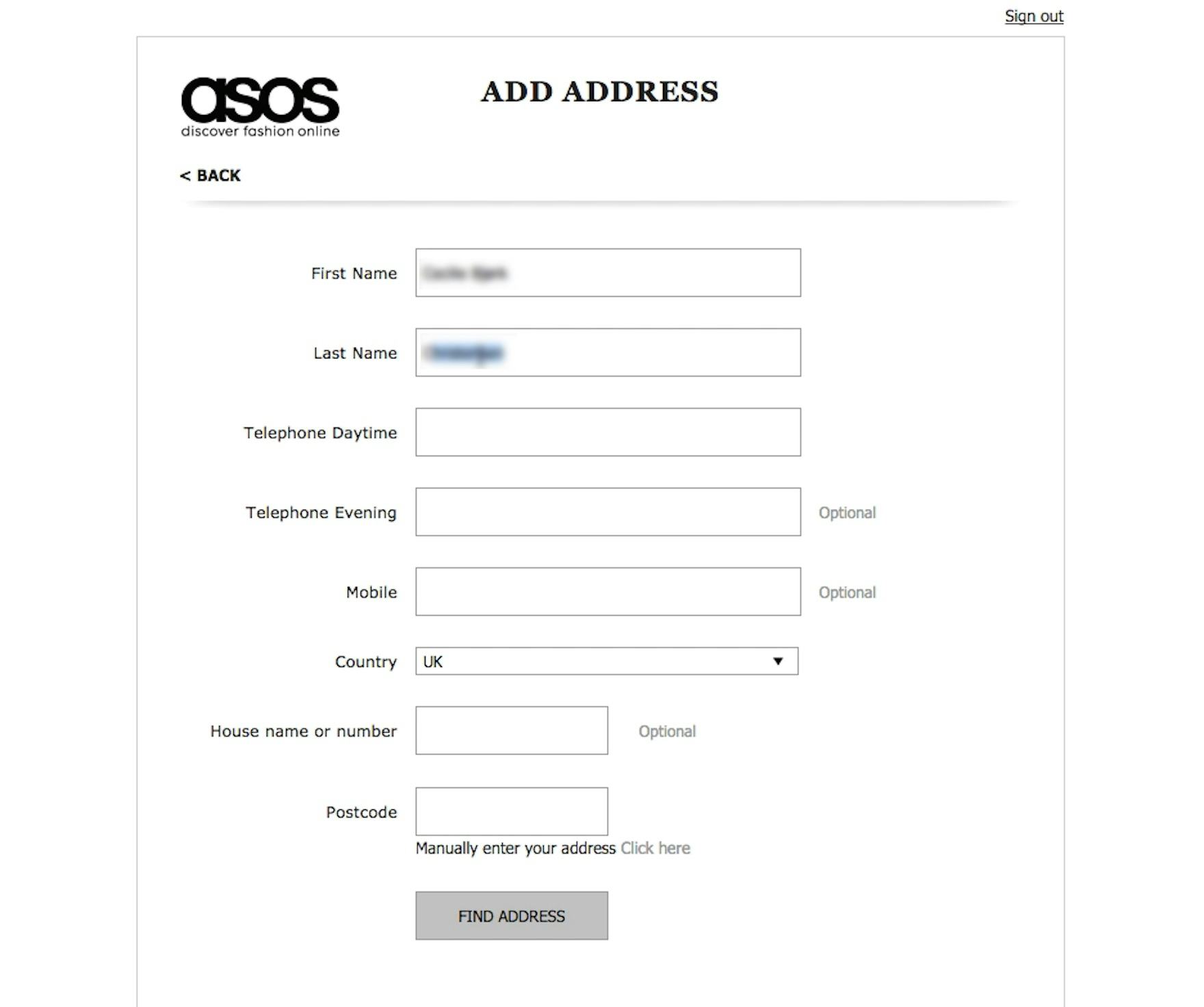
After indicating she was sending a gift at ASOS, this test participant’s name was autofilled using her account data. While this is generally recommend this in most cases, gift-marked orders provide an exception.
Furthermore, using location data, account information, and previously entered user information to prefill shipping information form fields — which is recommended in most cases — proved confusing for participants who were gifting orders.
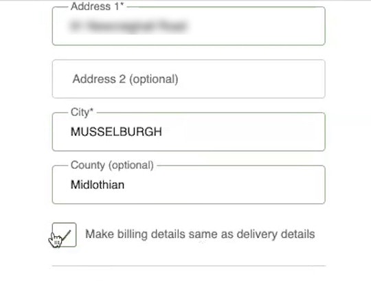
At Walmart, designating the order as a gift in the cart (first image) results in the ”Same as delivery address” checkbox on the ”Payment” step being unchecked by default, in contrast to its usual default setting for nongift orders (second image). Going a step further, the site dynamically updates the ”Shipping Address” step to specify that the address and phone number should be the recipient’s (third image).
Even when they are signed in to their accounts, once users mark their order as a gift they should be required to enter the gift recipient’s address (or select one from an address book), rather than being taken through the normal checkout flow (where any previously entered billing and shipping addresses may be used by default).
Lastly, the labeling itself can be improved by simply changing the title and label on the shipping address step to clarify that it’s the gift-recipient’s address that is being asked for — for example, labels like “Gift Recipient’s Name” and “Gift Recipient’s Shipping Address”.
The Season of Gifting UX Is Year-Round
Gifting is at its height during holiday seasons, and so the gifting strategies we have discussed in this article are likely to gain special attention during these special times.
But gifting happens even “off-season”, as users purchase gifts for birthdays, anniversaries, and other special events.
Most users do not give gifts every day, which only serves to increase the importance of the purchase experience when they do buy gifts.
Users can become confused and frustrated when they want to give a gift but cannot figure out how to do so or what the options are.
And, of course, no one wants to accidentally send the gift to the wrong place.
With these 4 research-backed strategies, though, sites can save users a lot of headaches (and potentially increase sales):
- Explain available gifting features in detail (60% don’t)
- Consider showing gifting options on the product page (68% don’t)
- Allow users to designate gifts in the cart (68% don’t)
- Dynamically adjust shipping field labels for gift-marked orders (81% don’t)
This article presents the research findings from just a few of the 650+ UX guidelines in Baymard – get full access to learn how to create a “State of the Art” ecommerce user experience.
If you want to know how your desktop site, mobile site, or app performs and compares, then learn more about getting Baymard to conduct a UX Audit of your site or app.


