Key Takeaways
- The average checkout flow in 2024 is 5.1 steps long and contains 11.3 form fields — and 18% of users have abandoned due to checkout complexity
- But the length of checkout in steps has less impact on overall checkout performance than the total number of form fields users must manage
- Reducing the number of fields users must contend with will improve checkout UX
At Baymard, we’re often asked, “Is there a relationship between the number of checkout steps and the usability of a checkout?”
In short, the presumption is that checkouts with more steps are less UX friendly compared to checkouts with fewer steps — and therefore to optimize checkout for the UX you should strive to reduce checkout steps.
Yet as we’ve researched this over 10+ years, we’ve found that this question is a red herring: what really matters to the overall UX of checkout is the number of form fields users must consider.
However our e-commerce UX benchmark shows that many sites are still including too-many form fields in their checkouts — degrading the overall user experience.
In this article, we’ll discuss our large-scale Premium research findings related to checkout steps, checkout form fields, and how both relate to checkout UX:
- How many steps are in the average checkout flow
- Why form fields matter more than steps
- Five specific ways to minimize the number of visible form fields
The Average Checkout Length (In Steps)
A “checkout step” is any distinct phase in the checkout process that users must complete to finalize a purchase (key examples include creating accounts and entering shipping, billing, and payment information).

In 2024, the average checkout has 5.1 steps.
Our e-commerce UX benchmark reveals that the average checkout flow for a new user is 5.1 steps long — counting from the shopping cart step to the order review step (both included).
This latest number has been surprisingly persistent and remains largely unchanged since we first started tracking the number of checkout steps at large retailers in 2012.
Looking closer at the actual step distribution, it’s interesting to note that there continue to be almost no sites with very short checkout flows (1–2 steps, including the cart step), while there’s been a slight increase in the number of 3-step checkouts.
On the other end, the ultra-long checkouts with 8 and 9 steps continue to be nearing extinction.
As usual, most checkouts remain 5-to-6 steps in length.
However, our research indicates that a different aspect of the design impacts users far more than steps: perceived checkout effort.
Why Form Fields Matter More than Steps (Checkout Length vs. Checkout Effort)
While sounding slightly counterintuitive, what we consistently observe during end user testing is that the number of overall steps in the workflow isn’t the most important or impactful aspect of the user’s checkout experience.
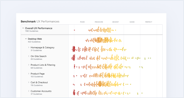
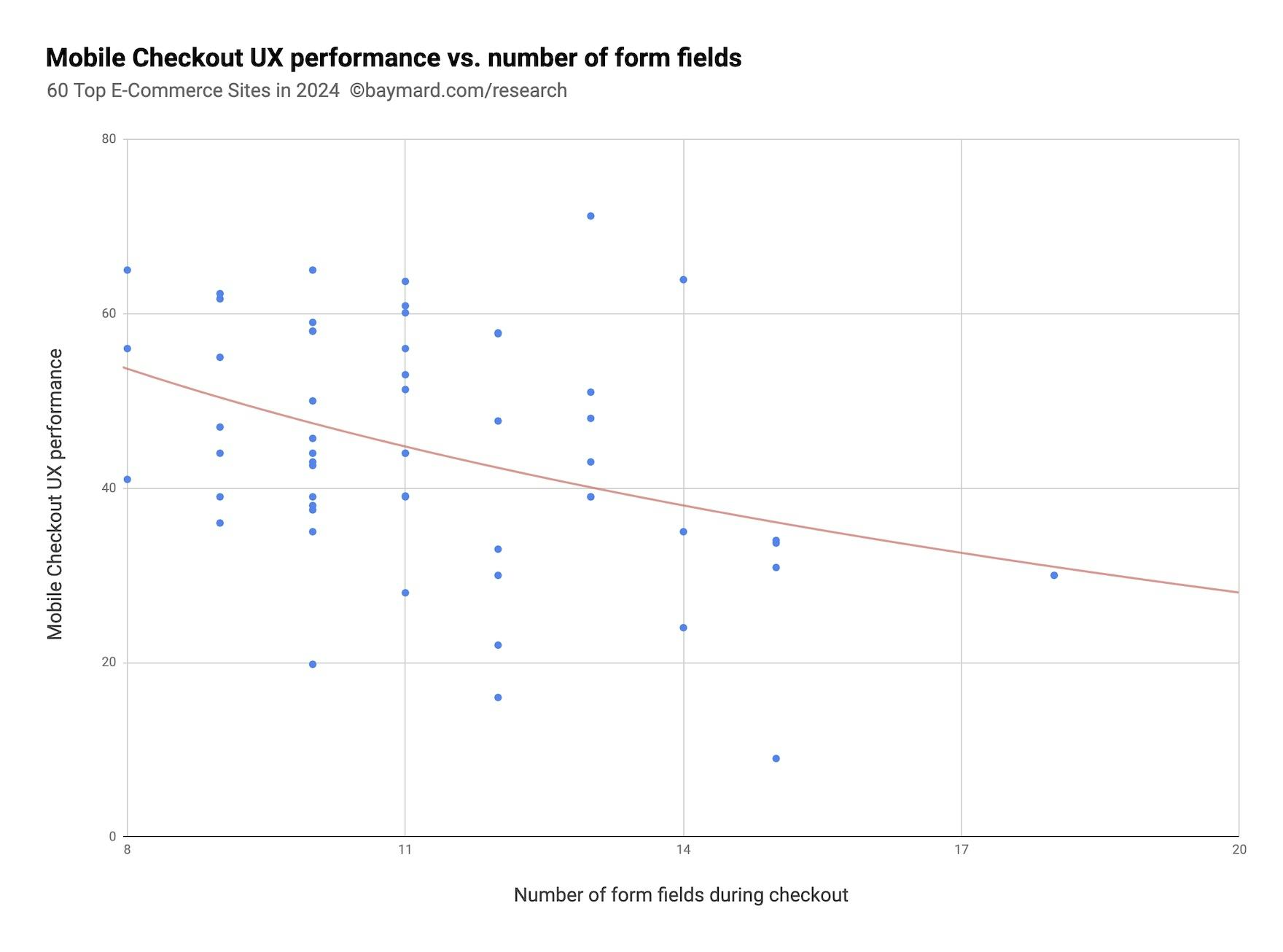
Our e-commerce UX benchmark and Premium research findings indicate that, as the number of form fields increase, the overall checkout UX performance decreases.
Rather, what’s more important is what the user has to do at each of those steps (up to a certain point at least, as usability does seem to suffer after 8+ checkout steps).
Therefore, to increase the performance of your checkout experience, it’s better to ask, “How can we reduce the number of form fields users must consider?”.
Indeed, our research shows that, in general, the number of form fields in a checkout impacts overall usability far more than the number of steps.

Maxon’s desktop site from 2022 contains an intimidating number of form fields (15) for users to read and complete.


In this gaze plot from an earlier round of testing, which accumulates where 32 test participants fixated their eyes while browsing REI’s payment step (first image), note how the participants spent a very large amount of their total attention on the “New REI membership” and “Current REI members” subscription sections, despite the membership being completely irrelevant to the test participants’ purchase.
What’s more, we’ve found that most sites need only 8 form fields in total for a checkout flow — yet the average in 2024 was 11.3 form fields (slightly down from 11.8 in 2021 and 12.7 in 2019).
This number of fields unnecessarily increases the perceived and actual complexity of a user’s checkout.
Thus, to reduce checkout abandonments, the focus should be less on optimizing checkout steps and more on how to reduce the number of form fields users must review or consider to the minimum required for users to complete the checkout process.
Note that not only does the number of form fields greatly impact checkout usability, but so do a myriad of other factors — error recovery (here and here, questionable required fields, and understanding order fulfillment options — which too are unrelated to the number of checkout steps.
5 Ways to Minimize the Number of Form Fields Users Must Consider
In the following five sections, we’ll present our test findings for some of the checkout fields users are often asked to consider and explain how to optimize the checkout flow to reduce the total number of fields.
1) Have a Single “Name” Field (89% Don’t)
During all of our checkout usability test studies, we’ve observed how users generally think of their name as a single entity.

“Oh wait.” This participant at American Eagle typed the street address in the “Last Name” field before realizing there were two separate name fields, forcing her to copy and paste both the street address and last name into the correct fields.

Multiple participants at Apple included the recipient’s full name in the “First Name” field, leading them to pause and subsequently revise their entry.
As a consequence, when there are multiple name fields, many users will spend time typing out their full name in the “First Name” field.
During testing, 42% of participants typed their full name in the “First Name” field at least once.
Given how simple it should be to type your name, the needless friction and rework is quite significant.

This participant on Currys (UK) during large-scale European testing began to type his second name into the “First Name” field before realizing his mistake. While not a severe issue, it is a very common one.

On HP, users are presented with extraneous fields (multiple name and address fields) during mobile checkout. On a mobile device, every unnecessary form field makes the form’s length seem even more unwieldy than on desktop, due to the limited screen size.
On mobile sites the issue is more severe, as typing in general is more difficult on mobile. When users notice their error they’ll have to reenter the field (potentially encountering a tap issue), select the text or otherwise delete it, and copy/paste or retype the text into the correct field.
A relatively minor interruption on desktop can swiftly become a more trying ordeal as mobile users struggle to navigate the form and keyboard.
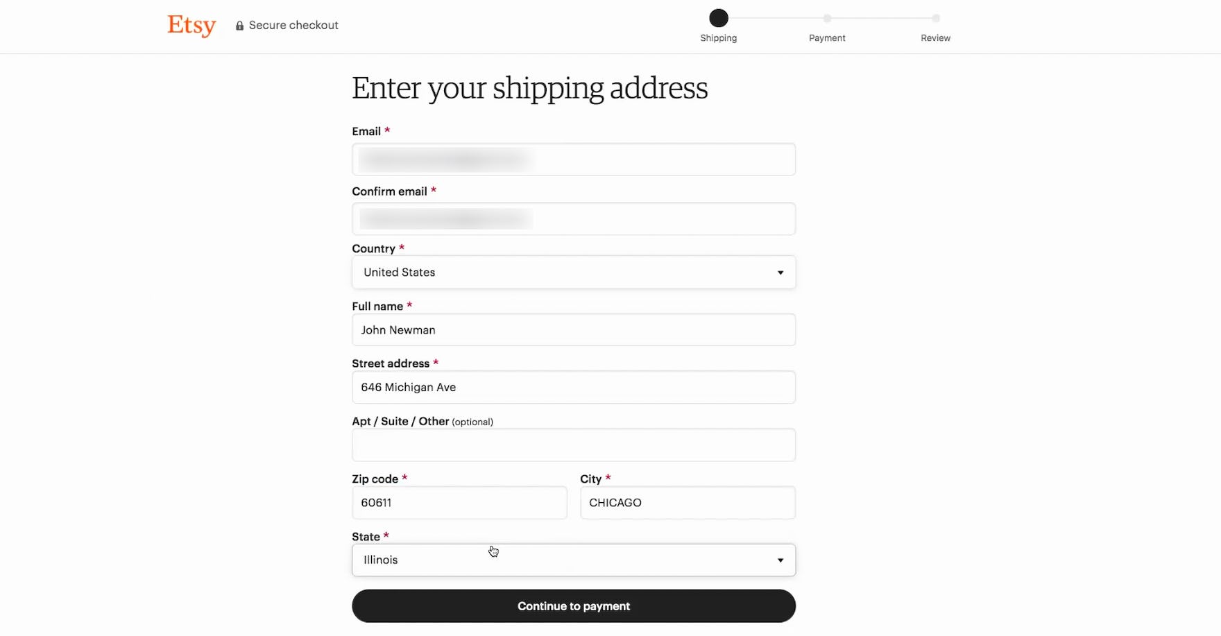
This participant at Etsy easily input name information, as the single field for “Full name” helped to streamline the task.
However, the solution is relatively straightforward: acknowledge users’ tendency to think of their name as a single entity by implementing just one “Full Name” field.
When testing sites with a “Full Name” field, only 4% of users briefly hesitated before typing in their full name, and no one had the kind of typing or interaction issues observed in the multiname fields approach.
Yet 89% of sites in our e-commerce UX benchmark have more than one “name” field.
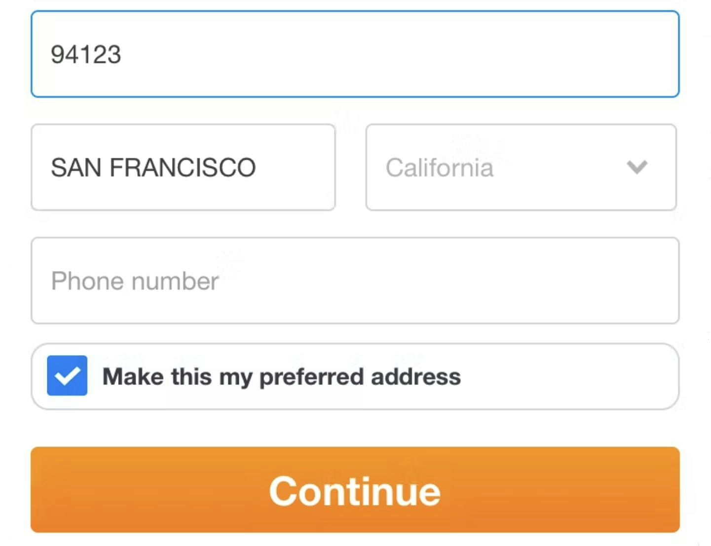
2) Hide “Address Line 2” (75% Don’t)

At ASOS, multiple participants stopped and doubted how to correctly fill their street address in the “Address 1” and “Address 2” fields, often clicking and moving parts of the street address back and forth, before finally deciding on how to proceed.
During testing 30% of participants came to a stop when arriving at “Address Line 2”, and some questioned if their initial “Address Line 1” input was correct.
On the other hand, participants who needed to input “Address Line 2” were well aware of this, and actively sought out the field.

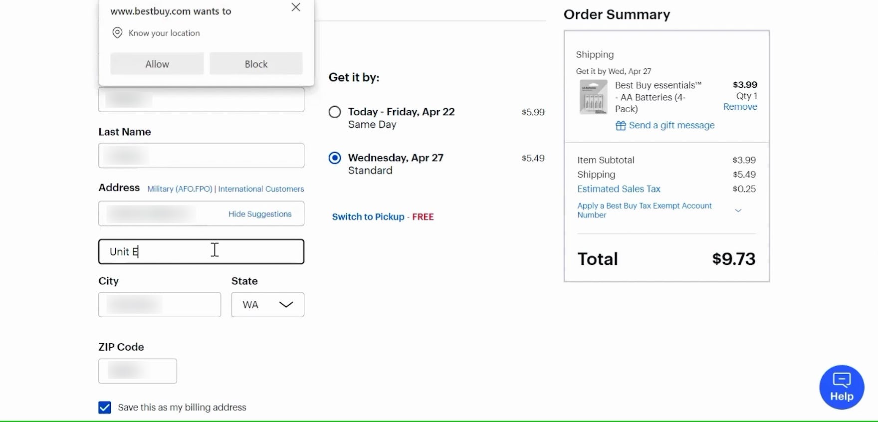
This participant checking out at Best Buy easily located the link to “Add Apt. #, Suite, Floor” (first image), adding her address’s unit number (second image).
Therefore, to further streamline the checkout process for the majority of users, hide “Address Line 2” behind a link.
Hiding “Address Line 2” removes a form field that most users don’t need to consider, while those who do need the field are minimally inconvenienced.
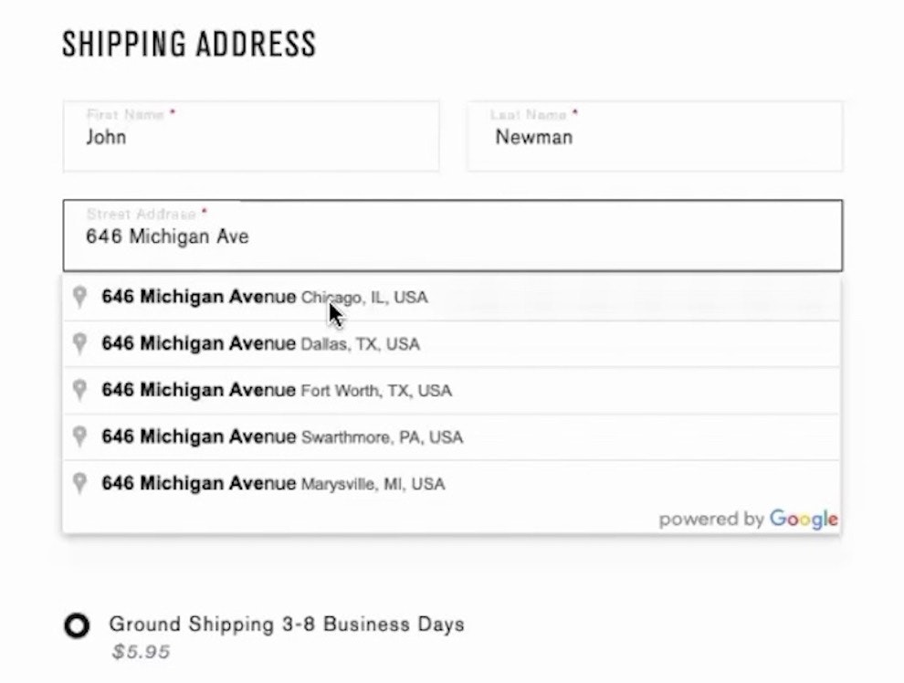
Furthermore, to vastly reduce the complexity of all address fields, you can instead rely on a fully automatic address lookup feature to insert the user’s full address — hastening users’ progress through this set of fields even more.
3) Hide “Coupon Code” (35% Don’t)


“See that it says ‘Enter a promo code’? I would go to Google, go to ‘Crowd Cow promo code’, and see if I could find one.” Upon encountering the “Coupon Code” field, this participant checking out at Crowd Cow immediately left the site to try to find a coupon code for getting a better deal.
Similarly, promotional code fields (e.g., “Promo Code”, “Discount Code”, “Coupon Code”) are widespread in e-commerce, with our e-commerce UX benchmark showing that 70% of sites have them.
While perhaps not considered to be a field likely to cause disruption, our testing reveals that most users will at the very least pause briefly to consider the field.
Moreover, instead of moving past the field, a subgroup of participants came to a full stop to consider it — and determine if they might be able to find a coupon code to fill in.
In the worst cases (in terms of disruption for users) a handful of participants left the site to search for promo codes. In practice, as soon as users have left the checkout to go look for coupons, the chance of them not returning to complete the purchase increases significantly.
Yet despite these issues, 35% of sites with promotional code fields display them by default.

Adidas offers users the ability to input a promo code in the cart but collapses the field to decrease the emphasis.
Instead, “Coupon Code” fields, like “Address Line 2” fields, should be hidden behind a link.
(To tackle this issue even more proactively, consider proactively applying any discounts that are applicable to the user’s cart.)
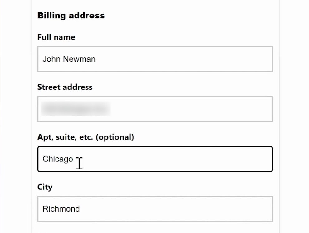
4) Hide “Billing Address” Fields (24% Don’t)

At Fat Brain Toys, the form by default displays different shipping and billing addresses, resulting in an unnecessary number of form fields on the page.
At 24% of e-commerce sites the default design is to assume different shipping and billing addresses are needed.
This results in the majority of the sites’ users, who only have a home address, being needlessly intimidated by the large number of form fields presented on the page.
When both billing and shipping addresses are displayed, most users are effectively shown an entirely redundant set of fields.

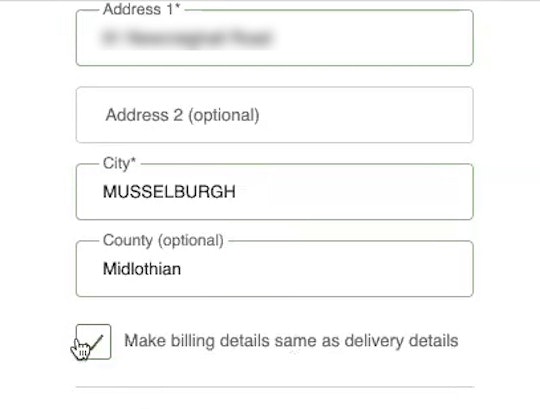
At Lowes, the “Billing Address” fields are hidden by default. The subgroup of users who need a separate billing address simply have to uncheck the checkbox to be provided with those fields.

“Yeah. Same as the delivery address, yeah. Okay.” On Zalando.de, this participant was able to very easily confirm that the billing address was the same as that she had entered in the shipping address form. With a hidden billing address form, users don’t have to work out what a billing address is, they just have to accept the default value — while still having the option of specifying a different billing address if needed.
The solution is to set “Billing Address = Shipping Address” by default.
Furthermore, how you implement this is important: when you set the “Billing Address is the same as Shipping” (or vice versa) checkbox to be selected by default, the billing address fields should be hidden altogether (rather than autofilled).
(An exception to this is sites where the order logs show a large number of customers who actually use different addresses, such as gifting and business-to-business sites.)
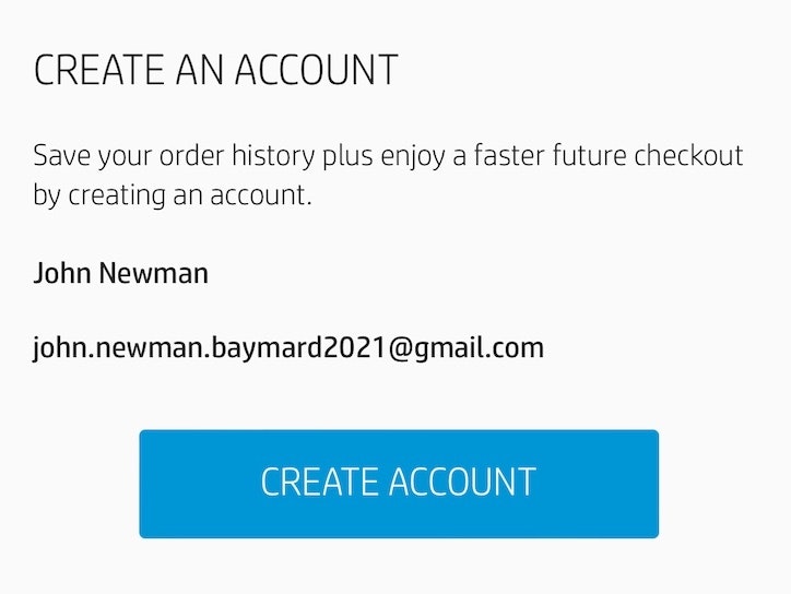
5) Delay the Account Creation (84% Don’t)
Requiring users to create an account to check out, or even nudging them to (e.g., by making account creation prominent on the Account Selection Step), will result in at least some users being forced to consider fields like “Create a Password” and “Birthdate” — which may cause some to abandon due to the intimidating nature of the checkout process.
Indeed, while having users create accounts can be great for both the site and the user, as it can result in more loyal customers for sites and faster checkouts in the future for users, it distracts from the main goal of the checkout process: having users successfully place their order.

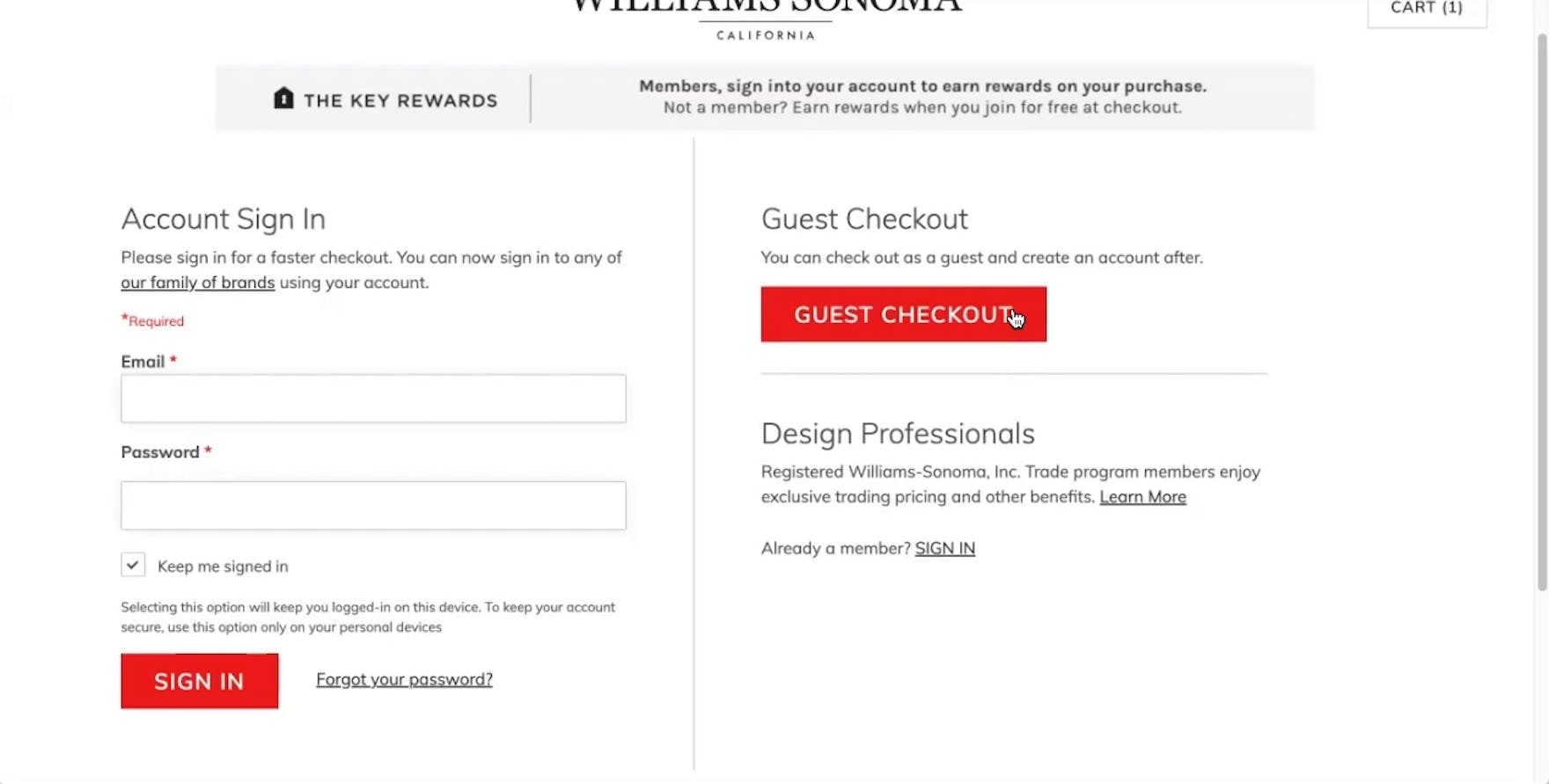
During testing at Stance (first image) and Williams Sonoma (second image), participants selecting the “Guest Checkout” option were reassured that they could create an account following checkout, allowing them to devote their focus to getting through the checkout process.
Instead, during testing we observed that delaying the option to create an account until the Confirmation Step is a better-performing strategy.
At the confirmation step, a user has already entered the necessary account details during the checkout; the account-creation work can be reduced to just one or two password fields.
Note: when saving account creation for the confirmation step, ensure that users are informed at the account-selection step that they’ll have the option to create an account at the end of the checkout.
Users who suspect they will be repeat customers will often want an account, and they may waste time trying to figure out how to create an account if they don’t spot one at the account-selection step and there’s no notice that they’ll be able to create one after checkout.
Despite users’ perceived efficiency gains from creating accounts at the confirmation step, 84% of sites fail to do so.
Optimizing Checkout UX
When it comes to optimizing checkout and UX, it matters much more to users how many form fields they need to consider — rather than the total number of checkout steps they must go through.
In this article we’ve highlighted 5 ways to reduce the number of form fields users must contend with.
Furthermore, by applying the same reasoning to additional, optional fields (e.g., “Company Name”, “home/work/cell phone number”, “Fax”, etc.) — hiding them behind links — and by providing a “Fully Automatic Address Lookup” feature, you can now present users with only the fields they absolutely need in order to effectively complete their checkout.


Crutchfield’s mobile site exemplifies how few form fields are really needed for most checkouts. The optimized checkout process helps ensure users will proceed efficiently through and be able to place their order with minimal friction.
Despite the UX performance and conversion rate gains from optimizing the total number of form fields users must contend with, our e-commerce UX benchmark reveals that the vast majority of sites fail to take advantage of ways to minimize the number of fields displayed:
- Have a single “Name” field (89% don’t)
- Hide “Address Line 2” (75% don’t)
- Hide “Coupon Code” (35% don’t)
- Hide “Billing Address” fields (24% don’t)
- Have delayed account creation (84% don’t)
As a result, the overall UX performance of the checkout suffers — increasing the likelihood that users will abandon due to the perceived difficulty of completing the checkout process.
This article presents the research findings from just 1 of the 650+ UX guidelines in Baymard – get full access to learn how to create a “State of the Art” ecommerce user experience.
If you want to know how your desktop site, mobile site, or app performs and compares, then learn more about getting Baymard to conduct a UX Audit of your site or app.