Key Takeaways
- Typos and other entry errors are common occurrences for users entering their address information in checkout
- Such errors slow users’ progress through checkout and increase the amount of friction
- A “Fully Automatic Address Lookup” feature can resolve the issues for most users
Video Summary
Entering customer and address information is a cumbersome but necessary part of completing checkout, representing a sizable proportion of the total number of standard checkout fields.
Across multiple rounds of Baymard’s large-scale UX testing, we’ve observed that address entry errors — whether due to accidental typos or incorrect address information — were common, slowing or even halting participants’ progress through checkout.
As a result, the burden of completing multiple address fields presents a requirement that is at the very least time-consuming — and at worst significantly increases the risk receiving an error message.
However, for many sites a high-performing solution exists: providing a “Fully Automatic Address Lookup” feature.
Yet our e-commerce UX benchmark reveals that 55% of sites don’t provide such a feature to users — leading to increased friction when inputting address data.
In this article we’ll discuss our Premium research findings for the Shipping Address step in Checkout:
- How the “Address” fields can be such a stumbling block for users
- How a “Fully Automatic Address Lookup” feature can resolve the issue
- 3 implementation details for “Fully Automatic Address Lookup” features to ensure they perform as users expect
How the “Address” Fields Can Be Such a Stumbling Block for Users
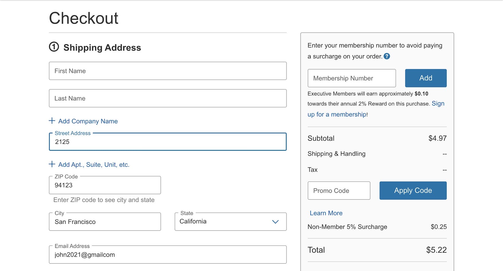
“It’s weird how the states are not in order here.” At Oceanbox, a participant opened the “State” drop-down and had to spend some time scrolling to find the right state (California). “Address” field friction can compound, causing a user’s progress through checkout to slow considerably.
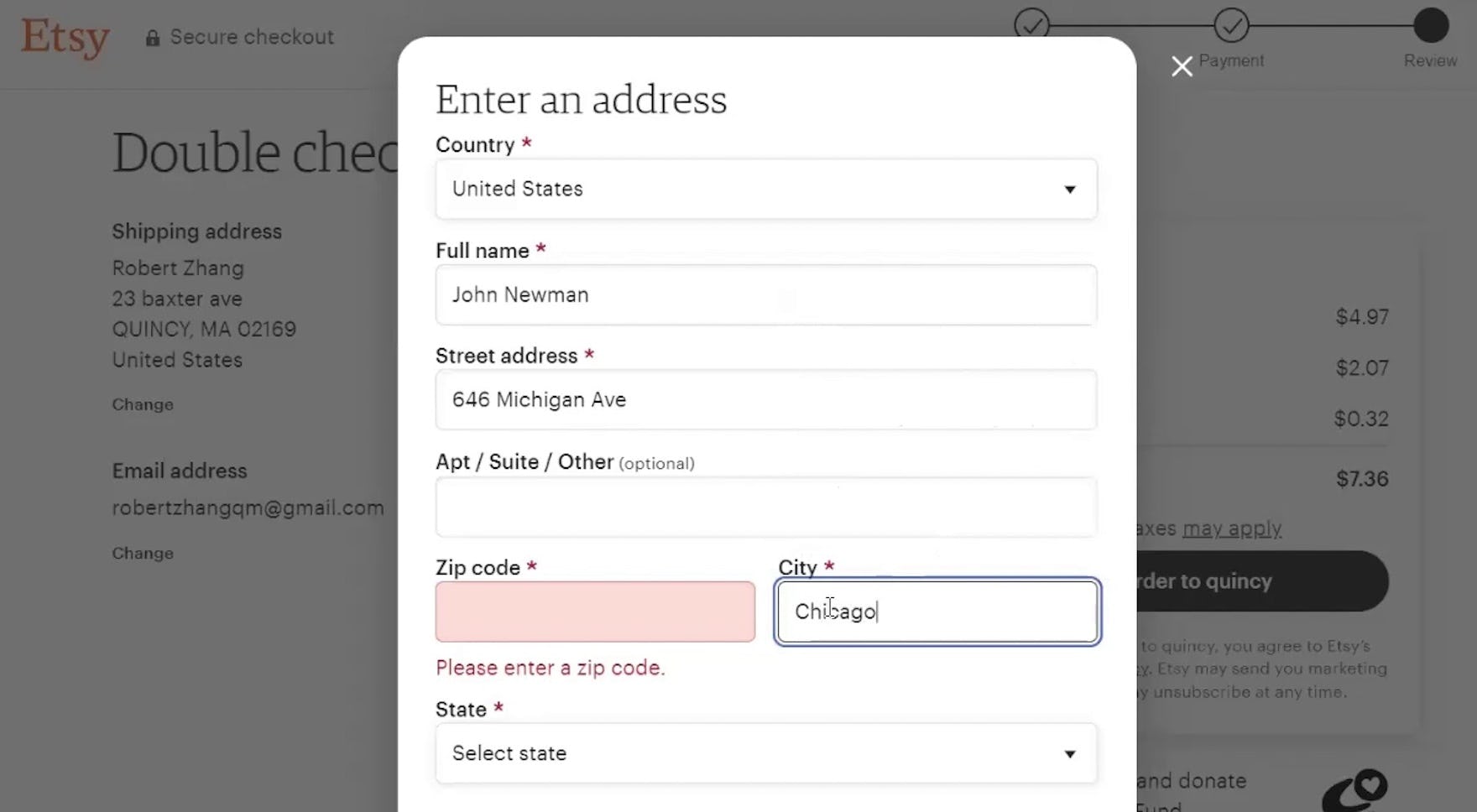
At Etsy, a participant mistakenly entered his city in the “zip code” field (first image). Recognizing his mistake, he moved the city to the appropriate field, but then received an error for having a blank “zip code” field (second image).
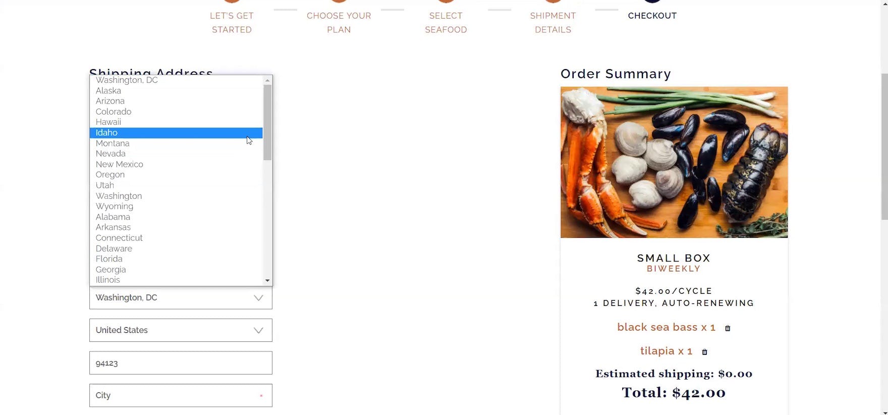
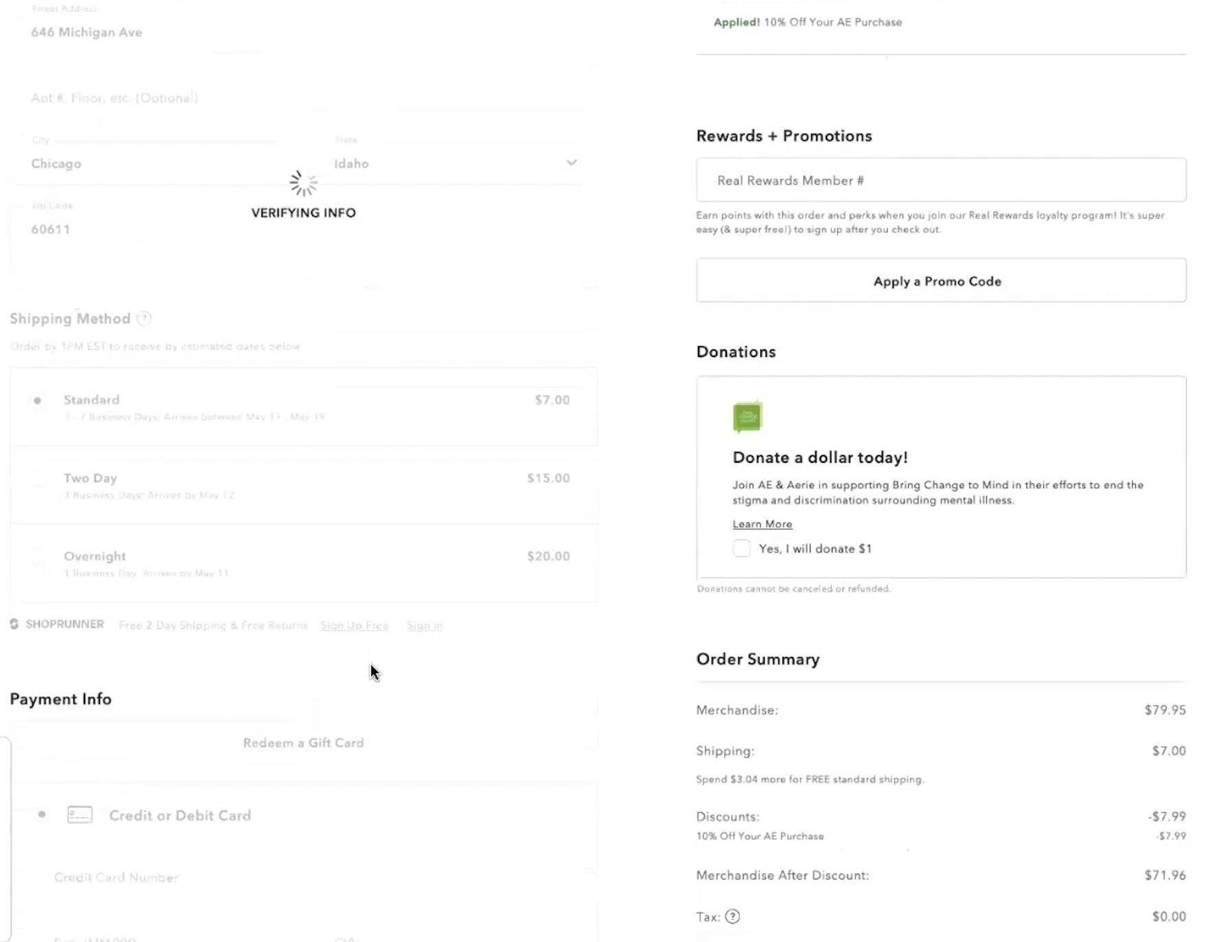
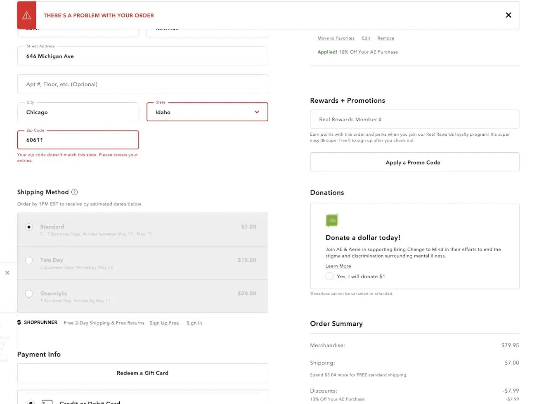
At Best Buy, a participant mistakenly selected “Idaho” instead of “Illinois” for the “State” field. After waiting for the information to verify (first image), she received an error (second image). Entering an address can be full of friction for some users — despite being a seemingly straightforward task.
Many users progressing through checkout have to enter their address manually by typing and selecting each component of their address, generally including their street address, city, state, ZIP code, and country.
With any large amount of data entry, typos and other input errors are a sizable risk — in fact, one round of Baymard’s large-scale UX testing found that 9% of manually entered addresses contained typos or misspellings in the shipping address.
Typically, these involved an incorrectly spelled city name, street name, or the incorrect house number.
At best, the error is a minor speedbump in a user’s progress through checkout.
At worst, when neither the user nor the site catches the mistake, orders will be undeliverable or delivered to the wrong address.
While some users will be able to bypass time-consuming address fields by using browser autofill, not all users utilize these browser features, requiring them to input their address information manually.
What’s more, users will not be able to rely on browser autofill in all situations, such as when sending a gift to a previously unsaved address — and in practice users entering an unfamiliar address are even more at risk of making a mistake while entering it.
How a “Fully Automatic Address Lookup” Feature Can Resolve the Issue
“I do like when you just type in the street name and it’ll pop up with the city or town and state. That’s one of those nice features.” This participant checking out at Wayfair noted the convenience of a “Fully Automatic Address Lookup” feature, saving him the time and effort of needing to type more than a handful of characters.
“This one is also pulling up like autosuggested addresses, which is nice, and then it autofills in everything else. So that’s really great.” Checking out at The Container Store, this participant appreciated the “Fully Automatic Address Lookup” feature. Another participant on the same site noted, “This one does what I like where you’re typing it [and] it’s autopopulating. See, it’s easier, saves time”.
On Stance, this participant selected his address from the “Fully Automatic Address Lookup” feature (first image) and had the rest of his address — city, state, and ZIP code — automatically populate (second image).
“I love it when websites do that autofill thing. I’m like, yeah, you know how to optimize this. So, I appreciate that very much.” A participant at Dinnerly appreciated the convenience of the “Fully Automatic Address Lookup” feature.
In testing, the best-performing solution to the risk and burden of address data entry was a “Fully Automatic Address Lookup” feature, where users begin typing in their street address and the site then provides live autosuggestions on the possible full addresses, based on what the user has typed (similar to search autocomplete).
Originally used in mapping applications, the use of this functionality in checkout has become widespread to the point where participants in testing often expected it and were surprised when they were forced to complete their entire address manually.
As one participant stated, “I definitely prefer websites where it ‘auto does’ the address. I think that’s easier.”
In practice, “Fully Automatic Address Lookup” not only saves users time, providing an effective shortcut to their complete address after inputting only the first few characters, but can also prevent validation errors, as the suggested addresses — matched against an official database (e.g., see Google’s implementation) — are likely to be valid and matching in street number, name, city, state, and ZIP code.
3 Implementation Details for “Fully Automatic Address Lookup” Features
Providing a “Fully Automatic Address Lookup” feature is an important first step towards streamlining the checkout flow.
Additionally, in testing we observed 3 implementation details that are key to performance when executing a “Fully Automatic Address Lookup” feature:
- Offer relevant suggestions for close matches and misspelled addresses
- Always display all address fields
- Order address matches by proximity
1) Offer Relevant Suggestions for Close Matches and Misspelled Addresses
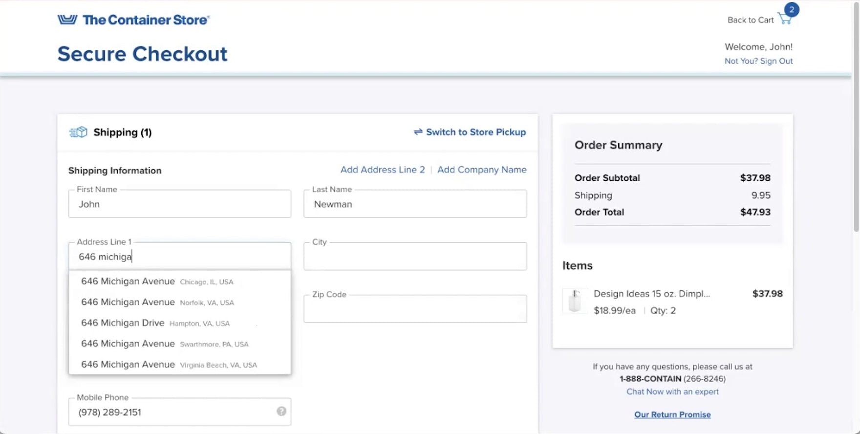
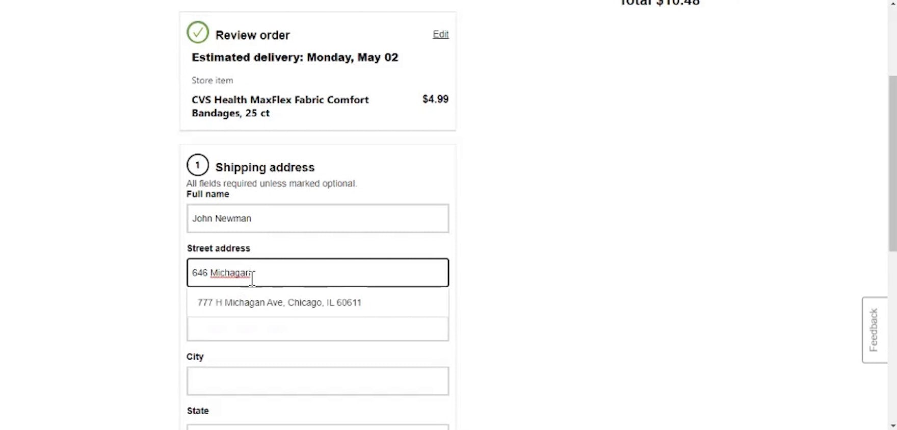
“I don’t think I spelled ‘Michigan’ correctly.” After a slight misspelling of the street name, this participant at CVS received only a single incorrect address suggestion.
Even with only a single field to complete, users are still prone to entering typos — especially on mobile — or may make various address mistakes, such as typing “Road” instead of “Street”.
In effect, users who fail to see an accurate suggestion due to a typo will have their progress slowed significantly, negating the benefit of “Fully Automatic Address Lookup”.
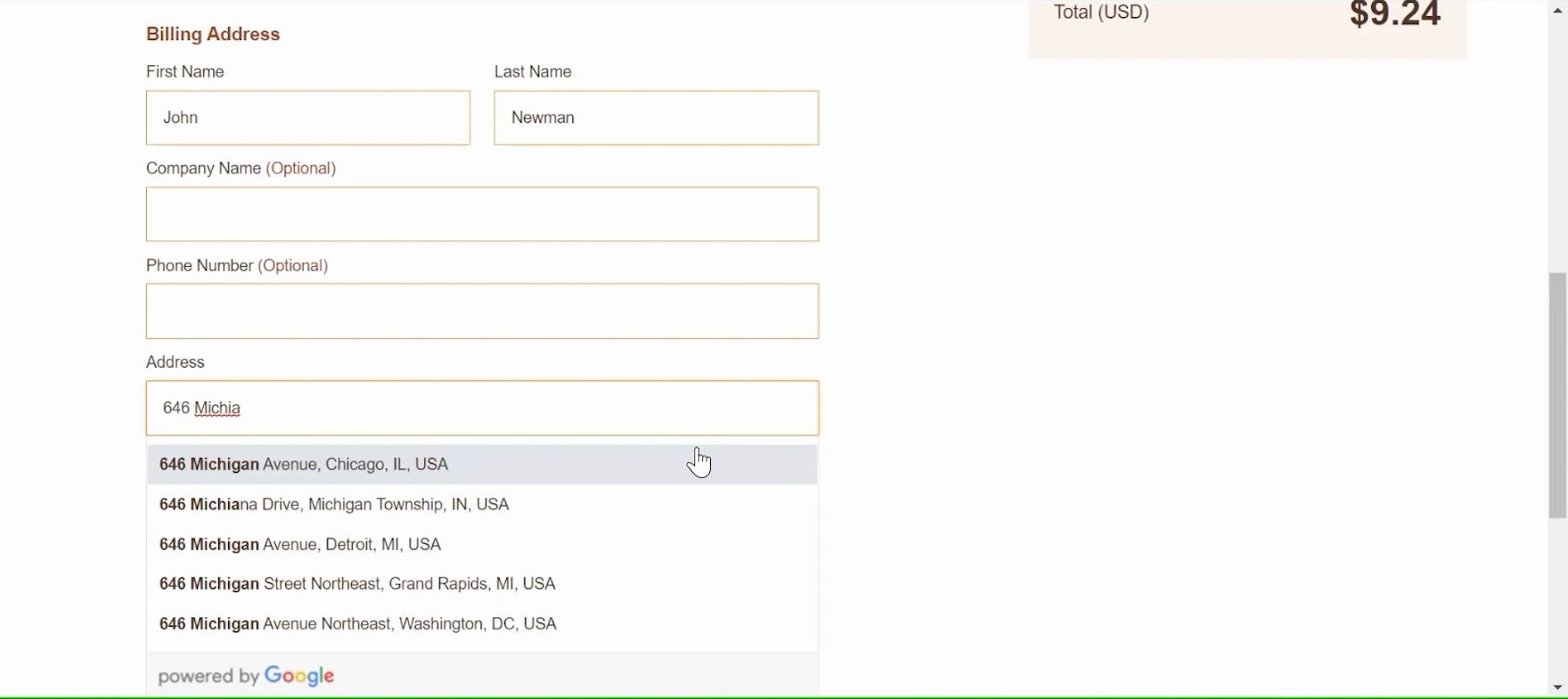
Even misspelling the street name, this participant received the exact desired address in the “Fully Automatic Address Lookup” feature at Theo Chocolates.
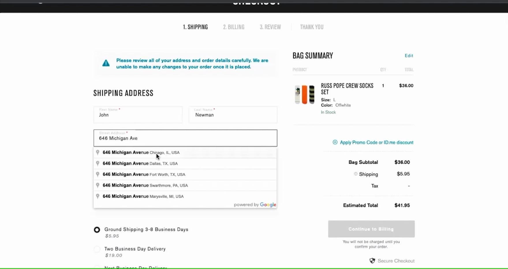
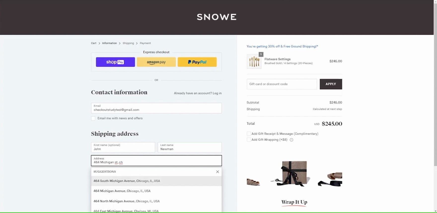
“I like when it starts coming up like this…Oh, did I spell that wrong?” This participant at Snowe typed “Michigan St” instead of the correct “Michigan Ave” yet still received suggestions including the correct address.
Similar to handling misspellings with search autocomplete, “Fully Automatic Address Lookup” should generously interpret misspellings or variations and return relevant address suggestions.
When their address is suggested even with minor entry mistakes, users don’t need to pause to reconsider their entry or fall back on entering it manually, allowing them to quickly and efficiently continue to the next step of checkout.
2) Always Display All Address Fields
It can be tempting to reduce the shipping address interface to just a single form field when using “Fully Automatic Address Lookup”.
However, in testing we observed this implementation often led to severe issues for users who wanted or needed to enter their address manually.
When their address failed to appear in suggestions — whether due to entry errors, as previously discussed, or because there were too many matches — 69% of participants in testing opted to complete their address manually, moving on to input the “City”, “State”, and “ZIP code” fields by hand.
When these fields were unavailable, participants were often at a loss as to how to move forward with their desired address, as the expected and conventional address fields appeared to be missing.
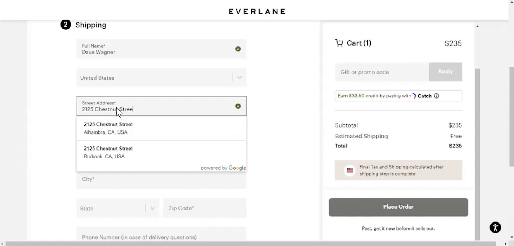
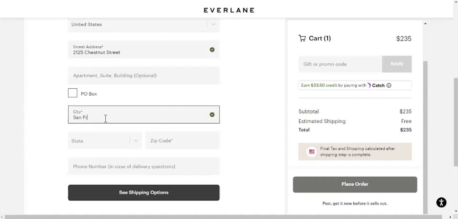
“‘San Francisco’ is still not coming up. So I would just go ahead and put it in.” When the correct address was not suggested in the “Fully Automatic Address Lookup” feature at Everlane (first image), this participant easily moved on to enter the city manually (second image).
To provide a fallback for manual entry and make it easier to review and revise the selected address, conventional address fields should be displayed by default, with “Fully Automatic Address Lookup” in the “Street address” field automatically filling subsequent fields when a selection is made.
Maintaining conventional fields also helps optimize the address step for browser autofill.
3) Order Address Matches by Proximity
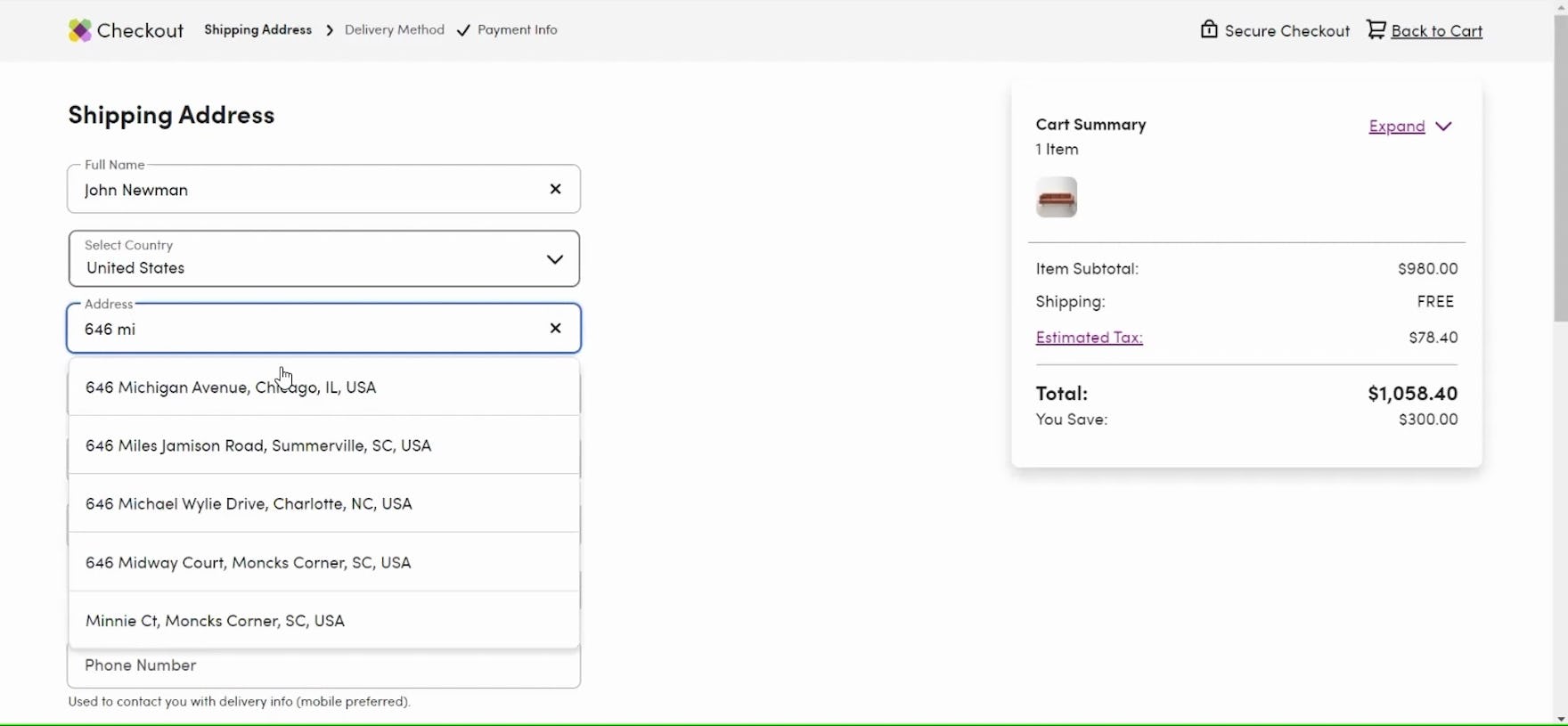
“So this gives me…a little list I can pull down. So that’s Chicago, Illinois. That one does not come up under that list.” At Best Buy, address suggestions are ordered alphabetically by city, forcing users to either continue typing in hopes of an accurate suggestion or type the rest of the address manually — both of which require additional effort.
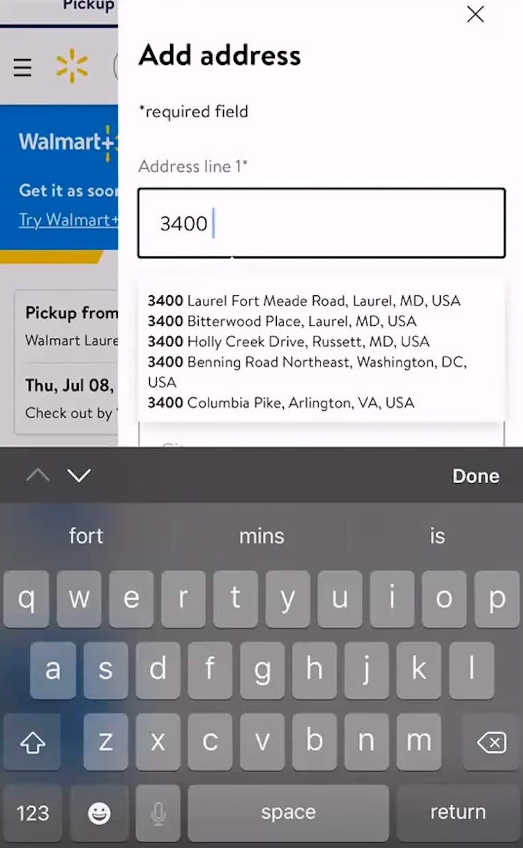
Based on only the street number or first few characters of the street name, it’s likely that there are a high number of possible matches across a user’s country, making the order of results an important factor in how much effort a “Fully Automatic Address Lookup” feature will save.
In testing, address suggestions ranked alphabetically were most likely to result in the need for participants to input more information, either typing the entire street name and at least part of the city name or giving up on the suggestions and entering the entire address manually.
In practice, this necessity diminishes the value of “Fully Automatic Address Lookup”.
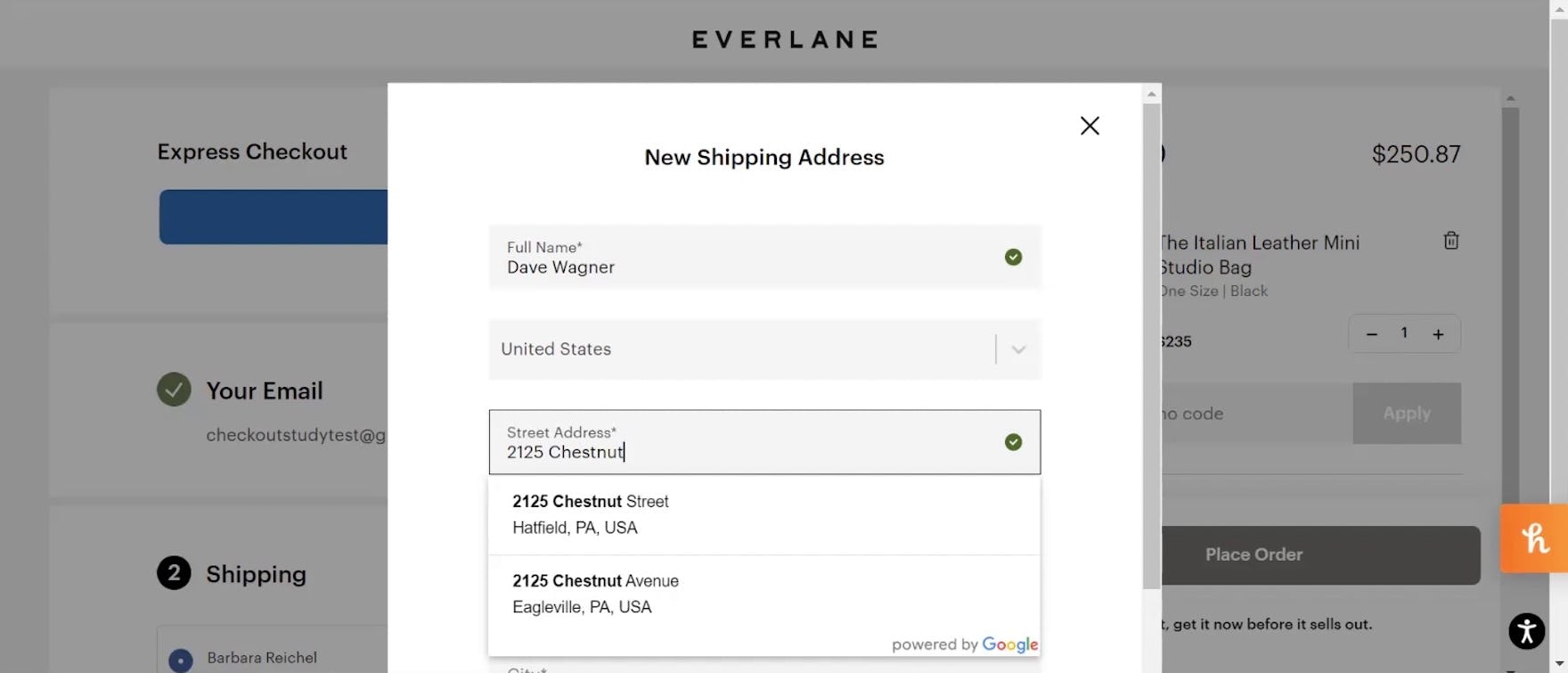
“I like how the autofill…is doing Pennsylvania because it’s looking at my location.” This participant, located in Pennsylvania, on Everlane received address suggestions prioritizing those near his location. This ranking is a logical default on sites where most orders are sent to the user’s own address.
Therefore, it’s important to determine an order of suggested addresses that is most likely to prioritize the address nearest the user’s current location.
As the vast majority of users are likely to be ordering to their own address, using a user’s geotargeted IP address to approximate their location and rank suggestions by proximity is a logical order that performed well for participants in testing.
Reduce Friction for Users Entering Address Information
Over time, users’ need to input their entire address manually has become increasingly rare as various automatic or semiautomatic lookup features have become more common, making manual address entry not only riskier but also surprising.
Now, many sites provide address validators to check a user’s inputted address against a database.
However, even mistakes caught by an address validator require users to halt their progress through checkout to review and resolve the issue, making the process less efficient.
Additionally, across multiple rounds of testing, we’ve observed participants often experienced a higher rate of input errors and typos on mobile devices due to the smaller touch keyboard, making it more difficult to efficiently complete address fields on mobile.
Effectively, even with accuracy failsafes in place, checkout address fields can be both time-consuming and tricky to complete.
On the other hand, a “Fully Automatic Address Lookup” feature streamlines address entry for the vast majority of users — yet our e-commerce UX benchmark shows that 55% of sites don’t provide one, making their checkouts more difficult for users to complete.
Finally, note that, if for whatever reason a “Fully Automatic Address Lookup” feature is not possible, another common address simplification feature that we observed to perform very well during testing is ZIP or postal code autodetection, where a user provides their ZIP or postal code and the site then autodetects the corresponding state and city.
While not as efficient as “Fully Automatic Address Lookup”, this implementation still reduces the burden of address data entry and can help prevent errors, and is a decent alternative to a “Fully Automatic Address Lookup” feature if needed.
This article presents the research findings from just 1 of the 650+ UX guidelines in Baymard – get full access to learn how to create a “State of the Art” ecommerce user experience.
If you want to know how your website performs and compares, then learn more about getting Baymard to conduct a UX Audit of your site.

