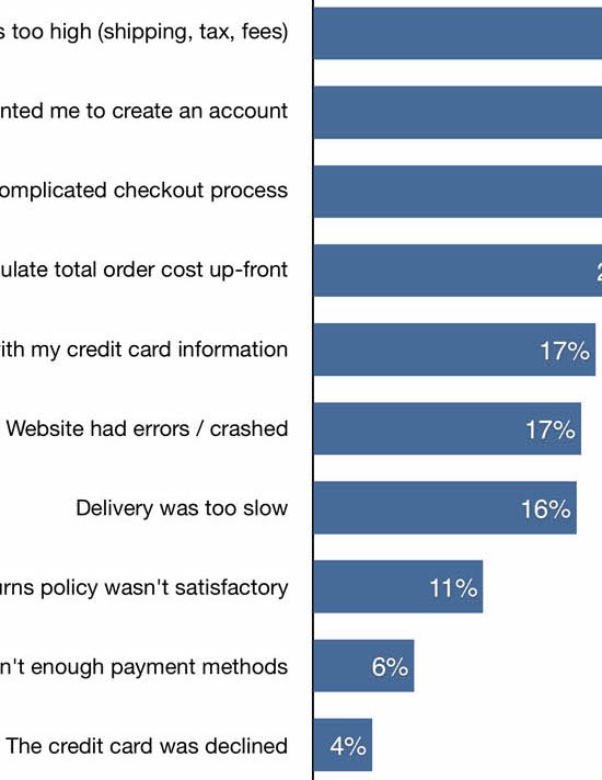
In Baymard’s checkout research, we’ve found that on average 26% of users have abandoned purchases during the checkout flow solely because the checkout flow was too long or too complex.
At the same time, our most recent checkout UX benchmark — which was just updated with 7,900+ new manually rated checkout UX performance scores for the world’s 60 largest e-commerce sites — show that the average e-commerce site has 12.8 form fields in their checkout flow.
While 12.8 fields in late-2019 is a 14% improvement compared to the 14.88 form field average we measured in 2016, it’s still too high when considering that sites can achieve a checkout flow with as little as 6-8 form fields (for a “guest checkout” flow incl. the credit card fields).
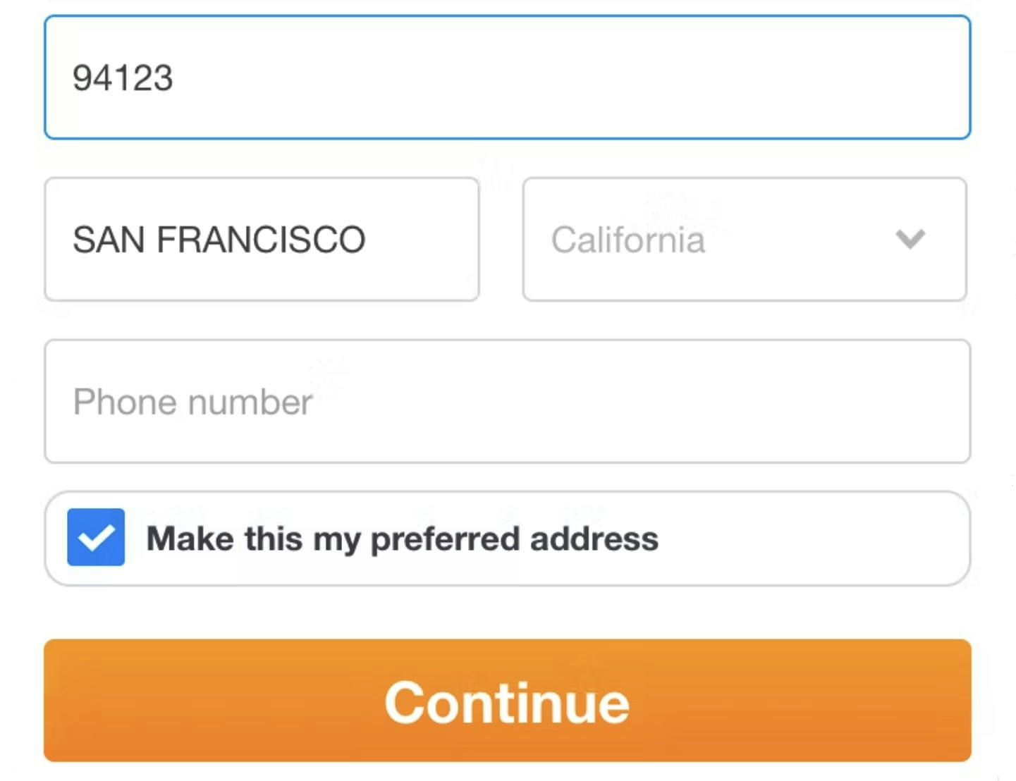
In the below form design keynote presentation, Baymard’s research director Christian Holst will walk you through a selection of Baymard’s checkout research findings showing you how you can achieve an 8 field long checkout flow:
This article presents the research findings from just 1 of the 650+ UX guidelines in Baymard – get full access to learn how to create a “State of the Art” ecommerce user experience.


