Key Takeaways
- Asking users to create an account at the beginning of checkout risks distracting them from their primary goal of finalizing their purchase
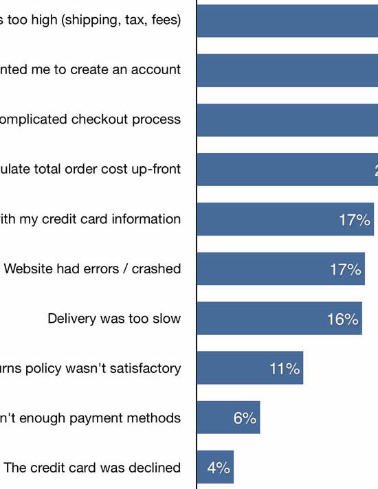
- Yet 42% of sites ask users to create an account at the beginning of checkout or before users have placed their order
- Saving account creation for the confirmation step keeps users focused on completing checkout
While users should always be able to complete a “guest checkout”, getting an invitation to create an optional account is appreciated by some users.
During Baymard’s large-scale testing, most participants explained how they would likely create accounts at sites they expected to visit or purchase from multiple times, and in practice having an account at a site saves users time and makes checking out more efficient.
Yet at the same time, interrupting all guest users to suggest they create an account too early — before or in the middle of the checkout process — was observed to cause some participants to hesitate and stop their progression through checkout.
Despite the increased friction, 42% of sites in our e-commerce UX benchmark interrupt users prior to or during the checkout flow to suggest they create an account.
As a result, some users will be delayed in completing their checkout, while others will become so distracted that they leave altogether.
In this article we’ll discuss our latest Premium research findings related to user accounts:
- Why asking users to consider creating an account during checkout is distracting
- How saving account creation for the confirmation page resolves the issue
- 2 implementation details to ensure “Delayed Account Creation” performs well for end users
Why Asking Users to Consider Creating an Account During Checkout Is Distracting
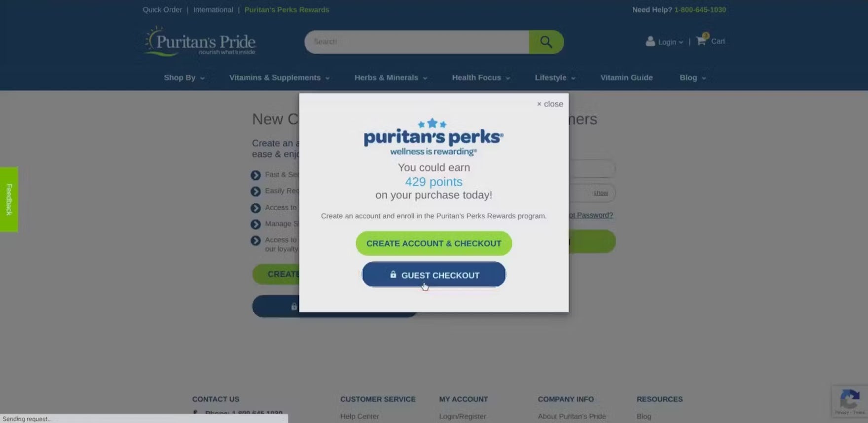
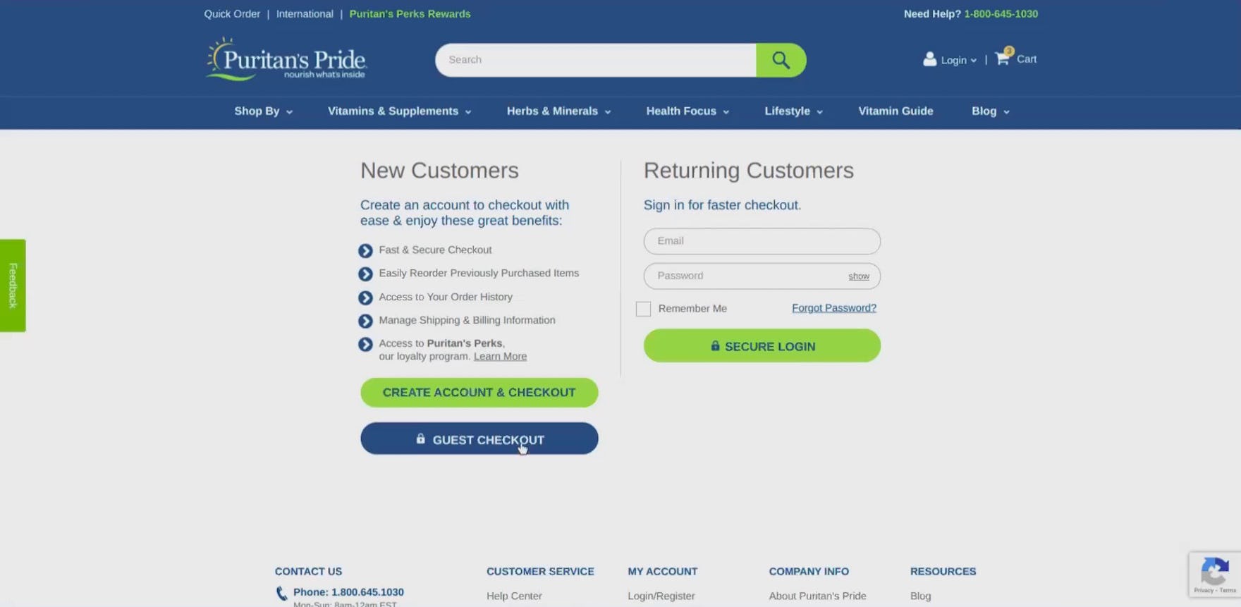
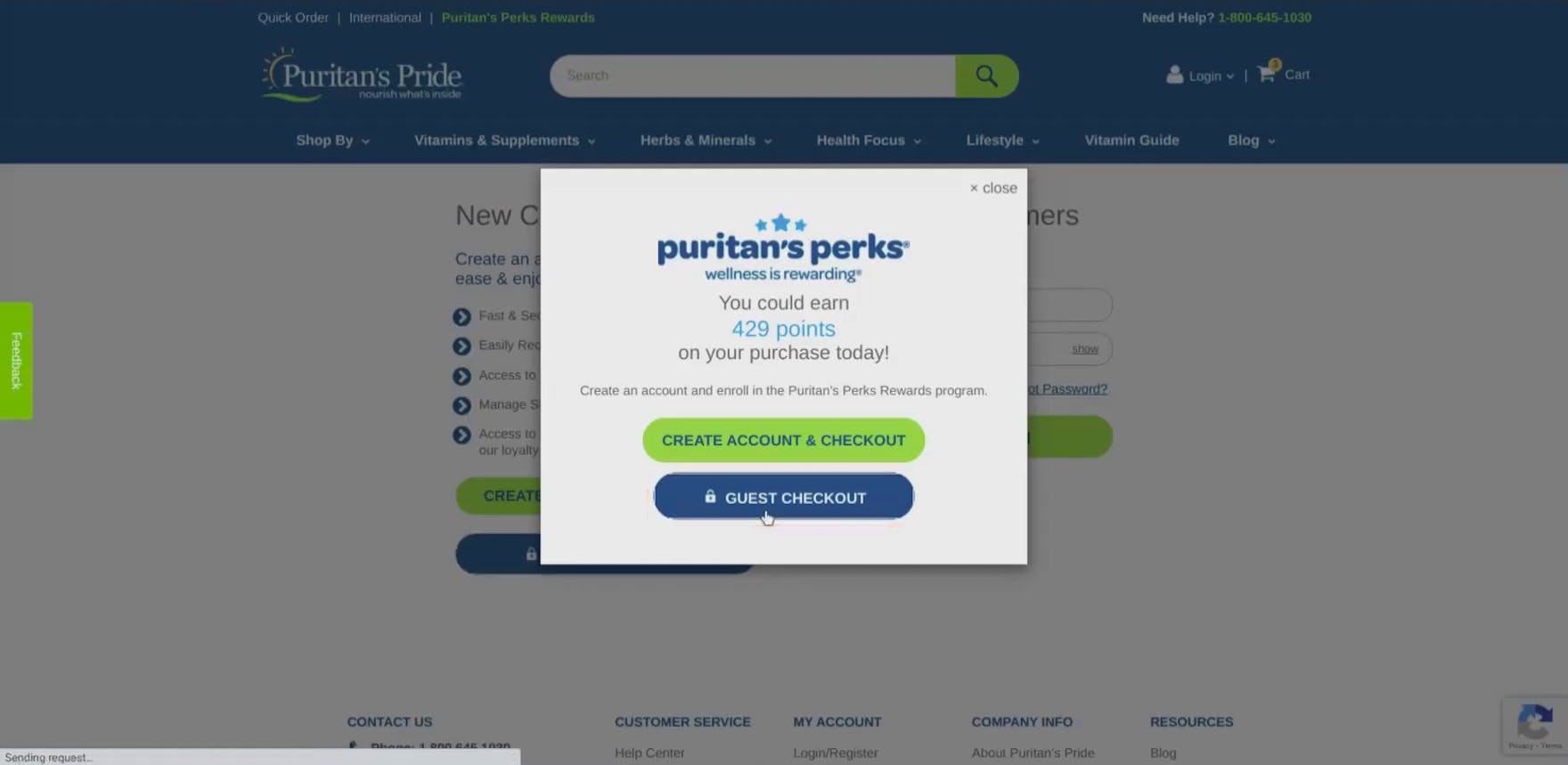
“This is annoying…I don’t want to just stop what I’m doing to go create an account, verify my email, then come back here. That’s a lot for me to do. Just let me check out as a guest. I’m wondering if it lets me do that.” Wary of the commitment required to create an account, this participant at Puritan’s Pride opted for the “Guest Checkout” option when invited to register prior to checkout (first image). However, rather than continuing to checkout, he was then prompted a second time to create an account, initially misinterpreting the overlay to mean he would need to register after all (second image): “Nope, it doesn’t [let you check out as a guest]. Why wouldn’t they say that?”.
During testing, presenting account creation at the beginning of checkout (at the account selection step) was perceived by many participants to be a significant burden (especially when compared to moving forward with “Guest Checkout”).
Despite account creation typically adding only an additional field or two to the overall checkout process, some users presented with the option to create an account at the outset of checkout will consequently associate the majority of the form fields in the checkout flow with account creation, rather than recognizing them as standard checkout fields they would have to complete regardless of whether they create an account or check out as a guest.
At this early stage of checkout, any additional options or considerations added to the checkout flow become potential obstacles for users on their road to completing their purchase, and forcing users to consider whether or not they would like to create an optional account adds an additional layer of perceived friction.
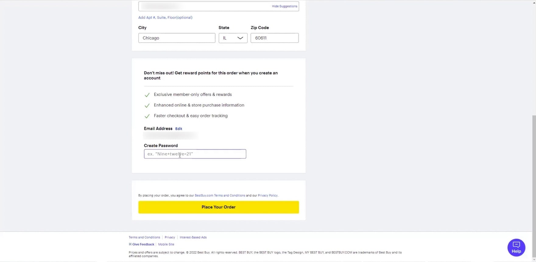
“It’s asking me to create a password, which I honestly just — I don’t love that. I’m just gonna leave that blank and see what happens.” On the final step of checkout at Best Buy, this participant was put off by the request to create an account and worried that it was required in order to complete his purchase.
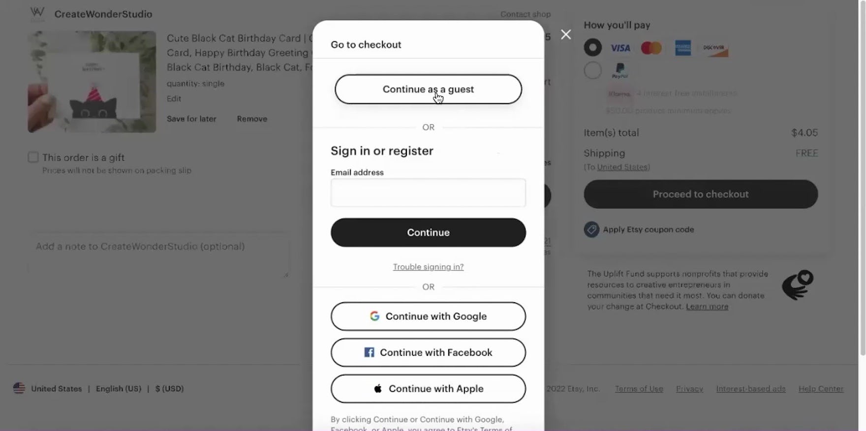
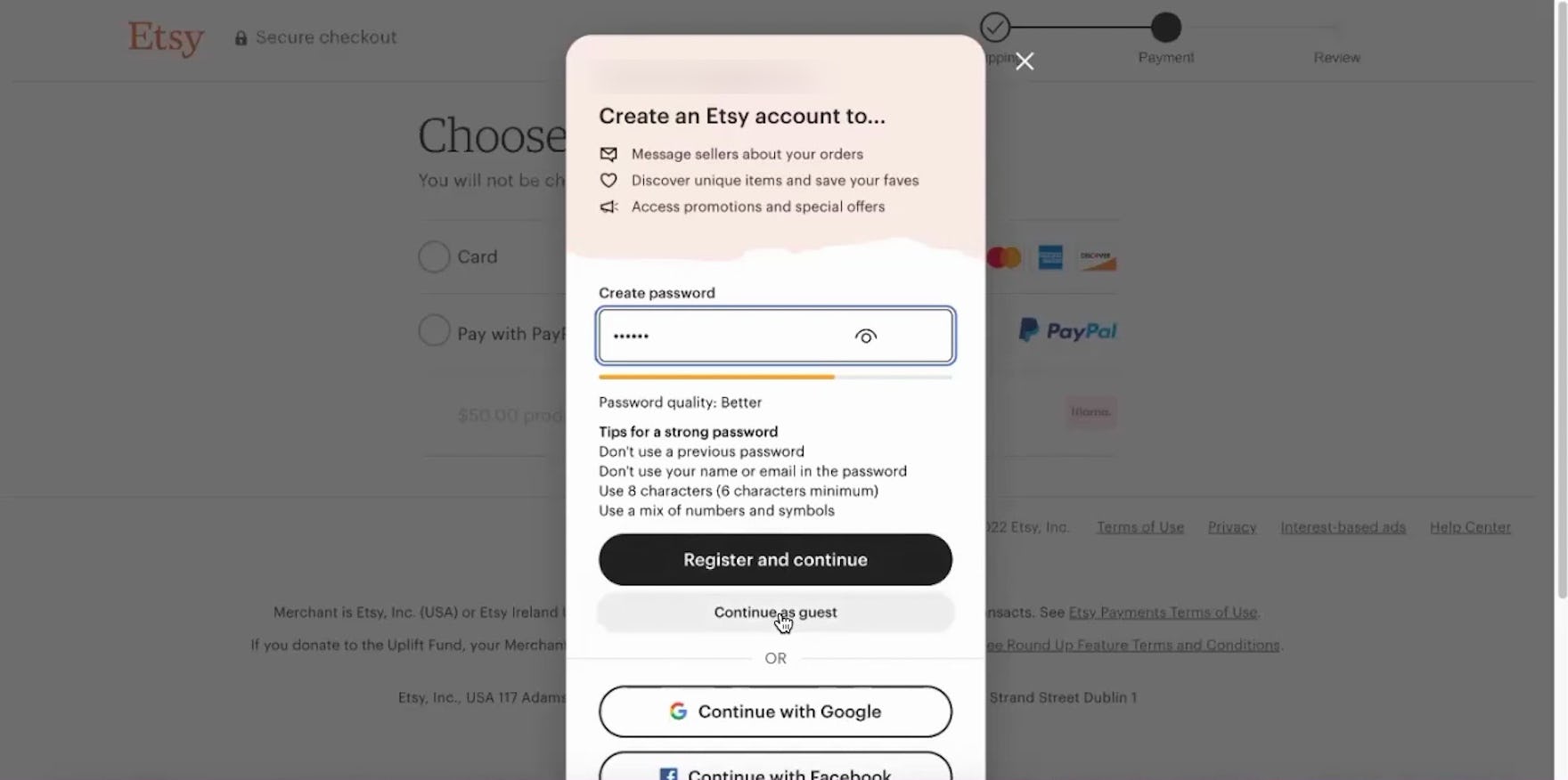
“I want to ‘Continue as guest’.” Checking out at Etsy, this participant selected the prominent option for “Continue as a guest” (first image), yet halfway through checkout was presented with another surprise invitation to create an account, this time with the “Continue as guest” option much more subdued (second image). Mistaking that she had to create an account in order to continue, she began inputting a password before noticing the link to continue without registering. Repeatedly inviting users to create an account at the beginning and during checkout can come across as “pushy” or even deceptive.
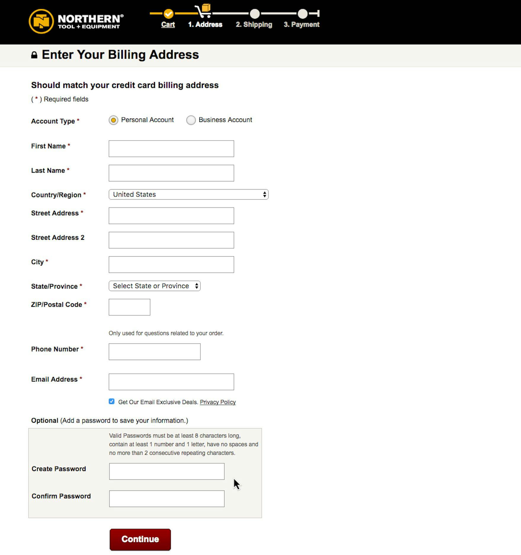
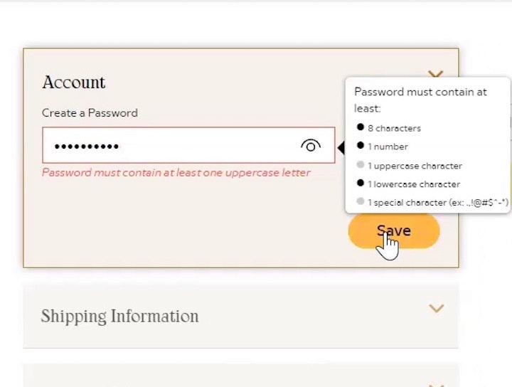
Northern Tool offers users the chance to create an account at the billing address step, running the risk of some users becoming distracted from their primary goal: completing the checkout. Even if account creation is only a password field, users can still have issues if in particular their preferred password can’t be used due to the password requirements.
Meanwhile, presenting the option to create an account during the checkout process itself can distract and derail users at a critical moment in their purchase flow.
Indeed, as more fields are added to the checkout process, the overall UX performance of the checkout tends to suffer, and even optional fields can attract undue attention from users and distract them from their primary goal.
Worse, participants in testing who had selected “Guest Checkout” at the outset were often annoyed at having to “tell the site twice” that they wanted to continue checkout as a guest, with some even mistaking the midcheckout invitation to create an account as a mandate that account creation was actually required.
In practice, users who opt to complete checkout as a guest risk stalling their progress when required midcheckout to reconsider whether they want to create an account.
How Saving Account Creation for the Confirmation Page Resolves the Issue
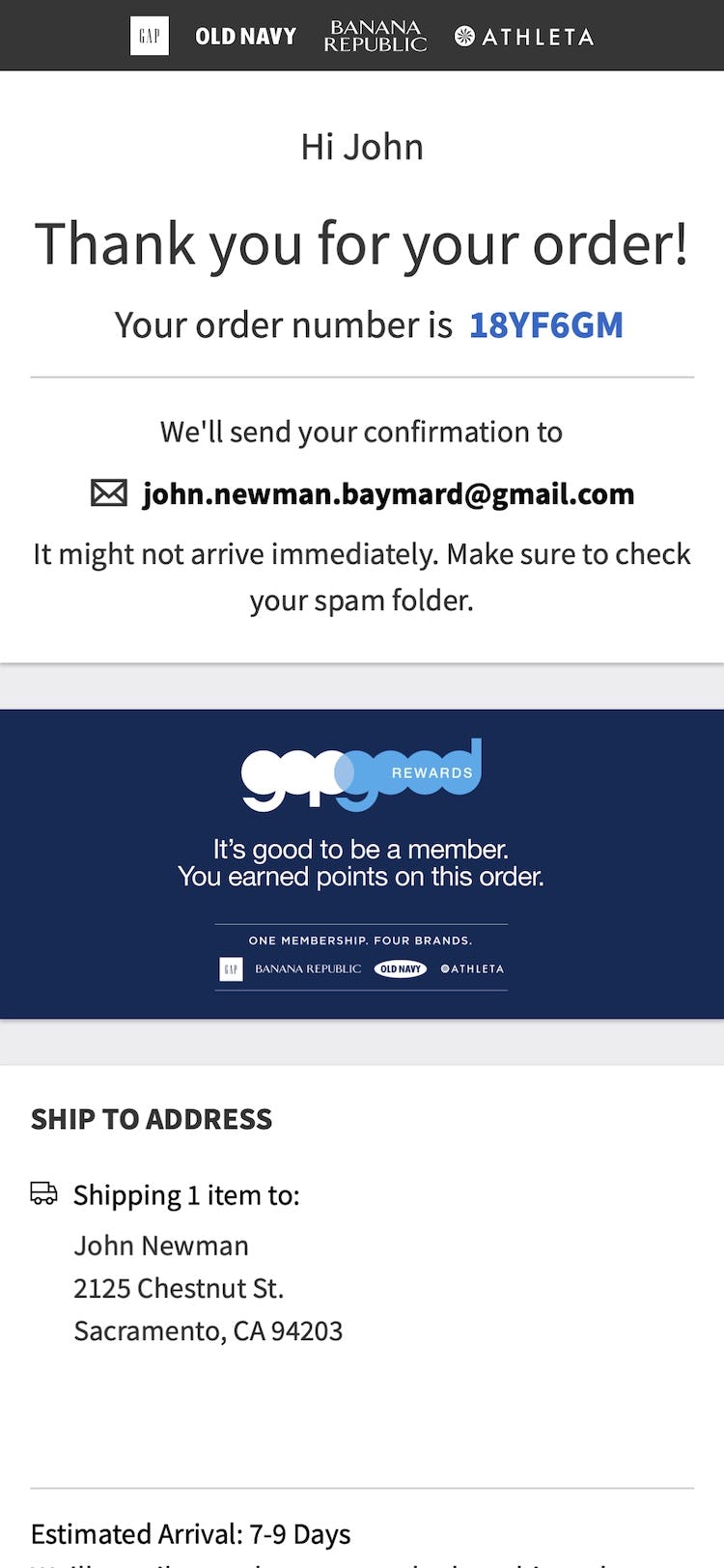
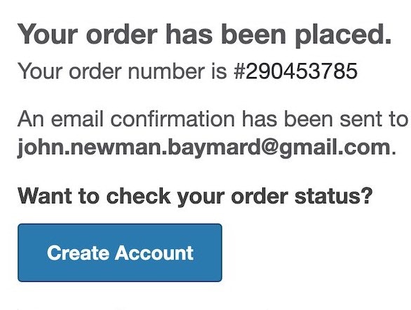
To keep users focused on the primary goal — getting through the checkout process — sites should save the option to create an account until after checkout is complete.
In testing, this implementation performed better than presenting the invitation at either the outset of or during the checkout process.
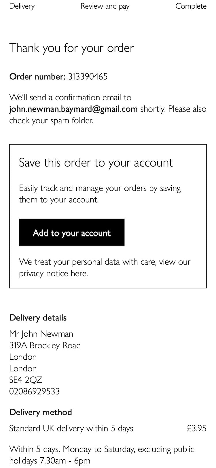
By saving account creation for the confirmation step, users won’t have to evaluate the pros and cons of creating an account before they’ve finalized their order — instead, they can proceed directly with completing their purchase.
In practice, any opportunity to delay users’ choices until after the order has been placed creates a checkout flow that is easier to complete — and, more importantly, feels easier to complete for the end user.
Additionally, the confirmation step generally has more room to sell users on the benefits of creating an account (see first implementation detail below).
With this additional flexibility, sites can use styling and wording that more actively nudge users into creating an optional account — and, as the order has already been placed, there’s no risk that users will assume they have to create an account to check out.
Saving account creation for the confirmation step may also increase users’ willingness to create an account, as users are less likely to associate the bulk of checkout fields — such as address and payment information — with account creation, as they will already have completed them as part of the guest checkout process.
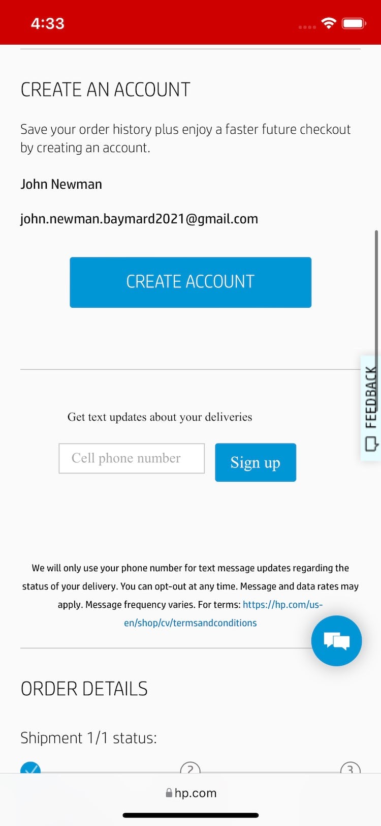
Consequently, creating an account will then only consist of creating a password — and all of the guest user’s information can be automatically saved for the next time they return.
In effect, sites that don’t invite guest users to create an account following checkout miss a key opportunity to entice users to sign up.
2 Implementation Details to Ensure “Delayed Account Creation” Performs Well for End Users
Saving account creation for the confirmation step allows users checking out as guests to focus on completing the checkout process.
To ensure “Delayed Account Creation” performs as best as possible, be sure to heed the following 2 implementation details.
1) Inform Users of “Delayed Account Creation” at the Account-Selection Step
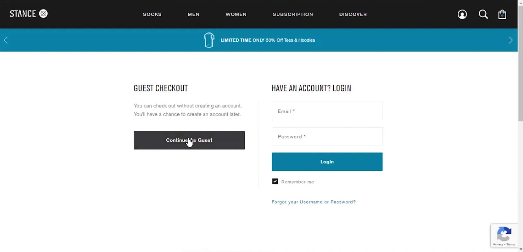
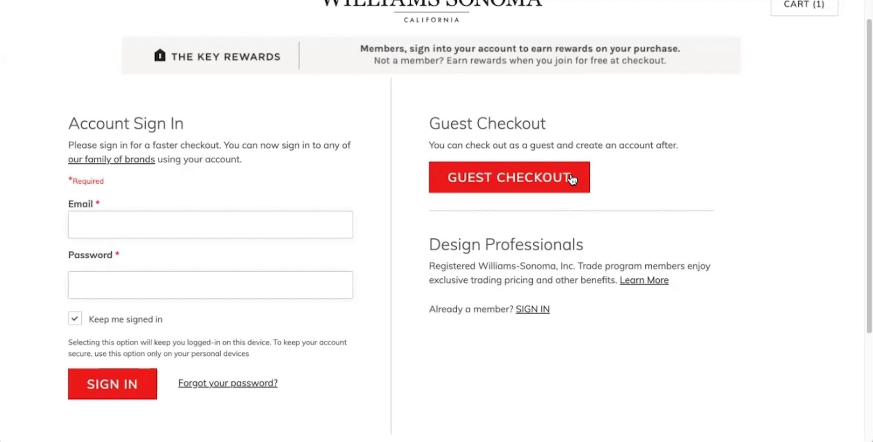
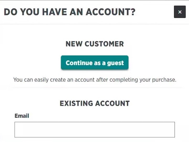
During testing at Stance (first image) and Williams Sonoma (second image), participants selecting the “Guest Checkout” option were reassured that they could create an account following checkout, allowing them to devote their focus to getting through the checkout process.
When saving account creation for the confirmation step, it’s vital that users are informed at the outset that they’ll have an option to create an account at the end of the checkout.
Because users who suspect they will be repeat customers will often want an account, they may waste time trying to figure out how to create one if there’s no explanation initially presented.
Including a simple, short description for the guest checkout option at the account-selection step lets users who want to create an account know that they will have the option to create an account following checkout, keeping them on track towards completing their order.
2) Provide Users with the Benefits of Creating an Account
To ensure as many users as possible register for an optional account, detailed benefits of having an account should be explicitly mentioned.
In other words, it’s not enough to simply provide a password field and a message saying, “Create an account for faster checkout next time”.
In general, we’ve observed that most participants need more convincing to “take the plunge” and create yet another e-commerce account.
In practice, being as clear and detailed as possible helps users understand the tangible benefits they get for registering with the site and can help convince them it’s worth the effort.
While account benefits vary from site to site, common ones to mention are faster checkout (by saving users’ information), access to order history and order tracking, and rewards programs.
Help Users Stay Focused on Their Primary Goal — Completing Their Order
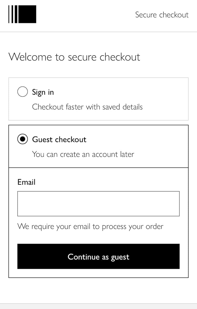
At John Lewis, users are informed when selecting “Continue as guest” that they can create an account later (first image). Following checkout, they can then add the order to their existing account or create an account — which will be perceived by many as less taxing because all that is required at this point is a password.
For many users — especially mobile users — distractions abound when it comes to shopping online.
Thus, it’s critical to keep checkout as seamless and straightforward as possible.
Asking users to consider creating an account at the outset — when they should instead be focused on moving to the next checkout step — adds time to users’ checkout.
For some users, it will only be a minor bump in the road, as they consider and then reject creating an account.
For others, however, they may get sucked into account creation — before completing their order — risking that they fail to finalize their purchase.
Moreover, users tasked with creating an account at the outset of checkout may resent having to fill out “account-creation form fields” — whereas users filling out “guest checkout form fields” are more forgiving.
Therefore, always save account creation for the end of checkout, where users’ prior-inputted information can simply be saved, along with a password.
Additionally, ensure users checking out as guests are informed at the account-selection step that they’ll be able to create an account at the end of checkout, and provide 3–5 benefits of creating an account at the confirmation page.
Saving account creation for the confirmation step ensures one additional option is removed from users’ consideration until they’ve finalized their order — ensuring less friction in the checkout process.
This article presents the research findings from just a few of the 650+ UX guidelines in Baymard – get full access to learn how to create a “State of the Art” ecommerce user experience.
If you want to know how your desktop site, mobile site, or app performs and compares, then learn more about getting Baymard to conduct a UX Audit of your site or app.

