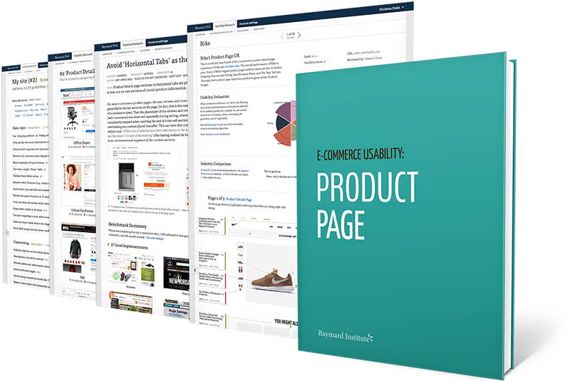
Today we’re releasing our new Product Page Usability study providing you with the results of two years’ worth of usability testing and researching product page layouts, designs, content types, and features.
Nearly all users go through a product page before making any purchase, and it’s often on the product page where users make up their mind on whether or not they want to purchase the item. This makes the product page the centerpiece of your users’ e-commerce experience. Yet at the same time, the product page layout and features tend to be under a lot of strain as they often rely on the same template re-used across the entire site’s product catalog.
Furthermore, our testing shows that users on the product page are often in very different stages of the purchasing decision cycle: some users are casually browsing product pages with no particular product in mind, others know exactly what they want and wish to go straight to the details (or even checkout), while others know so little about the product domain that they require information not just on the product itself but also the product vertical as a whole.
The combination of the product page being the centerpiece page in users’ purchasing decisions, the extreme diversity of product types the page must be able to accommodate, and users’ varying use-contexts for the product page makes it vital that the product page implementation is state-of-the-art. Failure in the product page implementation will often cause failures in users’ e-commerce experience.
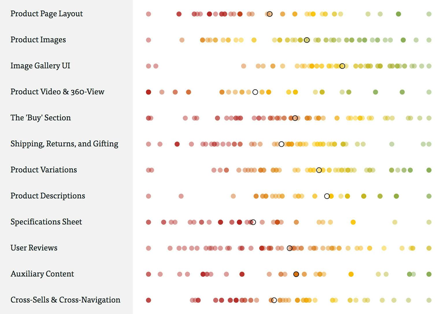
The Average Site Has 24 Unresolved Structural Product Page Issues

5,700+ manually reviewed product page elements summarized across 12 sub-themes, with each dot in the scatterplot representing one of 60 top-grossing e-commerce sites. For an interactive version of this graph, head to the benchmark page.
Our UX benchmark of product page implementations at 60 of the world’s top-grossing e-commerce sites sadly reveals that the product page is difficult to perfect: the average e-commerce site has 24 structural usability issues with their overall product page design and features — and just 18% of e-commerce sites have an overall “acceptable” or “good” product page UX performance, leaving a massive group of 82% sites with “mediocre” to “poor” product page implementations.
However, behind that overall lackluster product page UX performance is a much more nuanced picture. If we look at the UX performances within the 12 sub-themes of product page UX, there are large fluctuations in both the individual site’s and the average site’s performance:
- The average site’s product page UX performance is “good” within sub-elements such as Product Images and Product Variations, and to some extent also within the Image Gallery UI and Product Descriptions
- On the other hand, the vast majority of e-commerce sites have multiple severe usability issues with their Specifications Sheet, Shipping & Returns, User Reviews, The ‘Buy’ Section, and Cross-Sells & Cross-Navigation, causing much of the overall substandard product page performance.
In our upcoming series of articles at Baymard we’ll dive deeper into this dataset and the specific findings. Starting today, you can also browse the free part of the benchmark database and explore the product page implementations and UX performances of 60 of the world’s largest e-commerce sites.
New Research Study Out on ‘Product Page Usability’
The importance and complexity of product page implementations explains why we’ve spent two years’ worth of testing and researching product page layouts, designs, content types, and features. Today we’re releasing those results in our Product Page Usability study, which distills all of our research findings into 98 usability guidelines specific to product pages.
The Product Page study is based on both qualitative website usability testing following the “Think Aloud” protocol (1:1 moderated testing) and in-lab eye-tracking testing with a combined 236 test subjects/site sessions.
The study includes test findings on Product Page topics such as: the best-performing product page layouts, the multitude of ways users engage with and interpret product images, the image gallery UI itself, general product page features, product videos, how to structure product descriptions, “buy button” designs, the best layout for spec sheets, how user reviews are best presented to support the user’s purchasing decision, cross-sell logic and placement, how visually-driven and spec-driven product pages should differ, and so on. In short: the entire product page user experience.
In addition to the Product Page report, the study also includes unrestricted access to the Product Page UX benchmark database. The benchmark reviews and compares the product page experience and performance of 60 major US and European e-commerce sites across each of the 98 guidelines presented in the 621-page report. This provides you with an additional 4,100 categorized and performance-verified best-practice implementation examples, and more than 5,700 product page UX performance scores, identifying which sites and competitors offer their users a superior product page experience, and why that is.
You can learn more and get full access to the Product Page Usability report and benchmark at baymard.com/product-page


