Inspirational images, common on homepages, category pages, and even headers on product listing pages, can be great at lifting the aesthetic appeal of an e-commerce site design.
Indeed, our research shows that bespoke imagery is one of the biggest factors in positively influencing the user’s initial perception of the site, with 88% of our benchmark sites using inspirational imagery across the site.
However, users seeking the specific products depicted — or to replicate the entire depicted look — can become frustrated when they are able to clearly see the product they want but are unable to easily navigate to them.
“Users become frustrated when they can clearly see a product but are unable to navigate to it.”
As sites realize this key opportunity for upsells, our benchmark sites shows a growing number of sites consistently link to products depicted in inspirational images — from 47% in 2013, to 55% in 2017, to 91% in 2019.
However, 9% of sites continue to frustrate users by failing to provide easy access to highlighted items.
In this article, we’ll cover our research findings from both desktop and mobile large-scale UX testing regarding the use of inspirational images during product finding, including:
- Why users want to find particular featured items — and the roadblocks that keep them from doing so
- 4 different ways to provide access to products depicted in inspirational images
- What to do when products depicted in inspirational images are not available
You Can See It, But You Can’t Buy It
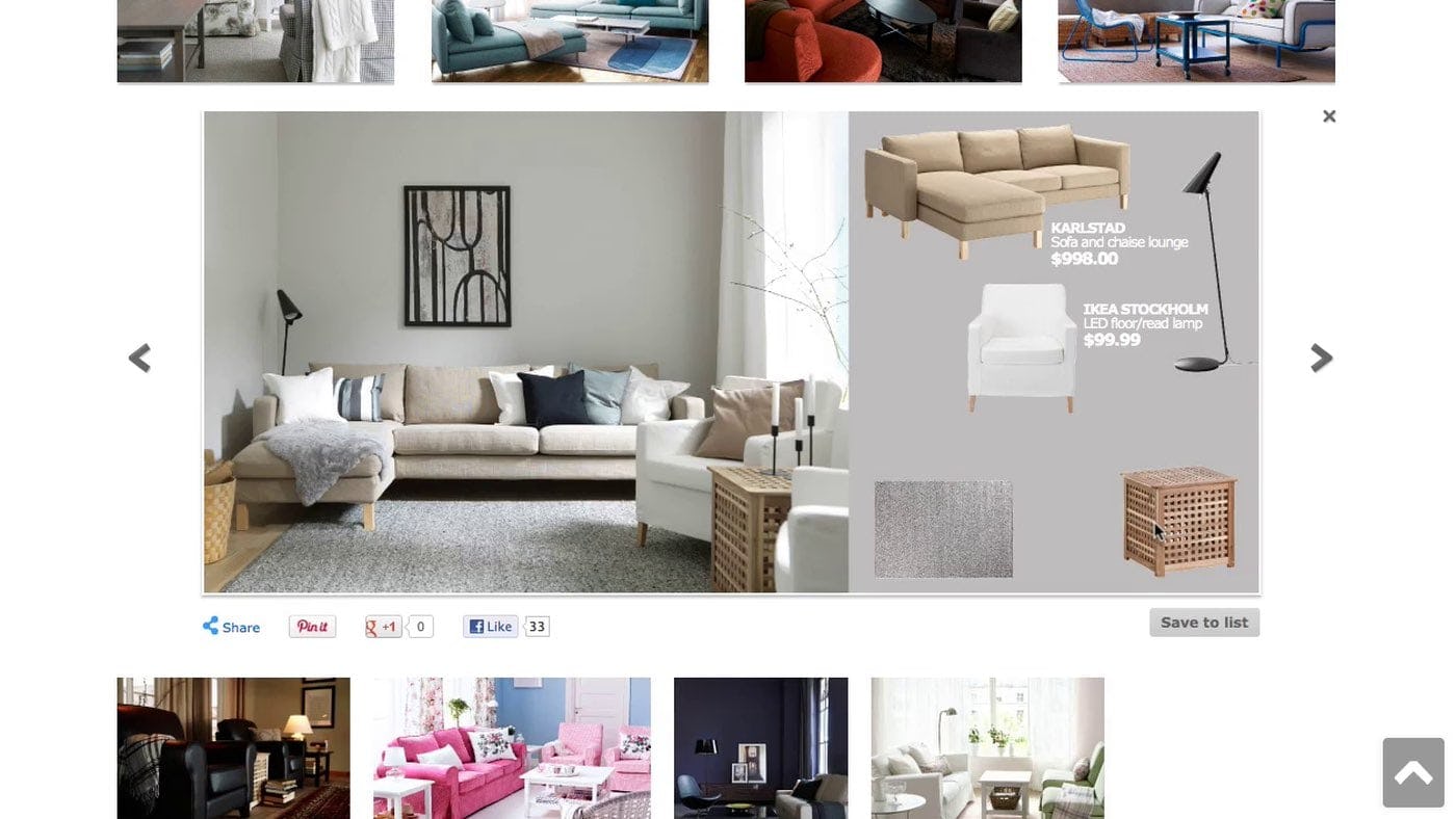
“Noo…arrgghhh, it only added the sofa. I would like to get the sofa table”, a user on IKEA exclaimed while hovering and clicking the table in the image. Laughing in despair he continued, “I want this — what do I do…I want this one! [pointing at the table]”.
Images in general tend to receive a lot of attention from online users, and inspirational product images in particular are often designed to draw the eye with enticing photography and featured products within a beautifully styled setting.
Inspirational images are often used as an illustrative and visually interesting representation of a product category, such as a model wearing an outfit with a winter coat to represent the “Outerwear” category or a beautifully furnished room to represent the “Living Room Furniture” category.
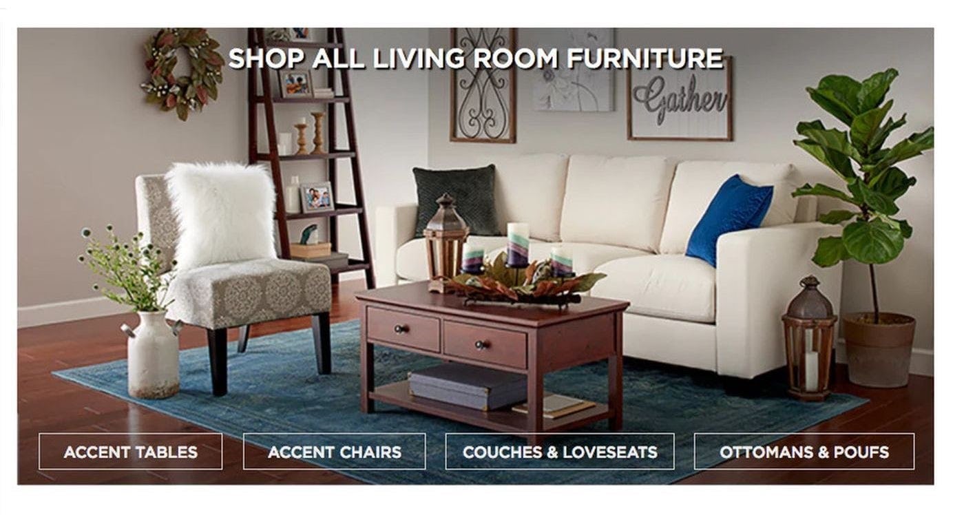
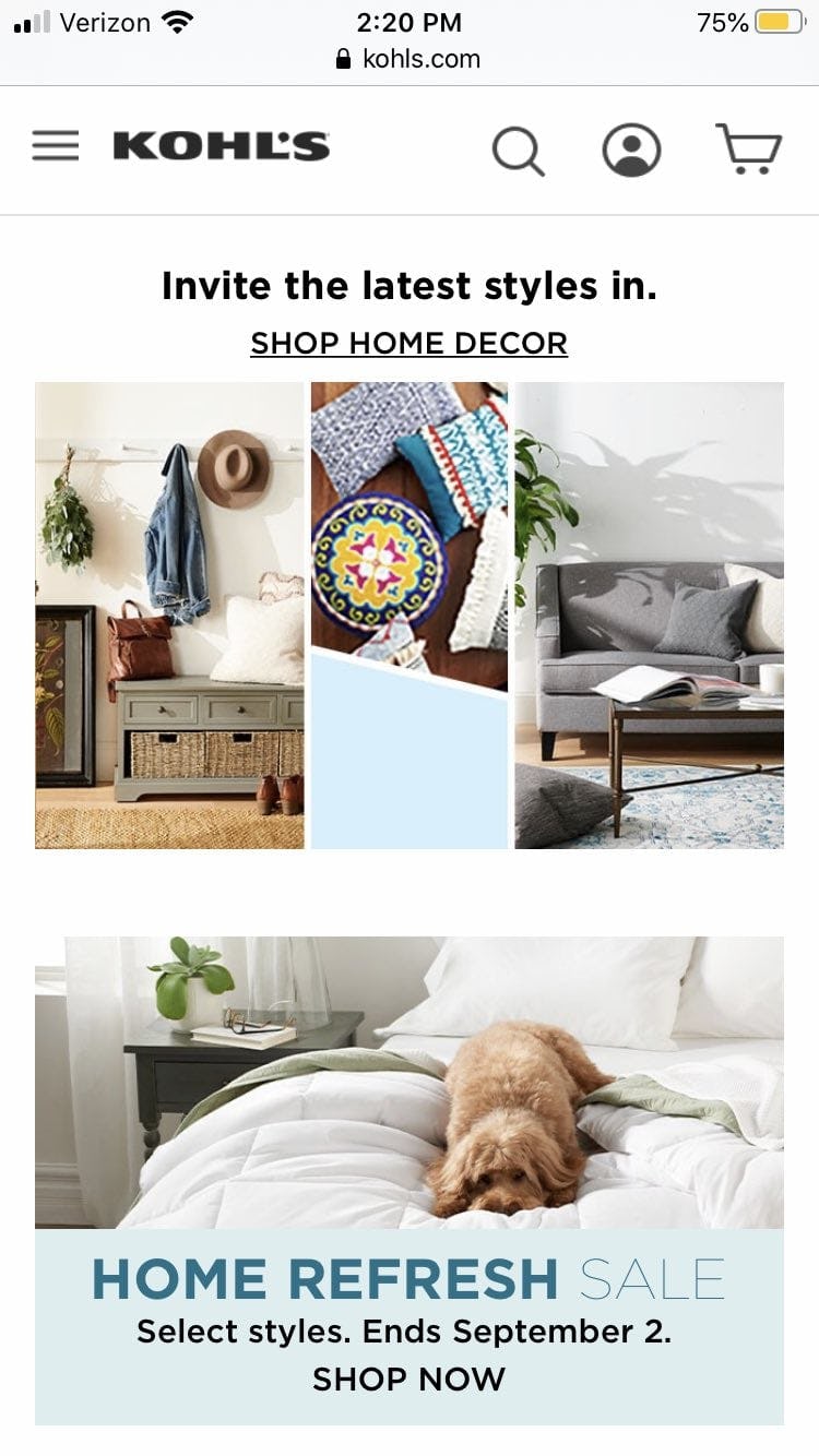
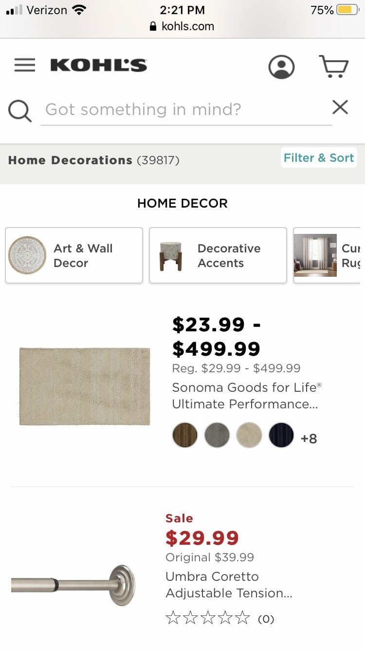
On Kohl’s, users’ interest might be piqued by the inspirational images featured on intermediary category pages, such as the sofa and coffee table shown in the top image (first image). On the resulting page, however, these items are not available at all (second image).
However, the eye-catching tendency of inspirational images also leads to a potential problem: while the image is typically meant to promote a category of products, users may become interested not only in the overall category, but specifically in the particular products depicted — possibly even in a product besides the category the image is designed to promote.
For example, users may want that particular coat being worn by the model, or they may be interested in the rug shown in the image of a room meant to highlight the furniture.
Because these different products are — in the user’s eyes — so prominently featured on the site, users tend to expect to be able to access the specific products depicted, including auxiliary products shown in the background.
During our usability research studies, we time and again observed users grow frustrated as they spotted a product they wanted in one of these inspirational product images that they weren’t able to navigate to, either because the image linked to a category from which those products weren’t evident or because the image wasn’t a link at all.
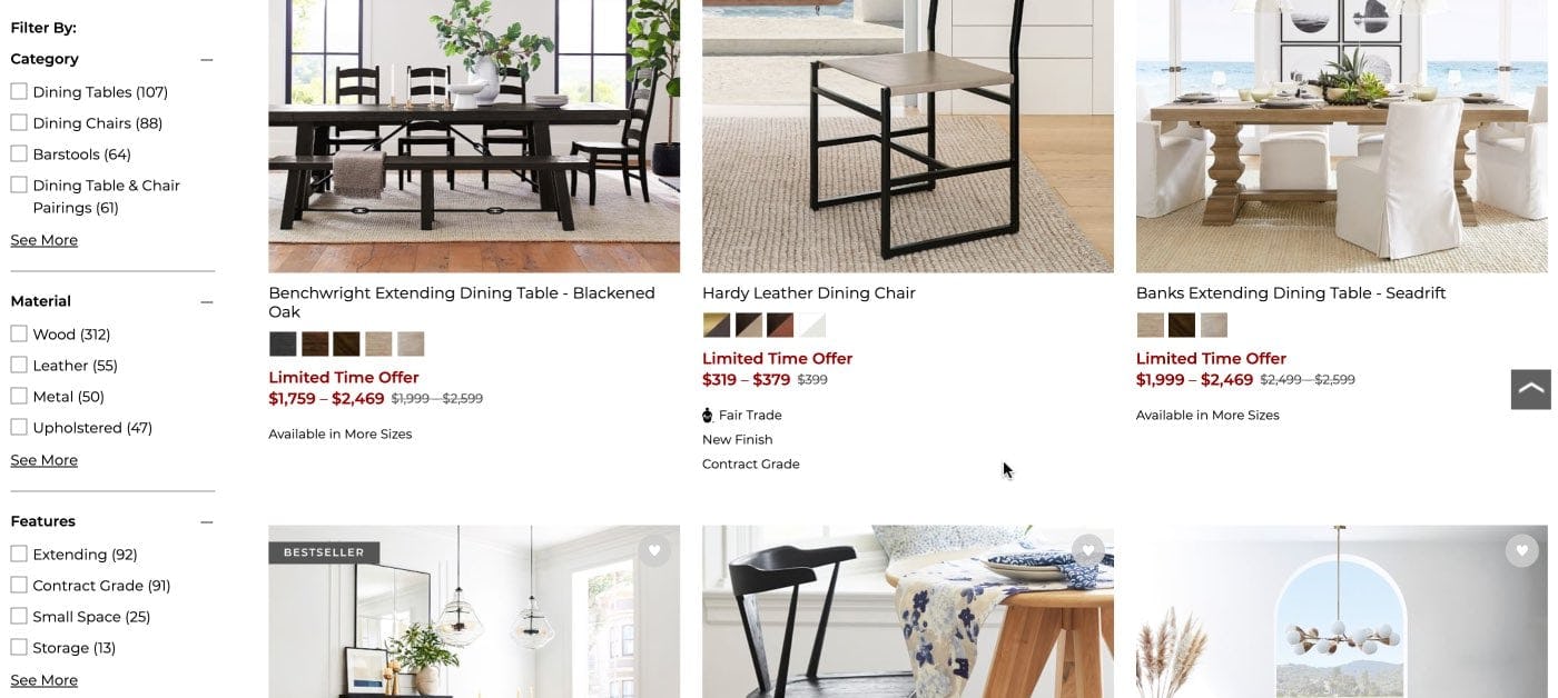
A user browsing on Pottery Barn might be interested in the upholstered dining chair prominently featured in this category image (first image). However, it is not evident on the resulting listing page, even after extensive scrolling (second image). Determined users might strive to locate this chair via navigation or search, but many will give up their attempt to find it or possible alternatives.
When users don’t have immediate access to products that are being promoted, they are essentially forced to play a cat-and-mouse game where they must manually scan and search the site to hunt down the product on their own. In practice, many users will quickly give up the search, deciding it requires too much effort.
Failing to provide access to products depicted in inspirational imagery not only inconveniences and frustrates users, but it also presents a sizable missed opportunity for sites to upsell.
Users can be drawn to the entire “look” depicted by the styled room, vignette, or outfit and may be tempted to purchase all of the included products to replicate it in its entirety. Without an easy way to do so, users may give up on manually locating all of the products featured, missing out on a fully curated look — while the site misses out on a sale.
How to Provide Access to Depicted Products
In practice, there are 4 strategies for providing access to depicted products.
1) Include the Products as List Items Near the Inspirational Image
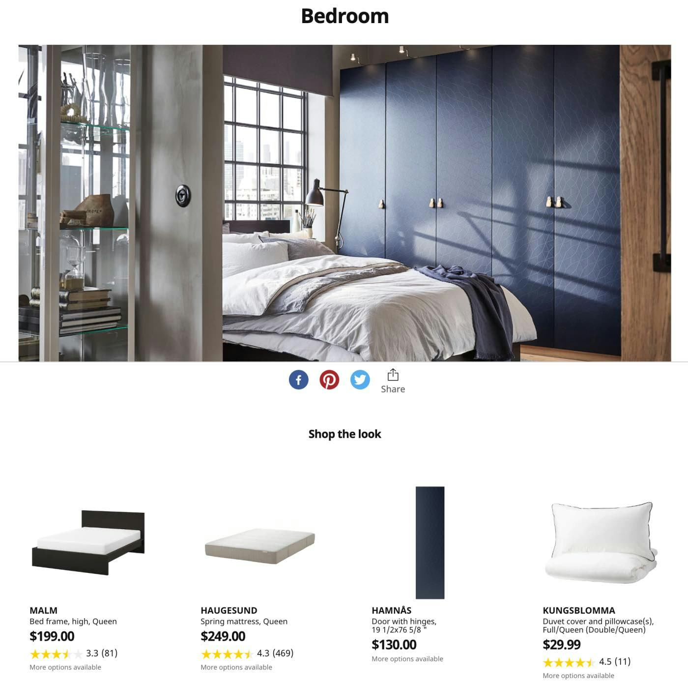
On this intermediary category page at IKEA, products featured in an inspirational image are listed directly on the page, so users can immediately explore any they are interested in.
The most direct option is to list featured or depicted products directly on the homepage or intermediary category page alongside the inspirational image.
This implementation allows users immediate access to product information that would normally be included in a product list, such as the product name, price, and average rating, without the need to further interact with the page.
However, product list thumbnails have the potential to be confused for subcategory thumbnails, so intermediary category pages containing both kinds of images must be carefully designed to ensure each kind of image and link is distinct.
2) Provide a Link to a Curated Page that Contains the Depicted Items
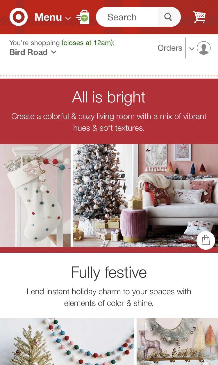
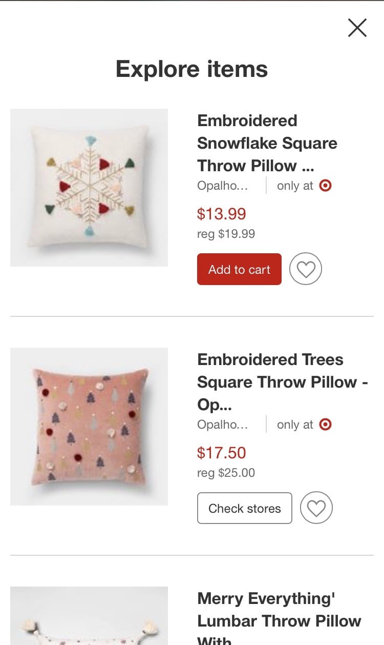
At Target, inspirational imagery features a shopping bag icon (first image) that opens a curated overlay listing the items featured (second image), providing easy access to shop the entire featured “look”.
If there’s a chance that the individual products may distract too much from subcategory thumbnails (which are important on the homepage and category pages), another option is for inspirational imagery to include a link to a page or overlay specifically listing the depicted products.
This implementation is especially beneficial for fully styled outfit or room photos, where users may be interested in purchasing all of the included products to fully replicate the look.
3) Provide a Link to a Product List that Includes the Depicted Items at the Top of the List
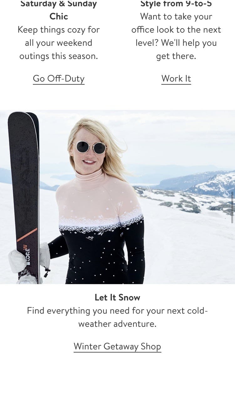
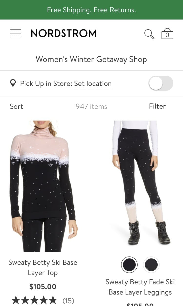
On Nordstrom, this inspirational image representing a curated seasonal category (first image) provides the previously featured products as the first results on the subsequent listing page (second image). Users initially drawn to these items on the intermediary category page can access them immediately, without the need to scroll or otherwise hunt for them.
When inspirational images are linked to product listing pages, any products depicted in the original image should appear first within the product list so they are immediately visible and accessible.
This strategy will meet the needs of both users who expect the link to lead to a product-listing page as well as those particularly interested in the products depicted in the inspirational image.
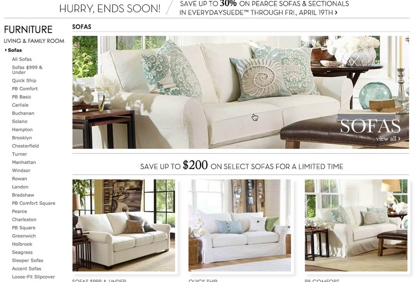
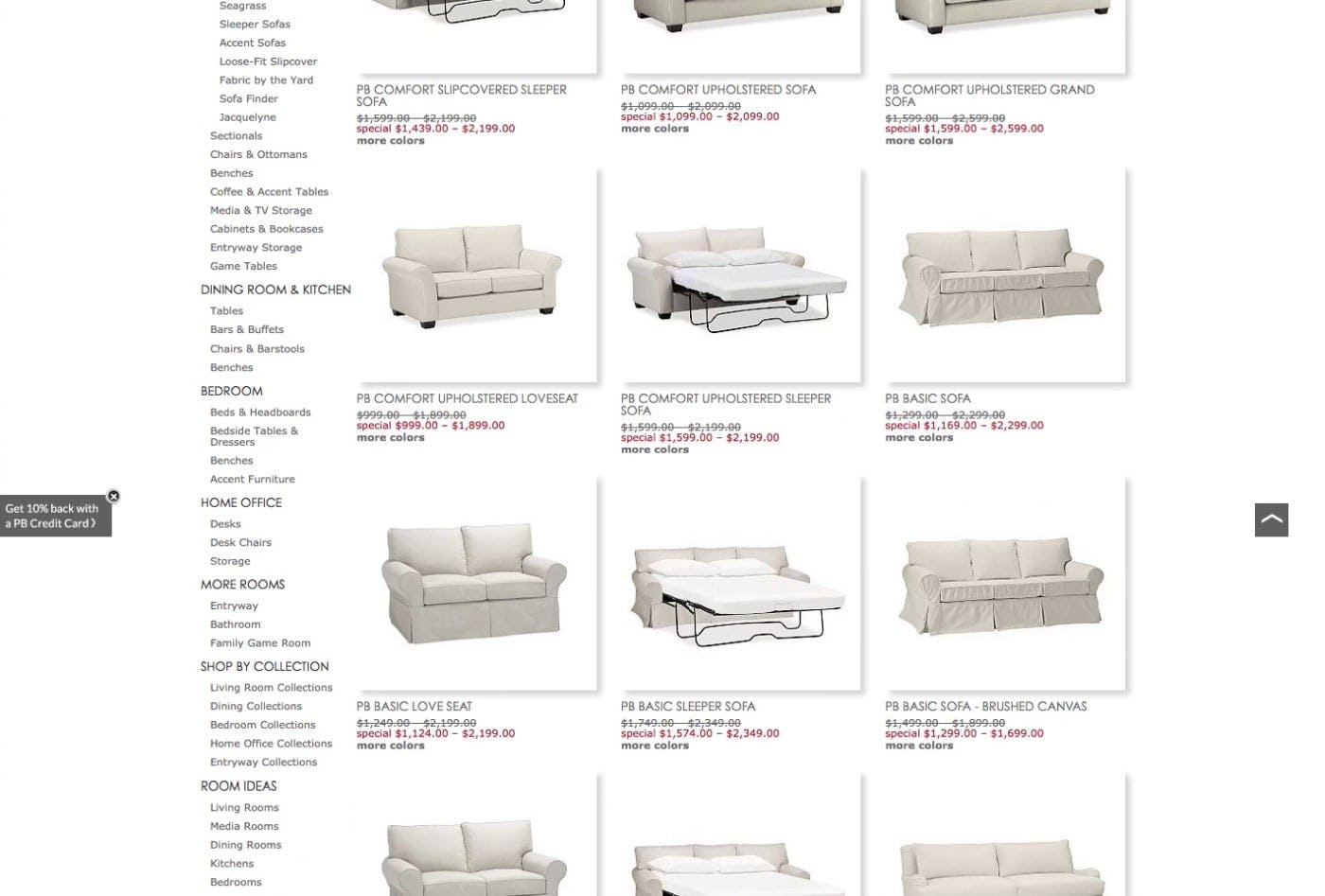
During an earlier round of testing on Pottery Barn, a user found the sofa in the header image (first image) interesting and clicked it to further investigate, assuming the link would lead specifically to that sofa. Instead, the link led to the “Sofas” listing page (second image). Surprised by the listing page, the user was unable to find the sofa he was originally interested in, as the product list thumbnails were extremely similar, and he ultimately abandoned his hunt.
Note that during testing some users assumed that clicking directly on a depicted product within the inspirational image would take them directly to that particular product’s detail page.
These users were disappointed to arrive at a curated page or product listing page; however, if the depicted product they were interested in is immediately accessible in the resulting list then they’ll have to overcome only a minor speed bump on their way to their product of interest.
To further help users identify the product they’re interested in, it’s thereby important to make it easy to recognize product list item(s) that match the products depicted in the original inspirational image. This can be done by listing the name of the product(s) within or alongside the inspirational image or indicating on the product-listing page which items have been featured.
4) “Tag” Individual Products in the Inspirational Image
Another interesting strategy to consider is to provide interactive tags within the inspirational image. Products depicted in the inspirational image are marked with a pin, dot, or icon, such as a price tag symbol, and clicking the icon provides users with additional product information and a link to the full product details page.
This implementation can be particularly engaging, encouraging users to interact with the inspirational image in detail, and may be most valuable on intermediary category pages with large inspirational images.
However, this strategy should be approached cautiously, as testing hasn’t yet verified the performance of this design pattern.
On mobile, where there is no hover state, it may be less obvious that inspirational images contain links to various product pages. Instead, including a button or icon within the image invites users to tap right away, thereby exposing the links to the individual product pages.
Get Maximum Value from Inspirational Images
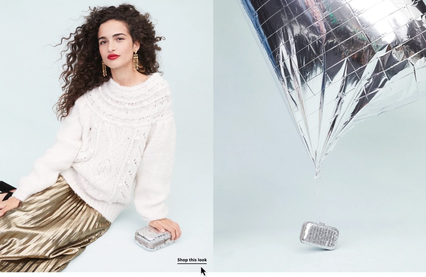
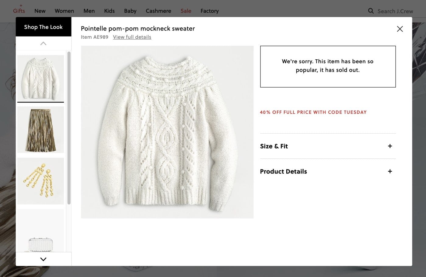
The inspirational images on this J.Crew intermediary category page feature an explicit “Shop the Look” link that opens an overlay featuring all of the depicted items (first image). When items are out of stock (second image), the layer informs users of this fact.
Inspirational images are often the most expensive to shoot, so it’s not uncommon for them to continue to be used on a site even if some of the products depicted are no longer available.
In these cases, users should be notified that the item is no longer available, instead of simply removing the product from the curated page or product list.
The description can be as simple as “discontinued”, “unavailable”, “only available in stores”, etc. Even better, if similar products are available, consider linking to those or their categories as alternatives.
While users may be disappointed to see their desired item is out of stock, this notification is far preferable to removing the item from this layer entirely, leaving users to wonder about the item’s availability or waste time searching the site for it.
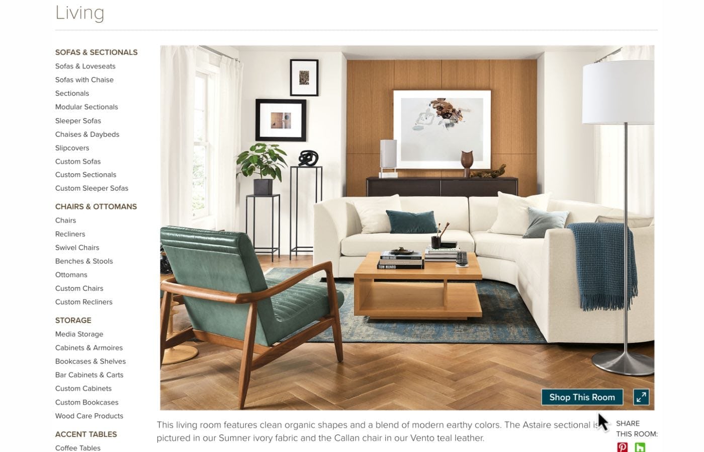
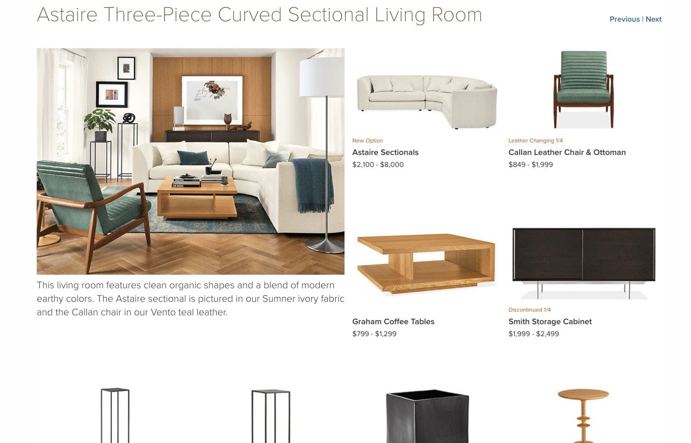
In this example from Room&Board, inspirational images on this intermediary category page include a link labeled “Shop the Room” (first image) in the lower-right corner that leads to a curated page with all of the depicted items (second image).
Inspirational images can pull extra weight by not only visually enhancing the representation of product categories across the site, but also by giving users a clear path to featured products.
Doing so helps both users and the site itself: users can immediately learn more about all of the different available products they may be interested in, while the site makes it easier for them to find — and eventually purchase — a wider array of products.
Luckily, sites have several options for making products featured in inspirational images easy to find.
- Include the products directly on the page near the inspirational image
- Provide a link to a curated page or overlay containing the depicted items
- Link the image to a product list that includes the depicted items at the top of the list
- “Tag” individual products in the inspirational image.
Given the benefits for users, it’s surprising that 9% of benchmark sites still don’t provide clear access to products featured in inspirational images.
Without a direct path to visually highlighted products, users who are drawn in by eye-catching inspirational images are likely to give up on manually locating the products — and the site misses out on an easy sale.
This article presents the research findings from just 1 of the 650+ UX guidelines in Baymard – get full access to learn how to create a “State of the Art” ecommerce user experience.

