Key Takeaways
- Our research focus on European e-commerce sites has uncovered over 1,000 medium-to-severe usability issues encountered during 160 participant/site qualitative usability test sessions
- 18 large e-commerce sites in the apparel and technology sectors were tested in the UK, Germany, and Nordic countries
- More than 250 examples from European sites were added to 150 of the most important guidelines in the Baymard Premium catalog
At Baymard we’re periodically asked by clients how US and European sites differ when it comes to e-commerce UX.
While over our years of usability research we’ve tested on a diverse assortment of sites — including US and European sites — we’ve never until now conducted a research track solely focused on how the largest European sites perform with regards to the product-finding and -purchasing user experience.
To that end, our research team has recently spent over 550 hours usability testing and researching features, layouts, content, and designs on just European e-commerce websites.
The research included more than 160 qualitative participant/site usability test sessions following the “Think Aloud” protocol (1:1 remote moderated testing). The 18 test sites are based in Germany, the Nordic countries, and the UK, and comprised apparel and technology sites, as follows.
German sites
Apparel: Esprit, Bonprix, Zalando
Technology: Otto, Notebooksbilliger, Cyberport
Nordic sites
Apparel: Boozt, Miinto, H&M
Technology: Power, Elgiganten, Hi-Fi Klubben
UK sites
Apparel: Marks & Spencer, Next, Boohoo
Technology: Argos, Currys, Appliances Online
In short, testing revealed that European sites suffer from the same type of UX issues as US sites.
European Sites Differ Slightly, but European Users Behave the Same
Despite testing a diverse set of European sites, throughout the test sessions the European participants repeatedly ran into difficulties with the layout, content types, or features. Indeed, during testing the participants encountered 1,000+ medium-to-severe usability issues — which largely could be mapped to existing published guidelines.
In fact, none of our 550+ guidelines was contradicted by the experiences of European test participants, nor did they have to contend with any issues not seen previously over our 12 years of usability testing.
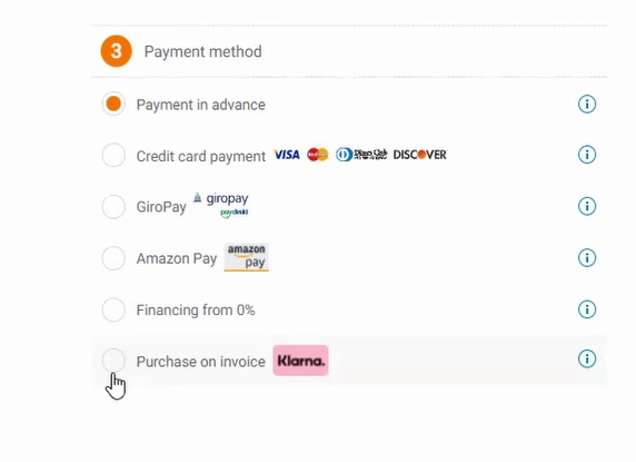
One of the few differences between US sites and European sites, such as here on the German sites Notebooksbilliger.de (first image) and Zalando.de (second image), was the wider range of third-party payments available. These included “Payment in advance”, “Giropay” (bank transfer), and “Purchase on invoice”, which allows users to pay up to 30 days after purchasing.
Some local differences were observed, such as the larger range of third-party payment and delivery options in Germany and the Nordic countries. These included payment by invoice and by bank transfer in Germany. Yet, despite these additional third-party payment options being present, participants didn’t experience any substantially different issues from what we’ve observed in our other large-scale B2C testing.
Over 250 New European E-Commerce UX Examples Added
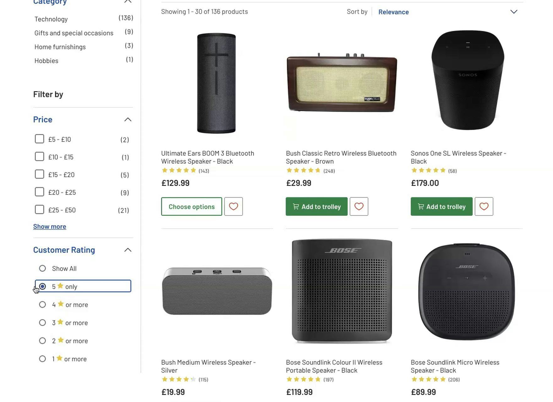
European test participants sought out the same filter types as those in the US, such as the size filters on Boohoo (UK, first image) and the average rating filters on Argos (UK, second image).
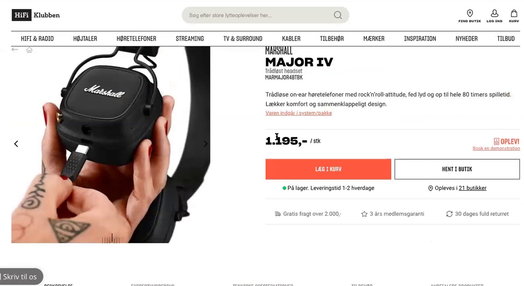
Product images were just as important to European users as to their US counterparts. They also sought out photos that showed products in scale (as on the Nordic site HiFi-Klubben, first image) and that had a decent zoom level (as on another Nordic site, Miinto, second image).
To provide a better “European context” to our guidelines, we’ve added more than 250 examples from European e-commerce sites to over 150 of the most important guidelines in the Baymard Premium catalog.
The 250 examples cover a diverse array of interfaces, from the Homepage through checkout.
To access this research, along with 71,000+ hours of UX research findings, all distilled into 550+ design guidelines and 119,000+ UX performance scores, sign up for Baymard Premium.


