During our large-scale usability research, the product page was often observed to be a pivotal point in the user journey.
Indeed, based on the information they found in the product description, some users would feel confident enough in a product’s suitability for them to decide to purchase.
On the other hand, the lack of sufficient product information would cause other users to abandon the page — sometimes, even, the site itself.
Furthermore, when sites did not provide desired information, we observed that some users would make incorrect assumptions about a product (which would sometimes result in frustration and unnecessary returns).
However, based on our most recent benchmark data, 10% of the largest e-commerce sites fail to have a consistently high level of detail for their product descriptions.
In this article, we’ll discuss
- How insufficient product descriptions can lead to users abandoning products
- What basic information to consider providing in product descriptions (if relevant for the product type)
- How thorough descriptions can support product images
How Insufficient Product Descriptions Can Lead to Users Abandoning Products
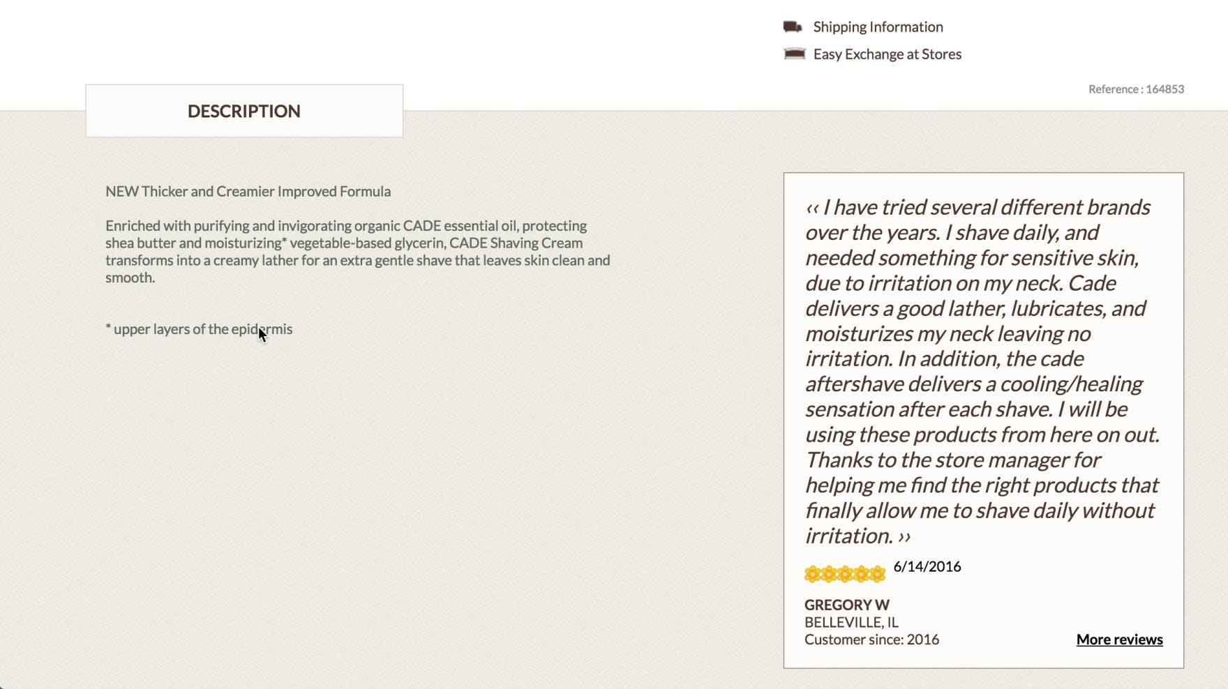
“I would have thought [the ingredients] would have been under the description.” A user was disappointed not to find a list of ingredients in the product description for L’Occitane’s shave cream. She dismissed the product when she was not able to find this information. Users will often abandon a product when important information is missing from the product description.
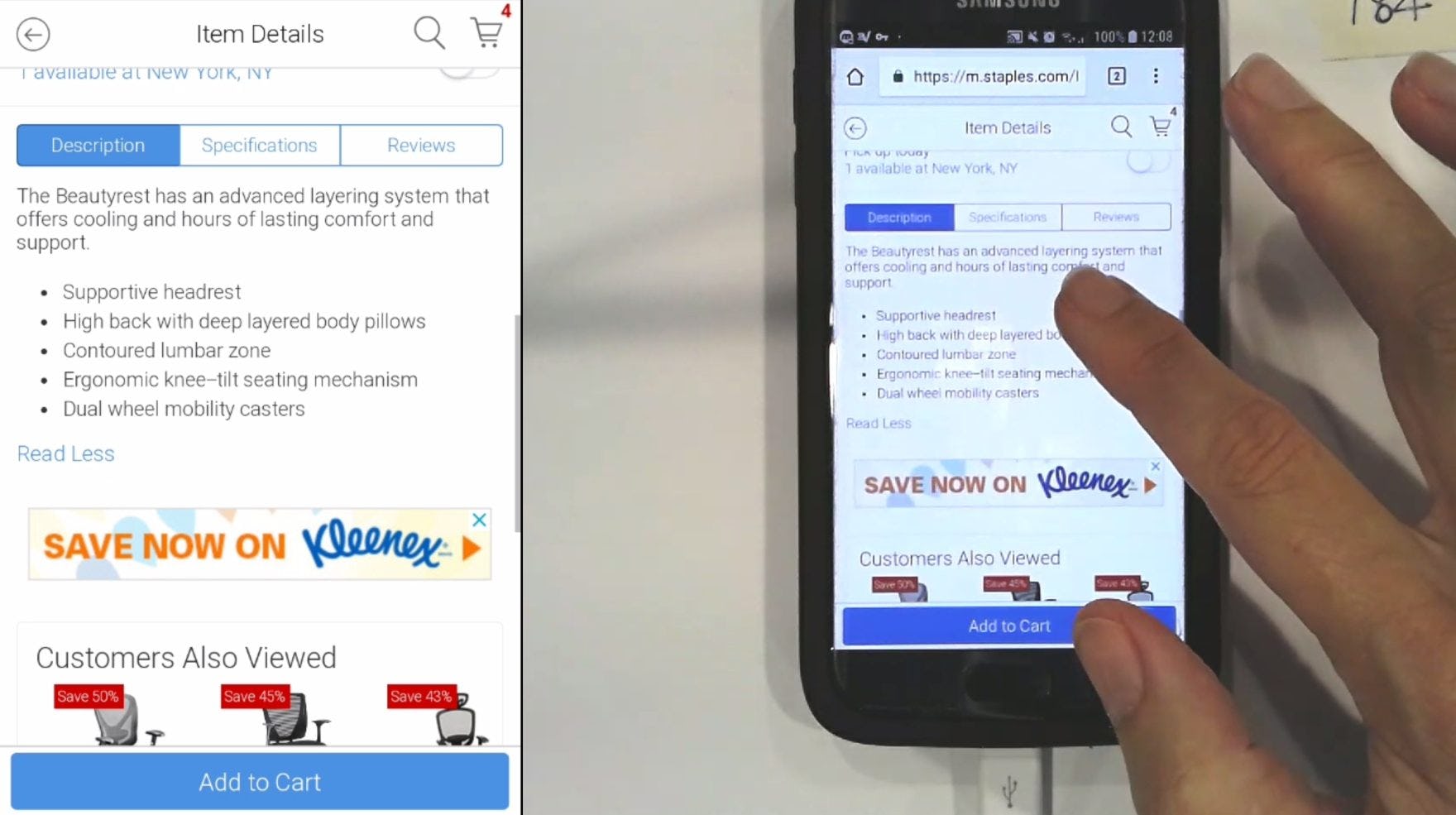
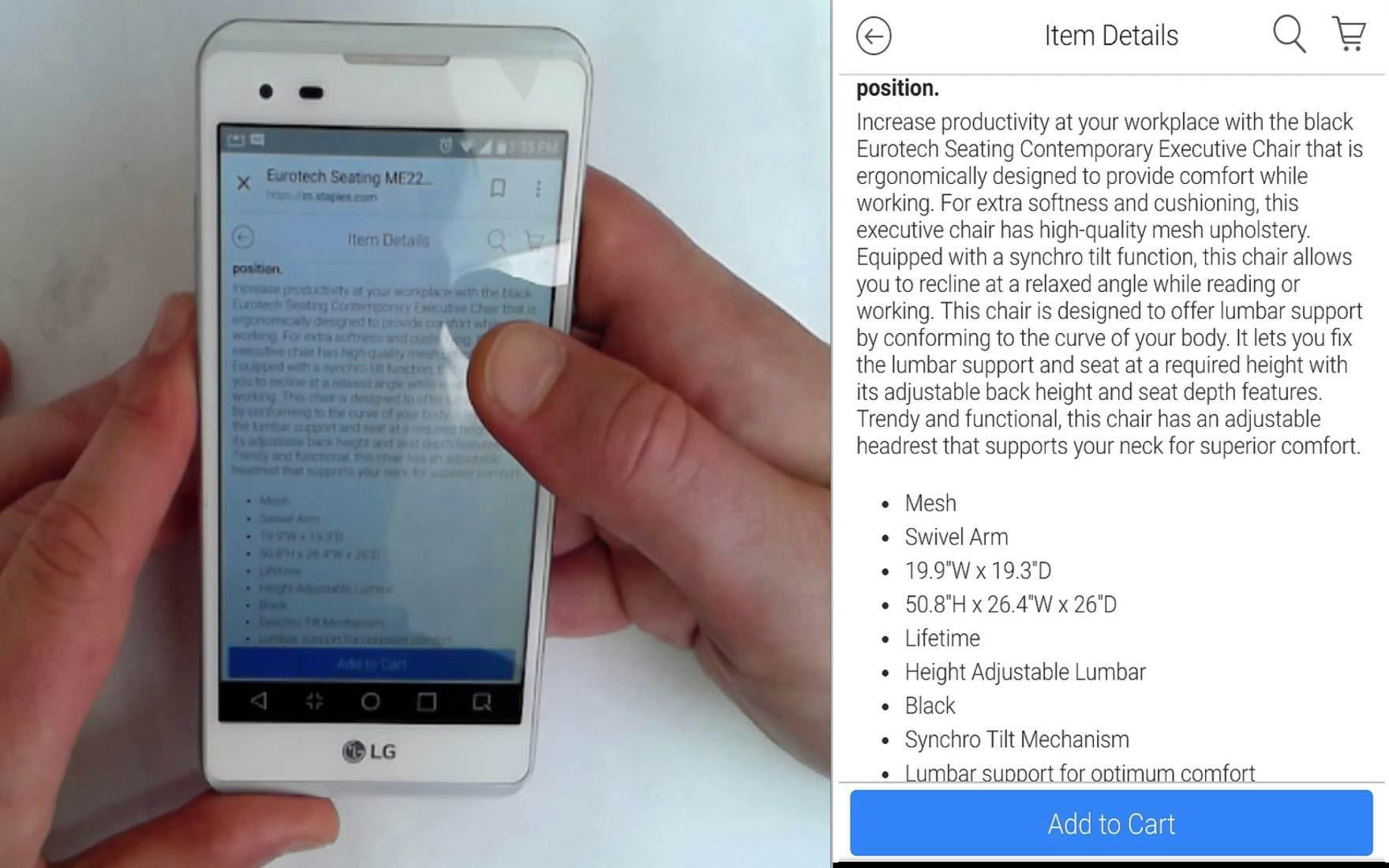
At Staples, a user added an office chair to her cart for later comparison, but upon further inspection she found the product description to be overly brief. Note that the entire product description — including text and bullet points — takes up only half the mobile viewport. Too brief product descriptions often fail to give users enough confidence about a product to consider purchasing it.
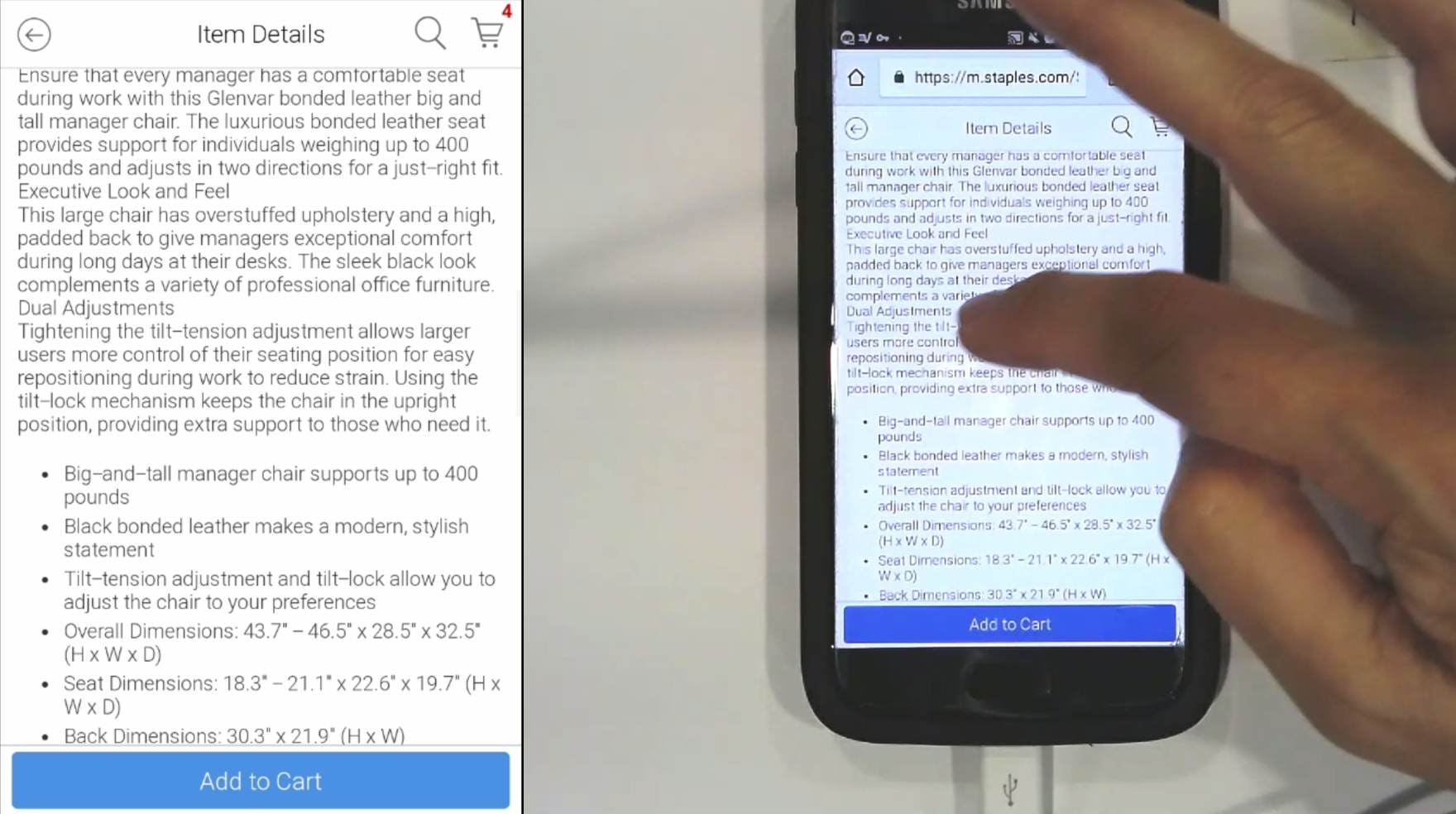
“There’s a lot of information here, on the chair…I’m starting to discount [the other chair], because there’s very little information.” Looking at another office chair at Staples, the same user stated that the more detailed description for this chair reflected poorly on the one she had added to her cart (in the previous example). She discarded the previous chair as a result.
When desired information wasn’t available in overly brief product descriptions, some users during testing would quickly move on to consider another product — or would move on to a different site.
This is especially true when users encounter more than one insufficient description on the site, as some users will assume that the quality of descriptions they have already seen is representative of the overall quality of product information across the site.
Others spend a bit more time on the product page (1–3 minutes) scanning other sections of the product details page searching for this information.
Sometimes they find what they are looking for in, for example, the reviews, but overly brief product descriptions place too much strain on other page sections, which may or may not resolve the issue for users.
It’s important to remember that while a customer in a physical store can often consult with an employee about a product’s features, online shoppers are more restricted: even if the option to “chat” about the product is available, almost no users are likely to do so (as was observed in testing).
Therefore, the product description is sometimes all a user has when it comes to trying to find detailed information about a product.
If the description fails to meet users’ expectations, many will simply abandon, rather than take a chance on purchasing the product.
Information to Consider Providing in Product Descriptions
Testing made it clear that sites must provide sufficient information in product descriptions to give users enough to consider purchasing a product.
Yet what exactly should be provided differs, of course, from site to site and from product to product.
However, even though it would be impossible to anticipate every high-priority question a user may have about a product, addressing the needs of many users can be relatively straightforward for most product types.
Below are some examples of common information that users sought out in testing, but was sometimes not provided by sites.
1) Materials and Ingredients
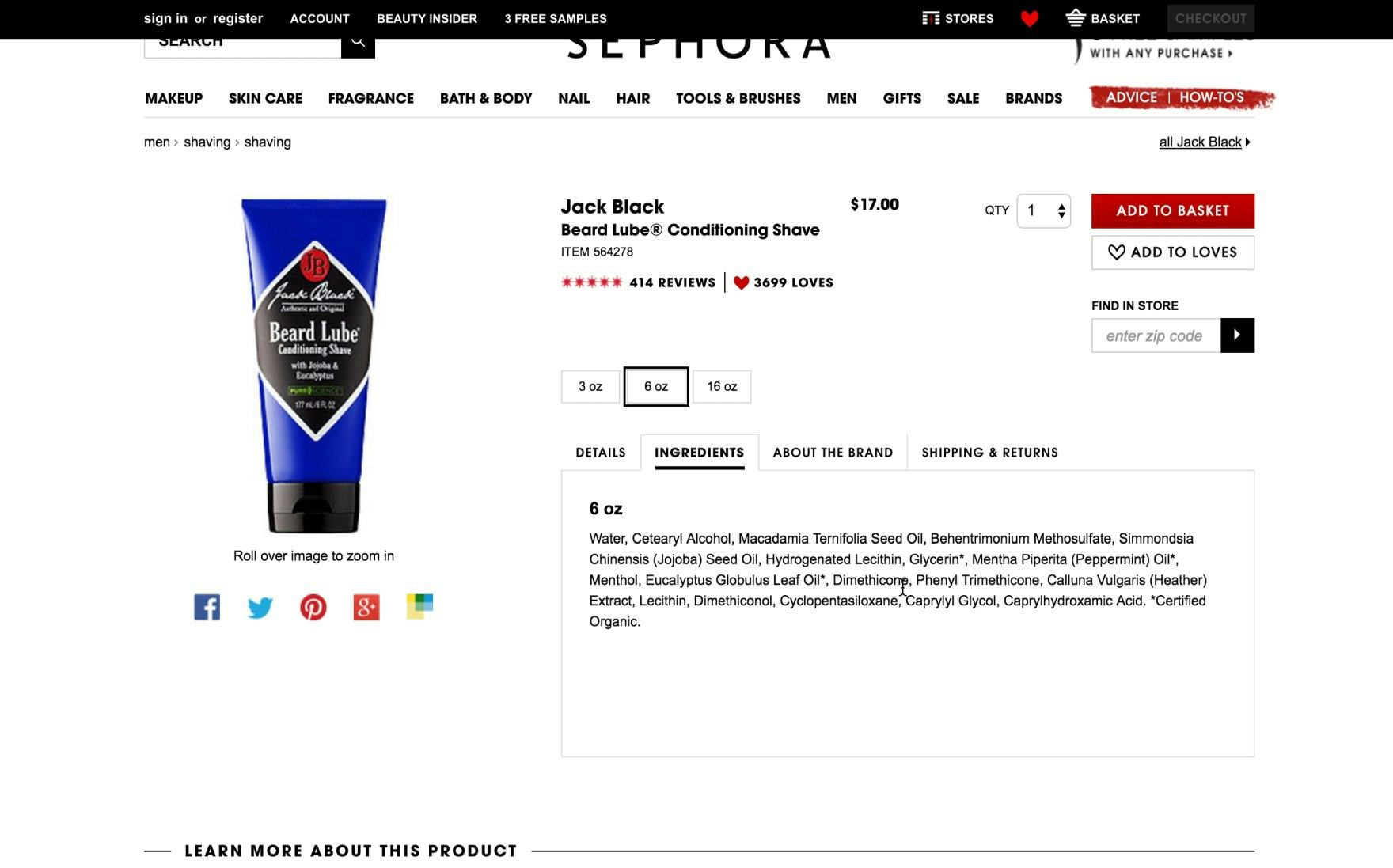
“I would be more inclined to go with the beard lube, because I know more about it.” One user was comparing different products at Sephora and ultimately chose the product where the description clearly displayed ingredient information.
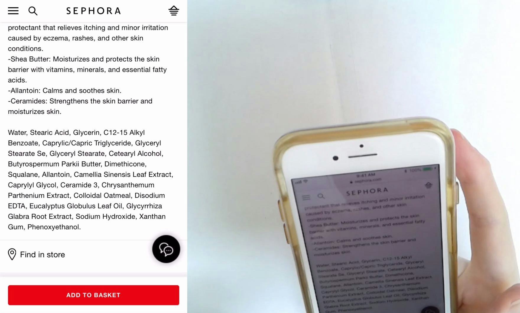
Another user at Sephora viewed a product description where the list of ingredients were similarly laid out: “‘Dimethicone’, that kind of freaks me out. Because that’s…silicone. Sometimes I don’t like the way silicone products feel on my face. So I would say ‘no thanks’ to that”. While this user ultimately did not purchase the product, she felt confident in her choice due to the detailed product information.
Materials and Ingredients — or generally a product’s composition — were key product details that users sought out during testing.
This type of information could apply to the chemical composition of products in the health and beauty industry, such as makeup and skin care products, or to the textile and material composition of apparel, such as clothing items and athletic shoes.
When shopping for beauty products, for example, 50% of users in our desktop study required information regarding the ingredients. If such information was not readily available, users were quick to dismiss a product in favor of one with a more detailed product description.
Moreover, while many users just want to get an overview, some have specific concerns about particular ingredients — which might be based on allergies or other sensitivities.
Therefore, users also react positively to product information about what ingredients are explicitly not included. These intentional omissions could be potentially harmful chemicals — for example, being “BPA-free”.
Similarly, during testing users shopping for apparel repeatedly inquired after the material makeup of products they were interested in. Users’ interest in apparel materials most likely could be related to future care instructions — which are sometimes included in product descriptions as well.
For example, some users may be looking for technical benefits of the material itself — such as Gore-Tex being waterproof, or spandex being flexible. Other users may have material sensitivities or simply preferences for one material type over another.
Whatever the users’ needs happen to be, including material and ingredient information helped many users find suitable products and made their ultimate purchasing decisions easier.
2) Product Dimensions
“Seems pretty tall. 50 inches high. Maybe that’s the back of the chair.” This chair on Staples included two sets of dimensions but neither was labeled. This forced the user to make unnecessary assumptions about how the dimensions applied to the product. The benefit of including dimensions is greatly diminished when the information is not properly labeled.
“There’s a lot of information here, on the chair.” This product description, also at Staples, displayed not only the “overall dimensions” of an office chair, but both the “seat dimensions” and “back dimensions” as well. The high level of detail provided here was enough to satisfy this user and cause them to abandon another product in favor of this one. Providing detailed and clearly labeled product dimensions minimizes users’ need to make assumptions about a product.
Product dimensions were observed in testing to be important to most users looking for physical items. Many had questions or concerns which could be linked to a product’s measurements.
Whether it was external dimensions or the particular dimensions of a given feature, users were often swayed by the presence — or absence — of the product’s dimension and size details:
- External dimensions are often very important to users shopping for large items, such as appliances, or for items which have a strictly prescribed use case, such as luggage — which must comply with flight travel regulations.
- Feature dimensions, which are more specific than external dimensions, describe particular parts of a product — for example, giving individual “seat” and “back” dimensions in addition to the overall dimensions. Some products only include external dimensions and overlook the individualized feature dimensions which give users a much clearer picture of the product.
As we observed in testing, this extra level of detail can be a crucial differentiating factor between products.
Similarly, labeling dimensional values with their units of measure is essential.
However, as one user stated, “‘65 cm’. I don’t really know how that would compare with inches”. Therefore it may also be advisable to include a product’s dimensions in an alternate measurement system — for example, including Imperial units in parentheses alongside metric measurements.
3) Compatibility Information
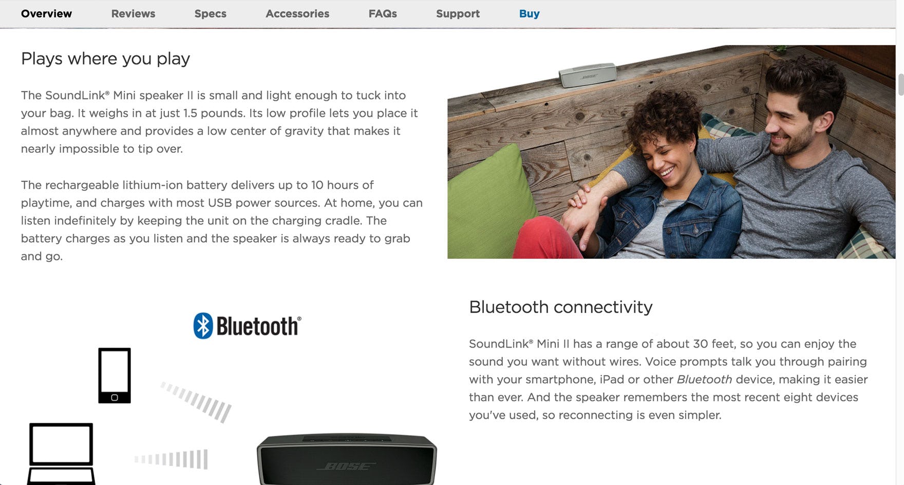
The product highlights in this description on JBL provided clear compatibility information related not only to other products of the same brand (“JBL Connect technology”) but also compatibility with industry-wide systems (“A2DP Wireless Stereo Bluetooth” and “AVRCP Bluetooth Remote Control”). Including specific compatibility information, even if the information is highly technical, will assist users in finding products that will work together.
Compatibility information will often be the most important product attribute for users investigating products with strict compatibility dependencies.
In some cases, a product’s relevance is determined entirely by its compatibility with another product the user already owns or plans on buying.
Some examples of compatibility-dependent products include the following:
- Accessories (e.g., a case for a laptop)
- Products used in conjunction with other products (e.g., a soundbar for TVs and other media)
- Spare parts (e.g., an AC adapter that needs to match a laptop’s power rating)
- Consumables (e.g., ink that has to fit an exact printer model)
If users are unable to find key compatibility information, or if the information is incomplete — such as listing a model series but not the explicit model number, or the information is not presented in a way users can understand — users will be forced to either conduct their own research off-site or abandon the product altogether.
Most importantly, very few users will feel confident in making a purchase for a compatibility-dependent product where there’s even the slightest doubt whether it will be compatible — simply, users’ desire and ability to “fill in the blanks” is virtually nonexistent for products with incomplete compatibility specs.
How Thorough Descriptions Can Support Product Images
Since product images are so important in helping users find a suitable product, questions or concerns that arise from these images should be addressed in the product description.
Indeed, during testing users at times were intrigued by a feature depicted in a product image, and wanted to learn more about it — and would often look to the product description to fill in the gaps.
Even when supporting captions are provided for ambiguous images, the following image types are particularly likely to prompt users to seek answers in the product description.
1) Images That Include Descriptive Graphics
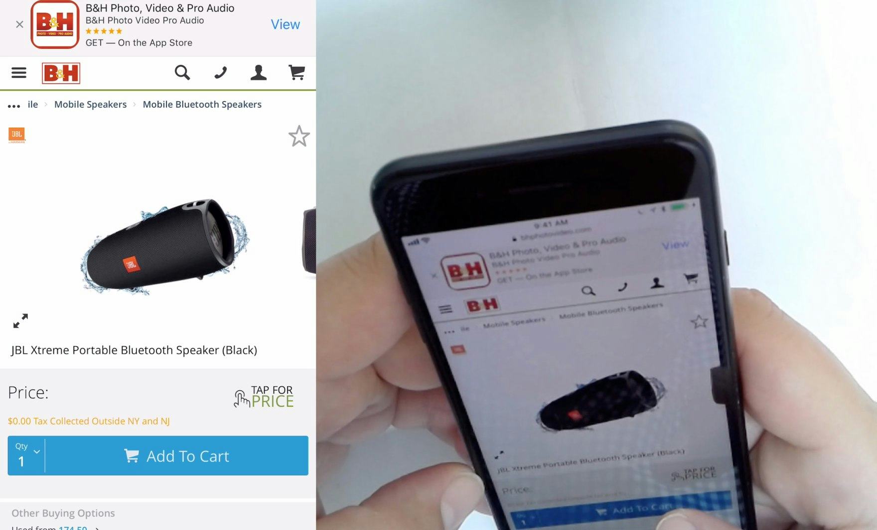
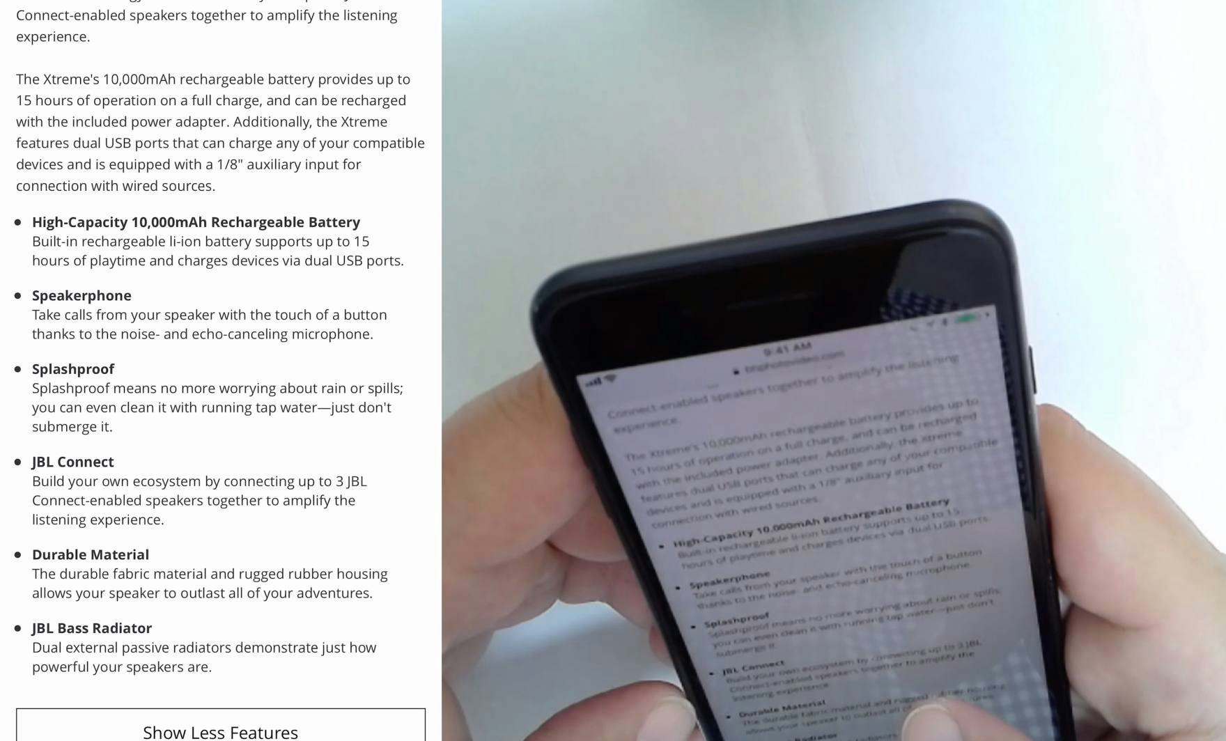
“I wanted to see if it was waterproof…and it said ‘Don’t submerge it’. Which I thought was helpful to know.” The image for a Bluetooth speaker on B&H Photo displayed the product being splashed by water (first image). This evocative image, which illustrated a key feature of the product, prompted the user to investigate the product description so they could discover more information about this particular feature (second image). The product description for the speaker explained what was hinted at in the graphic in greater detail using plain language. Potentially ambiguous graphics included in product images should be explained in the product description.
Product images that include graphics meant to bring attention to features may be especially evocative — as shown in the above example with the water splashing on a speaker — but also potentially ambiguous, misleading, or otherwise hard to interpret for users.
Indeed, these images were consistently observed during testing to lead to additional questions from users.
Therefore, any graphics included for product images, which could be ambiguous or misinterpreted, should be further explained in the product description.
Users who already understood the graphic will have their understanding confirmed, while users who were uncertain will be able to fill in the gaps using the product description.
2) Site-Specific Icons
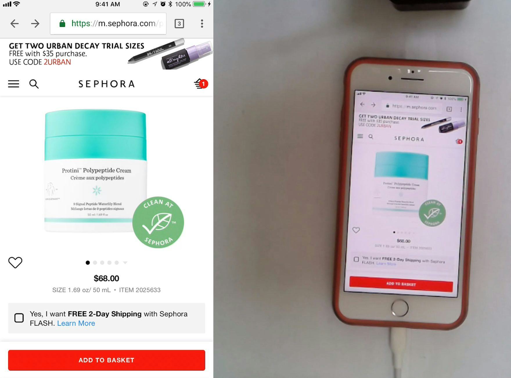
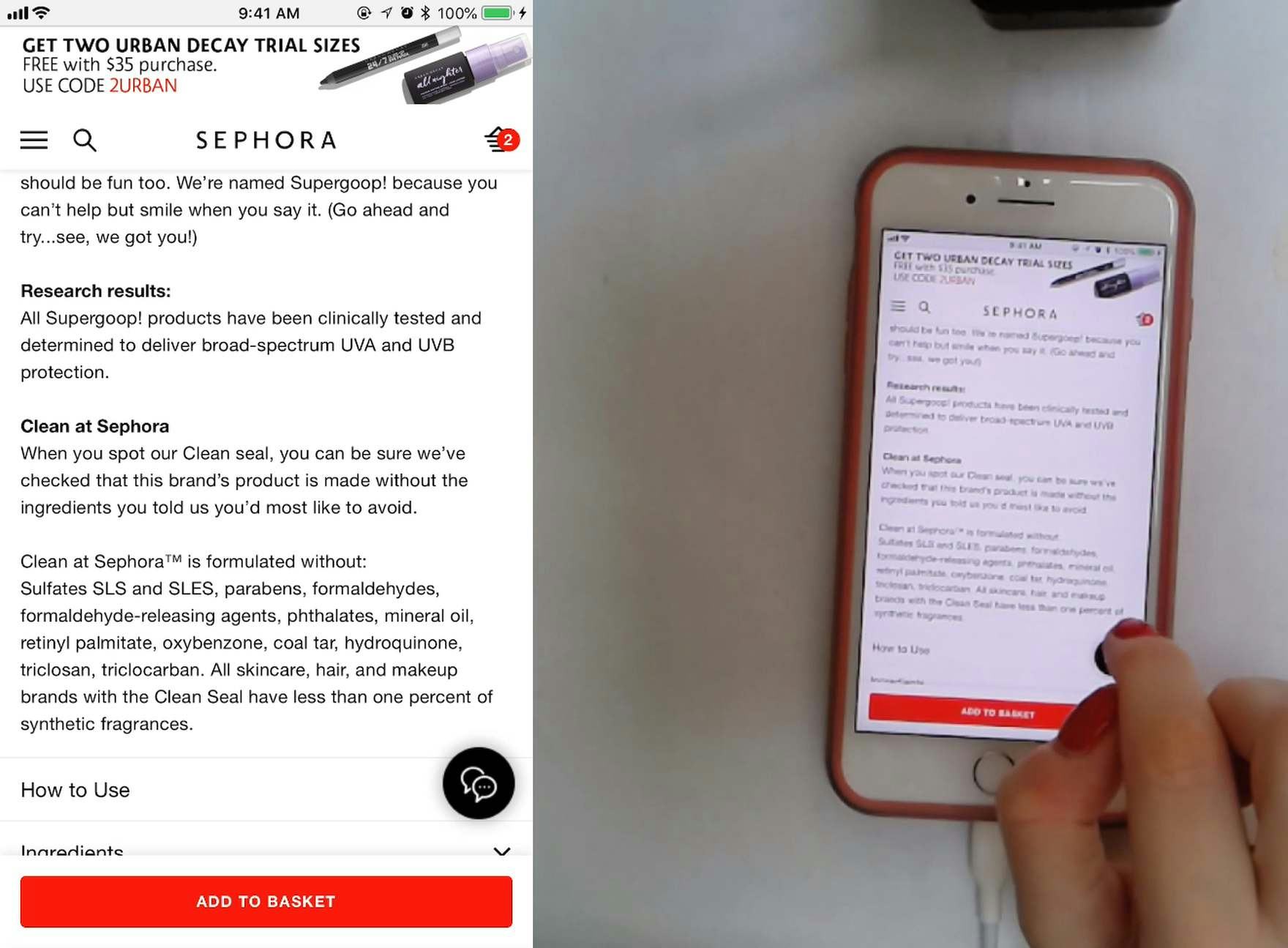
“I’m definitely interested in working out what [the ‘Clean at Sephora’ icon] means…I am assuming that means that it’s free of a particular list of ingredients that Sephora has decided on.” The “Clean at Sephora” icon (first image) prompted this user to speculate on the meaning of the icon, which she found in the product description (second image). Even though this user’s assumption was mostly accurate, she was able to verify the icon’s meaning because the definition was included in the product description at Sephora.
Similar to images that include graphics, icons are sometimes used to bring attention to specific facets of a product — which are often site-specific.
While the general idea behind these icons may be correctly inferred from context by some users, others users may misunderstand their actual meaning.
In either case, including a definition of an icon’s meaning in the product description is necessary to fully explain its nuances to the user.
Otherwise, users will have to hunt for this information elsewhere on the site — and where that information may be found won’t be obvious to users (if it’s explained at all).
3) “Included Accessories” Images
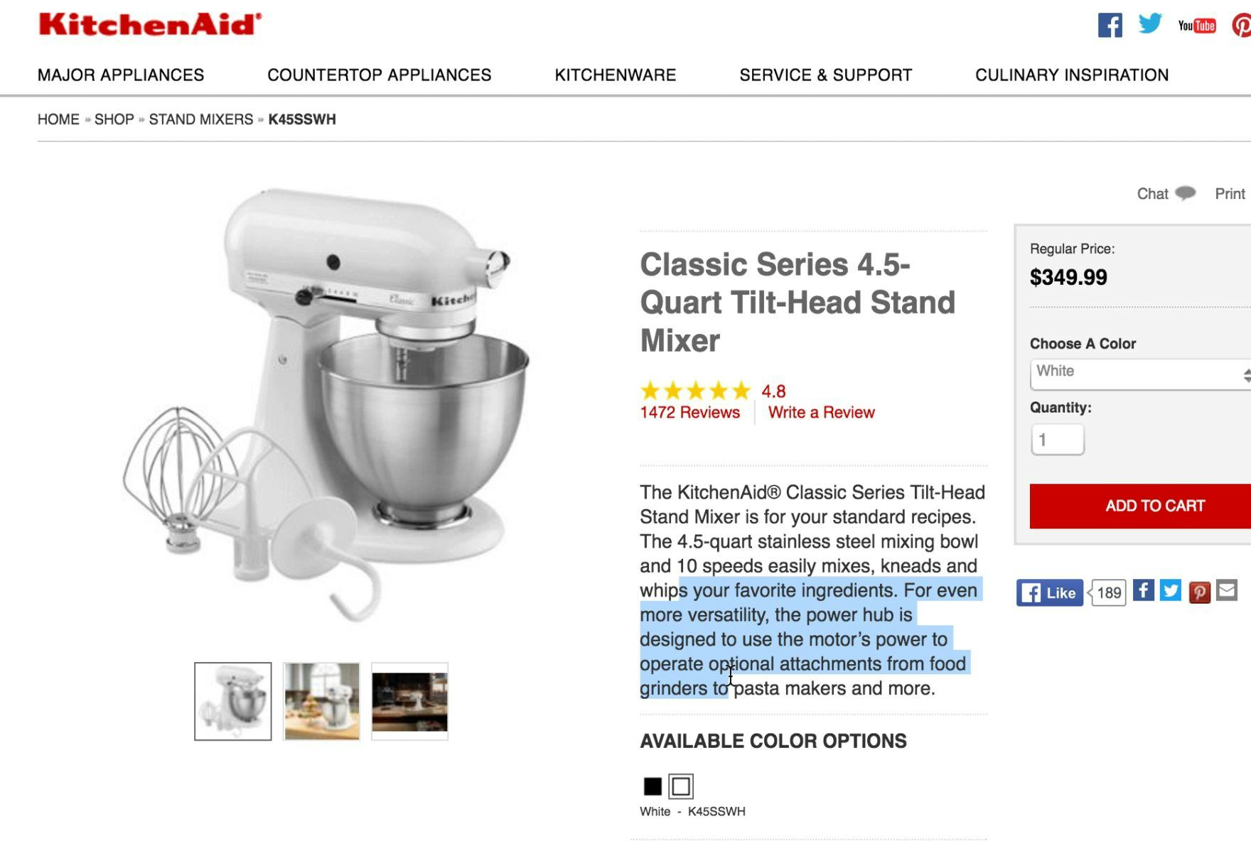
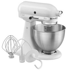
“I don’t know if these attachments are extra. I guess I’d have to dig around to see if they came with the attachments.” The three attachments in the product image were included — “optional attachments” referred to some 20 or so extra attachments available for this product — but the initial product description didn’t include this information. Instead, the user had to find this information further down the page.
Additional items featured in product images will lead many users to wonder if the pictured items are included in the purchase price, or whether they illustrate an available selection of optional accessories which are not included, or if the images are merely meant to show the product in a potential usage context.
In short: “Included Accessories” images, while important to provide, can be confusing, and therefore what is and what isn’t included should be described in the product description.
Note that having a caption (e.g., “Included Accessories” ) for “Included Accessories” images will be enough for some users. However, during testing some users skipped this information, and therefore having this information in the product description as well serves as a good fallback location for this crucial information.
4) “In Scale” Images
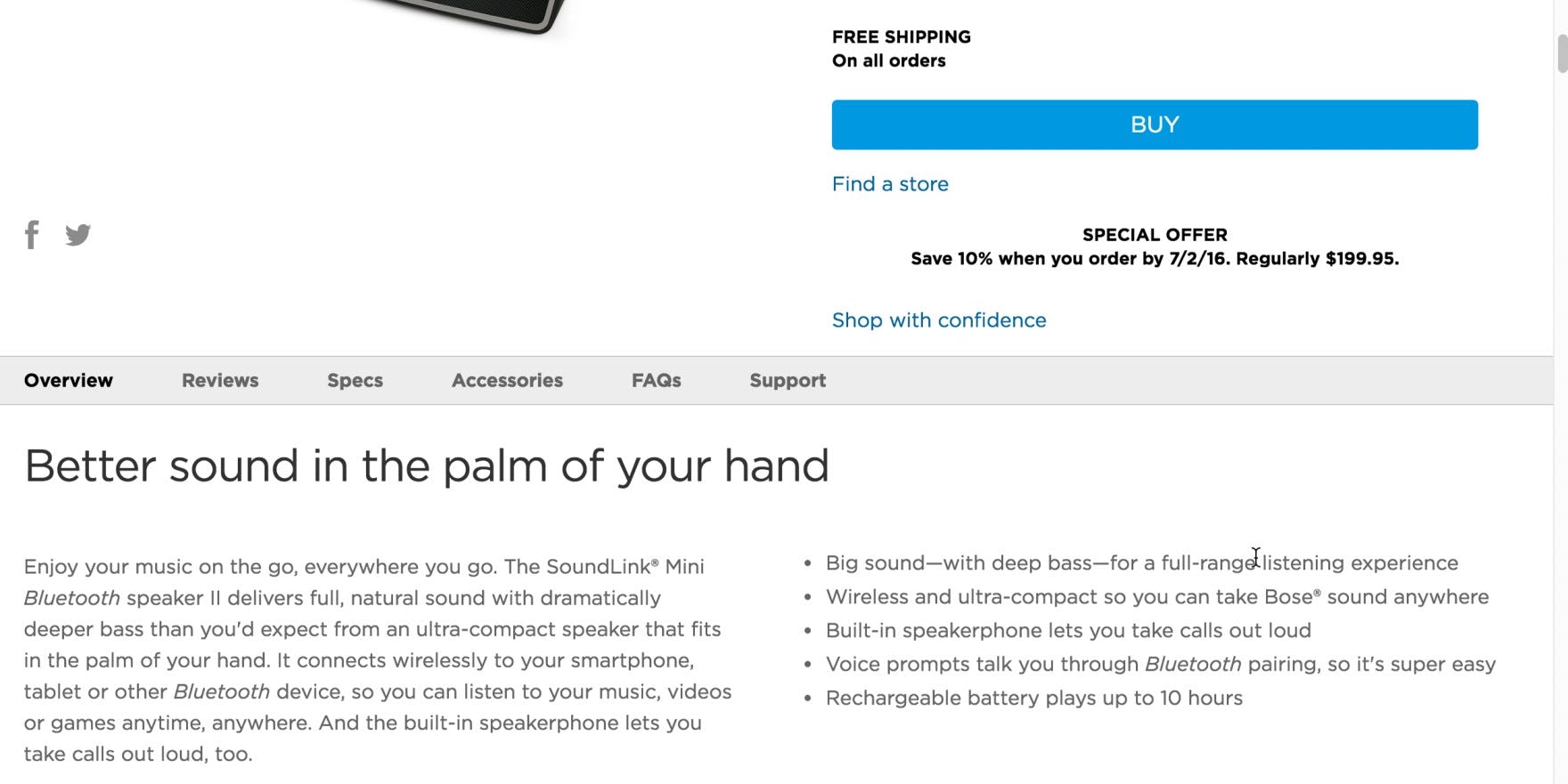
“I can’t immediately tell from this picture but the fact that it says it fits ‘in the palm of your hand’ means it is quite small.” This user wasn’t able to find an image which showed the size of the Bluetooth speaker — which can be essential for online shoppers — but the title of the product description gave her an idea of its size. Product descriptions need to support product images by providing enough detail to give users a clear mental picture of a product.
Images can give users a better understanding of a product’s scale, but product descriptions can provide further, important details.
For example, as discussed above, dimension measurements are required to communicate exact product size specifications.
Yet some users’ eyes glaze over when reading “18 in x 22 in x 36 in”, but they respond much better to plain and accessible language that translates those measurements into something easier to grasp. For example, “fits in the palm of your hand” or “slides easily into your purse”.
Highly Detailed Product Descriptions Are Already the Industry Standard
As our desktop benchmark data shows, 90% of the top-60 e-commerce sites currently maintain a high level of quality and consistency in their product descriptions, making it the current industry standard — therefore, any deviations from that high-quality standard will be easily noticeable.
Moreover, when users do encounter poorly detailed product descriptions — violating the quality expectations they have, developed based on other e-commerce sites — this will likely lead to users experiencing frustration, delays in finding suitable products, and sometimes even site abandonment (either to conduct their own product research, or to visit a competitor site).
Therefore, to minimize these potential risks it is important to ensure a high level of quality and an extensive level of detail for product descriptions across the entire product catalogue.
Some information is likely to be sought by users considering specific product types, including
- materials and ingredients,
- product dimensions, and
- compatibility information.
Additionally, product descriptions should support product images by explaining and contextualizing potentially confusing or ambiguous images.
Thorough product descriptions, provided consistently sitewide for all product types, will help to ensure users have enough information to make purchase decisions — while insufficient descriptions risk users concluding that a site “isn’t legit”, at which point they leave for a site that more robustly supports users’ information needs.
This article presents the research findings from just 1 of the 650+ UX guidelines in Baymard – get full access to learn how to create a “State of the Art” ecommerce user experience.

