Most users during our large-scale Product Page usability testing attempted to infer product features from the product images provided in the main image gallery.
In fact, images in the main image gallery are the first product page content most users will explore — 56% of users’ first actions upon arriving at a product page was to explore product images.
Furthermore, knowing that a particular product has accessories included in the purchase price can be a deciding purchasing factor for some users — as accessories can constitute both a large part of the product benefits and the total cost (if not included).
However, we also observed that some users are reluctant to commit to reading product descriptions or specs — where info on accessories can furthermore be difficult to find if provided — and instead try to quickly pick it up from product images. This is especially the case when users are in an “exploratory browsing” mode, quickly viewing multiple products before beginning to zero in on their favorites.
Yet our UX benchmarking reveals that 31% of e-commerce sites don’t provide an “Included Accessories” image in the main image gallery for their relevant, top-selling products. This can often be the direct cause for users wrongly discarding products as they consequently under- or overestimate the product value and costs.
In this article, we’ll discuss the test findings from our E-Commerce Product Page usability study related to what we call “Included Accessories” images, as well as the related image type, “Optional Accessories” images. In particular, we’ll discuss:
- Issues caused when accessories aren’t depicted but are included in the purchase price
- Issues caused when accessories are depicted but aren’t included in the purchase price
- How to decide whether to show optional accessories alongside relevant products in an “Optional Accessories” image
Failing to Depict ‘Included Accessories’ Can Be a Direct Cause of Lost Sales
Users’ reliance on product images can be a double-edged sword: on the one hand, high-quality and comprehensive imagery can be a determining factor when it comes to a user’s decision to purchase a product. On the other hand, poor-quality imagery, or products that lack some specific image types, will cause some users to abandon a product, as they think it won’t meet their needs.
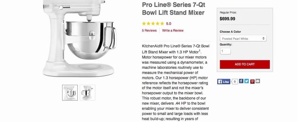
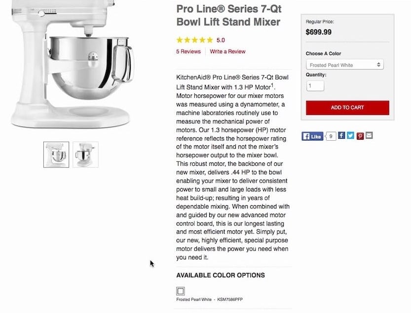
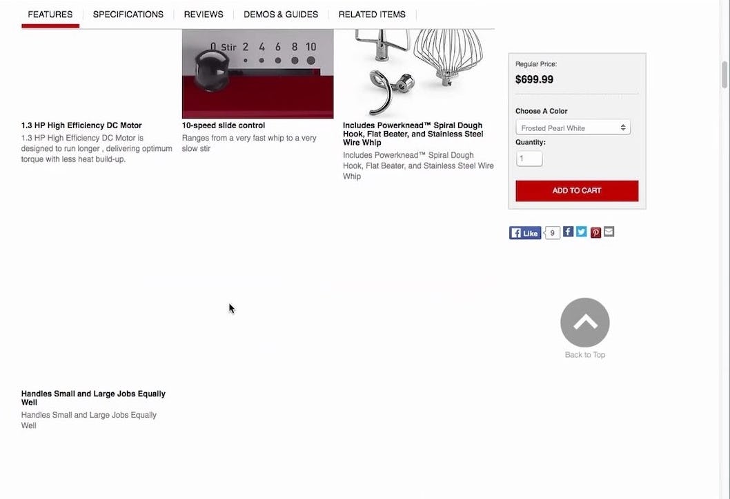
“You don’t even have a photo of what it comes with”. During testing, 63% of users had trouble determining if this mixer without an “Included Accessories” image did in fact come bundled with accessories. The mixer did include three mixing attachments; however, they weren’t depicted in the main image gallery, and consequently the majority of users doubted whether the mixer included accessories.
During testing, when there was no image in the main image gallery that showed a product alongside its included accessories, many users concluded that it meant that the product then didn’t come with any accessories.
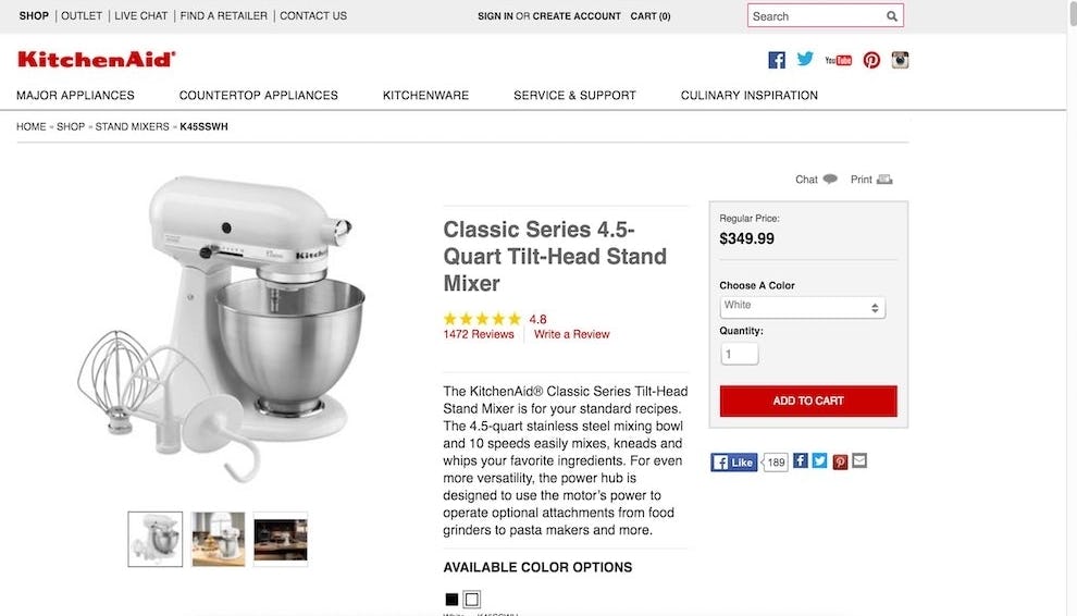
“I want to know what attachments are available and this makes it pretty clear”. During testing, users tended to prefer a different mixer, which had an “Included Accessories” image, to the mixer that didn’t have this image type. To perfect this implementation, descriptive text should be added to clarify that “Attachments are included”.
This will directly impact sales, since users comparing two different products — one where they can see it comes with accessories, and one where they can’t see if it comes with accessories (because there’s no “Included Accessories” image provided) — will wrongly attribute lower value to the latter product, simply because the accessories aren’t depicted.
If the accessories that aren’t depicted are essential to the user’s intended usage of the product, it essentially means that users will misunderstand something as crucial as the product price, as most will then assume they will have to pay extra for the accessories that aren’t depicted.
The fact that a product comes bundled with accessories should, therefore, be treated as an additional product feature or “bonus” and should always be depicted.
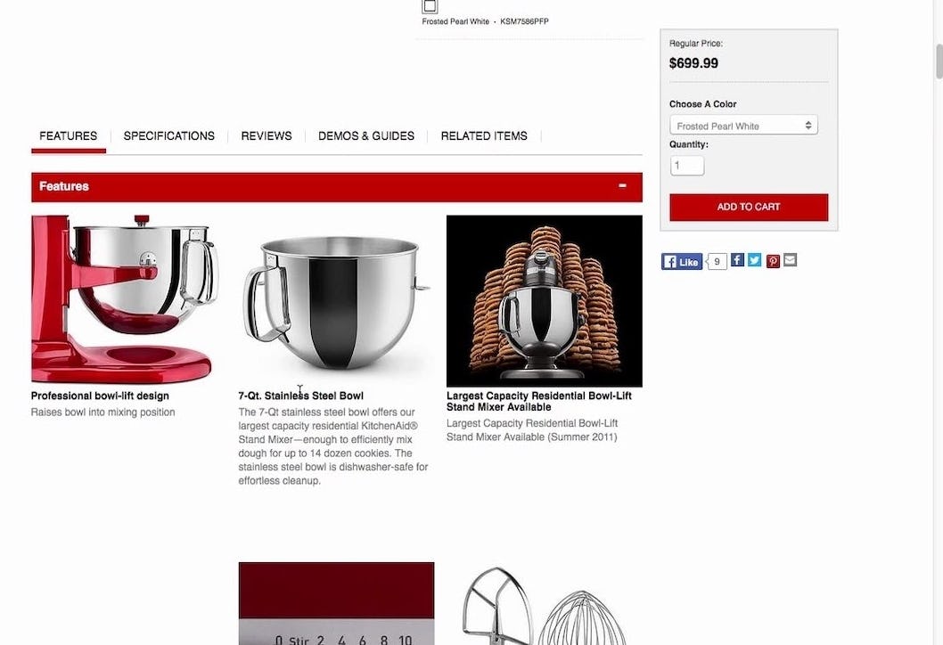
“I really don’t understand what it comes with and that should be detailed and outlined more specifically”. This user scrolled right past the “Features” callout, located below the fold, that described the included accessories for the mixer that didn’t have an “Included Accessories” image.
Another user eventually found the accessories information but was annoyed: “I guess it does come with stuff as well but you don’t see that immediately”, adding, “This one you have to work a bit harder to find out what there is to offer. And I don’t know whether I’d spend that much time with something like this”.
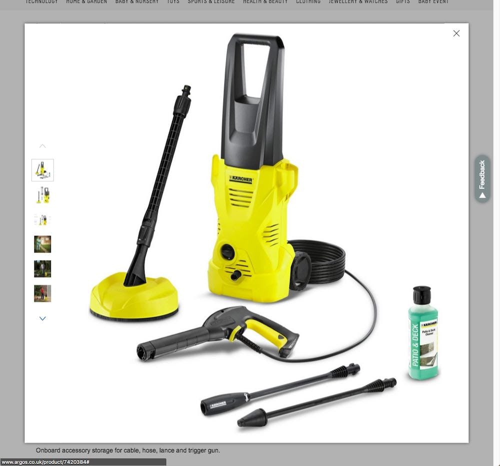
It’s important to note that the “Included Accessories” image should be included in the main image gallery, and that the included accessories should be depicted alongside the product.
Placing the “Included Accessories” image in the main image gallery ensures that users will be able to find it quickly (although be aware of how images are truncated — poor truncation can cause 50%–80% of users to overlook additional images), while placing the accessories alongside the product communicates clearly that these accessories belong to this product.
If an “Included Accessories” image, or included accessories information in general, is instead placed further down the product page or is buried in lengthy product text descriptions, many users will miss it entirely, or assume it’s a cross-sell for supplementary products. In fact, 63% of users during testing initially missed the fact that a mixer without an “Included Accessories” image did in fact come bundled with three premium steel accessories.
However, despite the importance of an “Included Accessories” image, our benchmarking reveals 31% of e-commerce sites don’t include one for top-selling, relevant products.
Accessories Are Depicted but Aren’t Included in the Purchase Price: Don’t Make This PDP UX Mistake
When accessories are shown alongside products but are not included in the purchase price (i.e., “optional accessories”), some users will misinterpret the image to indicate that the accessories are included in the purchase price of the product (i.e., “included accessories”).
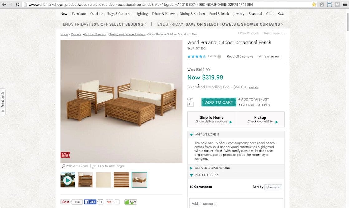
“This is a cool set, and it’s really inexpensive, which I don’t really get but that’s very appealing to me”. This user mistakenly thought that the purchase price included all the items depicted. The user eventually figured out that the price only included the bench by looking through the assembly instructions, and commented, “I was confused by this picture…I would…feel a little aggravated that it’s not the whole set, and I feel a little bit lost”.
This is understandable, given that, without descriptive text or graphics that clearly indicate that these are optional accessories (e.g., “Ottoman sold separately”), users in practice end up relying on what they see in the product images, as not all users read the product description in full and many only scan long titles.
When this occurred during testing, users felt greatly frustrated when they finally learned that the pictured accessories weren’t included in the purchase price or, even worse, learned so only once they’d received the product.
It’s important to ensure that users don’t mix up what’s included and what’s optional with the purchase of a particular product. Users love seeing that they are getting additional accessories but, on the other hand, users will often feel misled when finding out that accessories they assumed were included in the purchase price are in fact extras.
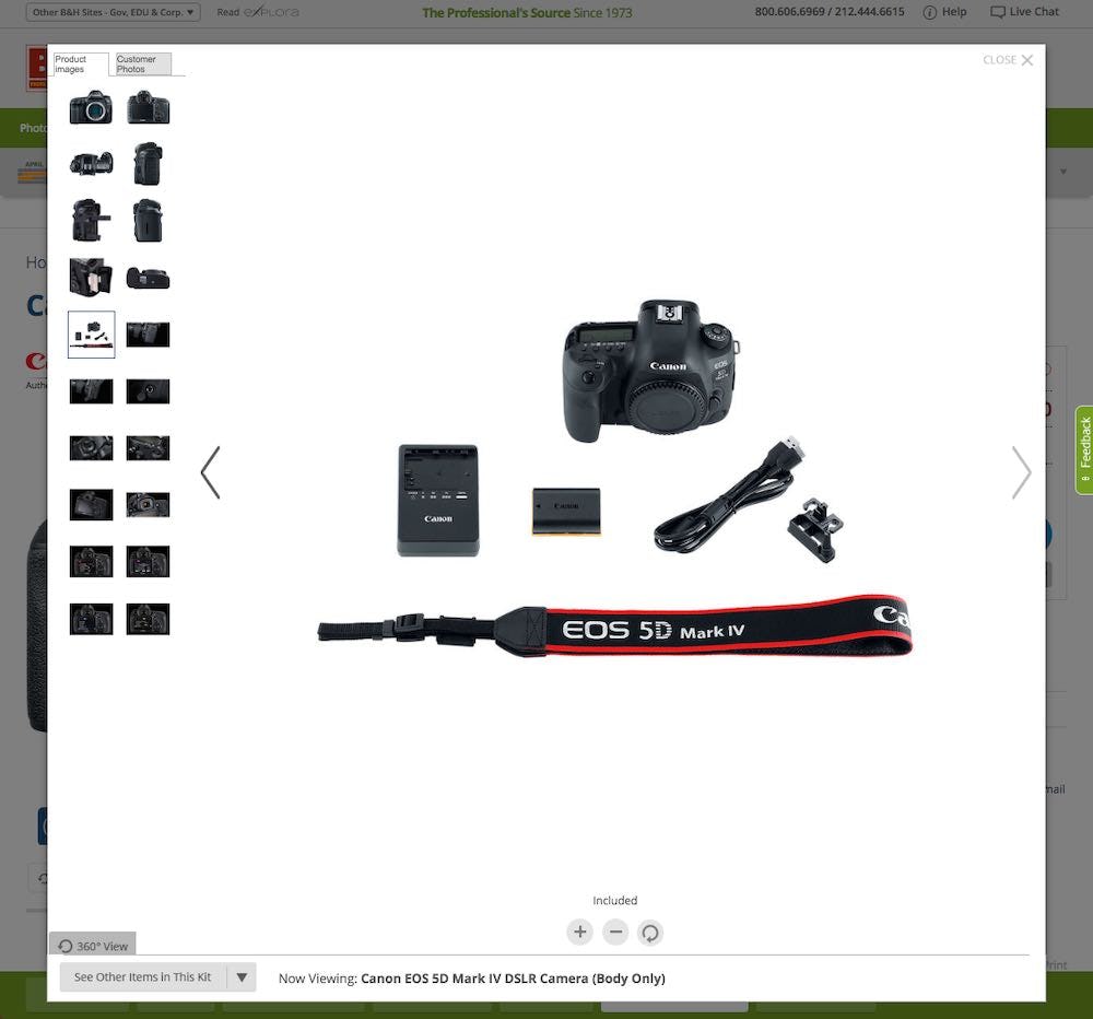
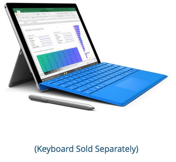
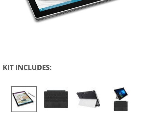
B&H Photo clarifies which accessories are optional and which are included. The first image includes microcopy stating “Keyboard Sold Separately”, clarifying that the stylus comes with the purchase but the keyboard does not. The second image (of another product) makes it clear that the items depicted in the thumbnails are part of a kit (i.e., are the included accessories), including a stylus and keyboard.
Therefore, it’s important to make it clear to users that accessories shown in an image are available but not included in the purchase price on or near the image itself — for example through the use of descriptive product text or graphics. Not having any indication stating that the accessories are optional will mislead some users to assume that the accessories are included.
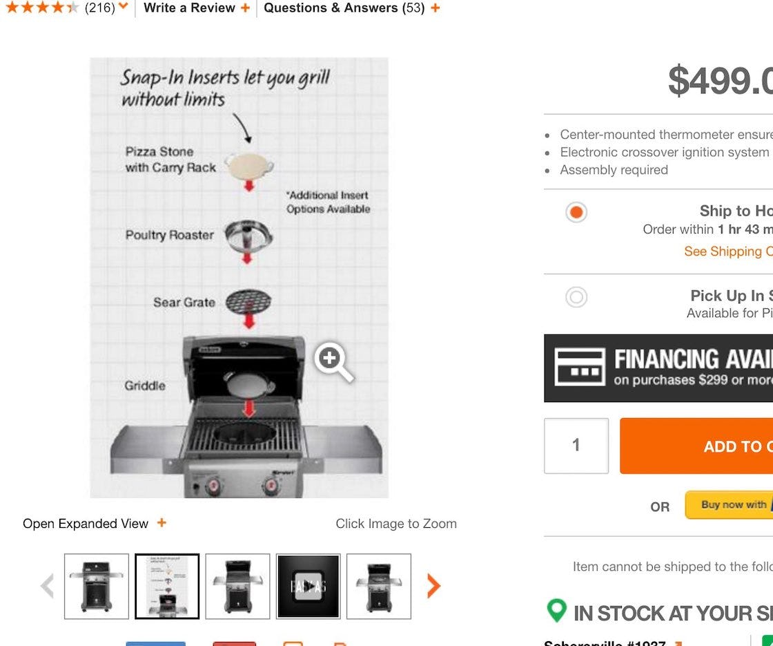
“One thing that’s not clear with this picture is — do these all come with this grill?” A user viewing a grill with inserts at Home Depot wasn’t sure if the inserts were included in the purchase price. After scrolling and reading the product description he realized they weren’t included, and was frustrated that this wasn’t conveyed clearly by the image: “That picture is kind of annoying. I mean, I guess it does say ‘Additional Insert Options Available’, but, yeah, they don’t make it clear”.
Additionally, it’s important that the language used to convey the fact that the pictured accessories are optional and not included is as clear as possible.
Vague language like “Additional accessories available” and small disclaimers don’t make it clear to users that they will have to pay extra for the depicted accessories. It’s better to alert users to this fact upfront rather than have them be disappointed when they find out that the accessories aren’t included in the purchase price.
Yet 13% of sites fail to clarify that optional accessories aren’t included in the purchase price.
For Some Products, Consider Depicting Optional Accessories Alongside the Product
A final consideration for how to treat accessories in product images is whether optional accessories (not included in the purchase price) should be shown alongside a product (i.e., in an “Optional Accessories” image) or whether they can be shown elsewhere on the product page, separate from the product. The decision depends on how important accessories are to a particular product, as well as how many optional accessories are available for a product.
In short, when optional accessories are a key feature of a product, they should be included together with the product in an “Optional Accessories” image in the image gallery.
For example, the inserts for the grill at Home Depot are a key feature and a major unique selling point of the product, so it makes sense to highlight the accessories in an “Optional Accessories” image in the image gallery. In fact, 75% of users during testing quickly discovered the insert accessories from the “Optional Accessories” image.
On product pages where there are no “Optional Accessories” images in the main image gallery, users will often have a more difficult time finding the accessories due to their less-prominent placement on the page.
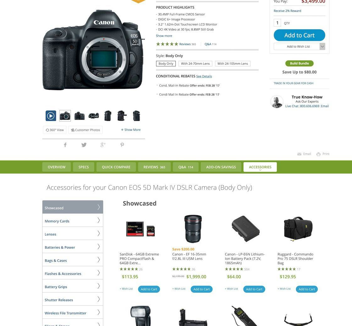
There are so many accessories available for a DSLR camera that accessories are given their own separate tab on B&H Photo’s product pages. Creating “Optional Accessories” images for each accessory and showing them next to the camera would be overwhelming; instead, by giving accessories their own section, users are allowed to focus solely on the product, then can choose to view all of the accessories at once. (Note however that this implementation suffers from using “Horizontal Tabs” as the layout.)
However, when optional accessories are less-essential features of a product, then they can be relegated to a cross-sells section, as it’s less crucial for users to find this information upfront.
If a product has a lot of accessories available — for example, all accessories available for a laptop or camera — then they should also be relegated to a cross-sells section, as having dozens of “Optional Accessories” images is unrealistic and unhelpful.
However, if there are a few crucial accessories that can be highlighted — for example, the keyboard and stylus in the Microsoft Surface example provided earlier — then it makes sense to provide an “Optional Accessories” image solely to highlight those accessories.
Make It Clear What Is and What Isn’t Included in the Purchase Price Through Images
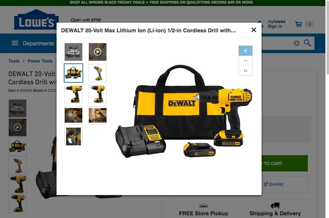
At Lowe’s an “Included Accessories” image makes it clear what accessories are included for a particular product. Users browsing image thumbnails will have a great deal of valuable information conveyed quickly — compared to trying to find this information if it was only available in the product description or specs.
“Included Accessories” images are crucial when users are determining if a product will suit their needs and when they are comparing similar products and prices.
An “Included Accessories” image is an efficient way to provide users with critical information quickly and will be the deciding factor for some when making their purchase decision.
Despite this, 31% of sites don’t provide an “Included Accessories” image for their top-selling products that come with accessories included in the price.
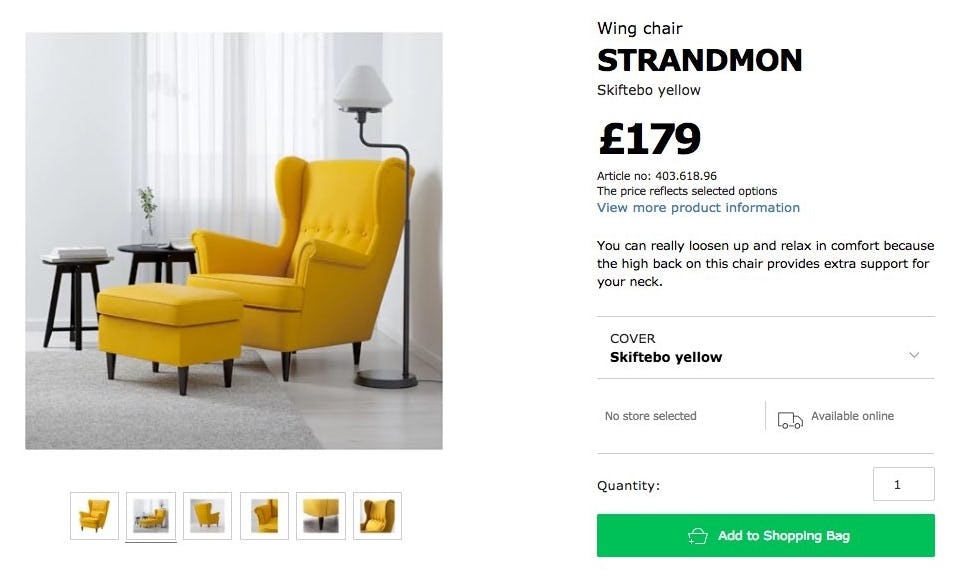
IKEA doesn’t clarify that the ottoman pictured with a chair isn’t included in the purchase price. Many users will assume that the ottoman comes with the purchase of the chair, and will be surprised and frustrated when they find out it doesn’t.
For optional accessories, it should be determined whether products with optional accessories need to be displayed alongside their accessories in an “Optional Accessories” image, or whether it’s better to place the accessories in a supplementary cross-sells section.
If the decision is made to display the optional accessories alongside the product, then it must be clear to users that the accessories aren’t included in the purchase price of the product.
Yet 13% of sites fail to make it clear that the optional accessories for relevant, top-selling products aren’t included in the purchase price of the product.
This article presents the research findings from just 1 of the 650+ UX guidelines in Baymard – get full access to learn how to create a “State of the Art” ecommerce user experience.

