Videos Summary
Product images are crucial to users’ ability to make a purchase decision about a particular product.
During Baymard’s large-scale usability testing, 56% of users’ first actions were to immediately begin exploring product images after arriving on the product details page.
Yet despite the importance of product images, our benchmark reveals that 25% of e-commerce sites provide product images that are insufficient for users’ need to perform a visual exploration and evaluation of a product — and that’s despite our benchmark primarily assessing a site’s most popular categories and products.
During testing, both low-quality images and images that couldn’t be zoomed sufficiently to see product details were a cause of product abandonments.
In this article, we’ll discuss the test findings from our large-scale Baymard Premium UX research database, related to product image quality and level of zoom. In particular, we’ll discuss:
- How low-resolution images affect users’ perception of products — an issue at 14% of e-commerce sites.
- How not being able to zoom product images sufficiently hampers users’ product-exploration process – an issue at 11% of e-commerce sites.
How Low-Resolution Images Affect Users’ Perception of Products
“Well that sucks….This is completely pixelated and grainy, so I can’t get a good [look]…I mean, this picture just sucks, I don’t even know what that is! Or well I know what it was supposed to be, but this is still kinda disappointing.” The low-resolution close-up of a furniture’s fabric was disappointing to all users exploring these detailed images at Sears.
Our testing revealed that low-quality images drag down users’ perceptions of products.
In many cases, having low-quality images is almost worse than having no images at all, since users are encouraged to explore a product visually — for example, by a thumbnail in the product page image gallery — but are severely disappointed when they open the larger image and find it’s grainy or pixelated.
For many users it’s perceived as if the site doesn’t care enough to provide them with the visuals they need to make a purchase decision — and thus we observe that many users will instead abandon to try and find this visual information on another site.
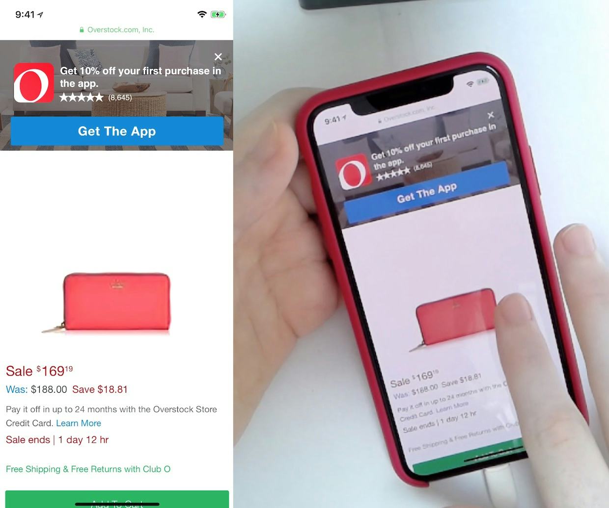
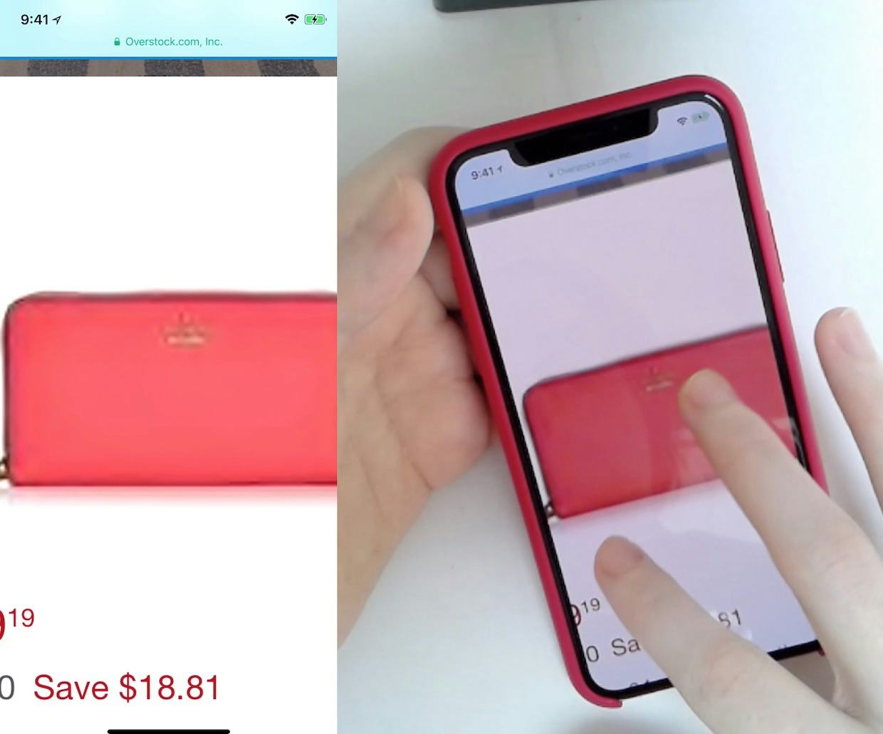
“This only provides one photo. And it’s a fuzzy photo. I could never make a decision based on that one photo of whether I want this wallet or not. Even if the description told me it would give me $100 every day by magic [laughs] I’m not going to purchase it. I wouldn’t even bother looking at the description. I need to see a photo. I’m a visual buyer…The quality is so bad…it’s almost turning me off on the whole thing [the site].” A user during testing was severely disappointed by the overall quality of photos on Overstock and indicated she was ready to move on to a new site.
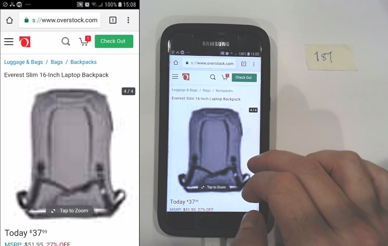
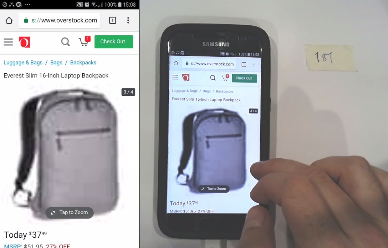
“These two images aren’t helpful.” Another subject complained about the quality of images on Overstock. Product image quality is a critical user concern.
Indeed, during testing users extended their disappointment beyond the specific product that they were viewing to the site or brand. This was especially the case when users encountered low-quality images for 2 or more products.
On the other hand, sites that consistently have high-resolution product images are viewed much more positively by users — the site feels more polished and professional, and users are more confident purchasing products that they feel like they’ve sufficiently visually investigated.
Why It’s Critically Important for Users to Be Able to Zoom Images to View Product Details
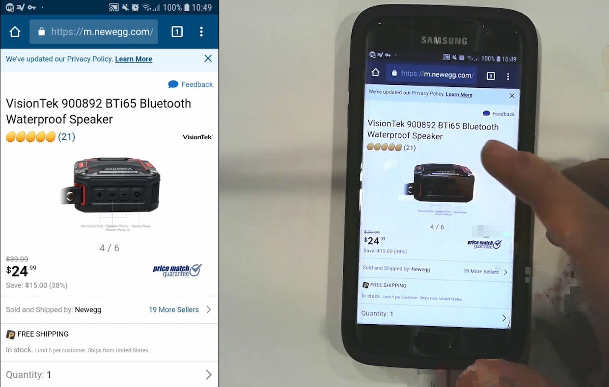
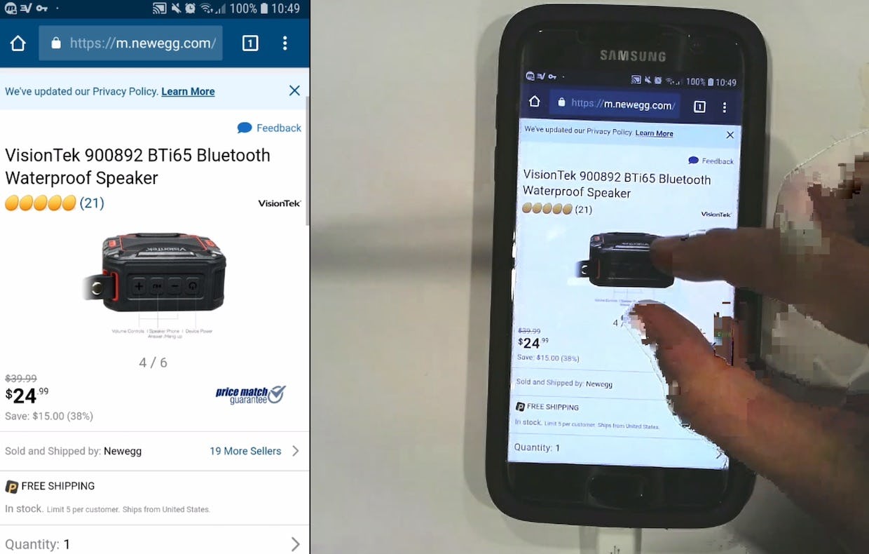
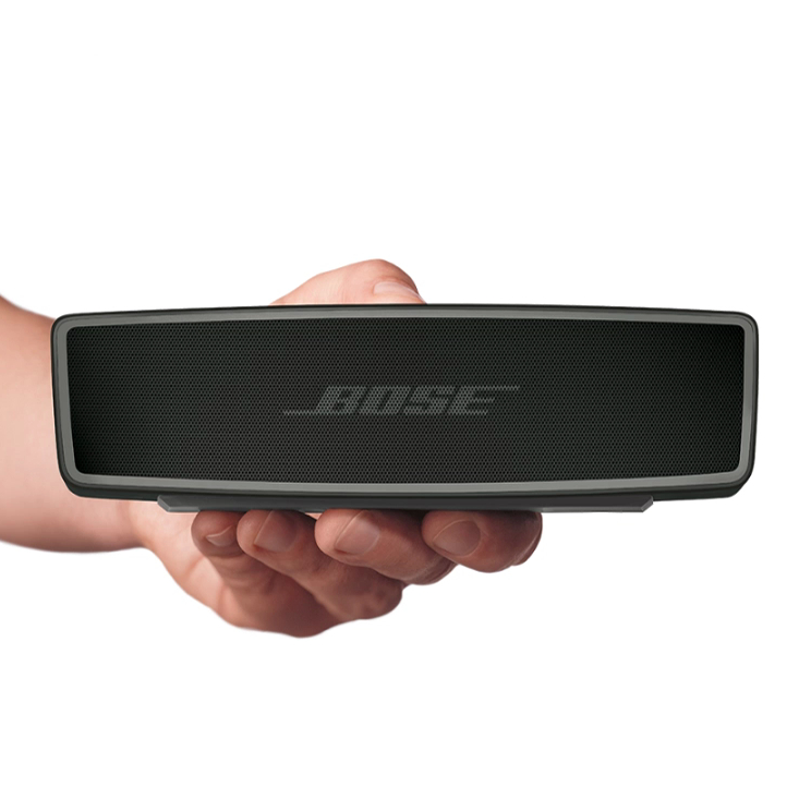
“I can’t seem to click in there to zoom into the image. That I really don’t like. You should always be able to click in and open up the image. Because it’s really hard to read that [text on image]…[I’m missing] clarity on the details of the product, and a better idea of the make…it makes [only] a little bit of a difference but enough of those little differences and I leave….It’s hard to see what the buttons are made out of, if it’s the same plastic, or if they are a different material. I can’t really figure that out by just looking at it without the zoom.” At Newegg, a user first tried tapping (first image) then pinching (second image) to zoom a product image, but was unable to zoom. Being unable to see product details causes some users to abandon products that could be suitable.
Allowing users to zoom product images has by this point become a web convention in e-commerce: our benchmark reveals that 93% of e-commerce desktop sites allow users to zoom some or all of the product images.
A user at Walgreens attempted to pinch-to-zoom an image in a product page image gallery multiple times, before finally being able to just make out the SPF information she was attempting to read. Users will often need to zoom more than the level of zoom an image gallery overlay image provides to see the details they’re interested in.
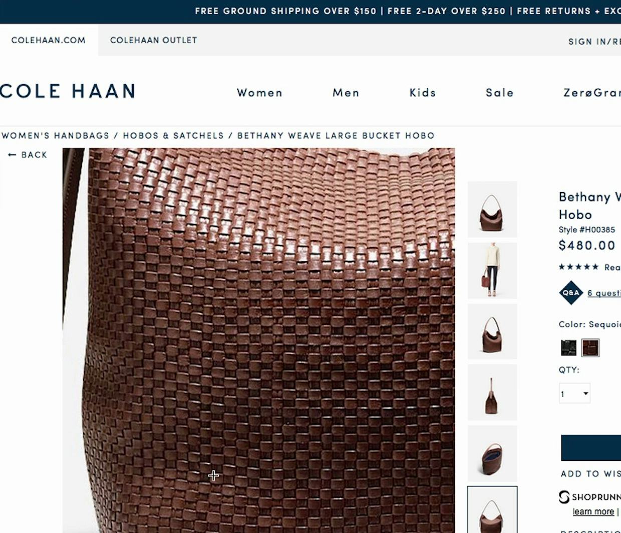
Yet sometimes, even if users can zoom product images, the level of zoom is insufficient to see the product details of interest (an issue at 5% of sites). If either the resulting zoomed image is low-resolution, or the site only offers a small level of zoom (typically due to a lack of image resolution), users won’t be able to obtain the visual information they need.
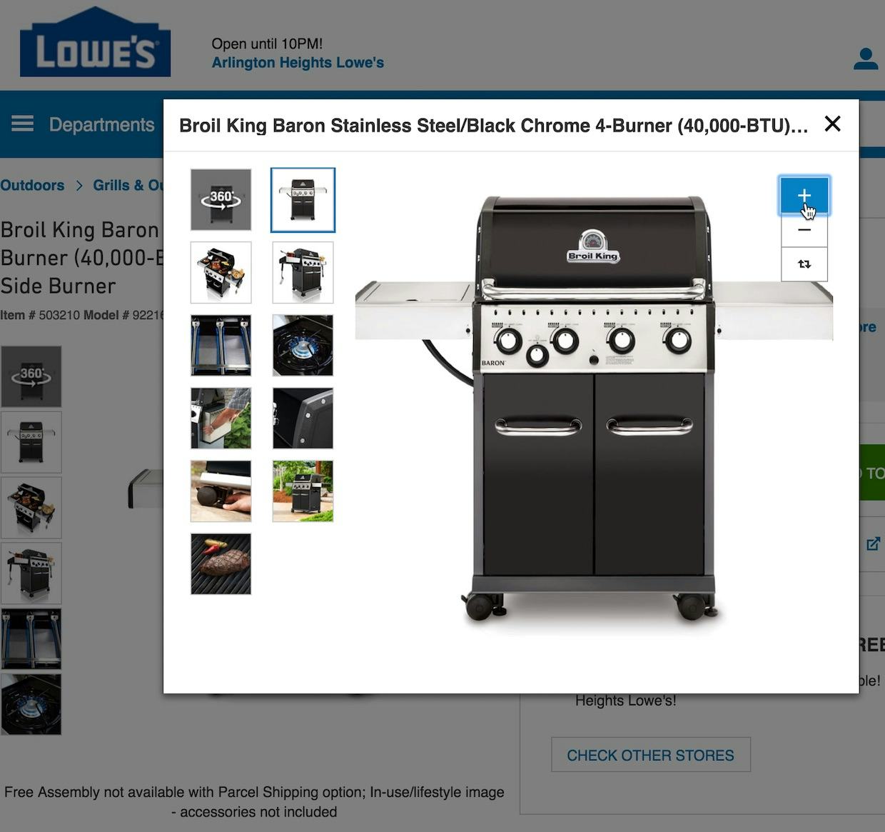
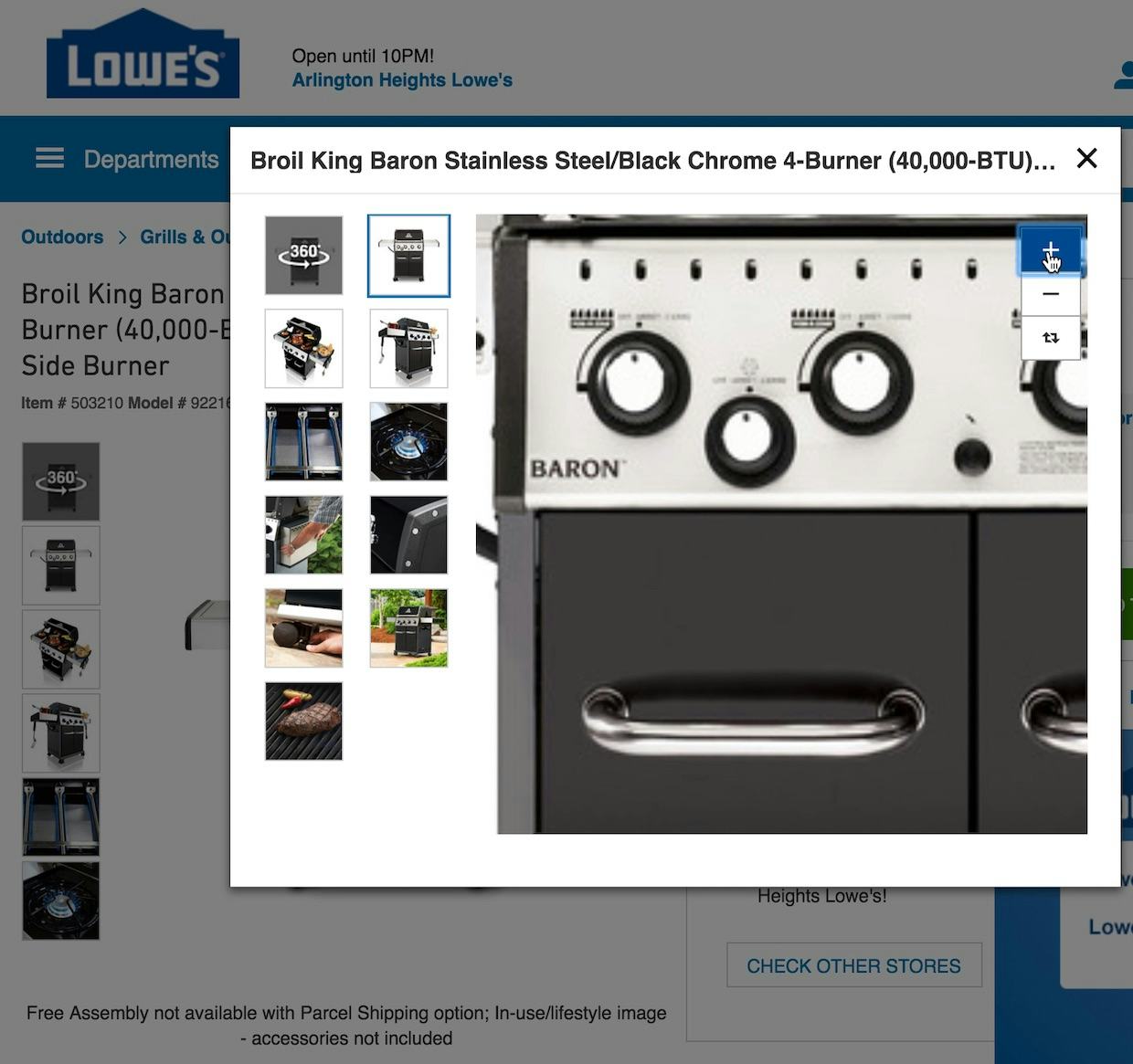
“It gets closer but it doesn’t repixelate, so I wanted to know what the knobs are, but it’s just not clear”. A user was unable to get a high-quality zoomed image of a grill at Lowe’s, frustrating his desire to get sufficient visual product information.
Depending on the significance of the detail, some users will choose to abandon at this point since they can’t get a rich visual understanding of crucial product details — something we observe to directly impact how confident users will be when considering purchasing a product they haven’t seen or touched in real life.
Allow Users to Obtain the Visual Product Information They Need
Being able to perform a satisfactory visual inspection of a product is one area where e-commerce has often failed to match the experience of shopping at a physical store. After all, if shopping in a physical store the user at Walgreens above could have simply brought the bottle of lotion closer to her eyes to quickly read the SPF information, while the user at Newegg could have picked up and held in his hands the speaker to get a sense of the build quality.
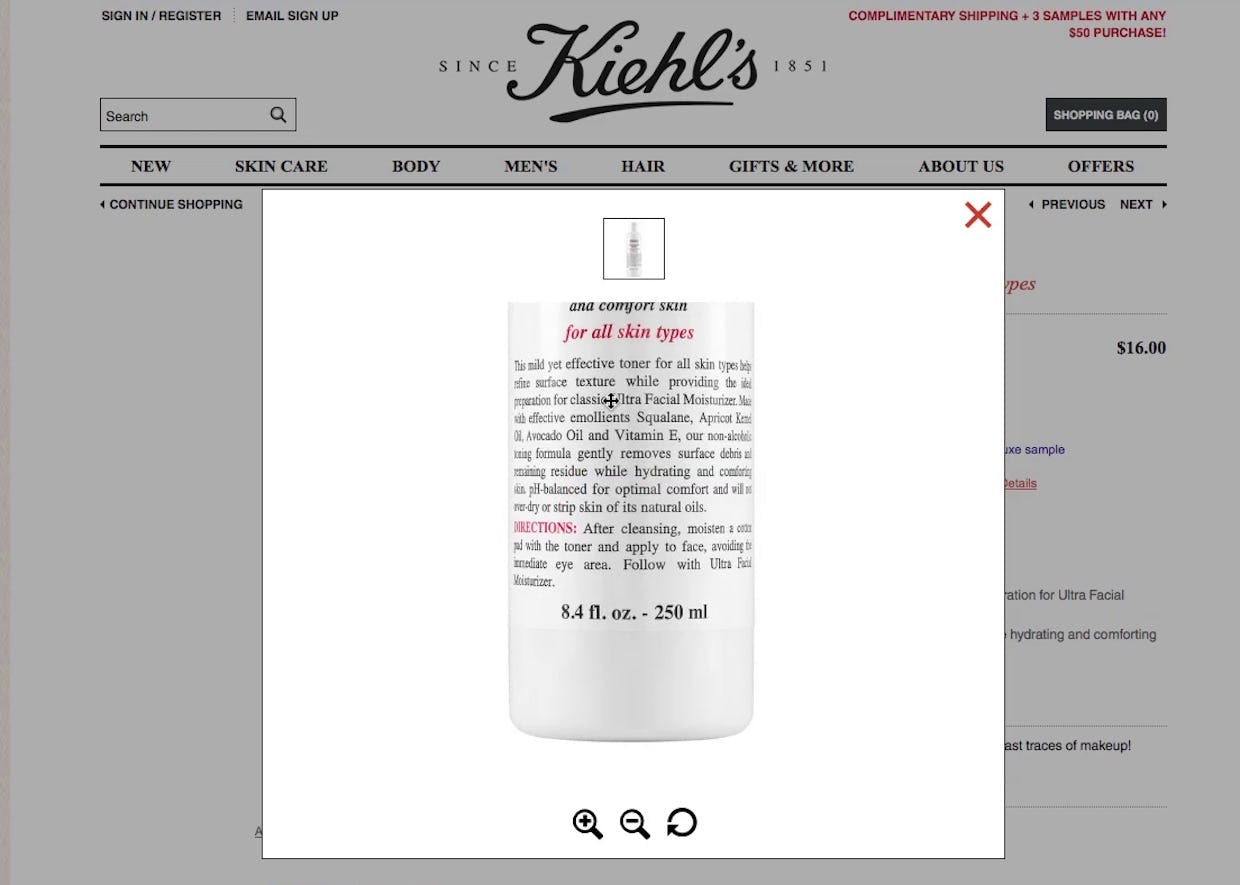
“I’d like to read what it says….They’re not going to let you turn it”. At Kiehl’s, while the level of zoom and resolution were sufficient, this user still couldn’t read the ingredients list on a bottle of skin toner. After zooming in, the user wanted to be able to turn the image to see the ingredients list, but was unable to find a view where she could. A 360-view feature here may have helped.
Users’ need to perform visual inspections of products therefore presents a serious challenge to e-commerce sites — which is why ensuring users have enough different types of images, such as images that show accessories, images that show scale, and images that include descriptive text, is crucial. Moreover, it’s also key to ensure images are easy to find — after all, images that aren’t found by the user may as well not be there at all.
Unfortunately, users don’t have a good appreciation of the expense that goes into providing multiple high-quality product images across a large product catalog. They simply judge a product, and by extension the e-commerce site, based on the images presented to them for the particular product they’re interested in.
“I guess for me the most important information is the picture. And the different pictures as well…I feel like I’ve almost touched it.” High-resolution images and a sufficient level of zoom ensure users get a rich visual sense of a product, which is crucial to users’ product-exploration strategy.
Of course, when it comes to providing multiple high-quality images there’s a difference between what’s feasible for brand sites (e.g., nike.com), where it’s relatively easy to shoot multiple high-quality images for all products sold at the site, and traditional e-commerce sites that sell products from multiple vendors (e.g., walmart.com), where it’s often unrealistic for the e-commerce site to shoot multiple high-quality images for the entire product catalog.
For sites where it’s not feasible to provide multiple high-quality images for all products due to the vastness of the product catalog, as a minimum then it’s important to source, buy, or shoot high-quality images for the most important product verticals, as well as the best-selling products.
To make a strong case internally in a large organization for allocating more resources to product images, the return on investment for adding more product images can be closely monitored via A/B split-testing on select high-traffic products or product categories.
On mobile sites, in particular, having low-resolution images, or an insufficient level of zoom, is an unfortunate but predictable implementation. After all, most mobile sites rightfully use mobile-optimized, lower-resolution product images to reduce the download footprint of their pages.
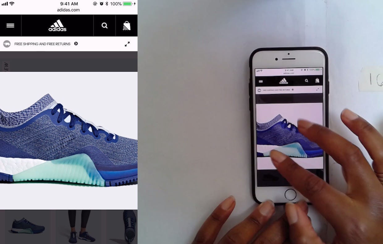
A user at Adidas zooms to inspect a shoe, and the resulting zoomed image is high-resolution, enabling her to successfully visually inspect the product.
If using mobile-optimized images, it is therefore important to make sure that your image gallery implementation fetches a higher-resolution version of the product image when users begin zooming, to ensure that they can actually see the product details they are trying to inspect.
Whether on desktop or mobile, it’s clear from testing that users expect a large variety of high-quality images — and that the resolution remains high when they zoom in. Sites that don’t provide this put themselves at risk of seeming “cheap” or unprofessional. For many users, low-resolution images are a deal-breaker — they’ll quickly exit the product page to search for an alternative product, while some may even abandon the site altogether.
Yet, our benchmark shows that 25% of sites fail to provide product images that are sufficiently high-resolution, or don’t provide an adequate level of zoom — even for some of their most popular products.
This article presents the research findings from just 1 of the 650+ UX guidelines in Baymard – get full access to learn how to create a “State of the Art” ecommerce user experience.


