This article continues our mini-series on the current state of mobile e-commerce usability by focusing on product image usability and zoom gestures. We dive into observations from our qualitative 1:1 usability tests and statistics from our benchmark database.
During our mobile usability testing of e-commerce sites we’ve time and again documented that users try to use gestures such as pinch, double-tap, and swipe, to try zooming and navigating images on mobile product pages. However our latest benchmark of 50 top-grossing US mobile e-commerce sites reveal that 40% fail to support these image gestures.
In this article we’ll present our usability test findings on what image zoom gestures users expect to be supported on mobile images galleries, and whether mobile sites need to state it when pinch and tap is supported. We’ve also sprinkled the article with a number of best and worst practice examples from the benchmarked sites.
Support Zoom via Double-Tap and Pinch Gestures
It became very clear during our mobile usability testing that a single large-sized image is not enough for mobile sites in industries where product aesthetics or details have even the slightest influence on the user’s purchasing decision. This in particular include sites that sell apparel, toys, gifts, art, furniture, most consumer electronics, tools, etc.
While the user can get an idea of the overall visual appearance of a product from a large-sized image, they cannot properly inspect its material and texture, judge the build quality, see the different parts of a package, or special product details (compartments, physically small features, etc) – all of which can be vital to the user’s buying decision.
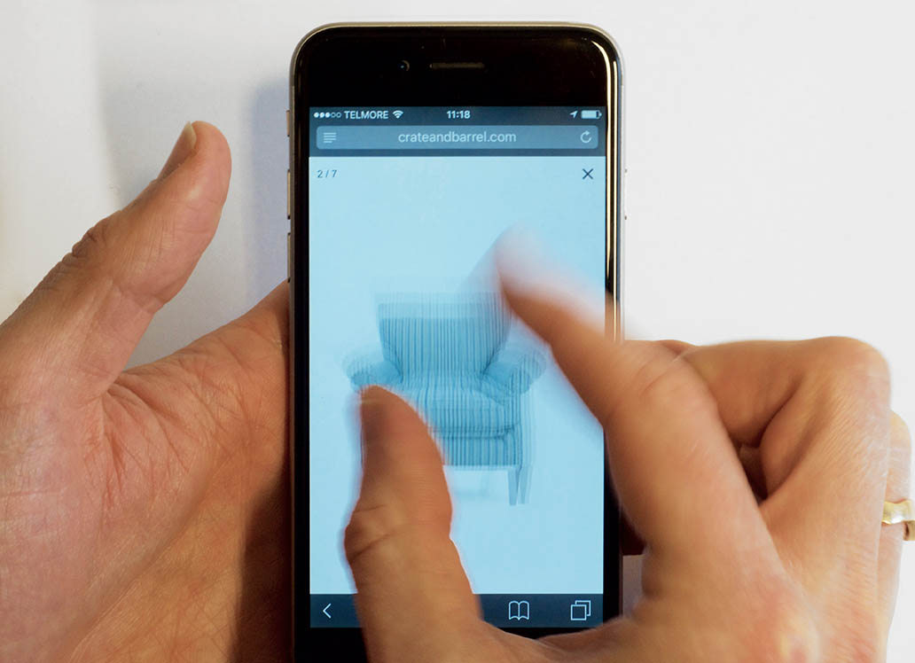
Throughout testing the subjects would try to interact with the images on product pages to inspect a particular product detail or quality. Some tried zooming the product image by tapping and pinching it – alas many of the tested sites didn’t support these gestures and had also disabled their users’ ability to zoom the webpage as a whole through the <meta name="viewport" ..> tag (note: we have an upcoming article dedicated to this tag and its usage).
At the sites where nothing happened many of the test subjects chose to go hunt for other products – both on- and off-site – since they felt they weren’t able to sufficiently inspect the product’s quality or features, and therefore didn’t feel comfortable buying it. These two quotes from subjects that abandoned sites due to lack of a detailed image view illustrates just how severe this issue can be:
A subject looking at a set of tin figures in a toy store: “I would like to see what figures I am buying and if they are painted decently. To see if they are suitable as a gift.”
A subject looking at a dress on an apparel site: “I would never buy anything on a page like this because I can’t see what it is I’m really purchasing. I need to see the details. You wouldn’t purchase anything you couldn’t see how it looked up close – you are after all to wear it, so you will notice it if things don’t look good up close.”
Even on sites that had dedicated close-up images in their image gallery the test subjects would still try to zoom the images via gestures. Given the severity of users not being able to zoom product images via pinch and tap gestures, and the extent to which users expect to be able to do this, it’s shocking that 40% of mobile sites don’t support these image gestures.
The test subjects were observed to rely on both tap and pinch gestures, and for this reason alone we’d recommend supporting both gestures. Furthermore, site support for these two predominant zoom gestures is very inconsistent, further amplifying the need to support both (since there is no web convention).
Interestingly, the need for advanced zoom features is a largely mobile-specific issue caused by the small form factor of the platform. We haven’t observed anywhere near as strong a need for advanced image zoom functionality during our desktop e-commerce studies where a “Larger View” feature that scales the image to full-width of the (much larger) laptop or desktop screen typically provides the user with sufficient detail to inspect product details and textures.
Low-Resolution Images is Effectively the Same as Not Supporting Zoom
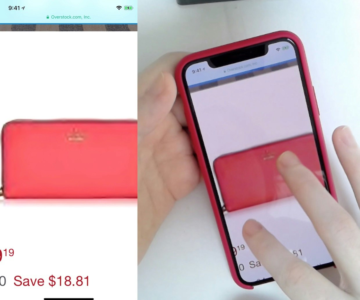
While the zoom gestures are technically supported at Overstock, notice how the mobile product images are of a very low image resolution, in practice ruining the purpose of supporting the zoom gestures.
While 4% of the benchmarked sites did technically support the gestures to zoom, they failed to provide pictures in a decent image resolution, resulting in images that were in practice unusable when zoomed due to their low quality.
This is an unfortunate but predictable implementation. After all, most mobile sites (rightfully) use mobile-optimized lower-resolution product images to reduce the download footprint of their pages. If using mobile-optimized images, it is therefore important to make sure that your image gallery implementation fetches a higher-resolution version of the product image when users begins zooming, to ensure that they can actually see the product detail(s) they are trying to inspect.
Explain that Zoom is Supported (50% Don’t)
With 40% of mobile sites not supporting zoom gestures, users simply can’t predict whether your site will or not. Interestingly, out of the 60% of sites that support zoom gestures, only half of them inform their users that they support pinching and tapping.
The test sessions revealed that it actually helped users when sites indicated support for image gestures. It obviously helped underscore that the gestures would be supported but perhaps more importantly it reminded and encouraged the user to take advantage of this “hidden” feature.
Users are made aware that they can zoom images via (the otherwise hidden) gesture features at Musician’s Friend and Home Depot – it’s only 50% of the sites that support zoom gestures that also inform their users.
We observed no noticeable usability issues on sites that chose to hide / fade out the “zoom support” message after a few seconds (the case for both of the above examples). If opting for a permanently visible message it is, however, important that it doesn’t obscure the default image.
A last implementation detail observed during testing was that – depending on the mother tongue of your site audience, and how technically inclined it is – not all users will recognize the terminology “Pinch” for this gesture. Some of the test subjects that weren’t native in English had trouble understanding the terminology. It is therefore recommended to write “Double-Tap to Zoom” or use a gesture icon in combination with any usage of the word “Pinch” (while still supporting both gestures).
Mobile Pinch and Tap Gestures
It’s baffling that 40% of the mobile sites from major retailers still neglect basic features that are central to overcoming the limitations of users browsing on 3-5” screens. Especially considering how relatively straight-forward the fixes are.
As detailed throughout this article, our mobile usability research shows that a simple set of guidelines for image zoom gestures can be summarized thusly:
- Support both the pinch and double-tap gesture since there’s no web convention for one or the other and users rely on both gestures.
- Fetch images in a higher resolution when users begin zooming so that they can actually see the product details they’re trying to inspect.
- Indicate support for zoom gestures when the page loads by displaying a temporary message that fades out after a few seconds.
- Accompany any usage of the term “Pinch” with an icon if selling to an international audience since the terminology isn’t understood by all non-native speakers.
This article presents the research findings from just 1 of the 650+ UX guidelines in Baymard – get full access to learn how to create a “State of the Art” ecommerce user experience.

