Note: there is a more up-to-date version of this article available
Inspirational product images – that is, images of a product in context (such as a lifestyle, usage, or animate product image) – are an excellent way increase the aesthetic appeal of an e-commerce site and the desirability of its products and categories.
Indeed, our research show that bespoke imagery is one of the biggests factors in positively influencing the user’s initial perception of the site.
American Eagle Outfitters has a big inspirational product image promoting a “50% off all sweaters” Christmas sale category, however, the test subject was interested in the depicted scarf. Alas, the subject had no way of accessing this scarf as the category was only for sweaters and not scarfs.
Inspirational product images suffer from an inherent dilemma: the image is designed to promote a specific product or category by placing it (or an archetype of it, in case of categories) in an inspirational setting that shows the user just how delightful this product or category is. Yet, sometimes the user is actually more interested in a product from the inspirational setting – that is, one of the auxiliary products used to frame the centerstage product or category archetype.
During our usability research studies we time and again observe test subjects grow frustrated as they spotted a product they wanted in one of these inspirational product images but weren’t able to navigate to, because the image either linked to a category or wasn’t a link at all (e.g. a product page image that’s merely meant to depict the selected product in an inspirational setting, not actually lead the user to another page).
You Can See It, But You Can’t Buy It
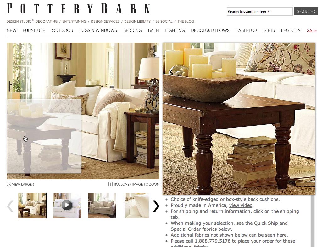
“Noo.. arrgghhh, it only added the sofa. I would like to get the sofa table”, a subject exclaims while hovering and clicking the table in the image. Laughing in despair he continues, “I want this – what do I do … I want this one! [pointing at the table]”.
Images in general tend to draw a lot of attention, and inspirational product images in particular because they often include context (and therefore tend to have more depth) and animate subjects (people, pets, ..). Therefore, even the auxiliary products in these images will get a fair amount of attention. So even though the auxiliary products in the inspirational product image were likely only included to add a certain mood or perhaps showcase the possible uses of the centerstage product, they will in reality attract significant interest. Indeed, many users will expect to be able to access these auxiliary products because they – in the user’s eyes – are so prominently featured on the site.
During testing, the subjects found it completely incomprehensible why a site wouldn’t just link directly to the depicted products, but instead played a cat-and-mouse game where they were given a peek at a product they wanted yet then forced to hunt down the product if they felt compelled to purchase it. As a result, not having direct links to all of the depicted products reflected very poorly on the subject’s perception of the site and was interpreted by some as a sign that the site owners clearly hadn’t tried to use their own site.
Simple Interlinking Solutions
Of course, simply changing all inspirational images to link to specific products instead of categories isn’t ideal either. During testing some subjects would expect an inspirational product image such as the earlier American Eagle Outfitters banner to open a category while others expected the depicted products to open. As designers we therefore have to resolve this tension of seemingly opposing user expectations. Luckily, there are elegant ways to solve this dilemma.
Crate & Barrel mark up their inspirational product images with black ‘+’ buttons that, when clicked, open an overlay dialog with more details on that particular product.
Probably the best solution is to overlay inspirational product images with tiny buttons pinned to the depicted products. The general image can still lead to the category but users now also have the option to access the specific products depicted in the image as well by clicking these pinned buttons. This gives us the best of both worlds.
The pinned buttons may open an overlay dialog, link directly to the product page, reveal an image preview on hover, or some other sensible behavior. What’s important is that the user has an easy way to access the depicted products and that it is clear to them what will happen if they click. A hover effect may be desirable to clarify this as it provides information scent and hints at the button’s destination.
Here a test subject is on the product page of a sofa she has decided to purchase (it’s the white one in the center of the inspirational product image), and now, after adding the sofa to her cart, she also wants to sofa table in the image. Unfortunately, Pottery Barn doesn’t tag their images and the user has no way to access the sofa table from this product page.
The approach will also work even if the general image doesn’t link to a category. For example, on the product page there may be an image slideshow that displays the products from different angles and in different contexts. If some of these images are inspirational product images that include other products from the store, those could very meaningfully be interlinked from the page too.
This is an excellent way to suggest complementary products to “go along” with the product the user is currently viewing. Here’s an example where good usability is great business. Why wouldn’t you want to give users easy access to these products? This is a non-obtrusive way of asking if “you want fries with that?” or whether “you’d like some jeans to go with that shirt?”
Yet while it seems like common sense, our recent benchmark revealed that only 36% of the top 50 e-commerce sites currently links to the depicted products in their inspirational images.
Category header images can be a similar source of user frustration as they often depict specific products. Once again, the solution is to tag the inspirational product image with links to the depicted products. If the image only depicts a single product, a subdued text link - as seen here on Williams-Sonoma - may prove sufficient.
While tagging all products may take a little while to do retroactively, it is a relatively minor investment compared to all the work that goes into creating the inspirational product images in the first place. If all these resources have already been invested – hiring a photographer, setting a scene, hiring models, renting props, post-production photo editing – it would seem incredibly wasteful not to have someone spend two minutes marking up the image with tags to the products depicted in it.
So make that one-time investment in setting up the image tagging system and then make sure that – at least going forward – all your inspirational product images link to all of the products depicted, not just the centerstage item. It’s good for usability. And it’s great for business.
This article presents the research findings from just 1 of the 650+ UX guidelines in Baymard – get full access to learn how to create a “State of the Art” ecommerce user experience.


