Jamie Holst
Co-Founder, DK

Jamie is co-founder of Baymard and CTO. Jamie oversees all of Baymard's technical development and writes articles on general UX topics and on the intersection between technology & UX, like compatibility features, UI bugs, search logic, and how it impacts the end user experience.
74 Articles by Jamie Holst
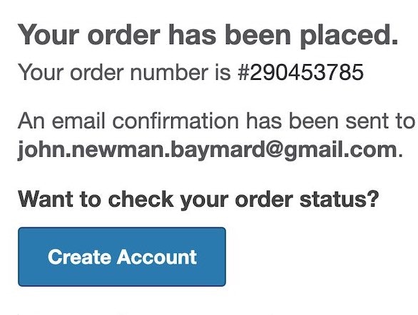
6 Ways to Get More Out of Your Order Confirmation Page
November 8, 2023 Popular
UX Research on Product Page Videos: Where and How to Embed Them (35% Get it Wrong)
May 14, 2019
Product Page UX: Data Should Be Synchronized Across Product Variations (28% Don’t)
April 18, 2019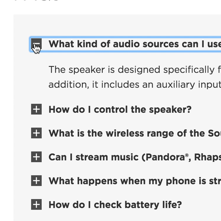
Product Page UX: Provide Both Site-Authored FAQs and Community-Driven Q&As (70% Get it Wrong)
July 4, 2017
3 Strategies for Handling Accidental ‘Taps’ on Touch Devices
March 28, 2017 Popular
How Users Perceive Security During the Checkout Flow (Incl. New ‘Trust Seal’ Study 2023)
October 5, 2016 Popular
How Layout Bugs Keep Haunting E-Commerce Sites – It’s Time to Fix This
June 28, 2016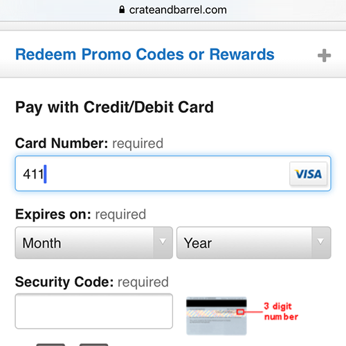
The State of Mobile Checkout & Form Usability
December 2, 2015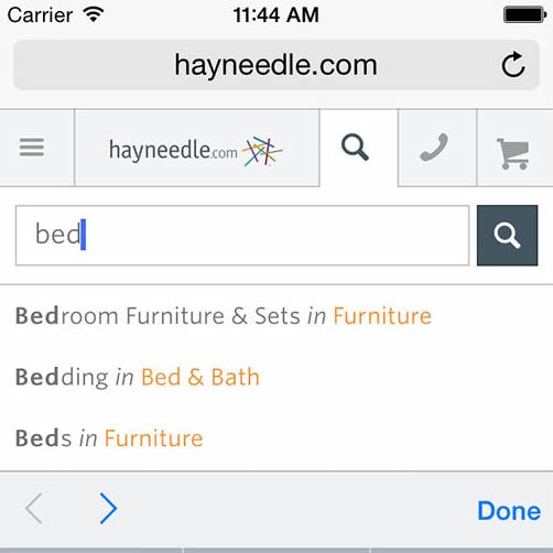
The State of Mobile E-Commerce Search and Category Navigation
November 17, 2015
6 Use Cases for Compatibility Databases on E-Commerce Sites
October 6, 2015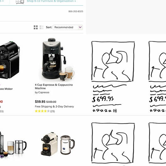
Responsive Upscaling: 11 Ideas for Large-Screen E-Commerce Design
August 18, 2015 Popular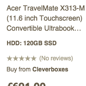
Contextual List Item Information – A New E-Commerce Personalization Technique
May 19, 2015
Category-Specific Sorting: A New Way to Sort Products
April 14, 2015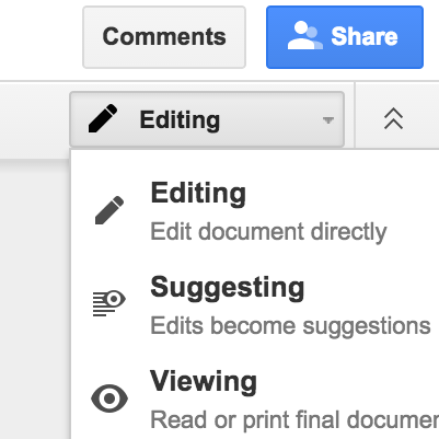
When to Override Native UI Components
January 27, 2015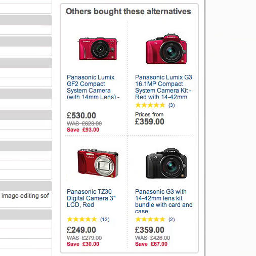
Product Page Usability: Recommend Both Alternative & Supplementary Products (Only 42% Get it Right)
November 25, 2014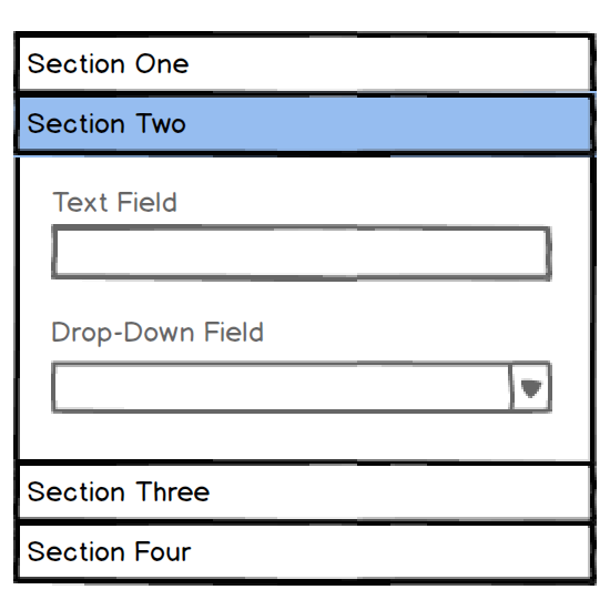
Accordion UX: The Pitfalls of Inline Accordion and Tab Designs
October 21, 2014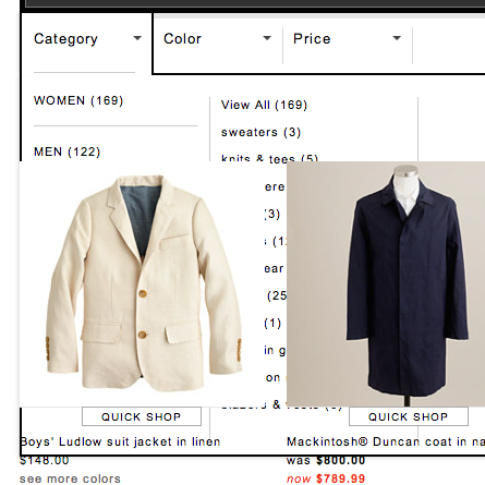
Fixing Bugs – the Next ‘Big Thing’ in E-Commerce?
October 7, 2014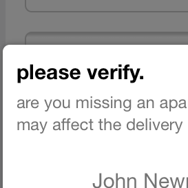
Form Usability: Validations vs Warnings
September 23, 2014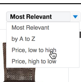
Faceted Sorting - A New Method for Sorting Search Results
September 2, 2014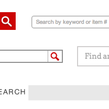
E-Commerce Search Field Design and Its Implications
July 30, 2014
Avoid These 5 Types of E-Commerce Graphics
March 4, 2014 Popular
Inspirational Images Should Link to All Depicted Products
January 7, 2014
E-Commerce Sites Need 2 Types of Breadcrumbs (68% Get it Wrong)
December 10, 2013 Popular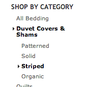
E-Commerce Navigation: Show Sibling Categories for Easy Scope Adjustment (47% Get it Wrong)
October 29, 2013
6 Mobile Checkout Usability Considerations
October 1, 2013 Popular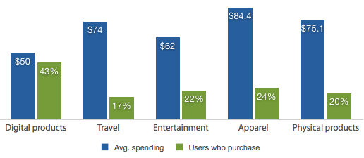
Mobile Commerce Spending Patterns (2013 Survey Results)
August 27, 2013
Users Continue to Double-Click Online
July 25, 2013 Popular
Mobile Form Usability: Never Use Inline Labels
June 4, 2013 Popular
Drop-Down Mobile UX: Never Use Native Drop-Downs for Navigation
April 23, 2013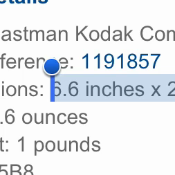
Mobile Product Pages: Always Offer a List of Compatible Products
April 2, 2013
Mobile Form Usability: Avoid Splitting Single Input Entities
February 12, 2013
Social Media: Analyze Affordances, Not Features
January 8, 2013
Add Descriptions To Checkout Form Labels (92% Get It Wrong)
November 6, 2012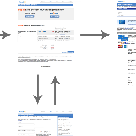
Why Your Checkout Process Should Be Completely Linear
October 3, 2012
Visually Reinforce Your Credit Card Fields (89% Get it Wrong)
August 21, 2012 Popular
Checkout Usability: Don’t Use “Apply” Buttons (72% Get it Wrong)
July 11, 2012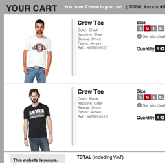
A Consistent Shopping Experience With Product Thumbnails
May 22, 2012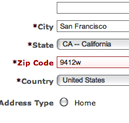
Idea: Error-Fields Only
April 10, 2012
8 Limitations When Designing for Mobile
March 21, 2012 Popular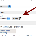
Checkout Usability: Apply Changes Immediately and Near the Input
February 22, 2012
UI: Getting the Details Right
January 24, 2012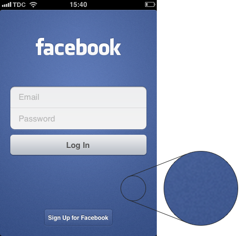
UI: Adding Subtle Textures for Depth
December 6, 2011
UI: Thoughts on the New Facebook Timeline Design
November 16, 2011
Jobs’ Impact on the Design & UX Industry
October 9, 2011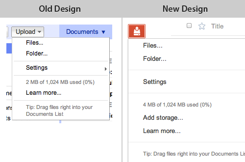
Design Trend: Interfaces with Less Information
August 16, 2011
E-Commerce Copywriting: Returning Customer?
June 28, 2011
Account ‘Sign Up’: Ask to Confirm E-mail, Not Password
June 16, 2011
Responsive Web Design and Mobile Devices
May 7, 2011
E-Commerce: Why Customers Abandon Their Shopping Cart
January 19, 2011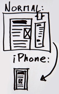
Mobile: Venturing Into Responsive Design
December 21, 2010
E-Commerce Home Page Focus
December 14, 2010
Mobile: Thoughts on Native apps vs Web apps
December 7, 2010
“What’s this?” Link & Tooltip
November 9, 2010
HTML5: Anchor Content, Not Anchor Text
October 13, 2010
From Sketch to Website (Hint: Skip Photoshop)
October 5, 2010
Form Field Usability: Matching User Expectations
August 31, 2010
Visual Balance: Dealing with Variable Headline Lengths
August 24, 2010
Formatting Links for Usability
August 17, 2010
Conversion: Reducing Sign Up Friction
July 28, 2010
4 User Interface Sketching Pitfalls
June 24, 2010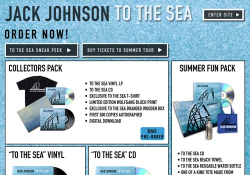
Why Jack Johnson’s Splash Screen(!) is Great
May 26, 2010
Links and the Hover State
May 17, 2010
Google Chrome and the Importance of Good Copywriting
April 16, 2010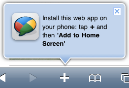
How Google Keep their iPhone Visitors Coming Back
March 30, 2010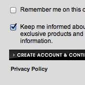
People Think Registration Leads to “Spam”
March 25, 2010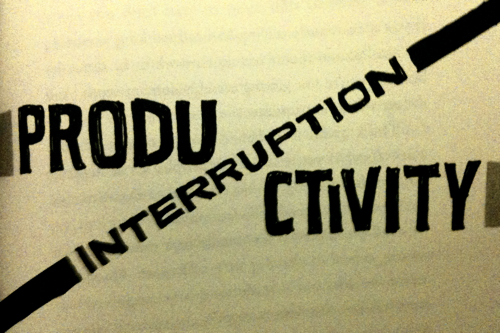
Review of Rework
March 2, 2010
Why People Buy Online
February 14, 2010
People Still Double-Click Online
February 4, 2010
Links and the Visited State
January 12, 2010
Decoration - the Enemy of Good Web Design
December 3, 2009
Video: Designing a new Website
November 21, 2009
Designing a new Website #3: Finished Layout
October 24, 2009
Designing a new Website #2: Design Drafts
October 13, 2009
Designing a new Website #1: Priority Lists
October 10, 2009
