There’s 7 reasons customers abandon their shopping cart.
Update: we have a more recent version of ‘reasons for checkout abandonments’ available here: New E-Commerce Checkout Research – Why 68% of Users Abandon Their Cart.
During our recent study on checkout usability the test subjects gave us some insight into the many different reasons customers abandon their shopping cart.
While the reasons for shopping cart abandonment will vary greatly from customer to customer (and from site to site) they all fit into the following 7 categories.
These are all general reasons customers abandon their shopping cart.
1) Distractions
During checkout people can be distracted. These distractions can be external – like a phone ringing, the kids calling, etc. – and they can be distractions on the site itself – cross-sell in cart, navigation, etc.
You obviously can’t control the external forces but you can control the distractions on your site and make the checkout process distraction-free. Obviously, the longer it takes to complete your checkout, the higher the risk of external distractions kicking in.
2) Poor Usability
If it is too difficult to buy from your store, many customers will give up. Either because they can’t be bothered, but more likely because buyer’s remorse sets in fast when things get complicated.
This will vary greatly from industry to industry. If you’re selling high-performance computers (high cost planned purchase), people are more forgiving of a slightly slow and difficult checkout experience than if your are selling chocolate or books (low cost impulsive purchase).
Obviously horrible usability that is so bad your customers can’t figure out how to complete their purchase will cost you customers no matter what industry you’re in.
3) Fraud
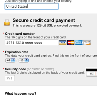
Customers are terrified of being defrauded, so they are unlikely to buy if your site doesn’t feel trustworthy.
We’ve all heard the horror stories and people are terrified of being defrauded. If the site doesn’t feel safe and trustworthy, few customers will take the risk.
Big brands and businesses with physical stores are at an advantage here. Big brands because people trust them. Physical stores because people know they can go somewhere and hold a person responsible.
Remember: there isn’t necessarily a direct relation between the actual technical security of your checkout, and the perceived security of it.
4) Does it Fit?
Say you’re shopping for a new pair of pants. Online you can’t try them on first and see if they fit before you buy them. This will scare away a great deal of customers. They go through the checkout all the way to the payment form, and then, as they’re pulling out their credit card they start thinking “what if they don’t fit me?”.
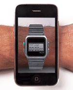
Online you can’t try out the product before buying, you can’t even see it with your own eyes. While things like augmented reality can simulate this experience we’re very far away from anything that comes close to the experience of seeing the product in a real store.
This fear is obviously most prevalent to products where the aesthetics or physical form are of great importance. Product images can help too, but many customers have been mislead by generic product images before and as a consequence don’t trust them fully.
5) Don’t Want to Buy
Sometimes people are just surfing and putting products in their shopping cart for the sake of it. They have no intention of buying. Or perhaps they just don’t have the money right now.
Often people also just use the shopping cart as a way to temporarily store links back to different products they found funny or interesting, even though they don’t really want the product(s).
6) Can’t Buy
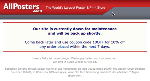
Server errors make it impossible for your customers to buy. Consider offering a promo code to make them return once you’ve fixed the error.
While running the checkout usability study some of the test subjects encountered technical problems, like an unresponsive server and error pages. There was no patience for such errors and in 8 of 9 instances the test subjects immediately abandoned their shopping cart.
While servers errors are hard to avoid (presumably you’re already doing everything in your power to prevent them), the negative effects can be minimized by e.g. offering a coupon code while down for maintenance.
7) Additional Costs
Handling fees, shipping fees, tax.. Often all of these additional costs are first added during checkout, and sometimes they make the product prohibitively expensive.
This is especially true for commodity products where customers instinctively know the regular retail price. They will likely abandon if it gets more expensive than in the physical store. The extreme example would be ordering 2 pounds of flour, where the shipping cost will outweigh the product price.


