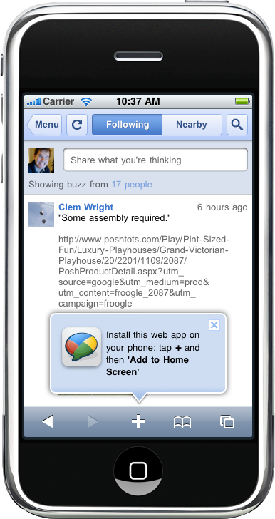
Google’s mobile interface for Google Buzz sports a brilliant call to action that is customized specifically to the mobile phone you’re using.
When you go to the mobile version of Google Buzz on your iPhone, a dialog pops up, saying you can “install this web app on your phone” by tapping the + icon. There’s even an arrow pointing down at this + icon (note: the + icon is not part of the Google Buzz website but part of the iPhone’s built-in browser). Google then goes on to tell you that you should tap on “Add to Home Screen”.
This is a very effective way to get a graphical bookmark right on the home screen of your visitor’s iPhone. Imagine that opportunity for a second – being on display every time your visitor unlocks her iPhone, just a single tap away from your website.
Google have customized their call to action specifically to iPhone visitors.
So how did Google do this? Well, it’s actually fairly straight-forward. Browsers send along OS and browser information to each and every website you visit, so Google simply use this information to determine if you’re using an iPhone and then display the message if you are. Google even goes so far as to customize the graphics to guide you in the right direction.
While it certainly took a little time to develop this feature, I have yet to see a better call to action on my iPhone (especially on a website). Well done Google!
Have you seen similar efforts by other companies? What do you think of this kind of call to action – is it worth the time? Let me know by posting a comment.


