During our most recent research study we once again found that a surprisingly large number (more than 50%) of the people aged 40+ still double-click on links and form buttons online.
This gives us a tiny glimpse into the vast proportions of novice users out there. These people are not stupid, they just have better things to do than learn that they have to treat links and buttons online differently from the documents and folders on their desktop.
When dealing with forms, this can actually be a real problem, since double-clicking the button will likely cause two identical posts to be made. The classic example of course being the e-commerce store, where the same order will be purchased (and billed) twice.
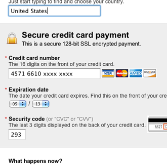
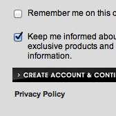
AllPosters.com disable their “Continue” button immediately after you click it.
Of course, we can get around this problem rather easily. You can either disable the submit button immediately after it has been clicked, or you can code your back-end to ignore identical orders made within e.g. a 3 second timeframe. Do both if you want to be on the safe side.
As it often is with usability, the technical solution is fairly straight-forward - it’s identifying the problem that’s difficult.
Thoughts? Have you identified similar problems?


