I see the mistake again and again – web designers that either don’t adjust the width of their form fields at all or adjust it based on what looks best in the layout of the page. To achieve good usability you should however adjust the width of your form fields so it matches the length of the expected input.
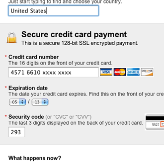
Skype’s name, credit card number and security code fields are too long.
Common offenders are things like credit card number fields that can contain 14 digits, even though we know that credit card numbers are often 16 digits long. Email fields that can contain 50 characters even though the average email address is about 25 characters long. Or credit card security code (CVV) fields that can contain 14 digits even though the max input is 4 digits.
During our recent usability study this issue had a surprisingly big impact on the overall usability of a form. If a field was too long or too short, the test subjects started to wonder if they had misunderstood the label – perhaps they had to enter something else in the field? This was especially true for fields with uncommon data or a technical label like CVV.
So making the input field’s width match the expected input is important to the usability of your form.
3 different types
When we tried to categorize the expected input length of our form fields, we ended up with 3 main types:
Type 1) Fields with a fixed input
Here you know exactly how long the input will be, like a “birth year” (it’s always 4 digits long).
In these cases the solution is straight-forward: you should adjust the width of the field so it’s just long enough to contain all the characters of the input but not any longer than that.
Type 2) Fields with a variable input but a normal average
This is the most common type of input field where the input is variable yet has an average length that’s within what can be considered a “normal” boundary of averages. This is fields like name and email. The length can certainly vary, but the average email is about 25 characters long – right within what can be defined as a “normal” boundary.
The “normal” boundary will change from site to site, but for the forms we studied, it typically spanned from 18 to 33 characters. To find this average, collect all your fields with a variable but somewhat normal input length and based on the average length of the input of all those fields combined, find a suitable width that will work for them all. Be generous and go for the slightly longer version (a couple more characters than your average).
By using the same width for all fields of this type (“variable input but a normal average”) you maintain visual consistency throughout your form.
Type 3) Fields with a variable input and an unusual average
Finally there are the outliers – fields with a variable input length where the expected input is unusually short or long. This is all the fields that don’t have a fixed input and don’t fit within the “normal” boundary we talked about in type 2.
This could be a customer’s postal/zip code which is typically quite short yet variable (the length differs from country to country). In these cases it’s a good idea to make exceptions and not use the default field width but rather a custom width based on the length of the expected input.
3 guidelines for form field length
This gives us 3 guidelines we can follow when designing our form.
- For form fields with a fixed input length, you should always adjust the width of the field to exactly match the known input length regardless of the other fields on the page.
- For form fields with a variable input length but within a standard average, you should find a good default you can use for all form fields of this type.
- For form fields with a variable input length but where the average deviates significantly from your default width, you should increase or decrease the field’s width accordingly (don’t use the default width).
By following these 3 guidelines you maintain the visual consistency throughout your form but at the same time avoid confusing customers by making form fields too long or too short.
Matching your customer’s expectations – even when it comes to the subconscious expectations of how wide an input field should be – is crucial if you want a user-friendly site.


