
Key Takeaways
- Drop-downs are generally a poor choice for offering fewer than 5 or more than 10 options
- Large drop-downs are hard to comprehend and cause selection errors, while small drop-downs waste users’ time
- Better options are radio buttons, open text fields, or automatically selected options, depending on the situation
Drop-downs can seem to be a simple solution to a simple problem: when designing an interface that has several options for users to choose from, provide a selectable drop-down that displays those options.
Unfortunately, drop-downs are often not the simple solution they seem to be.
In ecommerce, most users will encounter drop-downs while navigating the checkout flow, for a wide variety of inputs.
Baymard’s 150,000+ hours of large-scale usability testing reveal that using drop-downs for the “wrong” scenarios can lead to delays in checkout, web page errors, and user distraction, all of which increase the likelihood of checkout abandonments.
In this article, we’ll discuss some of our Premium research findings from our Cart & Checkout testing related to deciding when to use drop-downs, including:
- Why drop-downs should be avoided when there are too many or too few options
- Why opting for text fields or radio buttons is often a better choice (e.g., “Country” and “Title” selection)
- What to use instead of a drop-down for 2 required checkout fields that are often implemented as drop-downs
(To see what our recommendations look like in action, check out our e-commerce design examples, especially for Customer Info & Address, Cart, and Payment.)
Note: though specific numbers are used to illustrate “too many” and “too few” options in a drop-down, it’s important not to get hung up on what exact number of options in a drop-down should trigger using an alternative input interface. The number of options used in this article are for general guidance only — each site and input type has an individual context that should be taken into consideration. Furthermore, all these findings apply for e-commerce checkout flows; other contexts, like survey forms and application software, may deviate.
In General, Avoid Drop-Downs When There Are More Than 10 or Fewer Than 5 Options
The issues caused by drop-downs being used in the “wrong” situations were observed during Baymard’s very first rounds of checkout usability testing dating back to 2010.
Since then we’ve reconfirmed this user behavior during all subsequent checkout usability testing we’ve performed.
(Note that some sites also use custom-designed drop-downs, which can cause the problems described below to multiply, as they can restrict users’ ability view and interact with the options.)
Using Drop-Downs When There Are More than 10 Options
Drop-downs quickly become difficult for users when they are presented with an overwhelming number of options to choose from.
Take, for instance, the “Country Selection” drop-down, which is often included in checkout forms.
78% of sites in our benchmark include a country-selector drop-down in their checkout.
Testing revealed 2 main issues caused by massive drop-down inputs such as the “Country Selection” drop-down:
1) Lack of Overview

Long “Country” drop-downs like this one at Maxon confront the user with a page full of options to scan, which can overwhelm the user.
Seeing more than 20 uncategorized options can be bewildering and intimidating, and make it difficult for users to find the option they’re looking for.
Long country drop-downs, which often include over two hundred options, can be very difficult for users to get an overview of.
2) Scrolling Issues

Long “Country” drop-downs like those seen here at Urban Outfitters can lead to scrolling frustration, since the location of the mouse cursor on the screen can make the drop-down and the page scroll in unpredictable ways.
Scrolling large drop-downs can be a tricky, error-prone experience.
If the mouse cursor is outside of the drop-down, users will most likely scroll down the page instead of the drop-down, hiding the drop-down options from the screen.
In some browsers, however, the drop-down will actually scroll as long as it has focus, likely leaving users with erroneous data.
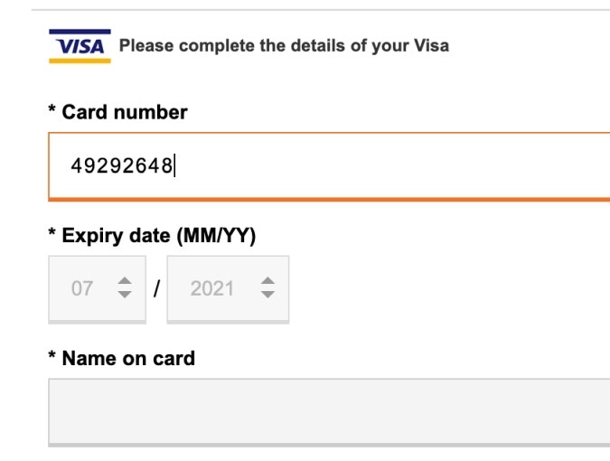
Using Drop-Downs When There Are Fewer than 5 Options
On the other hand, if there’s just a handful of options for a particular field, a drop-down will similarly nearly always be a poor interface choice.

Here at the German hardware site OBI, this “Titel” (title) drop-down contains only a few options — an inefficient way to present these to users.
This is because the space savings are small compared to the challenges created by not providing users with sufficient information scent — users must select the drop-down to see the 1–4 options it contains.
Furthermore, when the input is optional, as in the example of OBI above, 55% of users across our testing were observed to open a drop-down, just to see what it contained, and then immediately close it again without making a selection.
This occurred even when the drop-downs were clearly marked as being optional.
What to Use Instead: Text Fields and Radio Button Interfaces
For some fields, a drop-down is clearly a suboptimal selection UI.
Instead, text fields and radio buttons should be considered, depending on the specific context.
Open Text Fields
If there are many more than 10 options, but the user’s input doesn’t have to be validated, an open text form field will often be simpler than a drop-down, as users don’t have to read and understand all options before making a choice.

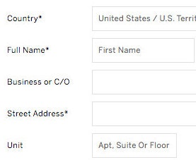
A “Full Name” text field, seen here at GAP, eliminates the need for “Title”, “Middle Name”, and “Suffix” drop-downs.
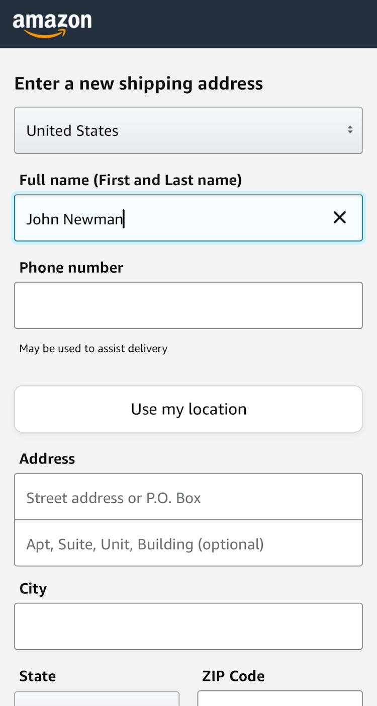
In this mobile example, Amazon avoids name drop-downs by asking only for the user’s “Full name (First and Last name)”.
For example, a “Full Name” field is a very flexible way of supporting optional “Title” and “Suffix” inputs (often wrongly displayed in a drop-down).
Similarly, an optional text field for delivery instructions will often be simpler than an optional drop-down.

A country autocomplete, as in the one here at Zoom solves the issue of having a massive drop-down that’s difficult to use, while it can also support typos and sequencing, synonyms, common names, local spellings, and abbreviations.
For some fields, such as “Country Selection”, where the input often does have to be validated, we observe that a well-performing alternative to a drop-down is an autocomplete field.
This addresses the issues of drop-downs by letting the user begin to type their country themselves.
As they begin typing, the possible matches are suggested, which simplifies the task of locating and selecting an option, and is observed to greatly speed up the country-selection process altogether.
Radio Buttons
For drop-downs with few options, a radio button interface will often be a better choice, as it doesn’t require users to open the drop-down just to scan the options.
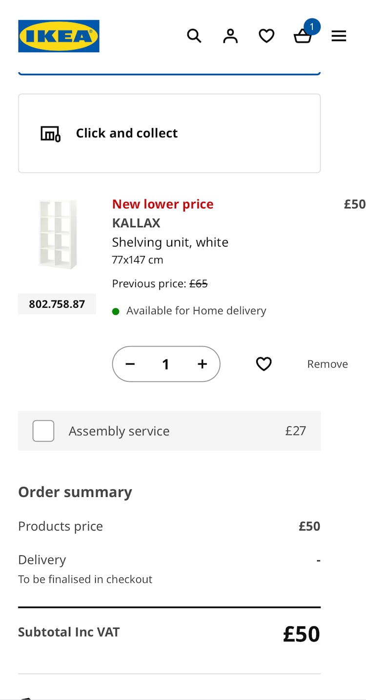
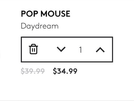
IKEA uses radio buttons and an open answer field in the middle to update cart quantity. It also automatically updates with every change, which our testing suggests is an especially important feature.
For example, radio buttons combined with an open-text field are especially effective for updating cart quantity, as testing found that drop-downs in that situation can be surprisingly perilous.

In checkout, Target automatically selects “Standard Shipping” with a bold, decisive green radio button when the other option (“Order Pickup”) is not available, saving the user the unnecessary move of “selecting” the one remaining option.
And if a selection interface only has a single option left (e.g., a user has selected other conditions that narrow their product options down to one, like a shoe style that only has one size left in stock), we recommend replacing the drop-down with plain text or at least preselecting the only remaining choice.
(A note on checkboxes: checkboxes are good when users have to choose between opting in or opting out (a single yes/no option), and when the majority of users should pay close attention to this choice. Common examples include newsletter opt-in, up-sell opt-ins (insurance, subscriptions, etc.), and for choosing “shipping address = billing address”. Thus, it’s often better to go with open text form fields or radio buttons when addressing the issue of drop-downs with too-many or too-few options.)
How to Handle 2 Specific Checkout Fields Often Implemented as Drop-Downs
There are 2 checkout fileds (not including “Country” or “Title”, discussed above) that our benchmark reveals are often implemented as drop-downs in the checkout, when there are in fact better alternatives.
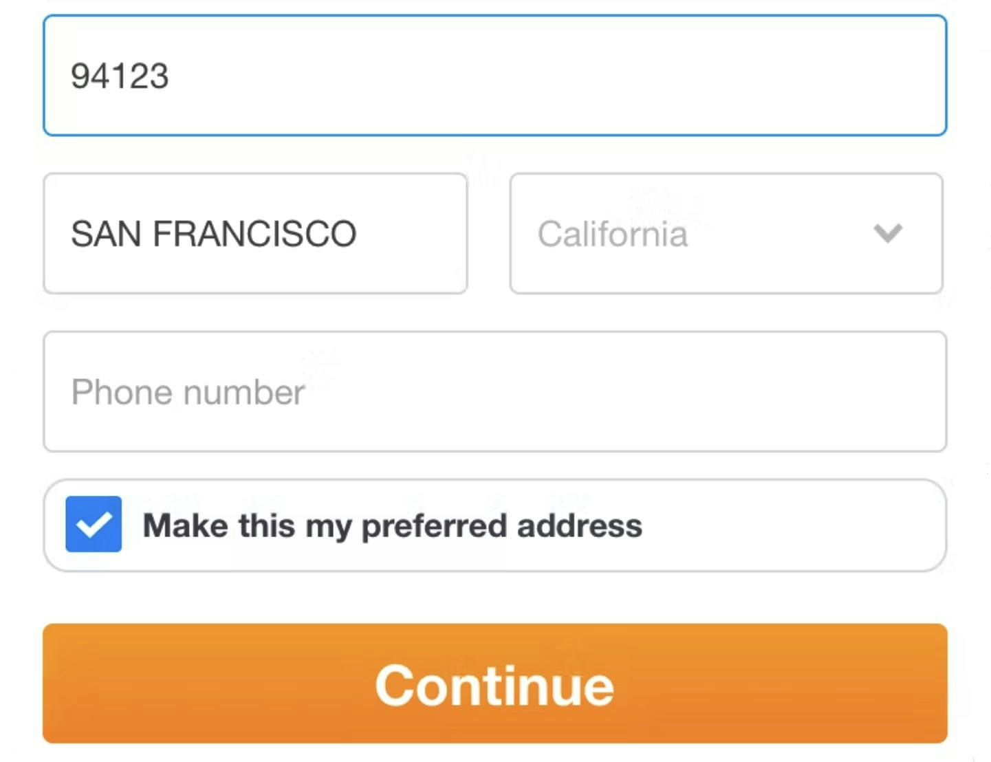
1) Shipping Address: “State” Field

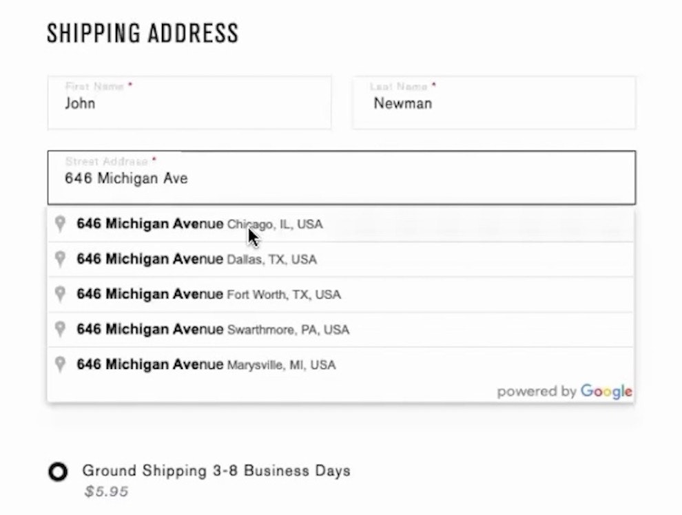
This checkout flow on Victoria’s Secret has a state-of-the-art automatic address lookup, which our testing has found is the best way for users to put in their addresses.

Gilt provides an automatic address lookup as a part of their checkout, which avoids drop-downs (other than the user’s choice of address).
“State” field drop-downs can be avoided by implementing automatic address lookup, which will allow the vast majority of users to skip interacting with the “State” field altogether.
Yet, our benchmark has found that only 38% of sites have fully implemented automatic address lookup.
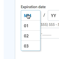
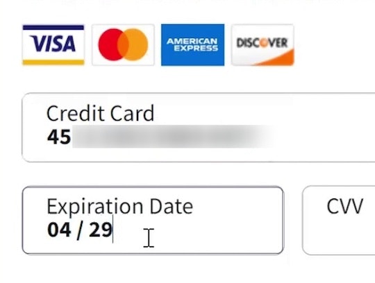
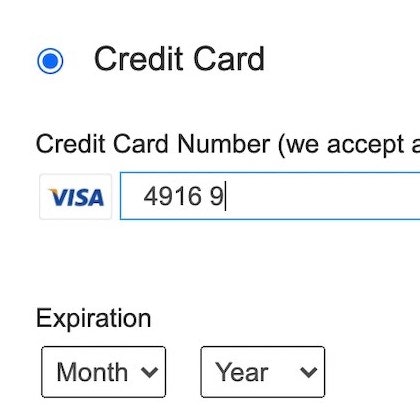
2) Payment: “Card Type” Field
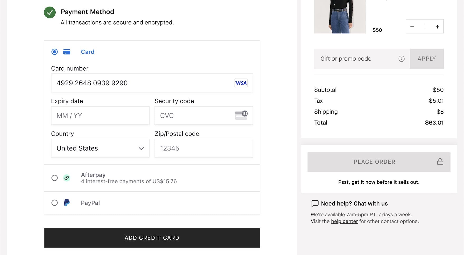
At Everlane, the credit card number entry automatically detects the card type so that users don’t have to use a drop-down to select it.

This Nordstrom mobile site checkout flow includes this credit card field which autodetects the type as the user enters it, displaying the card type immediately rather than waiting to update until the user leaves the field.
The first 6 digits of a credit card number indicate the user’s credit card type, so asking users to select their card type themselves creates needless friction.
Instead, the card type should be autodetected from the IIN (Issuer Identification Number) range.
This autodetection can go hand-in-hand with other credit card field implementations that our testing has found advantageous, like Luhn validation, card number auto-spacing, and currency autodetection.
Deciding Whether a Drop-Down Is the Appropriate Choice

At Amazon, a “Reasons for Return” drop-down contains 12 options. While it has slightly more options than is generally best for drop-down menus, in this instance the need for an answer in a structured format may outweigh the benefits provided by an open text field (which, on the other hand, could include more accurate and comprehensive information from users).
Our testing reveals that, in general, opting for an open text field or radio button interface instead of a drop-down with many or few options (respectively) is a better choice.
That’s not to say that drop-downs should never be used in these contexts, especially when there are many options to choose from.
A drop-down with more than 10 options can be a completely warranted choice if users don’t know their options upfront (and thus can’t type them).
Similarly, drop-downs can be effective when there are more than 10 options and the input has to be submitted in a known and structured format for validation and analysis.
But in many cases — like inputs for “Title”, “Country”, “State” or “Region”, “Quantity”, and “Card Type” — it’s likely that there’s a better alternative to drop-downs.
These situations are better served by the options discussed above, like radio buttons and open fields, which help users make choices more quickly and with less friction.
The decision of whether to use drop-downs may be small in the full scope of an ecommerce site, but small improvements like the ones suggested here ultimately yield sites that feel simple, easy, and intuitive.
This article presents the research findings from just a few of the 650+ UX guidelines in Baymard – get full access to learn how to create a “State of the Art” ecommerce user experience.
If you want to know how your desktop site, mobile site, or app performs and compares, then learn more about getting Baymard to conduct a UX Audit of your site.