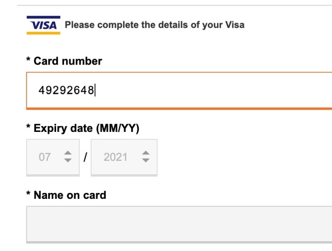
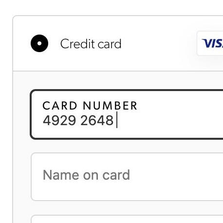
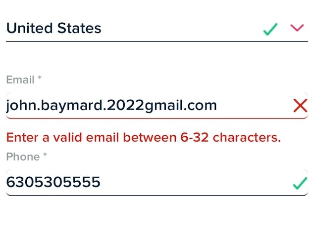
Despite credit card details being a commonly typed input on e-commerce sites, and despite the fact that they only constitute a small part of the overall amount of typing users have to do during the checkout flow, our 11 years of testing checkout flows reveal that the 3-5 credit card form fields are by far the most complex and error-prone input during checkout.
During years of large-scale checkout testing we observe that when test users run into issues in the credit card interface, for example due to an unclear field label or error message, the recovery rate for credit card fields is lower than any other checkout input. In essence, even a slight ambiguity or a lack of assisting features for the credit card fields can result in a surprisingly high degree of abandonments — abandonments that can be prevented with reasonably low-cost investments.
Despite the importance of the credit card interface, our benchmark reveals that 70% of the largest e-commerce sites do surprisingly little to assist their users with a smooth and error free typing of their card data. Indeed, 70% of e-commerce sites have a poor or mediocre “Credit Card Form” UX performance (as seen in the graph above that summarizes 600 manually audited “credit card form” UX parameters at 60 top-grossing e-commerce sites in Europe and the US).
In this article, we’ll explore 5 “Credit Card Form” implementations that make L.L. Bean best-in-class and with which most other sites struggle. We’ll show you some of our large-scale Premium checkout UX research findings that directly relate to the “Credit Card Form” step, and how these implementations can be executed to avoid unnecessary issues, covering:
- Luhn validate the credit card number field (53% of sites get it wrong)
- Autoformat spaces in the credit card number field (51% of sites get it wrong)
- Visually emphasize the security of the credit card fields (68% of sites get it wrong)
- Make credit card icons secondary in the payment interface (63% of sites get it wrong)
- Match the credit card field sequence to the physical card’s information sequence (36% of sites get it wrong)
1) Luhn Validate the Credit Card Number Field (53% of Sites Get it Wrong)
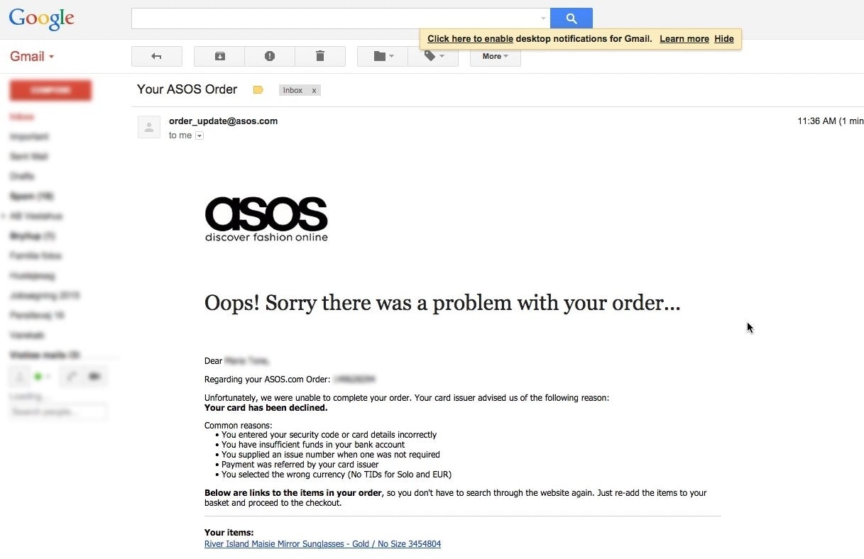
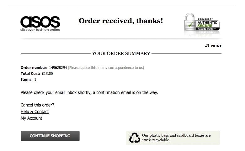
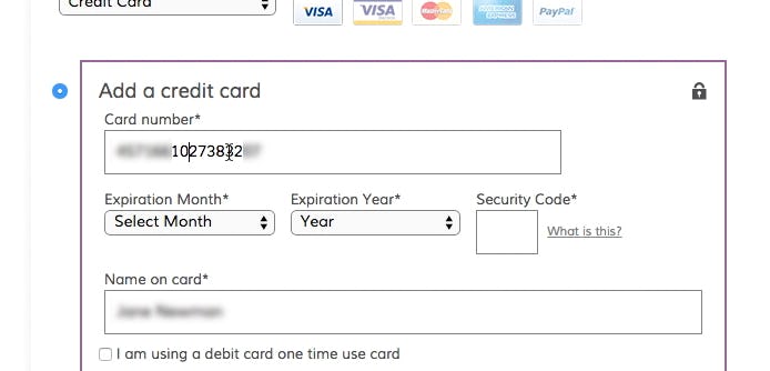
“Oh. My card is rejected. That is a little late they are telling me this….Oh no, then you have to start all over. This is really stupid, because if I mistyped a ‘Security Code’ or my ‘Card Number’ then I would be really furious and be kinda like, I’m not going to do this — no way.” This user’s card was not validated at the time of the order (first image), and the later received an email from ASOS that said the card number submitted wasn’t valid (second image).
Typing the typically 15- or 16-digit credit card number string without errors can be difficult for users. One aspect that more easily allows users to correctly input their credit card number is allowing them to type spaces and autoformatting the spaces embossed on the card (typically breaking the long input into more manageable 4-digit chunks — as outlined in our next guideline). However, even when broken into smaller chunks, the 15–16 digits still have to be typed perfectly to avoid payment validation errors.
Luhn validation of the credit card number field is an extra opportunity to immediately alert users if they’ve incorrectly entered their credit card number. Yet, our benchmark reveal that 53% of sites don’t Luhn validate the credit card number field. This is a small improvement over the 2016 numbers, when 67% of the same 60 top grossing e-commerce sites didn’t Luhn validate.
Luhn validation is a live front-end check to see if the card number entered by a user is plausible. All credit card numbers follow a pattern that will allow a simple Luhn/Modulus 10 checksum validation. Note that the check doesn’t submit and verify the card data with the payment processor. In other words, the Luhn validation can’t say if the card is valid, has sufficient funds, etc. — it can only tell if the typed credit card number sequence can never be a valid number, and hence is incorrectly typed. The card number could still fail later on, when the site submits the card data to the payment processor and tries to charge the card.
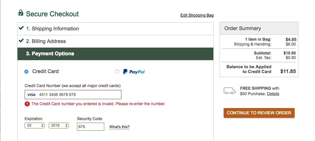
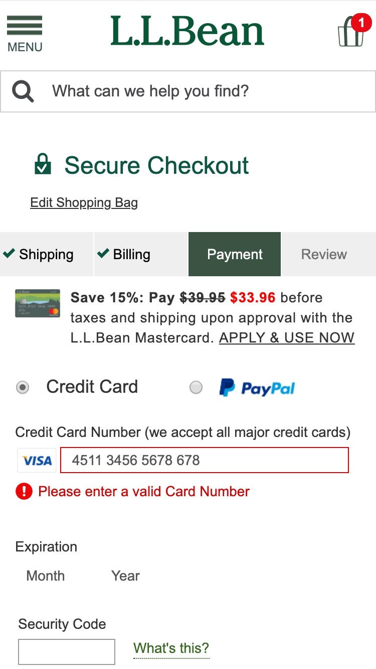
L.L. Bean utilizes Luhn validation within their credit card field so that users are immediately made aware if there are issues with the credit card number.
During testing, the difference between sites that employed Luhn validation and those that didn’t was clear. Users reacted with frustration and puzzlement when they received a card payment error from sites that didn’t provide Luhn validation and were slowed down in the checkout flow as they attempted to resolve the error.
This often turned out to have grave consequences as users abandoned sites thinking that their card failed to validate completely — for example, due to the charge being deemed fraudulent, for insufficient funds, connection errors, etc. — and never realizing that the card validation error was simply due to a simple one or two-digit typo. By contrast, users who received errors from sites that did live Luhn validation were able to resolve their typos more quickly; in fact, most recognized the typo as soon as they entered it.
2) Autoformat Spaces in the ‘Credit Card Number’ Field (51% of Sites Get it Wrong)
“I always check. I just check on the card that the numbers are right…I click between [every 4th digit] so I can gauge it.” This user explained her method for checking to make sure that the card number was inputted correctly. Note the placement of the cursor in the card number string.
The credit card number is inherently difficult to type, as, from a user perspective, it’s a 15–16 digit string of random numbers. During testing, we observed users struggling with both correctly typing their credit card number and verifying that it was correctly typed. Mistakes are common when it comes to typing in the credit card number, and if users don’t notice they’ve made an error it can result in card validation errors, which, during testing, was a cause of abandonments.
During testing, some “Card Number” fields didn’t apply any formatting to the card number either as it was being typed or after a user had completed typing the entire string. If users end up with a 16-digit long, uninterrupted credit card number in the “Card Number” field it’s very difficult to check if the typed number is accurate. A single typo when transferring the 15–16 digit string printed on the credit card to the “Card Number” form field will cause a validation error, which by itself can lead to abandonments. Even worse, many sites will, when payment validation errors occur, also clear out all the typed card data — forcing users to reenter all of their card data.
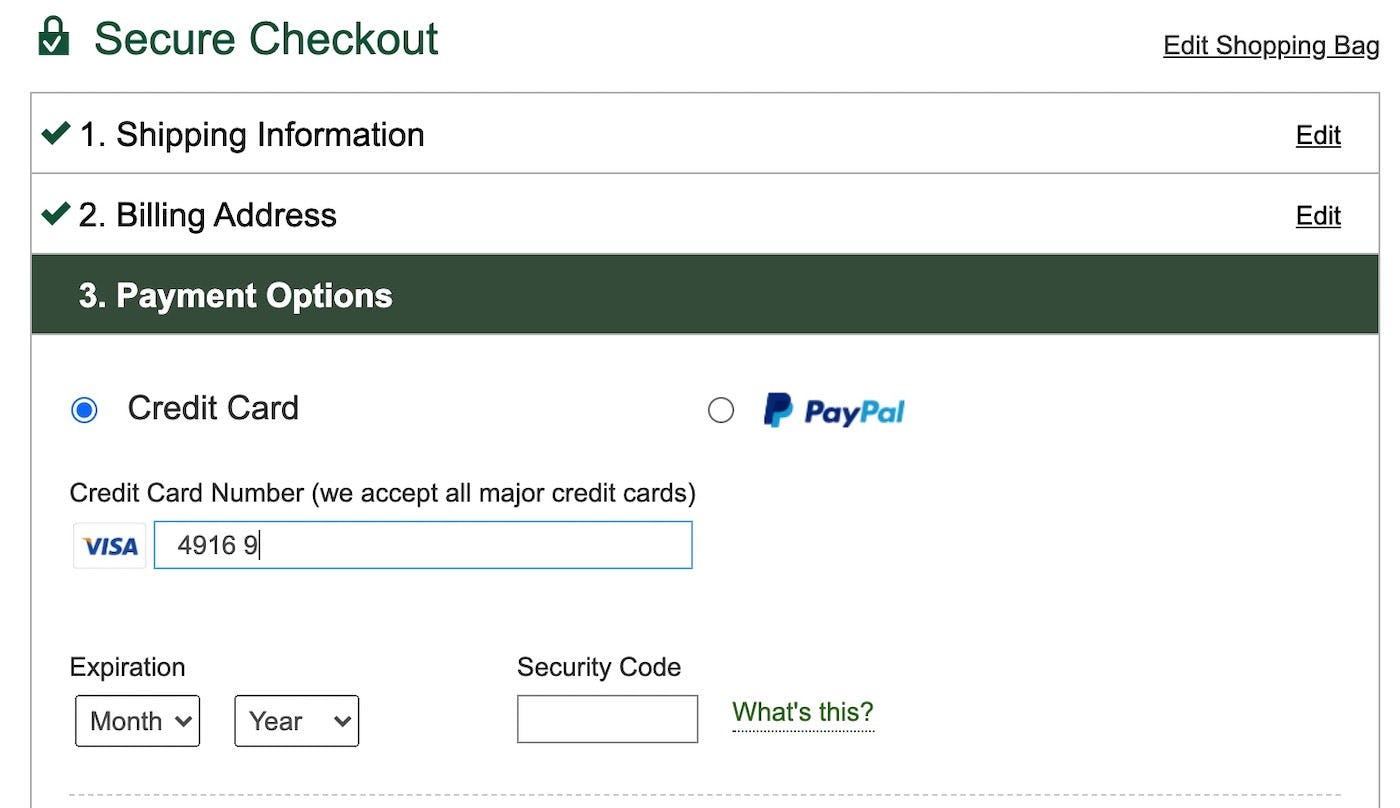
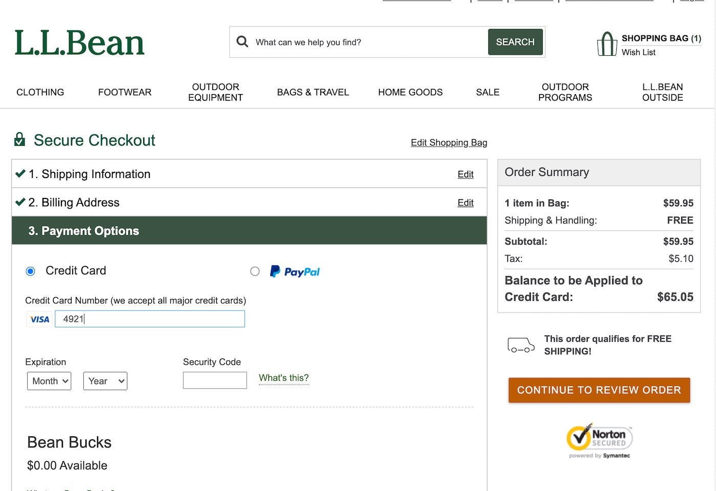
Autoformatting spaces as the user types, as seen here at L.L. Bean, reduces the frequency of incorrectly typed card numbers resulting in fewer payment validation issues.
However, when testing sites that autoformatted the user’s card number with spaces, users were observed to more frequently correctly type their card number. Consequently, they experienced fewer payment validation issues than they did on sites that didn’t autoformat spaces. For example, if users are typing a VISA or MasterCard card number, the input should be autoformatted to include a space for every 4-digit sequence.
Therefore, to make entering the credit card number as easy as possible, use an input mask for the appropriate card type after it’s been autodetected. An input mask that autoformats the card number (e.g., by automatically inserting a space after every 4th digit for a VISA card) provides users with an easy-to-read string of numbers that they can check as they type — reducing the chance they’ll make a mistake.
Note that credit card issuers employ different spacing formatting schemas for card numbers. Not all card numbers are 16 digits, separated as 4-digit sequences of numbers. The most important deviation is the 15-digit AMEX number, which uses a 4-6-5 chunking, and 19-digit cards, generally using 4-4-4-4-3 chunking. This means that the formatting of spaces for AMEX cards primarily has to change based on the card type autodetected. To maximize the ROI, consider not spending resources on trying to apply autoformatting of spaces for cards your system cannot identify or for rare cards that also deviate from normal 15- and 16-digit input length and 4-digit chunking, like Switch, Solo, Maestro, Diners enRoute, Diners Club, and Carte Blanche. (See this guide for more on IIN ranges.)
For more on autoformatting the credit card number, see our article on The ‘Credit Card Number’ Field Must Allow and Auto-Format Spaces — note that since this article was published our most recent checkout benchmark shows that 51% of sites fail to offer autoformatting, in comparison to 77% found in our 2016 benchmark.
3) Visually Emphasize the Security of the Credit Card Fields (68% of Sites Get it Wrong)
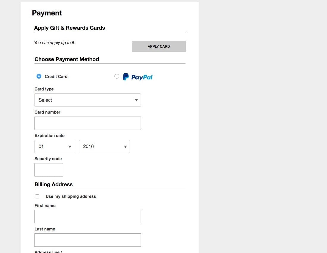
Users generally had less confidence in the security of their credit card details on pages where the credit card form fields didn’t look or feel more secure than the rest of the form fields used for far less sensitive information, such as seen here on Macy’s.
“People have lost everything you know, so I always check a 100 times before I purchase anything,” a user said, being meticulous before entering her credit card information. Users continue to feel uneasy about sharing their payment information with e-commerce sites.
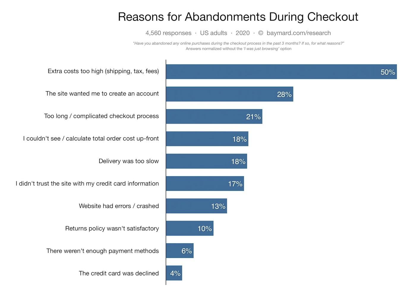
Our most recent quantitative study into user’s reasons for abandoning the checkout shows the range of reasons why user do not complete a purchase.
In fact, our quantitative study about reasons for checkout abandonments reveal that 17% of users have abandoned a checkout flow during the last 3 months because they didn’t trust the site with their credit card information (4,560 respondents, matched with average US internet population, 2020). Over the past 11 years of testing checkouts, we’ve consistently observed 2 important user behaviors relating to security:
- Depending on the design, users perceive parts of a page to be more secure than other parts of the same page.
- We consistently see that the average user’s perception of the site security is largely determined by their “gut feeling” which, beyond how much they trust the brand, is to a large extent observed to be directed by how visually secure the page looks.
For example, the parts of the checkout page with security icons, badges or reassuring microcopy and a general visual “robustness” are often perceived as being more secure, while parts without these visual clues inspire less confidence despite the fact that these input fields were all part of the same form on the same page.
From a technical perspective, this of course doesn’t make any sense, as all the form fields on an HTTPS-page are equally encrypted. However, most users don’t have these technical insights and will likely perceive some parts of the checkout page as more secure than others, whether it’s logical or not. During testing, we see two design aspects to perform particularly well when it comes to establishing a sense of security.
(It’s important to underscore that we see that test users exhibit almost no security concerns during checkout steps that ask for address, shipping methods, contact info, and similar. The security concerns arise only as users are confronted with the credit card interface.)
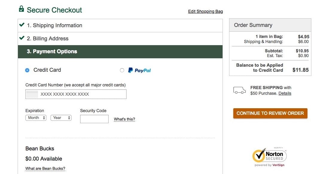
L.L. Bean offers a security badge within the checkout and in reasonable proximity to the credit card fields, along with a minimum encapsulation of the form fields. That said, addressing users security concerns is one of the weaker aspects of their credit card form design. A stronger visual reinforcement of the field section and close badge proximity would make the page better address security concerns.
One way to increase the perceived security of sensitive fields is to visually encapsulate them. This can be achieved by using borders, background colors, shading, and other visual styling that will make one part of the form seem more robust than the rest — as explored in our How Users Perceive Security During the Checkout Flow — Incl. New ‘Trust Seal’ Study 2020 article.
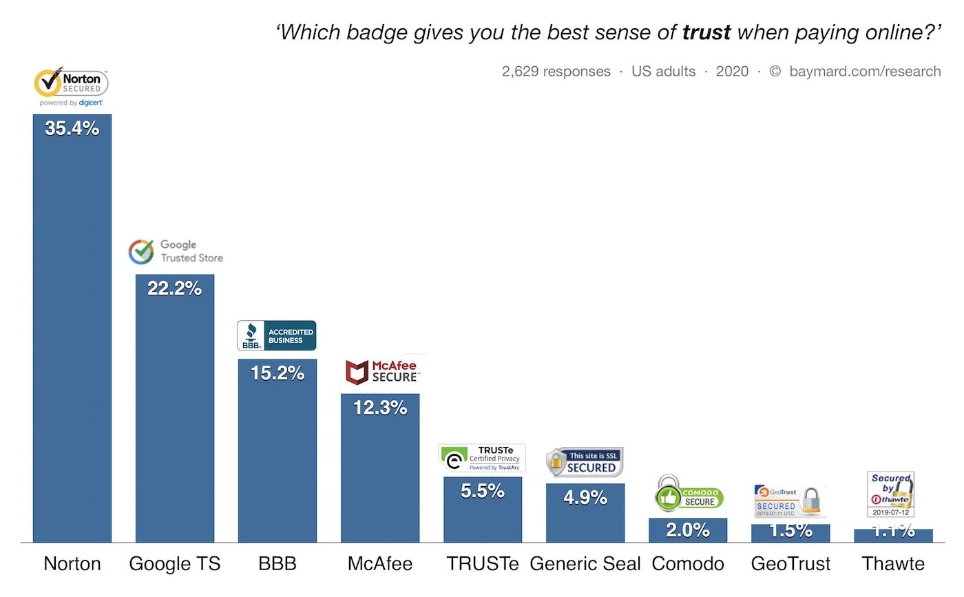
Another visual clue observed to be effective is using logos, SSL badges, and similar visual clues to indicate the site is trustworthy — like Norton, TRUSTe, Geotrust, Google Trusted Store, etc. Generally, we see during testing that adding any such visual icons increases users’ general level of perceived security. However, when looking a little deeper into which seals and icons inspire the highest level of confidence in users, we’ve conducted five quantitative studies testing various site seals, one in 2013, one in 2016, one in 2017, one in 2019, and one in 2020.
The results indicate that beyond the most recognized brands, which seal is chosen is of less importance. What’s most important is making sure there’s some kind of site seal present that makes users feel secure.
For more on the perception of security during the checkout, see our article How Users Perceive Security During the Checkout Flow, that also show more examples of stronger visual reinforcement of security that L.L. Bean provides.
4) Make Credit Card Icons Secondary in the Payment Interface (63% of Sites Get it Wrong)
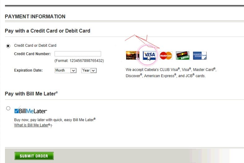
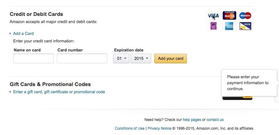
Users on Cabela’s and Amazon tried clicking the card icons to select their payment method, but were in doubt about what the site’s lack of response meant. “Isn’t there any VISA [available, ed.]?” and “‘Add card’. Aren’t you supposed to select the type of card first? Maybe you’re not”, said two of the users.
At the payment step in the checkout flow, many sites use a row of credit card icons that are meant to illustrate the payment methods that are accepted. Also, during testing, the majority of users also misinterpreted static card icons as being a selection they had to make. In fact, 61% of the users thought that they had to choose their card type by clicking the static card icons. When nothing happened, they were confused and unsure of how to indicate their card type.
Now, it’s not that strange that more than half of users may misinterpret static card icons for clickable buttons as:
- Several sites do require users to manually select their card type by clicking on a card icon, hence it’s inconsistent across sites if a row of card icons is something you have to click or not.
- A small rectangular static card icon is almost indistinguishable from a small rectangular card icon button. Users have to click on it to see the difference.
During testing, users eventually figured out that the card icons weren’t clickable. However, the icons proved a distraction for a majority of users — some made multiple clicks before proceeding. In particular, when card validation errors occurred, some users mistakenly thought that the error was caused by a missing card type selection. After 61% of users tried to select their card type by clicking the static card icons in the payment interface they eventually returned to the credit card number field and entered their number.
Given that the credit card input is already by far the most complex input during the checkout flow, eliminating even seemingly small bumps on the road is recommended — firstly by auto-detecting the card type, then by significantly reducing the visual emphasis of the card icons in the payment interface to ensure that users don’t misinterpret them for a choice of card types of which they have to select one.
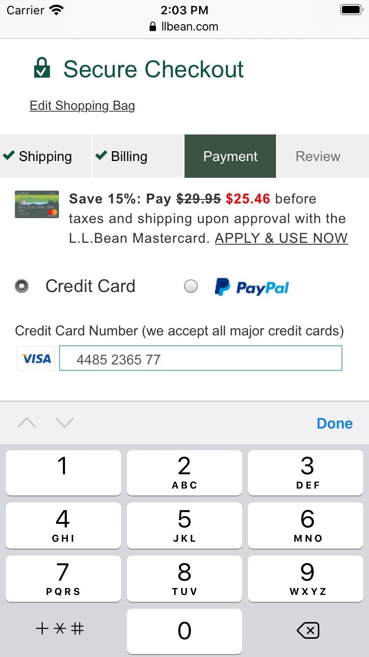
L.L. Bean autodetects the card type when the first few numbers are entered. The site also notes using microcopy that all major credit cards are accepted.
Sites that do not accept all of the major credit cards like VISA, MasterCard, AMEX, Discover, JCB (along with local card type important to a subset of the site users, like China Union Pay, etc.), still need to show their users what card types they do accept, hence, the card icons shouldn’t be removed from the payment step altogether. The card icons should instead be styled and positioned to indicate that no active selection has to be made.
An alternative and decently performing solution observed for sites that accept all major credit cards is to not have a full row of card icons in the payment interface, but instead show the icon for the auto-detected card type within the card number field itself. If removing the card icons entirely, they can also be substituted by text instead, e.g., “We accept VISA, MasterCard, American Express…”.
Generally, card icons shouldn’t be placed before or above the card number field. A well-performing design is to move the card icons to the right of the card number field. This allows users to see the card number field before the icons will help to clarify that an active selection is not necessary.
5) Match the Credit Card Field Sequence to the Physical Card’s Information Sequence (36% of Sites Get it Wrong)
“Ah I put the card number here [in the “Name on card” field], okay I just put it back here”, a user said, when recognizing his error before continuing. Just over 1/3 of the users that encountered this layout inputted their credit card number in the “Name on card” field.
Part of the reason that the credit card input is so error-prone is due to the fact that, unlike almost all other form fields during checkout, users don’t know the input by memory, but instead have to manually transfer the long strings of numbers printed on their physical card to the website interface. When users are tasked with inputting information that is being taken directly from a physical object, it’s helpful to have the sequence for the digital input match the physical layout.
During testing, a credit card field sequence that didn’t match the physical card sequence caused slower form completion for all users, but more importantly also caused invalid inputs for some users.
Users are likely to enter information in fields in the same order in which they appear printed on the physical card. When the form fields that are to contain this information are presented to users “out of order”, errors are bound to occur, where users enter the information seen on the card in the wrong form fields.
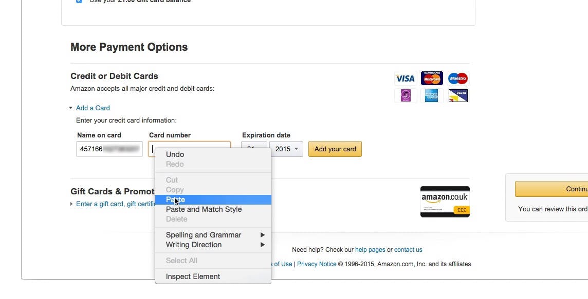
At a minimum, this causes needless form-filling friction, but it may also lead to security issues as users copy/paste sensitive card information (as observed during testing), not to mention needless card validation errors for those users who end up submitting the form. In particular, not having the “Card Number” as the first form field was observed to cause issues.
Besides typing data into the wrong form fields, there’s another, more subtle, typing interruption caused by a form-field sequence that doesn’t match what’s printed on the card: users have to flip the card more than once. For VISA and Mastercard cardholders (most cards other than AMEX), the card number, expiration date, and cardholder name are printed on the front of their card, while the security code is printed on the back. Hence, if the security code is not asked for last in the field sequence, users will have to “type > flip > type > flip > type”, instead of “type > flip > type”, making for a less-efficient typing flow. While a UX detail, note how the technical resources required to fix the field sequence are close to zero.
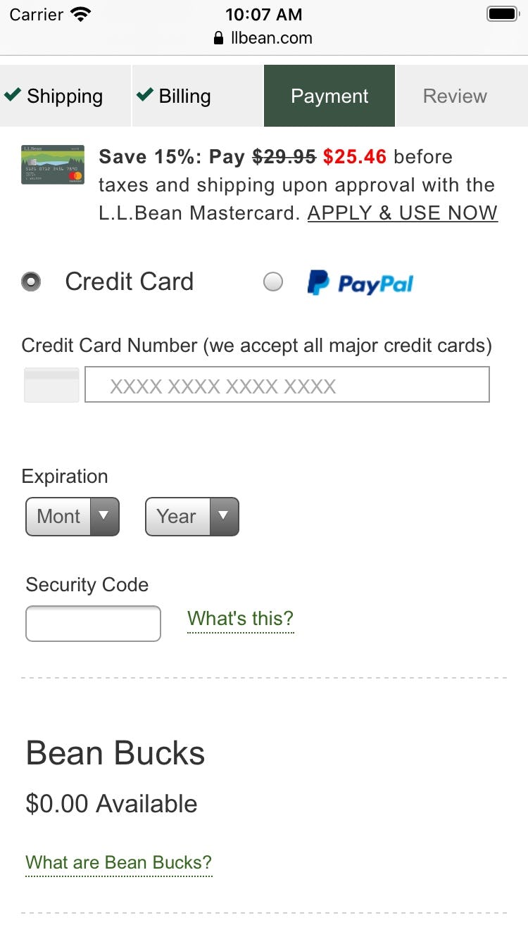
L.L. Bean, like many sites, opts to remove the “Name on card” field entirely. The resulting interface has less clutter, and, overall, the credit card form fields are less intimidating (especially on mobile devices). Here L.L. Bean has the perfect sequence for the credit card fields: “Card number”, “Expiration date”, and “Security code”.
The simple solution is to match the order of the credit card fields to what is presented on the physical card. Typically, this will be:
- Card number
- Expiration date
- Cardholder name
- Security code
It doesn’t matter whether or not the “Cardholder name” field is prefilled or not, as indicated by our testing. What does matter is the field sequence.
Despite the low cost of implementation, this issue is relatively widespread. Our current benchmark shows that 36% of sites don’t match the credit card field sequence to the physical card’s information layout, which is actually worse than the 28% of sites that had this issue in 2016.
Becoming Best-in-Class
Our most recent benchmark shows that L.L. Bean is on top when it comes to their credit card form implementation, as they manage to get the following right:
- Luhn validate the credit card number field – which 53% of sites don’t.
- Autoformat spaces in the ‘credit card number’ field – which 51% of sites don’t.
- Visually emphasize the security of the credit card fields – which 68% of sites get wrong.
- Make credit card icons secondary in the payment interface – which 63% of sites don’t.
- Match the credit card field sequence to the physical card’s information sequence – which 36% of sites get wrong.
However, that is not to say there’s no room for improvement, or that their overall checkout is best-in-class as a whole — that accolade goes to Crutchfield, with Build.com in second, and L.L. Bean in third.
L.L. Bean is just one source of inspiration for a well-implemented credit card form and checkout as a whole. For inspiration you can see another 129 desktop and 60 mobile examples of Credit Card Forms from other retailers in our Page Design tool.
This article presents the research findings from just 1 of the 650+ UX guidelines in Baymard – get full access to learn how to create a “State of the Art” ecommerce user experience.

