Video Summary
Typing a 15-16 long string of numbers without a single error can be challenging for most users – yet, it’s what all users have to do during the checkout flow as they reach the ‘Credit Card Number’ form field. During our large-scale checkout usability study we observed that a large sub-group of users struggle with correctly typing their 15-16 digit credit card number, and subsequently struggle with verifying that it’s typed correctly. During testing this was observed to be the direct cause for checkout abandonments as users got card validation errors due to simple typos.
The long 15-16 digit credit card number is very prone to typos and we observed 23% of users to either type or verify their card number in distinct 4-digit blocks – identical to the physical print on most credit cards.
Our test sessions also revealed that allowing users to type spaces and auto-formatting their card number with spaces can greatly improve users’ accuracy when typing their credit card number, and help them to more easily check that their typing is valid. Yet, our research also show that 80% of e-commerce sites currently don’t use this powerful typing aid for their credit card field.
In this article we’ll therefore present our test findings on the following:
- How users type their card number and why 23% of users are observed to type or verify their card number in distinct 4-digit blocks.
- Why it causes severe usability issues when sites disallow spaces in the card number input (never do this!).
- How auto-formatting spaces was observed to lift input accuracy and lower abandonment rates due to fewer card validation errors.
- How the technical implementation should handle card types with “odd” formatting (AMEX, Diners, etc).
Why 23% of Users Type or Verify Their Card Number in 4-Digit Blocks
There are two key test observations as to how users behave a) after having typed their card number, and b) when typing their card number.
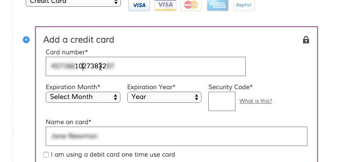
“I always check. I just check on the card that the numbers are right… I click between [every 4th digit, ed.] so I can gauge it.” This subject explained her method for checking to make sure that the card number is inputted correctly. Note the placement of the cursor in the card number string.
Firstly, during testing, subjects tended to be extra careful when inputting their card number. Oftentimes we observed that test subjects, after having inputted their credit card number, double-checked it to make sure the it was correct before submitting the form. A single typo when transferring the 15-16 digit numeral string printed on the physical card into the card number form field will cause a validation error. But in practice it’s often worse than just an error.
Many users have – likely due to poor prior general checkout experiences, typically on other sites – come to suspect that a card validation error may also clear out all of their typed card data, hence a transposed digit will force them into re-typing their full credit card data. Indeed our checkout benchmark reveals that even among the 50 top-grossing US e-commerce sites, 18% still clear out the user’s entire card number on just the smallest typo.
It’s therefore not that surprising when we during testing observed a sub-group of users meticulously double-checking their card number after having typed it by nearly always looking from the physical card to the typed number on the screen, and using the mouse cursor to inspect the typed number in 4-digit blocks.
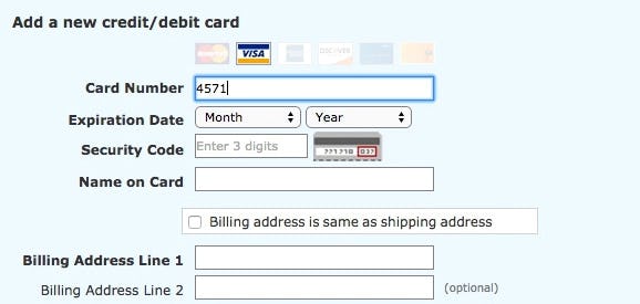
At Walmart, this test subject has begun to enter his credit card number. The subject would enter 4 digits from his card into the “Card Number” form field, then look down at his credit card for the next 4 digits, enter those, and so on until the entire number had been entered. Several subjects “chunked” the card number into 4-digit groups, rather than entering all 16 digits in one go.
Secondly, besides double-checking their card number after entry, the test subjects were often observed to enter their number in the same format in which it is embossed or printed on their physical card. For most credit cards (although not all), this is a 16-digit string with spaces between every 4th digit (later in the article we’ll elaborate on the cards that deviate from this pattern).
During testing, 23% of the subjects were observed to type and/or verify their card number in these distinct 4-digit blocks. Yet many sites returned validation errors whenever these subjects also typed in spaces, something we found to be a major source of usability issues.
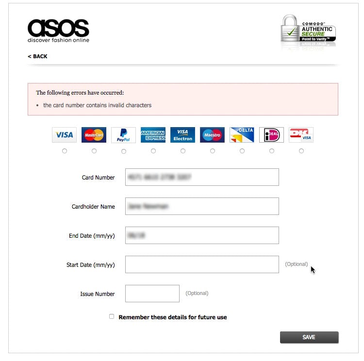
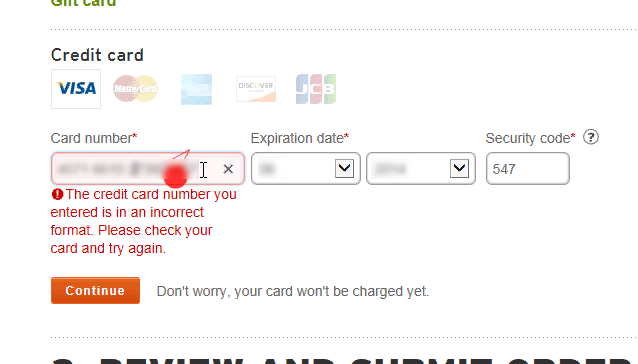
“If we assume the card is working then I’ve typed something wrong – but otherwise it’s because it’s an invalid card. So I really can’t get any further.” This test subject had entered a space after every fourth digit in her card number. After trying to submit the form, she received a validation error (due to the spaces), but assumed the validation error was due to the card being rejected and ended up abandoning the order.
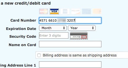
“I’ve typed spaces in between [every 4th digit, ed.], like there is on the card. I thought they should be there, since it’s on the card.” This test subject began to enter the credit card number, adding a space after every four digits. When she wasn’t able to enter the entire number – as American Eagle has a 16-digit character limit on the field – she became confused, unsure of what was wrong.
Card numbers on physical credit cards often contain spaces to help make the number string easier to read. Users sometimes interpret these spaces as being part of the number string and are liable to include them when they are inputting their credit card numbers into the “Card Number” field. However, some sites do not allow spaces in the card number field, resulting in validation errors for users who simply type exactly what they see on their card. Combined with the often highly generic card validation error messages (see Improve Validation Errors with Adaptive Messages), this can result in checkout abandonments, as seen in the test session example above.
Allow Users to Type Spaces
As a first foundational step, it’s crucial that users are allowed to include spaces in the “Card Number” field. Allowing spaces in the card number input means that users can type exactly what they see printed on their physical card. As a nice bonus, it also makes it a lot easier for the user to validate their card number input. “4571661027381607” is simply more difficult to visually validate than “4571 6610 2738 1607”.
Within the “Card Number” field spaces should not provoke validation errors or be stripped from the displayed input. If your card payment processor doesn’t accept spaces submitted, then the spaces can instead automatically be removed before submitting the form to the server (simply create a JavaScript EventListener that binds to the form and then use a regular expression to detect and wipe out any whitespace characters in the card number input just before it gets sent along to the server for processing).
Another subject encountered a card validation error at REI because he’d accidentally added an extra “0” in the credit card number. He tried adding a space after every 4th digit, however, there was a character limit on the field so after adding the 3rd space nothing happened. Highly confused, he began looking at the other credit card fields and re-read the error message. Unable to spot the error he ended up submitting the wrong input 3 times in a row.
Additionally, some sites, rather than provide an error, simply limit the allowable characters in the “Card Number” input field. This is not recommended. Besides inherently disallowing spacing, it can also have drastic consequences for a smaller sub-group of users since not all card numbers are 16 digits long. While most credit cards are 16 digits, there is variance: AMEX is 15 digits, VISA has reserved the right to use 13-19 digits, Maestro 12-19 digits, Solo and Switch have 16, 18, or 19 digits, China UnionPay has 16-19 digits, and so on. A front-end character limitation, in practice, is bound to also completely lock out the few users with a card number length that deviates from the norm.
Auto-Format the ‘Card Number’ with Spaces
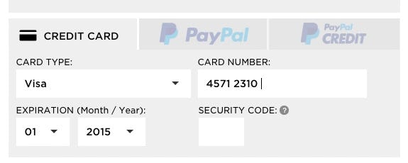
“It just formats it all,” a test subject said, positively surprised as he had entered his 16-digit VISA number (left), and Walmart then auto-formatted it with spaces for every 4-digit chunk (right).
It is clear from the test sessions that users aren’t just highly likely to make typos in their card number – it’s also difficult for them to subsequently validate this error-prone input. However, when testing sites that auto-formatted the user’s card number with spaces, the subjects were observed to experience a combination of easier correct typing of what they saw printed on their credit card, and easier subsequent validation of what they had typed.
Consequently, the subjects experienced fewer payment validation issues on sites that auto-formatted their card number input with spaces compared to those sites that didn’t. Therefore, if the user is typing a VISA or MasterCard card number, the input should be auto-formatted to include a space for every fourth digit.
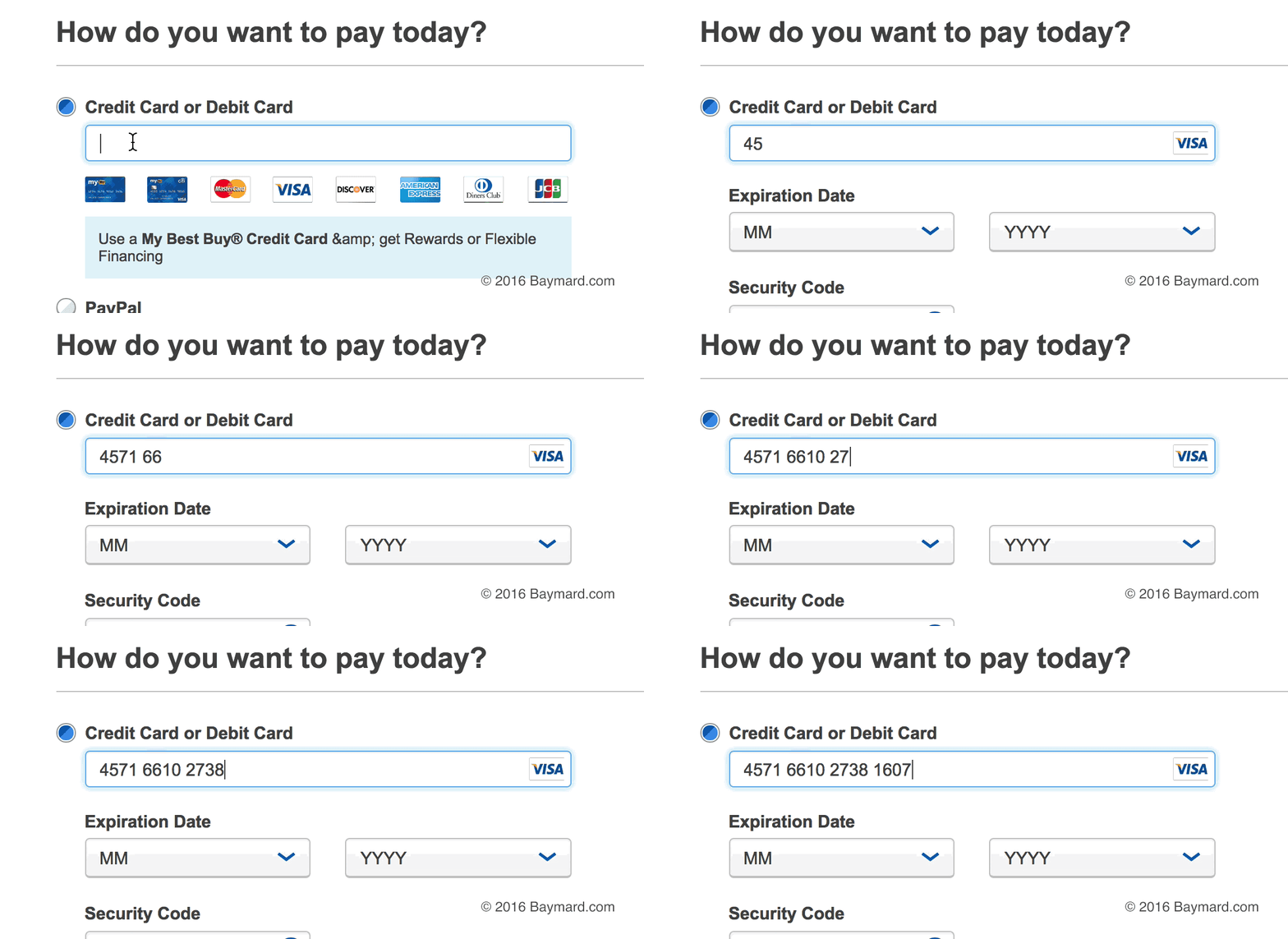
BestBuy auto-formats the user’s credit card number as it is entered.
Auto-formatting card numbers should ideally be accomplished live while users enter their card number (also known as an “input mask”). Input masking offers the benefit of allowing users to more easily check the card numbers because spaces are added while they enter them. Additionally, input masking alerts users to the fact that the card number will be formatted for them. If the number isn’t formatted until users leave the field they may not know that the auto-formatting will occur. Without live formatting, users may enter spaces needlessly (although spaces should of course never cause issues regardless of the input mask).
It’s worth noting how the concept of making the card input closely resemble what’s printed on the user’s physical card was also observed to apply for “Expiration Date” drop-downs, as we covered in Format the ‘Expiration Date’ Fields Exactly as the Credit Card (40% Get it Wrong).
Some Card Types Deviate from 4-Digit Chunking
When venturing into supporting auto-formatting of spaces, it should be noted that credit card issuers employ different space-formatting schemas. While the vast majority of cards and card types use 16 digits, chunked into 4-digit sequences – like all VISA, MasterCard, Discover, and JCB cards – a few card types deviate. The most important deviation is the 15-digit AMEX number which uses a 4-6-5 chunking. Any 19-digit credit card number generally uses 4-4-4-4-3 chunking.
Much like we did for our list of Cart Abandonment Rate Statistics, we’ve gathered information on a bunch of different card types and created a reference table you can use to implement card number auto-formatting. The table includes card number length, IIN ranges, and spacing patterns for 20 different card types.
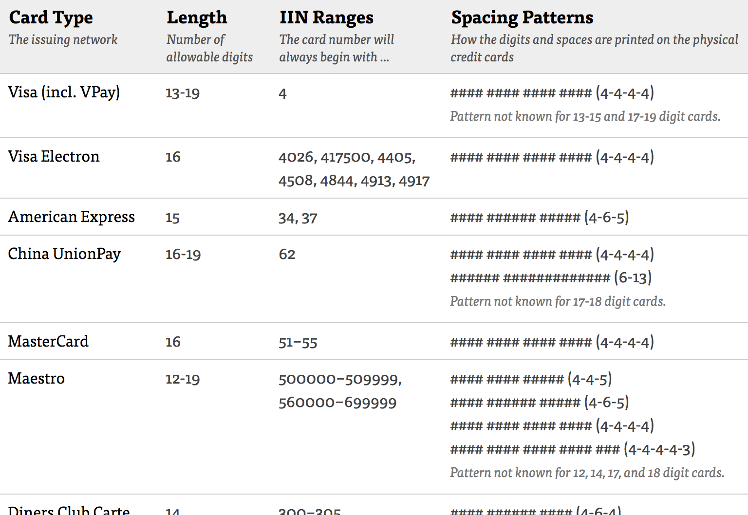
To make it easier to implement this auto-formatting feature, we’ve created a reference table with the IIN Ranges and Spacing Patterns of 20 different card types.
This means that the formatting of spaces, primarily for AMEX card inputs, has to change based on the card type. Luckily the card type can be auto-detected based on the first digits in the card number, where AMEX cards start with either “34” or “37”. To ensure a good return on investment, consider only supporting auto-formatting for the most common 15- and 16-digit cards, like VISA, MasterCard, JCB, Discover, and AMEX (and/or any card types that are particularly popular on your site). Given the rarity of cards that deviate from these two patterns, just allowing users to type spaces themselves will have to do for the “odd ones out” cards (typically it’s Switch, Solo, Maestro, Diners enRoute, Diners Club, and Carte Blanche, that deviate).
Auto-Formatting the ‘Card Number’ Input with Spaces
Considering that we found 5% of US users have abandoned one or more checkouts in the past quarter solely due to credit card validation errors, it’s staggering that 80% of sites don’t actively aid their users to more accurately type and validate the 15-16 card number input. Especially given the error-prone process of transferring the card number printed on the physical card to the on-screen form field.
At the most basic level all sites should allow users to type spaces in the “Card Number” field. That means sites should neither disallow the specific “space” input character nor set an input length limitation (e.g., limiting the field to 16 characters).
Ideally, the concept is taken further by auto-formatting all users’ “Card Number” inputs with spaces, knowing that this leads to fewer card validation errors – both because it increases the user’s accuracy when typing the card number and makes it easier for them to spot any typos afterwards. For 16-digit cards like VISA, MasterCard, Discover, and JCB this means auto-adding a space for every 4th digit users type. For 15-digit AMEX cards the auto-spacing should use a 4-6-5 pattern instead.
This article presents the research findings from just 1 of the 650+ UX guidelines in Baymard – get full access to learn how to create a “State of the Art” ecommerce user experience.


