Our large-scale UX research on e-commerce product pages reveal that 28% of sites are suffering severe user experience issues related to how they handle product variations.
More specifically, our product page usability testing showed that users couldn’t properly evaluate the products they were interested in when product variations weren’t interlinked or (more commonly) information about a product wasn’t synchronized across its variations.
For instance, having a description of materials for the blue variation of a t-shirt but not for the red variation. Or having 31 user reviews for the red variation of the t-shirt, but then only 9 user reviews for the blue variation, instead of combining them into a total of 40 user reviews displayed across both color variations. It’s one of our core product finding axioms:
“If the user can’t find it, it doesn’t exist (to them)” — Baymard Institute
Such separation of core product content across the variations of the same product is harmful to the user experience as users inevitably miss out on content that is critical to their purchasing decision. Indeed, during our usability test sessions, we observed this to be a direct cause for product and site abandonments.
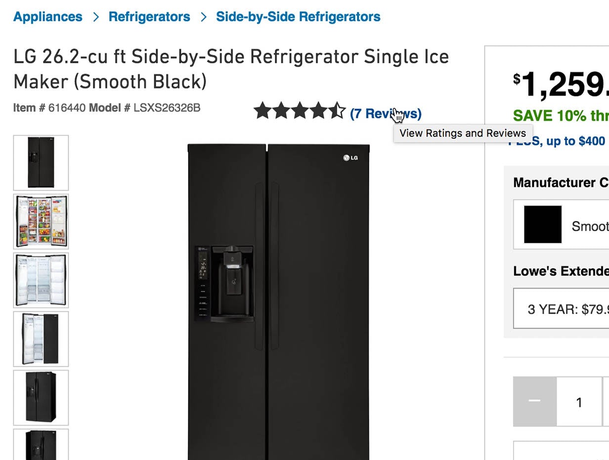
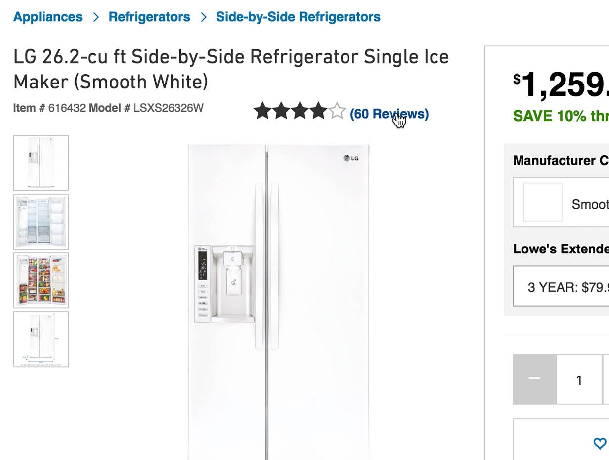
“Even though my colors are different the functionality should still be the same… it’s cumbersome going to each product [variation] to see how many reviews there are.” This attentive user during testing noticed that the number of reviews for the black version of a fridge at Lowe’s (left) was different from the number of reviews for the white version (right). Product reviews are critical to most users’ purchasing decision process and should be the same across variations of the same product.
Beware if you think this is simple or self-evident — our product page benchmarking revealed that 28% of major e-commerce sites fail at this. While most sites do recognize the importance of interlinking product variations and manage to do so, surprisingly many (we’re talking 1 in 4 sites!) fail on the second part: ensuring that core product information is replicated across all product variations so the user can fully evaluate the product regardless of which variation they happen to be interested in.
If you want to create a state of the art product page user experience you must, however, go further than interlinking product variations and synchronizing their information: you must also label variation-specific information to help users grasp the differences that do exist between the available variations. And there are of course exceptions to the rule: images should ideally be unique for each variation. Yet, when that isn’t feasible due to the cost of producing unique images for all variations of the product, then variation-specific images should actually be carefully mixed with universal product images and video.
Sharing information across products is clearly fraught with potential issues, but not doing it and consequently providing your users with insufficient visual information about each variation is even worse. So the question isn’t whether this should be done, but rather how to do it — and that is precisely what we’ll explore in this article.
Table of contents:
- Product variations must be interlinked to enable easy discovery and cross-navigation
- All “core content” should be replicated across all variations of the product
- Variation-specific content should be labeled accordingly
- Dealing with the special-case of images and how to avoid prohibitive content production costs
Product Variations Must Be Interlinked
Core issue: When product variations aren’t interlinked, many users will simply assume they don’t exist or aren’t available.
During our testing, failing to interlink product variations proved to be the direct cause for product and site abandonments, because users couldn’t find the product variation they wanted and therefore (falsely but understandably) concluded that the site didn’t carry that item. It’s back to that product finding axiom: if the user can’t find it, it doesn’t exist (to them).
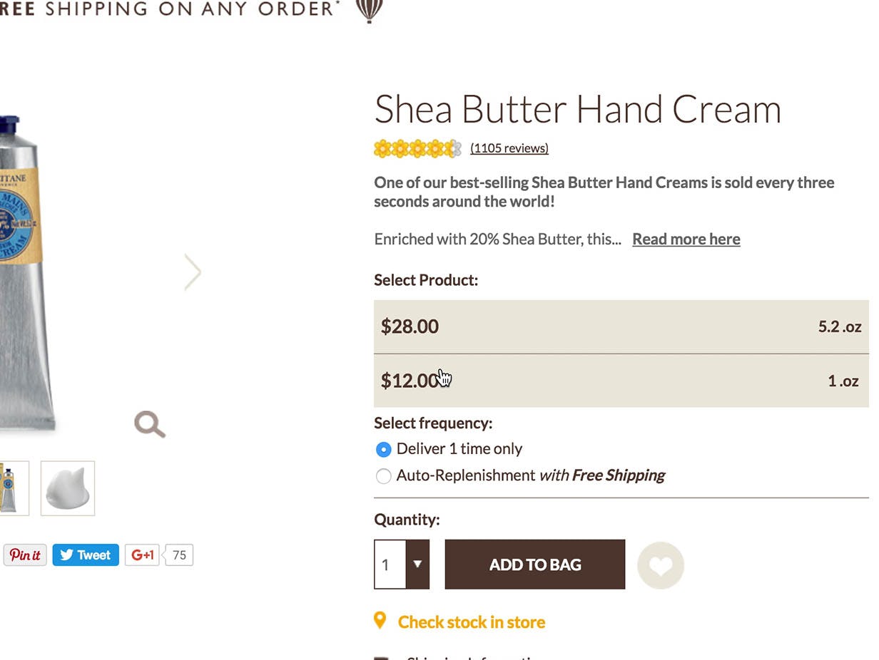
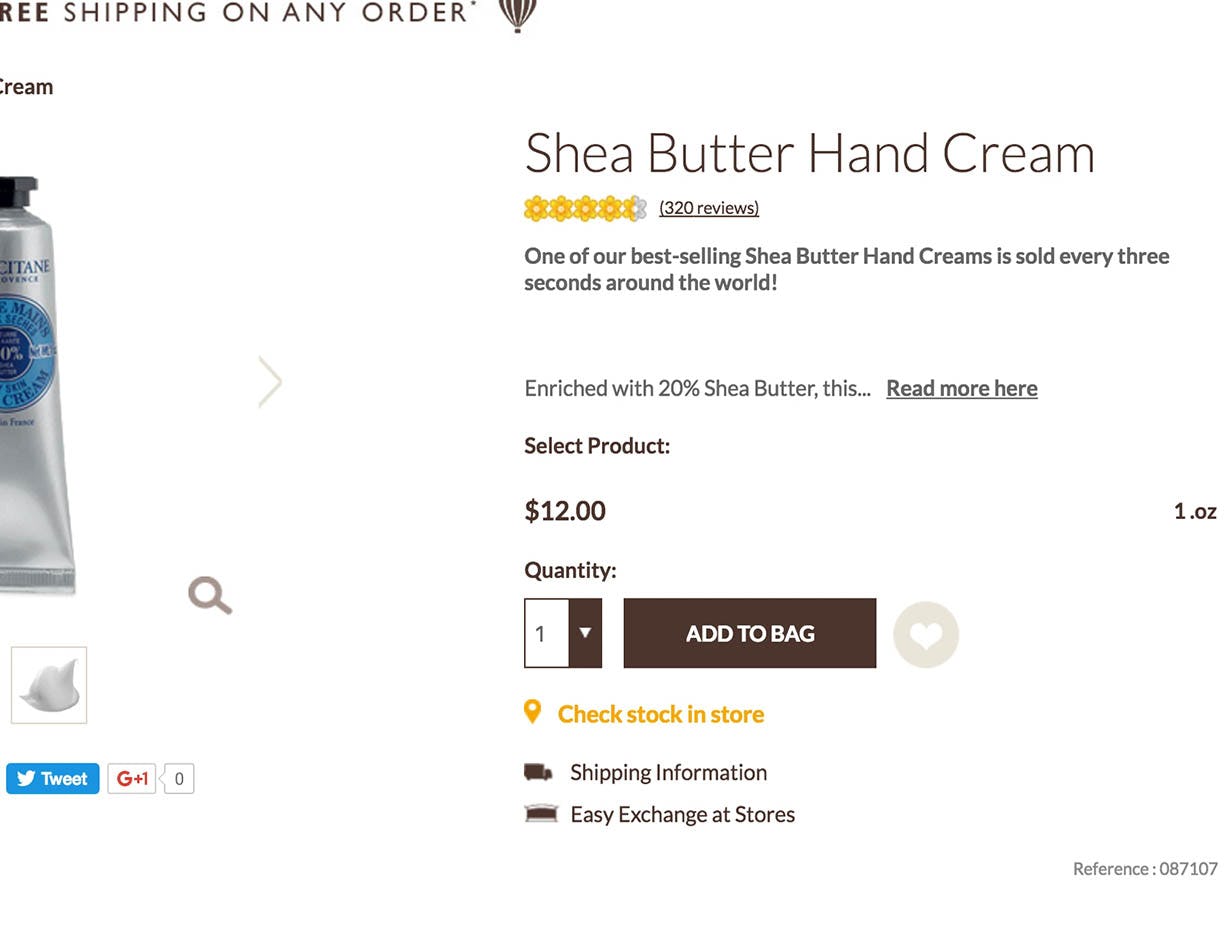
“Oh, I can get 1 oz for my purse,” one user explained during usability testing when she found a smaller size of hand cream at L’Occitane (left). She was surprised, however, when the page reloaded to display the 1 oz size (right): “That was weird… it knocked me to a new page when I clicked it. I didn’t like that, I just wanted to look at it.” Additionally, note that the 1 oz size doesn’t link to the 5.2 oz size; users who land on the page for the 1 oz hand cream have no way of knowing that there is a larger size available.
When observing an issue like this it is important to appreciate that the severity is two-fold: there’s the obvious loss of a sale here and now. However, what’s less obvious is that a misalignment occurred, too: the user concluded that the site didn’t carry that item, and therefore ended up with an inaccurate mental model of the site’s product catalog, perceiving it as being more narrow than it actually is. The site is thus liable to suffer long-term consequences, too, as those users are unlikely to return when looking for similar products, since users rarely go to sites they believe not to carry the items they are interested in.
It should be pretty self-evident, that if a user doesn’t believe you have a certain product, they won’t think of you when looking for it.
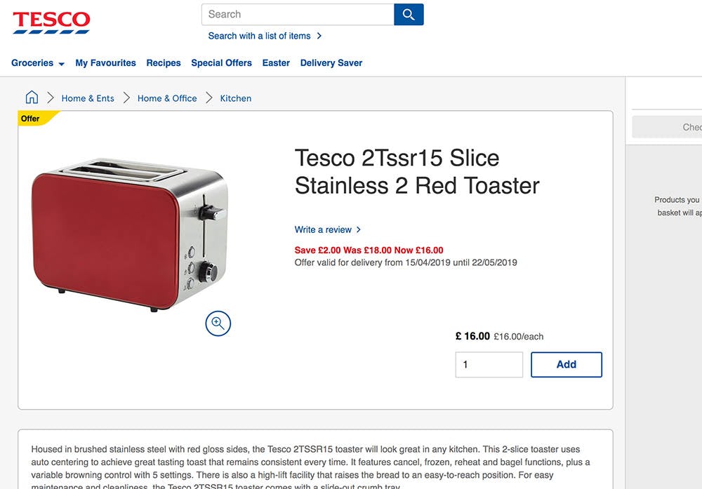
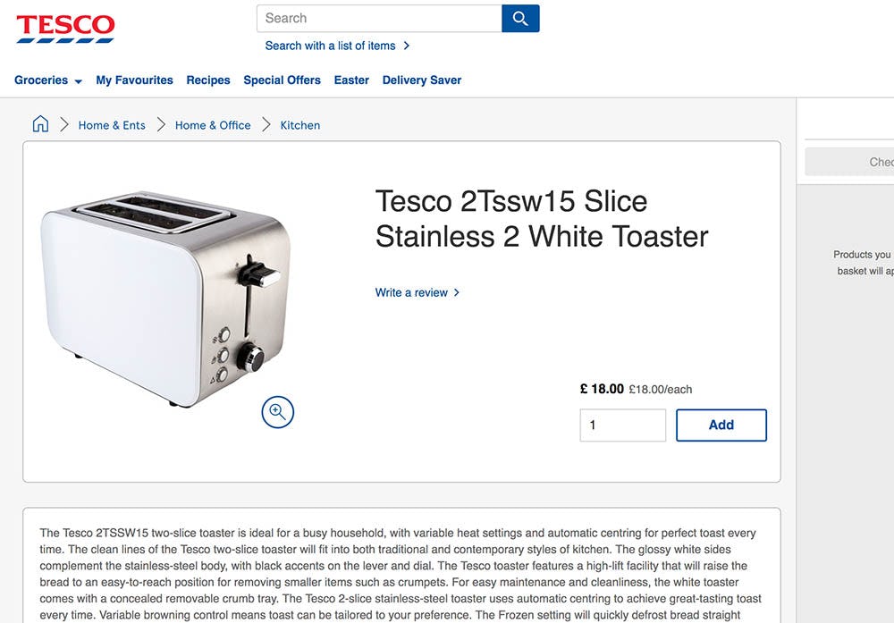
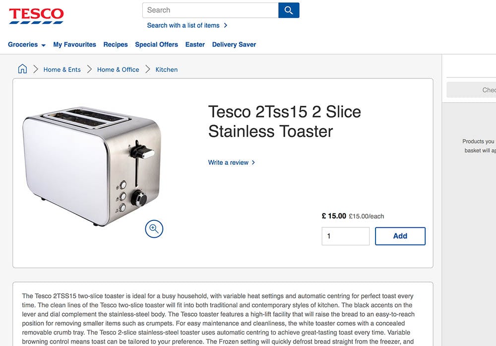
Tesco doesn’t interlink their product variations, so a user who lands on the red variation of this toaster won’t necessarily know that it’s also available in a white or stainless steel look.
Even those users who know (or simply guess) that other variations of the product are available on the site will have a needlessly difficult time navigating to them when the variations aren’t interlinked. In other words, the best-case scenario of failing to interlink product variations is that you provide a bad user experience.
At this point it is hopefully painfully clear that the page for variations of the same product should be interlinked to aide discovery and enable easy cross-navigation. Interlinking product variations is one of the most fundamental aspects of product page UX, and there are zero observed pitfalls to doing it — “get this right or go home”.
Aside: Interestingly, interlinked product variations may be thought of as a special type of ultra-relevant alternative product recommendation — they help the user narrow in on “just the right item” once they’ve nailed down the main characteristics of the product they’re interested in.
“Core Content” Should Be Replicated Across All Product Variations
Core issue: When important product information is sparse or flat out missing, users cannot make informed decisions about the product they are looking at.
During our product page usability testing, we observed that most users would assume that if a piece of product information wasn’t available for the variation they were currently looking at, then it wasn’t available on the site at all.
The users were very unlikely to explore product variations they weren’t interested in just to see if it contained more product information. For instance, a user exploring a fridge who wanted it in stainless steel would not click on the “Black” variation just to see if there should happen to be a product video or different Q&A content. The thought simply didn’t occur to most users.
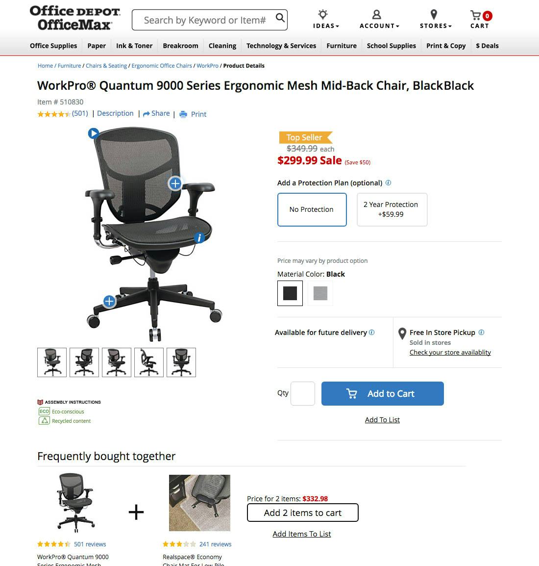
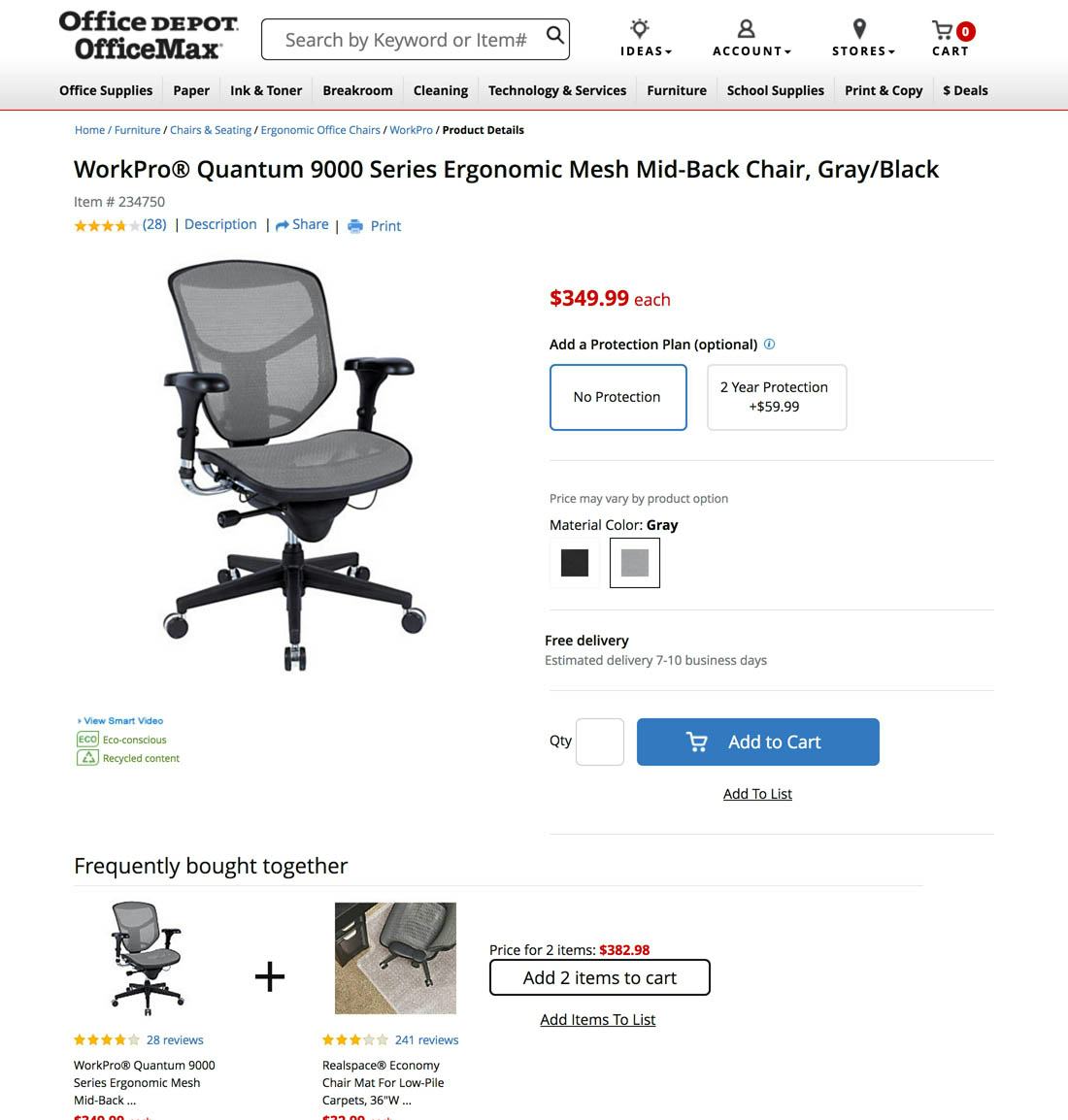
Notice how these two variations of the same chair at Office Depot offer widely different product information: the black variation has 501 user ratings, an image gallery, and an interactive default image, whereas the gray variation only has a single static image and 28 ratings.
Users are often moving quickly when examining a product page — they may be comparing multiple different products on a site, or they may be comparing products across different sites. It is wishful thinking to expect that users will slow down long enough to view every variation for a product just to see if additional content should be available.
In practice, this means that if product information isn’t replicated across all product variations, some users will inevitably miss out on content that is critical to their purchasing decision. Hence our earlier product finding axiom — “If the user can’t find it, it doesn’t exist (to them)” — applies to product information, too; when users cannot find a piece of product information, that content doesn’t exist to them. And when users cannot find product information that’s important to their purchasing decision, they are naturally less likely to buy those products.
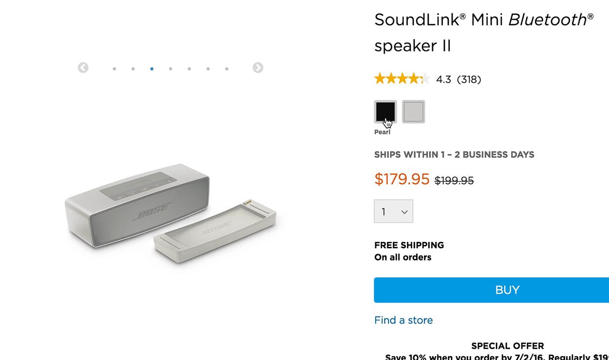
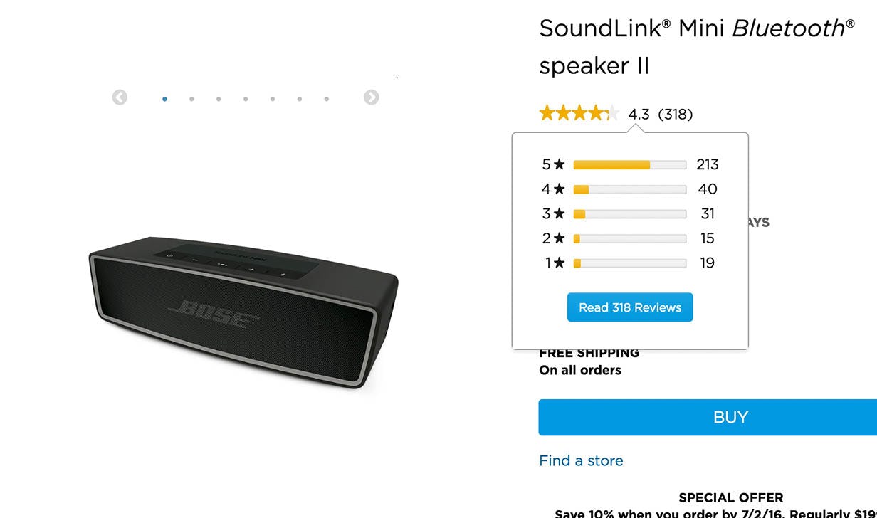
At Bose, the silver (left) and black (right) variations of the wireless speaker include the same user review content. Benchmarking shows that many sites fail to get this implementation detail right.
When failing to replicate “core content” across all variations of a product, the best-case scenario is that the user suspects the site may have failed to synchronize this information and actually goes through the laborious task of collecting the information they need by opening all variations of the product and mentally merging that information. During testing, we only observed users making this realization by accident, because they were unsure about which of two variations they wanted and therefore switched back-and-forth between them, and then noticed that some content was available for one variation but not the other.
The more common scenario when “core content” isn’t replicated across product variations is that users conclude the information is missing, and therefore decide to go off-site to search for the information they need to properly evaluate the product variation. The moment this happens, inertia kicks in: once a user has left a site to conduct product research, it requires a conscious effort of them to go back after having researched their options and decided on the exact item they want to buy. Worse yet, competitors suddenly get a chance to pick up the customer during their product research.
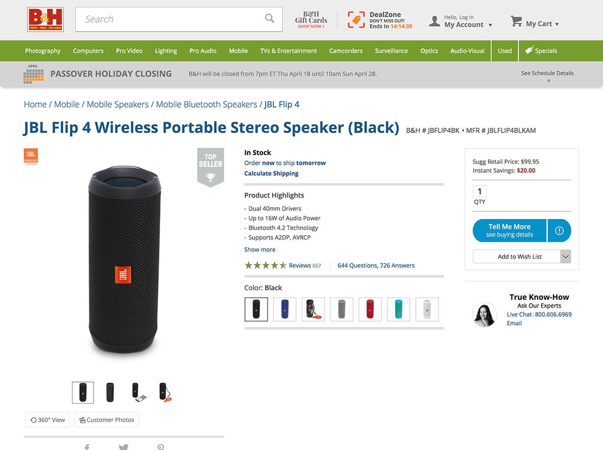
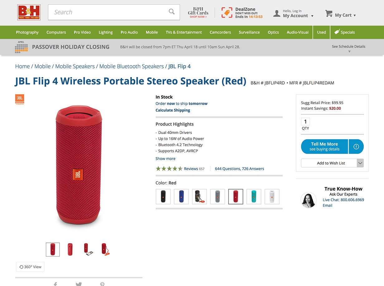
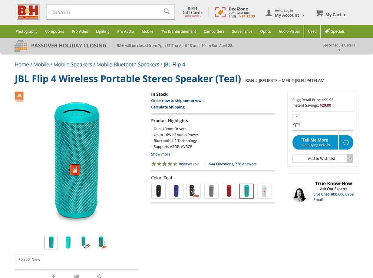
B&H Photo manages to get a lot of the details right — they synchronize: user ratings and reviews, questions and answers, a 360° view, and product specifications. (For perfection, the customer photos available for the black variation would have been shared in the other variations as well.)
So “core content” should be replicated across all variations of a product — but what exactly constitutes “core content”? Different users unsurprisingly have different information needs, so what’s important to one user is inessential to another. Hence a perfectly delineated categorization is probably not possible, but testing revealed that product reviews, images, videos, and product descriptions are crucially important to many users’ product-exploration strategy, while content such as Q&A sections and manuals were important to a subset of users.
Therefore, ensure that all of this product information is replicated for all variations available. The one exception to this is images, which is a special case that requires careful and deliberate synchronization (see the next section in this article for the precise logic and research insights related to this). If in doubt, err on the side of synchronization — during our research studies we very rarely observe issues with sites having too much product information available, but very frequently see issues arising from having too little.
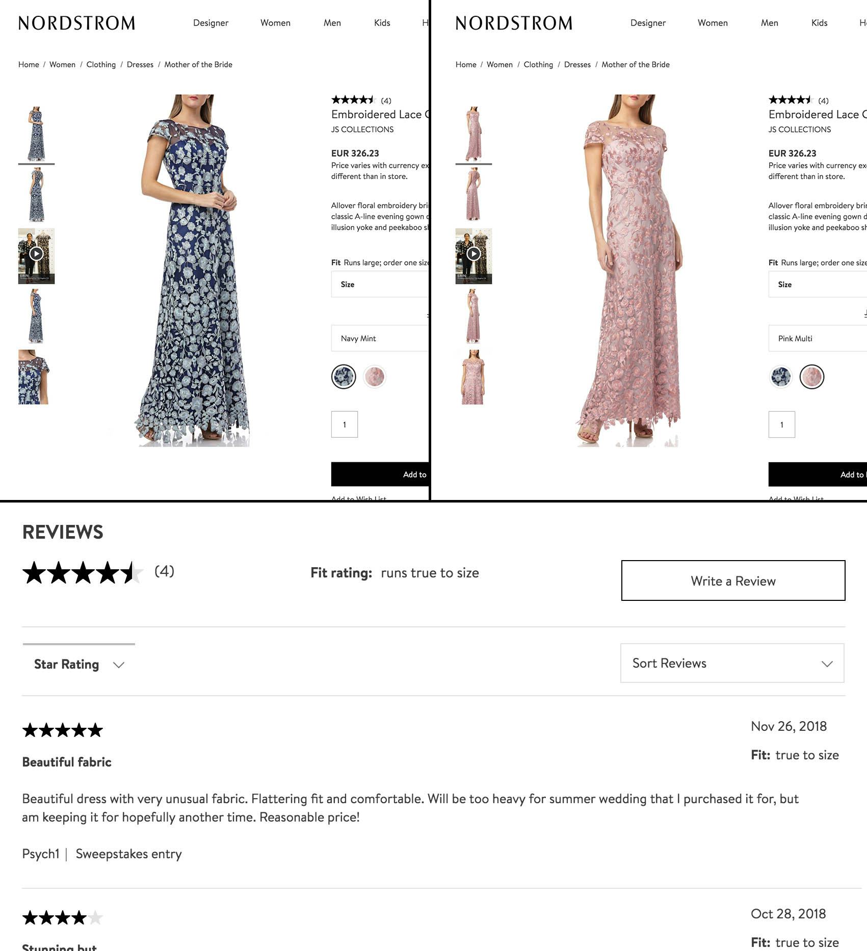
Our product page benchmarking of 60 major e-commerce sites reveals that user generated content (e.g. user reviews) is a particularly common oversight. Make sure to store and share this information across all versions of the same product. For example, a fridge that comes in black, white, and stainless steel should have one unified list of 78 reviews instead of three separate lists of 7, 60, and 11 reviews.
Variation-Specific Content Should Be Labeled Accordingly
Core issue: When product information is replicated across variations, the actual differences between variations can become less clear to users unless variation-specific content is labeled accordingly.
There is, unfortunately, one potential pitfall in sharing information across product variations: it can become more difficult for users to discern the differences that do exist between the different variations of a product. For instance, different color variations of a t-shirt may also be made from slightly different fabrics. Similarly, a wristwatch in size ‘Small’ will naturally come in different dimensions than one in size ‘Large’.
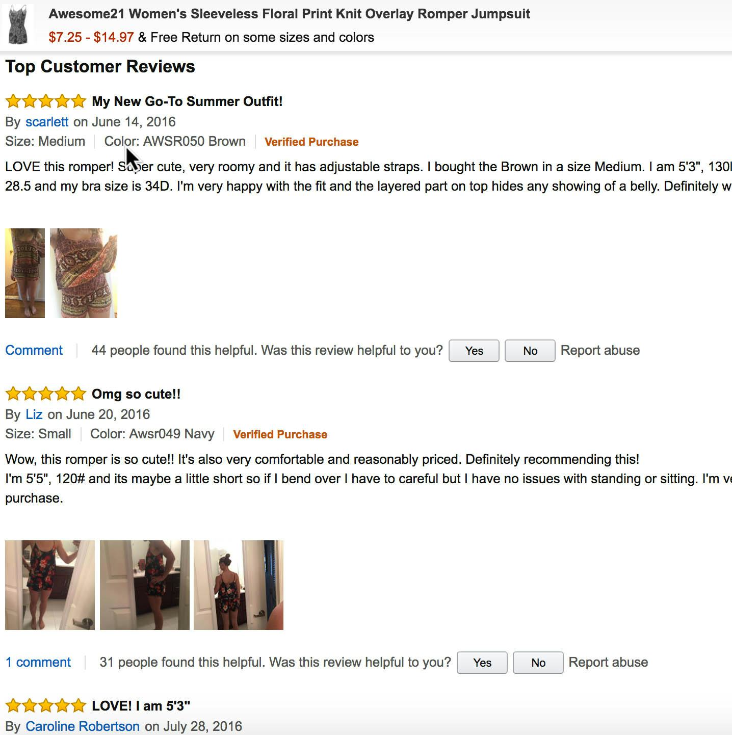
It is therefore essential that variation-specific content is labeled accordingly. Most notably, product descriptions and spec sheets must clearly outline any differences in materials, dimensions, ingredients, features, etc. It must be obvious what does and doesn’t apply to each individual variation. For user reviews, the product variation should be captured and displayed alongside the review, so in case a user writes “True to color”, the reader will know that they are talking about the “Blue” variation specifically.
So while it’s important to synchronize information across all product variations, it’s equally important to highlight differences. When there are important differences between product variations that are of legitimate concern to users, make sure that this is clear by having proper labeling of variation-specific content so users can make those distinctions.
Video and Images Are the Exception To the Rule (and How To Avoid Prohibitive Content Production Costs)
Core issue: Ideally all video and images are variation-specific, yet producing all this content is often prohibitively expensive.
Note: The below only applies to visually-driven product verticals.
During our testing, product pages where all the displayed images were of the chosen variation performed the best, as the user was able to get as much visual information about the product variation they were interested in.
However, when certain image types were missing from some product variations during testing (ostensibly due to the content production costs of producing numerous images for each and every product variation), the issues were severe — it was essentially a case of “missing core content”, with all the downsides that come from this as described earlier.
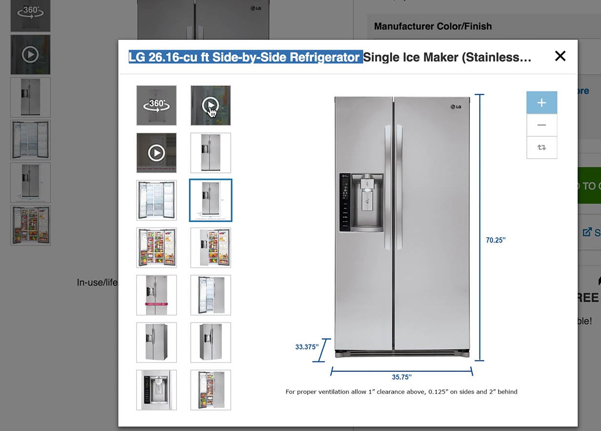
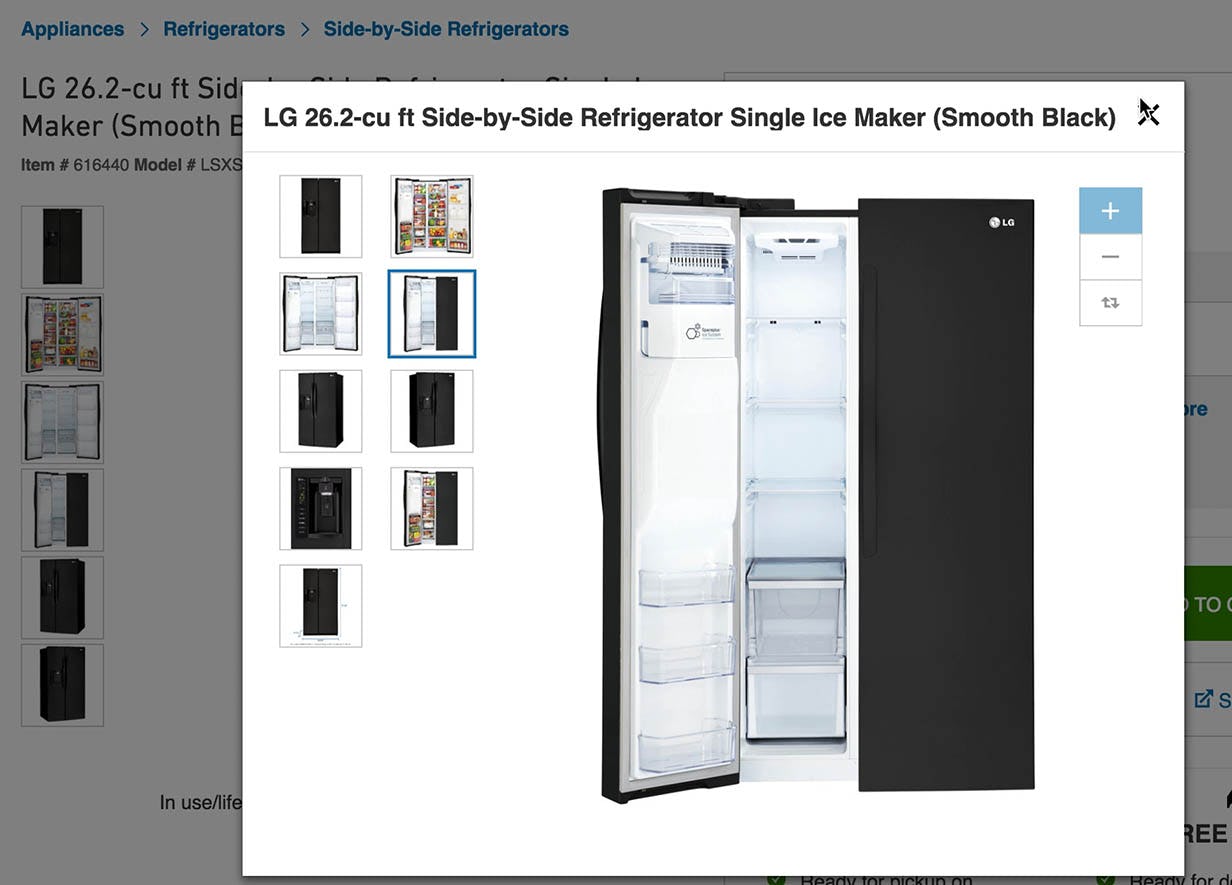
“If I went and chose my color first… I might not have seen the videos.” This test user was among the few that noted the silver version of a fridge at Lowe’s included extra content, including a dimension-image, two videos, and a 360° view (left), that wasn’t available for the black version of the fridge (right).
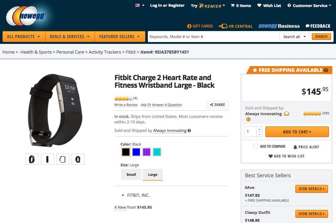
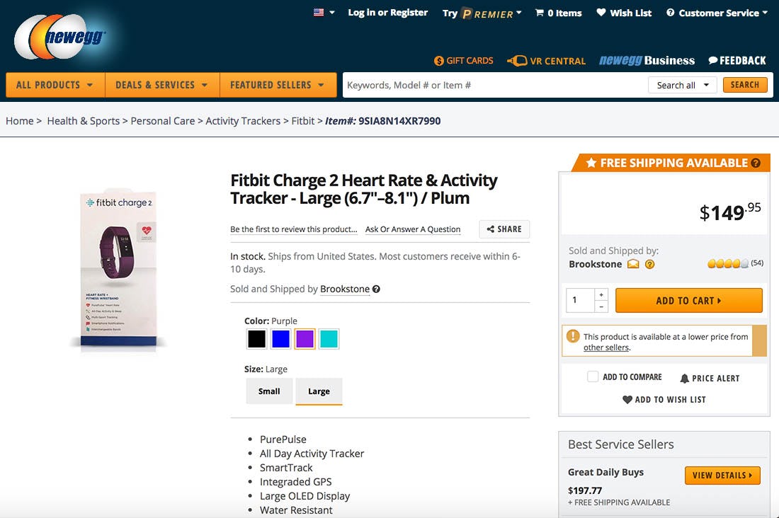
At Newegg, the ‘Black’ variation of the Fitbit Charge 2 product has four product images, while the ‘Plum’ variation only has a single image of the product packaging.
Luckily, our product page usability testing also revealed that video and most image types were fine to re-use across product variations, so long as unique variation-specific “Cut Out” and “Angle” images were provided. In other words, so long as a few images shot from different angles with a plain background were available for each variation of the product, then videos and auxiliary image types, such as lifestyle, scale, usage inspiration images, could be shared across all variations.
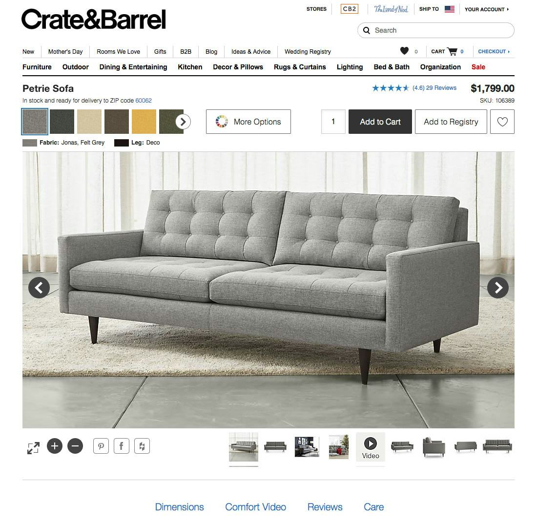
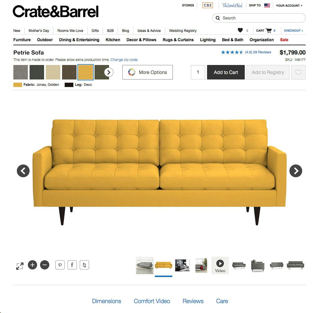
Crate & Barrel re-uses images of the grey variation (left) of this sofa across other production variations, such as the yellow version (right), presumably in an effort to vastly cut down on the content production costs. While a couple of additional images in the chosen color would be great, this approach still vastly outperformed only showing a single variation-specific image and nothing else.
Having 2-4 variation-specific images typically provided users with enough visual information so that when they saw pictures of other product variations they were able to mentally substitute it with their desired variation.
We thus have a ladder of implementations, going from bad to ideal:
- Bad: having a few variation-specific images and nothing else, with videos and auxiliary image types only being available for one variation.
- Good: having 2-4 variation-specific “Cut Out” and “Angle” images for each variation, and then sharing videos and auxiliary image types across all variations.
- Ideal: having variation-specific versions of all image types and videos.
Given the content production costs typically associated with option #3, and the marginal benefits it provides over option #2, option #2 will often be the best choice for most large e-commerce sites (better invest that money in other user experience improvements).
In Summary
If a user cannot find a product variation, or they cannot find core information about it, then in the experience of the user the content is not there. It doesn’t matter that something is technically available if the average user cannot find it.
Interlinking product variations is thus a no-brainer and should just be done, as there are no UX pitfalls in doing it and the downsides of not having them interlinked are major — both short-term and long-term. Most sites do get this right, but it is far from enough: for an acceptable user experience, you must go further and ensure all core product information is replicated across all product variations so that any given variation provides the user with all the information they need to evaluate the product.
This sharing, however, does require some special handling:
- Variation-specific content must be labeled accordingly so users can easily grasp and understand the differences that do exist between the variations, and
- Visual product information is a special-case, where auxiliary images and videos may be re-used to avoid prohibitive content production and maintenance costs, so long as 2-4 variation-specific images with a plain background and from different angles are available
Getting all of this right apparently isn’t easy, because our benchmarking reveals that 28% of major e-commerce sites fail at it. Make sure you aren’t one of them by seeing to it that all of your product variations are interlinked and that their information is carefully synchronized and labeled.

