Video Summary
The amount of content available on a typical mobile product page makes maintaining an overview and sense of orientation difficult for many users.
During our large-scale mobile usability testing, in an attempt to mitigate this issue, some sites placed some of the product page content on subpages.
However, on sites that used “subpages” for some product page information, a subset of users during testing were unable to find this information, while others who found the information had trouble retaining a sense of orientation or navigating back to the product page “main page”.
Yet our newest mobile benchmark reveals that 26% of mobile sites use subpages for some of their product page content.
If users fail to find critical information on the product page some will abandon, thinking, sometimes wrongly, the product won’t meet their needs.
In this article, we’ll cover our mobile research findings on mobile product page subpages, including:
- Why subpages may seem like an attractive way to structure product page information
- Why the most severe issue subpages cause should be enough for sites to avoid them altogether
- How a second subissue further makes subpages difficult to navigate for users
- How using “Vertically Collapsed Sections” resolves the issues caused by subpages
The Mobile Product Page Dilemma: Lots of Content, Little Space
Product page subpages are an attempt to resolve the dilemma of providing content on mobile product pages:
- Enough content must be provided so that users can get the product details they need
- Providing too much content directly on the product page can leave users feeling intimidated and overwhelmed
First, it’s important to note that users should be provided with all the content — images, videos, reviews, Q&As, manuals, product highlights, etc. — that could help them make a purchase decision.
Our testing has consistently shown that users — especially when getting ready to make a purchase decision — zero in on the content that’s most useful to them, and the right piece of content has often been observed to be the key factor in their decision to purchase a product (e.g., “I wasn’t sure that refrigerator would fit in my space, but that video made it clear that it would”).
Therefore, it’s never a good idea to omit content from a mobile product page for fear of overwhelming users.
That said, that leaves the second part of the dilemma unresolved: how to provide all the relevant content without intimidating or overwhelming users.
Users becoming intimidated or overwhelmed is a real risk, as comments from users such as “This is too much” or “There’s so much here…I can’t find what I’m looking for” are also common when a mobile product page has a lot of content.
Indeed, some of these users will abandon a mobile product page if they feel overwhelmed by the content and the way it’s presented to them.
To resolve this dilemma, 26% of sites in our mobile benchmark provide some product page content on the “main” product page, while hiding the rest on separate product page subpages.
Subpages could, in theory, resolve this issue, as the hidden content doesn’t bother users who aren’t interested, while users who are interested make it explicit that they’d like to view it by tapping the link to see the additional information.
Yet, in reality, during testing this led to 2 severe issues.
Issue 1: Content Is Useless if It’s Never Found
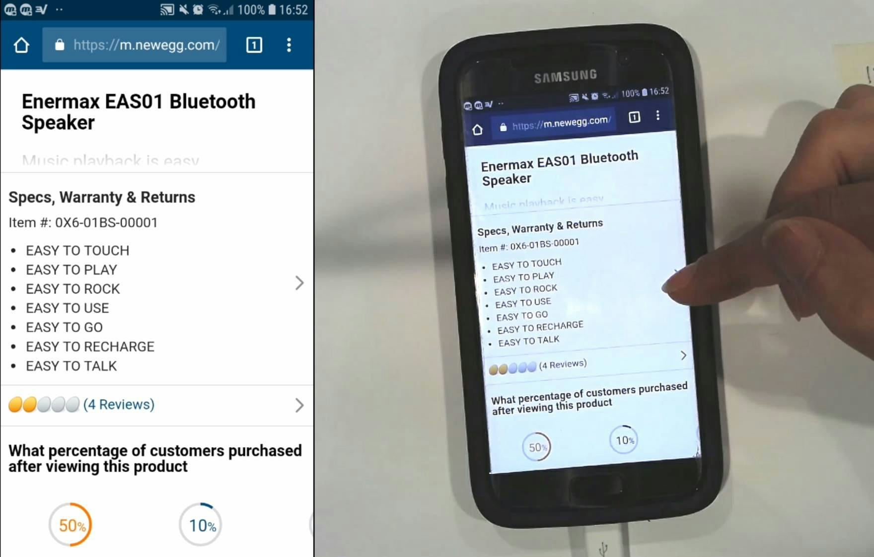
“Jeez, they really don’t give much information.” A subject at Newegg wanted more information on a product but didn’t think to tap the arrow to see information on a subpage. She abandoned the product because of this.
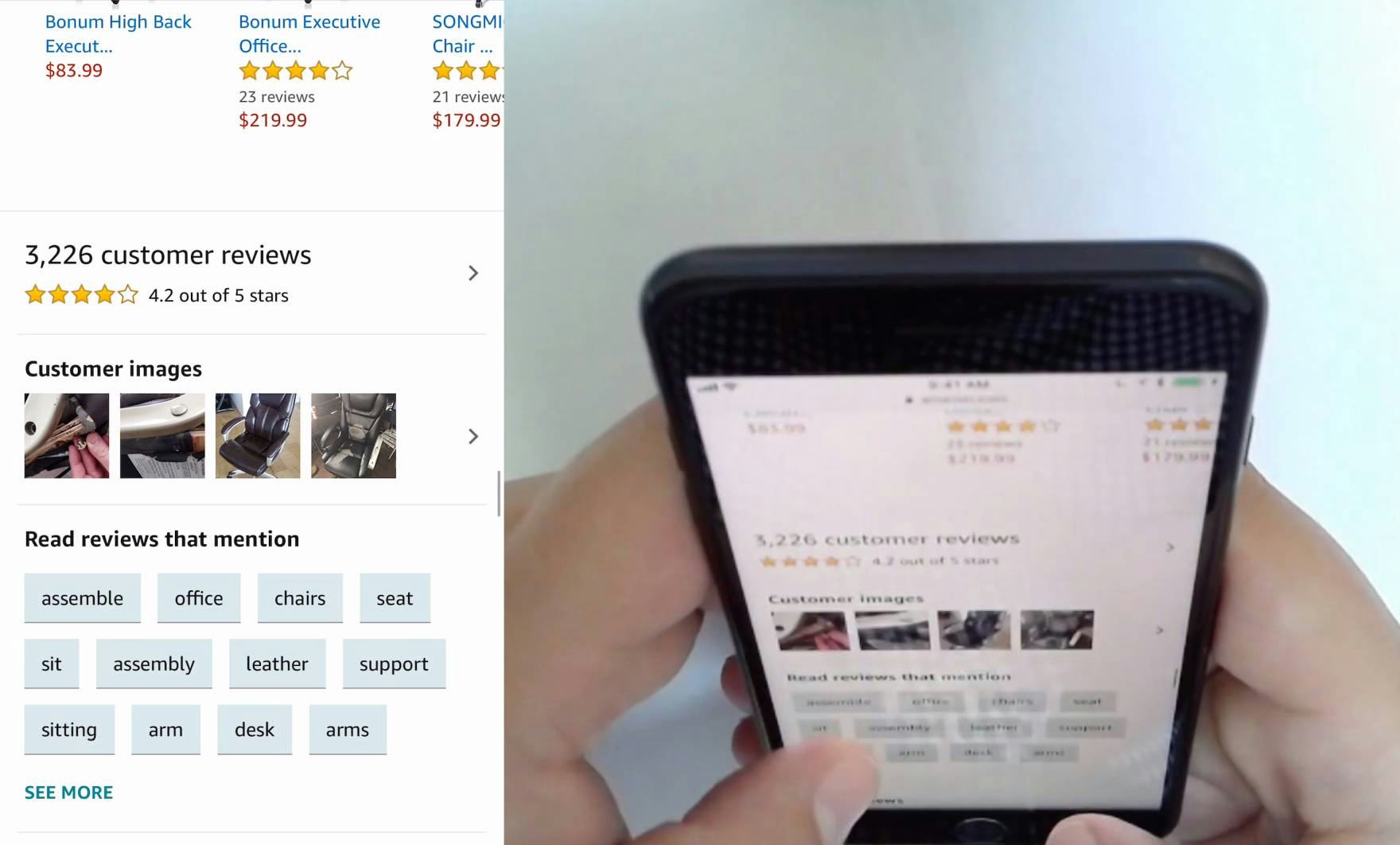
“I was looking for the star chart.” A different subject at Amazon similarly didn’t tap an arrow to view the reviews subpage, which would have contained the distribution star chart he was looking for.
During testing, the most severe issue caused by mobile product page subpages was that a subset of users missed the link to the subpage.
This left them with a very poor content experience, as they thought that the only content available was the content on the “main page” of the product page.
Many abandoned at this point, as they felt that they couldn’t get answers to some of their basic product questions, or thoroughly investigate the product’s features.
It’s also worth pointing out that the concept of having subpages within the product details page breaks with the general desktop web convention of “1 product = 1 product details page”, which has existed on desktop for more than two decades.
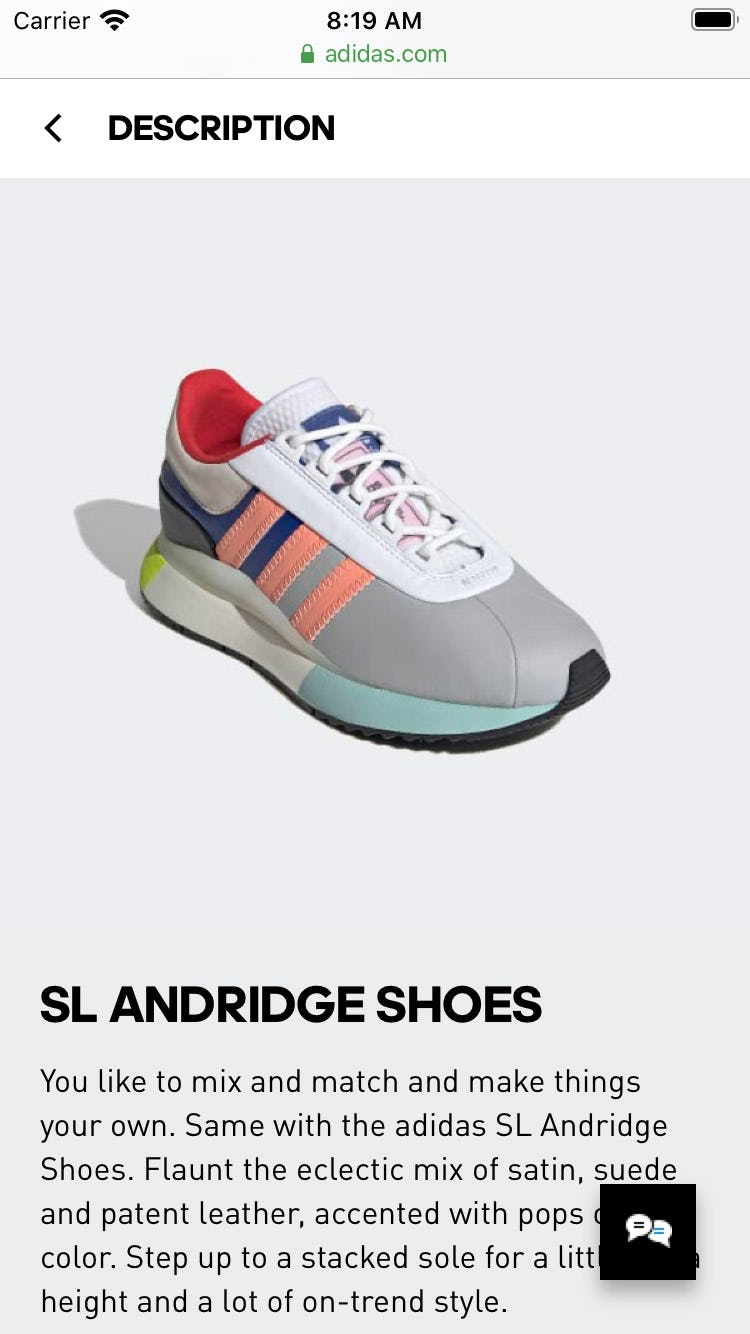
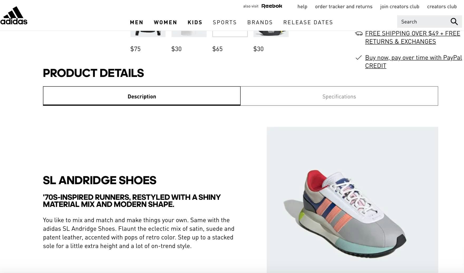
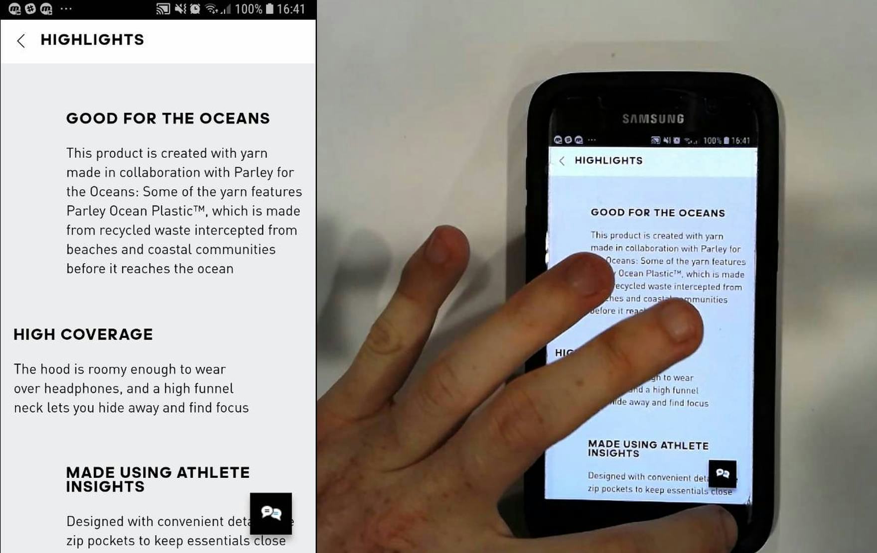
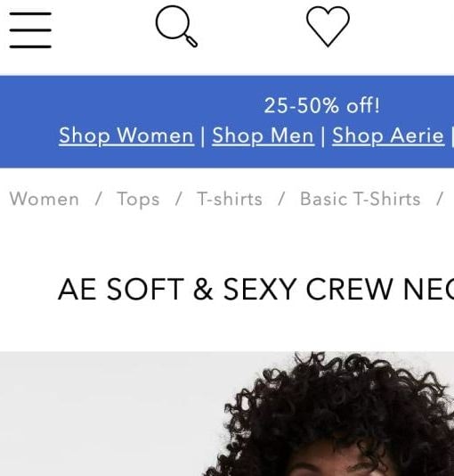
A lot of sites that use subpages use them only for their mobile implementation. Here notice how Adidas uses subpages on mobile for their product details description section (first image), but doesn’t use it on desktop (second image) — making for a more inconsistent experience.
Furthermore, a lot of sites that use subpages use them only in their mobile implementation: 3 of the 4 test sites that had mobile subpages — Newegg, Staples, and Adidas — didn’t use a subpage implementation for the same product page section on their desktop sites, making for an inconsistent experience across platforms.
This is likely also a contributing factor to why a subgroup of users consistently overlook subpages, as they simply don’t expect them.
Issue 2: Navigating “Back” from Subpages Is Often Disorienting
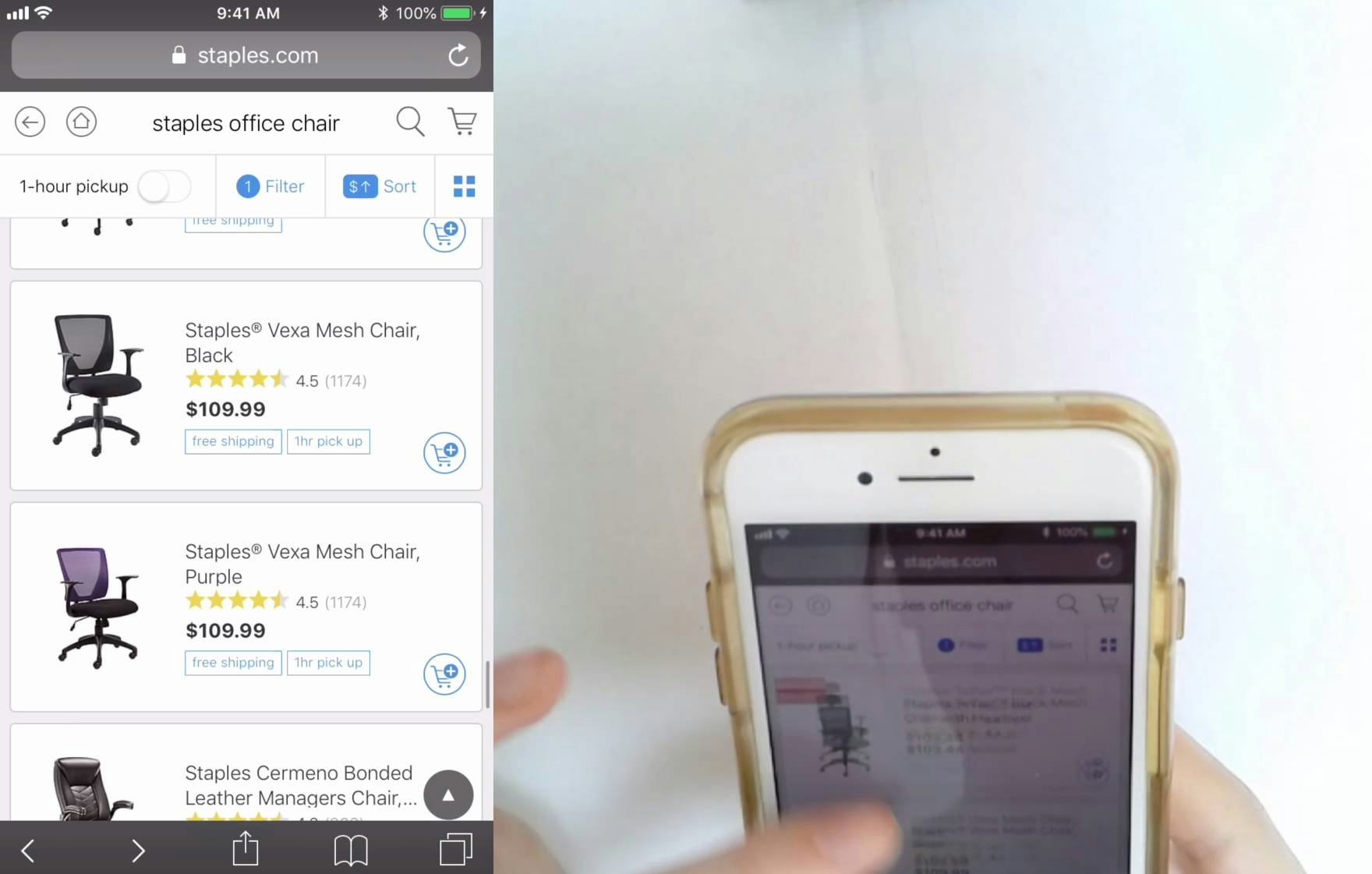
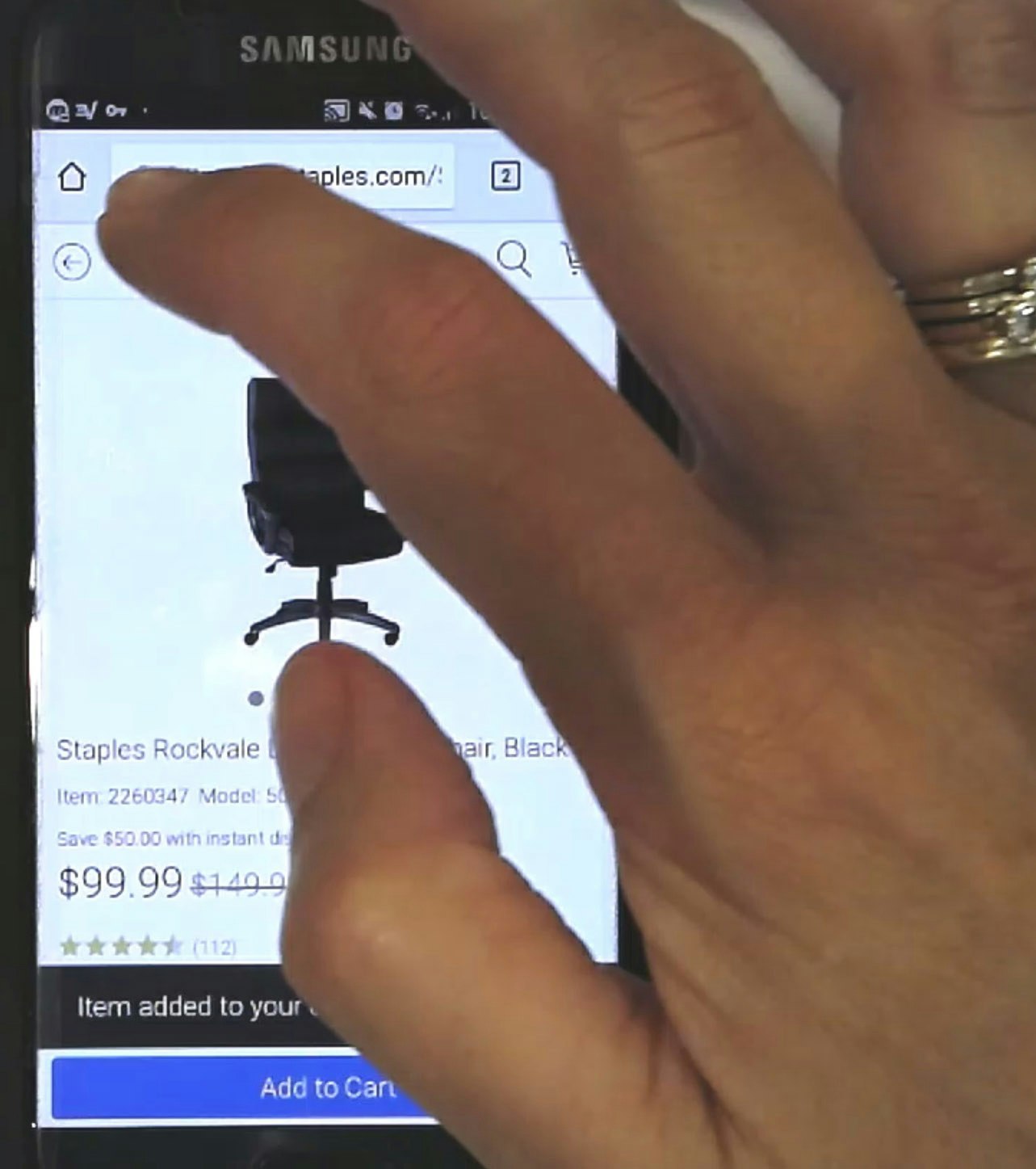
“Oops. I just lost it. It was what, $99?…I would like it, when I’m in the reviews for one chair, when I clicked ‘Back’ I would go back to that chair, so that I would not lose my place.” A user at Staples found a chair she liked after looking at the reviews on a subpage (first image). However, after tapping the browser “Back” arrow she wound up back in the product list (second image). Moreover she was returned to the top of the product list, and had to refind the list item she was just examining. Had she tapped the “X” instead to exit from the subpage (first image, upper-left corner) she would have been returned to the main product page.
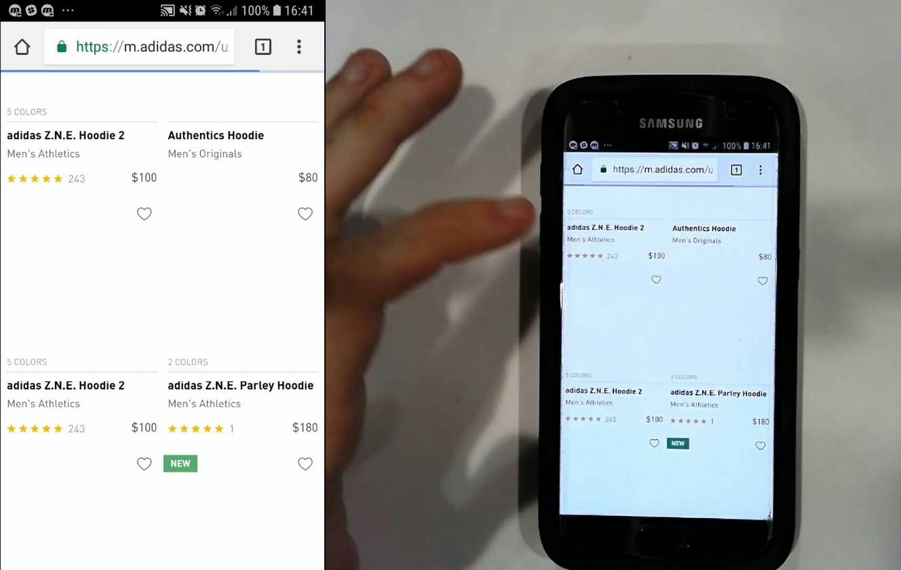
“Oh, that’s annoying that it brought me back to this thing [the product list]. I wanted to have a look at the specs. That’s annoying….It’ll make me less likely to click into them [the product page subpages] now because it’ll bring me back to that [the product list].” A user at Adidas had a similar issue, as he failed to use the site-provided “Back” link to return to the main product page and used the “Back” button instead. This returned him to the product list — a back-and-forth process he repeated 6 times, for over 3 minutes.
A second issue that occurred during testing was users having trouble navigating back from mobile product page subpages to the main product page.
Specifically, during testing several users missed the site-provided “Back” links (if available), which were the “correct” way to go from the product page subpage back to the product page main page, and used the device “Back” button instead.
However, after tapping “Back” many users will wind up in the product list — “2 steps back” — rather than being returned to the main product page.
Worse, in addition to being sent 2 steps back, sometimes users are simply returned to the top of the product list, nowhere near the product they had been considering, and they thus have to refind the product list item first before even being able to return to the product page.
Subpages thus introduce further navigational complexity to the mobile product-browsing experience, which is often already fairly complex.
The end result for many users is that they’re left feeling disoriented and frustrated as they attempt to navigate product lists, product pages, and product page subpages.
Consider Using “Vertically Collapsed Sections” if Providing a Lot of Product Page Content
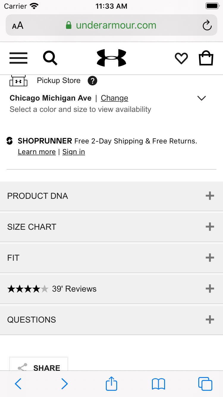
Our mobile testing identified the “Vertically Collapsed Sections” product page layout as, for most sites beyond those that only sell visually driven products, one of the two “safe” product page layouts.
The benefits include the following:
- The page appears less intimidating, as most of the content is collapsed
- It’s easier to establish and retain overview of the page, as section headers can be scanned and unwanted content can be collapsed
- The sections are less likely to be overlooked compared to “Horizontal Tabs”
- The headers can contain more information scent on what type of product info it contains, because each collapsed section header is on its own line
- Page length is controlled better than the length on many “One Long Page” layouts, allowing users to access, for example, the footer very easily or cross-sells (if placed below the collapsed sections)
Thus a major benefit a “Vertically Collapsed Sections” layout provides is its overall simplicity: the major product page content is usually visible in 1 or 2 viewports, and it’s typically clear how to access the content, or hide it when desired.
However, there are two key implementation details to ensuring “Vertically Collapsed Sections” layouts perform well for end users:
- The layout must be consistently used for all the major product page sections
- Section titles must be informative and easily interpreted
The Layout Must Be Consistently Used for All the Major Product Page Sections
A consistent implementation of “Vertically Collapsed Sections” is key to users’ ability to quickly understand the design pattern.
If “Vertically Collapsed Sections” are only partially implemented — for example, if the product description is implemented as a “Vertically Collapsed Section”, but reviews are on a subpage — then it’s harder for users to quickly internalize the page structure.
In particular, the major product page sections should all be implemented as “Vertically Collapsed Sections”:
- The product description
- User reviews
- Q&As
- Shipping info
- Specs
- Any other product type–specific content (e.g., “Ingredients”, “Fit”, etc.)
Other secondary content — for example, cross-sells, ads, company info, special offers or promos, etc. — doesn’t necessarily have to follow the same “Vertically Collapsed Sections” pattern, although it’s also fine if the layout is used for all content sections where it makes sense given the specific content in question. The key is to have all primary product content grouped in one location, and share the same “Vertically Collapsed Sections” layout.
Section Titles Must Be Informative and Easily Interpreted
Because the content in a “Vertically Collapsed Section” is typically hidden, it’s crucial to have informative section titles so that users know what content is contained in the section before they open it.
Often sticking with conventional titles is a safe choice — for example, “Product Description”, “Reviews”, “Specifications”, “Shipping & Returns”, and “Q&A” — though these can be tweaked to suit a particular site’s preferred terminology (within reason).
Furthermore, for sections where it’s helpful to provide a count of the content available — typically, reviews and Q&As, though potentially other auxiliary content as well such as manuals or videos — this should be provided as well in the section title (e.g., “Reviews (14)”).
Finally, when it comes to sections with dynamic content, be aware that the section title should then ideally also be dynamic.
Help Users Find All the Content They’re Looking For
Given the severe issue a subgroup of users will have of completely missing product page content because of its placement on a subpage, avoid using subpages for product page sections.
In particular, the major product page sections should all be on the main product page — it’s less severe if, for example, a store locator or special offer notice are implemented as subpages.
Instead, when there’s lots of content to provide on a mobile product page, consider using “Vertically Collapsed Sections”. Just be sure to use the design pattern consistently for all major product page sections and make section titles easy to understand and interpret.
Despite the clear pitfalls inherent in using product page subpages for some product page content, 26% of sites use this design pattern, ensuring a subgroup of their users will never find important product page content.
This will result in user abandonments, and furthermore is a waste of resources, as the most engaging and informative product page content will be completely overlooked by some of the very users who would benefit the most from seeing it.
This article presents the research findings from just 1 of the 650+ UX guidelines in Baymard – get full access to learn how to create a “State of the Art” ecommerce user experience.


