Providing the right kind of product images is essential to users’ ability to understand key visual details and make a purchase decision about a particular product.
During Baymard’s large-scale usability testing across desktop and mobile, we observed that, for certain products, simple “Cut Out” images of the product against a white background are simply not enough for users to get a sense of their physical qualities.
Specifically, products designed to be worn — apparel; accessories such as bags, jewelry, or watches; and cosmetics — require the context of a human model in order to get the truest sense of the product.
Without this context, users must estimate the suitability of a product based on other less helpful images and product information, resulting in lower confidence and lower likelihood to move forward with purchasing.
In this article we’ll discuss the test findings from our large-scale UX research related to “Human Model” images. In particular, we’ll discuss:
- How “Human Model” images provide key visual information that is hard to glean from other kinds of product images
- What kind of “Human Model” images to include on apparel and accessories sites
- The different rationale behind “Human Model” images on cosmetics sites
- When it’s most important to offer images of multiple models
“Human Model” Images Provide Vital Context and Product Information
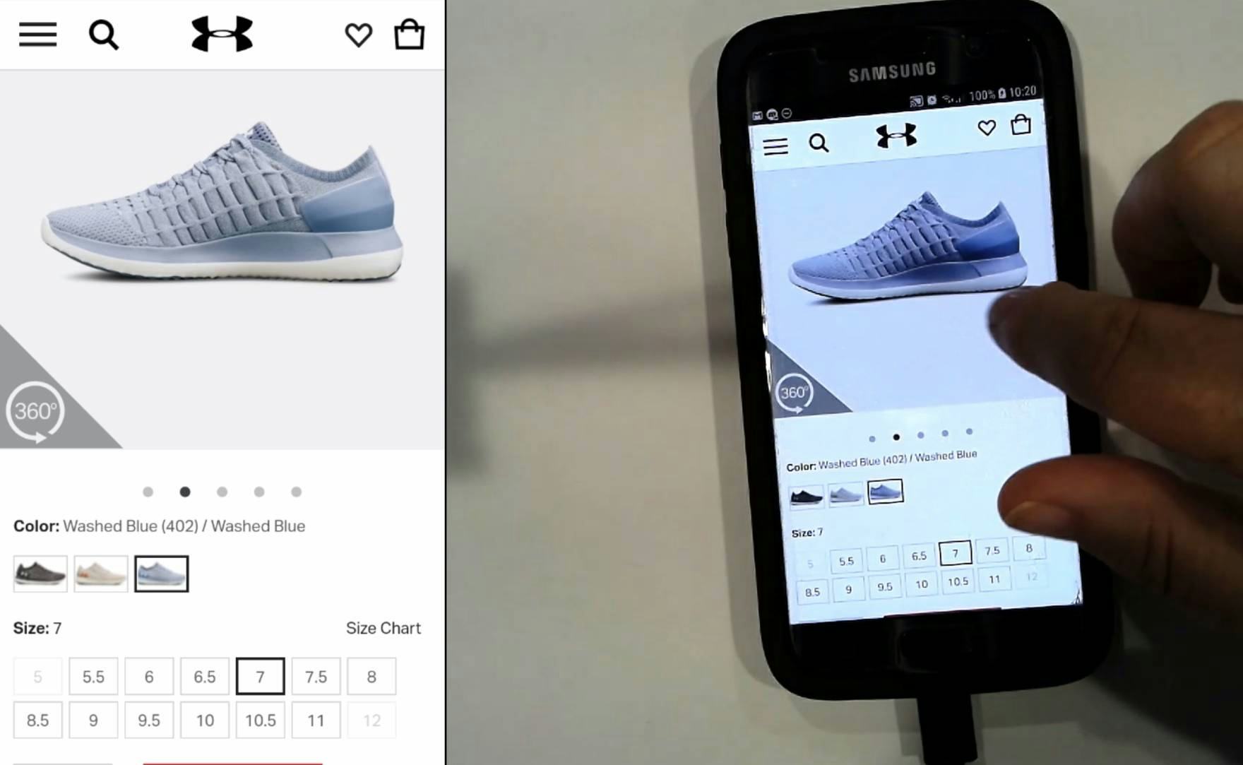
“I would have loved to see the shoe on an actual foot…sometimes they ride up quite high.” This user couldn’t effectively judge this shoe’s fit using only the “Cut Out” image on Under Armour. Without an image of the shoe being worn, details such as fit can be difficult to estimate.
When shopping in-store, users have the luxury of physically trying on apparel or sampling makeup to better understand the product’s qualities and if the product will work for them — which obviously isn’t possible when shopping online.
When trying on apparel in-store, for instance, users can better judge the product’s length, tightness, and overall fit, which are difficult to gauge from online images.
It can therefore be impossible for users to gain the same level of understanding when considering products on an e-commerce site, without which they may lack confidence in purchasing the product.
To best approximate the information users would gain from trying on a product in-store, sites can provide images of the product being worn on a human model. During mobile and desktop testing, having “Human Model” images was observed to be key for three major product types: apparel, accessories, and cosmetics.
“Human Model” Images for Apparel and Accessories Provide an “In Scale” Comparison
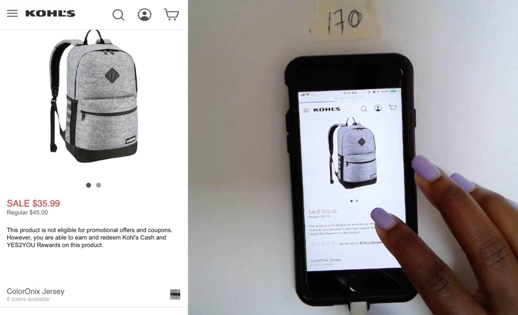
“So this one…I don’t think it has it on someone’s back, so I don’t know anything about what size it is…I don’t want something that’s too small…if it doesn’t specify, this might be a kid’s backpack for all I know.” Without the benefit of a “Human Model” image for this item on Kohl’s, fit and relative size are difficult to judge.
Some products require “In Scale” images for users to get a sense of the product’s size and scale. For example, a stand mixer might be shown on a kitchen counter next to a stack of cupcakes, helping users imagine how large the mixer is in real life.
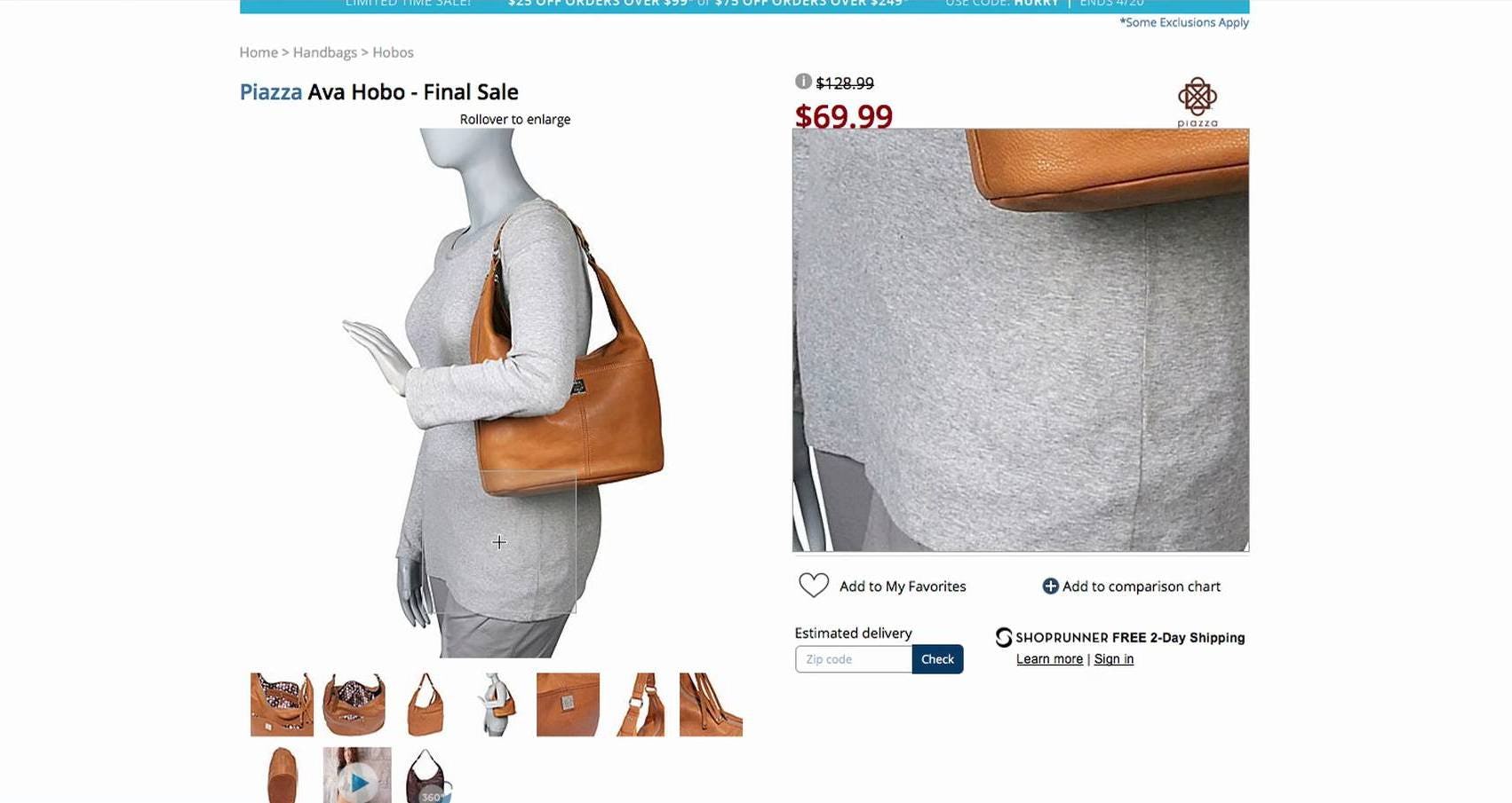
More specifically, for products designed to be worn, such as apparel and bags, the appropriate basis for comparison and understanding the product’s scale is naturally the human body.
When such products are displayed only “Cut Out”, without a human model for reference, users cannot accurately determine critical product attributes, such as the product’s fit and length — how large is this backpack, how fitted is the shirt, or does the skirt fall above or below the knee?
“Without “Human Model” images, it’s left up to the user’s imagination to try to picture how a product might look when worn.”
Likewise, without the context provided by a model, finer details of proportion and quality can be nearly impossible to estimate — how high is the rise of these jeans, or how does the fabric of this coat drape?
Images of the product isolated from being worn fail to provide the context necessary to determine how the product will look when worn — the product’s primary use case.
Some sites may provide some explanation of these product details within the product description. However, most users rely on product images for their first impression of the product and may disregard it based solely on details they can glean from the product images.
What’s more, many users neglect to read product descriptions in detail, while some overlook them altogether; if key product details are only provided in text form, many users will miss out on this product information and thereby have a more limited understanding of the product.
Product videos are also a poor substitute, as the majority of users don’t engage with this kind of content on product pages.
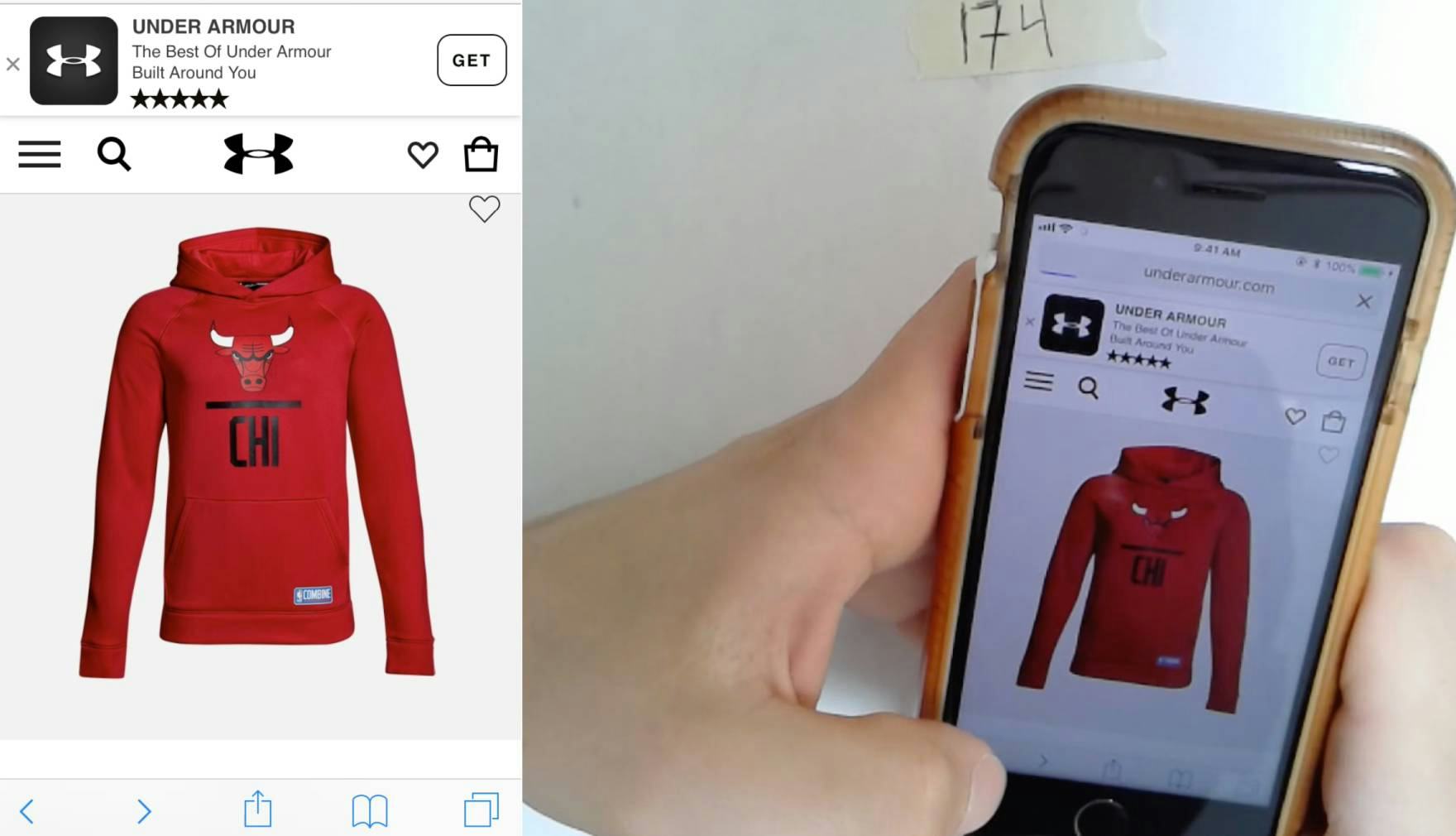
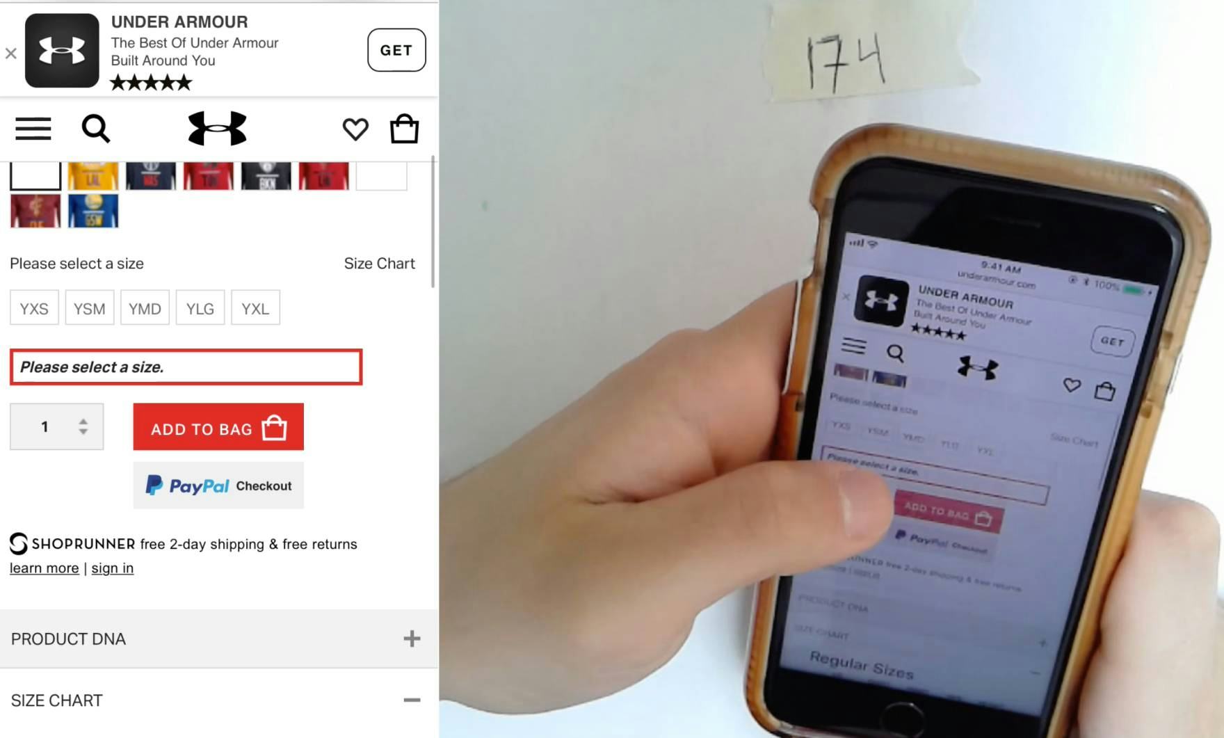
This user searched for ‘Chicago Bulls hoodies’ on Under Armor and navigated to a product details page. Wishing to add the item to the cart, he realized the hoodie was in fact for children. “It seems to only be giving me youth’s [sizes]…I dunno, it says YXS…I’m going to go back, because I won’t fit in a youth’s sweater, and find something else.” If the hoodie had been worn by a child model, it would have been immediately evident that this was not an adult-sized product.
Displaying model images can also help provide additional context about the product’s primary customer — for instance, if a sweater is meant for children, teens, or adults, or if a tee shirt is meant for women specifically or is unisex.
Without a “Human Model” image, users must rely on peripheral details for this information, such as breadcrumb trails or the product size selector, and might misinterpret whom the product is designed for, wasting time considering an inappropriate product.
“Let’s see a picture here, if anyone is wearing it. There’s no photo of anyone wearing it.” Users had trouble judging the size of the North Face backpack at Nordstrom because there were no images showing it on a model.
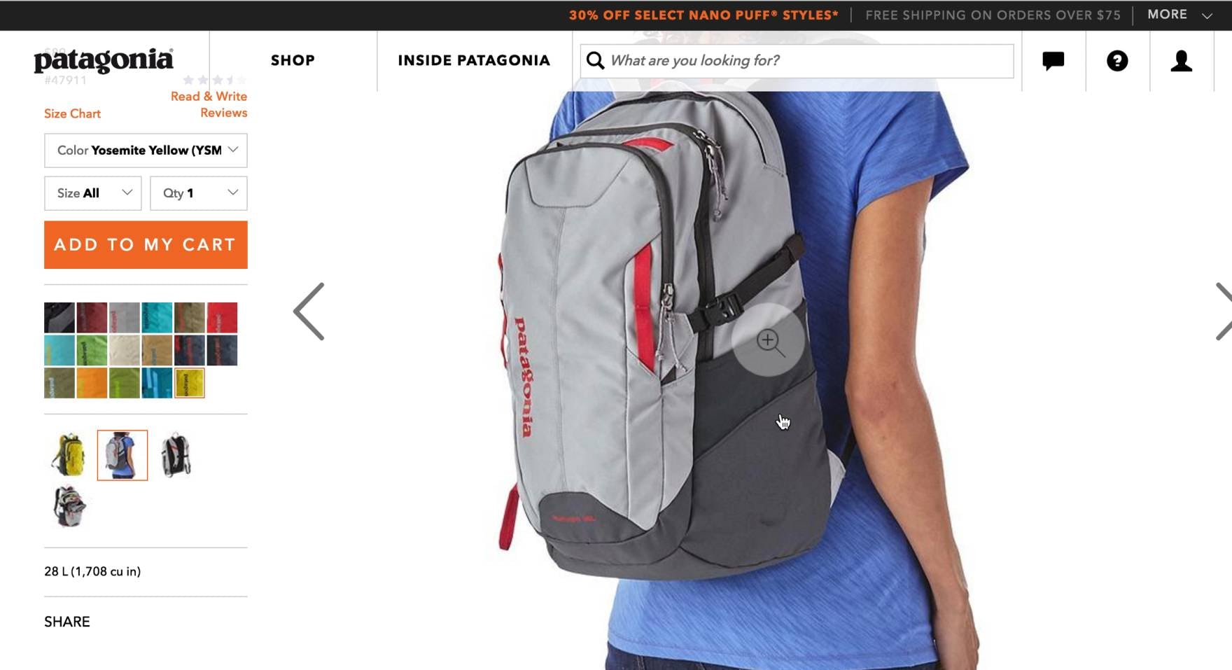
On the other hand, by showing the backpack on a model, Patagonia provided users with a good sense of its relative size; “I like that they show it on a person…gives a nice sense of scale”.
Combined with other rich product images, “Human Model” images can furnish a more comprehensive picture of the product and help users understand its visual qualities, which help them decide if the product is suitable for them.
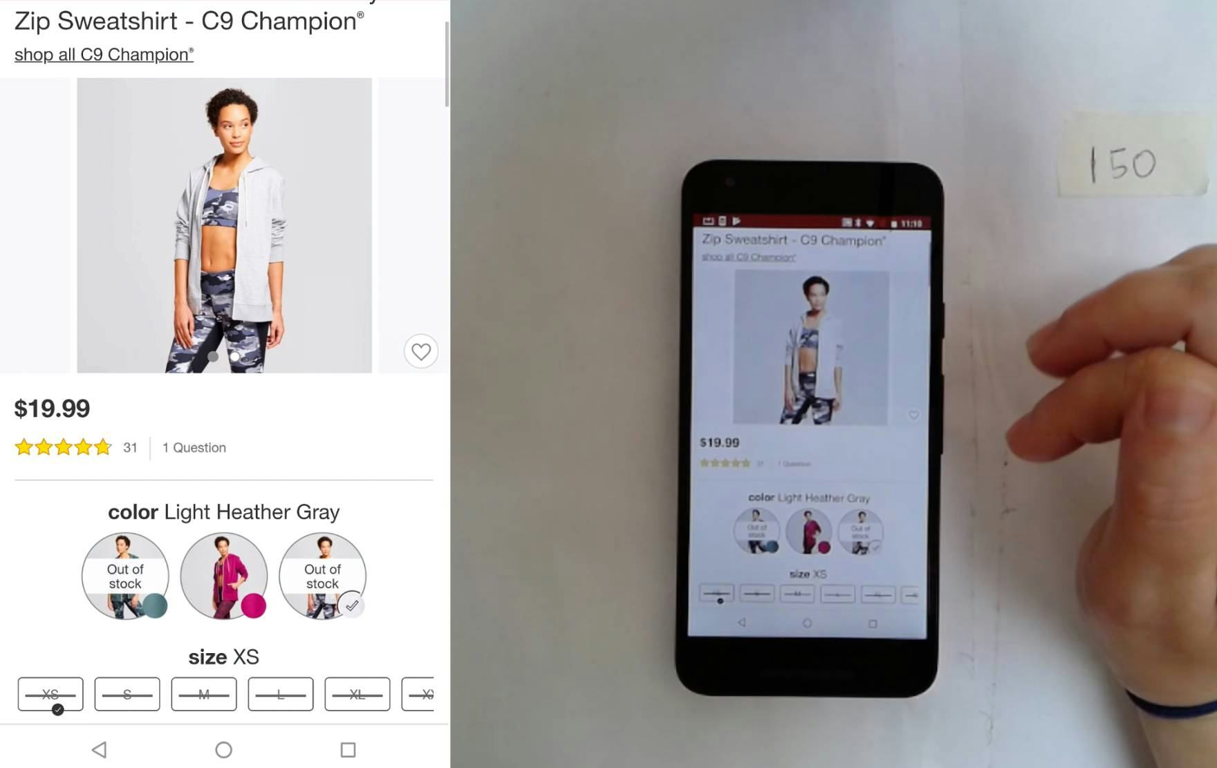
“I think it’s interesting, though, that the photo depicts the person with their sleeves raised. I do that a lot with hoodies, but that’s not why I am looking for a hoodie, I want long sleeves [depicted in the image].” This user on Target had a hard time estimating the length of this hoodie’s sleeves because the “Human Model” image showed the product with the sleeves rolled up.
When looking for “Human Model” images, users strive for a general understanding of qualities of length, scale, and fit.
When the apparel depicted on models is styled — for example, tucked in, rolled up, or pinned — these critical product attributes can be obscured, making it difficult to get a true overall sense of the product. Ideally, at least one basic “unstyled” image of the product being worn on a model should be provided to help users gauge product attributes such as length and fit.
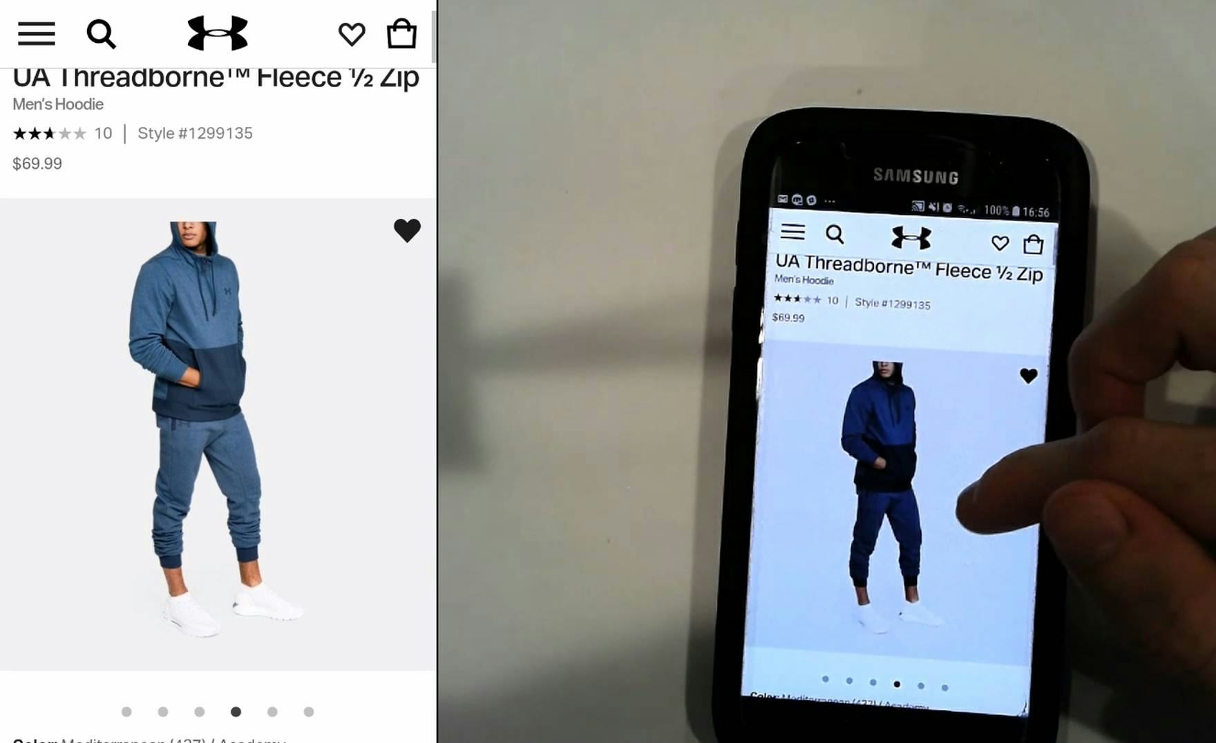
“I’d probably buy the pants, as well, actually, to have the whole lot…It’s rare that I’d buy a tracksuit, but they’re really nice. I quite like the distribution of the colors and the pictures give a good idea of it.” The “Human Model” images for this hoodie on Under Armour introduced this user to coordinating products that he quickly became interested in.
Introducing elements of “styling” does, however, create opportunities for promoting coordinating products by showing them as part of a complete outfit. Such images can also thereby promote “supplementary” cross-sells, inspiring users by showing coordinating styles they might wear for different occasions, such as going to work or a formal party.
“Having a mannequin in really boring clothes…it doesn’t make me want to buy this.” The bag on this mannequin on eBags failed to excite this user, who found the mannequin styling “cheap” and off-putting.
Finally, when it comes to using the human body as the frame of reference for apparel and other products, some sites may occasionally rely on artificial “human models” in lieu of a real person.
However, users during testing harshly judged images that appeared “cheap” or poor quality, including when products were displayed on mannequins; thus, mannequins or virtually rendered “models” should be considered only as a last resort, with real human models used whenever possible.
“Human Model” Images for Cosmetics Help Users Envision Colors on Their Complexion
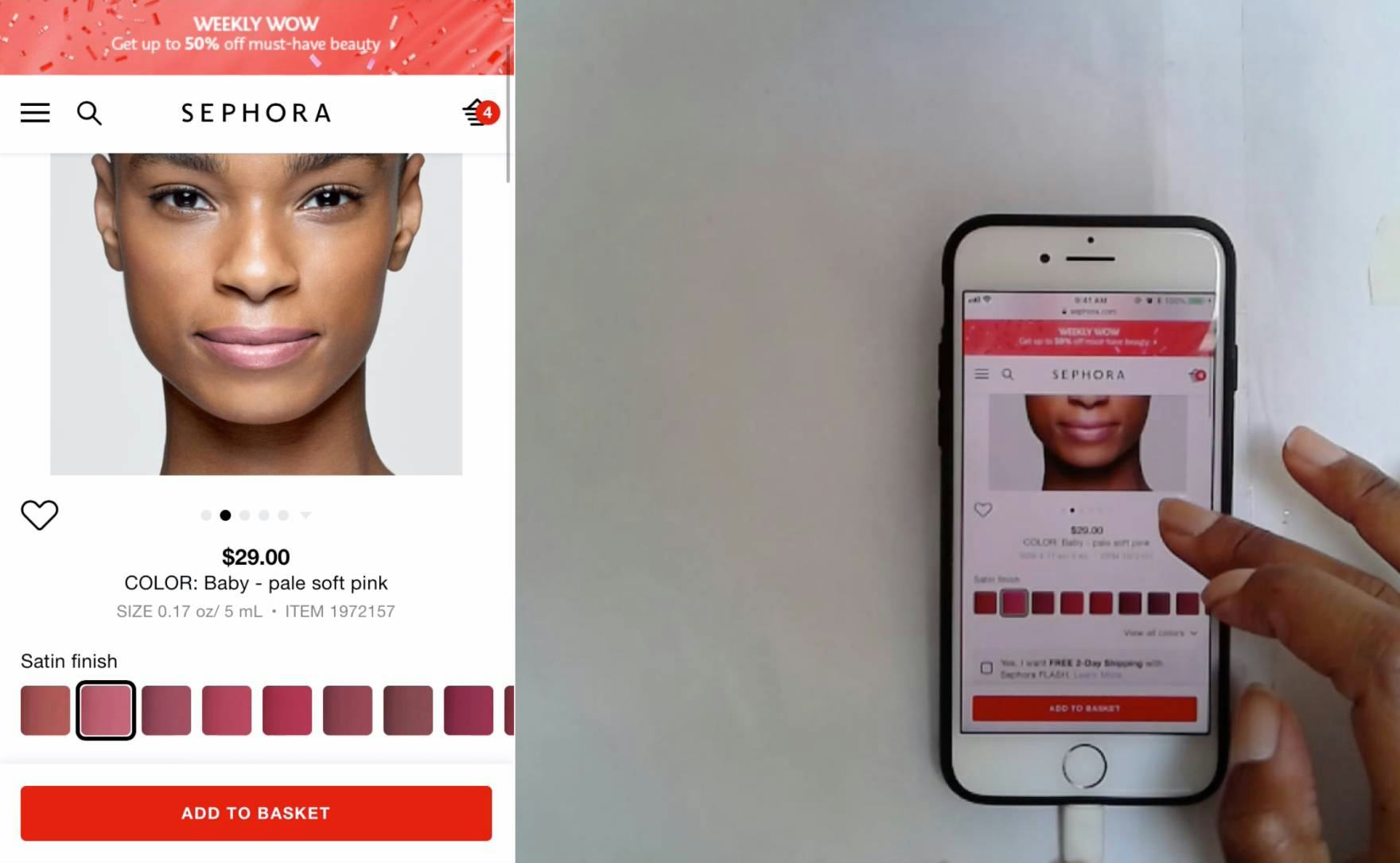
“See, that color looks a lot darker than it does on the model, it didn’t turn out how I thought it would.” This user on Sephora was surprised at the difference of this lipstick color displayed on the model versus the color depicted by its swatch.
The other main product type where human models were critical during testing was cosmetics. Without the reference of a human model, users are less able to visualize how the product will look when worn and may be hesitant to purchase.
The ability to see cosmetics such as lip colors or eyeshadow on a human face helps users have a better understanding of how different product variations look when worn, helping bolster their confidence.
Users are often wary that particular product variations can look very different when worn versus when depicted only by a swatch. With cosmetics in particular, key qualities such as opacity or sheerness, shine, and finish can appear vastly different when worn versus depicted in a swatch or in the packaging.
Without the context of a human model, some users may be skeptical that the color depicted by the swatch will be true to the actual product — especially how the color will look on their particular skin tone.
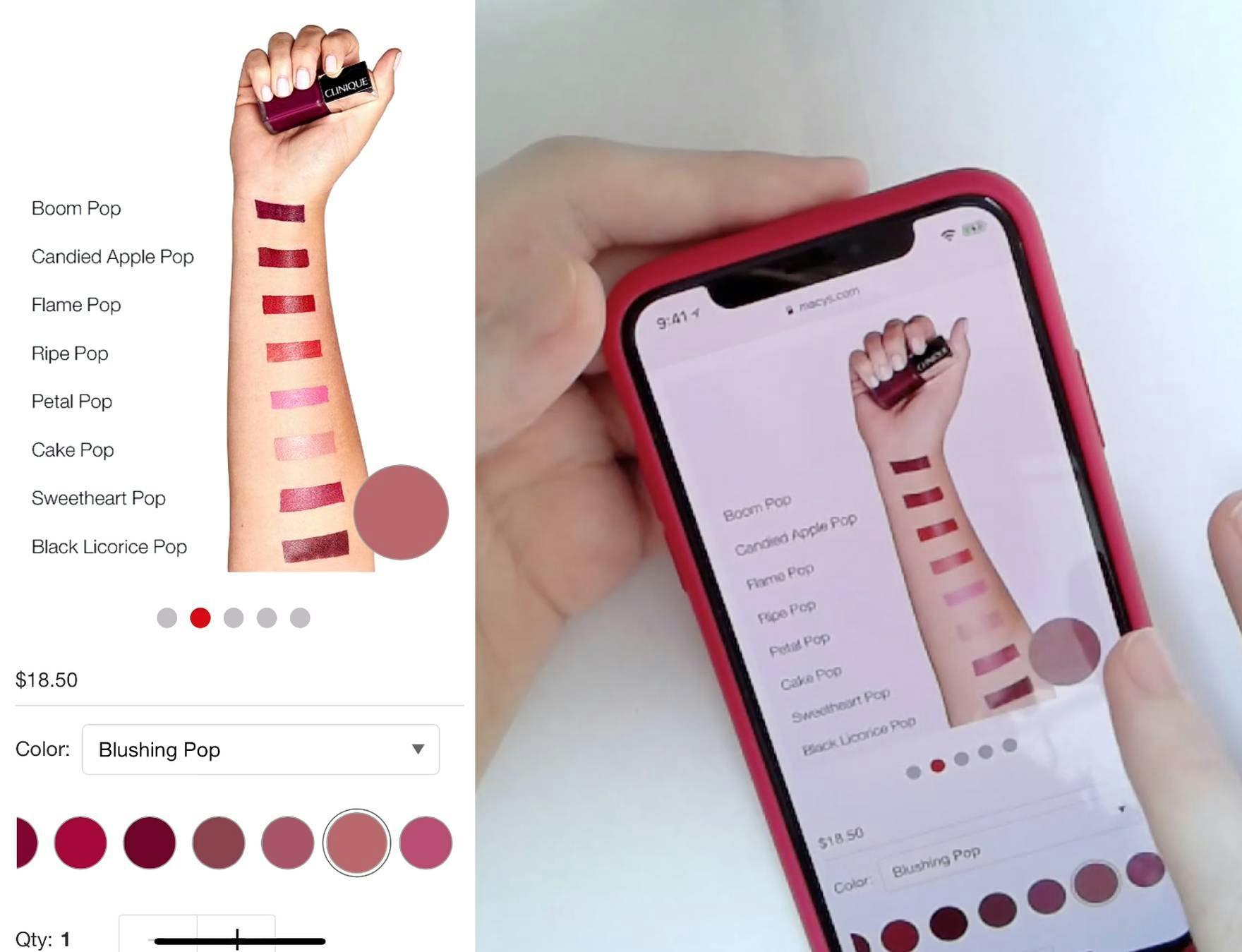
“Why can’t I see ‘Blushing Pop’ on a girl, why do I have to see swatches of everything? It’s really frustrating.” This user on Sephora wanted to see the color of lipstick she was interested in on a model’s face, rather than just the “Product Variation” image of swatches on an arm. Without seeing the lipstick on a model’s face, she was far less confident that the color she was interested in would truly suit her.
Furthermore, testing revealed that for cosmetics it’s important to show the cosmetic where it will actually be worn in real life — it’s not enough to simply display different shades of lipstick on an arm, for example.
During testing, we repeatedly observed that such “Product Variation” images were necessary but not sufficient when it came to helping users decide among colors for makeup products.
Once users had used the product variation image of lipstick shades, for example, to compare available colors, they then specifically looked for their color of choice being modeled on a face to get a better sense of how it would look when worn.
Failing to provide an image of the cosmetic where it will actually be worn will leave some users without sufficient visual information to decide if the product will suit them.
When to Invest in Multiple Models for “Human Model” images
Some apparel sites go a step beyond providing only some “Human Model” images and display products on multiple models of different sizes and body types.
Combined with text descriptions to specify the model’s measurements and size he or she is wearing, providing a diversity of models can help users better envision how the product will look on their body by finding a model of a similar size.
While shooting a product on multiple models can be a significant added expense, this can be a major benefit for products where fit is a critical concern.
It can also serve as a unique brand differentiator, as this enhanced offering remains uncommon among apparel sites.
However, it should be noted that no users during testing were deterred from purchasing apparel due to a lack of diversity in model body types, so providing multiple models for apparel and accessory sites should be considered an enhancement and not a necessity.
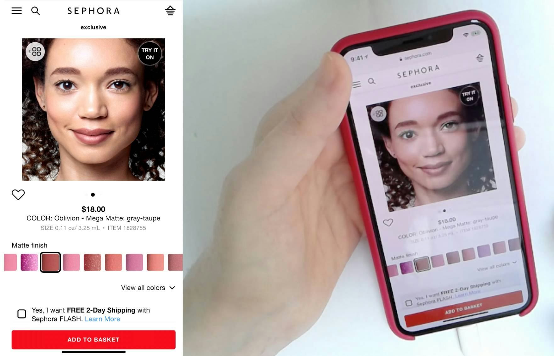
“They give me one girl…and she happens to be dark skinned. I don’t know what to do with that, it annoys me…I would probably look at this and go ‘I’ll just go to Ulta and try them on’. I don’t think I’d feel confident enough to buy it [online].” This user, with a light complexion, didn’t find the image of a model with a darker complexion helpful in her decision making on Sephora.
In contrast, for cosmetics we observed multiple users reject products when they could not find an image depicting a model with a similar skin tone to their own.
With cosmetics, users are not using a model as an “In Scale” comparison, but are rather concerned with the model’s complexion.
To serve as an appropriate basis for comparison, users must have a skin tone that is somewhat similar to the model being shown in order to get a sense of whether or not the color would be suitable for them. One user stated, noting the model did not share her skin tone,
On Glossier, every shade of this blush is viewable on multiple models of varying skin tone, allowing users to better estimate how each color will look on their own skin.
On Sephora, users are encouraged to upload their own photos showing them wearing different products, which can authentically show how different variations appear on a diversity of skin tones. While of course the image quality isn’t as good as if the images were professionally shot (as in the Glossier example above), crowdsourcing can be an effective strategy to ensure some diversity.
Ideally, each product variation should be viewable on multiple models of diverse skin tones to provide this comparative information.
However, this can present a sizable expense for sites where cosmetics isn’t their only product type, and given the likely abundance of variations for many products. As doing so for all variations of all products is likely infeasible for these sites, consider providing multiple model images for the most popular products.
Alternatively, crowdsourcing user-generated images through user reviews can be considered as a less-expensive way to cultivate a diverse collection of “Human Model” images.
“Human Model” Images Help Replicate an Essential Part of the In-Store Experience
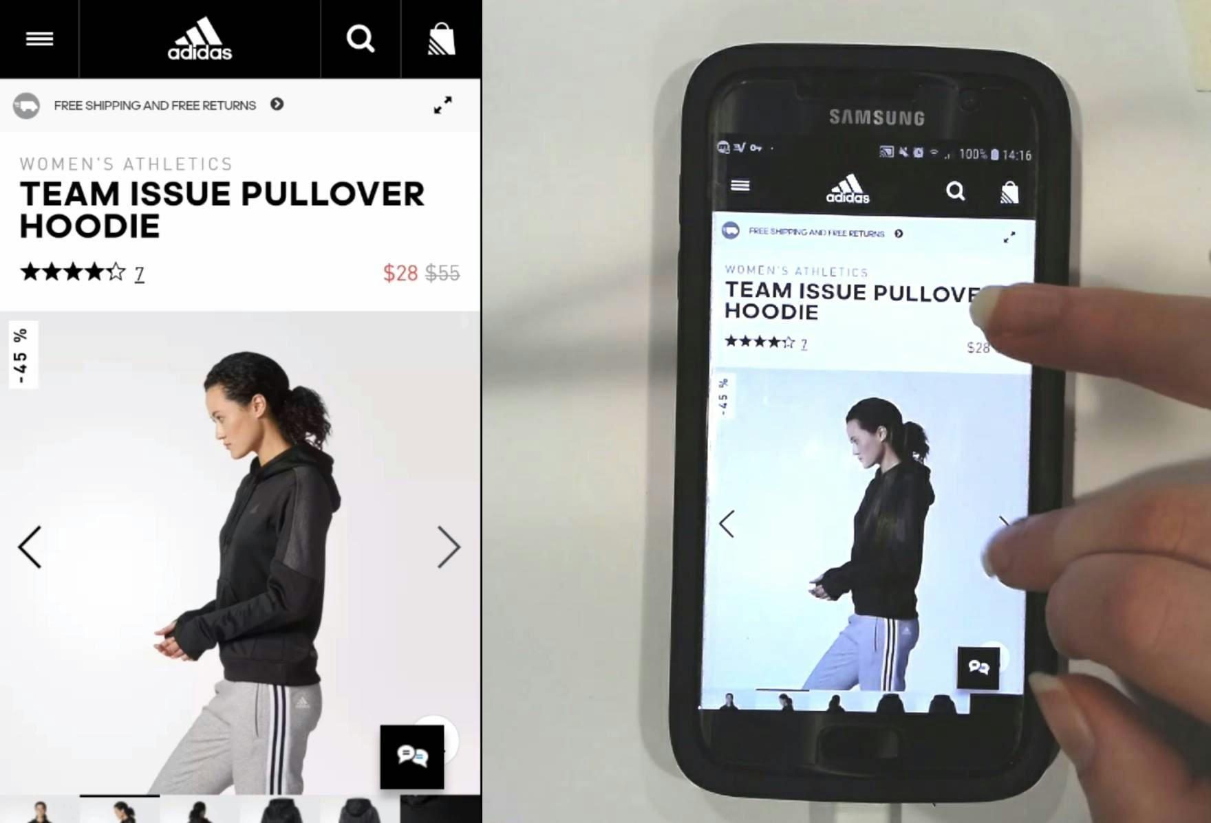
“I like how you can see what it looks like on”, noted this user, stopping on an image of the product being worn by a model on Adidas. The provided “Human Model” images helped her form a more accurate understanding of the product’s fit and visual qualities.
When shopping online, users cannot physically try on or sample products like apparel, accessories, and cosmetics to get a true sense of whether the product will work for them.
Only with the context provided by seeing the product worn on a human model’s body or face can users come close to this in-store experience, gaining a better understanding of the product and feeling more confident in purchasing it.
Without “Human Model” images, it’s left up to the user’s imagination to try to picture how a product might look when worn — which for many users is simply not enough to make them feel confident enough to purchase the product.
(Tip: see 239 examples of product pages showing how many of our benchmark sites use “Human Models” in product images.)
This article presents the research findings from just 1 of the 650+ UX guidelines in Baymard – get full access to learn how to create a “State of the Art” ecommerce user experience.

