Key Takeaways
- Our research shows that — on Direct-to-Consumer, small catalog websites — users need to “get to know” the brand before they want to make a purchase decision.
- Users are particularly interested in brand values and their “origin story”, but materials, manufacturing practices, and product quality are also of key importance.
- 67% of users on DTC sites seek out such nonproduct content, compared to just 37% of users on traditional retail websites.
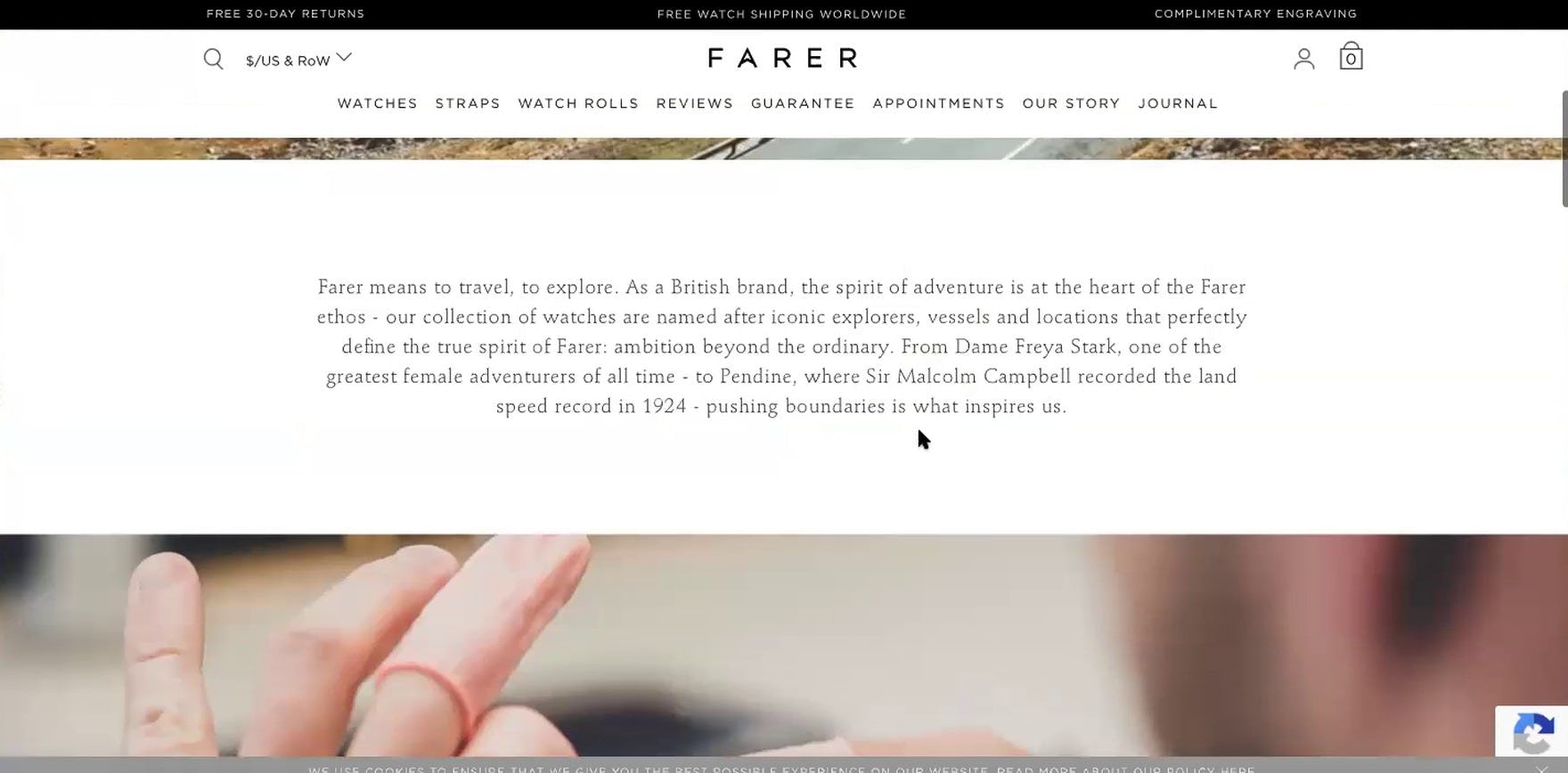
During Baymard’s large-scale testing on direct-to-consumer (DTC), small product catalog sites, 62% of users at some point engaged with nonproduct- and nonorder-related content; for example, content found on pages titled “About Us”, “Our Story”, “Our Process”, and so on.
In contrast, when testing general B2C sites, our large-scale UX testing shows that only 37% of users on beauty and apparel sites sought out similar information.
For DTC sites, therefore, providing pages dedicated to both “telling the brand’s story” and “showcasing the unique product qualities” helps users and, for some, is a critical consideration in their decision whether or not to purchase from a particular DTC brand.
While this information can be highlighted on the homepage and on product pages, for many DTC users, this basic summary information is often not enough to satisfy their curiosity about a new brand or its products.
In this article, we’ll discuss 5 specific ways our DTC UX research shows that sites can meet these information needs by showcasing:
- The Brand’s “Origin Story”
- The Brand’s Values
- Materials and Ingredients
- Manufacturing and Production Practices
- Overall Product Quality
Telling the Brand’s Story
Testing revealed that DTC, small catalog sites need to invest some resources in describing the brand: how it started, who the founders are, and what animates them when it comes to values.
All B2C sites we’ve tested do this to some extent — for example, Walmart has a “Get to Know Us” section in their footer that has links to information on their charity work, corporate mission, and values — and, in general, these pages performed well when it came to offering users the background information they were looking for.
Yet testing also revealed that, for DTC and small catalog sites, “going the extra mile” and providing a handful of such supplementary pages will help users “fill in the story” about a particular site, to the point where they get more comfortable with purchasing from the brand.
Users during DTC, small catalog testing actually actively sought out this kind of information — sometimes before even looking at the products.
In particular, during testing users were interested in learning more about the following brand information:
1) The Brand “Origin Story”
2) The Brand’s Values
1) The Brand’s “Origin Story”
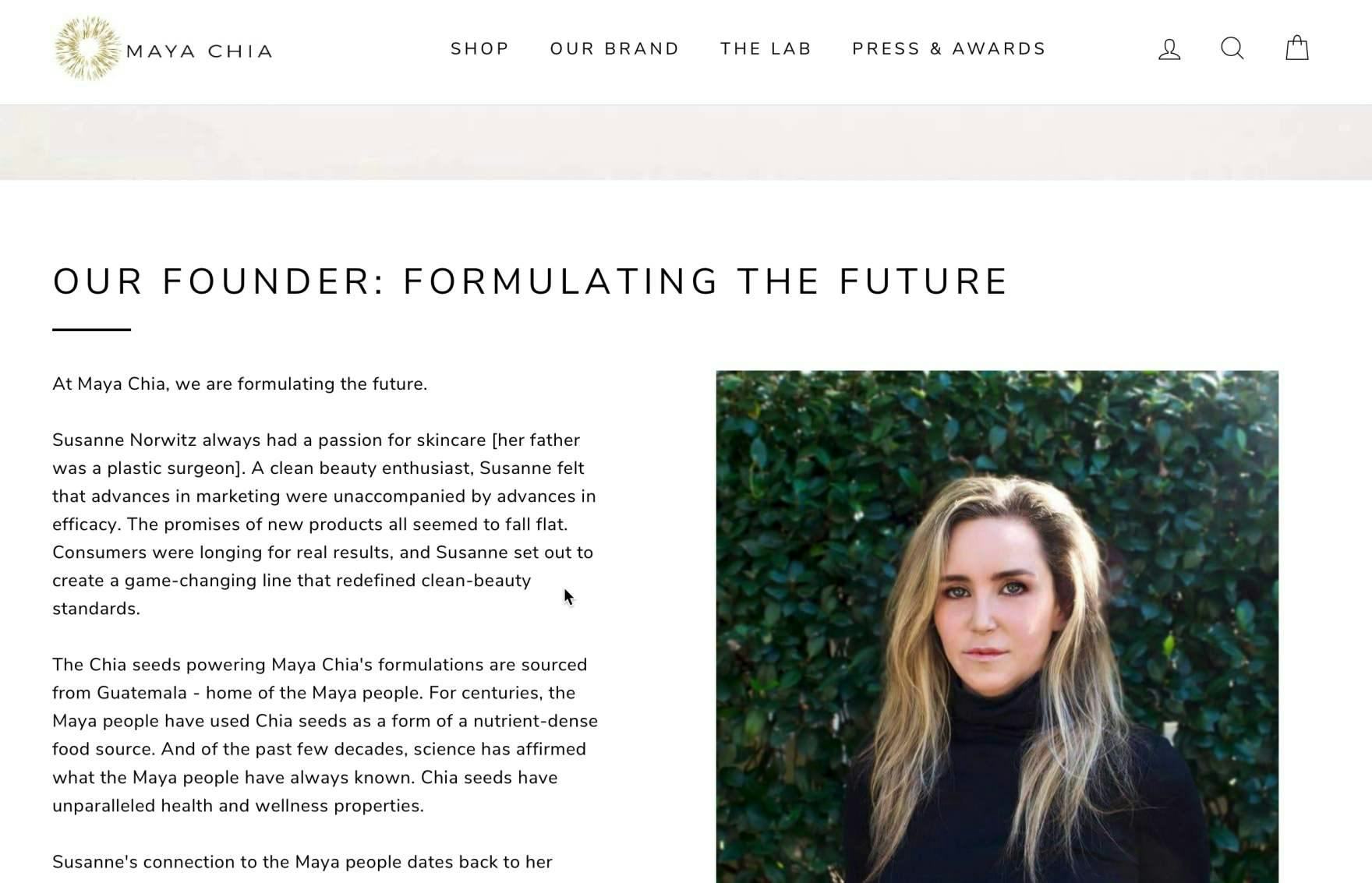
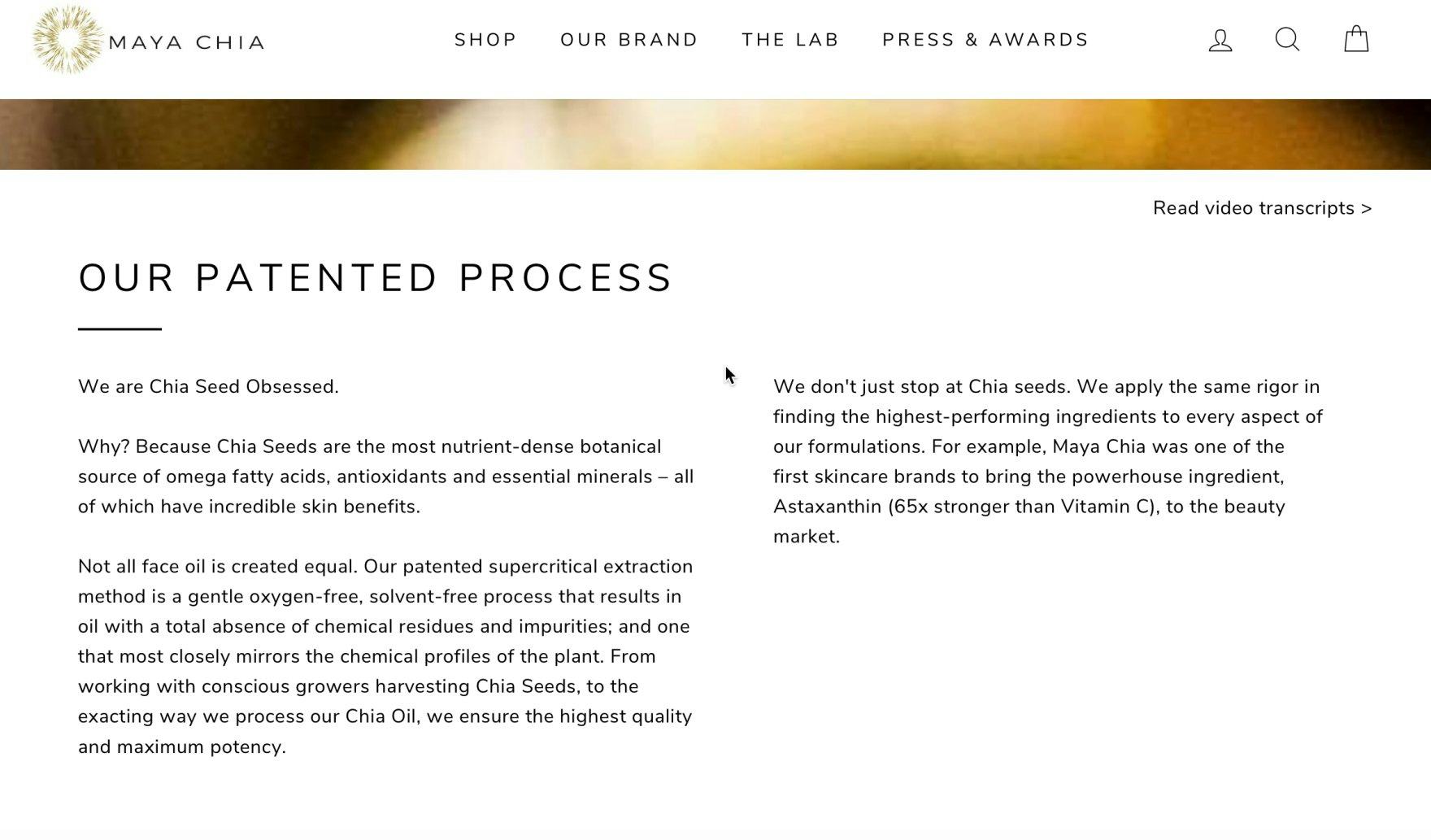
“I would look at the founder…What the founder does for a smaller company really matters, I think…I can tell she was passionate about it.” A user on Maya Chia sought out and read through information about the brand’s founder.
“I do love women-owned businesses, so I feel like that’s a selling point.” Another user on Great Jones similarly wanted to learn about the company’s founders and, after reading through the information, was more inclined to view the brand positively.
For many users in our DTC study, the brand’s founder and origin story proved to be of high interest.
As one user shared, “I like an ‘Our Story’ tab. That interests me…I’m curious often about how the brand started, how old it is, if there’s an interesting story behind it.”
Dedicating a page to the brand’s story can help convey the passion behind the brand and encourage users to form a personal connection with the brand.
In practice, the brand’s story can also help differentiate the brand from its competitors — including larger and more established (but “soulless”) brands.
2) The Brand’s Values
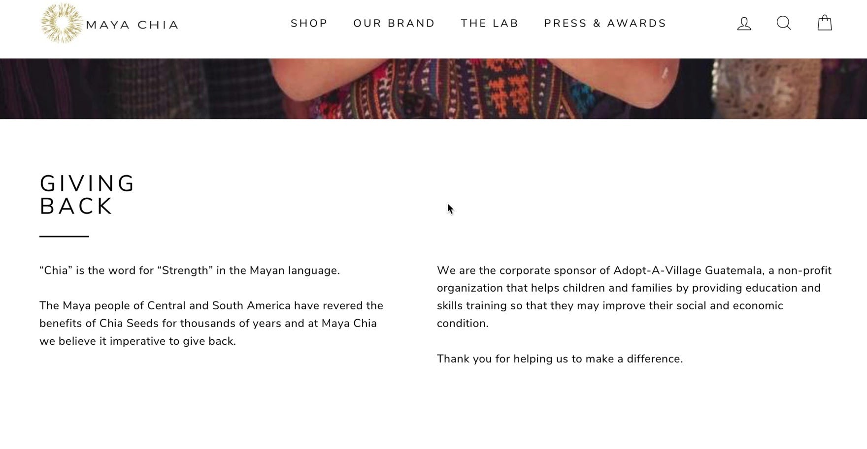
“If this is a brand…that I don’t know much about, sometimes I do like to read a little bit more about them and sort of what they do. I’m super interested in corporate social responsibility, so seeing that they are really invested in different communities and helping out people that are in need is something that’s really important to me, because I can see that when I purchase, I help this company make a difference.” This user formed a positive opinion of Maya Chia as a brand after reading about their charity program on the “Our Brand” page.
“This would probably make me look more, I appreciate when people take a stand on issues…I definitely would take a second look…Whenever possible I try to purchase from companies where my values align with theirs.” If a small catalog, DTC site’s principles align with a user’s, the user is much more likely to consider purchasing from the site, and potentially even overlook other issues they may have with the site or product.
In addition to the brand’s origin story, the brand’s ethos or company values can be a key factor for users hoping to learn more about what makes a brand special or unique.
During DTC testing, many users positively noted featured content highlighting the brand’s values and mission statement. In some cases, users who had initially dismissed the brand and been ready to abandon the site had their interest renewed by learning about the brand’s ethos.
While brand values won’t necessarily sway all users to stay and explore products, such content will resonate with many and have a positive impact overall.
Showcasing Unique Product Qualities
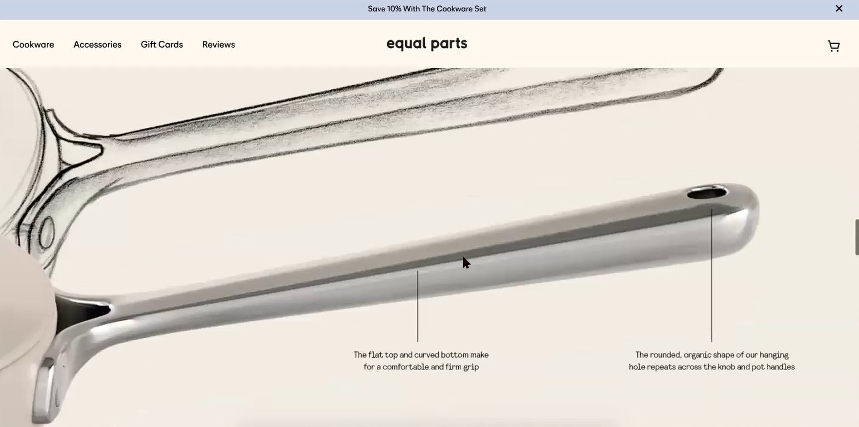
“The idea that it’s balanced is kind of a big deal…I have a lot of old cookware that I’ve inherited and…some of my pots are not balanced.” This user appreciated the details provided by Equal Parts on the design of the cookware.
Most DTC, small catalog brands, in addition to having information to share about the brand’s values and core principles, also have information to provide about the products themselves.
Given the small, focused product catalog, it’s typical on these types of sites for all products to share the same ingredients and manufacturing process. Moreover, it’s also often a key selling point for these brands to highlight the product materials and product-production process.
Testing revealed that these product “story” pages — where the general makeup and production process of the products is described — resonated with users, who, after reading the content, typically came away more impressed with the site’s products.
For many of these sites, an assumption is that customers will pay a bit more for products that have a higher degree of craftsmanship and that are ethically and sustainably produced, and it’s therefore important to devote a handful of site pages to describing this in more detail.
In particular, testing revealed users were generally interested in learning about the following general product information:
3) Materials and Ingredients
4) Manufacturing and Production Practices
5) Product Quality in General
3) Materials and Ingredients
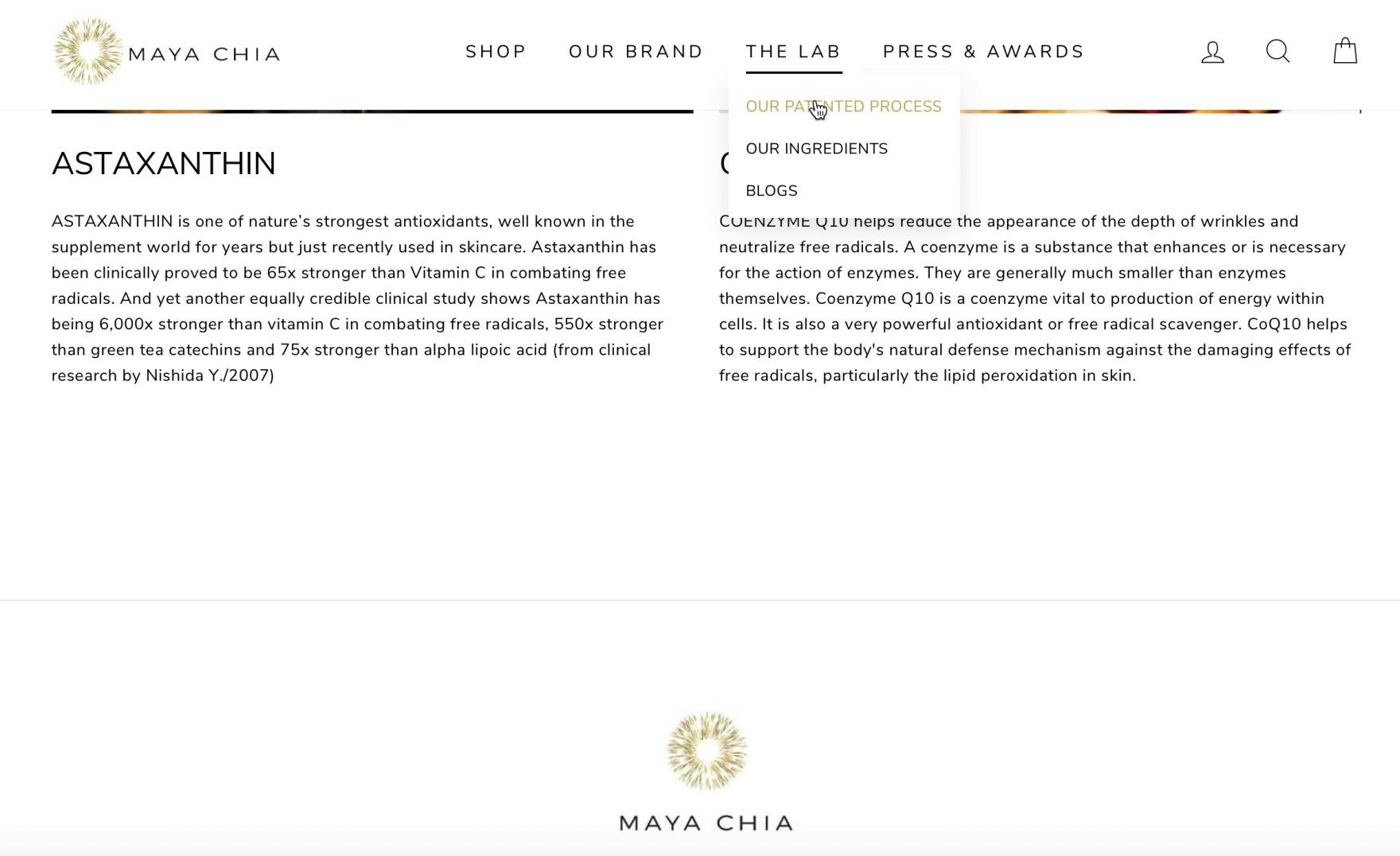
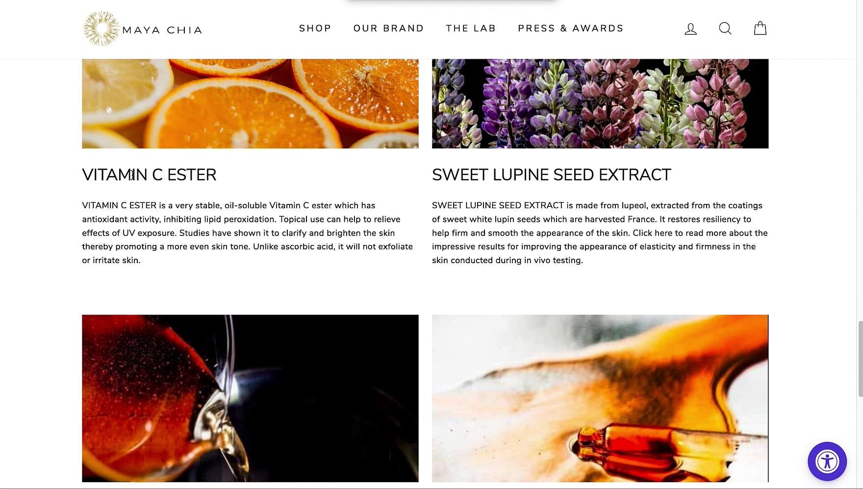
“They talk a little bit more about their ingredients, which is super cool. I love that. Being a skincare buff, it’s always exciting to learn something new…Even from the perspective of being interested and wanting to learn a little bit more about skincare [in general], I think this is super helpful to know how this is going to provide benefits if I buy it.” This user on Maya Chia spent a lot of time in “The Lab” section of the site, exploring information on the ingredients and extraction process.
Materials and ingredients were key product details that users sought out during testing of DTC sites.
In practice, this type of information could apply to the chemical composition of products in the health and beauty industry, such as makeup and skin care products, or to the textile and material composition of apparel, such as clothing items and athletic shoes.
If such information was not readily available, users were quick to dismiss a product in favor of one with a more detailed product description.
“I really do care about ingredients…I need to check if it’s vegan.” This user looked for and found detailed information on Maya Chia’s ingredients.
Moreover, while many users just want to get an overview, some have specific concerns about particular ingredients — which might be based on allergies or other sensitivities.
Therefore, users also react positively to product information about what ingredients are explicitly not included. These intentional omissions could be potentially harmful chemicals — for example, being “BPA-free”.
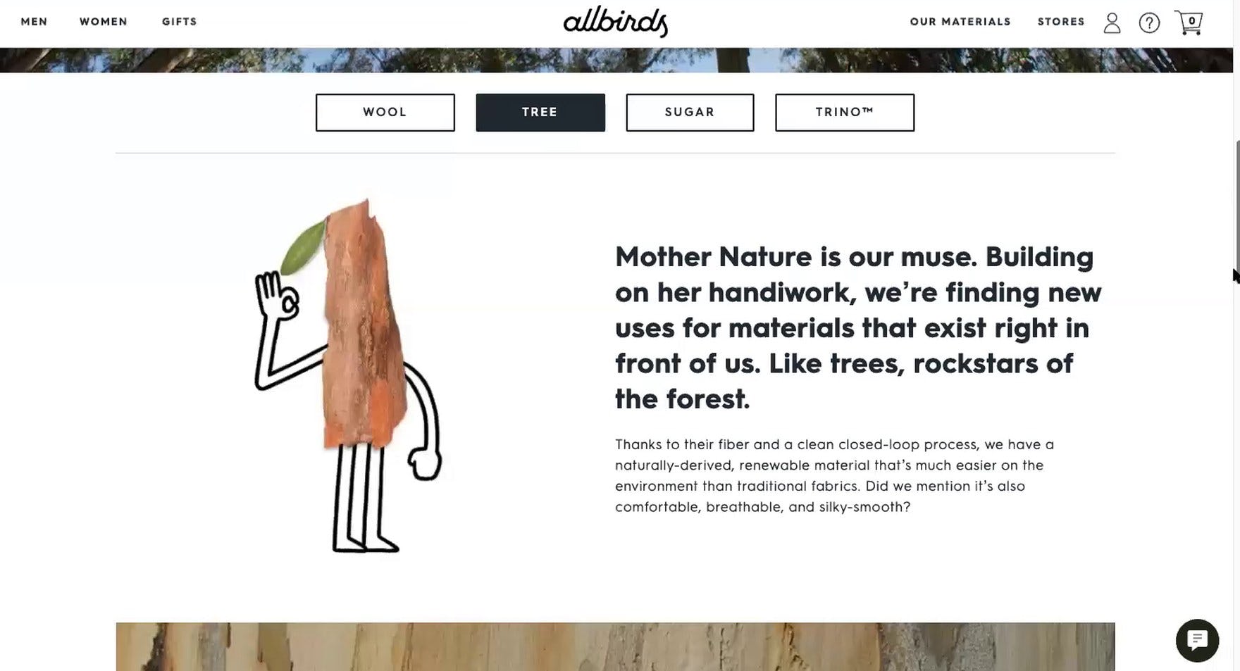
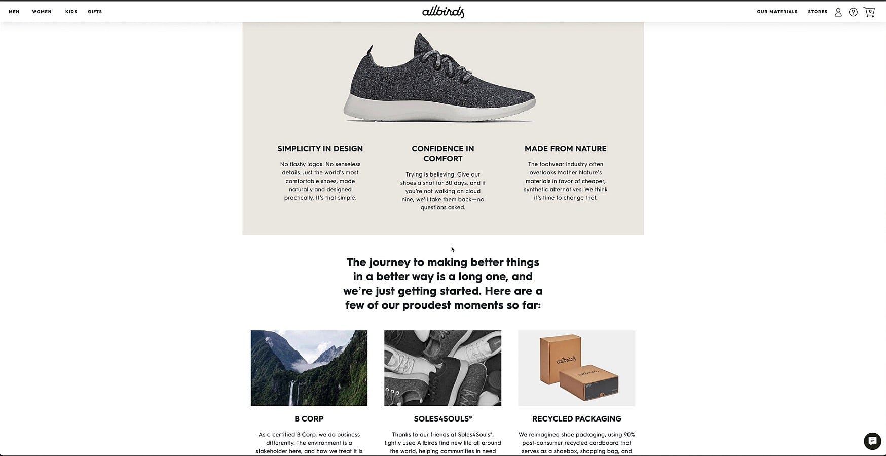
“I like that they have all of the different materials that they use.” Another user at Allbirds explored the page dedicated to the materials used to produce the shoes.
Similarly, during testing users shopping for apparel repeatedly inquired after the material makeup of products they were interested in. Users’ interest in apparel materials most likely could be related to future care instructions — which are sometimes included in product descriptions as well.
For example, some users may be looking for technical benefits of the material itself — such as Gore-Tex being waterproof, or spandex being flexible. Other users may have material sensitivities or simply preferences for one material type over another.
Whatever the users’ needs happen to be, expanding on material and ingredient information using dedicated pages helped many users find suitable products and made their ultimate purchasing decisions easier.
4) Manufacturing and Production Practices
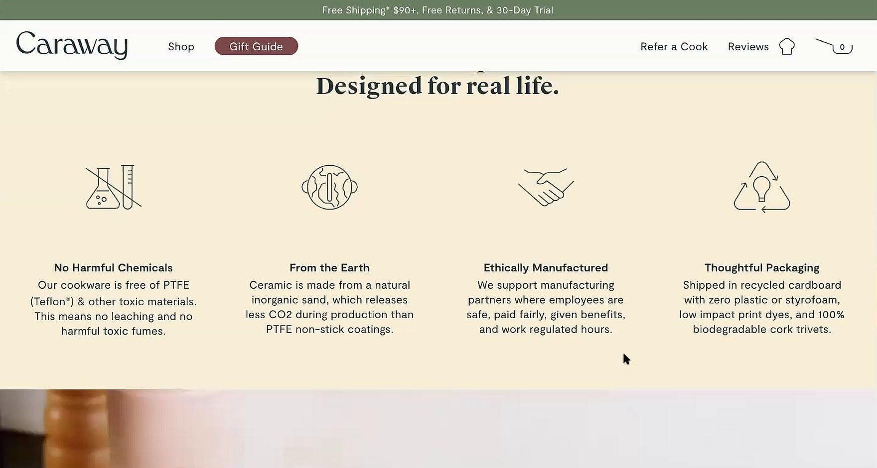
“Ethical manufacturing, I feel like that’s a selling point!…I’ll go to ‘About Us’ and see if they talk more about the ethical manufacturing.” This user’s interest in Caraway’s products was piqued by the information on the brand’s manufacturing process on the homepage.
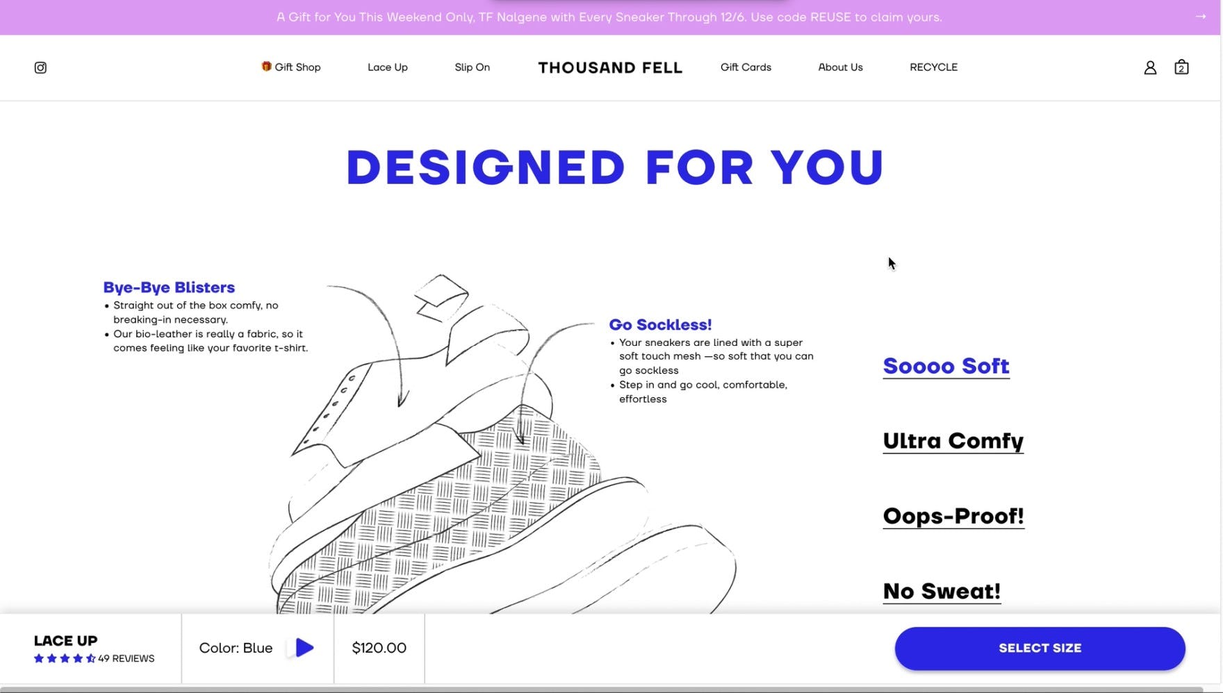
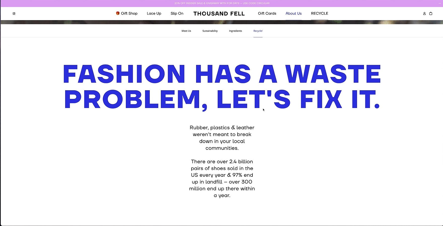
“I like good companies who try to give back a little bit…that’s actually really cool, I like this. Just from this information alone I already like what they’re about.” This user explored and appreciated Thousand Fell’s mission of sustainability, explained in detail within the “About Us” section of the site. Corporate mission statements can set brands apart from competitors and give users a positive message to connect with.
Meanwhile, for some users, supplemental information like manufacturing ethics or production practices is particularly important — and can have a major impact on their decision to purchase from a brand.
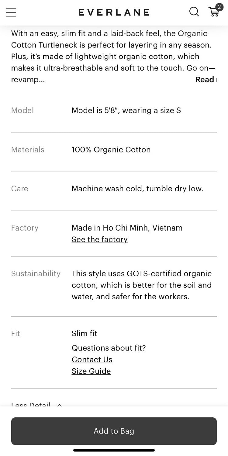
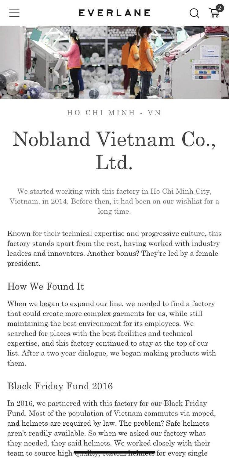
The product specs section on Everlane’s product pages (first image) links to a wealth of information on the ethics and sustainability of their manufacturing process (second image). For users for whom this information is top of mind, this direct link allows them to quickly access this information without needing to hunt through the site.
As with materials and ingredients, providing details about potential product concerns — sustainability, ethics, manufacturing etc. — answers users’ questions and allows them to discern if the product will meet their standards.
5) Overall Product Quality
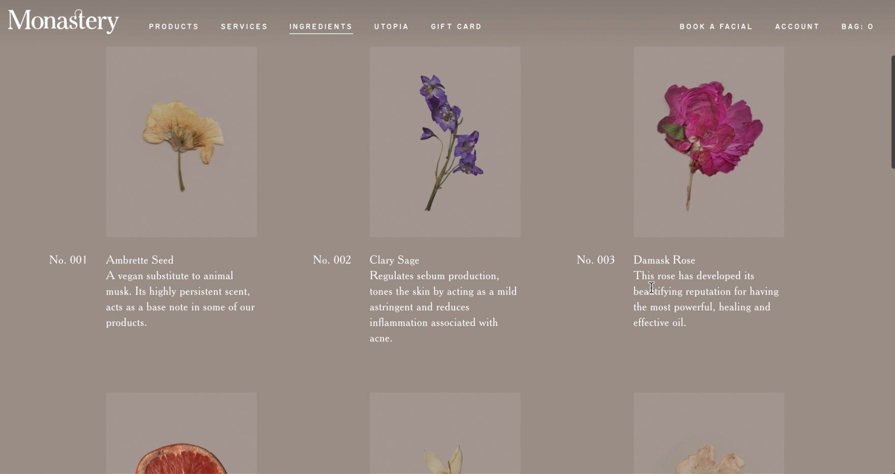
“It seems like everything is healthy here.” A user used the “Ingredients” page at Monastery to learn more about the composition of the beauty products.
This user went to the “Our Stories” page on Allbirds to learn more about the shoes’ design and quality.
Beyond the specific product attributes of materials and ingredients, and manufacturing and production practices, many users have more general information needs about the products.
Overall, new DTC brands face the challenge of convincing users why it’s worth purchasing their products over possibly cheaper and more widely available products from mass-merchants or larger, established brands.
In practice, relying on the information available on product pages — as detailed as it may be — may not be enough to convince users that the brand’s products are truly unique and worthwhile.
“Why do they not have this on the homepage? Why so hidden?…I think most people need to see this because…these are so much more interesting than white shoes.” Another user was impressed with the level of information on the product details page but wished the information had been provided earlier, saying she would have been “hooked” much sooner.
Bolstering the site with additional information on the products’ overall quality can help skeptical users understand what sets the brand apart and why it’s worth considering over other alternatives.
As well, DTC brands can further enhance this learning experience with engaging features, such as descriptive imagery, videos, and gifs, to highlight unique brand and product features.
Supplementary Brand and Product Pages Improve Users’ Perception of the Site
“I like their mission.” This user explored Thousand Fell’s “About Us” section detailing their brand ethos, product sustainability, and recycling program. This level of detail helps users get to know — and even form a personal connection with — a new brand.
Just as customers in a physical boutique store might stop to chat with the owner or store employees, users on DTC, small catalog sites feel the need to “get to know” the site before making a purchase decision.
Indeed, this user need for deeper understanding of and even personal connection with the brand is unique to DTC sites, presenting both a risk and opportunity for DTC brands compared to traditional B2C retailers.
In particular, DTC, small catalog sites need to provide details on the brand’s
1) “origin story” and
2) values,
and on the products’
3) materials and ingredients,
4) manufacturing and product practices, and
5) general quality
to ensure users have a comprehensive understanding of the unique benefits of purchasing from a particular DTC, small catalog site.
In practice, DTC brands that have a lot to say about their brand story or unique product qualities can safely dedicate resources — and space in the main navigation — to bringing these stories to life, as our research shows that these pages are highly sought after and appreciated on DTC sites.
Getting access: all 413 DTC UX guidelines are available today via Baymard Premium access. (If you already have an account open the DTC Study.)

