Key Takeaways
- While on-site search is a vital tool for product-finding on larger retail sites, users on small-catalog, direct-to-consumer sites rarely looked for this tool.
- 100% of DTC users’ initial product-finding behavior was to utilize the site’s main navigation and browse the product catalog manually, turning to search only if this strategy failed.
- Sites with a very small number of products should prioritize investment in navigation and product information above an on-site search tool.
Through years of UX research on traditional retail sites (including mass merchants like Amazon or Target), we’ve observed how on-site search is an incredibly popular and valuable resource for finding relevant products.
Unsurprisingly, when sites sell hundreds or thousands of different products, search often becomes users’ primary product-finding strategy over putting forth the time and effort to deliberately navigate the site’s (likely huge) product catalog to the appropriate category and apply the relevant filters.
However, during our testing of small-catalog, direct-to-consumer (DTC) sites, we observed that, far from being a primary product-finding strategy, users’ overall use of and concern with on-site search was entirely different — leading to major implications for DTC sites.
In this article, we’ll describe:
-
The unique product-finding behaviors we observed during testing of small-catalog DTC sites — and how it diverges from what we’ve observed on larger retail sites
-
How small DTC brands can facilitate users’ natural behaviors and virtually eliminate the need for on-site search altogether
Users on Small DTC Sites Rarely Use Search
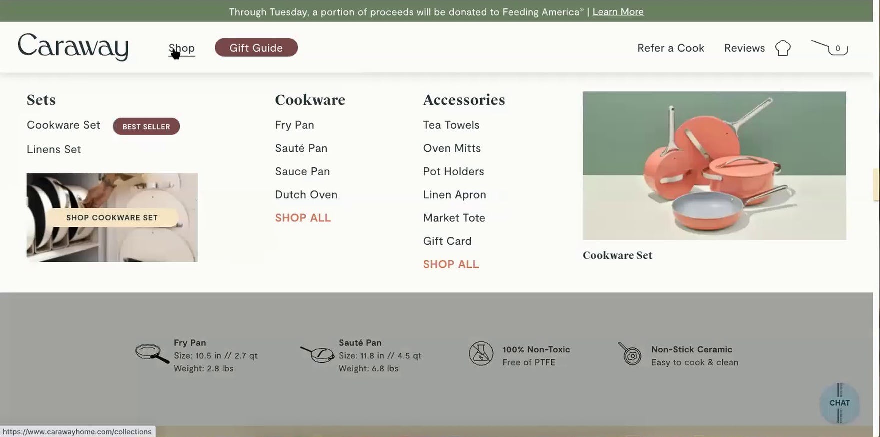
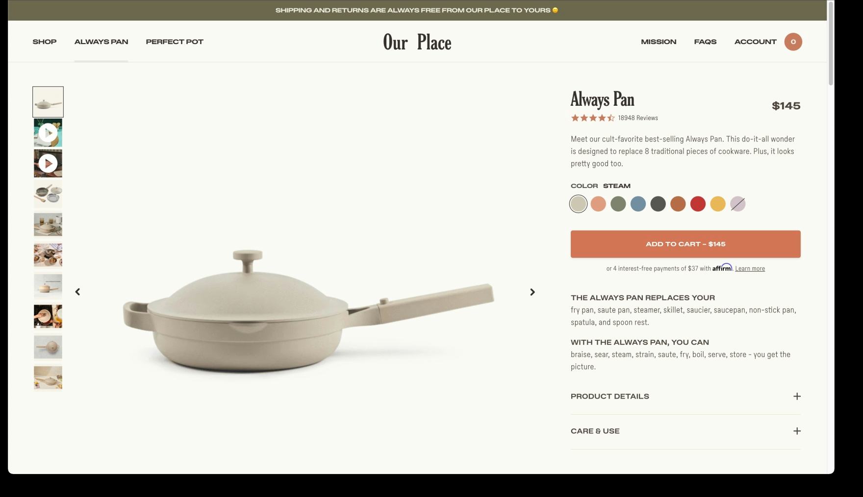
During testing, users very rarely penalized sites that didn’t support on-site search. As such, DTC brands with very few products, such as Our Place, generally don’t need this functionality to support users’ natural behavior.
During testing, 100% of users’ initial product-finding behavior was to utilize the site’s main navigation and browse the product catalog manually instead of turning to search (which was available on 23% of the test sites).
In fact, sites during testing were very rarely penalized for not having search: Only 15% of users on DTC sites ever looked for a search tool during testing, and — importantly — only did so after their primary strategy of browsing for products had failed.
With the flattened category taxonomy and smaller product catalog, users are likely to regard the category navigation method of product browsing on niche DTC sites as more approachable and easier to manage compared to larger and more complex retail sites.
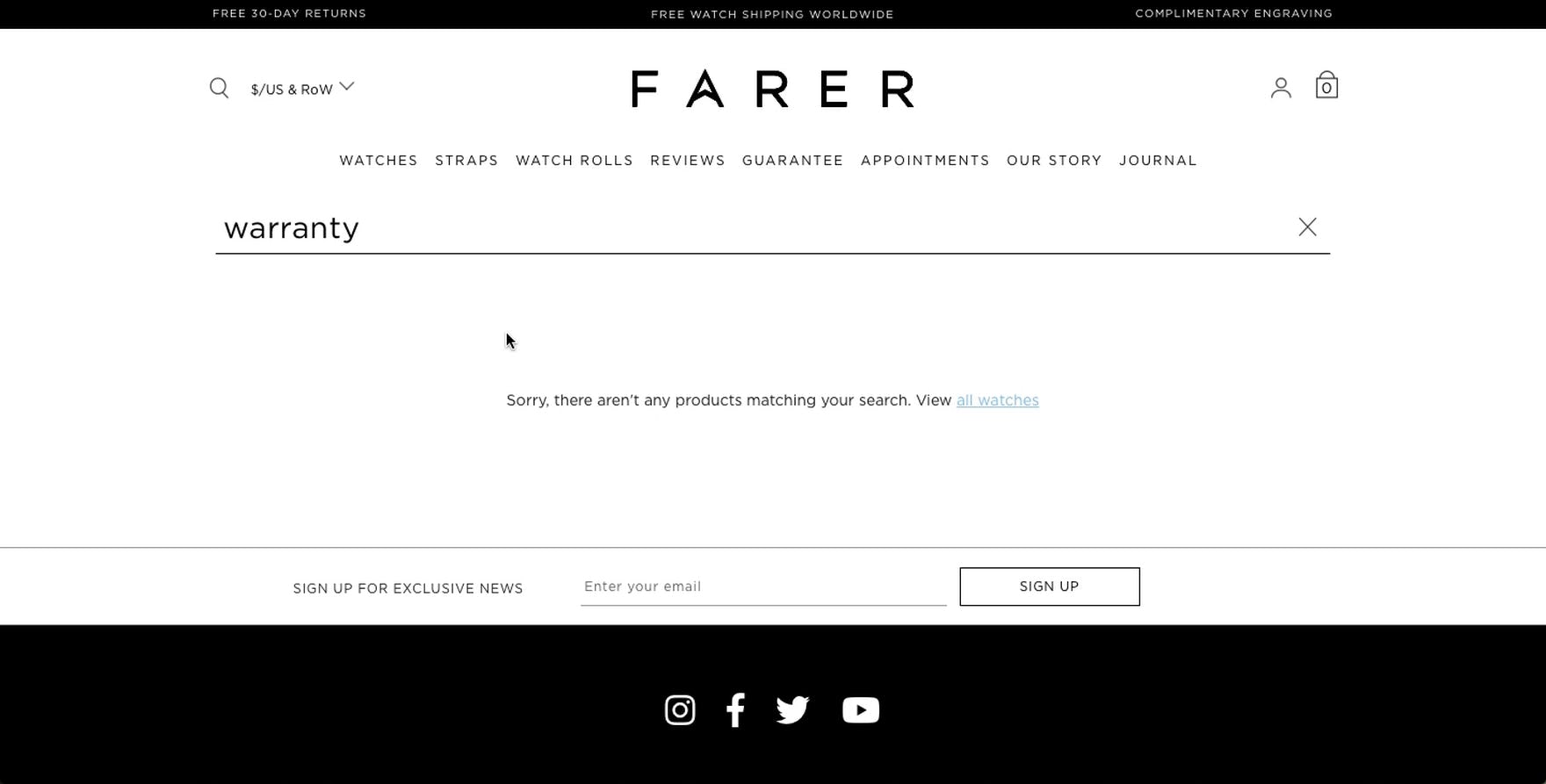
“Then I would look for ‘warranty’…I don’t see any warranty.” In a rare instance of search use from testing of DTC sites, this subject’s nonproduct search returned no results. Search on many small DTC brand sites is likely to be added as an afterthought, leading to frustration and disappointment for those who use it.
Moreover, during testing, when search was available it tended to underperform in the few instances it was utilized.
Indeed, our benchmark of 26 DTC sites shows the average search performance to be merely “mediocre”, making it likely for users to have a poor search experience.
While users may be drawn to search on larger sites that are likely to appropriately invest in a robust and fully featured search tool, prior experience with poor quality or unoptimized search on other small retailers may dissuade users from relying on search for product finding.
Indeed, using search as a last resort when navigating or browsing has failed — only to be disappointed with no or low-quality results — may be a worse overall experience than if search is not offered at all.
Most Small DTC Sites Don’t Need On-Site Search
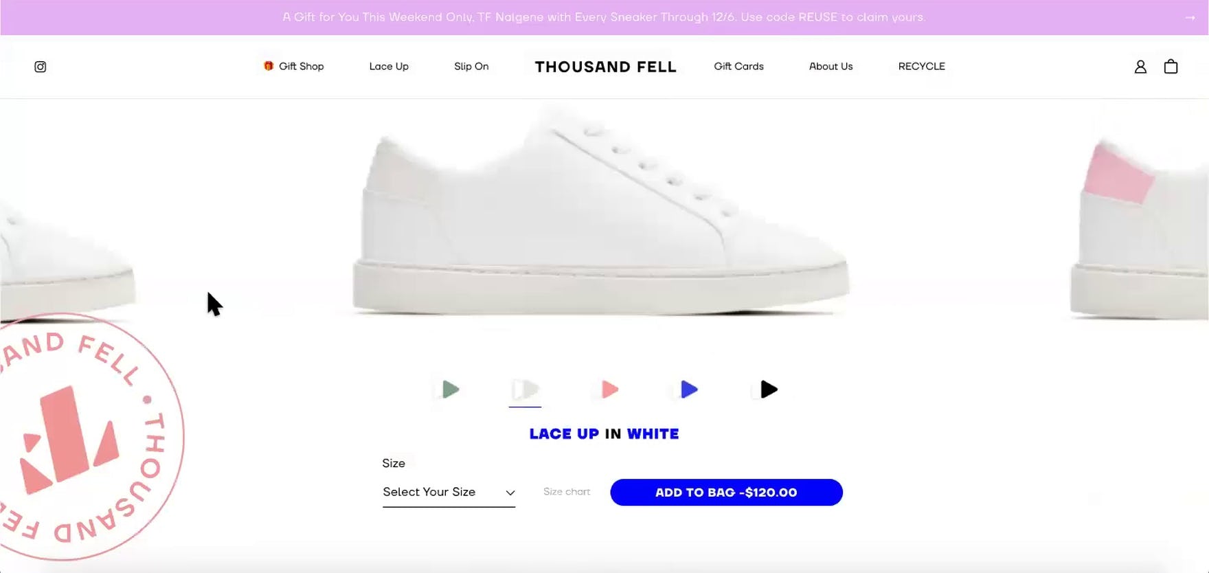
During testing of small-catalog DTC brands such as Thousand Fell, users barely noticed when a site did not support on-site search, suggesting that this feature is likely to go unutilized.
Given the low usage rates observed in testing, as well as users’ observed behavior in reserving search as a fallback strategy, most niche DTC and small catalog retailers can safely deprioritize on-site search in favor of other UX investments.
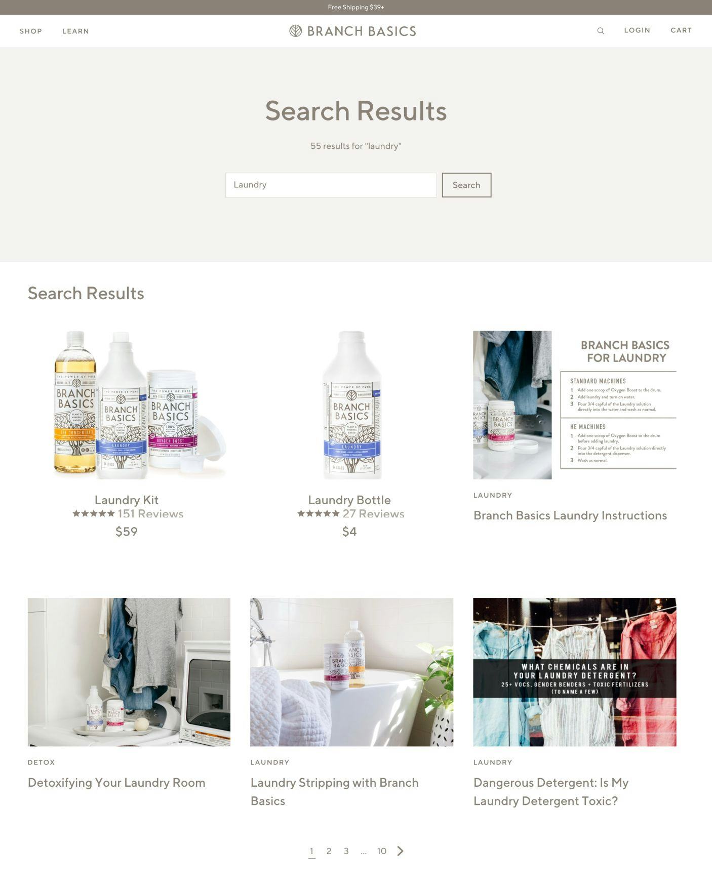
Branch Basics sells fewer than 20 products on its site (including various combination sets) yet still maintains an on-site search tool. While search may be beneficial for navigating the site’s auxiliary content and nonproduct information, most small retailers and DTC sites can expect a better return on investment by prioritizing areas of the site other than search.
Of course, this is not to say small retailers and DTC brands should never offer a conventional sitewide search tool; for a potential small subset of visitors, such a feature may be beneficial and even valuable, depending on the site’s content and user demographics and preferences.
For instance, brands that have an abundance of helpful auxiliary content, or an audience of discerning users likely to search for products with unique product features, may be well-served by an early investment in on-site search.
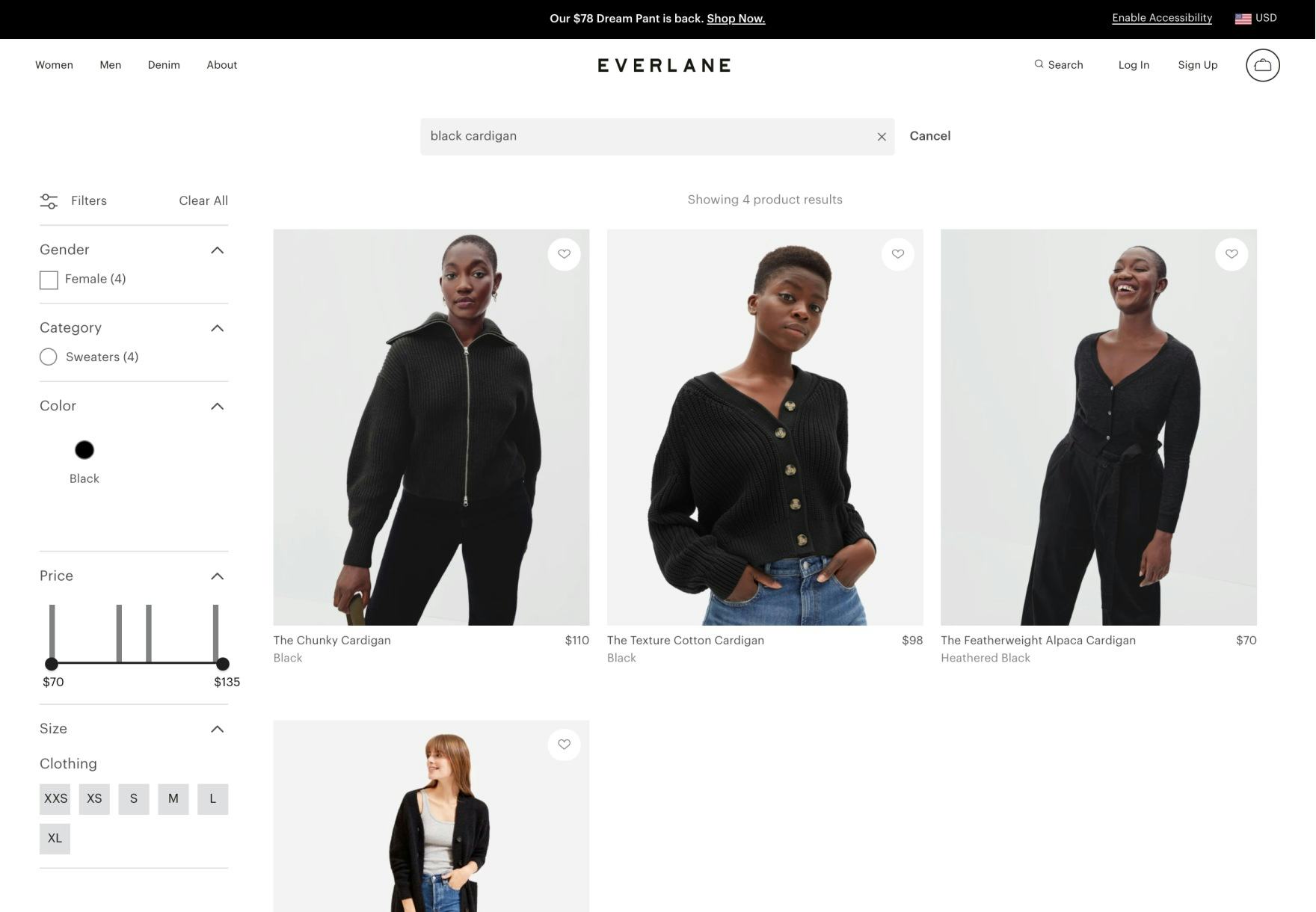
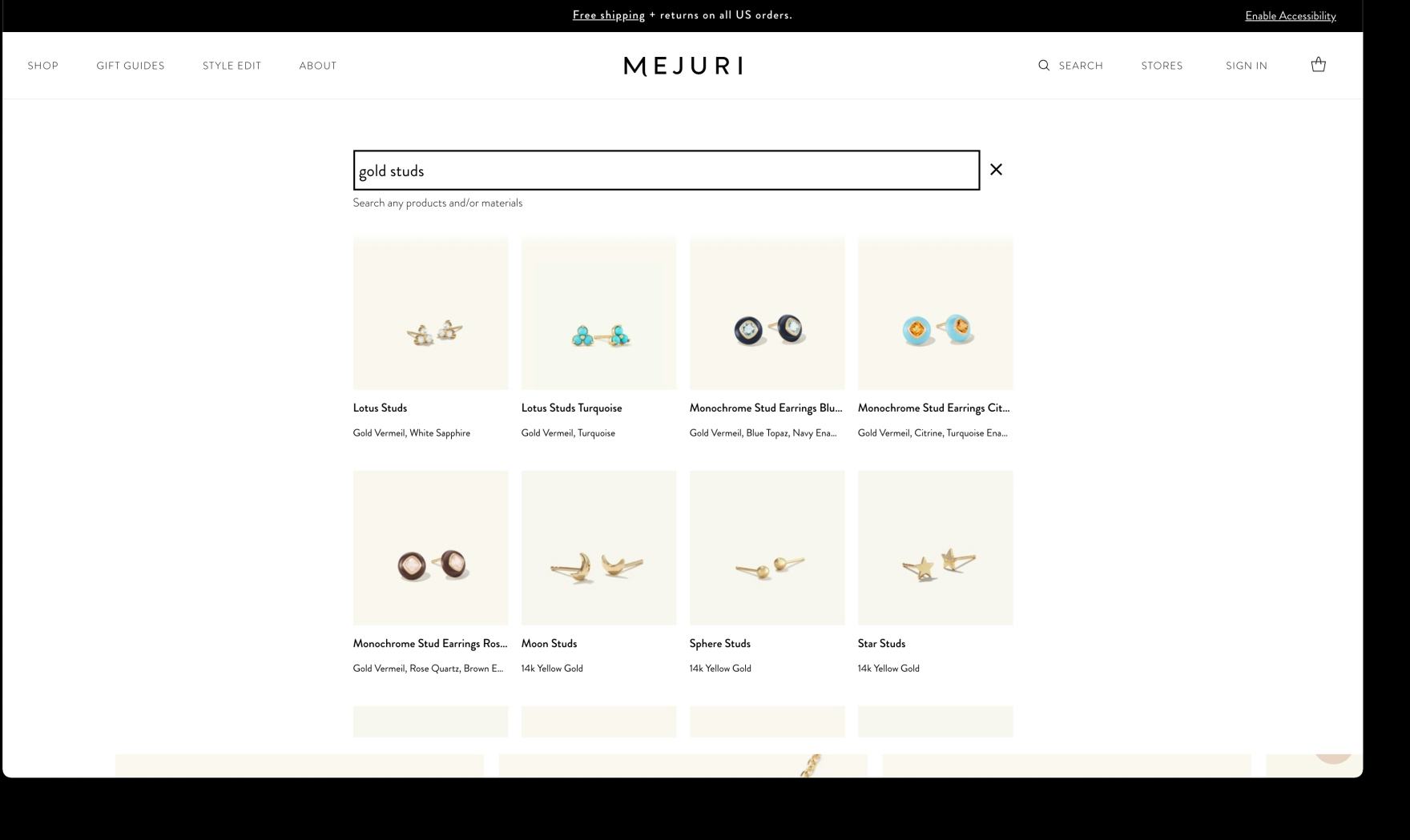
Once a DTC brand reaches a medium-to-large product catalog (around 20 or so unique products), some users are apt to switch from browsing to searching as a primary product-finding strategy. Shown above, Everlane (first image) and Mejuri (second image), having larger product catalogs, support users’ searching as well as browsing behavior.
Additionally, once a brand expands beyond a very small and obvious catalog of product offerings, more users will begin to look for search as a means to find specific products they’re interested in, making it important to start supporting on-site search as a means to more efficiently navigate as the brand and its product offerings grow and diversify.
Yet it’s important to remember that, even for the largest retailers with an abundance of resources, on-site search is a complex feature that can be tricky to implement well — as evidenced by our benchmark of some of the highest-grossing ecommerce sites.
In practice, smaller and less-well-resourced sites can face an uphill battle in providing a high level of search support.
“They have all the products listed individually, versus what I would prefer to see…like face serums, masks…I feel like it would make sense to categorize these a little bit more…Do they have a search bar? No… If you could search for like, ‘face masks’, that would help me find what I’m looking for.” This subject was troubled by the lack of clear categorization within Mahalo’s main navigation menu (first image) and looked for an absent sitewide search as a fallback to more easily navigate to certain kinds of products (second image). During testing of niche DTC sites, search was only sought out after users’ primary strategy of browsing for products had failed.
However, most niche, small-catalog DTC sites will get a better return on investment by prioritizing a solid navigation structure and other more universally impactful site features.
With a clear understanding of what is available on the site, users are likely to have fewer questions about what the brand offers and will be able to easily navigate to relevant products and nonproduct information.
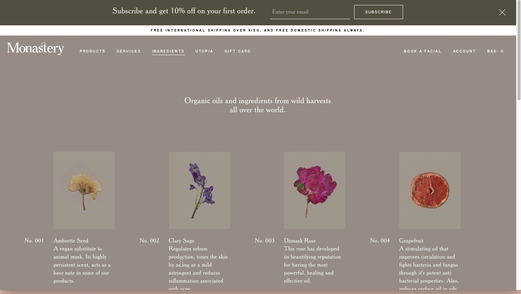
“I might search maybe ‘retinol’? I don’t see the search.” After scanning the product list and “Ingredients” page in an attempt to find if any of Monastery’s products contain retinol, her favored ingredient, this subject attempted to turn to search as an alternative product-finding tool. In practice, the lack of search on DTC sites only becomes detrimental when information scent or product information is insufficient.
Users may also turn to search when details for individual products are lacking, reasoning that search may be more efficient than carefully looking through product listings or details pages. In effect, search again becomes a fallback strategy when product information on the listing pages or product pages is unclear or incomplete.
Instead, providing as much rich product information, specifications, and descriptions as possible helps to support users’ primary browsing strategy and lessens the need for an on-site search tool.
The Importance of On-Site Search Increases in Proportion to the Product Catalog
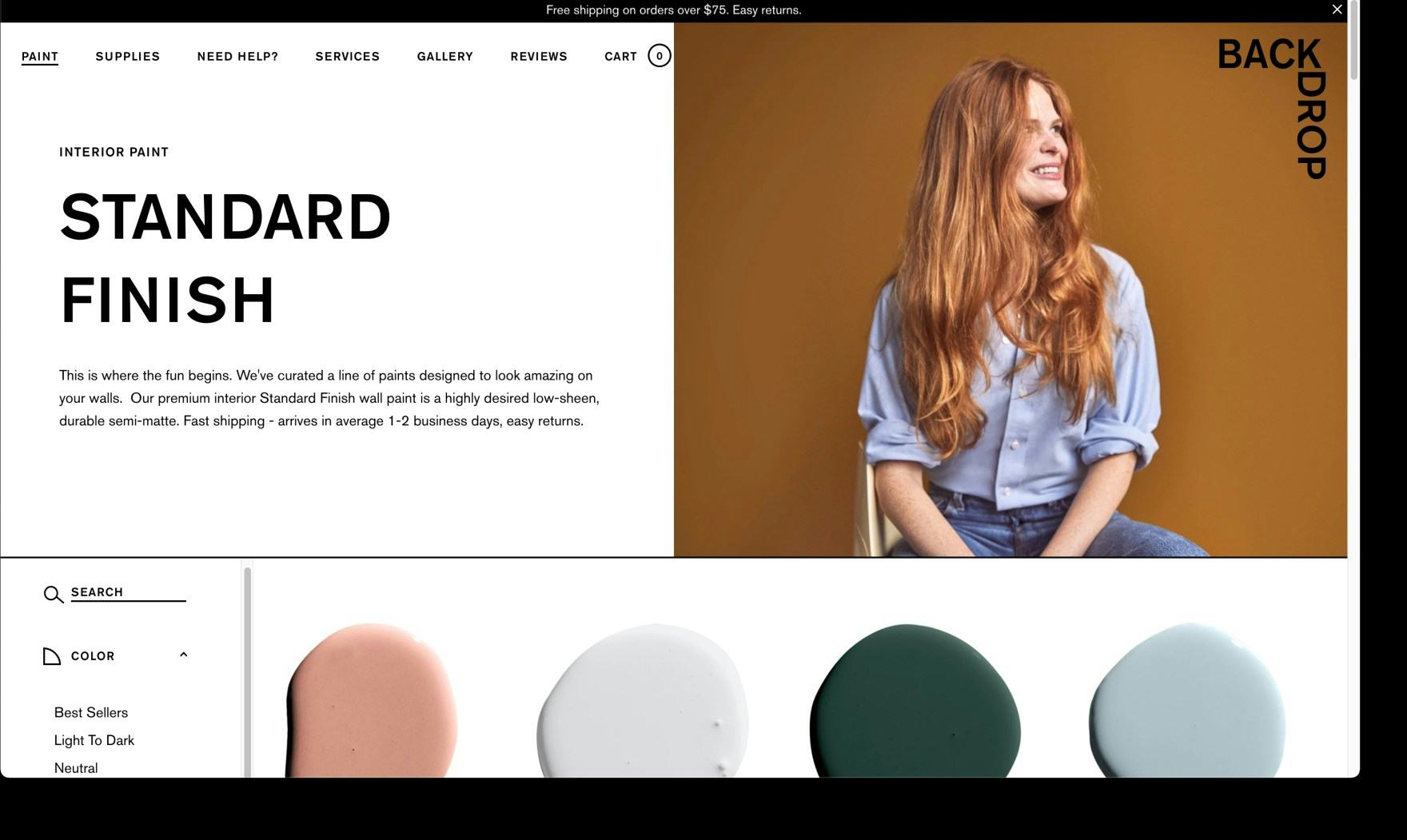
DTC sites with a small and highly edited catalog, such as Backdrop, are unlikely to benefit from investing in on-site search.
Small-catalog niche brands can certainly develop robust search tools — but when resources are finite, prioritizing other more universally beneficial site elements is almost certain to be a better return on investment.
In particular, a clear navigation structure and robust product information should be prioritized.
Additionally, bespoke imagery and comprehensive FAQs gives users of DTC sites the clarity they need to avoid needing to use search in the first place.
Of course, after such site tools and elements have been perfected — or once the brand is able to expand its product offerings — sites may consider supporting on-site search as an additional benefit (and reference Baymard’s comprehensive research on on-site search for properly implementing this complex tool).
Getting access: all 413 DTC UX guidelines are available today via Baymard Premium access. (If you already have an account open the DTC Study.)
This article presents the research findings from just 1 of the 650+ UX guidelines in Baymard – get full access to learn how to create a “State of the Art” ecommerce user experience.

