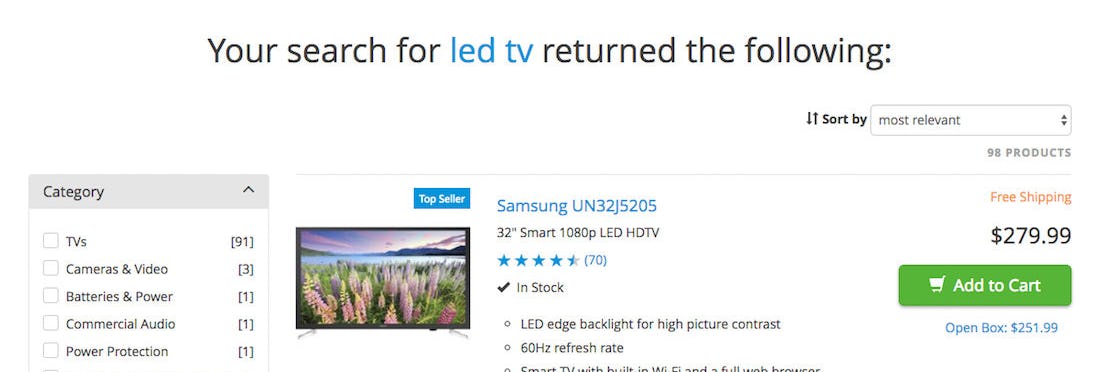
During our search usability testing of e-commerce sites we observe that, many users will choose to simply search for a product type, e.g., “mens shirts” or “led tv”, rather than try to use the main category navigation to find a category of the same name. The primary observed reason why users do this is simply due to “convenience”. So it’s important that those users who choose to search rather than manually navigate to the category, are provided with an equally good product exploration experience.
However, on many e-commerce sites, the users who search will get a subpar product results listing experience, compared to users who navigate to the same scope or category using the main navigation.
When users aren’t autodirected or guided to matching categories or subcategories, they may miss out on beneficial features and functionality that would otherwise be available through the matching main navigation category — which can result in users being unable to find items that match their specifications. Yet, our benchmark reveals that 46% of e-commerce sites don’t have this functionality.
This article will explore our large-scale usability test findings relating to when and why it’s beneficial to autodirect or guide users to a matching category. We’ll cover:
- The 3 issues users can encounter when not autodirected to an existing category scope
- Autodirecting to a category scope with a 1:1 match
- What to do when there isn’t a 1:1 match
The 3 Issues Users Can Encounter When Not Autodirected to an Existing Category Scope
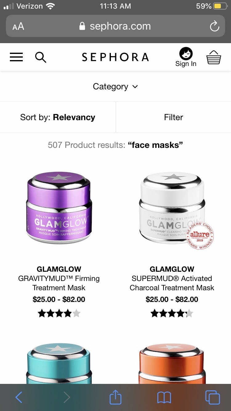
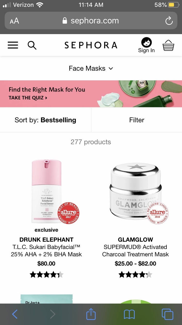
1) Overwhelming and/or irrelevant number of results. At Sephora during our testing, when users search for “face masks”, a query that precisely matches an available subcategory, they receive almost twice the number of results (first image) compared to if they navigate to the “Face Masks” subcategory (second image). The “extra” results returned when searching is irrelevant and highly partial results, significantly diluting the relevance of the overall product list.
1) Overwhelming and/or irrelevant number of results. Failing to autodirect or guide users to matching categories often results in users being forced to contend with an overwhelming and unmanageable number of search results.
Baymard’s testing revealed that there are often more product results available through searching compared to the products available when navigating to the category product list using the main navigation. For example, a user navigating to the “Laptop Batteries” subcategory sees a list of 250 products, compared to a user searching for “laptop batteries” who sees a list of 400 products. Due to the open-ended nature of search it will often, and especially in broad product catalogs, include a large amount of low-relevance partial matches.
When faced with an overwhelming number of results, users eventually gave up and tried a new search, or abandoned search altogether for the category navigation. After a few unsuccessful searches, and sometimes a few attempts at filtering, some users simply gave up and left for another site. Others began to explore the results, often spending several minutes unsuccessfully attempting to locate a product of interest.
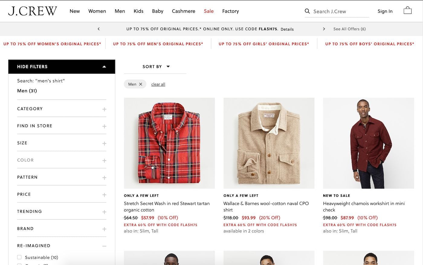
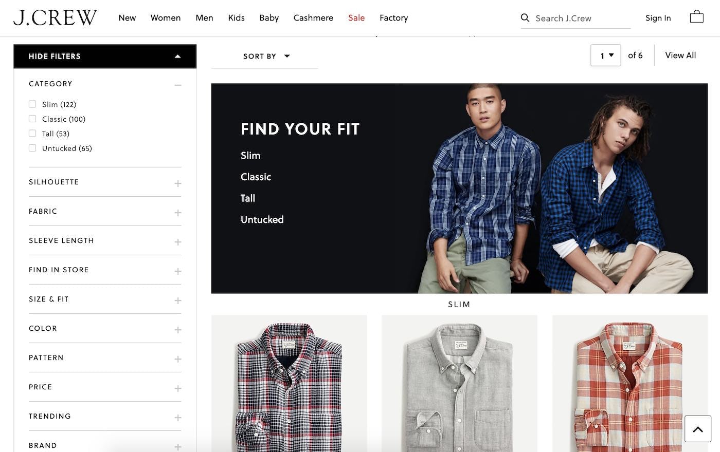
2) Results that fail to include all products in an existing category. On J.Crew, a user searching for ”men’s shirt” receives only 31 results. In contrast, if they navigated to the “Men’s Shirts” category, they would see 279 items available.
2) Results that fail to include all products in an existing category. Conversely, when users search for an existing category or subcategory, as opposed to navigating to the category via the category navigation, they’re sometimes presented with fewer products than actually exist in that category.
For example, a user navigating to the “Men’s Shirts” category and seeing a list of 500 products, vs. a user searching for “men’s shirt” and receiving only 200 results. This clearly limits users’ ability to effectively explore the product catalog and is likely to result in users being unable to find a suitable product — simply because they searched instead of using the category navigation. This too was in testing observed to consistently lead to site abandonments.
(You can find out more about users’ most common search query types, like “Product Type” searches in our article Deconstructing E-Commerce Search: The 12 Query Types.)
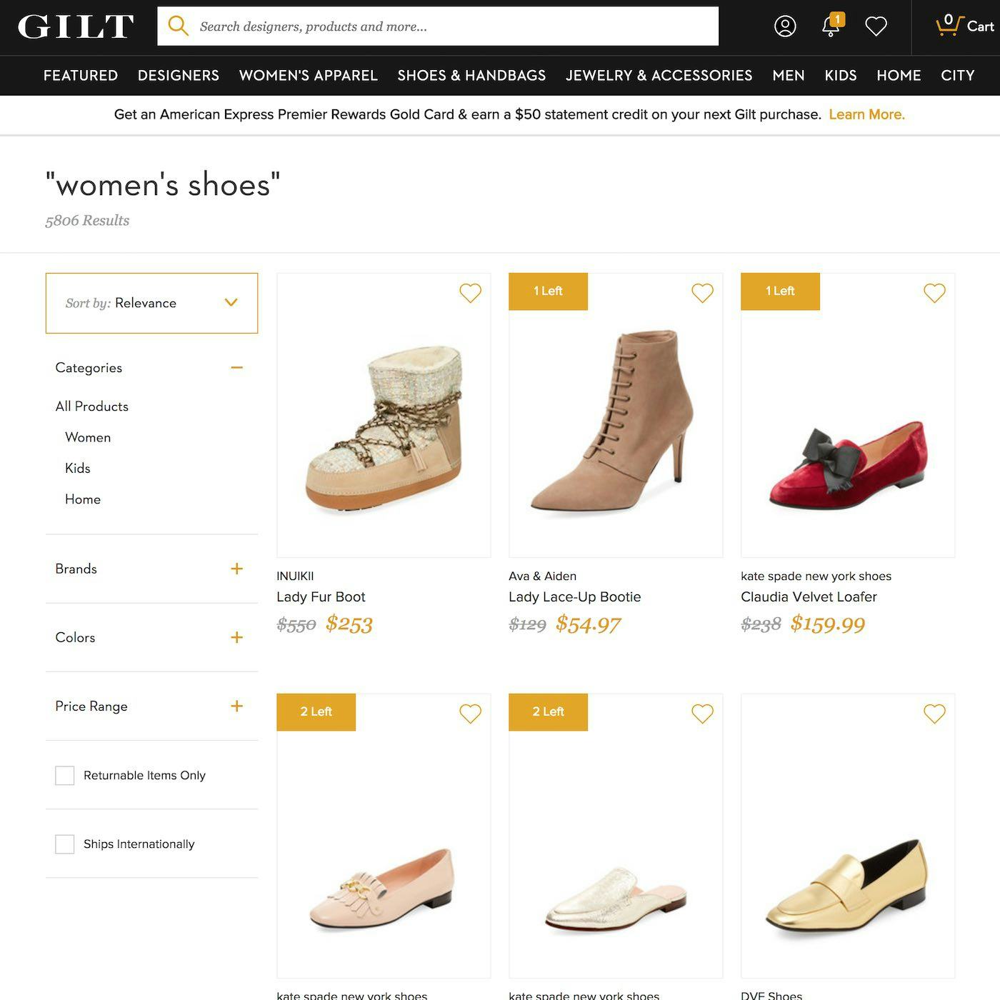
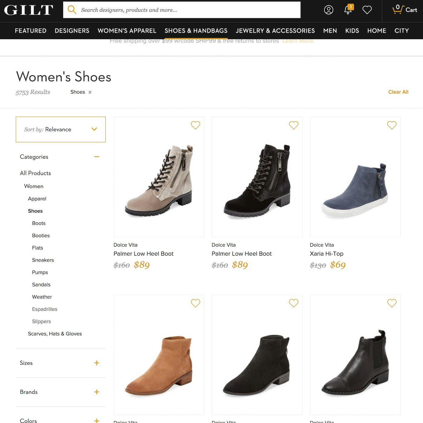
3) Poorer filtering and sorting options. While you’ll find nearly the same number of shoes on Gilt whether you’re searching for “women’s shoes” (first image) or pick the “Women → Shoes” category (second image), notice how a vastly more powerful set of filters are available when picking the category — the user can filter the product list by shoe type, size, etc. Unfortunately, Gilt doesn’t autosend users to this scope when they search for “women’s shoes”.
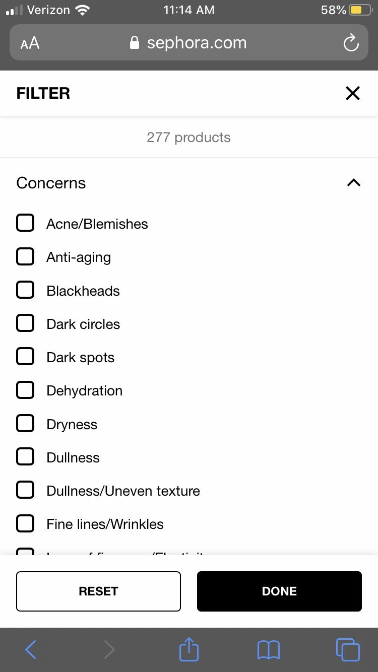
3) Poorer filtering and sorting options. Similarly, when viewing search results for “face masks” on Sephora, users can only filter by “Brand” and “Price” , but navigating to the “Face Masks” subcategory page reveals an additional key filter for skin “Concerns” (second image). Finally, the “Face Masks” subcategory also includes a product-finder quiz (first image), which can also help direct users to suitable products, but which isn’t available on the search results page.
3) Poorer filtering and sorting options. During testing, some users who searched for an existing category or subcategory, and who received subpar results, tried to tailor the results by using tools like sorting and filtering. For a lot of search results implementations category-specific filtering and sorting tools are often not available if a user’s query isn’t recognized as matching an existing category or subcategory. This limits users’ ability to tailor the search results — for example, a “Size” filter that’s not available when a user searches for “Men’s Shirts”, but which is available when navigating to the “Men’s Shirts” category.
(PS: This sub-issue is solvable if sites have Faceted Search filter suggestions, yet our latest late-2019 benchmarking reveals that even among the world’s largest e-commerce sites, 51% of sites still doesn’t offer faceted search filter suggestions. This is unchanged compared to our 2014 and 2017 search UX benchmarks. See guideline #376 for more on proper Faceted Search.)
Therefore, failing to autodirect or guide users to matching categories or subcategories can have serious consequences. For many users, the end result will be that they are unable to find a suitable product, and will decide to look for the product elsewhere.
Autodirecting to a Category Scope With a 1:1 Match
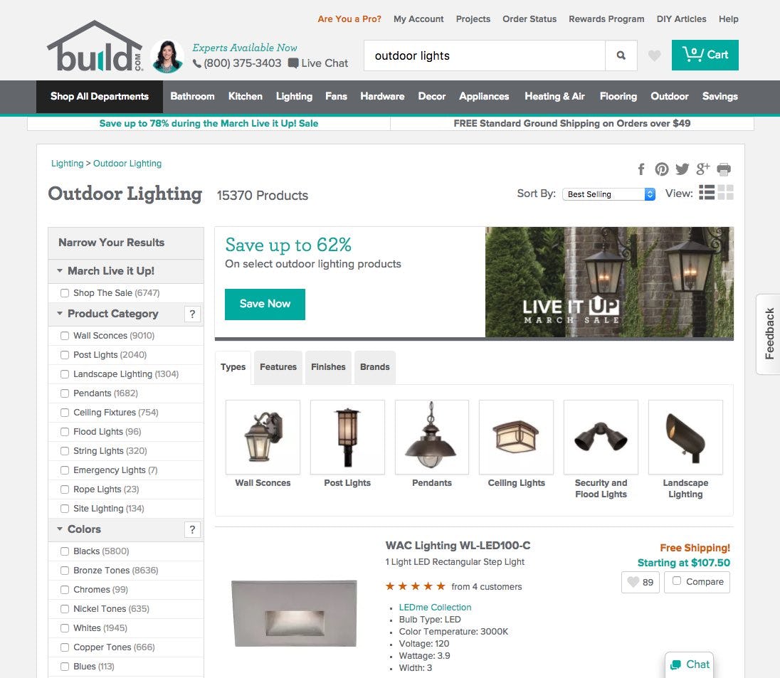
A search for “outdoor lights” on Build.com redirects users to the “Outdoor Lighting” category page, where they have access to many category-specific filters, which they can use to further refine their results.
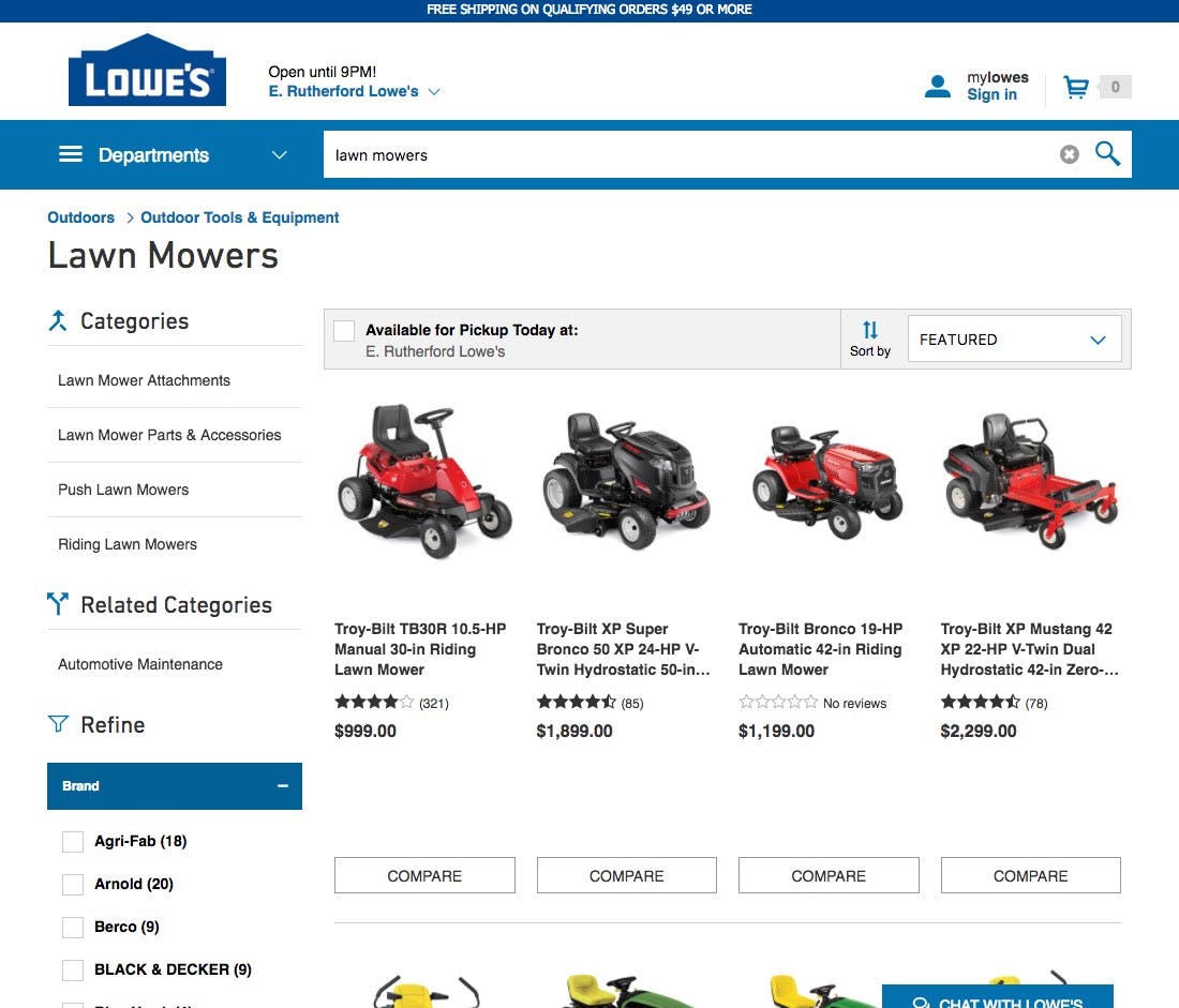
On Lowe’s, a search for “lawn mowers” redirects users to the category page for “Lawn Mowers”. Users can navigate among the subcategories of “Lawn Mowers” (“Lawn Mower Attachments”, “Riding Lawn Mowers”, etc.) or begin refining the product listing with the contextual filter options.
When the user’s search query is more or less a 1:1 map to an existing category or subcategory, they should be autodirected to appropriate Intermediary Category Pages, if one exists.
A 1:1 map between the user’s query and specific product categories commonly occurs for generic Product Type queries, while matches with product finders are often caused by Compatibility Queries (see our article on Deconstructing E-Commerce Search: The 12 Query Types to find out more on search query types).
So, directing the user to the appropriate Intermediary Category Page means that they see a page that is custom designed to match the unique aspects of that particular group of products and affords the user more control over the list (e.g., by having category-specific filters and sorting options, or wizards, available). Sometimes the category-based product list layout is also customized to the product it contains, e.g. showing larger product thumbnails for the product categories that are mianly visually-driven.
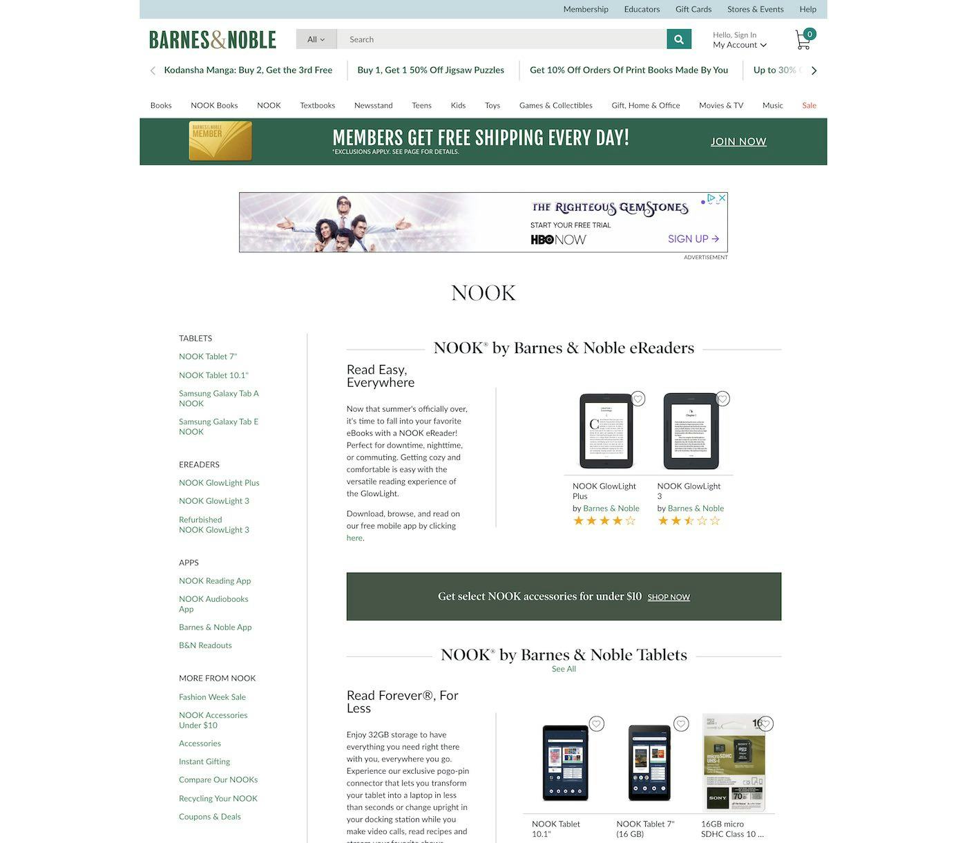
On Barnes and Noble, a search for “nook” autodirects to the “Nook” subcategory page, which features helpful descriptions of different models as well as links to compatible accessories and ebooks. (Although the query should be persisted on in the search field as well.)
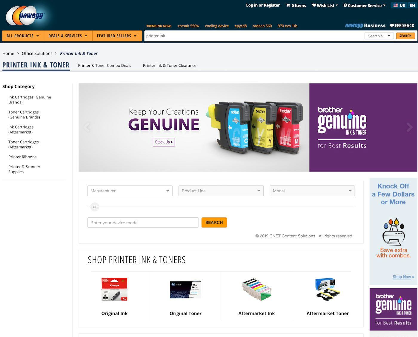
Newegg has a printer ink finder tool on its “Printer Ink & Toner” category page. Users searching for “printer ink” are appropriately redirected here, where they can use the prominent finder tool to determine which ink cartridges will work with their printer (note how the users’ query is still persisted in the search field, a vital detail that encourage searcy query iterations).
Additionally, intermediary category pages often contain guides, product-finder wizards, and other content that’s specifically tailored to users interested in that particular product type. For example, a user could be pointed to lipsticks that are likely to be a good match by answering questions regarding skin tone and desired level of moisturizing.
If this same content isn’t available, however, when a user searches for the category (instead of navigating to it), then they’re left without valuable tools that could direct them to products they would be interested in exploring further.
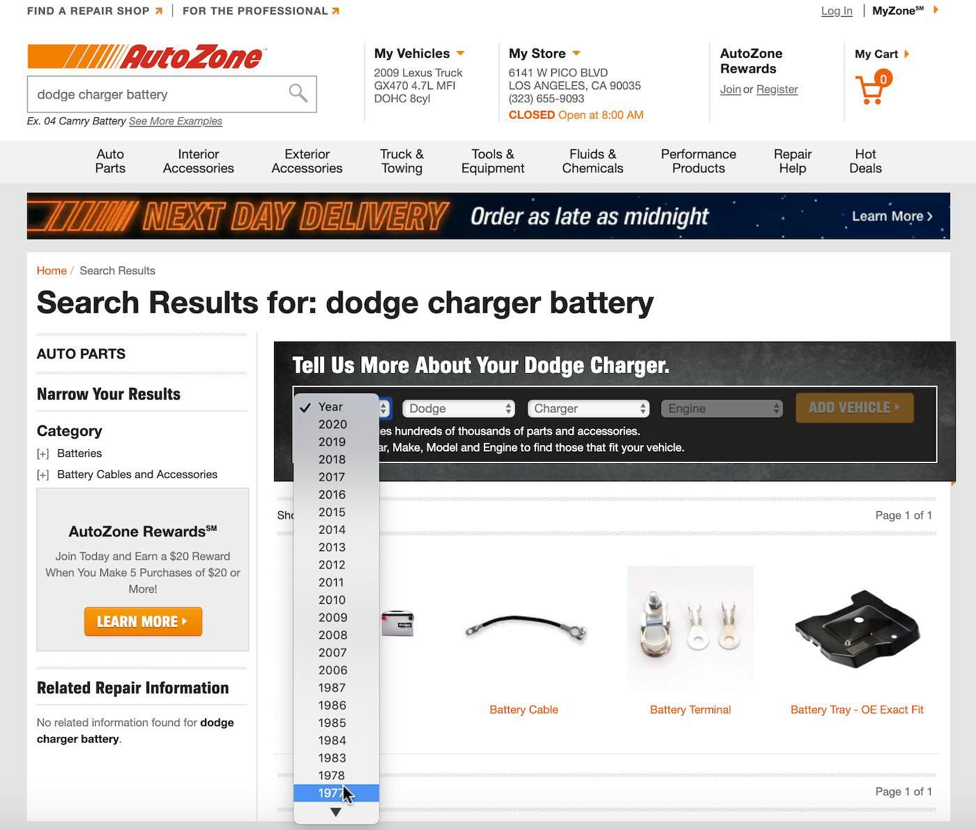
At AutoZone, a query for “Dodge Charger battery” includes a brief form above the results asking users to enter a little more detail about their vehicle in order to provide more relevant results. Note that “Dodge” and “Charger” are pre-populated based on the user’s query.
For product finders in particular, ideally any relevant information from the user’s search query is carried over into the product finder, so if a user searches for “replacement galaxy S8 battery”, and the site has a “Smartphone Battery Finder”, the phone (i.e., “galaxy s8”) would already be selected in the product-finder guide.
If there aren’t Intermediary Category Pages to direct users to, then the search results users see when searching for an existing category or subcategory should be the same, or nearly the same, as if a user had navigated to that category or subcategory via the category navigation. Additionally, any category-specific features — for example, category-specific filters, wizards, or guides — should be the same as well.
What To Do When There Isn’t a 1:1 Match
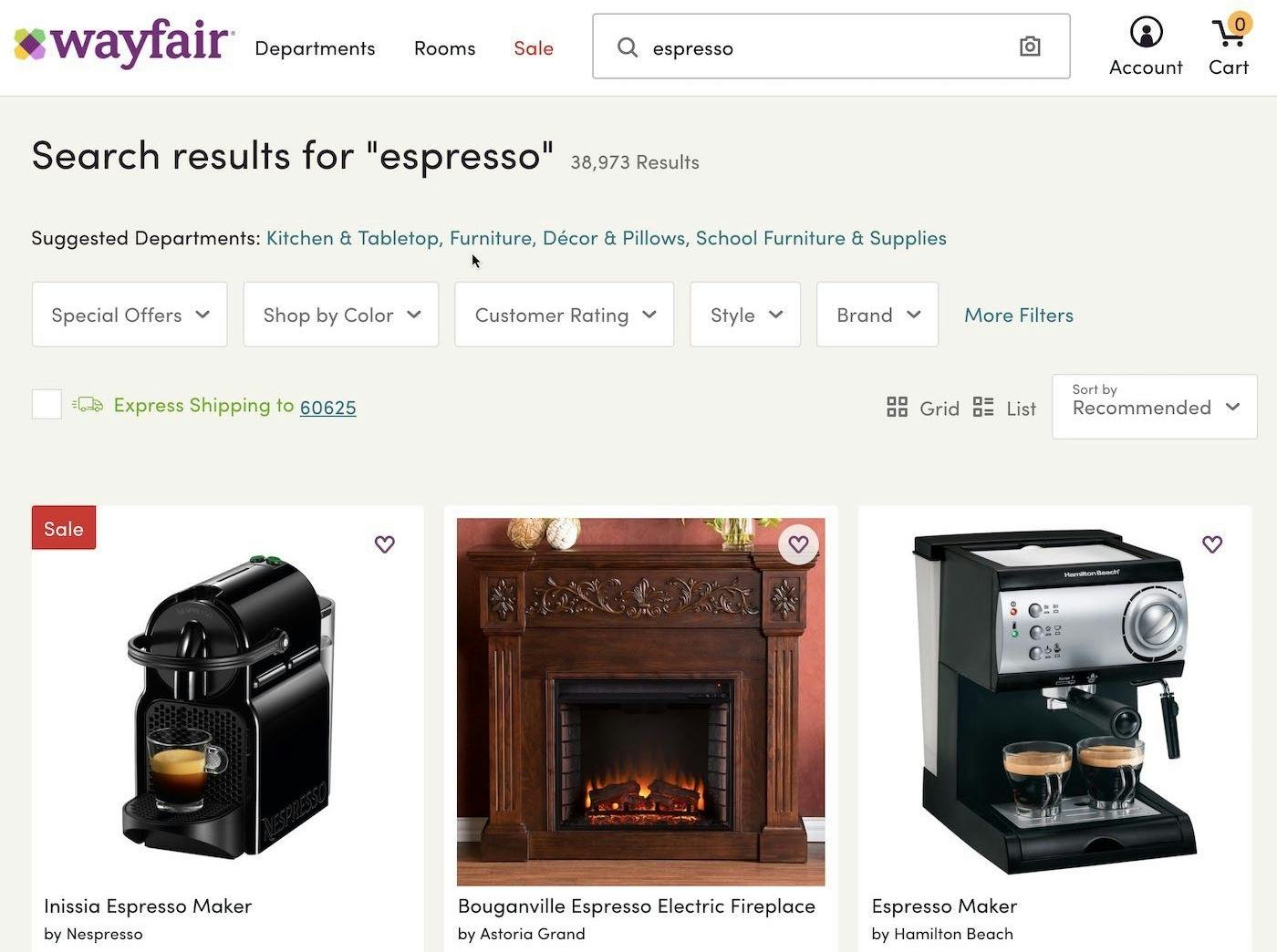
At Wayfair users are encouraged to select a “Department” scope at the top of the search results. This would help narrow down a massive search results list (38,973 results) and help users find the product that they’re looking for (e.g., an espresso machine in “Kitchen & Tabletop” or an espresso-colored chair in “Furniture”).
Now, sometimes a user’s search query isn’t a 1:1 match with an existing category or subcategory — for example, a search for “Apollo 13”, which might refer to a film, book, toys, apparel, etc., depending on the site. Or there’s a match with an existing subcategory, but a user would find a more tailored product list by selecting a top-level category scope for the subcategory they searched on (e.g., a search for “pants”, a subcategory that exists in “Mens”, “Womens”, and “Kids”). In cases such as these, autodirecting the user to a category or subcategory is an overly aggressive strategy.
Instead, users should be guided toward potentially relevant categories or subcategories by prominently providing links to likely relevant categories on the search results page.
These types of delineations are particularly common for top-level categories (“Mens” vs. “Womens” within “Apparel”), but can also apply to different types of products (“Stills” vs. “Video” for “camera”, and “Desktop” vs. “Laptop” vs. “Tablet” for “computer”). These are essentially variations of suggesting alternate queries, except whereas alternate queries are designed to pique users’ interest to explore and be inspired by related search terms, category or subcategory scope suggestions are designed to help users narrow their current results to achieve a more tailored product list.
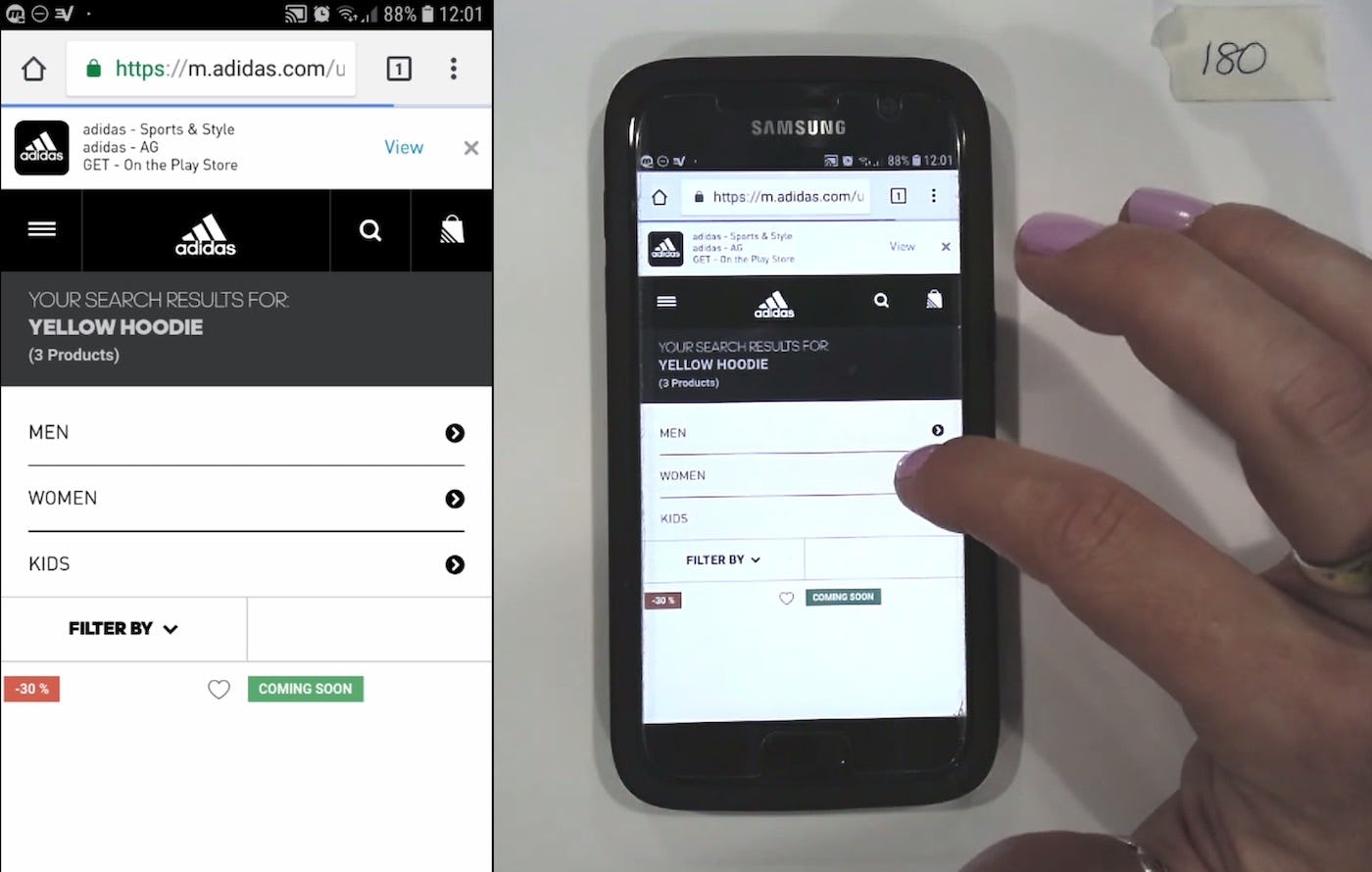
On Adidas, this user’s search returned only three results, but the search results page displayed prominent links to suggested top-level categories. With only three results to digest, it’s unnecessary to provide category links above the search results, as the relative value of narrowing the already-meager results is poor.
However, it’s important to keep in mind that category scope suggestions can be overused. For example, in cases where there are very few results (e.g., less than 10), category scope suggestions can be safely eliminated to allow users to focus on the few products in the results, and alternative queries can be provided instead to help users who’ve wound up in an overly narrow path broaden their search.
Helping Users Find the Most Relevant Products
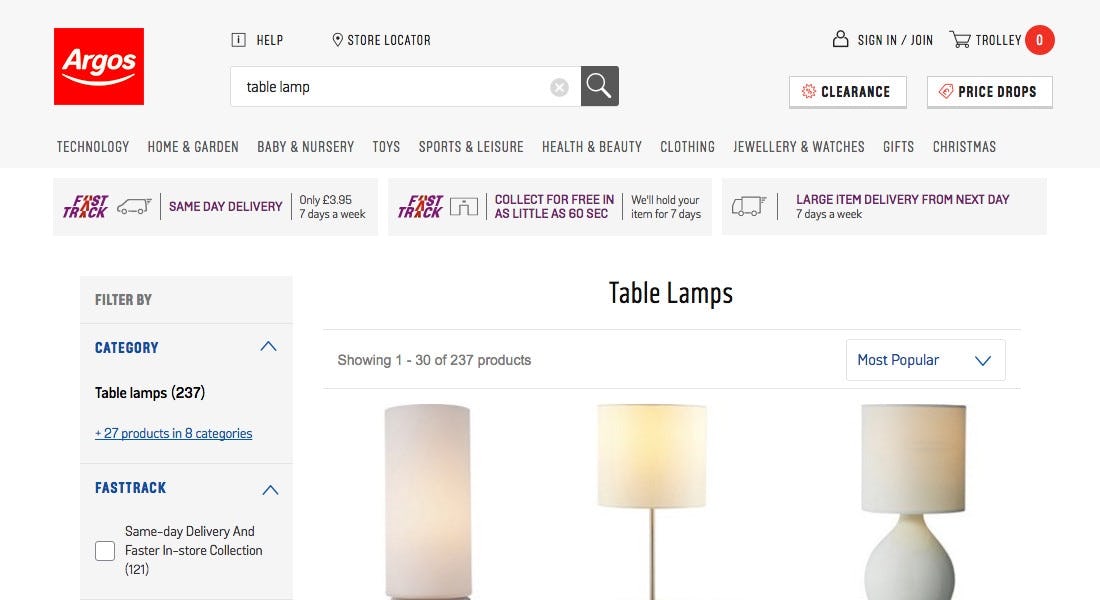
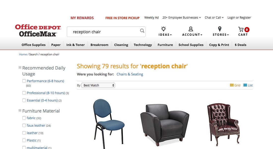
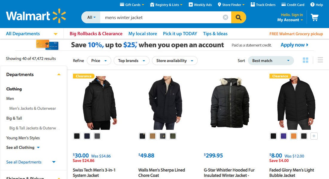
There are a few ways to help direct users to the most relevant products: autodirecting to the category scope when there’s a 1:1 match (Argos), or promoting a category scope (Office Depot), or providing categories as filters (Walmart) when there is not a 1:1 match and the user is better off selecting the scope manually.
Our most recent benchmark of 60 top-grossing US and European e-commerce sites, shows that 61% of all sites have a below acceptable search UX performance. It’s unsurprising that our testing shows that many users struggle to locate the products most relevant to them when interacting with a search results page.
In comparison, category-specific pages and results often feature benefits that standard search results pages lack, including clear subcategory navigation, contextual product-specific filters, links to relevant content such as product guides or finders, and sometimes a layout that’s optimized for the specific product type.
Autodirecting users to categories or subcategories when there’s a 1:1 match with the user’s query, (guiding users on the results page to likely relevant categories or subcategories when there isn’t a 100% match), will in the end make it easier for users to navigate search results and find products they’re looking for.
Yet, our benchmark reveals that 46% of sites don’t either autodirect users when they search for an existing category or even suggest relevant categories — making this a missed opportunity to help guide users to more relevant results.
This article presents the research findings from just 1 of the 650+ UX guidelines in Baymard – get full access to learn how to create a “State of the Art” ecommerce user experience.

